A complete guide to the proper use of animation in the UX
I bring to your attention the translation of a very cool article on the animation of the interface.
The ultimate guide to proper use of animation in UX author Taras Skytskyi.
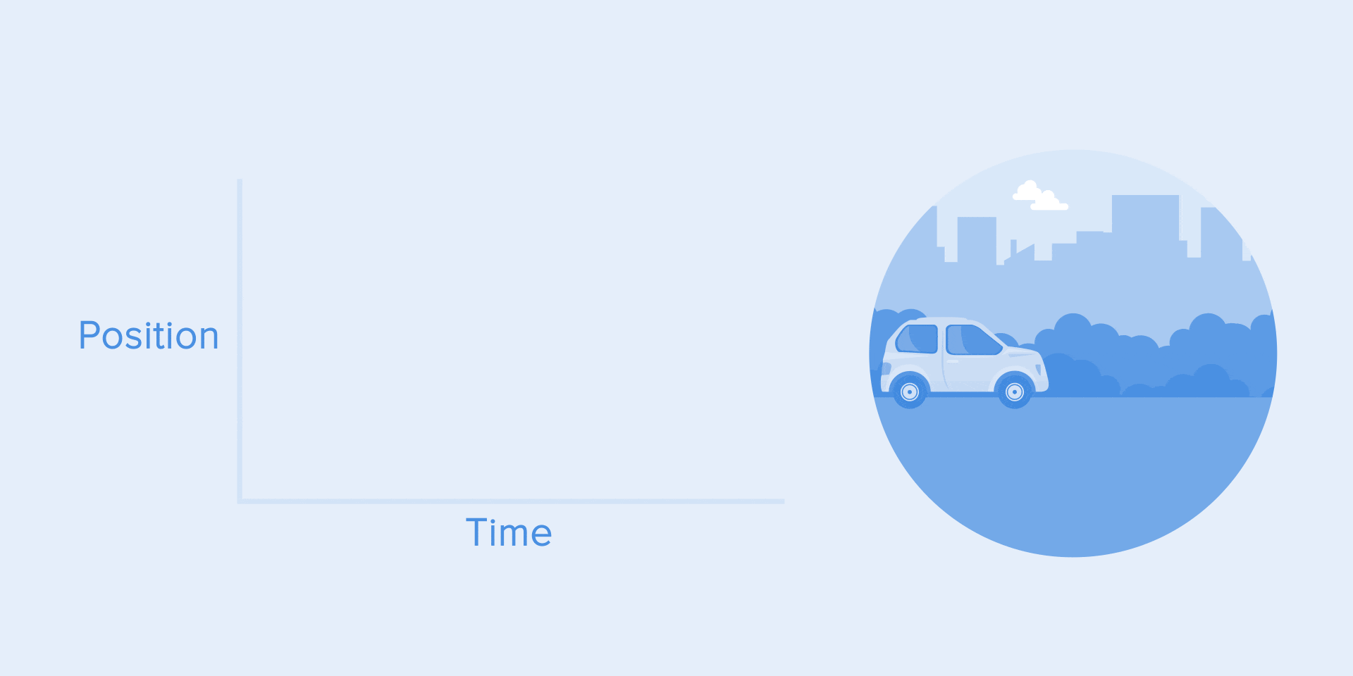
It is currently difficult to impress or even surprise with the animation of the interface. It shows the interaction between the screens, explains how to use the application, or simply directs the attention of the user. Studying the articles on animation, I learned that almost all of them describe only specific use cases or general facts about animation, but I did not come across any article where all the rules concerning interface animation would be clearly and practically described. But, in this article I will not write anything new, I just want to collect all the basic principles and rules in one place, so other designers who want to run animated interfaces do not need to look for additional information.
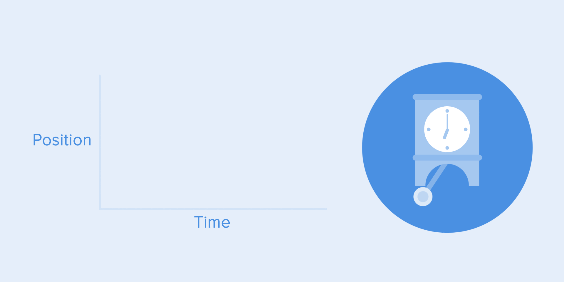
When elements change their state or position, the duration of the animation should be slow enough to allow users to notice a change, but at the same time fast enough so as not to cause an expectation.
Use the correct animation duration. Do not make it too fast and do not leave the user a lot of time for boredom.
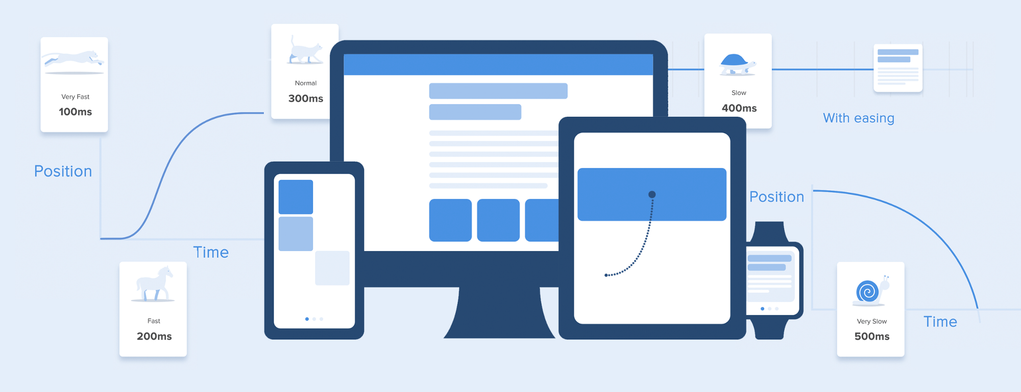
Numerous studies have shown that the optimal animation speed of the interface ranges from 200 to 500 ms. These numbers are based on the specific qualities of the human brain. Any animation shorter than 100 ms is instantaneous and will not be recognized at all. If the animation is longer than 1 second, it will give a sense of delay and, therefore, will be boring for the user.
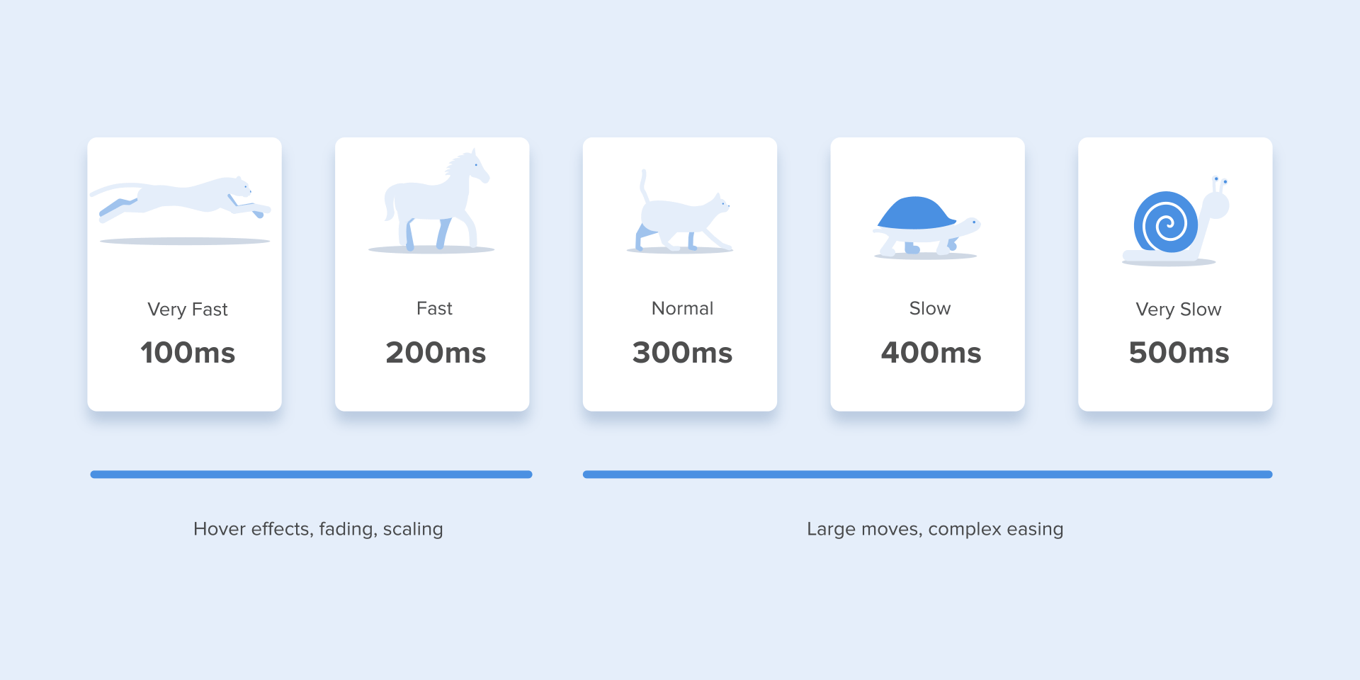
The duration of the animation, which is better to have in its interfaces
On mobile devices, the Material Design Guidelines also proposes to limit the duration of the animation to 200-300 ms. As for tablets, the duration should be longer by 30% - about 400-450 ms. The reason is simple: the screen size is larger, so objects travel a longer way when they change position. On gadgets, the duration should be correspondingly 30% shorter - about 150-200 ms, because on a smaller screen the distance covered is shorter.

The size of mobile devices affects the duration of the animation.
Web animation works differently. Since we are accustomed to almost instant opening of web pages in the browser, we also expect a quick transition between different states. Thus, the duration of web transitions should last about 2 times shorter than on mobile devices - from 150 to 200 ms. In other cases, the user inevitably thinks that the computer freezes or has problems connecting to the Internet.
But. Forget about these rules if you are creating a decorative animation on your website or are trying to draw the user's attention to certain elements. In these cases, the animation may be longer.

Large computer screen = Slow animation? Never!
It should be remembered that, regardless of the platform, the duration of the animation should depend not only on the distance traveled, but also on the size of the object. Smaller elements or animations with little changes should move faster. Accordingly, animation with large and complex elements looks better when it lasts a little longer.
Among moving objects of the same size, an object that has traveled the shortest distance must stop first.
Small objects move slower than large objects, as they make large displacements.
The duration of the animation varies depending on the size of the object and the distance traveled.
When objects collide, the collision energy should be evenly distributed between them in accordance with physical laws. Thus, it is better to eliminate the rebound effect. Use it only in exceptional cases when it makes sense.
Avoid using the bounce effect because it distracts.
Motion of objects should be clear, so do not use motion blur (yes, After Effects users, but not this time). It is difficult to reproduce the effect even on modern mobile devices, and it is not used at all in the animation of the interface.
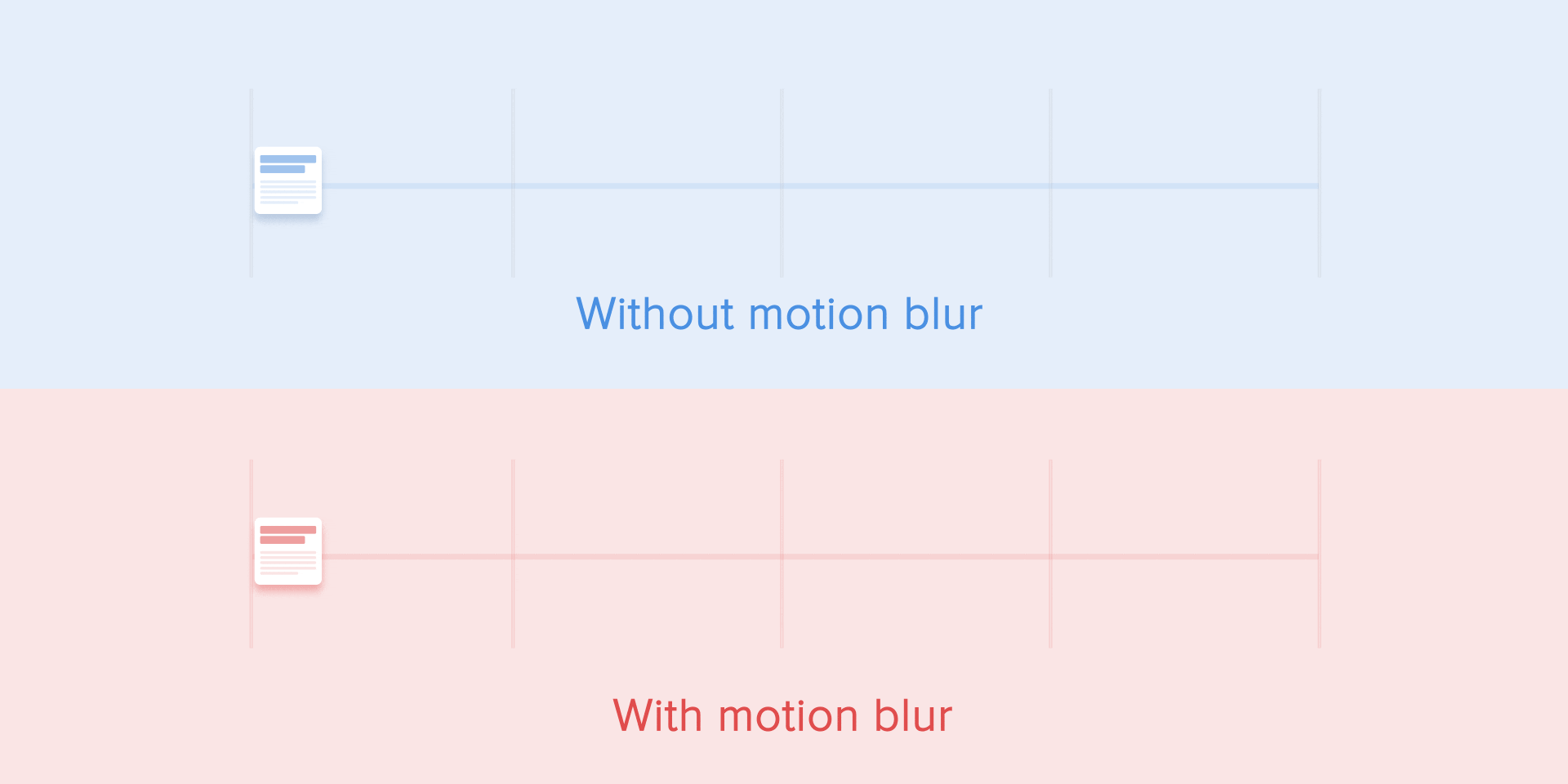
Do not use the blur effect in the animation.
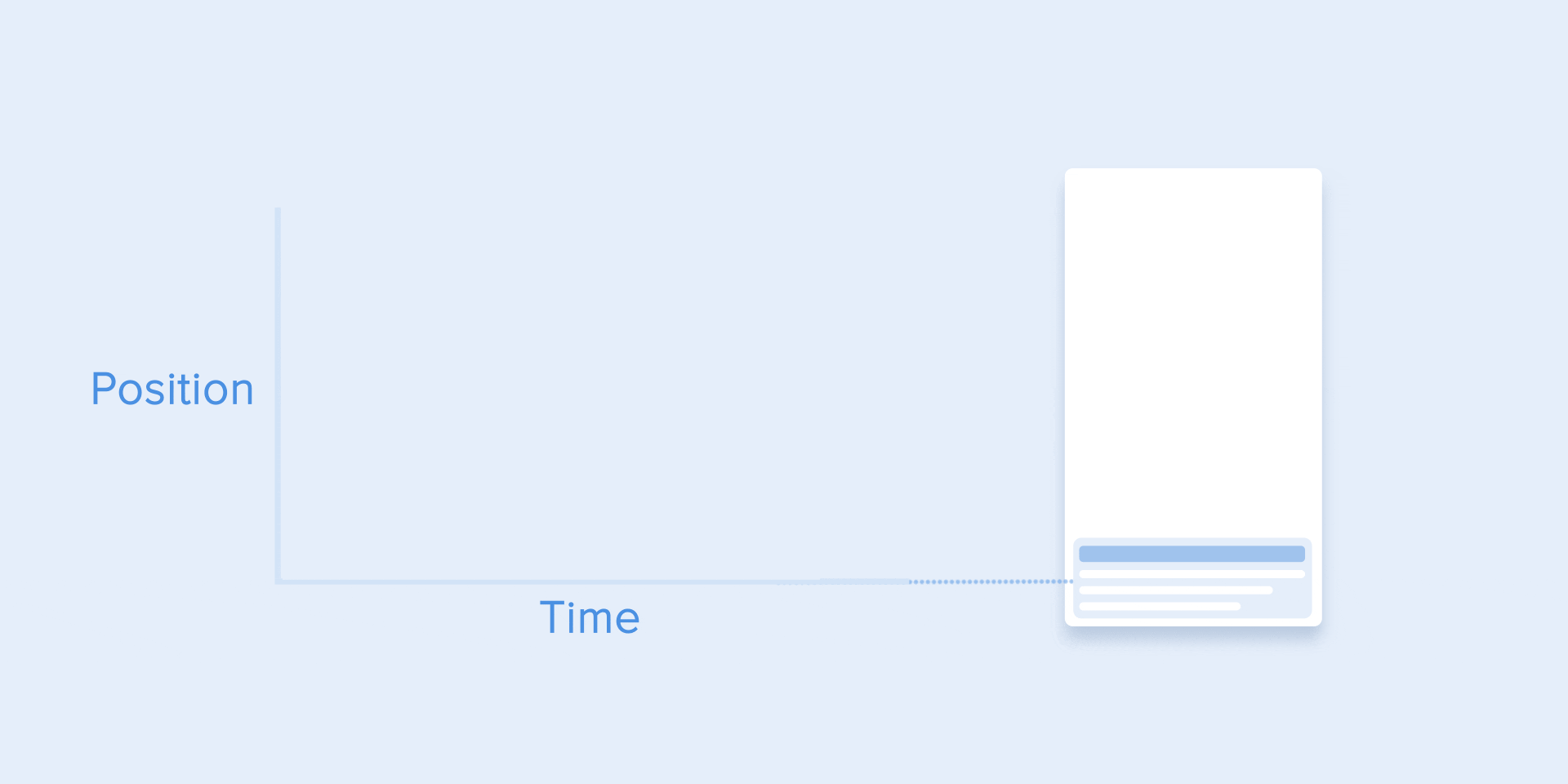
List items (news cards, email lists, etc.) Must have a very slight display delay. Each appearance of a new element should last from 20 to 25 ms. The slower appearance of the elements can annoy the user.

The animation for the list items should last 20-25 ms
Softening helps to make the movement of the object more natural. This is one of the basic principles of animation , which is described in detail in the book The Illusion of Life: Disney Animation , written by two key Disney animators - Olli Johnston and Frank Thomas.
In order for the animation not to look mechanically and artificially, the object must move with some acceleration or deceleration - just like all living objects in the physical world.
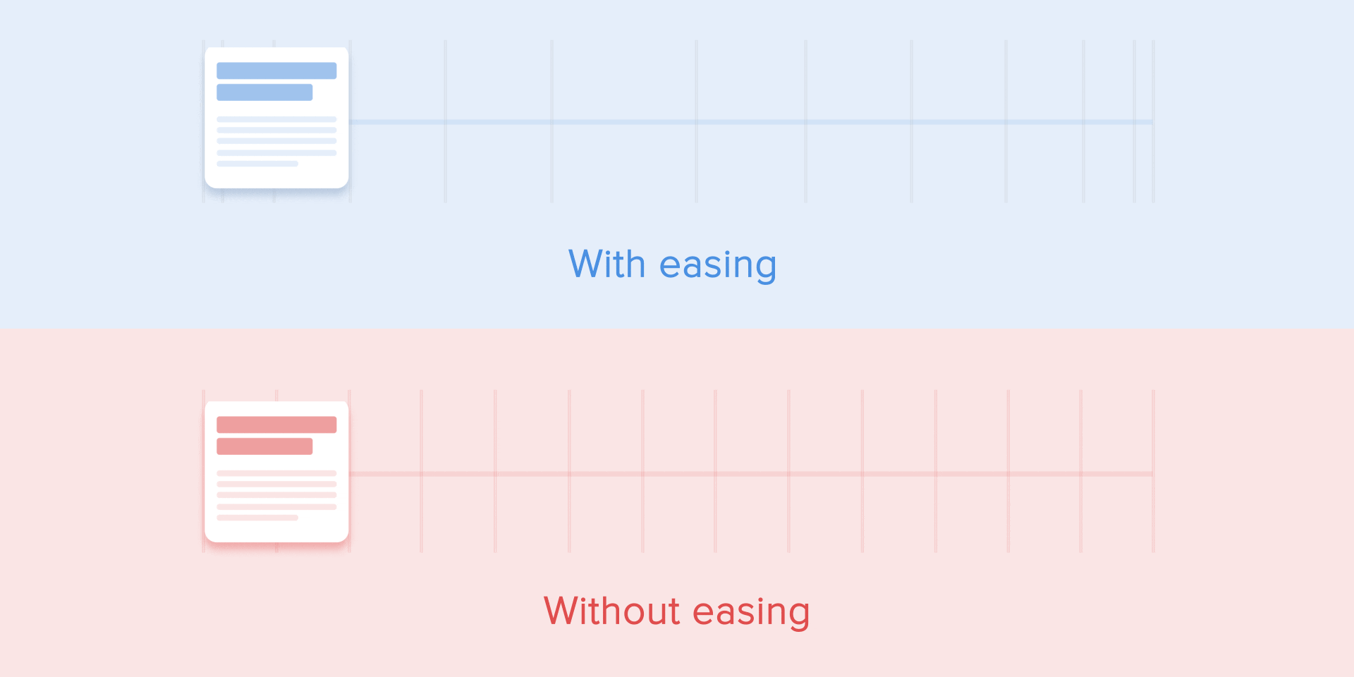
The weakening animation looks more natural than linear.
Objects that are not subject to any physical force move linearly, in other words, at a constant speed. And only because of this they look very unnatural and artificial to the human eye.
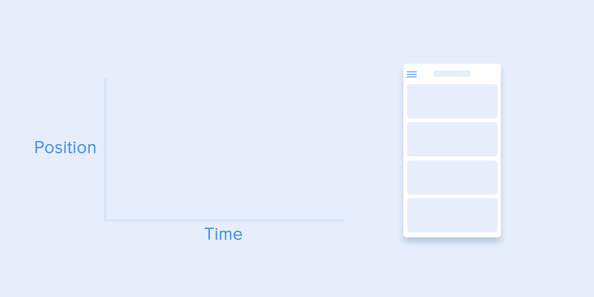
All animation applications use animation curves. I will try to explain how to read them and what they mean. The curve shows how the position of the object changes (y-axis) at the same time intervals (x-axis). In the current case, the movement is linear, so the object moves at the same distance at the same time
Linear motion curve.
Linear motion can, for example, be used only when the object changes its color or transparency. As a rule, we can use it for states when the object does not change its position.
We can see on the curve that at the beginning the position of the object changes slowly, and the speed increases gradually. This means that the object moves with a certain acceleration.
Acceleration Curve
This curve should be used when objects fly out of the screen at full speed. These can be system notifications or only interface cards. But keep in mind that this type of curve should only be used when objects leave the screen forever, and we cannot either return or recall them.
The acceleration curve for the ejection of the card from the screen.
Curve animation helps to express the right mood. In the example below, we see that the duration of the movement and the distance for all objects are the same, but even small changes in the curve give you the opportunity to influence the mood of the animation.
And, of course, changing the curves, you can move the object as close as possible to reality.
Same duration and distance, but different moods
This is opposite to the gain curve, so the object quickly covers a large distance, and then slowly loses speed until it stops.
Slowdown curve
This type of curve should be used when an element appears on the screen - it flies on the screen at full speed, gradually slowing down until it stops completely. This can also be applied to various maps or objects that appear outside the screen.

Braking curve for clarity
This curve causes objects to pick up speed at the beginning, and then slowly resets it to zero. This type of motion is most often used in interface animation. Whenever you doubt some type of movement to use in your animation, use a standard curve.
Standard Curve
According to the Material Design Guidelines , it is best to use an asymmetric curve to make the movement more natural and realistic. The end of the curve should be more underlined than its beginning, so the duration of the acceleration is shorter than the deceleration rate. In this case, the user will pay more attention to the final movement of the element and, consequently, to its new state.
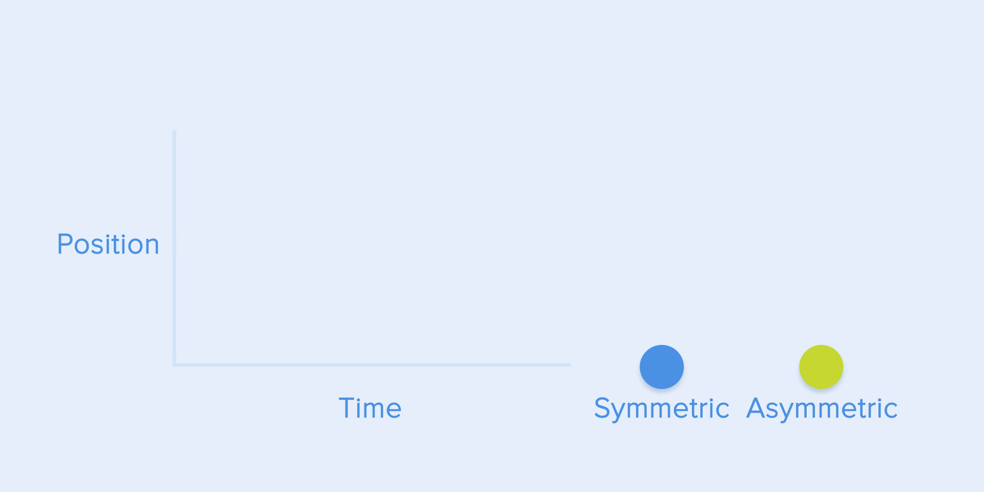
See Difference between symmetric and asymmetric standard curve.
The standard curve is used when objects are moved from one part of the screen to another. In this case, the animation avoids an attractive and dramatic effect.
Moving an element on the screen and the corresponding asymmetric curve
The same type of movement should be used when the element disappears from the screen, but the user can return it to the previous place at any time. This applies in particular to the navigation bar.
The navigation bar is hidden from the screen using a standard curve.
From these examples there is a fundamental rule that many beginners ignore - the initial animation is not equal to the final animation. As with the navigation bar, it appears with a slowdown curve and disappears with a standard curve. In addition, according to Google Material Design, the time of appearance of the object should be more to attract more attention.
The appearance and disappearance of the side menu is performed with a slowdown and a standard curve, respectively.
To describe the curves, use the cubic-bezier () function . It is called cubic because it is based on four points. The first point with coordinates 0; 0 (bottom left) and the last one with coordinates 1; 1 (top right) is already defined in the graph.
Based on this, we need to describe only two points on the graph, which are given by the four arguments of the cubic-bezier () function : the first two are the x and y coordinates of the first point, and the second are the x and y coordinates of the second point.
To simplify working with curves, I suggest using easings.net and cub-bezier.com sites . The first contains a list of the most commonly used curves, the parameters of which you can copy to the prototyping tool. The second source gives you the opportunity to play with different parameters of the curve and immediately see how the objects will move.
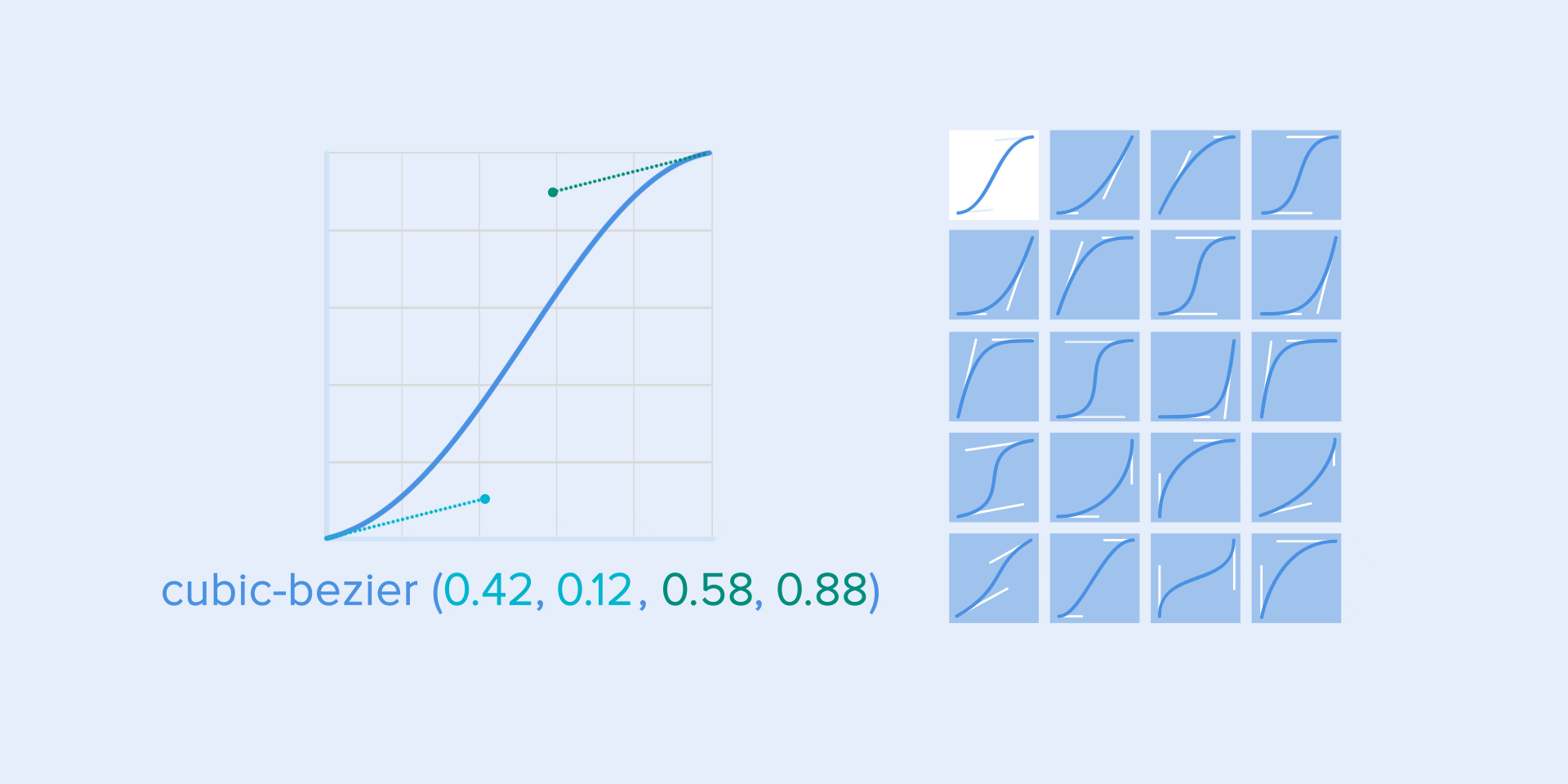
Different types of curves and their parameters for the function
As in ballet choreography, the basic idea is to direct the user's attention to change during the transition from one state to another.
There are two types of choreography - equal and subordinate interaction.
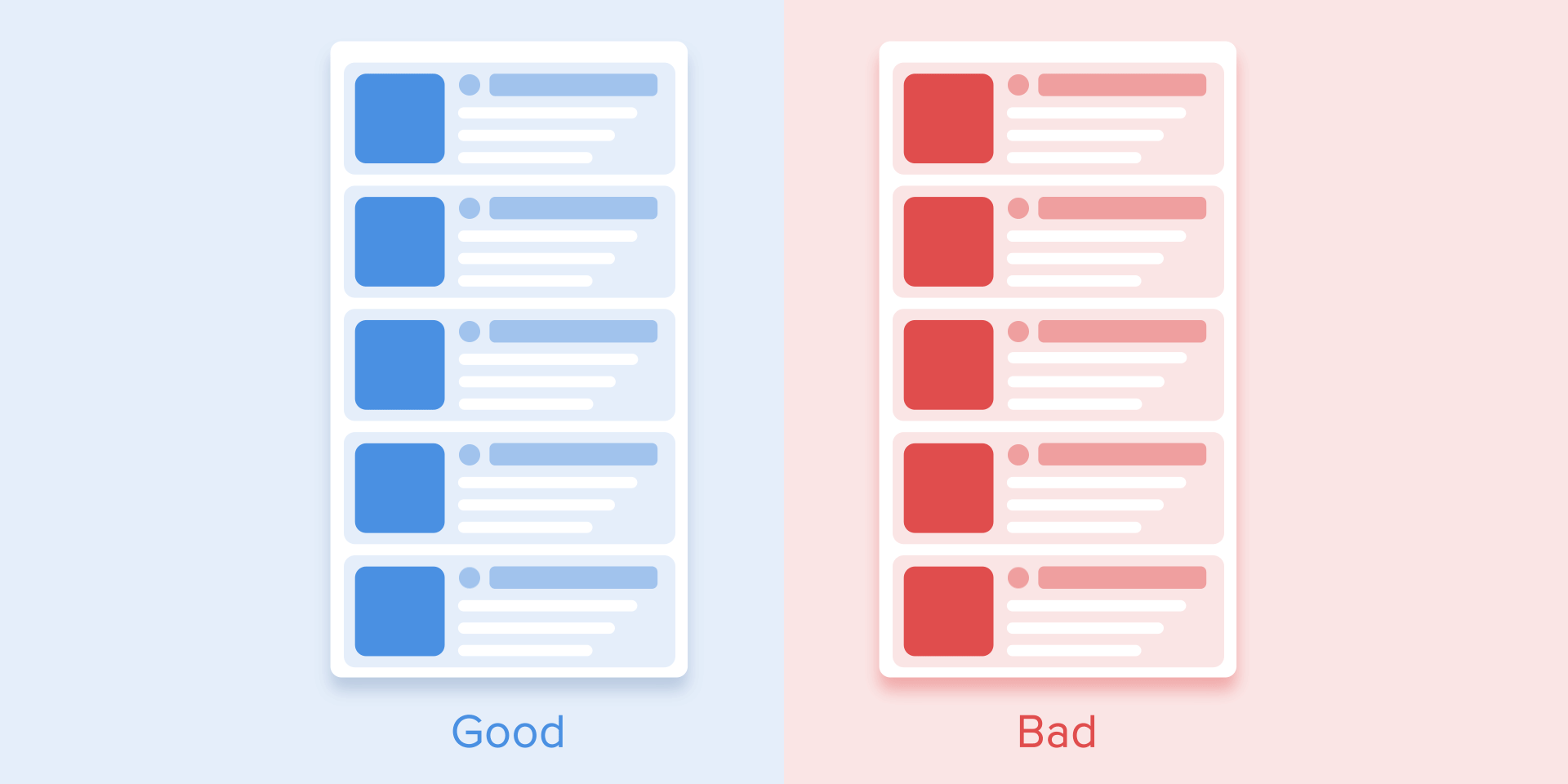
Equal interaction means that the appearance of all objects obeys one specific rule.
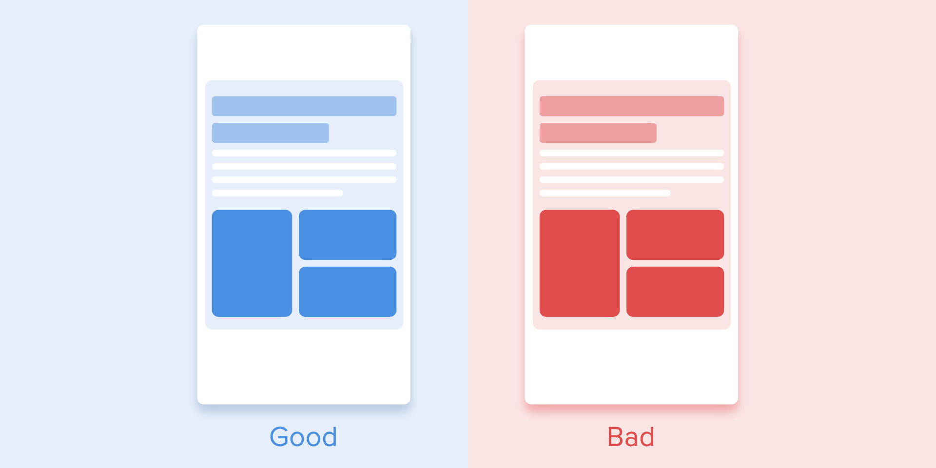
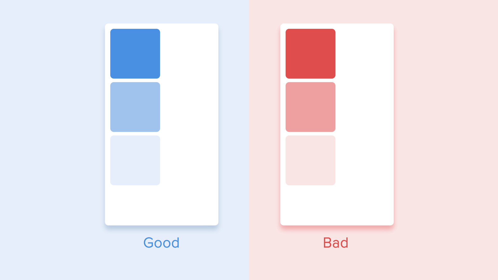
In this case, the appearance of all elements is perceived as one stream, which directs the user's attention in one direction, namely, from top to bottom. If we do not follow the order, the user's attention will be scattered. The appearance of all the elements will immediately look bad.
The attention of the user should be directed in one direction.
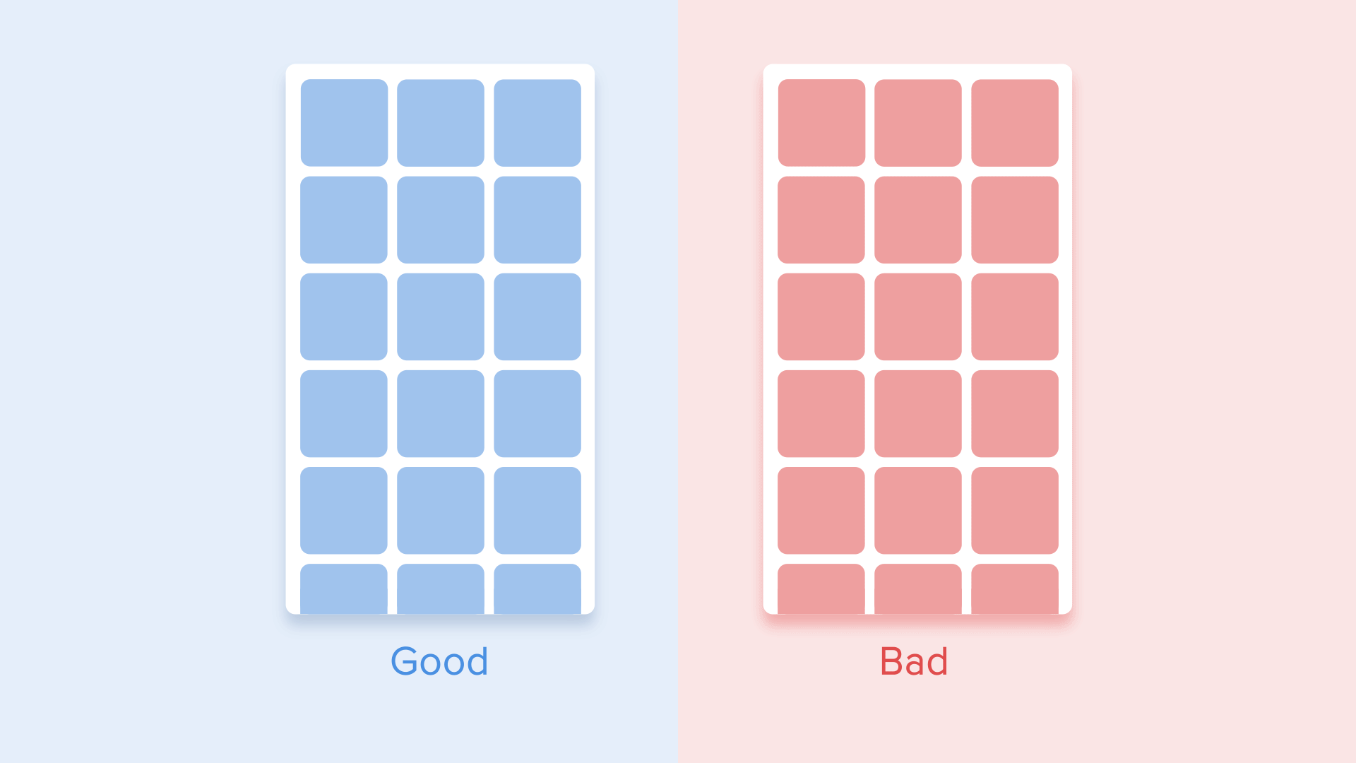
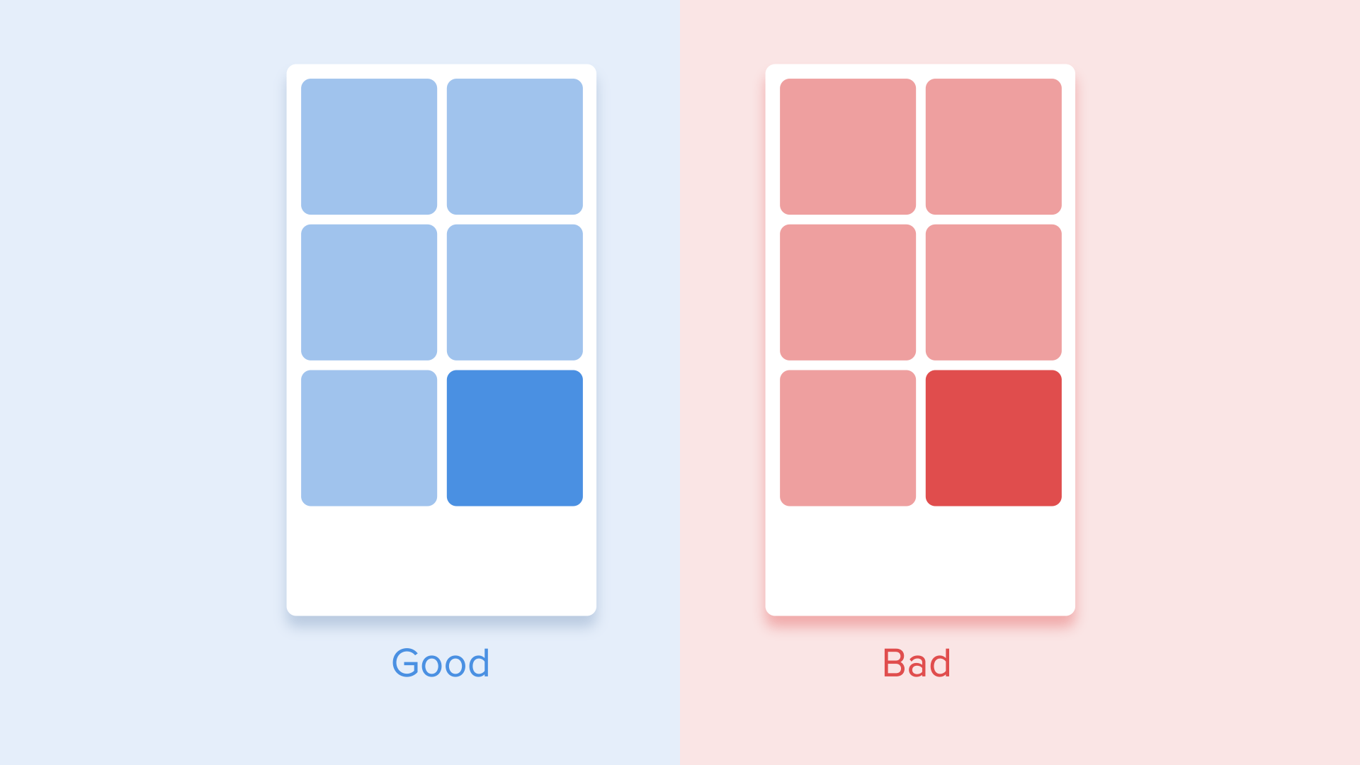
As for the table view, it is a bit more complicated. Here, the user's focus should be diagonally directed, so showing the elements one by one is a bad idea. Identifying each element one by one will make the animation excessively long, and the user's attention will be zigzagging, which is wrong.
Diagonal view for tabular display of elements
This type of animation gives a sense of order and draws more attention to the main content.
In other cases, it would be very difficult for the user to understand which object to observe, so his attention would be scattered. Therefore, if you have several elements that you want to animate, you need to clearly define the sequence of their movement and animate as few objects as possible at a time.
It is necessary to revive only one central object and all the others subordinate to it. Otherwise, the user will not know which object to pay attention to.
According to Material Designwhen moving objects are disproportionately transformed, they must move in an arc, and not in a straight line. It helps to make movement more natural. "In proportion," I mean that the change in height and width of an object by increasing / decreasing is asymmetrically, that is, at different speeds (for example, a square element turns into a rectangle).
The movement of an object that disproportionately changes its size should be located along the arc. The
movement along the line is used when the object changes its size proportionally. Since the implementation of such a movement is much simpler, the rule of disproportionate movement of the arc is often ignored. Looking at real-world examples of applications, you will see the dominance of linear motion.
Proportional resizing is performed in a straight line. A
movement along a curve can be achieved in two ways: the first one, called the Vertical Output, starts moving horizontally and ends with a vertical movement; the second - the horizontal exit of the object begins to move vertically and ends with a horizontal movement.
The path of the object along the curve should coincide with the main axis of the scroll interface. For example, in the next image, we can scroll the interface up and down, and, accordingly, the object rotates vertically - first to the right and then down. Movement in the opposite direction is the opposite way, that is, the object first rises vertically and ends with a horizontal movement.
The direction of the deployment / collapse of the object must coincide with the axis of the interface
If the paths of moving objects intersect with each other, they cannot pass through each other. Objects must leave enough space to move another object, slowing down or accelerating their own speed. Another option is that they simply repel other objects. Why is that? Since we assume that all objects in the interface lie in the same plane.
While moving, objects should not pass through each other, but leave space to move another object.
In another case, a moving object may rise above other objects. But again do not overlap with other objects. What for? Since we believe that the interface elements behave in accordance with the laws of physics, and no solid objects in the real world can do this.
Objects can rise above other objects and then move.
So, if we sum up all the above rules and principles, the animation in the interface should reflect the movements that we know from the physical world - friction, acceleration, etc. By simulating the behavior of objects from the real world, we can create a sequence that allows users to understand what to expect from the interface.
If the animation is built correctly, then it is unobtrusive and does not distract users from their goals. If so, you need to either soften or remove it altogether. This means that the animation should not slow down the work of the user or interfere with the execution of the task.
But do not forget that animation is more art than science, so it’s better to experiment and test your decisions on users.
A source:UX
Author: Taras Skytskyi.
The ultimate guide to proper use of animation in UX author Taras Skytskyi.
It is currently difficult to impress or even surprise with the animation of the interface. It shows the interaction between the screens, explains how to use the application, or simply directs the attention of the user. Studying the articles on animation, I learned that almost all of them describe only specific use cases or general facts about animation, but I did not come across any article where all the rules concerning interface animation would be clearly and practically described. But, in this article I will not write anything new, I just want to collect all the basic principles and rules in one place, so other designers who want to run animated interfaces do not need to look for additional information.
Duration and speed of animation
When elements change their state or position, the duration of the animation should be slow enough to allow users to notice a change, but at the same time fast enough so as not to cause an expectation.
Use the correct animation duration. Do not make it too fast and do not leave the user a lot of time for boredom.
Numerous studies have shown that the optimal animation speed of the interface ranges from 200 to 500 ms. These numbers are based on the specific qualities of the human brain. Any animation shorter than 100 ms is instantaneous and will not be recognized at all. If the animation is longer than 1 second, it will give a sense of delay and, therefore, will be boring for the user.
The duration of the animation, which is better to have in its interfaces
On mobile devices, the Material Design Guidelines also proposes to limit the duration of the animation to 200-300 ms. As for tablets, the duration should be longer by 30% - about 400-450 ms. The reason is simple: the screen size is larger, so objects travel a longer way when they change position. On gadgets, the duration should be correspondingly 30% shorter - about 150-200 ms, because on a smaller screen the distance covered is shorter.
The size of mobile devices affects the duration of the animation.
Web animation works differently. Since we are accustomed to almost instant opening of web pages in the browser, we also expect a quick transition between different states. Thus, the duration of web transitions should last about 2 times shorter than on mobile devices - from 150 to 200 ms. In other cases, the user inevitably thinks that the computer freezes or has problems connecting to the Internet.
But. Forget about these rules if you are creating a decorative animation on your website or are trying to draw the user's attention to certain elements. In these cases, the animation may be longer.
Large computer screen = Slow animation? Never!
It should be remembered that, regardless of the platform, the duration of the animation should depend not only on the distance traveled, but also on the size of the object. Smaller elements or animations with little changes should move faster. Accordingly, animation with large and complex elements looks better when it lasts a little longer.
Among moving objects of the same size, an object that has traveled the shortest distance must stop first.
Small objects move slower than large objects, as they make large displacements.
The duration of the animation varies depending on the size of the object and the distance traveled.
When objects collide, the collision energy should be evenly distributed between them in accordance with physical laws. Thus, it is better to eliminate the rebound effect. Use it only in exceptional cases when it makes sense.
Avoid using the bounce effect because it distracts.
Motion of objects should be clear, so do not use motion blur (yes, After Effects users, but not this time). It is difficult to reproduce the effect even on modern mobile devices, and it is not used at all in the animation of the interface.
Do not use the blur effect in the animation.
List items (news cards, email lists, etc.) Must have a very slight display delay. Each appearance of a new element should last from 20 to 25 ms. The slower appearance of the elements can annoy the user.
The animation for the list items should last 20-25 ms
Softening
Softening helps to make the movement of the object more natural. This is one of the basic principles of animation , which is described in detail in the book The Illusion of Life: Disney Animation , written by two key Disney animators - Olli Johnston and Frank Thomas.
In order for the animation not to look mechanically and artificially, the object must move with some acceleration or deceleration - just like all living objects in the physical world.
The weakening animation looks more natural than linear.
Linear motion
Objects that are not subject to any physical force move linearly, in other words, at a constant speed. And only because of this they look very unnatural and artificial to the human eye.
All animation applications use animation curves. I will try to explain how to read them and what they mean. The curve shows how the position of the object changes (y-axis) at the same time intervals (x-axis). In the current case, the movement is linear, so the object moves at the same distance at the same time
Linear motion curve.
Linear motion can, for example, be used only when the object changes its color or transparency. As a rule, we can use it for states when the object does not change its position.
Gain or acceleration curve
We can see on the curve that at the beginning the position of the object changes slowly, and the speed increases gradually. This means that the object moves with a certain acceleration.
Acceleration Curve
This curve should be used when objects fly out of the screen at full speed. These can be system notifications or only interface cards. But keep in mind that this type of curve should only be used when objects leave the screen forever, and we cannot either return or recall them.
The acceleration curve for the ejection of the card from the screen.
Curve animation helps to express the right mood. In the example below, we see that the duration of the movement and the distance for all objects are the same, but even small changes in the curve give you the opportunity to influence the mood of the animation.
And, of course, changing the curves, you can move the object as close as possible to reality.
Same duration and distance, but different moods
Weakening or slowing curve
This is opposite to the gain curve, so the object quickly covers a large distance, and then slowly loses speed until it stops.
Slowdown curve
This type of curve should be used when an element appears on the screen - it flies on the screen at full speed, gradually slowing down until it stops completely. This can also be applied to various maps or objects that appear outside the screen.
Braking curve for clarity
Gain and attenuation curve or standard curve
This curve causes objects to pick up speed at the beginning, and then slowly resets it to zero. This type of motion is most often used in interface animation. Whenever you doubt some type of movement to use in your animation, use a standard curve.
Standard Curve
According to the Material Design Guidelines , it is best to use an asymmetric curve to make the movement more natural and realistic. The end of the curve should be more underlined than its beginning, so the duration of the acceleration is shorter than the deceleration rate. In this case, the user will pay more attention to the final movement of the element and, consequently, to its new state.
See Difference between symmetric and asymmetric standard curve.
The standard curve is used when objects are moved from one part of the screen to another. In this case, the animation avoids an attractive and dramatic effect.
Moving an element on the screen and the corresponding asymmetric curve
The same type of movement should be used when the element disappears from the screen, but the user can return it to the previous place at any time. This applies in particular to the navigation bar.
The navigation bar is hidden from the screen using a standard curve.
From these examples there is a fundamental rule that many beginners ignore - the initial animation is not equal to the final animation. As with the navigation bar, it appears with a slowdown curve and disappears with a standard curve. In addition, according to Google Material Design, the time of appearance of the object should be more to attract more attention.
The appearance and disappearance of the side menu is performed with a slowdown and a standard curve, respectively.
To describe the curves, use the cubic-bezier () function . It is called cubic because it is based on four points. The first point with coordinates 0; 0 (bottom left) and the last one with coordinates 1; 1 (top right) is already defined in the graph.
Based on this, we need to describe only two points on the graph, which are given by the four arguments of the cubic-bezier () function : the first two are the x and y coordinates of the first point, and the second are the x and y coordinates of the second point.
To simplify working with curves, I suggest using easings.net and cub-bezier.com sites . The first contains a list of the most commonly used curves, the parameters of which you can copy to the prototyping tool. The second source gives you the opportunity to play with different parameters of the curve and immediately see how the objects will move.
Different types of curves and their parameters for the function
cubic-bezier()Choreography in animation interfaces
As in ballet choreography, the basic idea is to direct the user's attention to change during the transition from one state to another.
There are two types of choreography - equal and subordinate interaction.
Equal interaction
Equal interaction means that the appearance of all objects obeys one specific rule.
In this case, the appearance of all elements is perceived as one stream, which directs the user's attention in one direction, namely, from top to bottom. If we do not follow the order, the user's attention will be scattered. The appearance of all the elements will immediately look bad.
The attention of the user should be directed in one direction.
As for the table view, it is a bit more complicated. Here, the user's focus should be diagonally directed, so showing the elements one by one is a bad idea. Identifying each element one by one will make the animation excessively long, and the user's attention will be zigzagging, which is wrong.
Diagonal view for tabular display of elements
Subject Interaction
Subject interaction means that we have one central object that attracts the attention of all users, and all other elements are subordinate to it.
Vanilla Thunder.
This type of animation gives a sense of order and draws more attention to the main content.
In other cases, it would be very difficult for the user to understand which object to observe, so his attention would be scattered. Therefore, if you have several elements that you want to animate, you need to clearly define the sequence of their movement and animate as few objects as possible at a time.
It is necessary to revive only one central object and all the others subordinate to it. Otherwise, the user will not know which object to pay attention to.
According to Material Designwhen moving objects are disproportionately transformed, they must move in an arc, and not in a straight line. It helps to make movement more natural. "In proportion," I mean that the change in height and width of an object by increasing / decreasing is asymmetrically, that is, at different speeds (for example, a square element turns into a rectangle).
The movement of an object that disproportionately changes its size should be located along the arc. The
movement along the line is used when the object changes its size proportionally. Since the implementation of such a movement is much simpler, the rule of disproportionate movement of the arc is often ignored. Looking at real-world examples of applications, you will see the dominance of linear motion.
Proportional resizing is performed in a straight line. A
movement along a curve can be achieved in two ways: the first one, called the Vertical Output, starts moving horizontally and ends with a vertical movement; the second - the horizontal exit of the object begins to move vertically and ends with a horizontal movement.
The path of the object along the curve should coincide with the main axis of the scroll interface. For example, in the next image, we can scroll the interface up and down, and, accordingly, the object rotates vertically - first to the right and then down. Movement in the opposite direction is the opposite way, that is, the object first rises vertically and ends with a horizontal movement.
The direction of the deployment / collapse of the object must coincide with the axis of the interface
If the paths of moving objects intersect with each other, they cannot pass through each other. Objects must leave enough space to move another object, slowing down or accelerating their own speed. Another option is that they simply repel other objects. Why is that? Since we assume that all objects in the interface lie in the same plane.
While moving, objects should not pass through each other, but leave space to move another object.
In another case, a moving object may rise above other objects. But again do not overlap with other objects. What for? Since we believe that the interface elements behave in accordance with the laws of physics, and no solid objects in the real world can do this.
Objects can rise above other objects and then move.
findings
So, if we sum up all the above rules and principles, the animation in the interface should reflect the movements that we know from the physical world - friction, acceleration, etc. By simulating the behavior of objects from the real world, we can create a sequence that allows users to understand what to expect from the interface.
If the animation is built correctly, then it is unobtrusive and does not distract users from their goals. If so, you need to either soften or remove it altogether. This means that the animation should not slow down the work of the user or interfere with the execution of the task.
But do not forget that animation is more art than science, so it’s better to experiment and test your decisions on users.
A source:UX
Author: Taras Skytskyi.