New Life Telebreeze Player
Today we released the next version of our IPTV player with a completely new fashionable Flat design and with many improvements that affected both the user interface and the software part. The update occurred at once on all platforms, from the most popular desktop and mobile Windows, Android, IOS, MacOS, and ending with Smart TV, Mag250 and Roku. I want to say that we put our whole soul into it and it turned out more than worthy.
ALARM: Below are a lot of pictures, as this suggests a review of the new design
It all started a couple of months ago. We worked out the concept of a new design with one cool team of designers , ruled out unsuitable options, and set about creating the foundation. The new design is not just external changes, it is a different structure and a different vision, more convenient and improved.
At this stage, a basic version has been made, which from time to time, with each new update, will be replenished with various buns that will make the player more “smart”, convenient and attractive to the user.
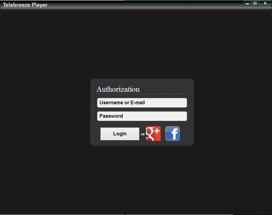
Login screen: BEFORE - AFTER

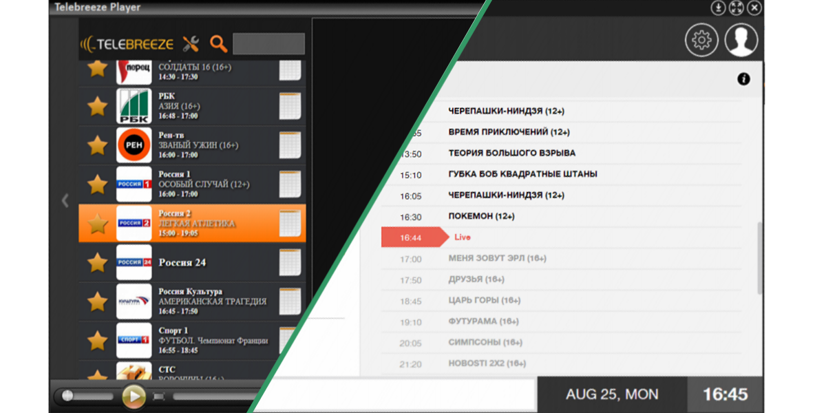
A little about the changes themselves. First of all, as regards the screen for selecting TV channels and EPG (program guide and archive of programs). Previously, it was two different screens, that is, the user had to click on the program icon to see the EPG. Now the user clicks on the channel and the EPG appears on the left side of the screen, where the program that is currently running is highlighted in red.

The old interface, with the old EPG structure and channel list

Now under each channel it’s now available to view the progress bar, which shows the duration of the program that is currently running on the channel. Convenient enough thing.

Well, the last addition on this screen is access to viewing channel information and the ability to add a channel to favorites by clicking on, after that the channel will be displayed at the top of the list.
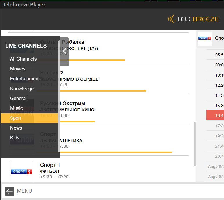
With the old design, the post-launch window for channel categories has also gone. That is, after authorization, it was necessary to select a category, and then the channel itself. We thought that it would be more convenient if this menu appears from behind the screen, and initially, after authorization, the user will see a list of all channels.

On a mobile device, this list of categories appears on the left side of the slide. It is also cleaned, only in the other direction. Very convenient and intuitive.
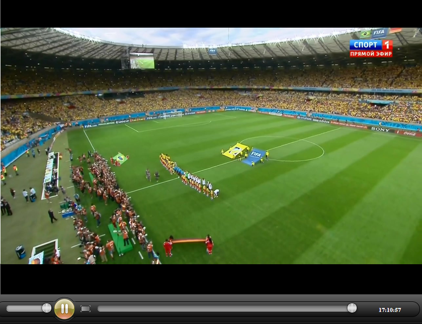
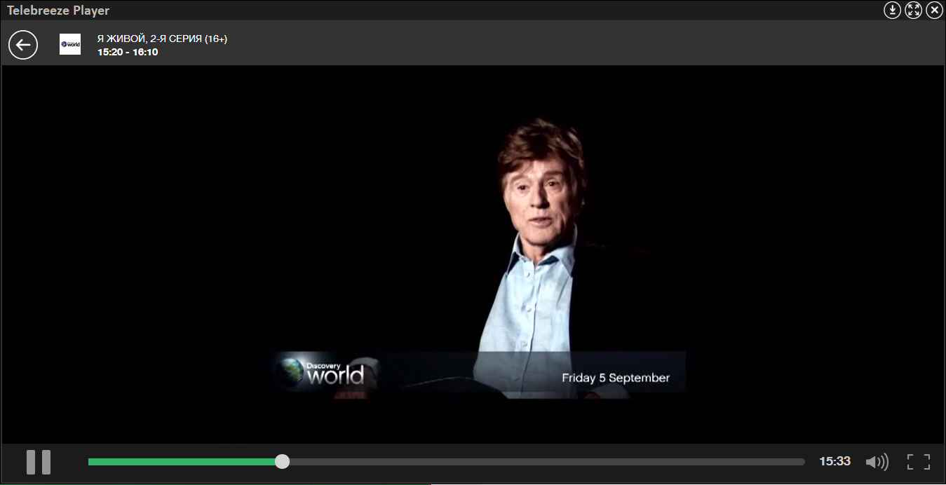
The changes also affected the video display screen. And then several important upgrades happened. Firstly, the scroll bar used to show the range of the entire archive, i.e. about 24 hours. It’s inconvenient, because if the user wants to skip exactly this program a couple of minutes ago, then it is definitely quite difficult to do this. Now, the scroll bar shows the time range of the particular transmission that is currently in progress. It is much more convenient to rewind and look for the necessary moment.
Secondly, the name of the channel, the name of the program that the user is watching and the time of its broadcast is not shown in the full screen. In the future, right on this screen, the user will be able to select any channel and program using the pop-up me.
As mentioned above, this is only the basic and simplest version of the player with a new design. Subsequently, it will be overgrown with new functionality, for example, video previews and the “metro station” system when switching between programs.
This screen has undergone only external changes. Nothing more can be said so far.

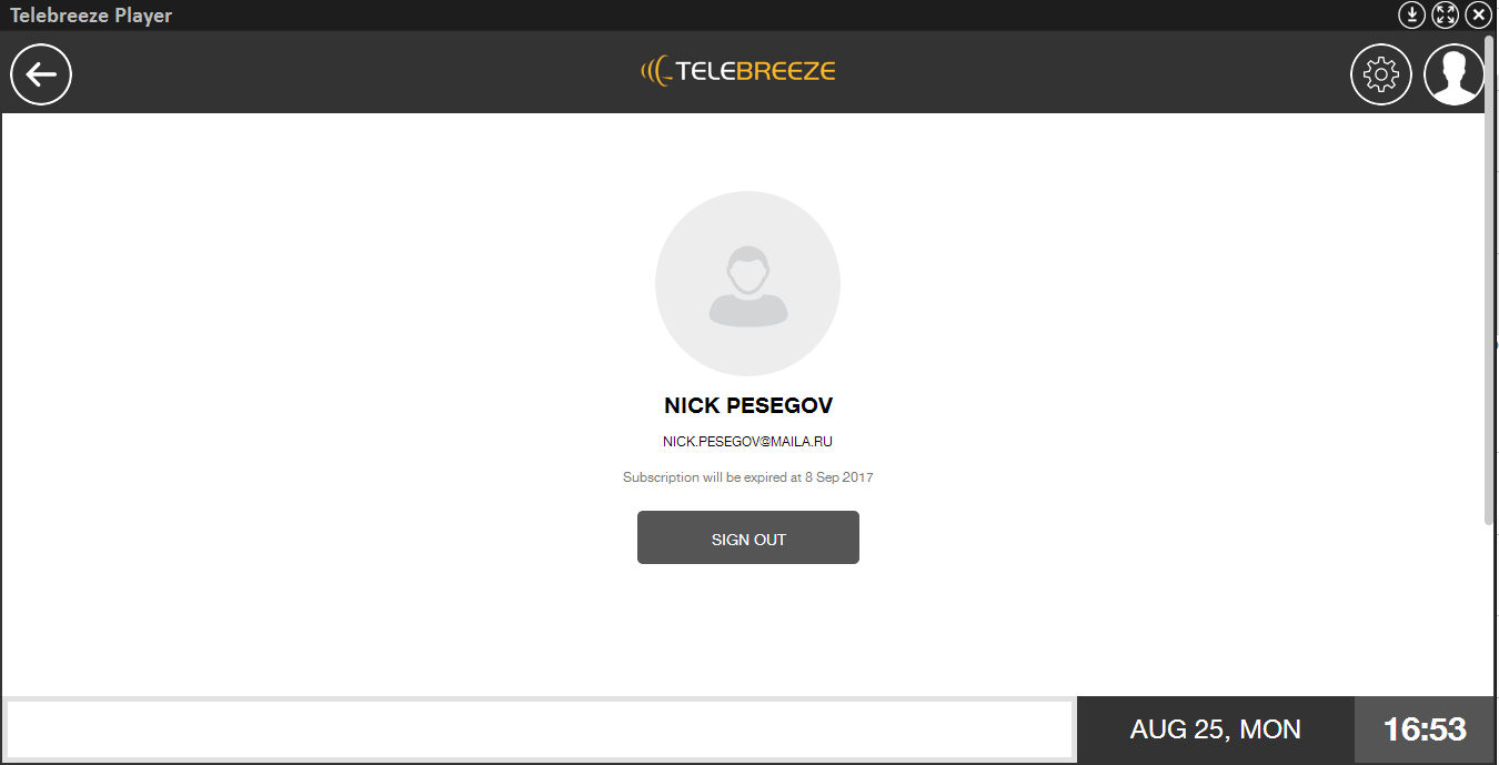
Each user has his own personal account. Now it is implemented with a minimum of functions. In the future, it is planned to add a billing system to the player itself, that is, a system for paying for packages, films, etc. Also, the user will be able to communicate with his friends who will use the player.
A separate topic for the IPTV operator is video on demand. We have created the ability to add various films, videos and other content that users can buy, watch, rate, comment, and recommend to their friends.

A new screen appeared, which was not in the old design. This is a screen of information about the movie that he bought and wants to watch. The screen displays various information about the film, it is possible to watch the trailer of the film, as well as rate this film. In the future, it is here that users will be able to leave their comments and share their opinions about any film.

What can be said in conclusion: with each new day we are moving closer to our ultimate goal - to create a unique application for viewing absolutely any video content, anywhere in the world, on any device. Each new problem gives us even more strength and energy, because with its solution we gain invaluable experience, which we try to implement in the further development of our product. We are open to cooperation and criticism. Everyone always learns from their mistakes.
You can download and try the Telebreeze player in the profile of our company on Habré , as well as on the official website . Log in using social networks and you will have access to 15 channels of general digital broadcasting. Telebreeze Team
ALARM: Below are a lot of pictures, as this suggests a review of the new design
Introduction
It all started a couple of months ago. We worked out the concept of a new design with one cool team of designers , ruled out unsuitable options, and set about creating the foundation. The new design is not just external changes, it is a different structure and a different vision, more convenient and improved.
At this stage, a basic version has been made, which from time to time, with each new update, will be replenished with various buns that will make the player more “smart”, convenient and attractive to the user.
Login screen: BEFORE - AFTER
List and EPG
A little about the changes themselves. First of all, as regards the screen for selecting TV channels and EPG (program guide and archive of programs). Previously, it was two different screens, that is, the user had to click on the program icon to see the EPG. Now the user clicks on the channel and the EPG appears on the left side of the screen, where the program that is currently running is highlighted in red.
The old interface, with the old EPG structure and channel list
Now under each channel it’s now available to view the progress bar, which shows the duration of the program that is currently running on the channel. Convenient enough thing.
Well, the last addition on this screen is access to viewing channel information and the ability to add a channel to favorites by clicking on, after that the channel will be displayed at the top of the list.
Categories
With the old design, the post-launch window for channel categories has also gone. That is, after authorization, it was necessary to select a category, and then the channel itself. We thought that it would be more convenient if this menu appears from behind the screen, and initially, after authorization, the user will see a list of all channels.
On a mobile device, this list of categories appears on the left side of the slide. It is also cleaned, only in the other direction. Very convenient and intuitive.
Video
The changes also affected the video display screen. And then several important upgrades happened. Firstly, the scroll bar used to show the range of the entire archive, i.e. about 24 hours. It’s inconvenient, because if the user wants to skip exactly this program a couple of minutes ago, then it is definitely quite difficult to do this. Now, the scroll bar shows the time range of the particular transmission that is currently in progress. It is much more convenient to rewind and look for the necessary moment.
Secondly, the name of the channel, the name of the program that the user is watching and the time of its broadcast is not shown in the full screen. In the future, right on this screen, the user will be able to select any channel and program using the pop-up me.
As mentioned above, this is only the basic and simplest version of the player with a new design. Subsequently, it will be overgrown with new functionality, for example, video previews and the “metro station” system when switching between programs.
Settings
This screen has undergone only external changes. Nothing more can be said so far.
Extra buns
Personal Area
Each user has his own personal account. Now it is implemented with a minimum of functions. In the future, it is planned to add a billing system to the player itself, that is, a system for paying for packages, films, etc. Also, the user will be able to communicate with his friends who will use the player.
Video on Demand (VoD)
A separate topic for the IPTV operator is video on demand. We have created the ability to add various films, videos and other content that users can buy, watch, rate, comment, and recommend to their friends.
A new screen appeared, which was not in the old design. This is a screen of information about the movie that he bought and wants to watch. The screen displays various information about the film, it is possible to watch the trailer of the film, as well as rate this film. In the future, it is here that users will be able to leave their comments and share their opinions about any film.
Total
What can be said in conclusion: with each new day we are moving closer to our ultimate goal - to create a unique application for viewing absolutely any video content, anywhere in the world, on any device. Each new problem gives us even more strength and energy, because with its solution we gain invaluable experience, which we try to implement in the further development of our product. We are open to cooperation and criticism. Everyone always learns from their mistakes.