Several reasons why the popularity of minimalism is constantly growing (translation)
annotation
Good day to all. As part of my work, I often have to read foreign periodicals for designers and, of course, often translate it. I have accumulated several translations already prepared, with one of them I decided to share with you. If someone is interested, I will continue.
PS Some translations are published on my blog, so if there is interest from the readers of the habr, I will leave the exclusive for habr.
Why is the popularity of minimalism constantly growing?
The popularity of minimalism has been growing steadily in recent years. Long before the advent of flat design (flat design, flat design), minimalism had a big impact on artists, sculptors, directors, interior designers, designers and, of course, web designers.
In minimalism, the design is composed of parts and crushed. Although difficult to master, the basics of minimalism are easy to learn. If you want to try minimalism in any artistic activity, you must clear the work of everything that is possible, leaving the most necessary elements.
When used correctly, minimalistic design can be the most effective and simple approach in website design. Minimalism will result in a less messy and noisy design.
For these purposes, designers are focusing on subtracting unnecessary elements, and more and more designers have been following this concept lately.
Its popularity has grown rapidly with the spread of the flat design trend. More and more websites have been adapted with a flat design that applies the concepts of minimalism, thinking that less is really more.
But why is minimalism so popular? What is behind the popularity of this design concept? And how can you use this popularity to make design more efficient and beautiful?
Less is more.
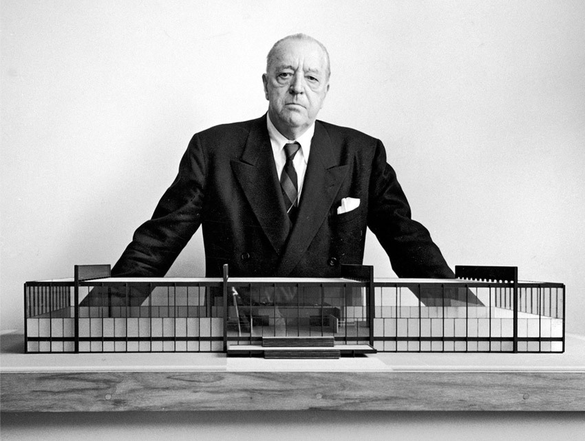
Ludwig Mies van der Rohe
Modernist architect Ludwig Mies van der Rohe might never have guessed what effect he said the phrase “less is more” to the brilliant minds that lived after him. These three words summarize everything that minimalism is - concisely and straight to the point.
When developing a site, you should always ask yourself the question: “What do I mean?”. Thus, you will understand where to lead the audience.
A cluttered design will only block this point. Unnecessary elements, as a rule, become an obstacle rather than a bridge for transmitting your goal to the viewer.
Why is that bad?
- Pile of elements only distracts the user to other things, rather than responding to your call to action.
- It makes information more difficult to understand.
The designer should trim his content, cut out unnecessary, less useful and irrelevant elements.
How to achieve more from less?
- Plan your website more carefully. This will prevent the addition of unnecessary elements before you even touch the design.
- Define your purpose. If one of the design elements does not serve this purpose, remove it.
- Spend time asking yourself, “Do I really need this?”
- Try using some click trackers on your website to identify items that are never used by viewers. After that, evaluate whether it is worth changing the place for these elements or deleting them.
Design responsiveness

With the daily increasing number of smartphone users, websites have to be responsive. As soon as your site becomes visible and beautiful on all types of devices, the chances of achieving your goal will be increased.
Why was design responsiveness mentioned here? What role does it play in the popularity of minimalism?
Important role
Responsive sites using a single prototype and grid system can safely switch from a desktop screen to mobile versions. With less content, fewer blocks and design elements (which adhere to a minimalist style), with the addition of white space, minimalistic websites are more likely to translate into beautiful mobile versions.
Another thing about responsiveness and its relationship with minimalism is users. Mobile users are less patient, always busy and always on the go. Providing information to a regular user of mobile devices can be very helpful. Remember, if the user wants it, give it to him as soon as possible.
Here are some things you should remember about responsive design:
- Think responsive. There are ideal designs for responsive design, and there are others that are not perfect. Understanding this will help you create a website design for any device.
- Pay attention to the control points. Screen resolutions have a set of different control points. These points should be leading in creating design for various screens.
- Drawings must be flexible. When changing the width, make your pictures as adaptive as possible. Here is a tool that can help you: Adaptive Images .
Lighter Websites

Imagine yourself in a balloon. You turn on the burner and the ball inflates. But you cannot take off, because heavy sandbags pull your ball to the ground. What are you going to do?
The answer is obvious. Lighter sites have become one of the main reasons for the popularity of minimalism. Having just a few design elements will mean a lighter website.
- Fewer content, widgets, design elements mean that less data needs to be downloaded to your browser, giving you a faster, easier, more efficient and productive user interface.
- You immediately design a more responsive design, thinking how fast your website will load on mobile devices.
- Having a lighter site means easier updating, maintenance, and troubleshooting.
- Remove unused plugins.
- If something does not work efficiently, throw it away.
- If you can create designer elements with code, do it.
- Consider when it is better to use PNG, GIF or JPG files.
Here are some suggestions:
- Remove unused plugins.
- If something does not work efficiently, throw it away.
- If you can create designer elements with code, do it.
- Consider when it is better to use PNG, GIF or JPG files.
Content Targeting

Content is the main thing. It is clear that everyone knows this. What motivates people when choosing minimalism is also its focus on content. Since minimalistic sites tend to discard unnecessary elements and expose the design as soon as possible, the user focuses on the main thing - the content.
Without any confusion, users can easily find what they need in order to quickly respond to a call to action. Website performance improves because it leads to increased conversions with minimal effort in design and maintenance.
How to create a design for content?
- Use suitable alignment.
- Use empty space.
- Use appropriate fonts.
- Remember that size matters.
Conclusion
How much is minimalism so popular? It reflects a lifestyle that stimulates introspection. What kind of things do I not need? What things do I need? The answer to these questions will lead you to realize what is really necessary and what you need to keep and preserve.
Source: http://www.1stwebdesigner.com/