Improving UI Web Applications
This year our service MySklad turned seven years old. The concept of what a good web service interface is is constantly changing. Visual solutions that worked well before become cumbersome and confusing as the number of functions grows in the service.
Therefore, we have to constantly update the interface of MyStore. We want to tell you about the general principles of processing UI - why, when and how to do it.
Recycling a UI is an expensive process. Recently, our developers have spent at least 30% of the time on it, but could instead add new features. So, we need to clearly understand why we are changing the UI and what benefits it will give.
For ourselves, we have identified the tasks that an ideal interface should solve:
Now about specific actions.
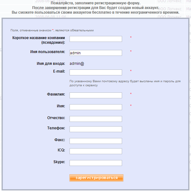
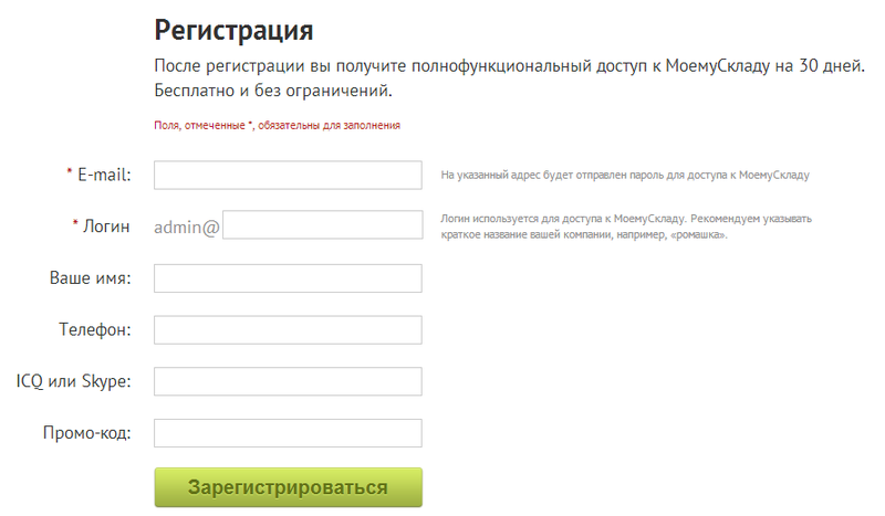
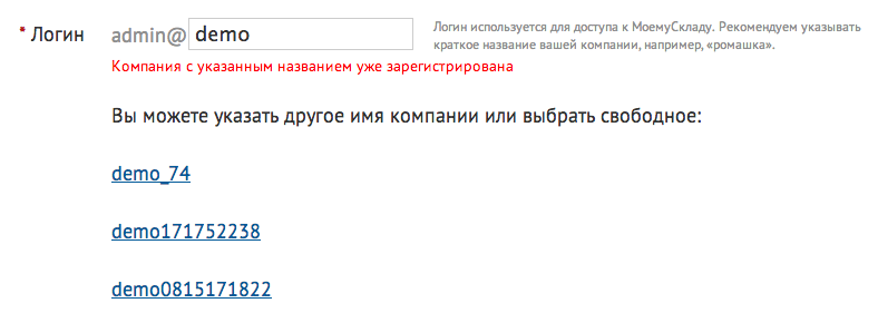
It was the main goal of improving this screen - to increase the percentage of successfully completed registrations. To do this, we have reduced the number of fields that the user must fill. We combined the two First Name and Last Name fields into one and made it optional, as did the ICQ and Skype fields. Unnecessary Patronymic and Fax fields were removed (how did the fax even get on this form?). It would seem an unprincipled change. But with the new registration form, the conversion of site visitors has increased by 45%. We know from our experience how annoying it is when you have to pick up a free account name during registration. Therefore, if the name is already taken, we must immediately offer the available options.
For many users, work in the service begins with the transfer of their data. As a rule, this is a table in Excel, which means that it is most convenient to just download this file into the system.
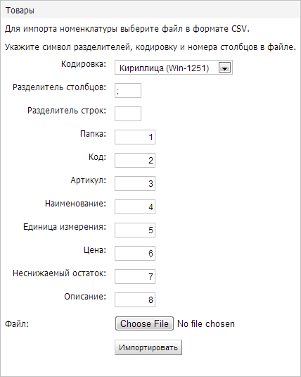
Importing data is a dangerous operation. Incorrect settings can lead to unpleasant consequences. In the old import, users had to indicate the number of the column in which this or that field was located. Naturally, they were constantly mistaken and filled their accounts with garbage.
It was In the new import interface, the user sees the downloaded file in the form of a familiar Excel spreadsheet. The correspondence between table columns and fields is established visually. It was what it gave in practice? Our support began to spend 2-3 times less time on issues related to data import.
One of the things that scare new users the most is the abundance of main menu items. The more concise the menu, the easier it is to learn the system.
The general principle of simplifying navigation is simple: data should be presented in accordance with the mental model of the user, and not in the form of a database model.
Best of all, we were able to simplify the organization of directories. Take a specific example - product information. Any product has two attributes: its country of origin and unit. Lists of countries and units of measure are stored in a database in separate tables. Traditionally, they are shown as separate directories in their own sections of the interface. We did the same at first, but then thought about it - why? Now users enter these attributes in the product card itself. The directories themselves remained in the database, but now they are hidden.
Due to this optimization, we got rid of five unnecessary sections.
What usually does a user who moves from a first acquaintance to a full-fledged job in the service? Tries to customize the system for himself.
The centralized location of all the settings in a separate section has its advantages.
It was , however, after reflection and observation, we concluded that it is better placed next to the settings customized object:
As a result, we moved all the report settings from a separate section “Settings” to the gear in the table with the report itself. Similarly, template management moved to the Print menu of the corresponding document.
It has to be said that we have not reduced the number of calls for support with issues related to printing. But the percentage of requests for the use of templates has increased, since this feature has become better visible to users.

Instead of a bright orange-green palette that distracts attention when working, we decided to use calm blue and blue tones. The application palette should not distract the user from work.
In our experience, it is better to present any information in graphical form (for example, highlighting in color). One of the most popular updates among users has become quite commonplace things - highlighting with different colors the status of documents and images of goods. Users do not like text and numbers and prefer to perceive data graphically. The most important screens in our system are document editors. The appearance of the document should help to concentrate on the data, so various controls should attract attention as little as possible. It was

One of the most used interface elements is the so-called selector. It allows you to select a value from the list or add a new one. We noticed that the icons in the selectors are too bright and made them less prominent.
Unexpectedly, it was just possible to make the list of positions in the document easier. Several positions can be selected, for this checkboxes are used. It turned out that the checkbox column overloaded the interface a lot. We began to show only the marked checkboxes and the one under the arm.
It becomes But most importantly, the differences between the new editors - they reduce the number of clicks that the user has to do. For us, this is the main metric that shows how convenient the interface is.
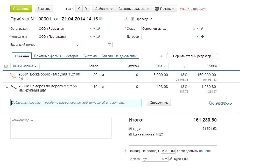
The key action is to add a position to the document - our users perform it most often. For one of the use cases, we reduced the number of necessary clicks from 5 to 2, for another - from 2 to 0. For this, we implemented in-place editing instead of a pop-up window, thought out the rules for automatically shifting input focus and responding to Enter.
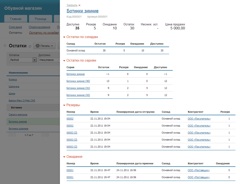
There is always not enough space on the screen. When users work with large reports and documents, scroll bars appear on the screen. How to solve this problem?
The most obvious improvement - we took out the block with the main actions and filters on the floating panel. It is always visible to the user, regardless of the current scroll position on the page (a similar solution is used in the GMail interface). When viewing reports, our users can view detailed information - “drill down”. Previously, the screen was divided into two parts - at the bottom, details were displayed for the line selected in the upper part. This provides a very fast navigation, but eats up the screen space. That was why we moved the detail display to a pop-up panel. Has become

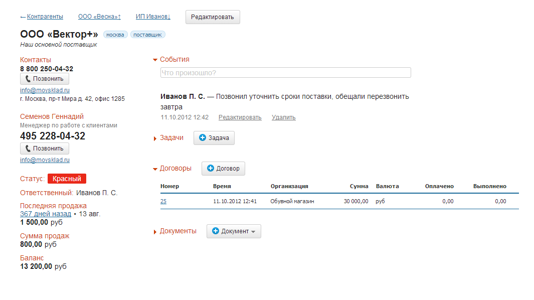
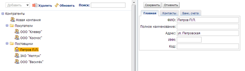
A dashboard (aka the manager’s screen or KPI) is not a new, but still effective way to display a lot of data on one page. On the dashboard, we placed the basic information that the manager needs, in a concentrated form - unprocessed orders, unpaid bills. Much had to be changed in the counterparties directory. When we started adding CRM capabilities to the system, more and more information appeared in the counterparty card - events feed, reminders, contact persons. The editor screen became overloaded.

What have we done? Firstly, we divided the screen of work with the counterparty into two parts - viewing and editing. In view mode, only that part of the data that is used in daily work, such as the history of customer interactions, is available. Those fields that are usually filled only once - when creating a new counterparty (for example, details), are opened only in the editing mode, it is used less often. We had to change the traditional organization of the counterparty directory - the folder tree on the left, the list of items in the current folder on the right. The “wooden” structure is a good solution that is familiar to everyone and has several disadvantages:
It was therefore that we replaced hierarchical folders with a tag system and suggest using search instead of navigating folders. It has become Improving and redesigning the interface is a process, not a project. It lasts continuously. So far, we have completed only part of the tasks that we set for ourselves at the beginning. But we hope that this experience will help you make your products more convenient and simple.
Therefore, we have to constantly update the interface of MyStore. We want to tell you about the general principles of processing UI - why, when and how to do it.
Why improve UI?
Recycling a UI is an expensive process. Recently, our developers have spent at least 30% of the time on it, but could instead add new features. So, we need to clearly understand why we are changing the UI and what benefits it will give.
For ourselves, we have identified the tasks that an ideal interface should solve:
- Help take the first steps for new users;
- To shift the focus of attention from service interface elements to data and accelerate the performance of routine operations;
- Optimize your screen space.
Now about specific actions.
Simplify registration
It was the main goal of improving this screen - to increase the percentage of successfully completed registrations. To do this, we have reduced the number of fields that the user must fill. We combined the two First Name and Last Name fields into one and made it optional, as did the ICQ and Skype fields. Unnecessary Patronymic and Fax fields were removed (how did the fax even get on this form?). It would seem an unprincipled change. But with the new registration form, the conversion of site visitors has increased by 45%. We know from our experience how annoying it is when you have to pick up a free account name during registration. Therefore, if the name is already taken, we must immediately offer the available options.
Simplify the first steps
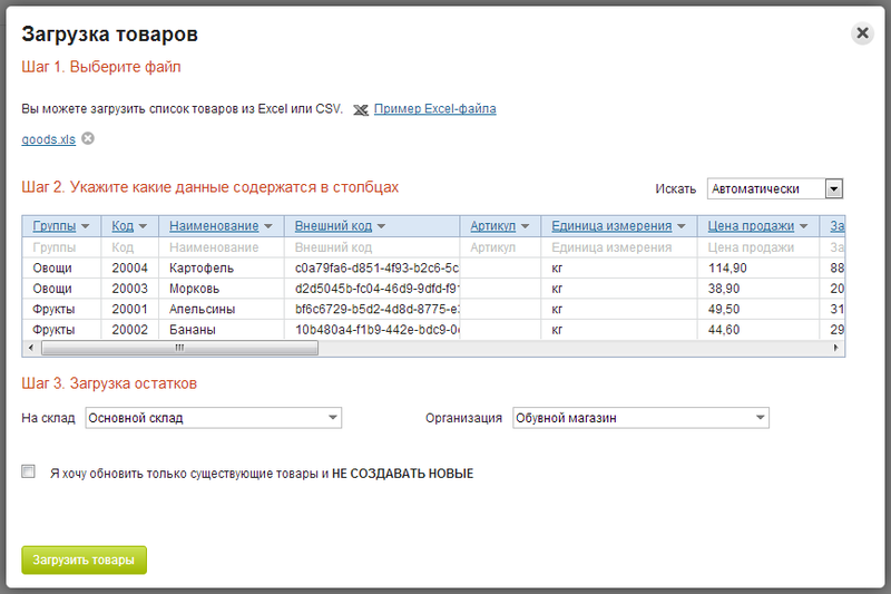
For many users, work in the service begins with the transfer of their data. As a rule, this is a table in Excel, which means that it is most convenient to just download this file into the system.
Importing data is a dangerous operation. Incorrect settings can lead to unpleasant consequences. In the old import, users had to indicate the number of the column in which this or that field was located. Naturally, they were constantly mistaken and filled their accounts with garbage.
It was In the new import interface, the user sees the downloaded file in the form of a familiar Excel spreadsheet. The correspondence between table columns and fields is established visually. It was what it gave in practice? Our support began to spend 2-3 times less time on issues related to data import.
One of the things that scare new users the most is the abundance of main menu items. The more concise the menu, the easier it is to learn the system.
The general principle of simplifying navigation is simple: data should be presented in accordance with the mental model of the user, and not in the form of a database model.
Best of all, we were able to simplify the organization of directories. Take a specific example - product information. Any product has two attributes: its country of origin and unit. Lists of countries and units of measure are stored in a database in separate tables. Traditionally, they are shown as separate directories in their own sections of the interface. We did the same at first, but then thought about it - why? Now users enter these attributes in the product card itself. The directories themselves remained in the database, but now they are hidden.
Due to this optimization, we got rid of five unnecessary sections.
Settings
What usually does a user who moves from a first acquaintance to a full-fledged job in the service? Tries to customize the system for himself.
The centralized location of all the settings in a separate section has its advantages.
It was , however, after reflection and observation, we concluded that it is better placed next to the settings customized object:
- If this principle is consistently respected, the user understands that if the function is configured, the settings are somewhere nearby.
- The user immediately sees how changing the settings affects the behavior of the system.
- This reduces the number of service screens and menu items.
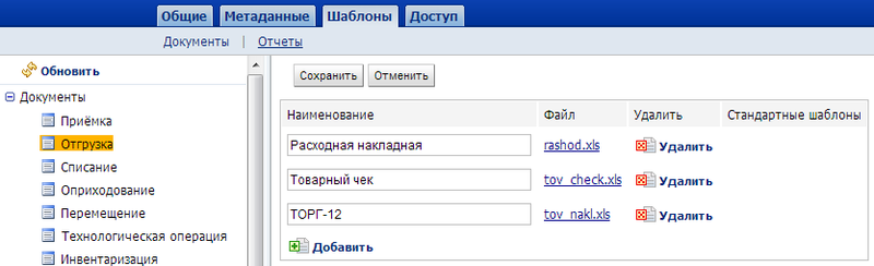
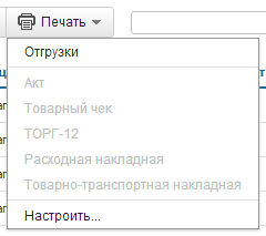
As a result, we moved all the report settings from a separate section “Settings” to the gear in the table with the report itself. Similarly, template management moved to the Print menu of the corresponding document.
It has to be said that we have not reduced the number of calls for support with issues related to printing. But the percentage of requests for the use of templates has increased, since this feature has become better visible to users.
We focus on data and simplify routine operations
Instead of a bright orange-green palette that distracts attention when working, we decided to use calm blue and blue tones. The application palette should not distract the user from work.
In our experience, it is better to present any information in graphical form (for example, highlighting in color). One of the most popular updates among users has become quite commonplace things - highlighting with different colors the status of documents and images of goods. Users do not like text and numbers and prefer to perceive data graphically. The most important screens in our system are document editors. The appearance of the document should help to concentrate on the data, so various controls should attract attention as little as possible. It was
One of the most used interface elements is the so-called selector. It allows you to select a value from the list or add a new one. We noticed that the icons in the selectors are too bright and made them less prominent.
Unexpectedly, it was just possible to make the list of positions in the document easier. Several positions can be selected, for this checkboxes are used. It turned out that the checkbox column overloaded the interface a lot. We began to show only the marked checkboxes and the one under the arm.
It becomes But most importantly, the differences between the new editors - they reduce the number of clicks that the user has to do. For us, this is the main metric that shows how convenient the interface is.
The key action is to add a position to the document - our users perform it most often. For one of the use cases, we reduced the number of necessary clicks from 5 to 2, for another - from 2 to 0. For this, we implemented in-place editing instead of a pop-up window, thought out the rules for automatically shifting input focus and responding to Enter.
We optimize the screen space
There is always not enough space on the screen. When users work with large reports and documents, scroll bars appear on the screen. How to solve this problem?
The most obvious improvement - we took out the block with the main actions and filters on the floating panel. It is always visible to the user, regardless of the current scroll position on the page (a similar solution is used in the GMail interface). When viewing reports, our users can view detailed information - “drill down”. Previously, the screen was divided into two parts - at the bottom, details were displayed for the line selected in the upper part. This provides a very fast navigation, but eats up the screen space. That was why we moved the detail display to a pop-up panel. Has become
A dashboard (aka the manager’s screen or KPI) is not a new, but still effective way to display a lot of data on one page. On the dashboard, we placed the basic information that the manager needs, in a concentrated form - unprocessed orders, unpaid bills. Much had to be changed in the counterparties directory. When we started adding CRM capabilities to the system, more and more information appeared in the counterparty card - events feed, reminders, contact persons. The editor screen became overloaded.
What have we done? Firstly, we divided the screen of work with the counterparty into two parts - viewing and editing. In view mode, only that part of the data that is used in daily work, such as the history of customer interactions, is available. Those fields that are usually filled only once - when creating a new counterparty (for example, details), are opened only in the editing mode, it is used less often. We had to change the traditional organization of the counterparty directory - the folder tree on the left, the list of items in the current folder on the right. The “wooden” structure is a good solution that is familiar to everyone and has several disadvantages:
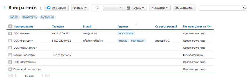
- With a large number of items in one folder, you must implement either paging or dynamic loading. Both that and another interferes with fast work.
- Search results have to be shown in a flat list. Constant switching "tree - flat list" knocks users down.
- There is no way to put one element in two categories. For example, a company may well be both a supplier and a buyer.
It was therefore that we replaced hierarchical folders with a tag system and suggest using search instead of navigating folders. It has become Improving and redesigning the interface is a process, not a project. It lasts continuously. So far, we have completed only part of the tasks that we set for ourselves at the beginning. But we hope that this experience will help you make your products more convenient and simple.