7 problems in the design of SaaS products, and how we solved them
The mission of the TrackDuck team is to simplify the process of developing any web projects. We understand how important reliable communication and understanding between the customer and the contractor is in the development process. Our project is almost 1.5 years old, but we feel that we are really just starting to work on it. And he, like any good service, constantly needs improvements. If you are interested in our experience, welcome to cat !

Any developer knows his product many times better than any user, and this can lead to misunderstandings between them. A good developer always tries to look at what he is doing with the eyes of his user, but he doesn’t always succeed.
Any developer will have thoughts on redesigning the web project interface if:
In any case, sooner or later, the developer understands that something does not work for clients as expected, or the process is not thought out in principle. And that means it's time to improve something!
In fact, TrackDuck , like any project, consists of several separate parts and we try to organically combine them in a product that we offer our users:
All this should be clear and accessible to users at any given time. The project should work on various platforms and devices, from mobile to tv monitors. Below we will talk about seven problems that we encountered in the last year of product development, and the way in which they were solved:
In the first version of the service, we used the space at the top of the page to navigate the key functions of the service and user projects, but over time we made sure that this path is not very good for several reasons:

In our case, the advantages of the sidebar are obvious. Its use allows you to well divide the application into zones, each of which will be associated with its functional part of the application. In addition, the right menu with the list of projects is hidden when it is not necessary, which makes it possible to use the space on the device’s screen even more efficiently.
The process of creating separate applications for mobile platforms is almost always associated with additional costs for the development and support of individual native applications for various platforms; a project does not always have these resources at an early stage. Based on this and the requests received, including from our commercial customers who wanted to access our service on mobile devices as soon as possible, we decided to make our control panel adaptive. The organization of the interface with vertical blocks allowed this to be done with minimal overhead. We used Media Queries, ngTouch, matchmedia-ng. We added the necessary styles and scripts for the main elements and now our application works almost everywhere:
In addition, our interface with a vertical separation of the areas of information presentation allows customers to focus on the part of the product with which they are currently working, allowing them to hide unused ones.
We carefully analyze the metrics for the use of various functionalities of our project and listen to user comments. We also try to identify the underutilized functionality of the project, the support of which is impractical, and add new functionality that allows us to solve the problems of our clients more effectively. The biggest problem at the same time is to keep the layout of elements familiar to our customers, test the new functionality on the control group until it is fully implemented, and effectively notify users about new features and working with them. He-board successfully copes with some of these problems (we specially design it so that when adding something interesting to our project, the new functionality does not go unnoticed)
Icons and pictograms greatly facilitate the work with the interface. Surely many of those involved in interface design are also familiar with the excellent book : - The key point is not to force people to read. We combine recognizable pictograms with captions to all key interface elements of our system. Very often, we forgot to change the type of cursor on special elements, we had to rework inline fields for entering text several times:
Also, very often we were mistaken, expecting a certain user reaction to the interface, but did not receive it in the future. After a year of work as a designer of projects of this size, I can summarize a common truth on my own: do not use non-standard controls there. where you can get by with classic ones. So, for example, even a missing triangle in the drop-down menu can mislead your user. If your application does not require page reloading, then immediately think over the state of the controls while waiting for a response from the server (yes, we also stepped on this rake) This is what is better not to postpone for later!
What should I do if you couldn’t come up with an elegant solution for some non-trivial actions that does not require action from the user? Tell him! For example, for the full-fledged work of our application with client sites, we suggest installing js code on their resources. Initially, it was assumed that it was quite simple and any user could handle it. But in the process, we found that very often our users are people without special technical skills, customers, project managers. For such cases, we developed a special context-sensitive help system that helped non-users get lost in a difficult situation, gave brief information about working with complex functionality, redirected to our help desk or directly to a consultant.

In the first version of the product, all the settings for any project could be counted on the fingers of one hand and there was no need to separate them - everything was extremely simple and clear. But time passed, the project grew, we removed something because of lack of demand, added something - as a result, the settings page became quite complicated for new users and we began to receive many calls. We analyzed the organization and evolution of settings in other projects and made several decisions.
Firstly , we decided to hide them a little, since in reality only every tenth user who connected our product used the project settings.
Secondly , for convenience, we divided all the settings into different thematic groups with a clear purpose.

Conclusion:
If you are working on a service for developers, be prepared to face a high bounce rate at the user registration stage. The most difficult step is to make the visitor become your user. To do this, he must well understand how your service works after 3-5 minutes on the site. I strongly advise you to look at how others do it at the product design stage, for example here: www.useronboard.com . The guys offer you some interesting cases of famous teams. As a result, after looking at this beauty and our sad at that time product activation metrics, we decided to do something about it.
Directions for work identified the following:
Complex registration:users were lost in the first steps of registration. It was decided to add training material on working with the service and simplify the process of creating the first project. In total, instead of 10 steps of mastering the service, it turned out 4. Now we are testing this functionality on the control group and are confident in the effectiveness of the innovations.
Controls: we made our plug-in for commenting sites minimalistic, because we did not want to annoy users with huge controls with signatures and instructions. But having solved one problem, we ran into another. Despite the fact that the number of buttons on the widget was minimal and they were equipped with icons, some users still did not understand how to use them.
To solve this problem, we made a short tour of 6 steps, which consolidated the practical skills of users - from adding comments on the project pages to appointing a team member responsible for solving the problem.

When developing a product for users, constantly test your hypotheses, test new functionality. Most of the mistakes made in interface design can be avoided at the prototype stage by simply asking your colleagues or friends to try your product. Invite them to visit, organize a record of their actions on the monitor and reactions (for example, we recorded sessions with a simple smartphone or webcam), set 3-4 key goals that will allow you to cover the tested functionality of the product. After that, take enough time to study the collected material, and you will immediately understand where people are faced with problems and inconveniences.
Invite to test your product, both experienced and far from technical innovations of people. Believe me, if, for example, your grandmother figured out the interface, then 90 percent of users will also not have problems.

Listen to your user, try to use your own product as often as possible, and constantly try to critically overestimate your own experience! Then you will get a wonderful product that you and your users will be proud of!
If you are interested in learning more about our service, we recommend that you read our previous article or try it in action .
Why redesign the interface?
Any developer knows his product many times better than any user, and this can lead to misunderstandings between them. A good developer always tries to look at what he is doing with the eyes of his user, but he doesn’t always succeed.
Any developer will have thoughts on redesigning the web project interface if:
- You get a lot of questions from your users asking you to help deal with some complex function;
- too few users convert to regular;
- a large number of resource visitors begin the registration process, but do not complete it. Those. visitors are not converted to users;
- part of the application’s functionality is outdated or not popular;
- you add new features;
- more than a month has passed since the last changes in the application.
In any case, sooner or later, the developer understands that something does not work for clients as expected, or the process is not thought out in principle. And that means it's time to improve something!
What did the experience in developing our own product teach us?
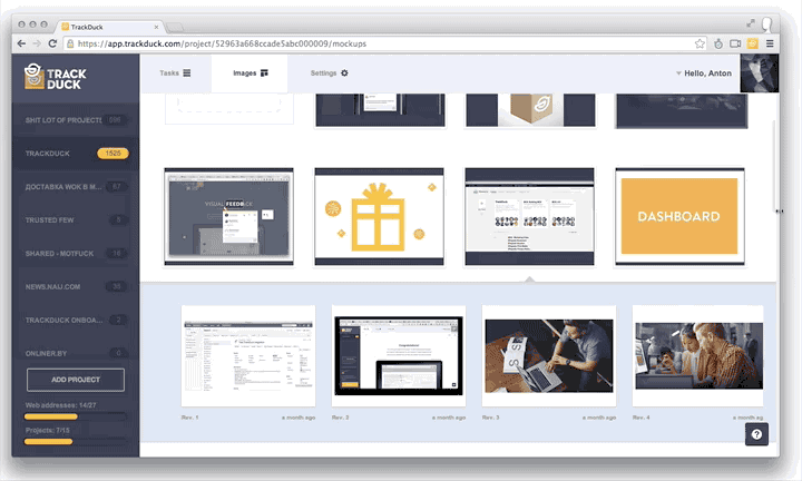
In fact, TrackDuck , like any project, consists of several separate parts and we try to organically combine them in a product that we offer our users:
- widget for commenting on third-party sites;
- managing and loading thumbnails and images;
- task list with error reports and screenshots;
- list of projects with the ability to add new ones;
- project settings;
- user profile settings, billing, personal data.
All this should be clear and accessible to users at any given time. The project should work on various platforms and devices, from mobile to tv monitors. Below we will talk about seven problems that we encountered in the last year of product development, and the way in which they were solved:
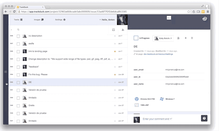
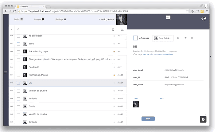
1. Sidebar or top navigation
In the first version of the service, we used the space at the top of the page to navigate the key functions of the service and user projects, but over time we made sure that this path is not very good for several reasons:
- it’s difficult to make an adaptive version of the product that works on tablets and devices with a small diagonal,
- inefficient use of space,
- sidebar and vertical sections allow you to better and more clearly organize the control panel space
In our case, the advantages of the sidebar are obvious. Its use allows you to well divide the application into zones, each of which will be associated with its functional part of the application. In addition, the right menu with the list of projects is hidden when it is not necessary, which makes it possible to use the space on the device’s screen even more efficiently.
2. How to create an interface that works for mobile, tablets, PC, TV
The process of creating separate applications for mobile platforms is almost always associated with additional costs for the development and support of individual native applications for various platforms; a project does not always have these resources at an early stage. Based on this and the requests received, including from our commercial customers who wanted to access our service on mobile devices as soon as possible, we decided to make our control panel adaptive. The organization of the interface with vertical blocks allowed this to be done with minimal overhead. We used Media Queries, ngTouch, matchmedia-ng. We added the necessary styles and scripts for the main elements and now our application works almost everywhere:
In addition, our interface with a vertical separation of the areas of information presentation allows customers to focus on the part of the product with which they are currently working, allowing them to hide unused ones.
3. Introduction of additional functionality to the interface
We carefully analyze the metrics for the use of various functionalities of our project and listen to user comments. We also try to identify the underutilized functionality of the project, the support of which is impractical, and add new functionality that allows us to solve the problems of our clients more effectively. The biggest problem at the same time is to keep the layout of elements familiar to our customers, test the new functionality on the control group until it is fully implemented, and effectively notify users about new features and working with them. He-board successfully copes with some of these problems (we specially design it so that when adding something interesting to our project, the new functionality does not go unnoticed)
4. Intuitive interface
Icons and pictograms greatly facilitate the work with the interface. Surely many of those involved in interface design are also familiar with the excellent book : - The key point is not to force people to read. We combine recognizable pictograms with captions to all key interface elements of our system. Very often, we forgot to change the type of cursor on special elements, we had to rework inline fields for entering text several times:
Also, very often we were mistaken, expecting a certain user reaction to the interface, but did not receive it in the future. After a year of work as a designer of projects of this size, I can summarize a common truth on my own: do not use non-standard controls there. where you can get by with classic ones. So, for example, even a missing triangle in the drop-down menu can mislead your user. If your application does not require page reloading, then immediately think over the state of the controls while waiting for a response from the server (yes, we also stepped on this rake) This is what is better not to postpone for later!
5. Contextual user assistance
What should I do if you couldn’t come up with an elegant solution for some non-trivial actions that does not require action from the user? Tell him! For example, for the full-fledged work of our application with client sites, we suggest installing js code on their resources. Initially, it was assumed that it was quite simple and any user could handle it. But in the process, we found that very often our users are people without special technical skills, customers, project managers. For such cases, we developed a special context-sensitive help system that helped non-users get lost in a difficult situation, gave brief information about working with complex functionality, redirected to our help desk or directly to a consultant.
6. Settings
In the first version of the product, all the settings for any project could be counted on the fingers of one hand and there was no need to separate them - everything was extremely simple and clear. But time passed, the project grew, we removed something because of lack of demand, added something - as a result, the settings page became quite complicated for new users and we began to receive many calls. We analyzed the organization and evolution of settings in other projects and made several decisions.
Firstly , we decided to hide them a little, since in reality only every tenth user who connected our product used the project settings.
Secondly , for convenience, we divided all the settings into different thematic groups with a clear purpose.
Conclusion:
- Hide away what you rarely use, but nothing to do without!
- Remove unused to pay more attention to working functions!
- Group!
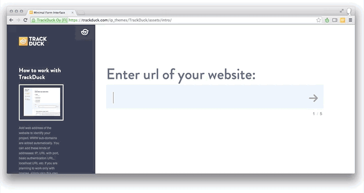
7. Registration
If you are working on a service for developers, be prepared to face a high bounce rate at the user registration stage. The most difficult step is to make the visitor become your user. To do this, he must well understand how your service works after 3-5 minutes on the site. I strongly advise you to look at how others do it at the product design stage, for example here: www.useronboard.com . The guys offer you some interesting cases of famous teams. As a result, after looking at this beauty and our sad at that time product activation metrics, we decided to do something about it.
Directions for work identified the following:
Complex registration:users were lost in the first steps of registration. It was decided to add training material on working with the service and simplify the process of creating the first project. In total, instead of 10 steps of mastering the service, it turned out 4. Now we are testing this functionality on the control group and are confident in the effectiveness of the innovations.
Controls: we made our plug-in for commenting sites minimalistic, because we did not want to annoy users with huge controls with signatures and instructions. But having solved one problem, we ran into another. Despite the fact that the number of buttons on the widget was minimal and they were equipped with icons, some users still did not understand how to use them.
To solve this problem, we made a short tour of 6 steps, which consolidated the practical skills of users - from adding comments on the project pages to appointing a team member responsible for solving the problem.
Instead of a conclusion:
When developing a product for users, constantly test your hypotheses, test new functionality. Most of the mistakes made in interface design can be avoided at the prototype stage by simply asking your colleagues or friends to try your product. Invite them to visit, organize a record of their actions on the monitor and reactions (for example, we recorded sessions with a simple smartphone or webcam), set 3-4 key goals that will allow you to cover the tested functionality of the product. After that, take enough time to study the collected material, and you will immediately understand where people are faced with problems and inconveniences.
Invite to test your product, both experienced and far from technical innovations of people. Believe me, if, for example, your grandmother figured out the interface, then 90 percent of users will also not have problems.
Listen to your user, try to use your own product as often as possible, and constantly try to critically overestimate your own experience! Then you will get a wonderful product that you and your users will be proud of!
If you are interested in learning more about our service, we recommend that you read our previous article or try it in action .