404 post

This post is significant for our blog. According to the account, he, no less than four hundred and fourth. In honor of this, we decided to write about how we once used the powerful potential of page 404 on Odnoklassniki. And at the same time made up a small selection of unusual and interesting pages from other sites.
Our experience
Every day, Odnoklassniki social network is used by more than 40 million people. And about 150 thousand of them stumble on page 404. The share is scanty, only 0.37% of the total number of visitors. But in absolute terms, a very decent attendance. “Your energy, but for peaceful purposes,” we thought, and decided to use this traffic to good effect. At that time, page 404 looked like this: There was no point in making just another design page. After long deliberation, for half an hour the idea of a charity campaign in favor of WWF was proposed. Nature must be protected - this is known from school. But this topic is very extensive, too much for the unfortunate 404 page. Therefore, we set ourselves three tasks: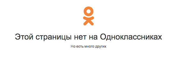
- remind people of the extinction of rare species of animals;
- introduce the WWF Wildlife Fund itself;
- give visitors the opportunity to make a personal contribution to the conservation of the global natural ecosystem.
As a result, the new 404 page began to look like this: Above was the text of the error itself, so that the user immediately understood where he got. Next to the Odnoklassniki logo, we placed the WWF logo. Below was an information block consisting of a photograph of a representative of an endangered species (a small selection was collected) and a brief description. In addition, a link to the official WWF group in Odnoklassniki led from this page. The first and second tasks were solved. And for the third task, we placed a special iframe in the WWF group through which visitors could go to the fund's website and make a donation.
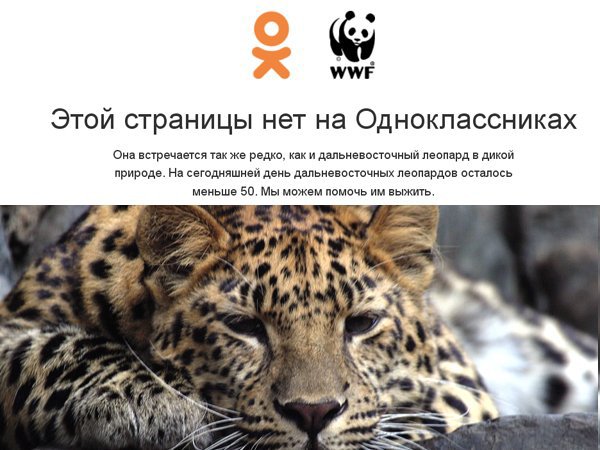

The result exceeded our expectations - about 50% of random visitors to page 404 clicked on the link to the WWF group. This project lasted one month, and at the time of its completion, the group grew to 30 thousand people. Moreover, according to WWF itself, during this month, Odnoklassniki users made about 7% of all donations. However, in reality, this share was most likely significantly higher. The fact is that, when switching from Odnoklassniki to the WWF website, not all visitors made a donation right away. Some returned later, but already directly, and not in a roundabout way.
The success of our project and the recognition of the general public, including in the form of foreign media , inspired us to further achievements. Our next 404 project was a charity event in favor of the Change one life fund.
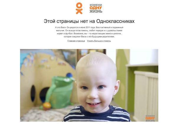
This is a fund to promote the adoption of orphans. We kept the same page structure: logo, photo, description. And in just two weeks that this project lasted, there were 18 calls from potential adoptive parents. And the first children were adopted a month after the start of the project.
The experience and results obtained during these two projects have demonstrated the underestimation of such an instrument as page 404. Of course, its potential depends solely on attendance. And let it bring a little better, but good, than serves only as a beautiful stub.
Other's
Of course, not everyone shares our opinion. In most cases, a 404 page does not appear at all. Some webmasters pay more attention to this element. And sometimes really interesting design options for page 404 come across. Not all of them are good in terms of retaining visitors to the site and ease of navigation, but they are made with fiction. Very expressive illustration, with humor. True webmasters will immediately say that this option is no good. But we liked the design. An animated page on which a fat sparrow of Asian origin sways. The triumph of minimalism, as well as design over functionality and utility. A good example of a functional and at the same time funny page.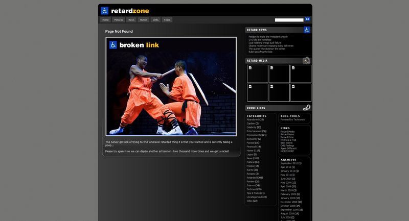

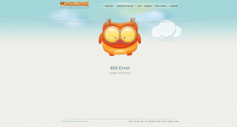
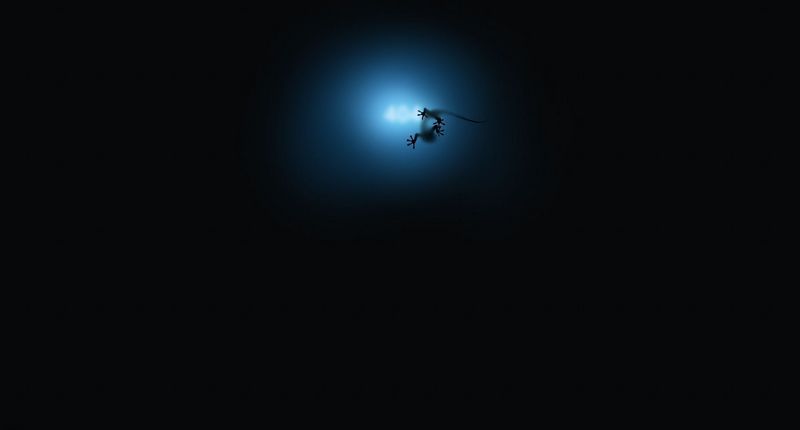
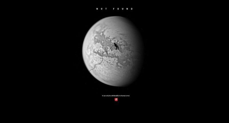
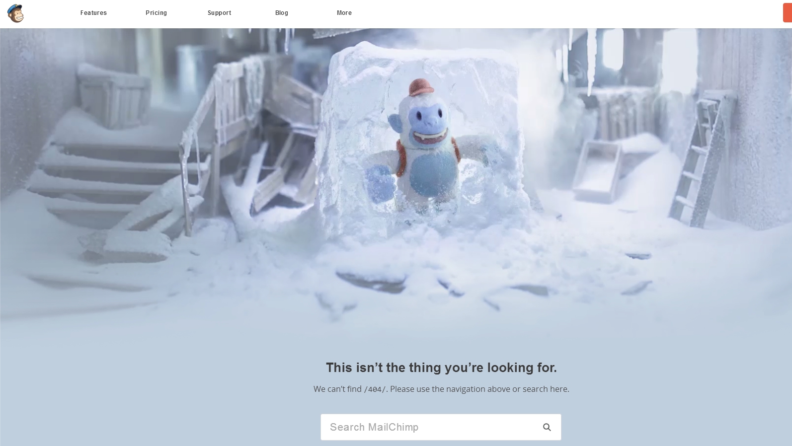
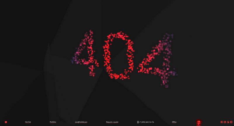
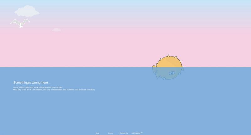
Another example of an exclusively designer page. Stylish and beautiful, and the strangeness of the picture makes you stop, attracts attention. Mail Chimp Always creatively design 404 pages. Homer Simpson has been a guest on this page for a long time, and now he is being replaced by a frozen monkey. Animated page with company symbol frozen in ice cube. Animated interactive page with beautiful effects. True, a bit heavy. Many have probably already seen this page. But still, we decided to include it, because this is one of the best examples. Not perfect, but close to that. The fish died. The page is animated, with responsive design, and even interactive. True, the quality of the animation is not very good, but it looks interesting and peaceful.

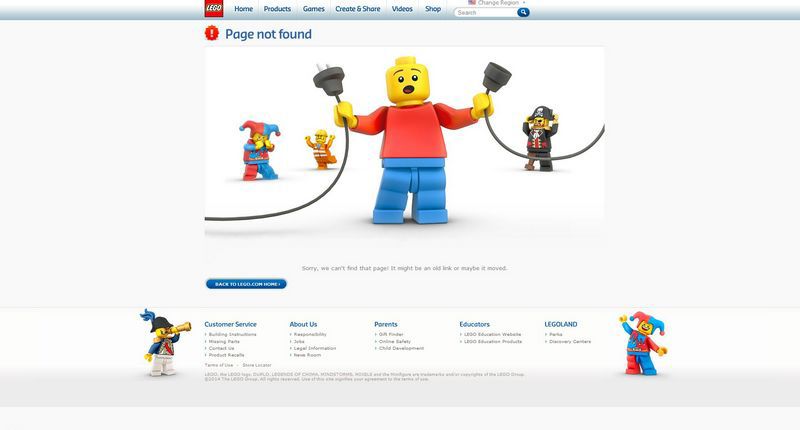
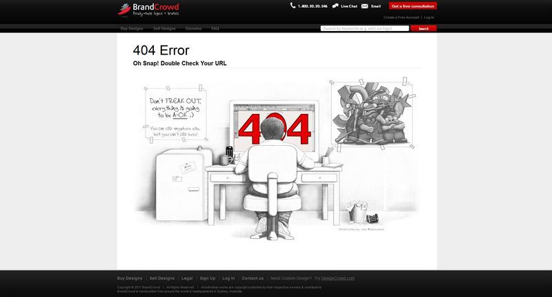
Another well-known example. With humor, logically connected with the company's products, everything is correctly thought out. One of the best ideas for 404 pages. It’s not immediately possible to figure out what it is, even there are no links. But the idea is great. At this, the exhibition of achievements 404 is completed. If you have in mind other options for unusual and beautiful pages, post links in the comments.