Search and create a visual style design project

Natasha Duke The
visual style unconsciously forms our impression of the product used, be it an online service or a physical item. Popular brands are well aware of this, so in their advertising campaigns they rely on emotions, not logic.
The mission of Ferrari is to create Italian-designed sports cars that will be equally good, both on the track and on the road. Thus, Ferrari immerses the driver in an atmosphere of speed, even if he most of the time has to be bored in traffic jams in the capital.
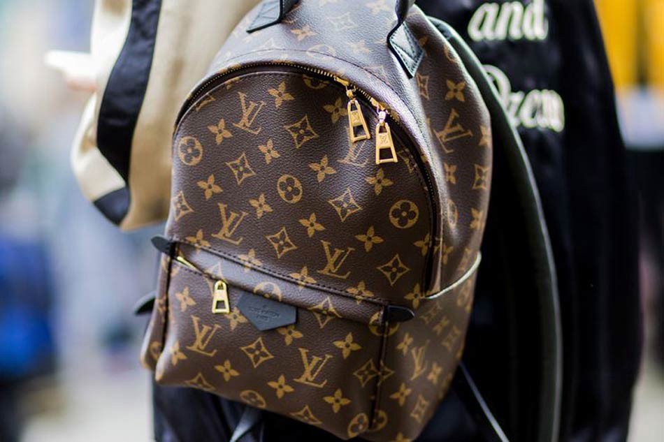
A similar story with many fashion brands. For example, a Louis Vuitton backpack is an indicator of luxury, which is indicated not only by selected colors (mostly gold and black), but also by public opinion (mostly erroneous). Thanks to the correct framing, touching the brand you feel like a status.
In digital design, everything is exactly the same. Compare the site of the men's magazine GQ and the source of business news RBC. If the first one meets the visitor with large photos and bright colors, the second one will plunge into the atmosphere of seriousness using black and green colors and dozens of headlines (which create the impression of rapidly developing events without which an erudite person cannot live a day).
Each successful brand has a unique message, which is transmitted through commercials, selected actors, music and color. Therefore, the main task of a designer when choosing a visual style is to understand the brand’s message and create an appropriate frame for it.
Most designers do not think about such things, focusing on trends, random inspiration or mood changes due to rainy weather or the lack of a DoubleBi coffee shop nearby. Professionals first of all delve into the essence of the project, trying to determine its promise, and only then proceed to search for inspiration.
Send definition
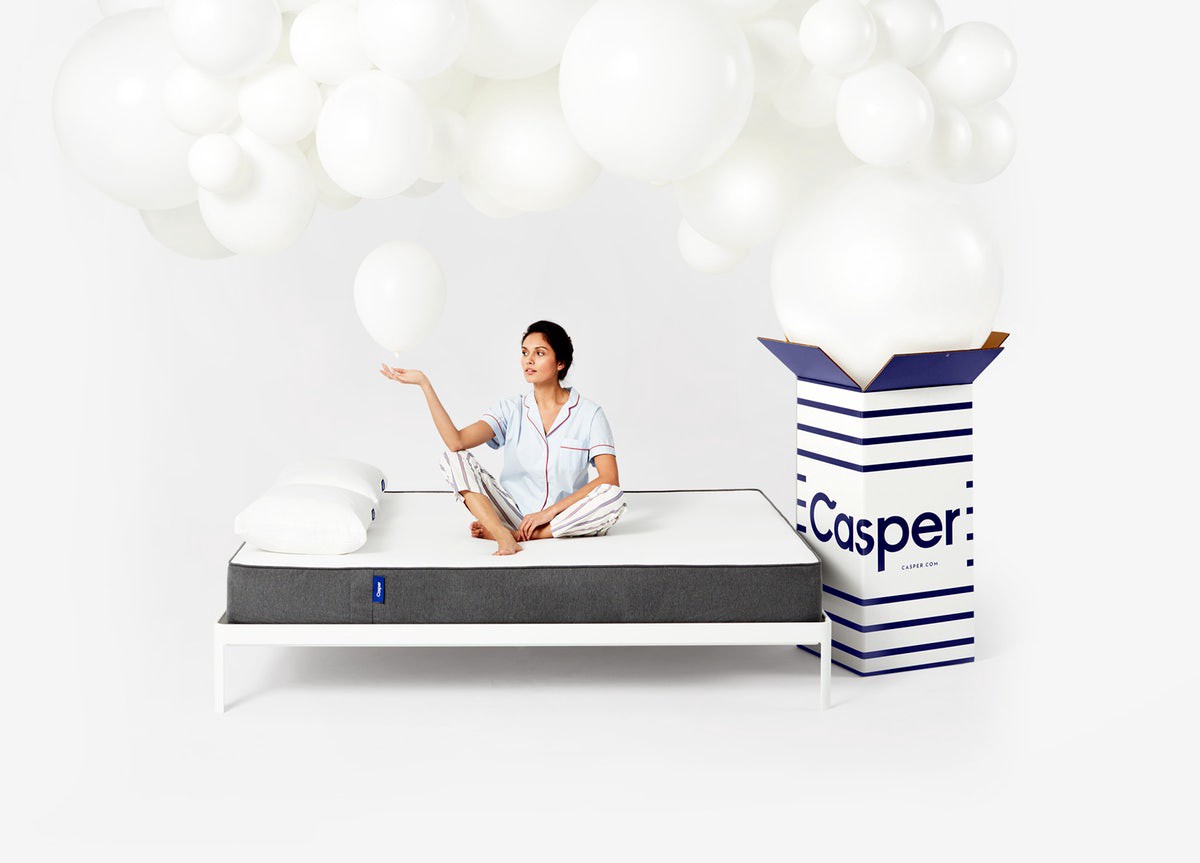
I regularly write young professionals. Some of them are asked to comment on the portfolio in order to get some tips. One of these people asked me to comment on his project (site for a company that sells mattresses).
Despite the good logic and good visual, something was missing in the work. A little thought, I realized that mattresses are an airy thing, which is associated with rest and sleep, and because of the selected gray background and dirty shadows, there was no feeling of lightness.
I advised the young designer to choose warmer tones and soft fonts in order to correctly convey the message. The potential buyer will not even think about it, but in his subconscious mind he will undoubtedly form a certain impression. The task of the visual style is to make this impression correct.
Over the years of active consumption, color associations have formed in our brain, which the designer needs to know about. Here are the most popular:
Red - danger, passion, excitement, energy.
Orange - freshness, creativity, adventure.
Yellow - optimism, enthusiasm, playfulness, happiness.
Green - natural, nature, health.
Blue - communication, reliability, peace of mind.
Violet - majesty, spirituality, mystery.
Brown - good, honesty.
Pink - femininity, sentimentality, romance.
Black - refinement, formality, luxury, sadness.
White - cleanliness, simplicity, innocence, minimalism.
But no need to become their hostage. When you create a new brand, take an unusual color or style will be an excellent marketing ploy. Having chosen the apple as its logo, Apple has distinguished itself among competitors, of which even then it was enough. See for yourself, more than 40 years have passed, but the apple logo still differs from most IT companies.
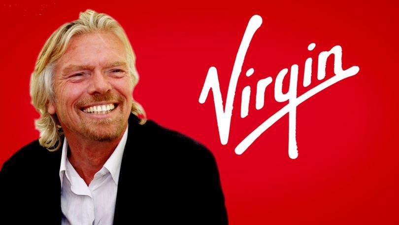
The Virgin Group, founded by Richard Branson, has chosen the red color and the upwardly written logo to convey the features of an eccentric founder. The conglomerate includes many companies from various fields (from a publishing house to a space tour operator) and they all use the same colors and one message becauseThe key thing in defining a visual language is not the line of business, but the brand philosophy .
Search for style
Having defined the promise, you can start searching for inspiration. But, before turning to practical advice, I want to remind one very important thing.
“Outstanding visual style is not the result of inspiration, but the result of many years of work, in which you analyze the projects of the best designers, regularly practice and reflect on progress. That is, gaining experience.
Therefore, those who are experiencing due to lack of inspiration will certainly lose to those who are not waiting for him, but daily hone their skills.
Innovation is a combination of existing ideas, not the creation of new ones. Consequently, the best ideas are created by designers who are able to use the accumulated experience to solve a specific problem. ”
From the telegraph channel of The Design Times.
Do not worry when you see that the first years of your work will be much inferior to others. Roll up your sleeves and have patience. Everything has its time.
The most popular way to find inspiration for designers is Dribbble and Behance. This is a good tool, but it has one problem. All professional spheres at some point begin to withdraw into themselves, shoveling the same ideas, therefore, if you want to create something unique, you need to look outside the usual sources.
For example, I regularly buy architectural magazine AD and look at their website. Thus, I expand the stock of visual patterns. In addition to architecture, you can watch nature or design equipment (from cars to kitchen appliances). Thanks to this, you gradually develop your visual taste and can find an interesting idea for a new project.

Favorite ideas, collect in a separate collection, which is often called a mindboard. This can be done on Pinterest or by attaching photos to the board (a great way, since collected ideas will always be visible). In addition, you can use Buckets on Dribbble, Board in InVision, and any other method (even a folder on the desktop) that you feel comfortable.
Style definition
In the course of collecting information, you should have formed certain ideas. From one project you can take fonts, from landscapes of color, from a promise technique (for example, status or professionalism). It’s ok if you have a few ideas. Visualize them and try to compare, keeping in mind the promise of the brand and the target audience.
The best description of the created style will be the brand book, that is, the rules of visual interaction of a person with a company. It should contain typography, colors, logo, recommended photos. Some companies generate a certain voice, but this is less related to the visual style, although no less important.
In this regard, I recall the story from personal practice. Working with a large financial institution (project under NDA), in one layout I put a nice image loaded from a professional photo stock as a background. But as it turned out, the colors and emotions of people more resembled the competitor's promise, so I had to change the photo.
I think few designers think about this by picking up photos or typography, although such things play a big role in shaping the visual language.
Total
The main thing that needs to be understood is that the visual style should correspond to the brand promise. This is the main criterion for your work. The style can be fashionable, boring, futuristic or any other, it does not matter at all. It is only important that he awaken the right emotions.