Optimizing graphics for the web: the most important
- Transfer
The author of the e-book is Eddie Osmani, one of the managers of Google Chrome.
Optimization of graphics must be automated. It's easy to forget about it, recommendations change, and the content itself can easily slip past the assembly line. To automate the build, use imagemin or libvips . There are many others.
Most CDNs (for example, Akamai ) and third-party solutions like Cloudinary , imgix , Fastly Image Optimizer , Instart Logic SmartVision, and the ImageOptim API offer comprehensive automated solutions for image optimization.
You will spend time reading articles and configuration setting, which is more expensive than paying for their services (Cloudinary has a freerate). But if you still don’t want to outsource your work for reasons of cost or due to additional latency, then choose the above open source options. Projects Imageflow or Thumbor offer an alternative on their own hosting.
At a minimum, use ImageOptim . It significantly reduces the size while maintaining visual quality. There are versions for Windows and Linux.
A more careful approach: run JPEG files through MozJPEG (web content is acceptable
Some browsers announce support for image formats via the Accept header. This can be used when choosing a format for output: for example, the WebP format for Blink-based browsers, such as Chrome, and the JPEG / PNG option for other browsers.
Compression can always be improved. There are tools for generating and issuing
The smaller the image size, the more convenient it is for users - especially with mobile phones. In this article, we will consider how to compress graphics with modern methods with minimal impact on quality.
Images make up a huge proportion of internet traffic. According to the HTTP Archive , 60% of the volume of web pages is JPEG, PNG and GIF graphics. As of July 2017, the images were 1.7 MB on an average web page of 3.0 MB.
The Tammy Everts experiment proved that adding images to a page or increasing existing images increases the conversion rate (percentage of visitors who become customers - approx. Lane). So the pictures will not go anywhere - that is why it is important to invest in an effective strategy for compressing them.
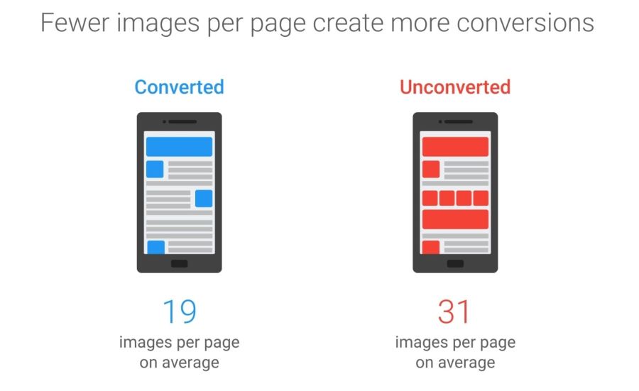
The 2016 Soasta / Google study showed that the illustrations are the second predictor of conversion, and effective pages have 38% fewer images.
Image optimization includes a number of measures. The choice depends on the quality loss considered acceptable.

Optimization: choose the right format, gently compress and prioritize the loading of different images.
Typical optimization includes compression, correct output of images based on the size with the help of tags
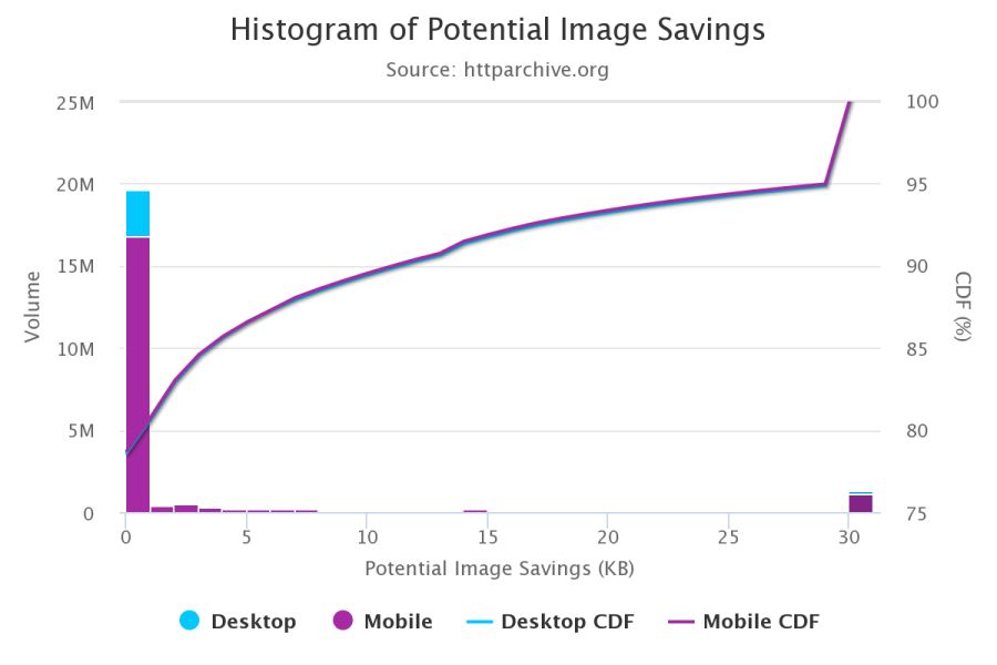
According to the HTTP Archive , at the 95th percentile (in the cumulative distribution function), each picture can be reduced by 30 KB!
We still have a lot of images that can be optimized.
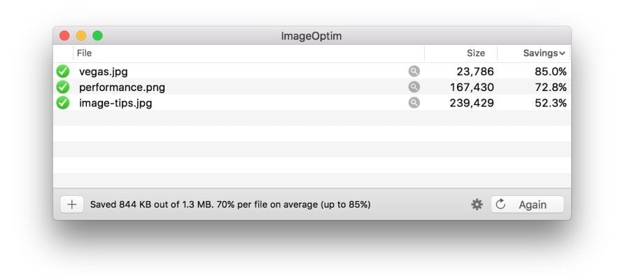
Free program ImageOptim reduces the size of graphics with the help of modern methods of compression and removal of unnecessary metadata EXIF.
If you are a designer, there is also an ImageOptim plugin for Sketch.which optimizes resources when exporting. I found it saves a ton of time.
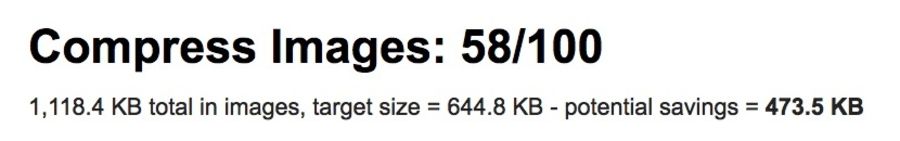
Audit the site using WebPageTest.org .
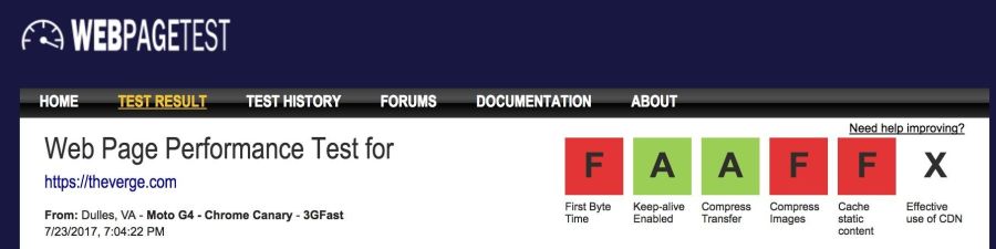
In the Compress Images WebPageTest report lists the images that can be compressed more efficiently, while the estimated potential gains on the size of files
Service Lighthouse also carries out performance audit, including checks optimizing images. It shows pictures that can be squeezed stronger and which can be put into a lazy download.
Beginning with Chrome 60, this service works in the Chrome DevTools audit panel:
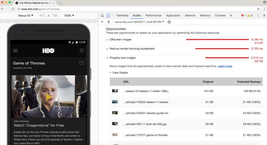
Lighthouse conducts audits with an eye on performance, best practices or advanced web application features (your choice)
you may be aware of other audit tools, such asCloudinary's PageSpeed Insights and Website Speed Test , including a detailed image audit.
As Ilya Grigorik noted in his excellent guide on image optimization , the “right format” combines the desired visual result and functional requirements. Do you have a raster or vector graphics?
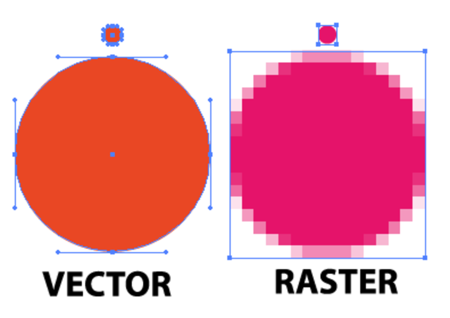
Raster graphics encodes the values of each pixel on a rectangular grid of pixels. They do not depend on resolution or scale. Such graphics work well with WebP or widely supported formats such as JPEG or PNG. Raster graphics are used where photorealism is needed. Guetzli, MozJPEG and other mentioned tools are suitable for raster graphics.
Vector graphicsuses points, lines and polygons to represent images with simple geometric shapes (for example, logos). It offers high resolution and scaling. For this option, better suited formats like SVG.
Choosing the wrong format will cost you dearly. The format should be changed with caution, conducting experiments with possible savings in different formats.
Jeremy Wagner in his lecture highlighted the compromises that should be considered when evaluating different formats in the optimization process.
JPEG is probably the world's most popular graphics format. As noted earlier, 45% of the images on sites in the HTTP Archive are JPEG images. Your phone, digital camera, old webcam - they all usually support this codec. It is very ancient, it has been used since 1992. During this time, a huge amount of research has been done on how to improve JPEG compression.
JPEG is a lossy compression algorithm that discards “extra” information to save space. The challenge is to maximize visual accuracy while minimizing file sizes.
Formats like JPEG are best suited for photos or images with lots of color. Most optimization tools will allow you to choose an acceptable level of compression: stronger compression reduces the size of the files, but may introduce artifacts: halo or blockiness.
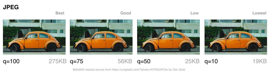
The visible JPEG compression artifacts are growing as the transition from best quality to worst. Note that the image quality indicators in different tools can be very different
When choosing the level of compression, you should take into account what quality is necessary for images:
Next, let's talk about the JPEG compression modes, which greatly affect the result.
JPEG has a number of different compression modes. Three popular: basic (sequential), progressive JPEG (PJPEG) and lossless compression.
Basic JPEG (the default mode in most editors and optimizers) encodes and decodes relatively simple: top to bottom. When a baseline JPEG is loaded over a slow or unstable connection, the user will first see the top of the picture. The lossless JPEG compression mode is similar to the baseline, with only a lesser degree of compression.
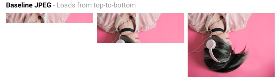
Baseline JPEG (baseline JPEG) is loaded from top to bottom, and progressive JPEG is loaded from blurred to sharp.
Progressive JPEG divides the image into a series of passes. The first pass shows the image in a blurred form and low quality, and subsequent passages gradually improve the quality. Each pass increases the level of detail. In the end, a full image is created.
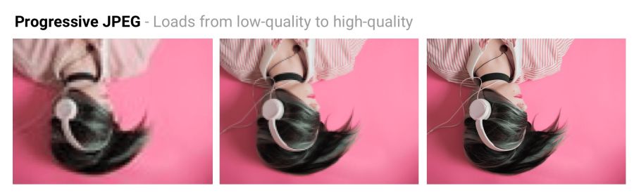
Baseline JPEG loads the image from top to bottom. PJPEG first shows a blurry image, and then increases the resolution. Pat Minan has developed an interactive tool for testing and studying progressive JPEG
files. Lossless JPEG optimization is achieved by removing EXIF headers from digital cameras and editors, optimizing Huffman tables, and rescanning an image. Tools like jpegtran provide lossless compression by rearranging the compressed data without degrading the image quality. jpegrescan , jpegoptim and mozjpeg (which we will soon discuss) also support lossless JPEG compression.
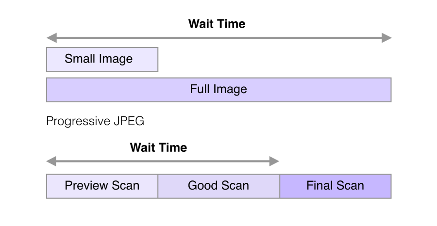
The ability of PJPEG to show previews when loading improves performance — it seems to users that the image loads faster than standard graphics.
On slow 3G connections, this allows you to approximately see the picture when only part of the file is received - and decide whether to wait for it to fully load or not. This may be more convenient than loading the image from top to bottom, as in basic JPEG.
In 2015, Facebook switched to PJPEG (for its iOS application) and traffic decreased by 10%. They were able to show a good quality image 15% faster than before by optimizing the perceived load time, as shown in the figure above.
PJPEG can reduce the file size by 2−10% compared to basic / simple JPEG for images larger than 10 KB. A higher compression ratio is achieved due to the fact that on each pass a separate Huffman table can be compiled . Modern JPEG encoders (for example, libjpeg-turbo , MozJPEG, and others) use the flexibility of PJPEG for better data compression.
Many other sites with a large number of graphic files, such as Pinterest , also use progressive JPEG in production.
Pinterest website images are encoded only in progressive JPEG. For users it is more convenient when the picture appears gradually
PJPEG decoding is slower than basic JPEG — sometimes three times slower. On desktop machines with powerful processors, this is not as important as on mobile devices with limited resources. Displaying incomplete layers requires work, since you are actually decoding the image several times. These multiple passes eat up CPU cycles.
Also pictures in progressive jpeg are not always smaller in size. Progressive encoding of very small images (for example, thumbnails for preview) can increase their size. And for such images, rendering in several passes generally makes little sense.
So, before choosing PJPEG, it is advisable to experiment and find the right balance between file size, network latency and CPU usage.
Some users may consider progressive download a disadvantage, as it makes it difficult to understand when the image has finished loading. Try to evaluate how your audience relates to this.
Tools and libraries like ImageMagick , libjpeg , jpegtran , jpeg-recompress and imagemin support progressive JPEG. If you already have an optimization pipeline, then it is likely that changing the JPEG encoding method will not be a problem:
Most editors save to default jpeg by default.
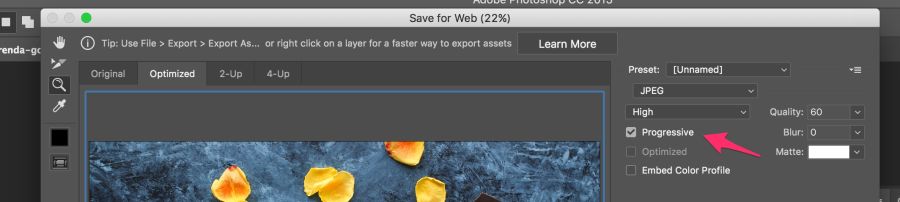
Most editors save to default jpeg by default, but this can be changed in the settings. In Photoshop, you need to select the command “File” → “Export” → “Save for the Web”, and then specify the format of progressive JPEG. Sketch also supports Progressive JPEG export by checking the JPG export menu.
Our eyes notice worse loss of color than brightness. Color subsampling (chroma subsampling) - a type of compression that reduces color accuracy due to brightness (luma). This reduces the file size to 15–17% without noticeably affecting the image quality. Downsampling also reduces memory usage.

The contrast is responsible for the sharpness in the picture, so luma is very important. In black and white photographs there is no color, but thanks to the brightness they look as detailed as the color counterparts. Chroma affects visual perception less.
JPEG supports various subsample types: no subsample, horizontal, horizontal + vertical. Here is an illustration from Frederick Kaiser 's JPEG for Crab article.
When discussing a subsample, there are usually a number of common examples: 4: 4: 4, 4: 2: 2 and 4: 2: 0. What are they? Suppose a subsample has the format A: B: C. Here A is the number of pixels in a line, for JPEG it is usually 4, B is the number of colors in the first line, and C is the number of colors in the second.
By reducing the number of pixels, you can significantly reduce the size of the color components, ultimately reducing the file size.
Color sub-sampling options for JPEG with a quality of 80
Color sub-sampling is useful for most images, although there are obvious exceptions: it is better not to use it where color detailing is as important as brightness (for example, medical images).
Suffer and pictures with the image of fonts. Sharp edges are harder to compress using JPEG because it is designed to better handle photographic scenes with softer transitions.
When working with text, the JPEG Study Textbook recommends adhering to 4: 4: 4 (1 × 1) subsampling.
By the way: the JPEG specification does not specify the exact method of color sub-sampling, therefore different encoders / decoders come in different ways. MozJPEG and libjpeg-turbo use one method, and older versions of libjpeg use another method, which adds artifacts.
For more information, see the article “Why don't you use color subsampling?”
tl; dr: browser support is very different. If you use modern development, you often have to give different browsers different formats.
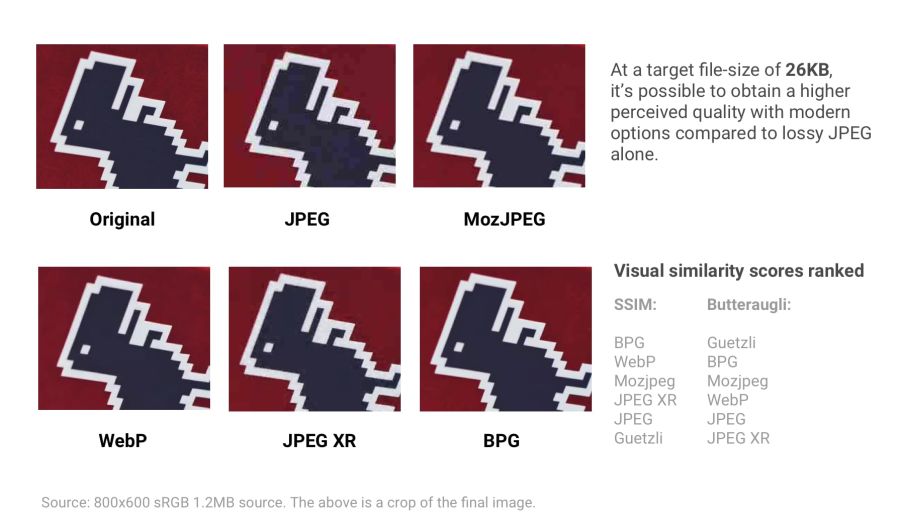
Various modern formats (and optimizers) show compression quality with a target file size of 26 KB. Quality is compared with the SSIM (Structural Similarity) and Butteraugli tools , which we will discuss in more detail later.
If you like to perceive information in graphical form, you can rate one of these visual comparison tools for some of the above formats.
Thus, browser support is very different . To use any of the above formats, you may have to give different copies to each of the target browsers. We see certain perspectives of WebP at Google, so we’ll take a closer look at this format in more detail.
You can also produce different formats (for example, WebP, JPEG 2000) with the same .jpg extension (or any other) because the browser can choose a content-type to render regardless of the extension. This allows you to specify a content-type.on the server side without changing the HTML document at all. Services like Instart Logic use this approach.
Next, let's talk about situations where it is impossible to produce images in different formats: JPEG-optimizers will help here .
Modern JPEG codecs are trying to reduce the size of JPEG files, while maintaining the highest quality and compatibility with existing browsers and applications. They eliminate the need to use new image formats and make changes to the ecosystem. Two such encoders are MozJPEG and Guetzli.
tl; dr: Which optimized JPEG codec to use?
Mozilla offers an upgraded JPEG encoder - MozJPEG . According to the developers, it reduces the size of JPEG files to 10%. Files compressed with MozJPEG open in all browsers, and among the supported features are progressive scanning, trellis quantization (removing parts that are worst compressed) and several advanced quantization table templates that help create smoother High-DPI images (although this is possible with ImageMagick, if you are ready to wade through the wilds of the XML configuration).
MozJPEG is supported by ImageOptim and for it there is a relatively reliable custom imagemin plugin . Here is an example implementation using Gulp:

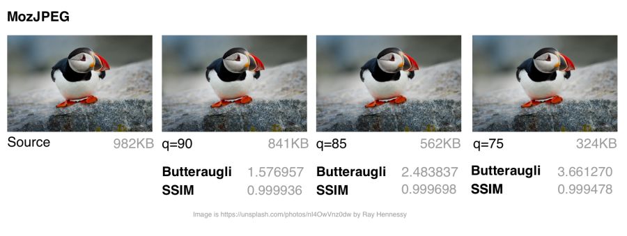
MozJPEG: Comparison of file size and visual similarity scores on different qualities
To calculate the SSIM scores (structural similarity with the original image), I used jpeg-compress from the jpeg-archive project.
In my experience, MozJPEG is a good option for compressing images for the Internet with high quality while reducing file size. For small and medium-sized images, MozJPEG (with a quality of 80–85) reduces files by 30–40% while maintaining acceptable SSIM and an improvement of 5–6% in jpeg-turbo. It encodes more slowly than basic jpeg , but the difference is not critical.
Guetzli is Google 's promising, but very slow, perceptual JPEG codec. He is trying to find the smallest JPEG, perceptually indistinguishable from the original. The codec performs a series of experiments, offering options for comparison, and takes into account the psycho-visual error of each option. The final result is the one with the highest score.
To measure the differences between images, Guetzli uses Butteraugli , a model based on human perception (discussed below). Guetzli takes into account some properties of human vision that are not taken into account by other JPEG codecs. For example, there is a relationship between the amount of visible green light and the sensitivity to blue, so changes in blue around green can be encoded less accurately.
Guetzli claims a difference in file size of 20–30% without reducing Butteraugli’s score compared to other compressors. Guetzli's big drawback is its extreme slowness, so at the moment it is only suitable for static content. A large amount of consumed memory is indicated in the README: encoding takes about 1 minute and 200 MB of RAM per megapixel. GitHub has a good thread with a discussion of actual Guetzli experience. The codec is ideal for optimizing images when building a static site, but to a lesser extent suitable for running on demand.
Tools like ImageOptim support Guetzli optimizations (in recent versions ).
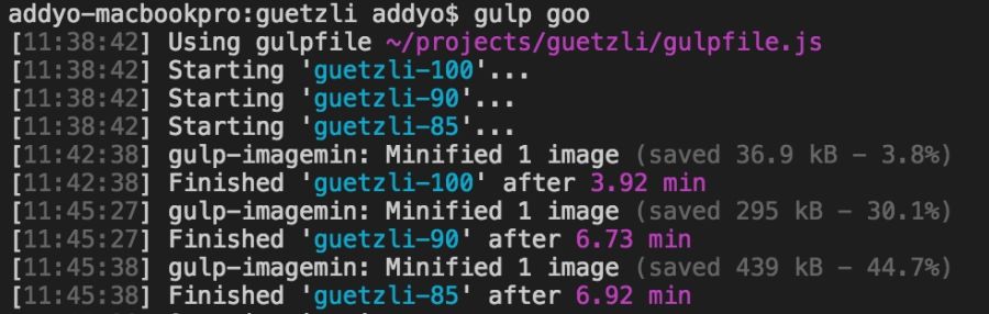
Encoding Guetzli images of 3000 × 3000 pixels with different levels took almost seven minutes. It makes sense for archival storage of high-resolution photos.
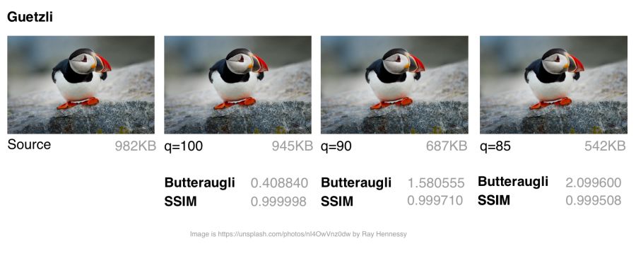
Guetzli: comparing file sizes and assessing visual similarities for different qualities
Guetzli spends very (very) a lot of time and will make the CPU cooler unwind, but worth it. I saw a number of examples when the file size was reduced by 40% while maintaining visual accuracy. This makes it an ideal choice for archiving photos. On images of small and medium size, there is also some savings (in the range of 10−15 KB), but not so significant. When compressing very small images, Guetzli can introduce “liquid-like” distortions.
For a variety of use cases , you might be interested in comparing Guetzli with Cloudinary automatic compression in Eric Portis research.
It is difficult to compare different JPEG codecs: it is necessary to evaluate both the quality and accuracy of the compressed image, not just the size. As the image compression expert Corneille Lesinski notes, the benchmark of only one, and not both, aspects can lead to wrong conclusions.
What do Guetzli and MozJPEG look like in comparison? Corneille approach:
There are a number of methods for determining the visual or perceptual similarity of compressed images with the source code. SSIM (structural similarity) is often used in research . However, Guetzli is optimized for Butteraugli.
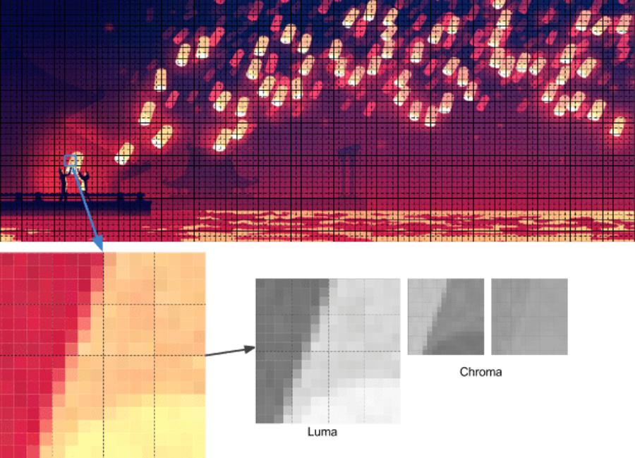
The Butteraugli system determines the moment when a person begins to notice the difference (psycho-visual similarity) between the two images. Butteraugli not only gives an estimate, but also makes a spatial map of the level of differences. While SSIM summarizes all the errors, Butteraugli looks for the maximum.
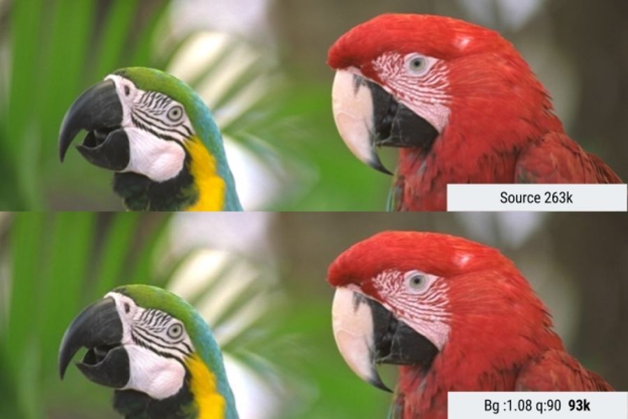
In this example, Butteraugli searches for a minimum JPEG quality threshold so that the user does not notice the visual difference between the images. This reduced the file size by 65%.
In practice, you determine the level of visual quality, and then run several image optimization strategies, looking at Butteraugli estimates, before choosing a result that matches the optimal balance between file size and compression level.
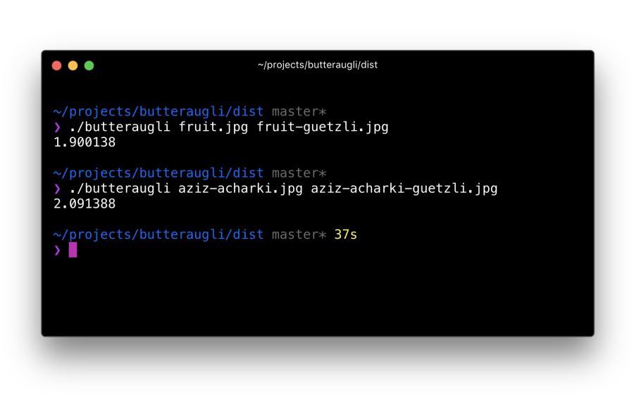
It took me about 30 minutes to localize the Butteraugli setup after installing Bazel and building the C ++ source code for correct compilation on a Mac. Its use is relatively simple: specify two images for comparison (source and compressed version) - and get an estimate
One of the developers of Guetzli says that Guetzli is better for Butteraugli, worse for SSIM, and MozJPEG is about equally good for both metrics. This is the strategy I use to optimize images. I run Butteraugli and a Node module like img-ssim to compare SSIM ratings before / after Guetzli and MozJPEG.
As practice has shown, the combination of Guetzli and MozJPEG without loss (jpegtran, not cjpeg, so as not to discard the work done by Guetzli) allows you to further reduce the file size by 10−15% (55% overall) with a very slight decrease in the SSIM score. This requires verification and analysis, but other specialists like Aria Hidayat tried - and got the same promising result.
MozJPEG is a convenient beginner codec that compresses files for the web relatively quickly and provides good image quality. At the same time, Guetzli is resource intensive and works best on large, high-quality images: I would recommend this option to advanced and professional users.
WebP is Google’s latest graphic format that seeks to reduce file sizes under lossless and lossy compression, providing an acceptable visual quality. Supports alpha channel (transparency) and animation.
WebP is improving: over the past year, it added a few percent in lossless and lossy compression, the coding speed was twice as fast, and the decoding speed increased by 10%. WebP is not a universal tool, but its popularity is growing. Let's take a look at why.
WebP: comparing file sizes and evaluating visual similarities at different quality levels
Developers say that with lossy compression using the VP8 or VP9 codec, files are reduced by an average of 25–34% compared to JPEG.
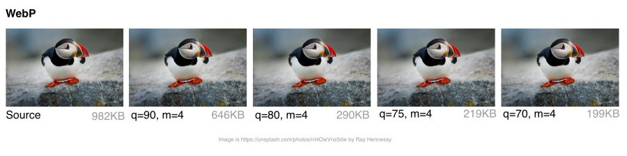
In the low quality range (0–50), WebP has a great advantage over JPEG, because it blurs ugly blockiness artifacts. Medium quality setting (-m 4 -q 75) —the default balance of speed and file size. In the high quality range (80–99), the advantages of WebP are minimal. WebP is recommended where speed is more important than quality.
WebP files with lossless compression are 26% smaller than PNG files . Download time is reduced by 3% compared to PNG. However, lossless compression is not commonly used on the Internet. This option is better suited for archival storage.
WebP has an 8-bit transparency channel with lossless compression of only 22% more bytes than PNG. It also supports lossy RGB transparency; this is a unique feature of WebP.
The WebP format supports metadata of EXIF photos and digital XMP documents, and also contains an ICC color profile.
WebP provides better compression due to higher CPU utilization. Back in 2013, WebP compression was about 10 times slower than that of JPEG, but now the difference is not so significant (some images can be compressed twice as slowly). For static images that are processed during the build process, this should not be a big problem. Dynamically generated images are likely to cause noticeable use of the CPU, which will have to be considered.
Many large companies use WebP in production to reduce costs and increase page loading speed.
Google reported a 30–35% savings on WebP compared to other lossy compression schemes. Google produces 43 billion images per day, 26% of which are compressed without loss. These are many requests and significant savings. Undoubtedly, it will increase even more when browsers improve support for WebP . Google uses this format on Google Play, YouTube and other sites.
Netflix, Amazon, Quora, Yahoo, Walmart, Ebay, The Guardian, Fortune, and USA Today compress and display WebP images for browsers that support it. The VoxMedia publisher reduced the download time for The Verge pages by 1-3 seconds by switching to WebP for Chrome users. Site500px recorded a decrease in file sizes by an average of 25% with the same or better quality.
In addition to the above, other companies use WebP.

Using WebP with Google: 43 billion pictures of WebP are issued daily on YouTube, Google Play, Chrome Data Saver and G +
For static images, WebP is an alternative to JPEG. In lossy coding, there are three key stages:
Macro-blocking — splitting an image into (macro) blocks of 16 × 16 pixels of brightness and blocks of 8 × 8 pixels of chromaticity. This is similar to how JPEG converts a color space, breaking it into blocks and lowering the number of pixels on the color channels.
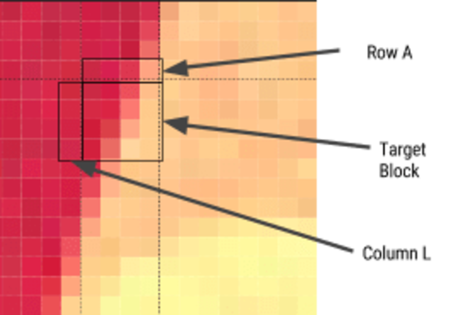
Prediction — For each 4 × 4 subblock, a prediction model is compiled that effectively performs filtering. It is determined by two sets of pixels around the block: A (the line immediately above) and L (left column). Using these two sets, the encoder fills the 4 × 4 test block with pixels and determines which values are closest to the source block. Colt Macanlis talks about this in more detail in an article. how WebP works in lossy compression mode.
The discrete cosine transform (DCT) is applied in several steps, as in JPEG. The key difference is the use of arithmetic compression , not a Huffman algorithm, as in JPEG.
For more information, I recommend the article "WebP Compression Methods" from Google Developer.
Not all browsers support WebP, but according to CanIUse.com , global support is about 74%. Chrome and Opera support the format. Safari, Edge and Firefox are experimenting, but have not yet implemented support in official versions. Because of this, WebP issuance often depends on the web developer. More on this later.
Here are the main browsers and support information for each of them:
WebP is not without flaws. It lacks full-resolution color space options and does not support progressive decoding. However, a decent toolkit has been created for WebP, and browser support is enough to consider WebP output as one of the options.
Several commercial and free editors support WebP. One of the most useful applications is XnConvert: a free cross-platform batch converter.
XnConvert batch processes images in more than 500 formats. You can combine more than 80 separate actions to convert or edit images in different ways.
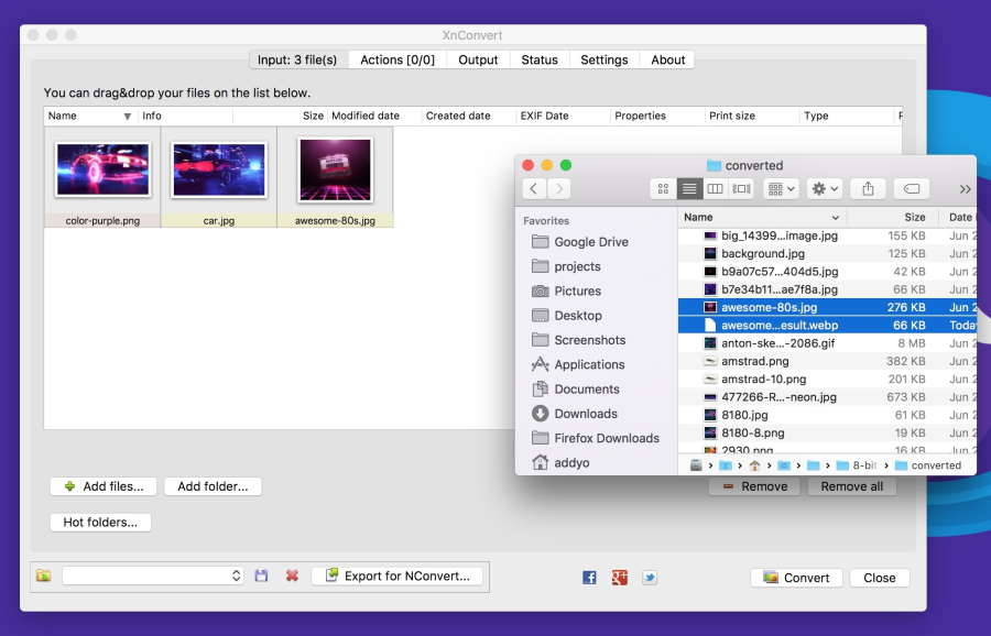
XnConvert supports batch image optimization by performing direct conversion from source files to WebP and other formats. In addition to compression, XnConvert can remove metadata, crop images, adjust color depth, and perform other transformations.
Some of the parameters listed on the xnview website:
Results of operations can be exported to approximately 70 different file formats, including WebP. XnConvert is a free program for Linux, Mac, and Windows. This is a great option, especially for small businesses.
Imagemin is a popular image compression module that has an extension to convert to WebP ( imagemin-webp ). Lossy and lossless compression is supported.
To install imagemin and imagemin-webp, run:
Then we can add () in both modules and run them on any images (for example, JPEG) in the project directory. Below we use lossy coding with the quality of the WebP 60 encoder:
As in JPEG, you can notice compression artifacts in the final image. See for yourself what level of compression is adequate for your files. Imagemin-webp can also be used to encode WebP images without loss of quality (with 24-bit color support and full transparency) by specifying the parameter
WebP plugin for Gulp from Sindre Sorgus is based on imagemin-webp, there is also a WebP uploader for WebPack . The Gulp plugin understands all the imagemin extension options:
Or lossless compression:
XNConvert supports batch compression, but everything can be done from the command line.
Batch image conversion to WebP format using cwebp :
Optimization codec MozJPEG using jpeg-recompress :
and trimming SVG using the svgo program (which we will look at later):
Jeremy Wagner wrote a more complete article on optimizing images in Bash and another one on parallelizing this task.
For Android, you can convert existing BMP, JPG, PNG and static GIF images to WebP format using Android Studio. See “Creating WebP Images Using Android Studio” for more information .
Although WebP images always open in a browser on the Blink engine (Chrome, Opera, Brave), they can be viewed directly from the OS using an add-in for Mac or Windows.
Several years ago, Facebook experimented with WebP and noticed a problem: some users saved pictures to disk, and then they could not open them. Here are three key issues:
Your users may not have such problems, but this is an interesting note in the margins. Fortunately, today there are utilities for viewing WebP under different operating systems.
On a Mac, try the Quick Look WebP plugin (qlImageSize). It works well:
Under Windows, you can download the WebP codec pack , which adds the WebP viewing option to File Explorer and Windows Photo Viewer.
Browsers without WebP support will not show any pictures. To avoid this, there are several strategies.
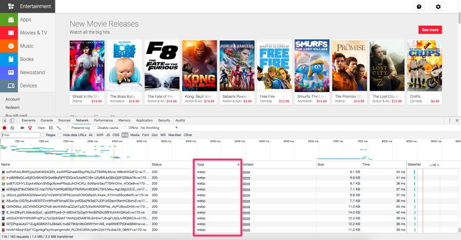
The Chrome DevTools Network panel with selection of WebP type files that are sent to browsers on the Blink
Play Store engine gives WebP browsers to Blink and JPEG to others, such as Firefox.
Here are some options for delivering WebP images to users:
Here's how to use .htaccess to output WebP files in supported browsers, if the server has a webp version of the JPEG / PNG file.
Vincent Orbach recommended this approach:
Browsers can explicitly signal support for WebP through the Accept header . In this case, you can give the server a WebP version of the image. But this is not always possible (for example, for static hosts, such as GitHub or S3 pages), so be sure to check before considering this option.
Below is an example .htaccess file for the Apache web server:
If there are problems with displaying WebP graphics, make sure that the image / webp MIME type is enabled on the server.
On Apache, add the following code to the .htaccess file:
On Nginx, add the following code to the mime.types file:
The browser itself is able to select the image format using the <picture> tag. Inside <picture> there is a set of <source> elements, with one <img> tag for each where the image is actually contained. The browser scans the <source> and requests the first matching one. If the <picture> tag is not supported, then the <div> is rendered using the <img> tag.
Here are some HTML examples:
Some CDNs support automatic conversion and WebP output at the client’s request whenever possible . Check your CDN for support. Perhaps the problem is solved very simply.
Jetpack : a popular WordPress plugin, includes a CDN image service called Photon with WebP support. It is included in the free version of the Jetpack, which is very practical and useful. The disadvantage is that Photon automatically resizes the image, puts the query string in the URL, and for each image an additional DNS query is performed.
Cache Enabler and Optimizer : if you are using WordPress, there is at least one open source option. In the menu plug Cache EnablerThere is a checkbox for caching and displaying WebP images, if the user's browser supports them. This makes it easier to work with WebP. There is also a disadvantage here: Cache Enabler requires the use of a related program Optimizer, for which an annual fee is charged. This is not very typical of open source solutions.
Short Pixel : another version of the optimizer for Cache Enabler, also paid. In terms of functionality, Short Pixel is very similar to the Optimizer mentioned. Allows you to optimize for free up to 100 photos per month.
Animated GIFs are still widely used, despite their narrow specialization. Although everything from social networks to popular media sites, using GIF-animation abundantly, this format was never meant for video or animation. In fact, the GIF89a specification clearly indicates that "GIF is not intended to serve as a platform for animation." The number of colors, the number of frames and proportions - all this affects the size of the animated GIF. Replacing video format gives maximum savings.
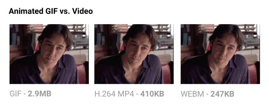
Comparing the size of GIF-animation and video in equivalent quality.
The output of the same video in MP4 format reduces the file size by 80% or more.Besides the fact that GIF files waste traffic, they take longer to load, contain fewer colors and usually do not look very nice. You may have noticed that GIF animations uploaded to Twitter work better there than on other sites. This is because Twitter animated GIFs are not really GIFs . To improve quality and reduce traffic, Twitter automatically converts them to video. Similarly, Imgur converts GIF to MP4 when loaded .
Why are GIFs so many times larger? Because they store each frame as a GIF without loss - yes, without loss. Poor GIF quality is not caused by compression, but by a palette of 256 colors. The format does not analyze adjacent frames for compression, unlike video codecs like H.264. MP4 video stores each keyframe as a lossy JPEG, discarding some of the original data to achieve better compression.
For more information, see the Rigor GIF Book .
Minimizing SVG files means removing everything that is unnecessary. As a rule, the SVG from the editor contains a lot of redundant information (metadata, comments, hidden layers, and so on). Often it can be safely removed or minimized without affecting the visual result.
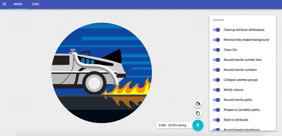
In the SVGOMG service from Jake Archibald, you can choose different optimization methods with an instant view of the result.
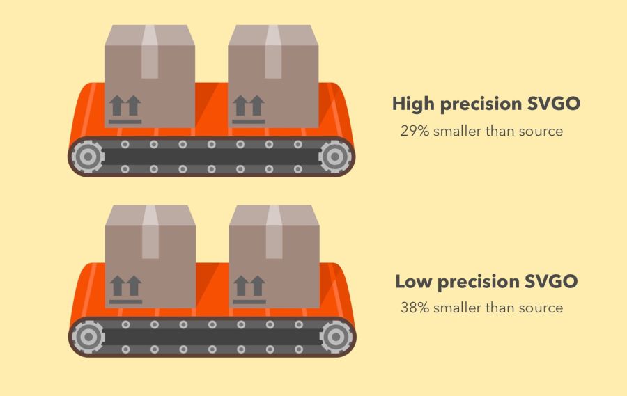
SVGO efficiency in high accuracy mode (−29% of the original file size) and low accuracy (−38%)
SVGO is an SVG optimization tool for Node. It reduces file size by lowering the precision of numbers in the definitions. Each digit after a point is an extra byte, so a change in accuracy (number of digits) greatly influences the file size. But be very careful, because the decrease in accuracy can visually affect the shape of the image.
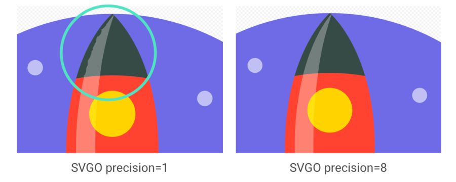
It is important to note: although SVGO succeeded in the previous example without unduly simplifying the ways and forms, it often happens otherwise. See how rocket flare distorts with decreasing accuracy
SVGO can be set up as a CLI if you prefer the command line:
Optimizing the SVG file:
All possible parameters are supported, including the floating point precision setting:
See the readme for a complete list of supported parameters.
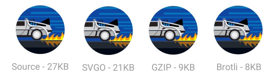
Also, do not forget to zip the SVG files or issue them using the Brotli protocol. The text format will compress very well (~ 50% of the source code).
When Google released the new logo, we announced that its minimum version only takes 305 bytes.
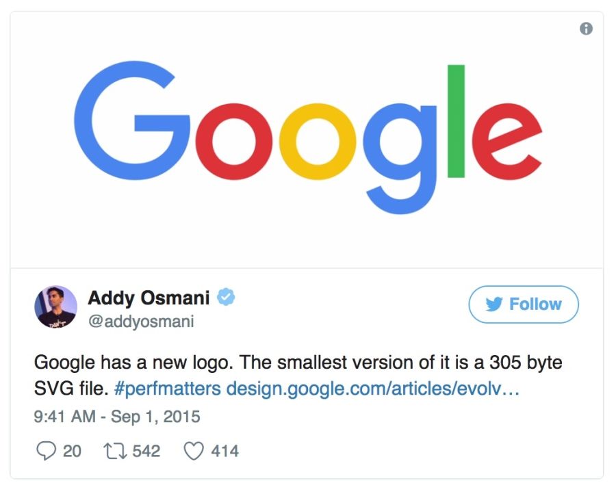
There are many advanced tricks to even more shrink the file (up to 146 bytes)!
SVG is great for icons, offering visualization in the form of a sprite without the quirky workarounds required for fonts. It has better control of CSS styles than fonts (SVG stroke properties), better control of positioning (no need to bother with pseudo-elements and
Tools like svg-sprite and IcoMoon automate the integration of SVG into sprites that can be used in the CSS Sprite , Symbol Sprite or Stacked Sprite . Worth learning practical tipsfrom Una Kravets, how to use gulp-svg-sprite in your workflow. Sarah Sudein in her blog describes the transition from icon fonts to SVG .
Sarah Soayeidan’s SVG Issuing Optimization Tips and Chris Koyer's “The SVG Practice Book” are excellent. I found very helpful articles by Andreas Larsen on SVG optimization ( part 1 , part 2 ). I can also recommend the article “Preparing and exporting SVG icons to Sketch” .
It is always recommended to compress the image from source. Re-clamping is fraught with unpleasant consequences. Suppose you take a JPEG that is already compressed with a quality of 60. If you re-compress it with a loss, it will look worse. Each additional round of compression will lead to an additional loss of quality - information is removed, and artifacts accumulate. Even if you pinch with high quality settings.
To avoid this trap, immediately set the minimum acceptable quality , and get the maximum savings from the outset. Then you will not re-compress, because any lossy file compression will look bad, although it will reduce the file size.
Example from excellent video and accompanying articleJohn Snayers shows the effect of clamping in different formats. Such a problem can be encountered if you save (already compressed) pictures from social networks and re-upload them (with repeated compression). The loss of quality is growing
MozJPEG (perhaps by accident) is more resistant to such degradation due to trellis quantization. Instead of compressing all DCT values as they are, it looks for close values in the + 1 / -1 range to compress them into fewer bits. A lossy FLIF uses a hack similar to a lossy PNG, where before (re) compression the codec analyzes the data and decides what to throw away.
Source files store them in a lossless format, such as PNG or TIFF, to maintain maximum quality.. Then the assembly tools or compressors will prepare a compressed version that you will give to users with minimal loss in quality.
We all gave users large images with too high resolution. You have to pay for it. Decoding and resizing - resource-intensive operations for the browser on a regular mobile phone. If you give large images, scaling them with CSS or width / height attributes, you will see how this affects performance.
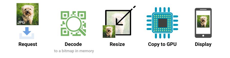
When the browser receives an image, it must decode it from the original source format (for example, JPEG) into a bitmap image in memory. Often the image requires resizing (for example, the width is set as a percentage). Decoding and resizing images - demanding operations that slow down rendering
Ideally, give the images that the browser displays without resizing. So give the minimum size pictures for the relevant screens and resolutions, using
Skipping attributes
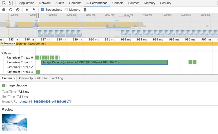
Browsers need to take a few steps to draw a picture on the screen. Having received the image, it needs to be decoded and often resized. These events can be tracked on the timeline.Chrome DevTools
Large images also take up memory: about 4 bytes per pixel after decoding. If you are not too careful, you can literally hang the browser; on low-end devices it’s not so difficult to bring the situation to a swap. So watch out for decode, resize, and memory consumption.
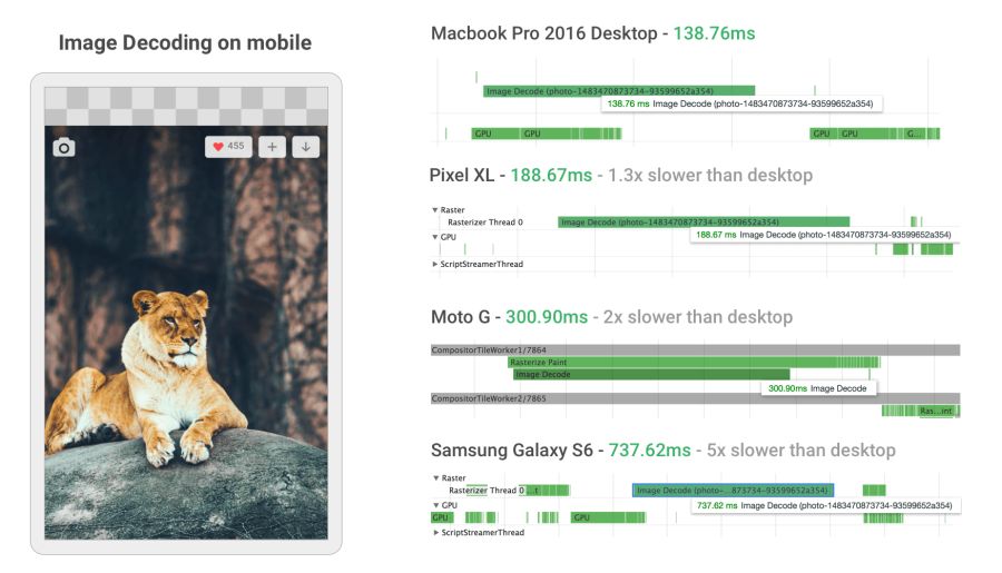
Image decoding can be incredibly resource intensive on mobile phones in the middle and lower levels. In some cases, it is 5 or more times slower than on the desktop.
When developing a new mobile version, Twitter greatly increased the speed of image decoding by setting the correct dimensions. For many images, the decoding time has decreased from ~ 400 ms to ~ 19 ms!
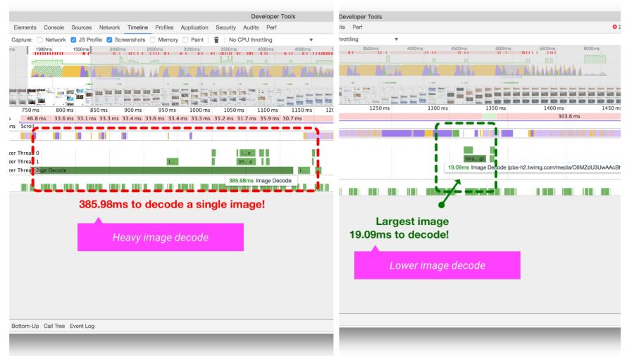
The Timeline / Performance panel in Chrome DevTools shows the time it takes to decode an image on Twitter Lite before and after optimization.
HiDPI Image Delivery with
Users can access the site through various mobile and desktop devices with high-resolution screens. The device pixel ratio (DPR) (also called “CSS pixel ratio”) determines how CSS should interpret the screen resolution. The DPR standard was created by phone manufacturers to increase the resolution and sharpness of mobile screens without reducing the elements.
For maximum quality, you should give the image with the most appropriate resolution. On devices with high-resolution screens, high-definition images (with DPR 2 ×, 3 ×) are given, and on standard screens - ordinary images, since pictures with DPR 2 × and 3 × are much heavier.
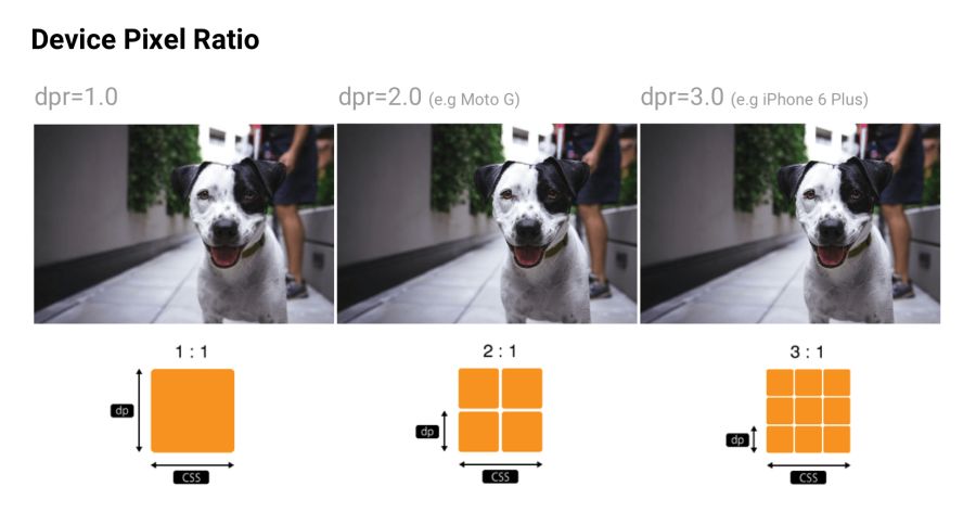
Device pixel ratio: many sites track DPR of popular devices via material.ioand mydevice.io
srcset allows the browser to select the optimal image for each device. For example, take a 2 × picture for a mobile display with a DPR 2 ×. Browsers without support
CDN for images like Cloudinary and Imgix support DPR for issuing images with optimal resolution from a single source.
I remind you that Client Hints is also a suitable alternative to specifying all possible DPR and formats in responsive markup. Instead, the relevant information is added to the HTTP request so that the web server chooses the most appropriate option for a particular screen.
Although choosing the right resolution is important, some sites still think about beauty. If the user has a small screen, you can trim or zoom in - and display the object differently, making the best use of the available space. Although the artistic transformation (art direction) beyond the scope of this article, some services like Cloudinary provide API-interfaces to automate such tasks.
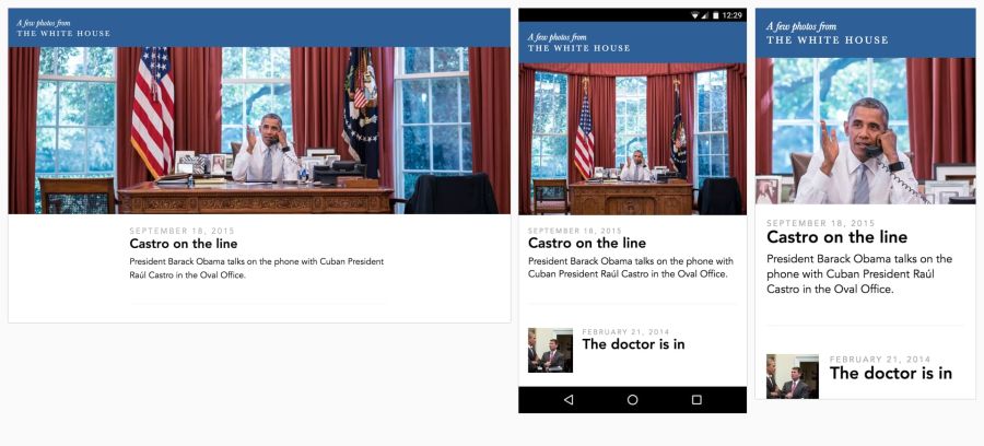
Eric Portis showed a great example of how to creatively use responsive images. In this example, the characteristics of the main object in the illustration are modified to make the best use of the available space.
Color can be viewed from at least three perspectives: biology, physics and printing. In biology, color is a phenomenon of perception . Objects reflect light in various combinations of wavelengths. Light receptors in the eyes translate these waves into a color sensation. In physics, wave frequencies and energy (brightness) are important. Printing is more about color gamut, colors and art models.
Ideally, all the screens and web browsers in the world should display the same color exactly. Unfortunately, this is not the case. Color management allows you to reach a compromise in the display of colors with the help of color models, spaces and profiles.
Color models are a system for creating a full spectrum from a smaller set of primary colors. There are different types of color spaces with different parameters for managing colors. Some spaces have fewer control parameters than others - for example, for all shades of gray, only one brightness parameter between black and white is sufficient.
Two common types of color models are additive and subtractive. Additive color models of the RGB type display the color with a glow, and subtractive CMYK types show the reflection (subtraction).
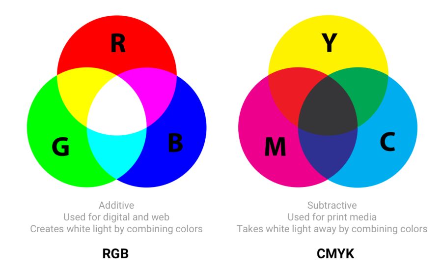
In RGB, red, green, and blue light are added in various combinations to produce a wide range of colors. CMYK (cyan, magenta, yellow and black) works with ink of different colors, taking away part of the white paper spectrum
Article“The concept of color models and color systems” describes well other color models and modes, such as HSL, HSV and LAB.
Color spaces are a specific range of colors that can be displayed for a given image. For example, in an image up to 16.7 million colors, and different color spaces allow you to narrow or expand this range. Some developers believe that color models and color spaces are one and the same.
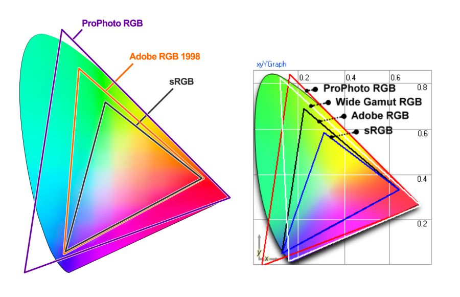
sRGB is developed based on RGB as a standard for the Internet. This is a small color space, which is usually considered the lowest common denominator and the safest option for color management in browsers. Other color spaces (for example, Adobe RGB or ProPhoto RGBused in Photoshop and Lightroom) contain more diverse colors, but since sRGB is common in browsers, games, and monitors, it is usually used.
Gamma - color range visualization in color space
Three color channels are used in the color spaces (red, green, and blue), each with 255 colors in 8-bit mode, which gives 16.7 million colors. 16-bit pictures can display trillions of colors.
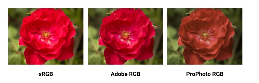
Comparing sRGB, Adobe RGB and ProPhoto RGB in a Yardstick image . It is incredibly difficult to illustrate this concept if your screen shows only sRGB colors. When comparing a normal photo in sRGB and a wide range, everything will be the same, except for the most saturated "rich" colors.
Color spaces differ in their gamma (range of colors that they can reproduce with hues), spectrum and gamma curve . sRGB is about 20% smaller than Adobe RGB, ProPhoto RGB is about 50% wider than Adobe RGB. The photos above are taken from the Clipping Path .
A wide gamut (wide-gamut) is a term meaning color spaces wider than sRGB. These types of displays are becoming more common. However, many digital displays are still simply not capable of displaying color profiles that are significantly better than sRGB. When saving for web in Photoshop, use the option to convert to sRGB, unless you are counting on displays with a wide color gamut.
Yes. If the image contains a very saturated / juicy / bright color - and you want to display it on compatible screens. However, in real photos this rarely happens. Often, you can easily tweak the settings so that the color looks bright, without going beyond the gamut of sRGB.
The reason is that human perception of color is not absolute. Perception works in relation to the environment - and it is easy to deceive. But if on the picture there is a trace of a fluorescent marker, then of course it is easier to show it in a wide range.
Gamma correction (or simply gamma) controls the overall brightness of the image. Changing the gamut can also change the ratio of red and green colors. Images without gamma correction often appear faded or dark.
In video and computer graphics, gamma is used for compression, similar to data compression. This allows you to compress useful brightness levels in fewer bits (8, not 12 or 16). The human perception of brightness is non-linearly proportional to the physical amount of light. Representing colors in their true physical form would be wasteful when coding for the human eye. Gamma compression (gamma compression) is used to encode brightness on a scale closer to human perception.
With gamma compression, the useful grayscale fits in with 8 bits of precision (0–255 in most RGB colors) because the luminance units are not linearly encoded. Imagine that you are in a dark room with one candle. Light the second - and notice a significant increase in brightness. Add a third candle and the room will become even brighter. Now imagine yourself in a room with a hundred candles. Light the 101st, 102nd candles - and you will not notice any changes.
In both cases, the same amount of light was physically added. But since the eyes are less sensitive to bright light, gamma-compression “compresses” bright values, so in physical units less accuracy is encoded there, but the scale itself is adjusted for people — and from a human point of view all values are equally accurate.
A color profile is information that describes the color space of a device. It is used to convert between different color spaces. The task of profiles - so that the images were as similar as possible on all types of screens and carriers.
Images may have an embedded color profile according to the International Color Consortium (ICC) standard in order to accurately determine colors. Profiles are supported in various formats, including JPEG, PNG, SVG, and WebP, and most major browsers also support embedded ICC profiles. If the picture opens in the program and the monitor profile is known, the colors are adjusted accordingly.
The embedded color profiles also significantly increase the size of the images (sometimes by 100 KB or more), so be careful. Tools like ImageOptim automatically remove all color profiles that they find. If the ICC profile is deleted, the browser will start displaying the image in the color space of your monitor, which can lead to a change in saturation and contrast. So it makes sense to look for a compromise for each specific case.
The Nine Degrees Below website has an excellent selection of resources for managing ICC color profiles if you need more information.
In previous versions of Chrome, there was not much support for color management, but the situation was corrected in 2017 by implementing the Color Correct Rendering feature . If the display profile is different from sRGB (latest MacBook Pro), then it converts the colors from sRGB to a display profile. This means that the colors will become more similar in different systems and browsers. Safari, Edge and Firefox browsers also take into account ICC profiles, so images with different profiles are now displayed correctly, regardless of whether you have a wide color gamut or not.
In image sprites (or CSS-sprite) has a long history, they are supported by all browsers and have been a popular way to reduce the number of uploaded images by combining them into one larger image, which is cut into pieces.
Image sprites are still widely used on large production sites, including the Google homepage.
According to the HTTP / 1.x standard, some used sprites to reduce the number of HTTP requests. This had a number of advantages, but it required accuracy due to the problem of invalidating the cache — changes to any small part of the sprite would invalidate the entire image in the cache.
Now splitting into sprites is against HTTP / 2 recommendations .. Since it has become possible to send many requests in one connection, it is better to upload images individually . Evaluate options for your situation.
Lazy (delayed) loading is a practice of increasing productivity, when loading images to the browser is delayed until the user actually needs it. For example, images are loaded asynchronously when scrolling through a page. This can save traffic in addition to compressing images.
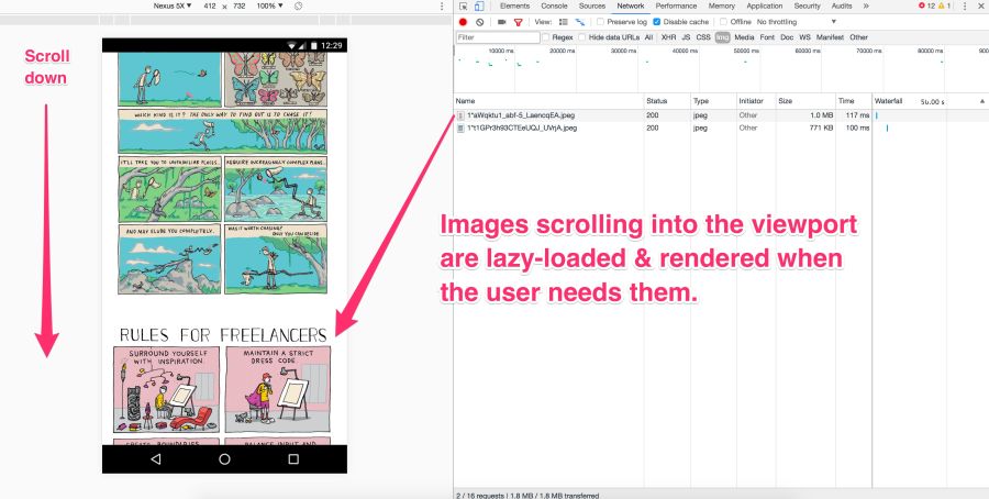
Pictures on the screen are loaded immediately. But the rest at this moment is not yet visible. They should not be downloaded immediately, but later - this is a lazy download. It occurs only if and when the user scrolls down the page.
Lazy loading is not supported by the browsers themselves (although this has been discussed in the past ). JavaScript is used instead.
She has many advantages:
However, as with other tools, great responsibility comes with great force.
Avoid deferred loading of images in scope. Use it for long lists (for example, products or custom avatars). Do not use it for the main picture on the page. Lazy loading in scope can slow down loading, both technically and for human perception. It kills preloading and progressive loading, and JavaScript generates extra work for the browser.
Be very careful with lazy loading images when scrolling.If you wait for the scrolling event directly, the user can see placeholders instead of pictures or get pictures before scrolling on them. One of the recommendations is to start a lazy download of the following images immediately after the previous one is displayed on the screen, regardless of user interaction.
Lazy loading is applied by the majority of large sites with a large number of images. For example, Medium and Pinterest .
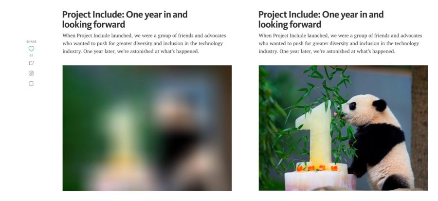
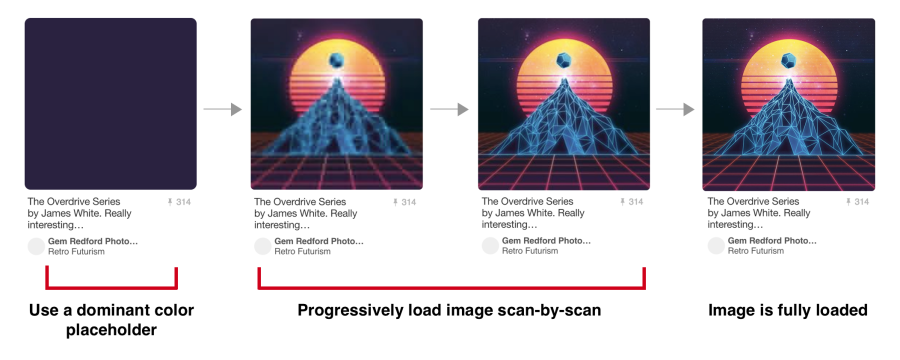
An example of a preview with a Gaussian blur of illustrations on the Medium.
On some sites (for example, Medium) a small blurry image (about 100 bytes) is displayed for preview, which, after delayed loading, turns into an illustration of normal quality.
José M. Perez talked about how to implement the Medium effect using CSS filters . He experimented with different graphic formats . Facebook also described its famous approach with 200-byte placeholders for capital photos. If you use webpack, thenLQIP loader will help automate some of these procedures.
To see a lazy download, just open your favorite catalog of high-quality photos, and then scroll down the page. Almost always you will see that the site loads only a few full-resolution images, and the rest is placeholders. As you scroll, the placeholders are replaced with full resolution images. This is a lazy download.
Recently, a new technique of vector , rather than raster, aggregates has become popular . She was offered by Tobias Baldauf in his SQIP tool . There, the Primitive utility generates an SVG preview of several simple forms, approximate with the main features of the image. The SVG is then optimized usingSVGO - and applies a Gaussian blur filter. The result is a SVG placeholder with a size of only 800-1000 bytes, which looks clear on any screens and gives a meaningful idea of what is on the real picture. Obviously, you can combine lazy loading and previewing images in low quality.
For deferred loading there are a number of methods and plugins. I recommend Alexander Farkas lazysizes due to its decent performance, functionality, additional integration with the Intersection Observer and plugin support.
Lazysizes is a JavaScript library, it does not require any configuration. Just download the minified js file and include it in the web page.
Below is a sample code from the README file:
Add the 'lazyload' class to images / frames in combination with the data-src attribute and / or data-srcset.
Additionally, you can add the src attribute with a low-quality image:
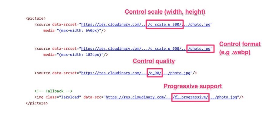
For the web version of this book, I linked Lazysizes with Cloudinary (although you can use any alternative). This allows you to experiment freely and with minimal effort with various scales, quality, formats and regardless of whether you need a progressive download:
Lazysizes is not the only option. There are other libraries:
Delayed loading is a common way to save traffic, reduce costs and improve user interaction. Evaluate how useful it is in your case. For more information, see the articles "Lazy loading images" and "Implementing progressive loading in Medium . "
Older solutions for responsive images mistakenly processed image requests when setting the CSS property
Have you ever written a media query that, under certain conditions, hides a picture in
Or hide images with a class
A quick check in the Chrome DevTools network panel shows that such “hidden” images are still loaded. In fact, this is the correct behavior of the browser according to the specification of embedded resources.
Not. The specified image will still be requested. Here, the library cannot rely on display: none, because the request is sent before JavaScript changes src.
Affirmative answer. The CSS background is not extracted when parsing an element. The calculation of CSS styles for children with
Jake Archibald has a great quest quiz on traps
Again, where possible, use <picture> and <img srcset> instead of relying on <display: none>.
The time spent reading articles to set up your image processing pipeline and its subsequent refinement is often much more expensive than the fee for this service. Cloudinary offers a free service, Imgix gives a free trial, there is a free alternative to Thumbor , so there are a lot of options.
For the fastest page load, you need to optimize image loading, including providing responsive images with compression on the server side, automatic selection of the optimal format and resizing. It is important to give the image the correct size to the correct device in the correct resolution - and as soon as possible. This is not as easy as it seems.
Image manipulation is a specific topic. Here everything is constantly changing, so let's start with a quote from an experienced specialist, and then continue.
“If your product itself is not related to image processing, then do not do it yourself. Services like Cloudinary [or Imgix, approx. auth.] cope much better and more efficiently. And if you're worried about the price, think about the cost of development and maintenance, as well as hosting, storage and delivery. ”- Chris Hmyr
At the moment, we tend to agree that it is better to use CDN for image processing. Consider two such services - as they correspond to the list of mentioned tasks.
Cloudinary and Imgix are well-known image processing CDNs. They are used by hundreds of thousands of developers and companies around the world, including Netflix and Red Bull.
The first huge advantage CDN has over its own solution is that they use a distributed global network system to keep your images closer to your users. And with CDN, it is much easier for you to guarantee the relevance of the service with future changes in technology, because not everyone can independently monitor trends, make changes - this requires maintenance, tracking by browser support for new formats and immersion into the life of the image compression community.
Second: each service has a multi-level tariff plan: Cloudinary has a free tariff , Imgix has an inexpensive starting plan. Imgix offers a free trial , which is almost the same as the free fare.
Third: both services have an API. Developers can programmatically connect to a CDN and automate the process. Client libraries, framework plug-ins and API documentation are available, although some options are only available at expensive rates.
We restrict discussion to static images. Cloudinary and Imgix offer a wide range of image processing methods. In standard and free tariffs, both support basic functions: compression, resizing, cropping, and generation of reduced copies.

Cloudinary Media Library: By default, Cloudinary produces regular, not progressive JPEGs . To activate this option, put the corresponding icon in the “Advanced Settings” or use the fl_progressive flag
Cloudinary names seven broad conversion categories , a total of 48 subcategories. Imgix has over 100 image processing operations .
Cloudinary by default performs the following optimizations:
Imgix by default does not launch optimizations such as Cloudinary, but allows you to set the default quality. In Imgix, automatic parameters help automate the basic level of optimization in the image catalog.
Currently four methods are used :
Imgix supports the following image formats: JPEG, JPEG2000, PNG, GIF, animated GIF, TIFF, BMP, ICNS, ICO, PDF, PCT, PSD, AI.
Cloudinary supports the following formats: JPEG, JPEG 2000, JPEG XR, PNG, GIF, animated GIF, WebP, animated WebP, BMP, TIFF, ICO, PDF, EPS, PSD, SVG, AI, DjVu, FLIF, TARGA.
CDN performance mainly depends on latency and speed.
The delay is always a bit longer for fully uncached images. But as soon as the picture gets into the cache and diverges across the servers on the network, the global CDN finds the closest route to the user. Together with the savings in file size, this almost always eliminates latency problems compared to non-optimized images or single servers that try to serve the entire planet.
Both CDNs have wide coverage and fast servers, which reduces latency and increases download speed. Speed affects page load time, and this is one of the most important user and conversion metrics.
Cloudinary has about 160,000 customers , including Netflix, eBay and Dropbox. Imgix does not report the number of users, but it is less than that of Cloudinary. However, Imgix includes heavyweights like Kickstarter, Exposure, unsplash, and Eventbrite.
There are so many parameters in image processing that cannot be objectively assessed, which makes it difficult to compare the performance of two services. Much depends on how you want to process the image (it will take different time), what size and resolution is needed in the end. In the end, the most important factor for you may be the cost.
CDN cost money. A heavy site with a lot of traffic can pay hundreds of dollars per month on CDN. A certain level of knowledge and programming skills is needed to get the most out of these services. But if you do not do anything unusual, then there will be no particular problems.
If you are now giving away images from your own server or planning to do so, you may need to think about a CDN.
Resources can set caching rules via HTTP cache headers . In particular, it
Most of the images are static resources that will not change in the future. The best strategy for them is aggressive caching.
When configuring HTTP caching headers, set Cache-Control with a
Critical resources can be preloaded with <link rel = preload> .
For preloading images, the value is
In this way, optimized resource utilization for
Sites such as Philips , Flipkart and Xerox are used
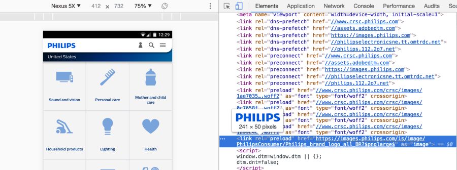
Link preloading is specified by an HTML tag or in an HTTP Link Header . In any case, the link tells the browser to start loading the resource into the cache memory, because the page is highly likely to expect this resource and you cannot wait until the preload scanner or the parser detects it.
The caption for images will look like this:
When the Financial Times introduced such a title on its website, users began to open content 1 second faster :
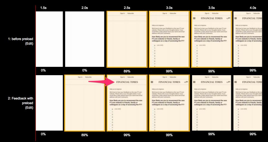
From the bottom: with <link rel = preload>, above: without. Comparison for Moto G4 on the 3G channel under the WebPageTest test before and after optimization
Similarly, Wikipedia accelerated the download of “before the logo”, as described in their study .
You need to be sure that the preloading of this particular resource is absolutely necessary, because it shifts the rest of the content to the end of the queue. Maybe you should focus on other content?
It is important to avoid
For more information, read the articles "Preloading and Priorities in Chrome" and "Preloading: what is it good for?"
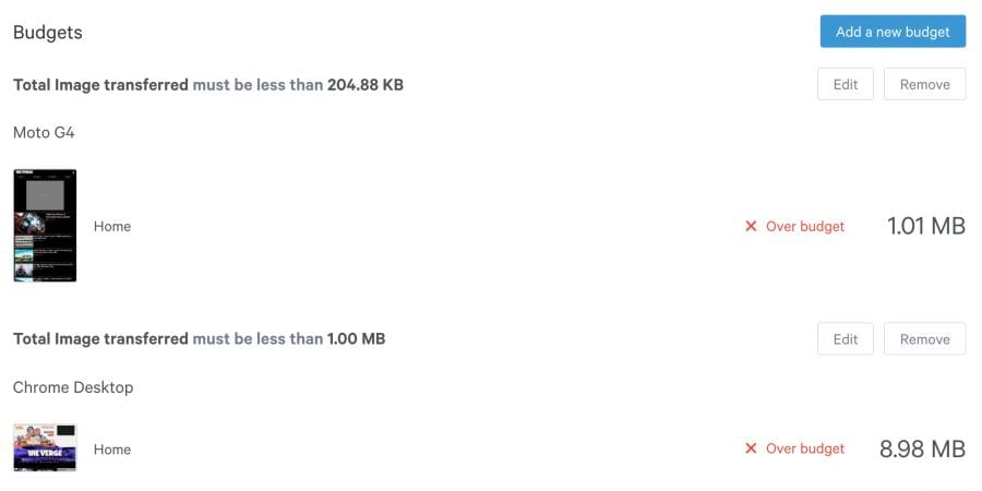
Performance budget is the maximum limit that developers try not to exceed. For example, "no more than 200 KB of pictures on one page" or "the user interface should load in less than 3 seconds." When the budget is not executed - learn why this is happening and how to remedy the situation.
Budgets help discuss performance. When a design or business decision affects performance, check with the budget. If the change does not fit into the budget, this is the reason to postpone or revise it.
I found that the performance budget is best performed if monitoring is automated. Instead of exploring networks, a service is started manually, which automatically signals a budget overrun. Two such useful services are Caliber.and SpeedCurve .
As soon as a budget is determined by the size of the images, SpeedCurve starts monitoring and warns you of excess:
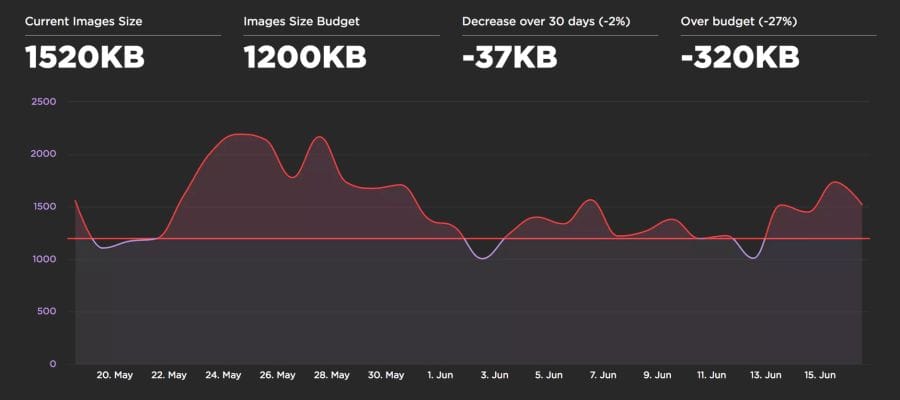
Caliber suggests setting a budget for each class of device. This is useful because the budget for the size of pictures for a desktop PC via WiFi may be very different from the budget for mobile phones.
Ultimately, the choice of image optimization strategy comes down to the types of images that you give to users, and a reasonable set of evaluation criteria to choose from. It can be SSIM or Butteraugli, and on a small set of illustrations you can trust your own eye: what looks better and what looks worse.
If you can not give images in different formats, depending on the support in the browser:
If you can render images in different formats, depending on browser support, using <picture>, Accept or Picturefill header :
Successful compression!
tl; dr
Image compression should always be automated.
Optimization of graphics must be automated. It's easy to forget about it, recommendations change, and the content itself can easily slip past the assembly line. To automate the build, use imagemin or libvips . There are many others.
Most CDNs (for example, Akamai ) and third-party solutions like Cloudinary , imgix , Fastly Image Optimizer , Instart Logic SmartVision, and the ImageOptim API offer comprehensive automated solutions for image optimization.
You will spend time reading articles and configuration setting, which is more expensive than paying for their services (Cloudinary has a freerate). But if you still don’t want to outsource your work for reasons of cost or due to additional latency, then choose the above open source options. Projects Imageflow or Thumbor offer an alternative on their own hosting.
All must effectively compress images
At a minimum, use ImageOptim . It significantly reduces the size while maintaining visual quality. There are versions for Windows and Linux.
A more careful approach: run JPEG files through MozJPEG (web content is acceptable
q=80or lower quality ) and consider Progressive JPEG support . PNG files pass through pngquant , and SVG - through SVGO . Explicitly specify metadata cleanup ( --stripfor pngquant) to avoid files being blown up. Instead of crazy giant animated gifs, give H.264 videos to users (or WebMfor Chrome, Firefox and Opera)! If you can't afford it, then at least use Giflossy . When there is an opportunity to spend a couple of CPU cycles, and you need a better quality image and you are ready to put up with a long coding time, then try Guetzli . Some browsers announce support for image formats via the Accept header. This can be used when choosing a format for output: for example, the WebP format for Blink-based browsers, such as Chrome, and the JPEG / PNG option for other browsers.
Compression can always be improved. There are tools for generating and issuing
srcset. Blink-based browsers automate resource selection with client-hints- and you will save traffic on users who have specified the "data saving" option in the browser via the Save-Data hint . The smaller the image size, the more convenient it is for users - especially with mobile phones. In this article, we will consider how to compress graphics with modern methods with minimal impact on quality.
Content
- Introduction
- How to find out whether to optimize images?
- How to choose a format?
- Modest jpeg
- JPEG compression modes
- What is WebP?
- SVG Optimization
- Avoid pinching graphics with loss of quality.
- Reduce unnecessary decoding and resizing costs
- Color management
- Sprites
- Lazy loading of non-critical images
- How to avoid the trap display: none
- Does it make sense to use CDN for image processing?
- Image caching
- Preloading important resources
- Web performance budgets for images
- Final Recommendations
- Little things
Introduction
Graphics remain the leading cause of web page obesity.
Images make up a huge proportion of internet traffic. According to the HTTP Archive , 60% of the volume of web pages is JPEG, PNG and GIF graphics. As of July 2017, the images were 1.7 MB on an average web page of 3.0 MB.
The Tammy Everts experiment proved that adding images to a page or increasing existing images increases the conversion rate (percentage of visitors who become customers - approx. Lane). So the pictures will not go anywhere - that is why it is important to invest in an effective strategy for compressing them.
The 2016 Soasta / Google study showed that the illustrations are the second predictor of conversion, and effective pages have 38% fewer images.
Image optimization includes a number of measures. The choice depends on the quality loss considered acceptable.
Optimization: choose the right format, gently compress and prioritize the loading of different images.
Typical optimization includes compression, correct output of images based on the size with the help of tags
<picture>/<img srcset>and resizing. According to the HTTP Archive , at the 95th percentile (in the cumulative distribution function), each picture can be reduced by 30 KB!
We still have a lot of images that can be optimized.
Free program ImageOptim reduces the size of graphics with the help of modern methods of compression and removal of unnecessary metadata EXIF.
If you are a designer, there is also an ImageOptim plugin for Sketch.which optimizes resources when exporting. I found it saves a ton of time.
How to find out whether to optimize images?
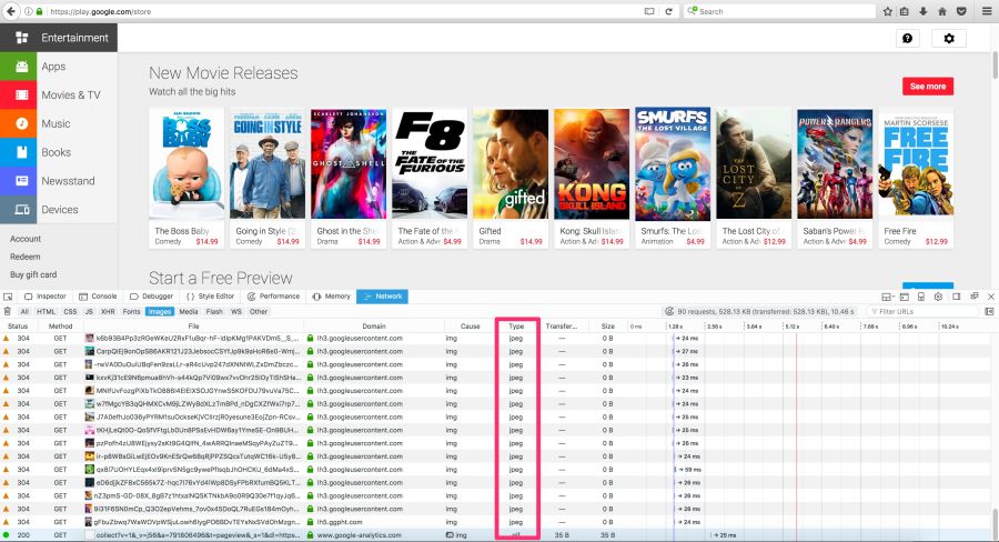
Audit the site using WebPageTest.org .
In the Compress Images WebPageTest report lists the images that can be compressed more efficiently, while the estimated potential gains on the size of files
Service Lighthouse also carries out performance audit, including checks optimizing images. It shows pictures that can be squeezed stronger and which can be put into a lazy download.
Beginning with Chrome 60, this service works in the Chrome DevTools audit panel:
Lighthouse conducts audits with an eye on performance, best practices or advanced web application features (your choice)
you may be aware of other audit tools, such asCloudinary's PageSpeed Insights and Website Speed Test , including a detailed image audit.
How to choose a format?
As Ilya Grigorik noted in his excellent guide on image optimization , the “right format” combines the desired visual result and functional requirements. Do you have a raster or vector graphics?
Raster graphics encodes the values of each pixel on a rectangular grid of pixels. They do not depend on resolution or scale. Such graphics work well with WebP or widely supported formats such as JPEG or PNG. Raster graphics are used where photorealism is needed. Guetzli, MozJPEG and other mentioned tools are suitable for raster graphics.
Vector graphicsuses points, lines and polygons to represent images with simple geometric shapes (for example, logos). It offers high resolution and scaling. For this option, better suited formats like SVG.
Choosing the wrong format will cost you dearly. The format should be changed with caution, conducting experiments with possible savings in different formats.
Jeremy Wagner in his lecture highlighted the compromises that should be considered when evaluating different formats in the optimization process.
Modest jpeg
JPEG is probably the world's most popular graphics format. As noted earlier, 45% of the images on sites in the HTTP Archive are JPEG images. Your phone, digital camera, old webcam - they all usually support this codec. It is very ancient, it has been used since 1992. During this time, a huge amount of research has been done on how to improve JPEG compression.
JPEG is a lossy compression algorithm that discards “extra” information to save space. The challenge is to maximize visual accuracy while minimizing file sizes.
What image quality is acceptable in your case?
Formats like JPEG are best suited for photos or images with lots of color. Most optimization tools will allow you to choose an acceptable level of compression: stronger compression reduces the size of the files, but may introduce artifacts: halo or blockiness.
The visible JPEG compression artifacts are growing as the transition from best quality to worst. Note that the image quality indicators in different tools can be very different
When choosing the level of compression, you should take into account what quality is necessary for images:
- The best thing : when quality is more important than file size. This may be due to the fact that the image is prominent in the design or displayed in full resolution.
- Good : when you think about saving traffic, but do not want to significantly affect the quality of the picture. The users are still important and the quality of illustrations.
- Low : when you take care of minimal traffic and tolerate image degradation. This profile is suitable for networks with poor coverage and thin channels.
- Lowest : bandwidth savings are paramount. Users agree on a rather poor quality for the sake of faster loading pages.
Next, let's talk about the JPEG compression modes, which greatly affect the result.
Note: it is possible that we sometimes overestimate the quality of the image that users need. Quality can be considered as a deviation from the ideal source. This is a subjective indicator.
JPEG compression modes
JPEG has a number of different compression modes. Three popular: basic (sequential), progressive JPEG (PJPEG) and lossless compression.
What is the difference between basic (or sequential) and progressive JPEG?
Basic JPEG (the default mode in most editors and optimizers) encodes and decodes relatively simple: top to bottom. When a baseline JPEG is loaded over a slow or unstable connection, the user will first see the top of the picture. The lossless JPEG compression mode is similar to the baseline, with only a lesser degree of compression.
Baseline JPEG (baseline JPEG) is loaded from top to bottom, and progressive JPEG is loaded from blurred to sharp.
Progressive JPEG divides the image into a series of passes. The first pass shows the image in a blurred form and low quality, and subsequent passages gradually improve the quality. Each pass increases the level of detail. In the end, a full image is created.
Baseline JPEG loads the image from top to bottom. PJPEG first shows a blurry image, and then increases the resolution. Pat Minan has developed an interactive tool for testing and studying progressive JPEG
files. Lossless JPEG optimization is achieved by removing EXIF headers from digital cameras and editors, optimizing Huffman tables, and rescanning an image. Tools like jpegtran provide lossless compression by rearranging the compressed data without degrading the image quality. jpegrescan , jpegoptim and mozjpeg (which we will soon discuss) also support lossless JPEG compression.
Benefits of Progressive JPEG
The ability of PJPEG to show previews when loading improves performance — it seems to users that the image loads faster than standard graphics.
On slow 3G connections, this allows you to approximately see the picture when only part of the file is received - and decide whether to wait for it to fully load or not. This may be more convenient than loading the image from top to bottom, as in basic JPEG.
In 2015, Facebook switched to PJPEG (for its iOS application) and traffic decreased by 10%. They were able to show a good quality image 15% faster than before by optimizing the perceived load time, as shown in the figure above.
PJPEG can reduce the file size by 2−10% compared to basic / simple JPEG for images larger than 10 KB. A higher compression ratio is achieved due to the fact that on each pass a separate Huffman table can be compiled . Modern JPEG encoders (for example, libjpeg-turbo , MozJPEG, and others) use the flexibility of PJPEG for better data compression.
Note: Why does PJPEG compress better? Because basic JPEG blocks are encoded one by one, and in PJPEG, discrete cosine transform coefficients from several blocks can be encoded together, which results in better compression.
Who uses progressive jpeg in production?
- Twitter.com produces progressive JPEGs with a basic quality level of 85%. They measured the subjective delay perceived by the user (the time to the first pass and the total load time), and decided that PJPEG is generally suitable based on compression quality, encoding and decoding rates.
- Facebook produces progressive JPEGs in an iOS application . This reduced traffic by 10% and accelerated the delivery of “good quality” images by 15%.
- Yelp switched to progressive jpeg . This is one of the measures that reduced the size of images by about 4.5%. It fell another 13.8% due to MozJPEG.
Many other sites with a large number of graphic files, such as Pinterest , also use progressive JPEG in production.
Pinterest website images are encoded only in progressive JPEG. For users it is more convenient when the picture appears gradually
Disadvantages of Progressive JPEG
PJPEG decoding is slower than basic JPEG — sometimes three times slower. On desktop machines with powerful processors, this is not as important as on mobile devices with limited resources. Displaying incomplete layers requires work, since you are actually decoding the image several times. These multiple passes eat up CPU cycles.
Also pictures in progressive jpeg are not always smaller in size. Progressive encoding of very small images (for example, thumbnails for preview) can increase their size. And for such images, rendering in several passes generally makes little sense.
So, before choosing PJPEG, it is advisable to experiment and find the right balance between file size, network latency and CPU usage.
Note: PJPEG (and all JPEG) hardware decoding can be supported on mobile devices. This does not reduce memory consumption, but reduces the load on the processor. Not all Android smartphones have hardware acceleration, but they are on high-end devices and iOS devices.
Some users may consider progressive download a disadvantage, as it makes it difficult to understand when the image has finished loading. Try to evaluate how your audience relates to this.
How to encode files in progressive jpeg format?
Tools and libraries like ImageMagick , libjpeg , jpegtran , jpeg-recompress and imagemin support progressive JPEG. If you already have an optimization pipeline, then it is likely that changing the JPEG encoding method will not be a problem:
const gulp = require('gulp');
const imagemin = require('gulp-imagemin');
gulp.task('images', function () {
    return gulp.src('images/*.jpg')
        .pipe(imagemin({
            progressive: true
        }))
        .pipe(gulp.dest('dist'));
});
Most editors save to default jpeg by default.
Most editors save to default jpeg by default, but this can be changed in the settings. In Photoshop, you need to select the command “File” → “Export” → “Save for the Web”, and then specify the format of progressive JPEG. Sketch also supports Progressive JPEG export by checking the JPG export menu.
Color downsampling
Our eyes notice worse loss of color than brightness. Color subsampling (chroma subsampling) - a type of compression that reduces color accuracy due to brightness (luma). This reduces the file size to 15–17% without noticeably affecting the image quality. Downsampling also reduces memory usage.
The contrast is responsible for the sharpness in the picture, so luma is very important. In black and white photographs there is no color, but thanks to the brightness they look as detailed as the color counterparts. Chroma affects visual perception less.
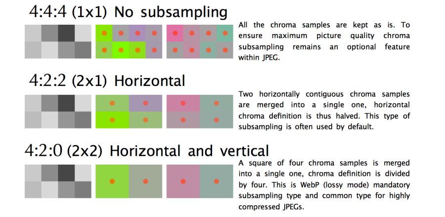
JPEG supports various subsample types: no subsample, horizontal, horizontal + vertical. Here is an illustration from Frederick Kaiser 's JPEG for Crab article.
When discussing a subsample, there are usually a number of common examples: 4: 4: 4, 4: 2: 2 and 4: 2: 0. What are they? Suppose a subsample has the format A: B: C. Here A is the number of pixels in a line, for JPEG it is usually 4, B is the number of colors in the first line, and C is the number of colors in the second.
- In
4:4:4no compression, color and brightness are transmitted completely. - In
4:2:2half sampling horizontally and full vertically. - In
4:2:0used colors from half the pixels of the first row.
Note: jpegtran and cjpeg support separate brightness and chrominance configurations via a flag-sample(for example,-sample 2x1). Some common rules: Sub-sampling (-sample 2x2) is great for photos. It is better to disable it (-sample 1x1) for screenshots, banners and buttons. Finally,2x1in case there is no certainty which option to use.
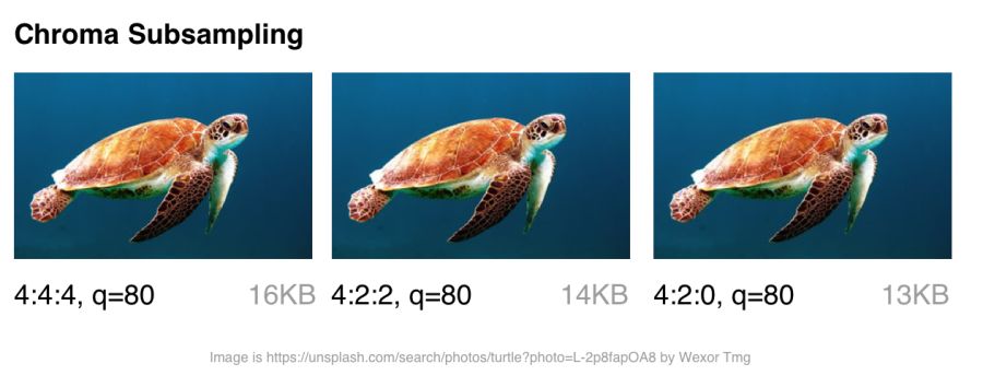
By reducing the number of pixels, you can significantly reduce the size of the color components, ultimately reducing the file size.
Color sub-sampling options for JPEG with a quality of 80
Color sub-sampling is useful for most images, although there are obvious exceptions: it is better not to use it where color detailing is as important as brightness (for example, medical images).
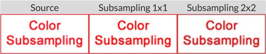
Suffer and pictures with the image of fonts. Sharp edges are harder to compress using JPEG because it is designed to better handle photographic scenes with softer transitions.
When working with text, the JPEG Study Textbook recommends adhering to 4: 4: 4 (1 × 1) subsampling.
By the way: the JPEG specification does not specify the exact method of color sub-sampling, therefore different encoders / decoders come in different ways. MozJPEG and libjpeg-turbo use one method, and older versions of libjpeg use another method, which adds artifacts.
Note: Photoshop automatically chooses color subsampling when “save to web”. If the quality is set in the range of 51–100, then downsampling is not used (4: 4: 4). When quality is lower, 4: 2: 0 is set. This is one of the reasons why file size decreases dramatically when switching quality from 51 to 50.
Note: The term YCbCr is often mentioned in the discussion of downsampling . This is a model of RGB color space with gamma correction. Y is the brightness with gamma correction, Cb is the chroma component of blue, and Cr is red. If you look at ExifData, you will see YCbCr next to the sample levels.
For more information, see the article “Why don't you use color subsampling?”
Improved JPEG
What is the current state of jpeg formats on the internet?
tl; dr: browser support is very different. If you use modern development, you often have to give different browsers different formats.
Various modern formats (and optimizers) show compression quality with a target file size of 26 KB. Quality is compared with the SSIM (Structural Similarity) and Butteraugli tools , which we will discuss in more detail later.
- JPEG 2000 (2000) - improved compression by replacing the discrete cosine transform with wavelets. Browser support: Safari and iOS desktop .
- JPEG XR (2009) is an alternative to JPEG and JPEG 2000 that supports HDR and wide color gamut . Creates files smaller than JPEG, with slightly less encoding / decoding speed. Browser support: Edge, IE .
- WebP (2010) - Google’s block-predicted format supports lossy and lossless compression. Provides better compression than JPEG, and supports transparency as PNG. There is not enough color subsampling and progressive loading settings. Decoding speed is lower than JPEG. Browser Support: Chrome, Opera. Experimental support in Safari and Firefox .
- FLIF (2015) is a lossless compression format that surpasses PNG, WebP lossless, BPG lossless, and JPEG 2000 lossless compression ratio. Browser support: no, but there is a JS decoder .
- HEIF and BPG . In terms of compression, they are the same, but they are shipped in different wrappers:
- BPG (2015) - JPEG replacement with more efficient HEVC ( High Efficiency Video Coding )based compression. It seems to provide a smaller file size compared to MozJPEG and WebP. It is unlikely to receive widespread support due to licensing issues. Browser support: no, but there is a JS decoder .
- HEIF (2015) is a format for images and image sequences encoded with HEVC with interframe prediction. Apple announced at WWDC that it will study the transition from JPEG to HEIF in the iOS operating system, which will reduce the file size up to two times. Browser support: none at the time of writing. Should appear in desktop Safari and iOS 11 .
If you like to perceive information in graphical form, you can rate one of these visual comparison tools for some of the above formats.
Thus, browser support is very different . To use any of the above formats, you may have to give different copies to each of the target browsers. We see certain perspectives of WebP at Google, so we’ll take a closer look at this format in more detail.
You can also produce different formats (for example, WebP, JPEG 2000) with the same .jpg extension (or any other) because the browser can choose a content-type to render regardless of the extension. This allows you to specify a content-type.on the server side without changing the HTML document at all. Services like Instart Logic use this approach.
Next, let's talk about situations where it is impossible to produce images in different formats: JPEG-optimizers will help here .
JPEG optimizers
Modern JPEG codecs are trying to reduce the size of JPEG files, while maintaining the highest quality and compatibility with existing browsers and applications. They eliminate the need to use new image formats and make changes to the ecosystem. Two such encoders are MozJPEG and Guetzli.
tl; dr: Which optimized JPEG codec to use?
- Most files: MozJPEG
- If quality is important and you agree on long coding: Guetzli
- If configurability is needed:
What is MozJPEG?
Mozilla offers an upgraded JPEG encoder - MozJPEG . According to the developers, it reduces the size of JPEG files to 10%. Files compressed with MozJPEG open in all browsers, and among the supported features are progressive scanning, trellis quantization (removing parts that are worst compressed) and several advanced quantization table templates that help create smoother High-DPI images (although this is possible with ImageMagick, if you are ready to wade through the wilds of the XML configuration).
MozJPEG is supported by ImageOptim and for it there is a relatively reliable custom imagemin plugin . Here is an example implementation using Gulp:
const gulp = require('gulp');
const imagemin = require('gulp-imagemin');
const imageminMozjpeg = require('imagemin-mozjpeg');
gulp.task('mozjpeg', () =>
    gulp.src('src/*.jpg')
    .pipe(imagemin([imageminMozjpeg({
        quality: 85
    })]))
    .pipe(gulp.dest('dist'))
);
MozJPEG: Comparison of file size and visual similarity scores on different qualities
To calculate the SSIM scores (structural similarity with the original image), I used jpeg-compress from the jpeg-archive project.
In my experience, MozJPEG is a good option for compressing images for the Internet with high quality while reducing file size. For small and medium-sized images, MozJPEG (with a quality of 80–85) reduces files by 30–40% while maintaining acceptable SSIM and an improvement of 5–6% in jpeg-turbo. It encodes more slowly than basic jpeg , but the difference is not critical.
Note: if you need a tool that supports MozJPEG with additional configuration and some free tools for comparing images, look at jpeg-recompress . Jeremy Wagner, author of the book Web Productivity in Action, successfully used the program in this configuration.
What is Guetzli?
Guetzli is Google 's promising, but very slow, perceptual JPEG codec. He is trying to find the smallest JPEG, perceptually indistinguishable from the original. The codec performs a series of experiments, offering options for comparison, and takes into account the psycho-visual error of each option. The final result is the one with the highest score.
To measure the differences between images, Guetzli uses Butteraugli , a model based on human perception (discussed below). Guetzli takes into account some properties of human vision that are not taken into account by other JPEG codecs. For example, there is a relationship between the amount of visible green light and the sensitivity to blue, so changes in blue around green can be encoded less accurately.
Note: The file size depends much more on the choice of encoding level than on the choice of codec. Between low and high quality levels in jpeg is much, much bigger difference than when changing codec. It is very important to specify the minimum acceptable level of quality. Be sure to pay attention to this indicator so that it does not turn out to be too high.
Guetzli claims a difference in file size of 20–30% without reducing Butteraugli’s score compared to other compressors. Guetzli's big drawback is its extreme slowness, so at the moment it is only suitable for static content. A large amount of consumed memory is indicated in the README: encoding takes about 1 minute and 200 MB of RAM per megapixel. GitHub has a good thread with a discussion of actual Guetzli experience. The codec is ideal for optimizing images when building a static site, but to a lesser extent suitable for running on demand.
Tools like ImageOptim support Guetzli optimizations (in recent versions ).
const gulp = require('gulp');
const imagemin = require('gulp-imagemin');
const imageminGuetzli = require('imagemin-guetzli');
gulp.task('guetzli', () =>
    gulp.src('src/*.jpg')
    .pipe(imagemin([
        imageminGuetzli({
            quality: 85
        })
    ]))
    .pipe(gulp.dest('dist'))
);
Encoding Guetzli images of 3000 × 3000 pixels with different levels took almost seven minutes. It makes sense for archival storage of high-resolution photos.
Guetzli: comparing file sizes and assessing visual similarities for different qualities
Note: It is recommended to run Guetzli on high-quality images (for example, uncompressed source images, PNG or JPEG with about 100% quality). Although the effect is on other images (for example, JPEG quality 84 or lower), but the results are worse.
Guetzli spends very (very) a lot of time and will make the CPU cooler unwind, but worth it. I saw a number of examples when the file size was reduced by 40% while maintaining visual accuracy. This makes it an ideal choice for archiving photos. On images of small and medium size, there is also some savings (in the range of 10−15 KB), but not so significant. When compressing very small images, Guetzli can introduce “liquid-like” distortions.
For a variety of use cases , you might be interested in comparing Guetzli with Cloudinary automatic compression in Eric Portis research.
Comparing MozJPEG and Guetzli
It is difficult to compare different JPEG codecs: it is necessary to evaluate both the quality and accuracy of the compressed image, not just the size. As the image compression expert Corneille Lesinski notes, the benchmark of only one, and not both, aspects can lead to wrong conclusions.
What do Guetzli and MozJPEG look like in comparison? Corneille approach:
- Guetzli is suitable for higher quality images (the optimal butteraugli score is calculated for q = 90 +, and for MozJPEG - around q = 75)
- Guetzli is much slower (both produce standard JPEGs, so decoding is equally fast, as usual)
- MozJPEG does not automatically select the quality setting, but you can find the optimum quality using an external tool, for example, jpeg-archive
There are a number of methods for determining the visual or perceptual similarity of compressed images with the source code. SSIM (structural similarity) is often used in research . However, Guetzli is optimized for Butteraugli.
Butteraugli
The Butteraugli system determines the moment when a person begins to notice the difference (psycho-visual similarity) between the two images. Butteraugli not only gives an estimate, but also makes a spatial map of the level of differences. While SSIM summarizes all the errors, Butteraugli looks for the maximum.
In this example, Butteraugli searches for a minimum JPEG quality threshold so that the user does not notice the visual difference between the images. This reduced the file size by 65%.
In practice, you determine the level of visual quality, and then run several image optimization strategies, looking at Butteraugli estimates, before choosing a result that matches the optimal balance between file size and compression level.
It took me about 30 minutes to localize the Butteraugli setup after installing Bazel and building the C ++ source code for correct compilation on a Mac. Its use is relatively simple: specify two images for comparison (source and compressed version) - and get an estimate
How does Butteraugli differ from other ways of assessing visual similarity?
One of the developers of Guetzli says that Guetzli is better for Butteraugli, worse for SSIM, and MozJPEG is about equally good for both metrics. This is the strategy I use to optimize images. I run Butteraugli and a Node module like img-ssim to compare SSIM ratings before / after Guetzli and MozJPEG.
Encoder Association?
As practice has shown, the combination of Guetzli and MozJPEG without loss (jpegtran, not cjpeg, so as not to discard the work done by Guetzli) allows you to further reduce the file size by 10−15% (55% overall) with a very slight decrease in the SSIM score. This requires verification and analysis, but other specialists like Aria Hidayat tried - and got the same promising result.
MozJPEG is a convenient beginner codec that compresses files for the web relatively quickly and provides good image quality. At the same time, Guetzli is resource intensive and works best on large, high-quality images: I would recommend this option to advanced and professional users.
What is WebP?
WebP is Google’s latest graphic format that seeks to reduce file sizes under lossless and lossy compression, providing an acceptable visual quality. Supports alpha channel (transparency) and animation.
WebP is improving: over the past year, it added a few percent in lossless and lossy compression, the coding speed was twice as fast, and the decoding speed increased by 10%. WebP is not a universal tool, but its popularity is growing. Let's take a look at why.
WebP: comparing file sizes and evaluating visual similarities at different quality levels
How does webp work?
Lossy compression
Developers say that with lossy compression using the VP8 or VP9 codec, files are reduced by an average of 25–34% compared to JPEG.
In the low quality range (0–50), WebP has a great advantage over JPEG, because it blurs ugly blockiness artifacts. Medium quality setting (-m 4 -q 75) —the default balance of speed and file size. In the high quality range (80–99), the advantages of WebP are minimal. WebP is recommended where speed is more important than quality.
Lossless compression
WebP files with lossless compression are 26% smaller than PNG files . Download time is reduced by 3% compared to PNG. However, lossless compression is not commonly used on the Internet. This option is better suited for archival storage.
Transparency
WebP has an 8-bit transparency channel with lossless compression of only 22% more bytes than PNG. It also supports lossy RGB transparency; this is a unique feature of WebP.
Metadata
The WebP format supports metadata of EXIF photos and digital XMP documents, and also contains an ICC color profile.
WebP provides better compression due to higher CPU utilization. Back in 2013, WebP compression was about 10 times slower than that of JPEG, but now the difference is not so significant (some images can be compressed twice as slowly). For static images that are processed during the build process, this should not be a big problem. Dynamically generated images are likely to cause noticeable use of the CPU, which will have to be considered.
Note: WebP's lossy quality settings do not match the JPEG settings. For example, JPEG with a quality of 70% will be very different from a WebP image with a quality of 70%, because WebP achieves smaller file sizes, discarding more data.
Who uses webp in production?
Many large companies use WebP in production to reduce costs and increase page loading speed.
Google reported a 30–35% savings on WebP compared to other lossy compression schemes. Google produces 43 billion images per day, 26% of which are compressed without loss. These are many requests and significant savings. Undoubtedly, it will increase even more when browsers improve support for WebP . Google uses this format on Google Play, YouTube and other sites.
Netflix, Amazon, Quora, Yahoo, Walmart, Ebay, The Guardian, Fortune, and USA Today compress and display WebP images for browsers that support it. The VoxMedia publisher reduced the download time for The Verge pages by 1-3 seconds by switching to WebP for Chrome users. Site500px recorded a decrease in file sizes by an average of 25% with the same or better quality.
In addition to the above, other companies use WebP.
Using WebP with Google: 43 billion pictures of WebP are issued daily on YouTube, Google Play, Chrome Data Saver and G +
How does WebP coding work?
For static images, WebP is an alternative to JPEG. In lossy coding, there are three key stages:
Macro-blocking — splitting an image into (macro) blocks of 16 × 16 pixels of brightness and blocks of 8 × 8 pixels of chromaticity. This is similar to how JPEG converts a color space, breaking it into blocks and lowering the number of pixels on the color channels.
Prediction — For each 4 × 4 subblock, a prediction model is compiled that effectively performs filtering. It is determined by two sets of pixels around the block: A (the line immediately above) and L (left column). Using these two sets, the encoder fills the 4 × 4 test block with pixels and determines which values are closest to the source block. Colt Macanlis talks about this in more detail in an article. how WebP works in lossy compression mode.
The discrete cosine transform (DCT) is applied in several steps, as in JPEG. The key difference is the use of arithmetic compression , not a Huffman algorithm, as in JPEG.
For more information, I recommend the article "WebP Compression Methods" from Google Developer.
WebP Browser Support
Not all browsers support WebP, but according to CanIUse.com , global support is about 74%. Chrome and Opera support the format. Safari, Edge and Firefox are experimenting, but have not yet implemented support in official versions. Because of this, WebP issuance often depends on the web developer. More on this later.
Here are the main browsers and support information for each of them:
- Chrome: full support from version 23
- Chrome for Android: starting with Chrome 50
- Android: from 4.2
- Opera: from 12.1
- Opera Mini: all versions
- Firefox: some beta support
- Edge: some beta support
- Internet Explorer: no
- Safari: some beta support
WebP is not without flaws. It lacks full-resolution color space options and does not support progressive decoding. However, a decent toolkit has been created for WebP, and browser support is enough to consider WebP output as one of the options.
How to convert images to webp?
Several commercial and free editors support WebP. One of the most useful applications is XnConvert: a free cross-platform batch converter.
Note: It is important to prevent WebP images from being low or medium quality JPEGs being converted. This is a common mistake that generates WebP images with JPEG compression artifacts. This reduces the effectiveness of WebP, since it has to save both the image and JPEG distortion , which leads to a double loss of quality. Download the file of the highest quality to the converter, preferably the original.
XnConvert
XnConvert batch processes images in more than 500 formats. You can combine more than 80 separate actions to convert or edit images in different ways.
XnConvert supports batch image optimization by performing direct conversion from source files to WebP and other formats. In addition to compression, XnConvert can remove metadata, crop images, adjust color depth, and perform other transformations.
Some of the parameters listed on the xnview website:
- Metadata: Editing
- Transformations: rotate, cut, resize
- Adjustments: brightness, contrast, saturation
- Filters: blur, relief, sharpness
- Effects: masks, watermarks, vignetting (partial dimming)
Results of operations can be exported to approximately 70 different file formats, including WebP. XnConvert is a free program for Linux, Mac, and Windows. This is a great option, especially for small businesses.
Node Modules
Imagemin is a popular image compression module that has an extension to convert to WebP ( imagemin-webp ). Lossy and lossless compression is supported.
To install imagemin and imagemin-webp, run:
> npm install --save imagemin imagemin-webpThen we can add () in both modules and run them on any images (for example, JPEG) in the project directory. Below we use lossy coding with the quality of the WebP 60 encoder:
const imagemin = require('imagemin');
const imageminWebp = require('imagemin-webp');
imagemin(['images/*.{jpg}'], 'images', {
    use: [
        imageminWebp({quality: 60})
    ]
}).then(() => {
    console.log(‘Images optimized’);
});
As in JPEG, you can notice compression artifacts in the final image. See for yourself what level of compression is adequate for your files. Imagemin-webp can also be used to encode WebP images without loss of quality (with 24-bit color support and full transparency) by specifying the parameter
lossless: true:const imagemin = require('imagemin');
const imageminWebp = require('imagemin-webp');
imagemin(['images/*.{jpg,png}'], 'build/images', {
use: [
imageminWebp({lossless: true})
]
}).then(() => {
console.log(‘Images optimized’);
});WebP plugin for Gulp from Sindre Sorgus is based on imagemin-webp, there is also a WebP uploader for WebPack . The Gulp plugin understands all the imagemin extension options:
const gulp = require('gulp');
const webp = require('gulp-webp');
gulp.task('webp', () =>
    gulp.src('src/*.jpg')
    .pipe(webp({
        quality: 80,
        preset: 'photo',
        method: 6
    }))
    .pipe(gulp.dest('dist'))
);
Or lossless compression:
const gulp = require('gulp');
const webp = require('gulp-webp');
gulp.task('webp-lossless', () =>
    gulp.src('src/*.jpg')
    .pipe(webp({
        lossless: true
    }))
    .pipe(gulp.dest('dist'))
);
Batch Image Optimization with Bash
XNConvert supports batch compression, but everything can be done from the command line.
Batch image conversion to WebP format using cwebp :
find ./ -type f -name '*.jpg' -exec cwebp -q 70 {} -o {}.webp \;Optimization codec MozJPEG using jpeg-recompress :
find ./ -type f -name '*.jpg' -exec jpeg-recompress {} {} \;and trimming SVG using the svgo program (which we will look at later):
find ./ -type f -name '*.svg' -exec svgo {} \;Jeremy Wagner wrote a more complete article on optimizing images in Bash and another one on parallelizing this task.
Other applications for processing and editing WebP
- Leptonica is a whole web site of free applications for image processing and analysis.
- Sketch supports saving to webp.
- GIMP is an open source free alternative to Photoshop.
- ImageMagick - create, layout, transform and edit raster graphics. Free, running from the command line.
- Pixelmator is a commercial image editor for Mac.
- Photoshop WebP Plugin is a free plugin from Google. Import and export images in Photoshop.
For Android, you can convert existing BMP, JPG, PNG and static GIF images to WebP format using Android Studio. See “Creating WebP Images Using Android Studio” for more information .
How to view WebP images on my OS?
Although WebP images always open in a browser on the Blink engine (Chrome, Opera, Brave), they can be viewed directly from the OS using an add-in for Mac or Windows.
Several years ago, Facebook experimented with WebP and noticed a problem: some users saved pictures to disk, and then they could not open them. Here are three key issues:
- After saving, you cannot view the WebP files locally. This is fixed in Chrome, which now registers the .webp extension for itself.
- After saving, the image is sent by email to a person who does not have Chrome. Facebook solved the problem by introducing a large “Download” button, which gives JPEG.
- Copying the URL of the image with the subsequent publication on the Internet is solved by agreeing the content-type .
Your users may not have such problems, but this is an interesting note in the margins. Fortunately, today there are utilities for viewing WebP under different operating systems.
On a Mac, try the Quick Look WebP plugin (qlImageSize). It works well:
Under Windows, you can download the WebP codec pack , which adds the WebP viewing option to File Explorer and Windows Photo Viewer.
How to give WebP?
Browsers without WebP support will not show any pictures. To avoid this, there are several strategies.
The Chrome DevTools Network panel with selection of WebP type files that are sent to browsers on the Blink
Play Store engine gives WebP browsers to Blink and JPEG to others, such as Firefox.
Here are some options for delivering WebP images to users:
Use .htaccess for issuing copies of WebP
Here's how to use .htaccess to output WebP files in supported browsers, if the server has a webp version of the JPEG / PNG file.
Vincent Orbach recommended this approach:
Browsers can explicitly signal support for WebP through the Accept header . In this case, you can give the server a WebP version of the image. But this is not always possible (for example, for static hosts, such as GitHub or S3 pages), so be sure to check before considering this option.
Below is an example .htaccess file for the Apache web server:
<IfModule mod_rewrite.c>RewriteEngineOn# Check if browser support WebP imagesRewriteCond%{HTTP_ACCEPT} image/webp
  # Check if WebP replacement image existsRewriteCond%{DOCUMENT_ROOT}/$1.webp -f
  # Serve WebP image insteadRewriteRule (.+)\.(jpe?g|png)$ $1.webp [T=image/webp,E=accept:1]</IfModule><IfModule mod_headers.c>Header append Vary Accept env=REDIRECT_accept
</IfModule>AddType  image/webp .webp
If there are problems with displaying WebP graphics, make sure that the image / webp MIME type is enabled on the server.
On Apache, add the following code to the .htaccess file:
AddType image/webp .webpOn Nginx, add the following code to the mime.types file:
image/webp webp;Note: Vincent Orback provides a sample htaccess for issuing WebP, and Ilya Grigorik maintains a collection of configuration scripts for issuing WebP that can be useful.
Using the <picture> tag
The browser itself is able to select the image format using the <picture> tag. Inside <picture> there is a set of <source> elements, with one <img> tag for each where the image is actually contained. The browser scans the <source> and requests the first matching one. If the <picture> tag is not supported, then the <div> is rendered using the <img> tag.
Note: Be careful with the order of the <source> elements. Do not place image / webp sources after obsolete formats, but place them in front of them. You can also place the images in ascending file size if they have the same size in pixels (when the attribute is not used media). Usually it turns out the same order as when first specifying newer formats.Here are some HTML examples:
<picture><sourcesrcset="/path/to/image.webp"type="image/webp"><imgsrc="/path/to/image.jpg"alt=""></picture><picture><sourcesrcset='paul_irish.jxr'type='image/vnd.ms-photo'><sourcesrcset='paul_irish.jp2'type='image/jp2'><sourcesrcset='paul_irish.webp'type='image/webp'><imgsrc='paul_irish.jpg'alt='paul'></picture><picture><sourcesrcset="photo.jxr"type="image/vnd.ms-photo"><sourcesrcset="photo.jp2"type="image/jp2"><sourcesrcset="photo.webp"type="image/webp"><imgsrc="photo.jpg"alt="My beautiful face"></picture>Automatic conversion to WebP on the CDN side
Some CDNs support automatic conversion and WebP output at the client’s request whenever possible . Check your CDN for support. Perhaps the problem is solved very simply.
WordPress support
Jetpack : a popular WordPress plugin, includes a CDN image service called Photon with WebP support. It is included in the free version of the Jetpack, which is very practical and useful. The disadvantage is that Photon automatically resizes the image, puts the query string in the URL, and for each image an additional DNS query is performed.
Cache Enabler and Optimizer : if you are using WordPress, there is at least one open source option. In the menu plug Cache EnablerThere is a checkbox for caching and displaying WebP images, if the user's browser supports them. This makes it easier to work with WebP. There is also a disadvantage here: Cache Enabler requires the use of a related program Optimizer, for which an annual fee is charged. This is not very typical of open source solutions.
Short Pixel : another version of the optimizer for Cache Enabler, also paid. In terms of functionality, Short Pixel is very similar to the Optimizer mentioned. Allows you to optimize for free up to 100 photos per month.
Compress GIF animations and why <video> is better
Animated GIFs are still widely used, despite their narrow specialization. Although everything from social networks to popular media sites, using GIF-animation abundantly, this format was never meant for video or animation. In fact, the GIF89a specification clearly indicates that "GIF is not intended to serve as a platform for animation." The number of colors, the number of frames and proportions - all this affects the size of the animated GIF. Replacing video format gives maximum savings.
Comparing the size of GIF-animation and video in equivalent quality.
The output of the same video in MP4 format reduces the file size by 80% or more.Besides the fact that GIF files waste traffic, they take longer to load, contain fewer colors and usually do not look very nice. You may have noticed that GIF animations uploaded to Twitter work better there than on other sites. This is because Twitter animated GIFs are not really GIFs . To improve quality and reduce traffic, Twitter automatically converts them to video. Similarly, Imgur converts GIF to MP4 when loaded .
Why are GIFs so many times larger? Because they store each frame as a GIF without loss - yes, without loss. Poor GIF quality is not caused by compression, but by a palette of 256 colors. The format does not analyze adjacent frames for compression, unlike video codecs like H.264. MP4 video stores each keyframe as a lossy JPEG, discarding some of the original data to achieve better compression.
If you can switch to video
- Use ffmpeg to convert animated GIFs (or source files) to MP4 (H.264). I run such a one-liner from Rigor :
ffmpeg -i animated.gif -movflags faststart -pix_fmt yuv420p -vf "scale=trunc(iw/2)2:trunc(ih/2)2" video.mp4 - The ImageOptim API also supports the conversion of animated GIF to WebM / H.264 and removes GIF anti-aliasing, which further enhances compression.
If you have to use animated gifs
- Tools like Gifsicle remove metadata, unused palette colors and minimize changes between frames.
- Consider lossy GIF encoding. Giflossy - fork Gifsicle, which supports the flag
-lossyand compresses the animation by 60−65%. On its basis, a good tool made Gifify . Convert non-animated GIFs to PNG or WebP format.
For more information, see the Rigor GIF Book .
SVG Optimization
Minimizing SVG files means removing everything that is unnecessary. As a rule, the SVG from the editor contains a lot of redundant information (metadata, comments, hidden layers, and so on). Often it can be safely removed or minimized without affecting the visual result.
In the SVGOMG service from Jake Archibald, you can choose different optimization methods with an instant view of the result.
Some common rules for optimizing SVG (SVGO)
- Minify SVG files and compress to gzip, because SVG is just text-based XML resources like CSS, HTML and JavaScript. To improve performance, they should be minimized and compressed.
- Instead of ways using SVG standard forms, such as
<rect>,<circle>,<ellipse>,<line>and<polygon>. This will reduce the amount of markup needed and the amount of code for parsing and rasterization in the browser. - If you need to use paths, try reducing them. Simplify and merge curves and paths where possible. The simplify tool in Illustrator well removes unnecessary points even in complex works, smoothing out irregularities.
- Avoid groups. If you can not, try to simplify them.
- Remove invisible layers.
- Avoid the effects of Photoshop and Illustrator. They can be converted into large bitmaps.
- Carefully check for embedded bitmaps that are not suitable for SVG.
- Use the tool to optimize SVG, here is the indispensable SVGOMG web interface for SVGO . If you use Sketch, an excellent Sketch plugin for SVGO reduces the file size when exporting.
SVGO efficiency in high accuracy mode (−29% of the original file size) and low accuracy (−38%)
SVGO is an SVG optimization tool for Node. It reduces file size by lowering the precision of numbers in the definitions. Each digit after a point is an extra byte, so a change in accuracy (number of digits) greatly influences the file size. But be very careful, because the decrease in accuracy can visually affect the shape of the image.
It is important to note: although SVGO succeeded in the previous example without unduly simplifying the ways and forms, it often happens otherwise. See how rocket flare distorts with decreasing accuracy
SVGO from the command line:
SVGO can be set up as a CLI if you prefer the command line:
npm i -g svgoOptimizing the SVG file:
svgo input.svg -o output.svgAll possible parameters are supported, including the floating point precision setting:
svgo input.svg --precision=1 -o output.svgSee the readme for a complete list of supported parameters.
Do not forget to squeeze SVG!
Also, do not forget to zip the SVG files or issue them using the Brotli protocol. The text format will compress very well (~ 50% of the source code).
When Google released the new logo, we announced that its minimum version only takes 305 bytes.
There are many advanced tricks to even more shrink the file (up to 146 bytes)!
SVG sprites
SVG is great for icons, offering visualization in the form of a sprite without the quirky workarounds required for fonts. It has better control of CSS styles than fonts (SVG stroke properties), better control of positioning (no need to bother with pseudo-elements and
display), and SVG is much better supported in browsers . Tools like svg-sprite and IcoMoon automate the integration of SVG into sprites that can be used in the CSS Sprite , Symbol Sprite or Stacked Sprite . Worth learning practical tipsfrom Una Kravets, how to use gulp-svg-sprite in your workflow. Sarah Sudein in her blog describes the transition from icon fonts to SVG .
Additional materials
Sarah Soayeidan’s SVG Issuing Optimization Tips and Chris Koyer's “The SVG Practice Book” are excellent. I found very helpful articles by Andreas Larsen on SVG optimization ( part 1 , part 2 ). I can also recommend the article “Preparing and exporting SVG icons to Sketch” .
Avoid pinching graphics with loss of quality.
It is always recommended to compress the image from source. Re-clamping is fraught with unpleasant consequences. Suppose you take a JPEG that is already compressed with a quality of 60. If you re-compress it with a loss, it will look worse. Each additional round of compression will lead to an additional loss of quality - information is removed, and artifacts accumulate. Even if you pinch with high quality settings.
To avoid this trap, immediately set the minimum acceptable quality , and get the maximum savings from the outset. Then you will not re-compress, because any lossy file compression will look bad, although it will reduce the file size.
Example from excellent video and accompanying articleJohn Snayers shows the effect of clamping in different formats. Such a problem can be encountered if you save (already compressed) pictures from social networks and re-upload them (with repeated compression). The loss of quality is growing
MozJPEG (perhaps by accident) is more resistant to such degradation due to trellis quantization. Instead of compressing all DCT values as they are, it looks for close values in the + 1 / -1 range to compress them into fewer bits. A lossy FLIF uses a hack similar to a lossy PNG, where before (re) compression the codec analyzes the data and decides what to throw away.
Source files store them in a lossless format, such as PNG or TIFF, to maintain maximum quality.. Then the assembly tools or compressors will prepare a compressed version that you will give to users with minimal loss in quality.
Reduce unnecessary decoding and resizing costs
We all gave users large images with too high resolution. You have to pay for it. Decoding and resizing - resource-intensive operations for the browser on a regular mobile phone. If you give large images, scaling them with CSS or width / height attributes, you will see how this affects performance.
When the browser receives an image, it must decode it from the original source format (for example, JPEG) into a bitmap image in memory. Often the image requires resizing (for example, the width is set as a percentage). Decoding and resizing images - demanding operations that slow down rendering
Ideally, give the images that the browser displays without resizing. So give the minimum size pictures for the relevant screens and resolutions, using
srcset/sizes - in the near future we will consider srcset. Skipping attributes
widthor heightmay also adversely affect performance. Without them, the browser assigns the smallest filler area to the image until it has received enough bytes to determine the correct size. At this point, the markup of the document must be updated using the resource-intensive operation reflow. Browsers need to take a few steps to draw a picture on the screen. Having received the image, it needs to be decoded and often resized. These events can be tracked on the timeline.Chrome DevTools
Large images also take up memory: about 4 bytes per pixel after decoding. If you are not too careful, you can literally hang the browser; on low-end devices it’s not so difficult to bring the situation to a swap. So watch out for decode, resize, and memory consumption.
Image decoding can be incredibly resource intensive on mobile phones in the middle and lower levels. In some cases, it is 5 or more times slower than on the desktop.
When developing a new mobile version, Twitter greatly increased the speed of image decoding by setting the correct dimensions. For many images, the decoding time has decreased from ~ 400 ms to ~ 19 ms!
The Timeline / Performance panel in Chrome DevTools shows the time it takes to decode an image on Twitter Lite before and after optimization.
HiDPI Image Delivery with srcset
Users can access the site through various mobile and desktop devices with high-resolution screens. The device pixel ratio (DPR) (also called “CSS pixel ratio”) determines how CSS should interpret the screen resolution. The DPR standard was created by phone manufacturers to increase the resolution and sharpness of mobile screens without reducing the elements.
For maximum quality, you should give the image with the most appropriate resolution. On devices with high-resolution screens, high-definition images (with DPR 2 ×, 3 ×) are given, and on standard screens - ordinary images, since pictures with DPR 2 × and 3 × are much heavier.
Device pixel ratio: many sites track DPR of popular devices via material.ioand mydevice.io
srcset allows the browser to select the optimal image for each device. For example, take a 2 × picture for a mobile display with a DPR 2 ×. Browsers without support
srcsetcan take the defaultsrcspecified in the tag<img>.<imgsrcset="paul-irish-320w.jpg,
paul-irish-640w.jpg 2x,
paul-irish-960w.jpg 3x"src="paul-irish-960w.jpg"alt="Paul Irish cameo">CDN for images like Cloudinary and Imgix support DPR for issuing images with optimal resolution from a single source.
Note: Learn more about the pixel ratio of the device and responsive images in this free Udacity course and Web Fundamentals image guide .
I remind you that Client Hints is also a suitable alternative to specifying all possible DPR and formats in responsive markup. Instead, the relevant information is added to the HTTP request so that the web server chooses the most appropriate option for a particular screen.
Artistic transformation
Although choosing the right resolution is important, some sites still think about beauty. If the user has a small screen, you can trim or zoom in - and display the object differently, making the best use of the available space. Although the artistic transformation (art direction) beyond the scope of this article, some services like Cloudinary provide API-interfaces to automate such tasks.
Eric Portis showed a great example of how to creatively use responsive images. In this example, the characteristics of the main object in the illustration are modified to make the best use of the available space.
Color management
Color can be viewed from at least three perspectives: biology, physics and printing. In biology, color is a phenomenon of perception . Objects reflect light in various combinations of wavelengths. Light receptors in the eyes translate these waves into a color sensation. In physics, wave frequencies and energy (brightness) are important. Printing is more about color gamut, colors and art models.
Ideally, all the screens and web browsers in the world should display the same color exactly. Unfortunately, this is not the case. Color management allows you to reach a compromise in the display of colors with the help of color models, spaces and profiles.
Color models
Color models are a system for creating a full spectrum from a smaller set of primary colors. There are different types of color spaces with different parameters for managing colors. Some spaces have fewer control parameters than others - for example, for all shades of gray, only one brightness parameter between black and white is sufficient.
Two common types of color models are additive and subtractive. Additive color models of the RGB type display the color with a glow, and subtractive CMYK types show the reflection (subtraction).
In RGB, red, green, and blue light are added in various combinations to produce a wide range of colors. CMYK (cyan, magenta, yellow and black) works with ink of different colors, taking away part of the white paper spectrum
Article“The concept of color models and color systems” describes well other color models and modes, such as HSL, HSV and LAB.
Color spaces
Color spaces are a specific range of colors that can be displayed for a given image. For example, in an image up to 16.7 million colors, and different color spaces allow you to narrow or expand this range. Some developers believe that color models and color spaces are one and the same.
sRGB is developed based on RGB as a standard for the Internet. This is a small color space, which is usually considered the lowest common denominator and the safest option for color management in browsers. Other color spaces (for example, Adobe RGB or ProPhoto RGBused in Photoshop and Lightroom) contain more diverse colors, but since sRGB is common in browsers, games, and monitors, it is usually used.
Gamma - color range visualization in color space
Three color channels are used in the color spaces (red, green, and blue), each with 255 colors in 8-bit mode, which gives 16.7 million colors. 16-bit pictures can display trillions of colors.
Comparing sRGB, Adobe RGB and ProPhoto RGB in a Yardstick image . It is incredibly difficult to illustrate this concept if your screen shows only sRGB colors. When comparing a normal photo in sRGB and a wide range, everything will be the same, except for the most saturated "rich" colors.
Color spaces differ in their gamma (range of colors that they can reproduce with hues), spectrum and gamma curve . sRGB is about 20% smaller than Adobe RGB, ProPhoto RGB is about 50% wider than Adobe RGB. The photos above are taken from the Clipping Path .
A wide gamut (wide-gamut) is a term meaning color spaces wider than sRGB. These types of displays are becoming more common. However, many digital displays are still simply not capable of displaying color profiles that are significantly better than sRGB. When saving for web in Photoshop, use the option to convert to sRGB, unless you are counting on displays with a wide color gamut.
Note: When working with original photos, do not use sRGB as the main color space. It is smaller in color spaces in most cameras and can lead to loss of information. Instead, work with a wide color space (for example, ProPhoto RGB), convert to sRGB only when exporting for the Internet.
Are there any cases where a wide gamut makes sense for web content?
Yes. If the image contains a very saturated / juicy / bright color - and you want to display it on compatible screens. However, in real photos this rarely happens. Often, you can easily tweak the settings so that the color looks bright, without going beyond the gamut of sRGB.
The reason is that human perception of color is not absolute. Perception works in relation to the environment - and it is easy to deceive. But if on the picture there is a trace of a fluorescent marker, then of course it is easier to show it in a wide range.
Gamma Correction and Compression
Gamma correction (or simply gamma) controls the overall brightness of the image. Changing the gamut can also change the ratio of red and green colors. Images without gamma correction often appear faded or dark.
In video and computer graphics, gamma is used for compression, similar to data compression. This allows you to compress useful brightness levels in fewer bits (8, not 12 or 16). The human perception of brightness is non-linearly proportional to the physical amount of light. Representing colors in their true physical form would be wasteful when coding for the human eye. Gamma compression (gamma compression) is used to encode brightness on a scale closer to human perception.
With gamma compression, the useful grayscale fits in with 8 bits of precision (0–255 in most RGB colors) because the luminance units are not linearly encoded. Imagine that you are in a dark room with one candle. Light the second - and notice a significant increase in brightness. Add a third candle and the room will become even brighter. Now imagine yourself in a room with a hundred candles. Light the 101st, 102nd candles - and you will not notice any changes.
In both cases, the same amount of light was physically added. But since the eyes are less sensitive to bright light, gamma-compression “compresses” bright values, so in physical units less accuracy is encoded there, but the scale itself is adjusted for people — and from a human point of view all values are equally accurate.
Note: Gamma correction or compression is different here from the gamma curves in Photoshop, the correct gamma compression is not similar.
Color profiles
A color profile is information that describes the color space of a device. It is used to convert between different color spaces. The task of profiles - so that the images were as similar as possible on all types of screens and carriers.
Images may have an embedded color profile according to the International Color Consortium (ICC) standard in order to accurately determine colors. Profiles are supported in various formats, including JPEG, PNG, SVG, and WebP, and most major browsers also support embedded ICC profiles. If the picture opens in the program and the monitor profile is known, the colors are adjusted accordingly.
Note: The color profiles of some monitors are similar to sRGB, so they will not be able to display colors from a wider range. Therefore, the introduction of digital profiles in images may be limited. Consider the features of your target audience.
The embedded color profiles also significantly increase the size of the images (sometimes by 100 KB or more), so be careful. Tools like ImageOptim automatically remove all color profiles that they find. If the ICC profile is deleted, the browser will start displaying the image in the color space of your monitor, which can lead to a change in saturation and contrast. So it makes sense to look for a compromise for each specific case.
The Nine Degrees Below website has an excellent selection of resources for managing ICC color profiles if you need more information.
Color profiles and browsers
In previous versions of Chrome, there was not much support for color management, but the situation was corrected in 2017 by implementing the Color Correct Rendering feature . If the display profile is different from sRGB (latest MacBook Pro), then it converts the colors from sRGB to a display profile. This means that the colors will become more similar in different systems and browsers. Safari, Edge and Firefox browsers also take into account ICC profiles, so images with different profiles are now displayed correctly, regardless of whether you have a wide color gamut or not.
Note: An excellent guide to the various ways to use color on the web is Sarah Drazner's “Guide to Color on the Internet” .
Sprites
In image sprites (or CSS-sprite) has a long history, they are supported by all browsers and have been a popular way to reduce the number of uploaded images by combining them into one larger image, which is cut into pieces.
Image sprites are still widely used on large production sites, including the Google homepage.
According to the HTTP / 1.x standard, some used sprites to reduce the number of HTTP requests. This had a number of advantages, but it required accuracy due to the problem of invalidating the cache — changes to any small part of the sprite would invalidate the entire image in the cache.
Now splitting into sprites is against HTTP / 2 recommendations .. Since it has become possible to send many requests in one connection, it is better to upload images individually . Evaluate options for your situation.
Lazy loading of non-critical images
Lazy (delayed) loading is a practice of increasing productivity, when loading images to the browser is delayed until the user actually needs it. For example, images are loaded asynchronously when scrolling through a page. This can save traffic in addition to compressing images.
Pictures on the screen are loaded immediately. But the rest at this moment is not yet visible. They should not be downloaded immediately, but later - this is a lazy download. It occurs only if and when the user scrolls down the page.
Lazy loading is not supported by the browsers themselves (although this has been discussed in the past ). JavaScript is used instead.
Why is delayed loading useful?
She has many advantages:
- Saving traffic . You load the minimum amount of resources. This is always good, especially on smartphones with traffic rates.
- Save battery power . Less load on the browser - less battery consumption.
- Increase download speed . Reducing the load time of a heavy site with an abundance of graphics from a few seconds to almost zero is worth a lot. In fact, this difference may save the visitor on the site, rather than adding one in the bounce statistics.
However, as with other tools, great responsibility comes with great force.
Avoid deferred loading of images in scope. Use it for long lists (for example, products or custom avatars). Do not use it for the main picture on the page. Lazy loading in scope can slow down loading, both technically and for human perception. It kills preloading and progressive loading, and JavaScript generates extra work for the browser.
Be very careful with lazy loading images when scrolling.If you wait for the scrolling event directly, the user can see placeholders instead of pictures or get pictures before scrolling on them. One of the recommendations is to start a lazy download of the following images immediately after the previous one is displayed on the screen, regardless of user interaction.
Who uses deferred loading?
Lazy loading is applied by the majority of large sites with a large number of images. For example, Medium and Pinterest .
An example of a preview with a Gaussian blur of illustrations on the Medium.
On some sites (for example, Medium) a small blurry image (about 100 bytes) is displayed for preview, which, after delayed loading, turns into an illustration of normal quality.
José M. Perez talked about how to implement the Medium effect using CSS filters . He experimented with different graphic formats . Facebook also described its famous approach with 200-byte placeholders for capital photos. If you use webpack, thenLQIP loader will help automate some of these procedures.
To see a lazy download, just open your favorite catalog of high-quality photos, and then scroll down the page. Almost always you will see that the site loads only a few full-resolution images, and the rest is placeholders. As you scroll, the placeholders are replaced with full resolution images. This is a lazy download.
Recently, a new technique of vector , rather than raster, aggregates has become popular . She was offered by Tobias Baldauf in his SQIP tool . There, the Primitive utility generates an SVG preview of several simple forms, approximate with the main features of the image. The SVG is then optimized usingSVGO - and applies a Gaussian blur filter. The result is a SVG placeholder with a size of only 800-1000 bytes, which looks clear on any screens and gives a meaningful idea of what is on the real picture. Obviously, you can combine lazy loading and previewing images in low quality.
How to apply delayed loading?
For deferred loading there are a number of methods and plugins. I recommend Alexander Farkas lazysizes due to its decent performance, functionality, additional integration with the Intersection Observer and plugin support.
What can Lazysizes?
Lazysizes is a JavaScript library, it does not require any configuration. Just download the minified js file and include it in the web page.
Below is a sample code from the README file:
Add the 'lazyload' class to images / frames in combination with the data-src attribute and / or data-srcset.
Additionally, you can add the src attribute with a low-quality image:
<!-- non-responsive: --><imgdata-src="image.jpg"class="lazyload" /><!-- responsive example with automatic sizes calculation: --><imgdata-sizes="auto"data-src="image2.jpg"data-srcset="image1.jpg 300w,
    image2.jpg 600w,
    image3.jpg 900w"class="lazyload" /><!-- iframe example --><iframeframeborder="0"class="lazyload"allowfullscreen=""data-src="//www.youtube.com/embed/ZfV-aYdU4uE"></iframe>
For the web version of this book, I linked Lazysizes with Cloudinary (although you can use any alternative). This allows you to experiment freely and with minimal effort with various scales, quality, formats and regardless of whether you need a progressive download:
Features Lazysizes:
- Automatically detects changes in visibility of current and future elements of lazy loading.
- Support for standard responsive images (picture and srcset)
- Automatic sizing and aliases for media queries
- Works with hundreds of CSS image / frames, scripted pages and web applications.
- Extensibility: supports plugins
- Easy but mature decision
- SEO Improvement: Don't hide images / assets from crawlers
Other ways of lazy loading
Lazysizes is not the only option. There are other libraries:
- Lazy load xt
- BLazy.js (or [Be] Lazy)
- Unveil
- yall.js (Yet Another Lazy Loader) is about 1 kilobyte in size and uses the Intersection Observer where possible.
What are the disadvantages of lazy loading?
- Screen readers, some search bots and users with javascript disabled will not see images uploaded with javascript. But this disadvantage can be avoided with a fallback <noscript>.
- Listening to scrolling events can negatively affect scrolling performance. The browser will try to redraw the screen many times (redraw), but competent delayed loading libraries will be able to mitigate this negative effect due to throttling. One of the possible solutions is the Intersection Observer, which is supported in the library lazysizes.
Delayed loading is a common way to save traffic, reduce costs and improve user interaction. Evaluate how useful it is in your case. For more information, see the articles "Lazy loading images" and "Implementing progressive loading in Medium . "
How to avoid the trap display: none
Older solutions for responsive images mistakenly processed image requests when setting the CSS property
display. This could lead to a significant increase in the number of requests, which is another reason why it is preferable to use <picture> and <img srcset>. Have you ever written a media query that, under certain conditions, hides a picture in
display:none?<imgsrc="img.jpg"><style>
@media (max-width: 640px) {
img {
display: none;
}
}
</style>Or hide images with a class
display:none?<style>.hidden {
display: none;
}
</style><imgsrc="img.jpg"><imgsrc=“img-hidden.jpg" class="hidden">A quick check in the Chrome DevTools network panel shows that such “hidden” images are still loaded. In fact, this is the correct behavior of the browser according to the specification of embedded resources.
Does display: none help avoid src request?
<divstyle="display:none"><imgsrc="img.jpg"></div>Not. The specified image will still be requested. Here, the library cannot rely on display: none, because the request is sent before JavaScript changes src.
Does display: none help avoid the request background: url ()?
<divstyle="display:none"><divstyle="background: url(img.jpg)"></div></div>Affirmative answer. The CSS background is not extracted when parsing an element. The calculation of CSS styles for children with
display:noneless useful, since they do not affect the rendering of the document. Background images of child elements are not calculated and loaded. Jake Archibald has a great quest quiz on traps
display:none. If in doubt, how a particular browser handles image requests, open DevTools and check for yourself. Again, where possible, use <picture> and <img srcset> instead of relying on <display: none>.
Does it make sense to use CDN for image processing?
The time spent reading articles to set up your image processing pipeline and its subsequent refinement is often much more expensive than the fee for this service. Cloudinary offers a free service, Imgix gives a free trial, there is a free alternative to Thumbor , so there are a lot of options.
For the fastest page load, you need to optimize image loading, including providing responsive images with compression on the server side, automatic selection of the optimal format and resizing. It is important to give the image the correct size to the correct device in the correct resolution - and as soon as possible. This is not as easy as it seems.
Your server or CDN?
Image manipulation is a specific topic. Here everything is constantly changing, so let's start with a quote from an experienced specialist, and then continue.
“If your product itself is not related to image processing, then do not do it yourself. Services like Cloudinary [or Imgix, approx. auth.] cope much better and more efficiently. And if you're worried about the price, think about the cost of development and maintenance, as well as hosting, storage and delivery. ”- Chris Hmyr
At the moment, we tend to agree that it is better to use CDN for image processing. Consider two such services - as they correspond to the list of mentioned tasks.
Cloudinary and Imgix
Cloudinary and Imgix are well-known image processing CDNs. They are used by hundreds of thousands of developers and companies around the world, including Netflix and Red Bull.
Main
The first huge advantage CDN has over its own solution is that they use a distributed global network system to keep your images closer to your users. And with CDN, it is much easier for you to guarantee the relevance of the service with future changes in technology, because not everyone can independently monitor trends, make changes - this requires maintenance, tracking by browser support for new formats and immersion into the life of the image compression community.
Second: each service has a multi-level tariff plan: Cloudinary has a free tariff , Imgix has an inexpensive starting plan. Imgix offers a free trial , which is almost the same as the free fare.
Third: both services have an API. Developers can programmatically connect to a CDN and automate the process. Client libraries, framework plug-ins and API documentation are available, although some options are only available at expensive rates.
Let's move on to image processing.
We restrict discussion to static images. Cloudinary and Imgix offer a wide range of image processing methods. In standard and free tariffs, both support basic functions: compression, resizing, cropping, and generation of reduced copies.
Cloudinary Media Library: By default, Cloudinary produces regular, not progressive JPEGs . To activate this option, put the corresponding icon in the “Advanced Settings” or use the fl_progressive flag
Cloudinary names seven broad conversion categories , a total of 48 subcategories. Imgix has over 100 image processing operations .
What happens by default?
Cloudinary by default performs the following optimizations:
- JPEG encoding using MozJPEG (chosen instead of Guetzli by default).
- Clearing metadata (original image remains intact). To change this behavior and give pictures with metadata, add a flag keep_iptc.
- Ability to generate WebP, GIF, JPEG and JPEG-XR with automatic quality. To change the default settings, set the quality parameter manually.
- Optimize file size with minimal impact on quality when generating PNG, JPEG or GIF.
Imgix by default does not launch optimizations such as Cloudinary, but allows you to set the default quality. In Imgix, automatic parameters help automate the basic level of optimization in the image catalog.
Currently four methods are used :
- Compression
- Visual improvement
- File Format Conversion
- Remove red eye
Imgix supports the following image formats: JPEG, JPEG2000, PNG, GIF, animated GIF, TIFF, BMP, ICNS, ICO, PDF, PCT, PSD, AI.
Cloudinary supports the following formats: JPEG, JPEG 2000, JPEG XR, PNG, GIF, animated GIF, WebP, animated WebP, BMP, TIFF, ICO, PDF, EPS, PSD, SVG, AI, DjVu, FLIF, TARGA.
What about performance?
CDN performance mainly depends on latency and speed.
The delay is always a bit longer for fully uncached images. But as soon as the picture gets into the cache and diverges across the servers on the network, the global CDN finds the closest route to the user. Together with the savings in file size, this almost always eliminates latency problems compared to non-optimized images or single servers that try to serve the entire planet.
Both CDNs have wide coverage and fast servers, which reduces latency and increases download speed. Speed affects page load time, and this is one of the most important user and conversion metrics.
What is better?
Cloudinary has about 160,000 customers , including Netflix, eBay and Dropbox. Imgix does not report the number of users, but it is less than that of Cloudinary. However, Imgix includes heavyweights like Kickstarter, Exposure, unsplash, and Eventbrite.
There are so many parameters in image processing that cannot be objectively assessed, which makes it difficult to compare the performance of two services. Much depends on how you want to process the image (it will take different time), what size and resolution is needed in the end. In the end, the most important factor for you may be the cost.
CDN cost money. A heavy site with a lot of traffic can pay hundreds of dollars per month on CDN. A certain level of knowledge and programming skills is needed to get the most out of these services. But if you do not do anything unusual, then there will be no particular problems.
Conclusion
If you are now giving away images from your own server or planning to do so, you may need to think about a CDN.
Image caching
Resources can set caching rules via HTTP cache headers . In particular, it
Cache-Controldetermines who should cache responses for how long. Most of the images are static resources that will not change in the future. The best strategy for them is aggressive caching.
When configuring HTTP caching headers, set Cache-Control with a
max-ageone-year term (for example, Cache-Control:public; max-age=31536000). Such aggressive caching works well for most images, especially for long-lived ones, such as avatars and images in page headers.Note: if you upload images using PHP, caching will be disabled due to the default setting of session_cache_limiter . The problem can be circumvented bysession_cache_limiter('public')specifyingpublicandmax-age=. Alternatively, disabling the option and setting custom cache management headers.
Preloading important resources
Critical resources can be preloaded with <link rel = preload> .
<link rel=preload>- this is a declarative download that forces the browser to send a request for a resource without blocking the event onloadfor the document. This raises the priority of requests for resources that would otherwise only be found later during the parsing. For preloading images, the value is
asindicated as image:<link rel="preload"as="image" href="logo.jpg"/>In this way, optimized resource utilization for
<img>, <picture>, srcsetand SVG.Note: <link rel=preload>supported in Chrome and browsers on the Blink engine, such as Opera and Safari Tech Preview , and also implemented in Firefox.Sites such as Philips , Flipkart and Xerox are used
<link rel=preload>to preload their logos (often used at the beginning of the document). Kayak also applies a preload to the main image in the title loaded as quickly as possible.What is the Link preload header?
Link preloading is specified by an HTML tag or in an HTTP Link Header . In any case, the link tells the browser to start loading the resource into the cache memory, because the page is highly likely to expect this resource and you cannot wait until the preload scanner or the parser detects it.
The caption for images will look like this:
Link: <https://example.com/logo-hires.jpg>; rel=preload; as=imageWhen the Financial Times introduced such a title on its website, users began to open content 1 second faster :
From the bottom: with <link rel = preload>, above: without. Comparison for Moto G4 on the 3G channel under the WebPageTest test before and after optimization
Similarly, Wikipedia accelerated the download of “before the logo”, as described in their study .
What are the pitfalls in this optimization?
You need to be sure that the preloading of this particular resource is absolutely necessary, because it shifts the rest of the content to the end of the queue. Maybe you should focus on other content?
It is important to avoid
rel=preloadpreloading images without wide support in browsers (eg WebP) and avoid using responsive images defined in srcset, where the source of the image depends on the type of device. For more information, read the articles "Preloading and Priorities in Chrome" and "Preloading: what is it good for?"
Web performance budgets for images
Performance budget is the maximum limit that developers try not to exceed. For example, "no more than 200 KB of pictures on one page" or "the user interface should load in less than 3 seconds." When the budget is not executed - learn why this is happening and how to remedy the situation.
Budgets help discuss performance. When a design or business decision affects performance, check with the budget. If the change does not fit into the budget, this is the reason to postpone or revise it.
I found that the performance budget is best performed if monitoring is automated. Instead of exploring networks, a service is started manually, which automatically signals a budget overrun. Two such useful services are Caliber.and SpeedCurve .
As soon as a budget is determined by the size of the images, SpeedCurve starts monitoring and warns you of excess:
Caliber suggests setting a budget for each class of device. This is useful because the budget for the size of pictures for a desktop PC via WiFi may be very different from the budget for mobile phones.
Final Recommendations
Ultimately, the choice of image optimization strategy comes down to the types of images that you give to users, and a reasonable set of evaluation criteria to choose from. It can be SSIM or Butteraugli, and on a small set of illustrations you can trust your own eye: what looks better and what looks worse.
Here are my final recommendations:
If you can not give images in different formats, depending on the support in the browser:
- Guetzli + jpegtran from MozJPEG is well optimized with a JPEG quality of more than 90.
- For the web, quality is
q=90too wasteful. For ordinary pictures it is enoughq=80, and for DPR 2 × evenq=50. Since Guetzli does not go to such a low level, you can use MozJPEG for the web. - Corneille Lesinski recently improved the cjpeg team at mozjpeg by adding a tiny sRGB profile to help Chrome display natural color on wide color gamut displays.
- For the web, quality is
- PNG pngquant + advpng provides a pretty good speed / compression ratio.
If you can render images in different formats, depending on browser support, using <picture>, Accept or Picturefill header :
- Give away WebP for browsers that support it.
- Create WebP from original images of 100% quality. Otherwise, you will be sending to the browsers images of lower quality and larger volume with JPEG distortions and WebP distortions! If you compress the original images with the WebP codec, the distortions will be less noticeable, and the compression level will be higher.
- WebP default settings
-m 4 -q 75are good for most cases, as the optimal ratio of speed and compression ratio. - WebP has a special lossless compression mode (
-m 6 -q 100), which reduces files by examining all combinations of parameters. This is an order of magnitude slower, but worth it for static resources.
- The backup option is Guetzli / MozJPEG for browsers that do not support WebP.
Successful compression!
Note: for more practical image optimization tips, I highly recommend the book Web Performance in Action by Jeremy Wagner. The book High Performance Images is also a lot of great tips and nuances.
Little things
- JPEG XT defines extensions to the 1992 JPEG specification. To ensure perfect compatibility with the old standard, the 1992 specification had to be clarified, and the codec libjpeg-turbo was chosen as the reference implementation (as the most popular).
- PIK is a new graphic codec, which is to be monitored. It is compatible with JPEG, has a more efficient color space and takes advantage of Guetzli. It decodes JPEG at 33% slower, but removes 54% more extra information from files than libjpeg. He is faster in Guetzli in decoding. A study of the psycho-visual similarity of modern codecs has shown that PIK is far superior to alternatives. Unfortunately, the codec is still in the early stages of development, and coding is so far unacceptably slow (the comparison was conducted in August 2017).
- ImageMagick is often recommended for image optimization . This is a good tool, but the result of its work usually needs additional optimization, while other tools do better. We recommend libvips , although it is a lower-level tool and more demanding on the technical skills of the user. At ImageMagick also periodically found security vulnerabilities, which are desirable to know about.
- Blink (a rendering engine in Chrome) decodes images outside the main stream. Migrating the decoder to the compositor stream frees the main stream to work on other tasks. We call this deferred decoding. But even in this case, the work of the decoder takes a critical path to display the frame on the screen, so it can still cause freezing and jerk animation. img.decode () API should fix this problem.