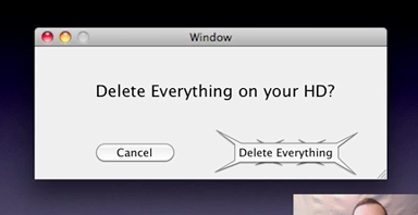
Aggressive “spiky” buttons against rounded
- Transfer
At UX Australia 2009, Keith Lang talked about how the geometric form of interface elements is perceived differently by humans. For example, rounded rectangles look naturally friendly, and some other shapes are hard and unpleasant. However, they can find application. Keith gave a very interesting example of how you can benefit from the use of aggressive “spiny” buttons.
In this picture, both buttons are equally rounded and cute.

And then the toothy delete button.

In the second case, think twice before clicking on the button, ready to bite your finger.
In this picture, both buttons are equally rounded and cute.

And then the toothy delete button.

In the second case, think twice before clicking on the button, ready to bite your finger.
