Booking.com app concept for iOS 7
The release of iOS 7 was an important stage for all mobile developers. Due to the new style, guidelines and logic, all applications often need to be completely redesigned for a new axis. If Tweetbot, Instagram (except the icon), Facebook, Linkedin have already been updated, then many other popular applications are stuck in the era of skeuomorphism.
At e-Legion, we design, draw and develop for iOS 7, and in our free time we think about how it would be possible to improve the applications used by millions of people. In this post, our lead designer Anna Kuchuganova will tell and show what problems the most famous Booking.com hotel reservation application has. For clarity, the main screens with an explanation of the selected solutions will be designed.
Next comes the direct speech.
Any article should begin with an epic story. Once I was stuck in Vietnam ... :) I urgently needed a hotel for one night, the Internet was very slow and, panicking through the list of hotels in the booking on the phone, I absolutely did not understand which hotel should go to and which one not. Even then, there was a desire to restore order in this application. Having started the concept, I immediately decided to focus on the design and appearance of the information and work out the main case - viewing the list of hotels.
The interaction begins with the application asking you to enter data to search for hotels. From the point of view of the UI, there are no problems, well thought out, nothing more. Only the design does not look modern, but this is a problem in the whole application.
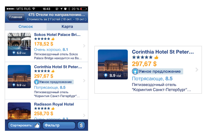
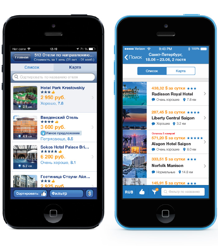
What we have? There is an unpleasant white hole in the cell space under a small photograph. The information is listed one after another and is very replete, each line has its own style, a great emphasis on price is reasonable, but a lot of things are mixed further. It’s not clear what “Fabulous 8.5” is, stars and a thumbs up? No, it’s generally clear that the hotel has a good rating or reviews, but why do you need to take 4 characteristics to different locations at once? Only 2.5 cells fit on the screen of my 4S, in general, not bad, but more can be done. Descriptive text that ends with an ellipsis and almost always repeats what is already written above.
Start to think. The first thing the user pays attention to when he makes the choice to tap / not tap is photo and price. Accordingly, I internally forbid myself to reduce the size of the photo, and set a micro-goal to increase it, if there is such an opportunity. We leave emphasis on the price. What else is important? Of course, the distance, the stardom of the hotel, user reviews. And this is enough to make a choice whether to continue browsing or not.
We begin to typeset. After about an hour of traveling in Illustrator, I find a nice layout. I provide the feedback and distance with an icon. I managed to enlarge the photo (I pressed it to the edges, the cell was built, but there is a lot of “white
space "which helps the user / reader to more easily perceive information). By the way, for desperate visuals like me, the Airbnb and iHotel apps offer just such a cell layout.

In Airbnb, you can also scroll through photos right in the stream. That's great! But let's proceed from what we have: we need to create a harmonious cell, the information on which is easily perceived. And another moment: I always dreamed of being informed, is the price indicated per day or for all days? Rejoice at this price, or upset and flipping on? Here's what happens:

We spend a little more time to see how the cell looks in the general list. At least 4 cells fit into the iPhone 5 screen, 3 pieces fit into the iPhone 4, given that we need to place some more interface elements.
Very often, designers like to type one text, insert one picture and duplicate them everywhere. This is bad form. It is very useful to insert real content into the layouts, this will help to avoid a lot of unpleasant surprises during assembly.

Let's go to the top bar. It is clear that we will use the style of iOS 7. But the point is not in the style, it can be anything, it is important to correctly work out the presentation of information. For example, the localization of Booking puts a user’s request in the title of the screen, it’s correct, but it’s wrong that the basic information often does not fit into the bar — we optimize it. The city, numbers, number of guests, everything perfectly fit coarsely in 2 lines. Go to the tabs, here I use the default ones. The mystery is why many customize the interface elements (and not always successfully), while the platform offers a decent appearance.
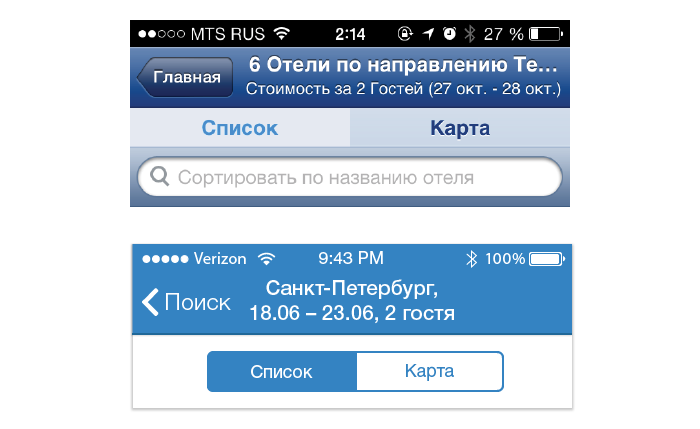
I deliberately did not endure the number of hotels in the Navigation Bar (upper), I think that this information can be neglected, especially since Booking itself offers an excellent solution - show the number of viewed / total number on a translucent die when scrolling. It is convenient, timely and saves space. Search is also not included in the upper structure, because this is not a search at all, but part of the filter (sorting by hotel name). In addition, I did not want to "weight" the upper part of the screen.
IOS7 design is not only new controls and “flat style”, but also animation. It seems to me, as more and more applications use the animation and the iOS7 physics engine (UIKit Dynamics), applications without them will look more and more bland for the user. Therefore, I suggest adding this kind of animation when viewing the list, it looks clean and concise.

Now let's get down to the filters. Filters are the pain of the interface designer, especially the pain of those who deal with mobile applications, because here the space is very limited. The problem of the filter is that it is not in the focus of attention when viewing the results, there is a modality, the user may forget that he installed some filter and lose some of the results. And I want to be able to:
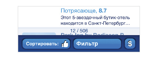
In the Booking application, filters, sorting and currency are located below, on a blue bar, which attracts attention. I like the solution, but implemented clumsily. The task is complicated by the fact that we have 12 filters, and this is a lot. I rummaged through Dribbble and Behance in search of examples of cool filter solutions, but I did not find anything worthy. If you suddenly have an application in mind where filtering is well implemented, please share!
In my head, a variant with small stickers that could be edited by tapu and easily deleted by a cross has long matured - conveniently! I'm trying to apply it here. It looks good, but I immediately realize that this option will not work for us, there are too many filters, and they will leave when scrolling. This option is good when the parameters are 2-3-4. Throw in the basket!

Here I come across an Ebay application for iOS and it pleasantly surprises. Sorting, adding to favorites and the appearance of the list are combined with the search, the filters themselves are placed under the bar. They scroll left / right and are marked blue if active. Boldly! However, the full modality could not be avoided. All the applied filters are still not visible and there is a little confusion, edit each filter in one place or separately? Yes, and the user does not need to constantly see the parameters, he remembers which hotel he is looking for.
I redraw the filters, sorting and currency as follows: I replace the words with icons, use the orange badge to highlight the active filter, and add a reminder in case the user suddenly absented himself in another section and then returned to the list. In the original application, when the currency changes, the dollar icon does not change, it is understandable why it is difficult to cut the icons of all currencies in the world. I propose to display a three-letter abbreviation - it's easier.

The filter itself also requires a little cleaning: the cells and fonts "jump". It’s hard to perceive such a large list at once, so I split it into small groups. In addition, to set a number of parameters, such as price or distance, you can avoid switching to a new screen.
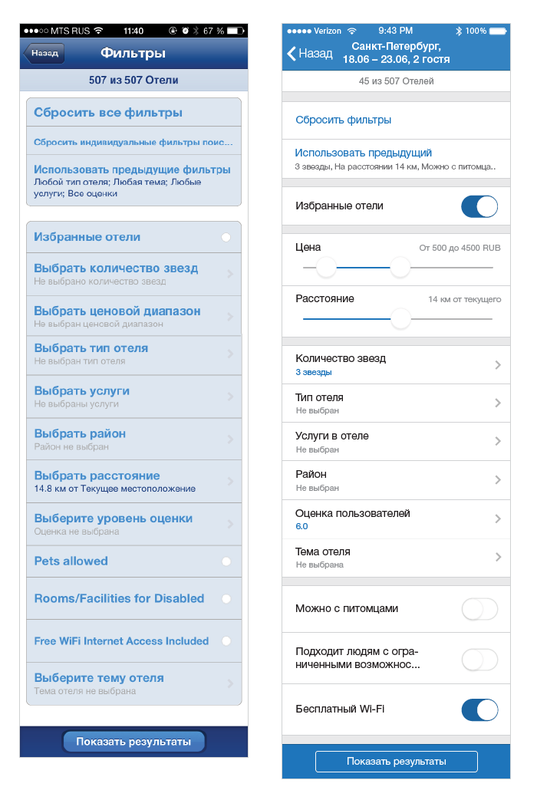
In the current application, you can run into a funny “bug”: when you try to move the left slider, lateral navigation is persistently opened. In the new axis, the gesture from the edge of the screen is the transition to the previous screen (link to developer.apple.com ). Therefore, I place the sliders a little further from the edges. By the way, this problem can be solved programmatically (increase the tapable area of the slider and make sure that extra gestures do not work on top of it). This point will need to be tested separately.

We take the last page - the hotel page. Let's start with the navbar, the rational idea is to take out the name of the hotel, and not the faceless "hotel". Then I make the first block more densely and free up space for large photos with scrolling. It looks aesthetically pleasing and immediately disposed to itself, no need to make extra taps. There are pictures with different aspect ratios on the booking site. With vertical previews, you can do this: zoom in width and cut a rectangle in the center. By tap, you can see the whole photo.
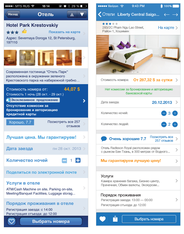
Then everything is simple - correctly sort the information. I think this way: if the user is satisfied with the price and appearance, he is already partially ready to make a reservation and reinforces (or vice versa) his decision by reading reviews and clarifying details. Price-> Options (so you can play with the price) -> Description. “Share” in the current application is designed as a normal cell. But this is an action, not a transition. Therefore, I consider it necessary to put the sharing in the form of an icon on the lower bar, next to "Add to Favorites", as these are actions of the same type.

click-through increase
The purpose of this post was to succinctly demonstrate that despite all subjectivity, the design can and should be convenient for any user. And this can be achieved with very little time - about 10 hours were spent on all the work. Disassembled screens, of course, can be implemented in a different way, or completely redone from scratch. It was important to show the direction of thought.
We look forward to the updated official Booking.com application for the new operating system. Surely some new interesting solutions will be used there, since iOS 7 capabilities allow.
At e-Legion, we design, draw and develop for iOS 7, and in our free time we think about how it would be possible to improve the applications used by millions of people. In this post, our lead designer Anna Kuchuganova will tell and show what problems the most famous Booking.com hotel reservation application has. For clarity, the main screens with an explanation of the selected solutions will be designed.
Next comes the direct speech.
Any article should begin with an epic story. Once I was stuck in Vietnam ... :) I urgently needed a hotel for one night, the Internet was very slow and, panicking through the list of hotels in the booking on the phone, I absolutely did not understand which hotel should go to and which one not. Even then, there was a desire to restore order in this application. Having started the concept, I immediately decided to focus on the design and appearance of the information and work out the main case - viewing the list of hotels.
Hotel list
The interaction begins with the application asking you to enter data to search for hotels. From the point of view of the UI, there are no problems, well thought out, nothing more. Only the design does not look modern, but this is a problem in the whole application.
What we have? There is an unpleasant white hole in the cell space under a small photograph. The information is listed one after another and is very replete, each line has its own style, a great emphasis on price is reasonable, but a lot of things are mixed further. It’s not clear what “Fabulous 8.5” is, stars and a thumbs up? No, it’s generally clear that the hotel has a good rating or reviews, but why do you need to take 4 characteristics to different locations at once? Only 2.5 cells fit on the screen of my 4S, in general, not bad, but more can be done. Descriptive text that ends with an ellipsis and almost always repeats what is already written above.
Start to think. The first thing the user pays attention to when he makes the choice to tap / not tap is photo and price. Accordingly, I internally forbid myself to reduce the size of the photo, and set a micro-goal to increase it, if there is such an opportunity. We leave emphasis on the price. What else is important? Of course, the distance, the stardom of the hotel, user reviews. And this is enough to make a choice whether to continue browsing or not.
We begin to typeset. After about an hour of traveling in Illustrator, I find a nice layout. I provide the feedback and distance with an icon. I managed to enlarge the photo (I pressed it to the edges, the cell was built, but there is a lot of “white
space "which helps the user / reader to more easily perceive information). By the way, for desperate visuals like me, the Airbnb and iHotel apps offer just such a cell layout.
In Airbnb, you can also scroll through photos right in the stream. That's great! But let's proceed from what we have: we need to create a harmonious cell, the information on which is easily perceived. And another moment: I always dreamed of being informed, is the price indicated per day or for all days? Rejoice at this price, or upset and flipping on? Here's what happens:
We spend a little more time to see how the cell looks in the general list. At least 4 cells fit into the iPhone 5 screen, 3 pieces fit into the iPhone 4, given that we need to place some more interface elements.
Very often, designers like to type one text, insert one picture and duplicate them everywhere. This is bad form. It is very useful to insert real content into the layouts, this will help to avoid a lot of unpleasant surprises during assembly.
Let's go to the top bar. It is clear that we will use the style of iOS 7. But the point is not in the style, it can be anything, it is important to correctly work out the presentation of information. For example, the localization of Booking puts a user’s request in the title of the screen, it’s correct, but it’s wrong that the basic information often does not fit into the bar — we optimize it. The city, numbers, number of guests, everything perfectly fit coarsely in 2 lines. Go to the tabs, here I use the default ones. The mystery is why many customize the interface elements (and not always successfully), while the platform offers a decent appearance.
I deliberately did not endure the number of hotels in the Navigation Bar (upper), I think that this information can be neglected, especially since Booking itself offers an excellent solution - show the number of viewed / total number on a translucent die when scrolling. It is convenient, timely and saves space. Search is also not included in the upper structure, because this is not a search at all, but part of the filter (sorting by hotel name). In addition, I did not want to "weight" the upper part of the screen.
IOS7 design is not only new controls and “flat style”, but also animation. It seems to me, as more and more applications use the animation and the iOS7 physics engine (UIKit Dynamics), applications without them will look more and more bland for the user. Therefore, I suggest adding this kind of animation when viewing the list, it looks clean and concise.
Filters
Now let's get down to the filters. Filters are the pain of the interface designer, especially the pain of those who deal with mobile applications, because here the space is very limited. The problem of the filter is that it is not in the focus of attention when viewing the results, there is a modality, the user may forget that he installed some filter and lose some of the results. And I want to be able to:
- see that the filter affects the output;
- reset it quickly.
In the Booking application, filters, sorting and currency are located below, on a blue bar, which attracts attention. I like the solution, but implemented clumsily. The task is complicated by the fact that we have 12 filters, and this is a lot. I rummaged through Dribbble and Behance in search of examples of cool filter solutions, but I did not find anything worthy. If you suddenly have an application in mind where filtering is well implemented, please share!
In my head, a variant with small stickers that could be edited by tapu and easily deleted by a cross has long matured - conveniently! I'm trying to apply it here. It looks good, but I immediately realize that this option will not work for us, there are too many filters, and they will leave when scrolling. This option is good when the parameters are 2-3-4. Throw in the basket!
Here I come across an Ebay application for iOS and it pleasantly surprises. Sorting, adding to favorites and the appearance of the list are combined with the search, the filters themselves are placed under the bar. They scroll left / right and are marked blue if active. Boldly! However, the full modality could not be avoided. All the applied filters are still not visible and there is a little confusion, edit each filter in one place or separately? Yes, and the user does not need to constantly see the parameters, he remembers which hotel he is looking for.
I redraw the filters, sorting and currency as follows: I replace the words with icons, use the orange badge to highlight the active filter, and add a reminder in case the user suddenly absented himself in another section and then returned to the list. In the original application, when the currency changes, the dollar icon does not change, it is understandable why it is difficult to cut the icons of all currencies in the world. I propose to display a three-letter abbreviation - it's easier.
The filter itself also requires a little cleaning: the cells and fonts "jump". It’s hard to perceive such a large list at once, so I split it into small groups. In addition, to set a number of parameters, such as price or distance, you can avoid switching to a new screen.
In the current application, you can run into a funny “bug”: when you try to move the left slider, lateral navigation is persistently opened. In the new axis, the gesture from the edge of the screen is the transition to the previous screen (link to developer.apple.com ). Therefore, I place the sliders a little further from the edges. By the way, this problem can be solved programmatically (increase the tapable area of the slider and make sure that extra gestures do not work on top of it). This point will need to be tested separately.
Hotel page
We take the last page - the hotel page. Let's start with the navbar, the rational idea is to take out the name of the hotel, and not the faceless "hotel". Then I make the first block more densely and free up space for large photos with scrolling. It looks aesthetically pleasing and immediately disposed to itself, no need to make extra taps. There are pictures with different aspect ratios on the booking site. With vertical previews, you can do this: zoom in width and cut a rectangle in the center. By tap, you can see the whole photo.
Then everything is simple - correctly sort the information. I think this way: if the user is satisfied with the price and appearance, he is already partially ready to make a reservation and reinforces (or vice versa) his decision by reading reviews and clarifying details. Price-> Options (so you can play with the price) -> Description. “Share” in the current application is designed as a normal cell. But this is an action, not a transition. Therefore, I consider it necessary to put the sharing in the form of an icon on the lower bar, next to "Add to Favorites", as these are actions of the same type.
Total

click-through increase
The purpose of this post was to succinctly demonstrate that despite all subjectivity, the design can and should be convenient for any user. And this can be achieved with very little time - about 10 hours were spent on all the work. Disassembled screens, of course, can be implemented in a different way, or completely redone from scratch. It was important to show the direction of thought.
We look forward to the updated official Booking.com application for the new operating system. Surely some new interesting solutions will be used there, since iOS 7 capabilities allow.