We display the status of the settlement account on the chart
Recently I came across an article about one of the financial accounting systems. In addition, it allowed to control balances in the current account, warning about the danger of cash gaps. There were these charts:

What is wrong with them, and whether it is possible to do better - read under the cut.
The idea of connecting points with smooth splines (and even lines) on graphs with money is basically wrong: after all, in reality, money comes and goes to the account in discrete, concrete payments with specific amounts. And an attempt to carry out a smooth curve through the points can generally play a bad joke with us like the following:
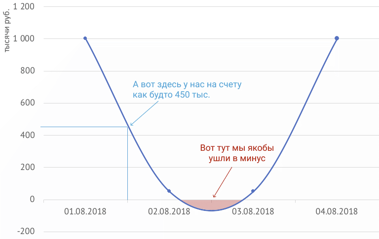
We had money in our account on the second and third of August, and the smoothed curve shows that we went into minus, misleading us. But even if you connect the points with straight lines, it will seem that between the first and second of August there were about 450 thousand rubles in the account, which is also not true. How to do the right thing?
A few years ago I had the opportunity to develop a financial system for one of the customers, for which it was required to invent and implement graphs of similar meaning. Below I would like to tell you about my way of solving this problem.
The source of data on the state of the current account is a bank statement: a list of transactions completed over a certain period of time. Each such operation is either the arrival of money in an account (payment from a client, interest on a bank deposit, etc.), or an expense (payment for goods and services, payment of salary, etc.) At the same time, the time of the operation is usually not it matters (and often we don’t know it, because the bank may not process the payment immediately), only the date is important.
It turns out that we do not see the movement of money within the day. But we know the balance in the account at the beginning of the day, the total amount of income, the amount of expenses and, as a result, the balance at the end of the day. I want to display this data in a clear and informative graphics.
The idea for him, I spied on the stock market players: for more than 250 years, they have been using the so-called stock exchange to display changes in stock prices. " Japanese candles ". They look like this:

The upper and lower faces of the body of the “candle” show the value of the quotation at the opening or closing period, which in general can be anything from several minutes to several years. If during the selected period the quotes have grown (i.e., the upper bound corresponds to closing), the body of the candlestick is filled with one color, if it has fallen - with another. Also, stock candles have “whiskers” corresponding to the minimum and maximum quotation values for a given period.
You have probably already caught the analogy between the behavior of stock quotes and our money in a current account. We also have a balance at the beginning of the day (opening) and at the end of the day (closing). Since we do not see the exact sequence of execution of operations within the day, we will not draw a mustache (the minimum and maximum balance within the day). The result is a graph that shows not just the change in the balance of the account at the end of the day, but also the prevailing direction of money on that day (income or expense - the color of the candle will depend on it), as well as the size of this income or expense.
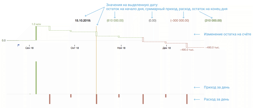
Here's what happened as a result (the image is clickable): Above - Japanese candles, showing the change in account balance, below - total income and consumption per day in the form of a standard bar chart.
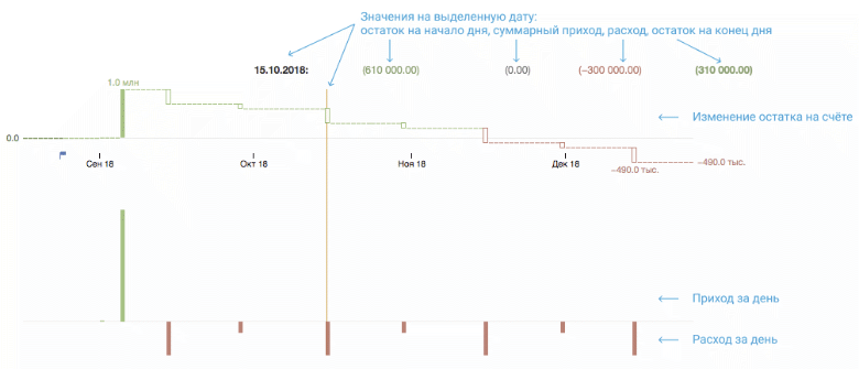
Here, for example, several planned (for this reason, the amounts in the legend are shown in brackets) payments for a young startup are shown: on September 1, the founders contributed a charter capital of 10 thousand rubles to the account, and 4 more days later they received 1 million from the first client. Each month, a startup must transfer to employees a salary of 300 thousand (15th day), and also pay 100 thousand for renting an office (at the end of the month). It can be seen that without additional funding, the company will last only two months: in November there will not be enough money to pay salaries.
And here is an example of data modeled on the basis of movements on the accounts of a real company (the image is clickable): To the left of the checkbox that indicates today's number, there are actual values, the pale graphs on the right are planned values.

Despite the fact that the balance on both accounts varies from a few hundred thousand to several million, the amount of daily payments on the histograms clearly show that the top account is the main one for the company. The frequency of payments is clearly visible, this is a consequence of the fact that the company introduced so-called. payment day You may also notice that the money on the account is not being delayed - it is possible that they are placed on short-term deposits. In a real system, this is easy to verify: when clicking on a particular day, a window opens with a list of payments.
So, thanks to the idea spied on by the exchange players, it turned out to be a very visual and informative tool for controlling the balances in the settlement accounts. I hope that someone else will find this analogy useful and apply it in their products.
What is wrong with them, and whether it is possible to do better - read under the cut.
The idea of connecting points with smooth splines (and even lines) on graphs with money is basically wrong: after all, in reality, money comes and goes to the account in discrete, concrete payments with specific amounts. And an attempt to carry out a smooth curve through the points can generally play a bad joke with us like the following:
We had money in our account on the second and third of August, and the smoothed curve shows that we went into minus, misleading us. But even if you connect the points with straight lines, it will seem that between the first and second of August there were about 450 thousand rubles in the account, which is also not true. How to do the right thing?
A few years ago I had the opportunity to develop a financial system for one of the customers, for which it was required to invent and implement graphs of similar meaning. Below I would like to tell you about my way of solving this problem.
The source of data on the state of the current account is a bank statement: a list of transactions completed over a certain period of time. Each such operation is either the arrival of money in an account (payment from a client, interest on a bank deposit, etc.), or an expense (payment for goods and services, payment of salary, etc.) At the same time, the time of the operation is usually not it matters (and often we don’t know it, because the bank may not process the payment immediately), only the date is important.
It turns out that we do not see the movement of money within the day. But we know the balance in the account at the beginning of the day, the total amount of income, the amount of expenses and, as a result, the balance at the end of the day. I want to display this data in a clear and informative graphics.
The idea for him, I spied on the stock market players: for more than 250 years, they have been using the so-called stock exchange to display changes in stock prices. " Japanese candles ". They look like this:
The upper and lower faces of the body of the “candle” show the value of the quotation at the opening or closing period, which in general can be anything from several minutes to several years. If during the selected period the quotes have grown (i.e., the upper bound corresponds to closing), the body of the candlestick is filled with one color, if it has fallen - with another. Also, stock candles have “whiskers” corresponding to the minimum and maximum quotation values for a given period.
You have probably already caught the analogy between the behavior of stock quotes and our money in a current account. We also have a balance at the beginning of the day (opening) and at the end of the day (closing). Since we do not see the exact sequence of execution of operations within the day, we will not draw a mustache (the minimum and maximum balance within the day). The result is a graph that shows not just the change in the balance of the account at the end of the day, but also the prevailing direction of money on that day (income or expense - the color of the candle will depend on it), as well as the size of this income or expense.
Here's what happened as a result (the image is clickable): Above - Japanese candles, showing the change in account balance, below - total income and consumption per day in the form of a standard bar chart.
Here, for example, several planned (for this reason, the amounts in the legend are shown in brackets) payments for a young startup are shown: on September 1, the founders contributed a charter capital of 10 thousand rubles to the account, and 4 more days later they received 1 million from the first client. Each month, a startup must transfer to employees a salary of 300 thousand (15th day), and also pay 100 thousand for renting an office (at the end of the month). It can be seen that without additional funding, the company will last only two months: in November there will not be enough money to pay salaries.
And here is an example of data modeled on the basis of movements on the accounts of a real company (the image is clickable): To the left of the checkbox that indicates today's number, there are actual values, the pale graphs on the right are planned values.

Despite the fact that the balance on both accounts varies from a few hundred thousand to several million, the amount of daily payments on the histograms clearly show that the top account is the main one for the company. The frequency of payments is clearly visible, this is a consequence of the fact that the company introduced so-called. payment day You may also notice that the money on the account is not being delayed - it is possible that they are placed on short-term deposits. In a real system, this is easy to verify: when clicking on a particular day, a window opens with a list of payments.
So, thanks to the idea spied on by the exchange players, it turned out to be a very visual and informative tool for controlling the balances in the settlement accounts. I hope that someone else will find this analogy useful and apply it in their products.