How to make pizza confused? Pizzeria tracker interfaces and their features
Today I will talk about the tracker in the kitchen of Dodo Pizza. In our kitchen, tablets with tracker interfaces hang. The tracker is the spinal cord of the pizza making process. It takes effect from the moment the order is accepted and until the delivery of the pizza bag to the courier.
The tracker consists of interfaces, each of which performs its important function. Each interface shows the user (kitchen employee) some specific product parameters.
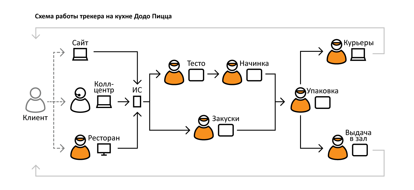
The logic of the tracker in one sentence: to receive information about the order from the client, to distribute products by type and to pass products through the kitchen before issuing to a specific courier. Interfaces are in front of employees on tablet screens, the employee presses the buttons, the product moves from screen to screen.
Product Types:
All products at the end are distributed on the screens of delivery (screens: Couriers and Delivery to the hall ).
Each screen displays a certain number of product types. For each product certain parameters are displayed (names, sizes, thickness of the test, etc.). The goal is to ensure that working with interfaces causes a minimum of errors for employees. I will show how the work on the interfaces was going on and what were the attempts to make the staff do not confuse pizzas.
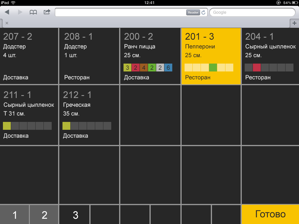
The appearance of the interfaces at the beginning of my work on them
I started working with the tracker interfaces when they already existed, but required certain modifications of the layout.
Further in the task queue was to minimize employee errors when working with interfaces.

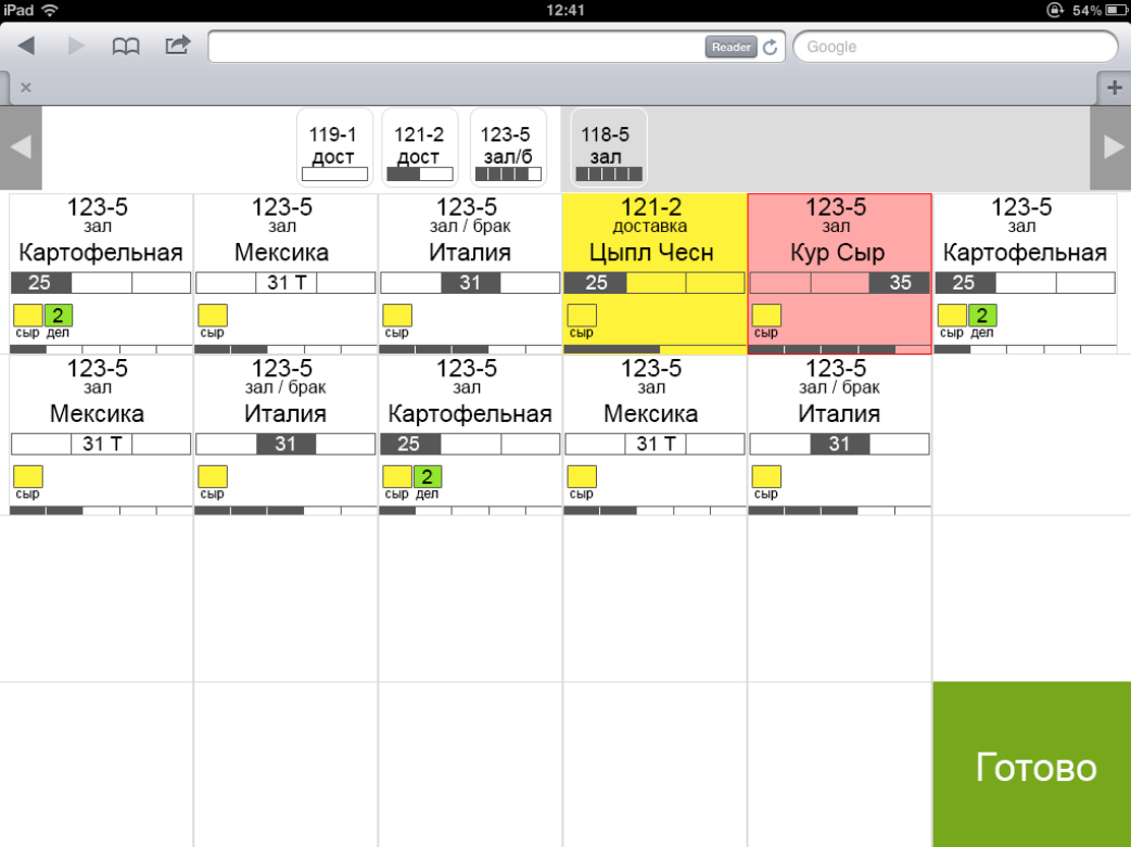
Interfaces Dough and Stuffing Today
These are two almost identical interfaces. They display only the basic parameters of pizzas. User's task: choose the right size of the dough, prepare the dough for a specific pizza (take into account the thickness, size and recipe when choosing the sauce for the base) and lay out the filling according to the recipe for a specific pizza.
Displayed parameters:
A large stream of orders passes through the pizzeria. Production is built on the principle of a conveyor. An employee has a few seconds to take a look at the screen and start preparing the product.
It is necessary to make sure that the number of errors associated with the choice of the test size and the thickness of the test is reduced: the employee pays attention to the number with the size, but does not notice the “T” mark, which indicates that the dough should be selected thin.

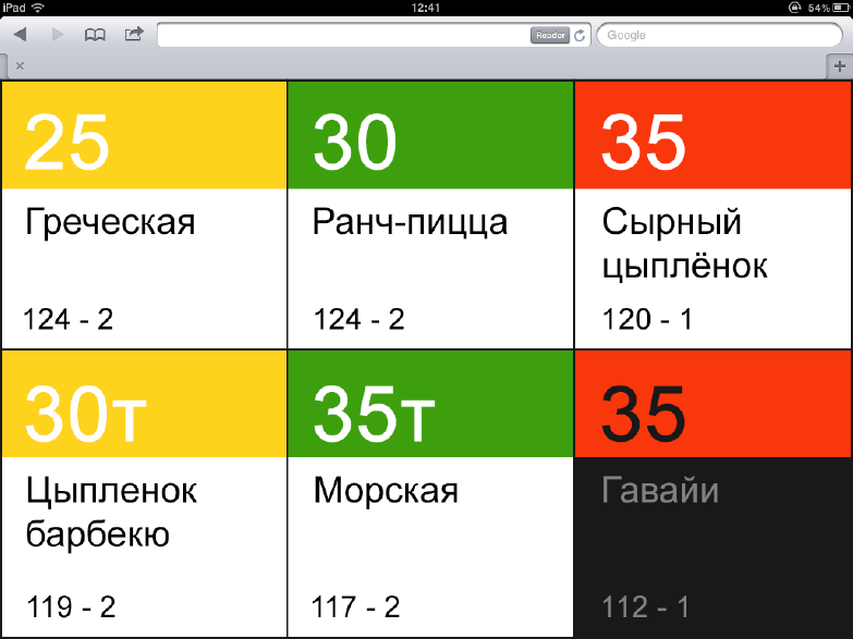
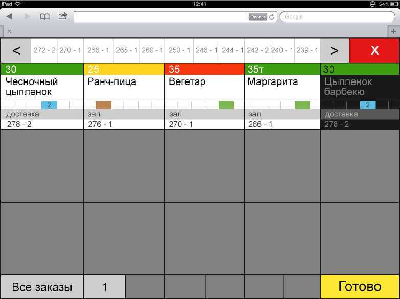
Indication of pizza sizes in graphical form
Pictograms representing sizes were invented. One of the first attempts to encode through color (now pizza boxes have different colors depending on size). Attempt to display thin test indicator (“T”) inside the pictogram.
Unfortunately, such indicators would be difficult to read in conditions of high speed. Even such icons are too detailed for an interface located at arm's length from the user.

Indication by "position"
3 fields in each pizza block are constantly displayed, and an indicator with a letter is displayed in the corresponding field.
Showing options with and without colors. The pressed blocks are highlighted in yellow. I suggest replacing the size numbers with letters (“B” - 35, large; “C” - 31, medium; “St” - medium on thin). There is also an attempt to display sauces for the base; today, an employee needs to memorize sauces and errors may occur. I try to emphasize pizza on thin crust.
Alas, the display is difficult to read, and it will be impossible to make out small sauces icons if the tablet is hanging on the wall.
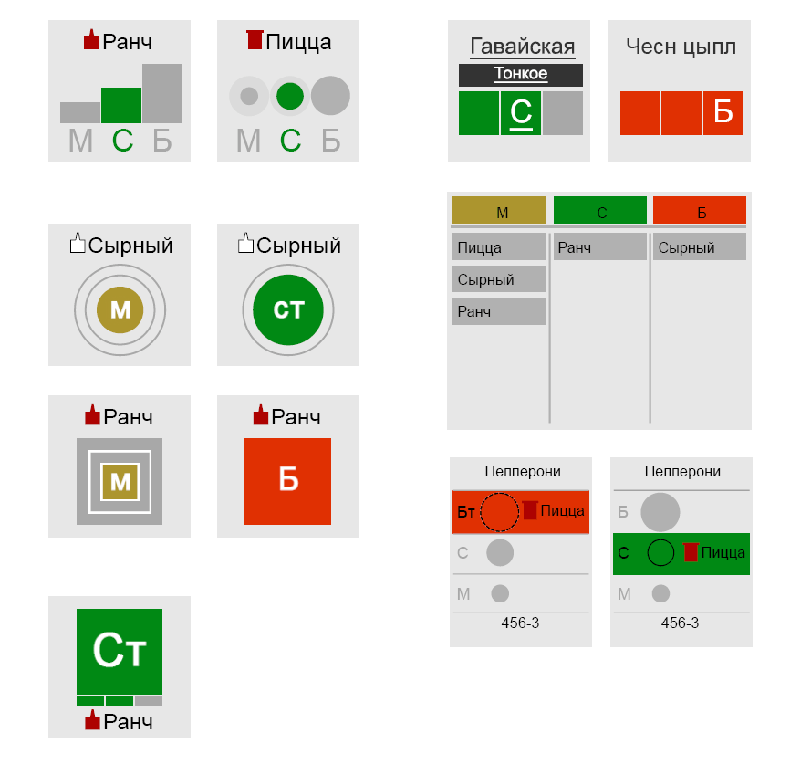
More concepts.
Next were experiments with colors, letters, grouping and indication of "position". Everything turns out to be too complicated for understanding and reading.
Non-radical solution
The most adequate way of indicating is to display an indicator of the thickness of the dough next to the size of the dough. The sauce for the base is shown (pizza sauce can not be shown at all, it is used by default).
The last of the proposals
In the last version, the colors for the sizes correspond to the colors of the boxes. For pizza on thin crust, the same color is shown as for pizza of smaller size on traditional dough - in the kitchen for large pizza on thin crust, the same workpiece is used as for average pizza on thick crust (actual on the Dough screen). The pressed block is highlighted in a dark background.

Snacks interface today
This interface is located separately, it needs to be read from a distance.
Here it is important for the employee not to confuse the types of snacks in order to put them in the oven.
Displayed parameters:
The interface is located on the wall separately from the pizza table. The employee should notice the appearance of the order and determine the type of product (about a dozen products with a difference in the preparation process before issuing). There are three types of snacks, the name of which starts with “K” (potatoes, corn, wings), which is why attempts to use abbreviations in the names led to employee errors.
You need to make sure that the type of product is recognized at a distance (then the employee can immediately understand what the next steps will be) and come up with readable labels for snacks with similar names.
Concepts for "Appetizer"
In the search process, pictograms were offered, as well as a grouping of displayed products by type directly in the interface. Grouping would be too inflexible (perhaps new products will appear or existing ones will leave). Pictograms are difficult to pick up and even more difficult to maintain their relevance in the future.
The last of the offers
In the last of the options, snacks are grouped by color. An attempt to get rid of the confusion in the abbreviations for the names on the "K". The pressed block is highlighted in a dark background.
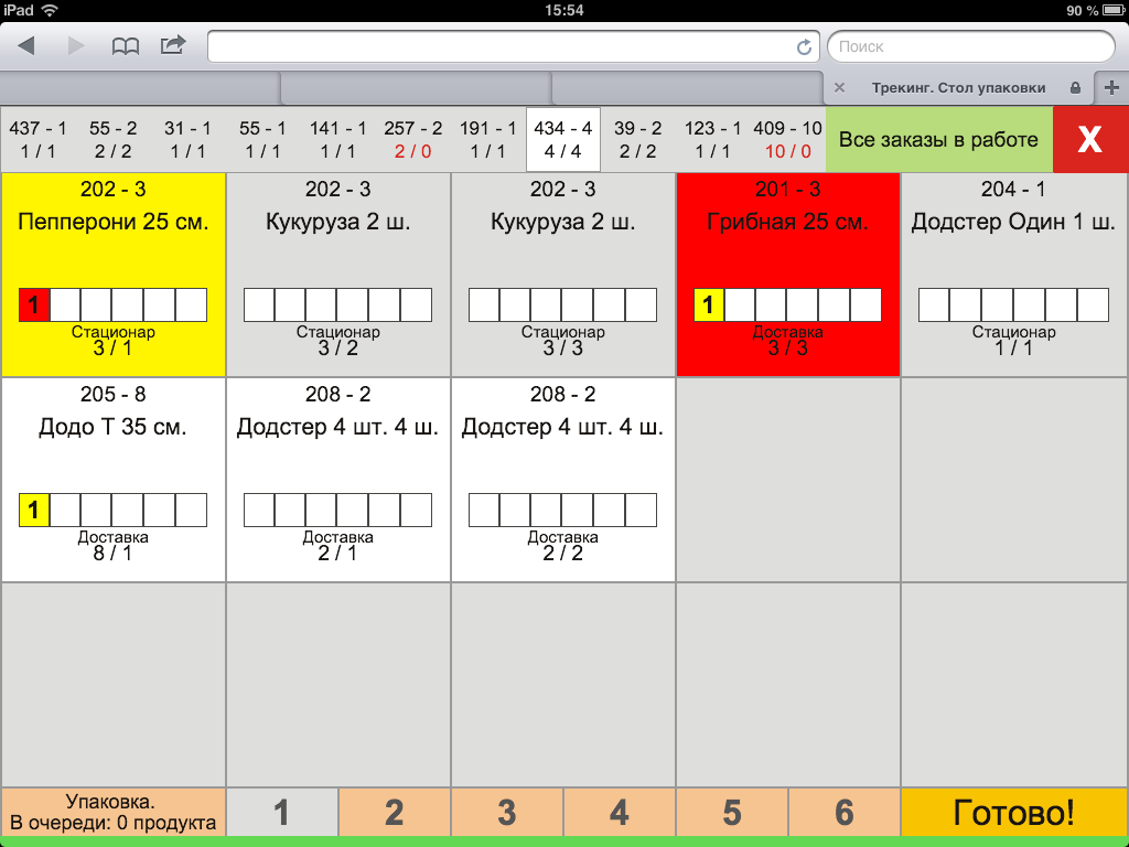
Interface Packaging today
This is an interface in which all product information from the tracker converges, a large amount of information is displayed.
Displayed parameters:
An employee who collects orders before issuing works with this interface; he also controls the quality of cooking and the possibility of errors in the kitchen.
One of the sketches. An
attempt to use the “position” indication for pizza sizes and for the number of boxes in an order is shown. Thin pizza pizzas are shown with an indicator on a white background (traditional ones are shown on a dark background). The block with a red background is for products that take too long to cook in the kitchen. An experiment showing the marriage is shown.
Abstract experiment with colors and alignment.
Last of the sentences.
In the last version, color size indication was used. A more explicit display of the method of issuing the order (delivery, room, pickup).
The difficult task of reducing errors requires the simplest solutions for employees to understand in the tracker interfaces.
Already now my latest offers seem to me not the best option.
Work on the design of the tracker interfaces, as well as on other Dodo projects, continues and the process can be monitored on my blog .
The tracker consists of interfaces, each of which performs its important function. Each interface shows the user (kitchen employee) some specific product parameters.
The logic of the tracker in one sentence: to receive information about the order from the client, to distribute products by type and to pass products through the kitchen before issuing to a specific courier. Interfaces are in front of employees on tablet screens, the employee presses the buttons, the product moves from screen to screen.
Product Types:
- Baked: pizza (screens: Dough , Filling , Packaging )
- Semi-finished products: salads, potatoes, corn (screens: Snacks , Packaging )
- Simple: drinks, muffins (added at the end, not shown in the diagram)
All products at the end are distributed on the screens of delivery (screens: Couriers and Delivery to the hall ).
Each screen displays a certain number of product types. For each product certain parameters are displayed (names, sizes, thickness of the test, etc.). The goal is to ensure that working with interfaces causes a minimum of errors for employees. I will show how the work on the interfaces was going on and what were the attempts to make the staff do not confuse pizzas.
The appearance of the interfaces at the beginning of my work on them
I started working with the tracker interfaces when they already existed, but required certain modifications of the layout.
Further in the task queue was to minimize employee errors when working with interfaces.
Interfaces: Dough and Filling
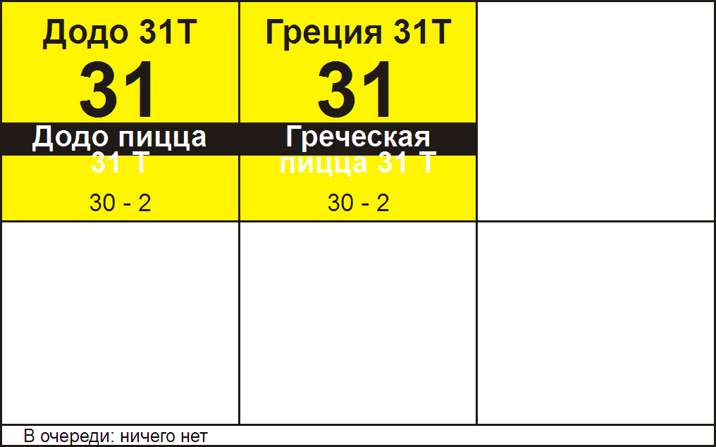
Interfaces Dough and Stuffing Today
These are two almost identical interfaces. They display only the basic parameters of pizzas. User's task: choose the right size of the dough, prepare the dough for a specific pizza (take into account the thickness, size and recipe when choosing the sauce for the base) and lay out the filling according to the recipe for a specific pizza.
Displayed parameters:
- Name of pizza
- Dough thickness
- Pizza size
- Order number
Description of the problem
A large stream of orders passes through the pizzeria. Production is built on the principle of a conveyor. An employee has a few seconds to take a look at the screen and start preparing the product.
It is necessary to make sure that the number of errors associated with the choice of the test size and the thickness of the test is reduced: the employee pays attention to the number with the size, but does not notice the “T” mark, which indicates that the dough should be selected thin.
Search for a solution
Indication of pizza sizes in graphical form
Pictograms representing sizes were invented. One of the first attempts to encode through color (now pizza boxes have different colors depending on size). Attempt to display thin test indicator (“T”) inside the pictogram.
Unfortunately, such indicators would be difficult to read in conditions of high speed. Even such icons are too detailed for an interface located at arm's length from the user.
Indication by "position"
3 fields in each pizza block are constantly displayed, and an indicator with a letter is displayed in the corresponding field.
Showing options with and without colors. The pressed blocks are highlighted in yellow. I suggest replacing the size numbers with letters (“B” - 35, large; “C” - 31, medium; “St” - medium on thin). There is also an attempt to display sauces for the base; today, an employee needs to memorize sauces and errors may occur. I try to emphasize pizza on thin crust.
Alas, the display is difficult to read, and it will be impossible to make out small sauces icons if the tablet is hanging on the wall.
More concepts.
Next were experiments with colors, letters, grouping and indication of "position". Everything turns out to be too complicated for understanding and reading.
Non-radical solution
The most adequate way of indicating is to display an indicator of the thickness of the dough next to the size of the dough. The sauce for the base is shown (pizza sauce can not be shown at all, it is used by default).
The last of the proposals
In the last version, the colors for the sizes correspond to the colors of the boxes. For pizza on thin crust, the same color is shown as for pizza of smaller size on traditional dough - in the kitchen for large pizza on thin crust, the same workpiece is used as for average pizza on thick crust (actual on the Dough screen). The pressed block is highlighted in a dark background.
Interface: Snacks
Snacks interface today
This interface is located separately, it needs to be read from a distance.
Here it is important for the employee not to confuse the types of snacks in order to put them in the oven.
Displayed parameters:
- The product's name
- Order number
Description of the problem
The interface is located on the wall separately from the pizza table. The employee should notice the appearance of the order and determine the type of product (about a dozen products with a difference in the preparation process before issuing). There are three types of snacks, the name of which starts with “K” (potatoes, corn, wings), which is why attempts to use abbreviations in the names led to employee errors.
You need to make sure that the type of product is recognized at a distance (then the employee can immediately understand what the next steps will be) and come up with readable labels for snacks with similar names.
Concepts for "Appetizer"
In the search process, pictograms were offered, as well as a grouping of displayed products by type directly in the interface. Grouping would be too inflexible (perhaps new products will appear or existing ones will leave). Pictograms are difficult to pick up and even more difficult to maintain their relevance in the future.
The last of the offers
In the last of the options, snacks are grouped by color. An attempt to get rid of the confusion in the abbreviations for the names on the "K". The pressed block is highlighted in a dark background.
Interface: Packaging
Interface Packaging today
This is an interface in which all product information from the tracker converges, a large amount of information is displayed.
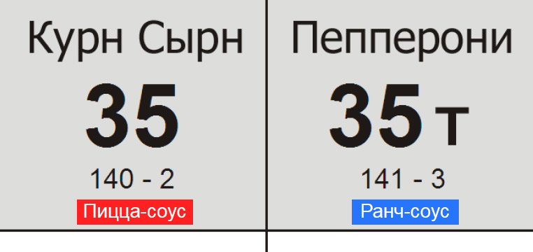
Displayed parameters:
- The product's name
- Pizza size
- Pizza Dough Thickness
- Free sauce for pizzas and some snacks
- Sales method
- Order number
- The number of boxes collected (in one order there may be more than one box)
Description of the problem
An employee who collects orders before issuing works with this interface; he also controls the quality of cooking and the possibility of errors in the kitchen.
One of the sketches. An
attempt to use the “position” indication for pizza sizes and for the number of boxes in an order is shown. Thin pizza pizzas are shown with an indicator on a white background (traditional ones are shown on a dark background). The block with a red background is for products that take too long to cook in the kitchen. An experiment showing the marriage is shown.
Abstract experiment with colors and alignment.
Last of the sentences.
In the last version, color size indication was used. A more explicit display of the method of issuing the order (delivery, room, pickup).
Total
The difficult task of reducing errors requires the simplest solutions for employees to understand in the tracker interfaces.
Already now my latest offers seem to me not the best option.
Work on the design of the tracker interfaces, as well as on other Dodo projects, continues and the process can be monitored on my blog .