Review of iOS 7 Beta 2 on iPad
Just the other day, iOS 7 Beta 2 was released. As promised, iPad support began, starting with the second generation.
The impressions of the first use are rather ambiguous: on the one hand, quite interesting features have appeared, such as a control point that allows you to quickly and with a minimum number of tapes enable or disable a certain function; and on the other hand - quite useless, for example, the same parallax effect (which is now called in the settings), dynamic wallpapers that do not carry any useful functionality, but only a dubious decoration.
Most of the innovations made in the first beta version have already been reviewed on the hub, but only regarding the iPhone. Now a similar review will be based on the iPad.
The update from version 6.1.3 went pretty painlessly and quickly.
After installation, the standard initial setup procedure. Unfortunately, I forgot to take pictures, so I will describe the steps of the settings after the update in words:
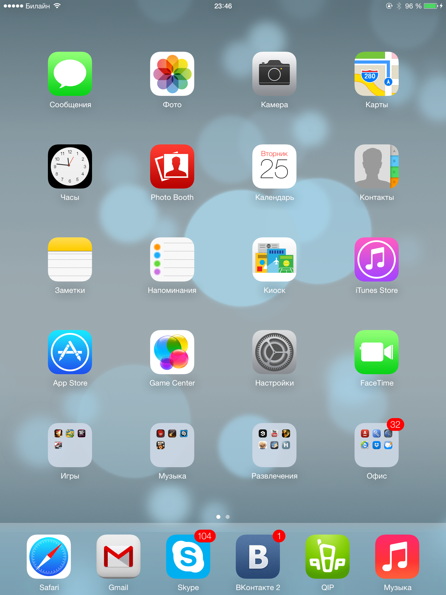
Then, literally within a few seconds, our eyes come up with a iOS homescreen (images are clickable): No significant changes compared to the previous beta on the iPhone.

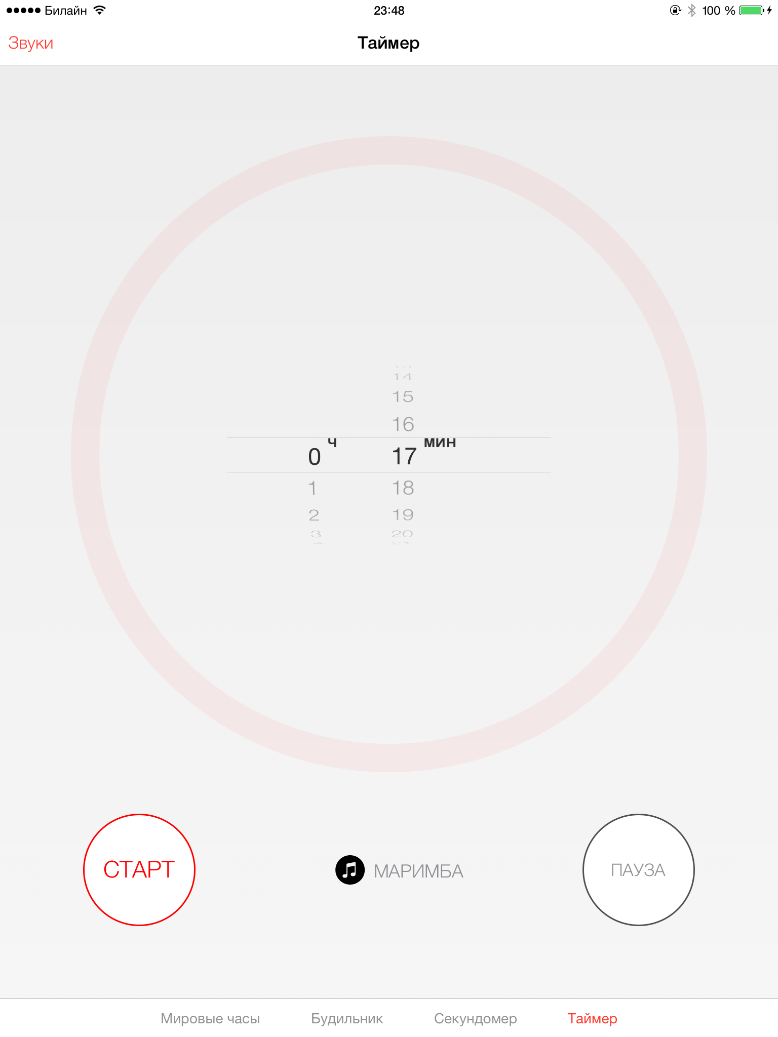
Alert center: Control center : It is worth noting that some of the functions available on the iPhone, such as a flashlight and a calculator, are absent here (due to their absence in principle). The Timer application icon has also been slightly changed.


Spotlight (which is now located not to the left of the main screen, but is called up by swiping down on any of the screens): Lock screen: You can now call the camera by pulling the lower right corner (where the camera icon is located)


Multitasking: In the version for iPad, as I believe, it was quite possible to expand the number of simultaneously displayed applications to five. The feature of completing several tasks at the same time works (swipe up several applications at the same time), but due to the iPad's large screen size, doing this is slightly inconvenient.

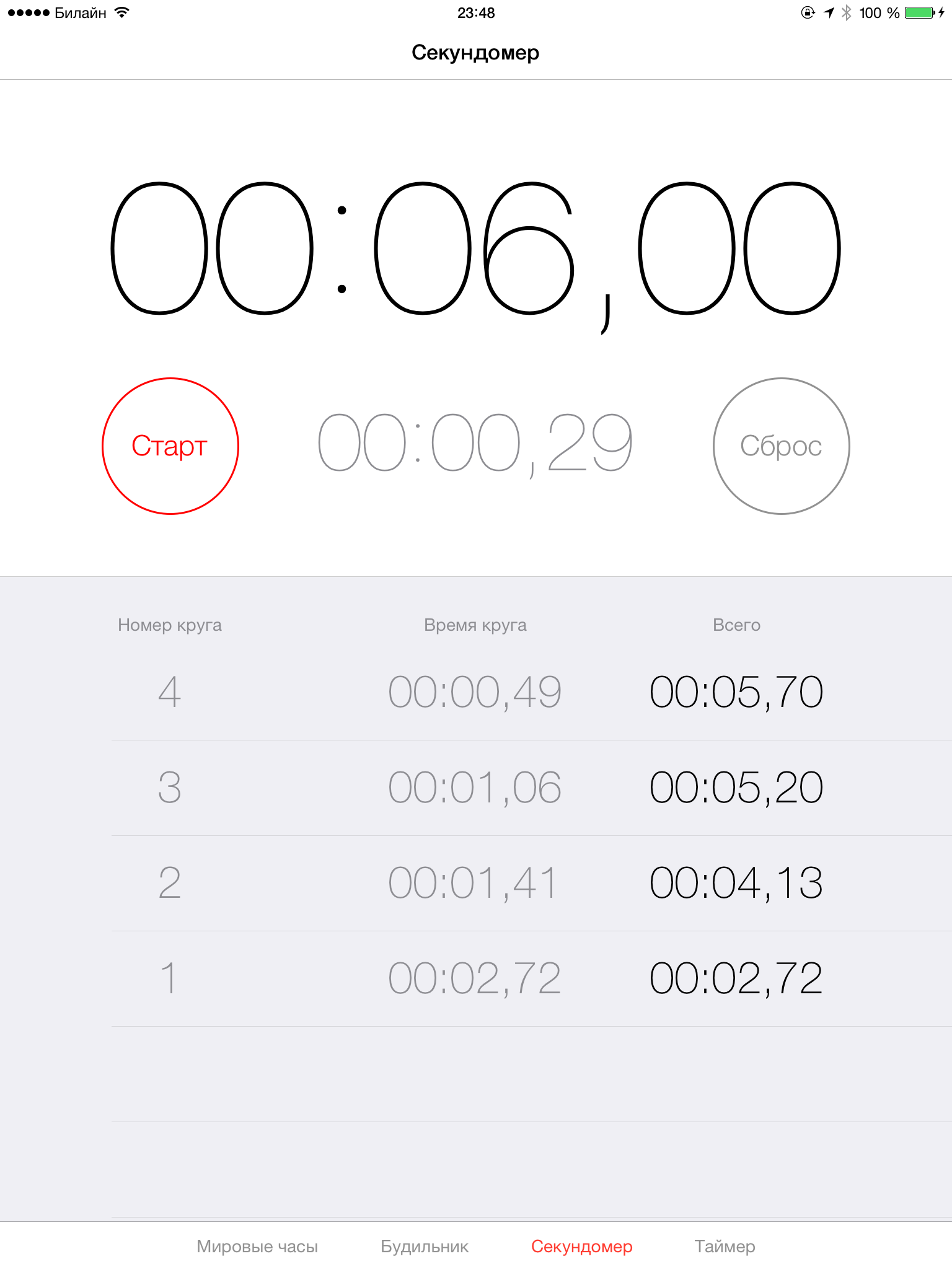
Stopwatch: Timer (in my opinion, it looks better than in the previous beta): Camera: Traditionally, there are no panoramic shooting modes and the “Hello Instagram” effects (although the photo in the form of a square is still present, it’s not clear for what purpose) How You may notice that the HDR shooting mode has appeared. With the default settings on the device, two pictures are saved - the original and directly HDR. Rumor has it that the quality of the shooting was improved, but in fact I did not notice the differences. Shooting modes are switched by swipe up / down on the sidebar. A few examples:


You may notice that the photo in the “Square” mode remains with the usual aspect ratio. However, on the device itself, photos are displayed as intended (possibly a bug, but most likely a feature):

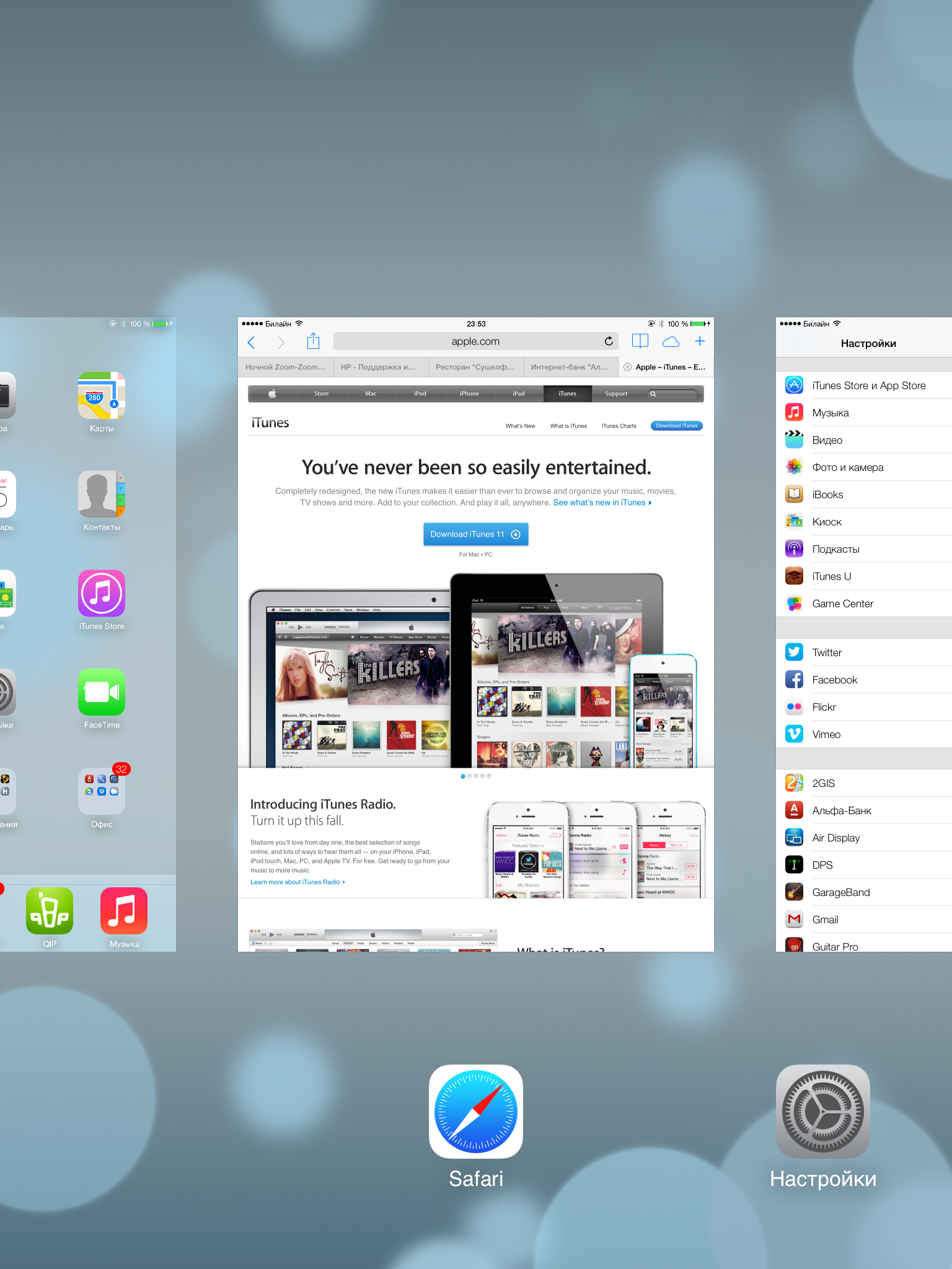
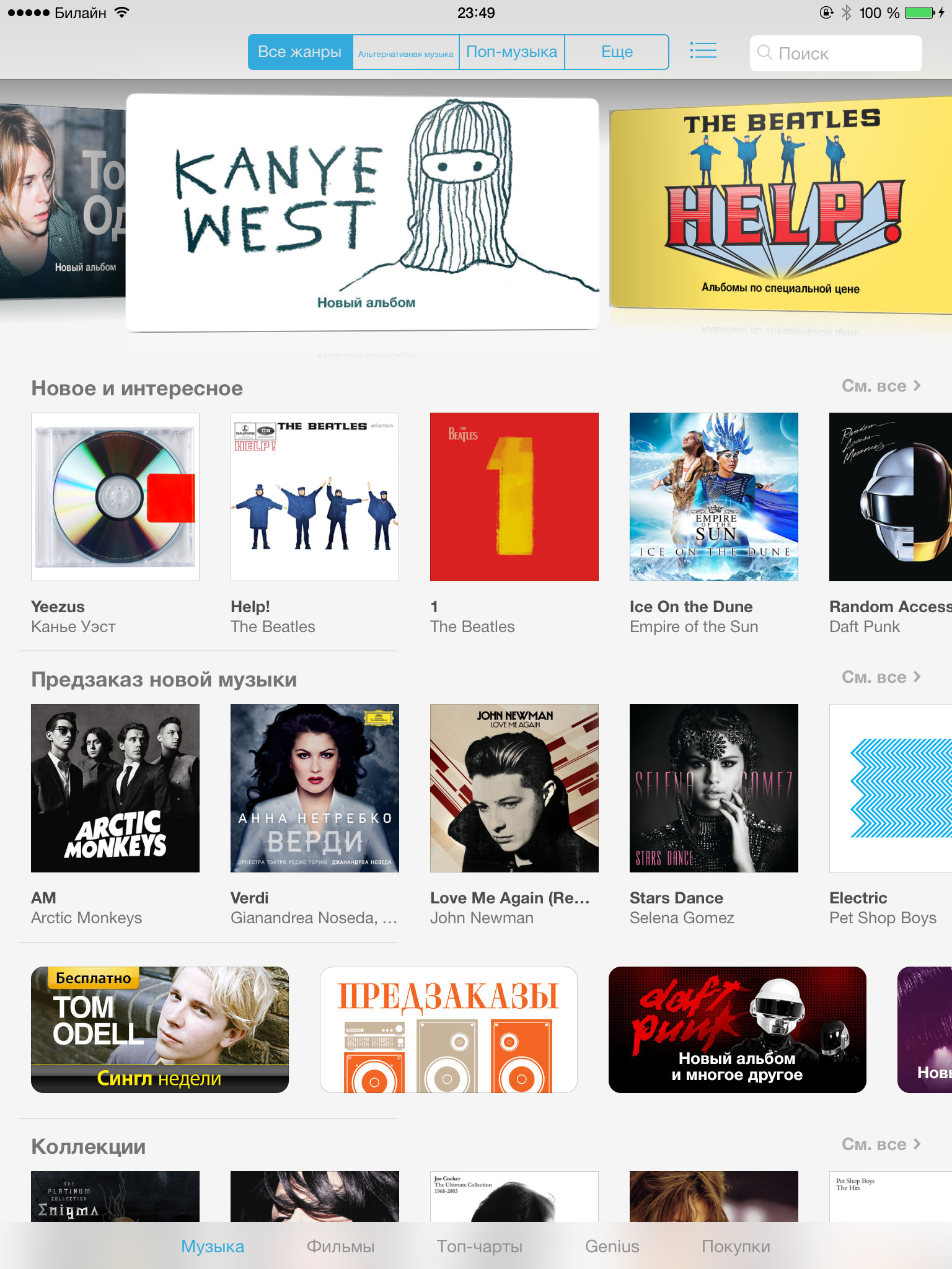
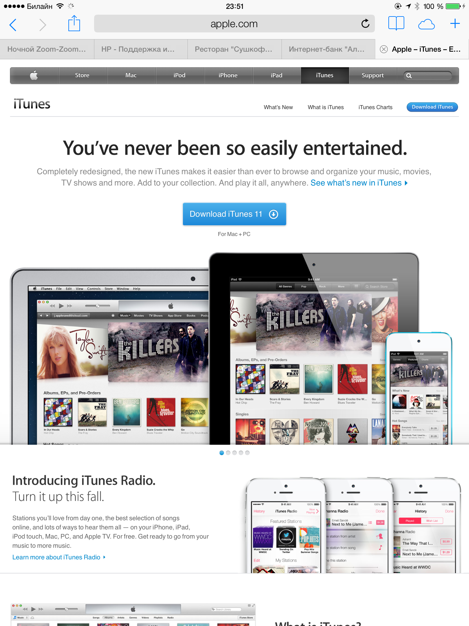
ITunes: It looks very sad compared to the iPhone, it is unclear even why the icons were removed - here they certainly do not take up much space, but give some kind of completeness to the lower menu. The view "we played around with fonts" in the top menu - here even words are no longer needed. Genius disappeared in the AppStore - this move is also completely unclear.

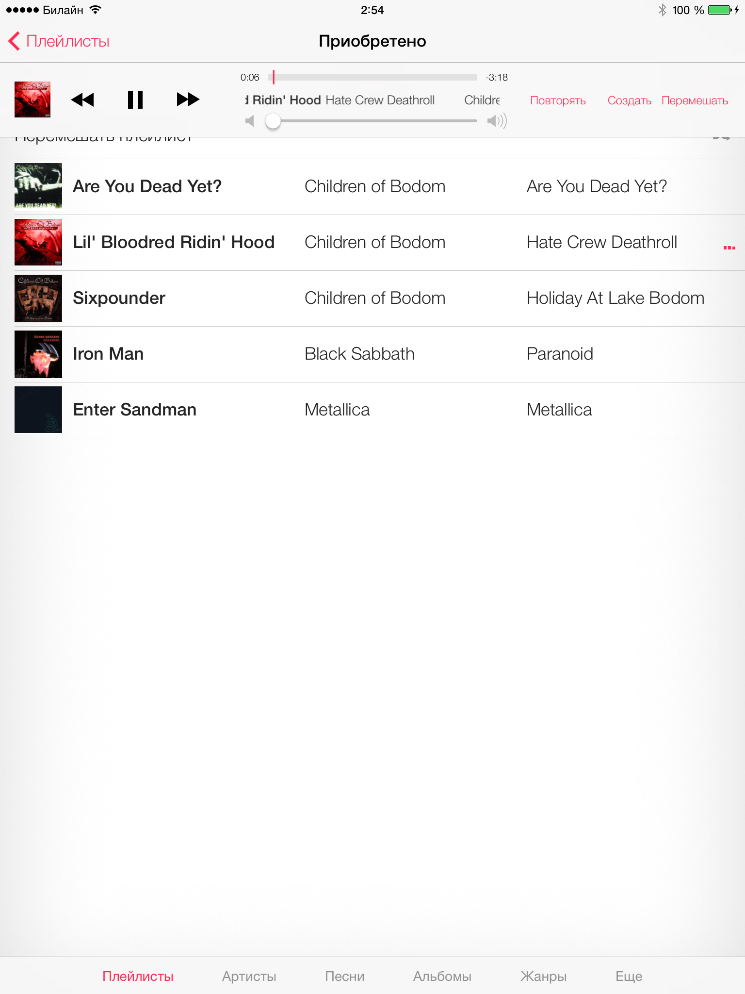
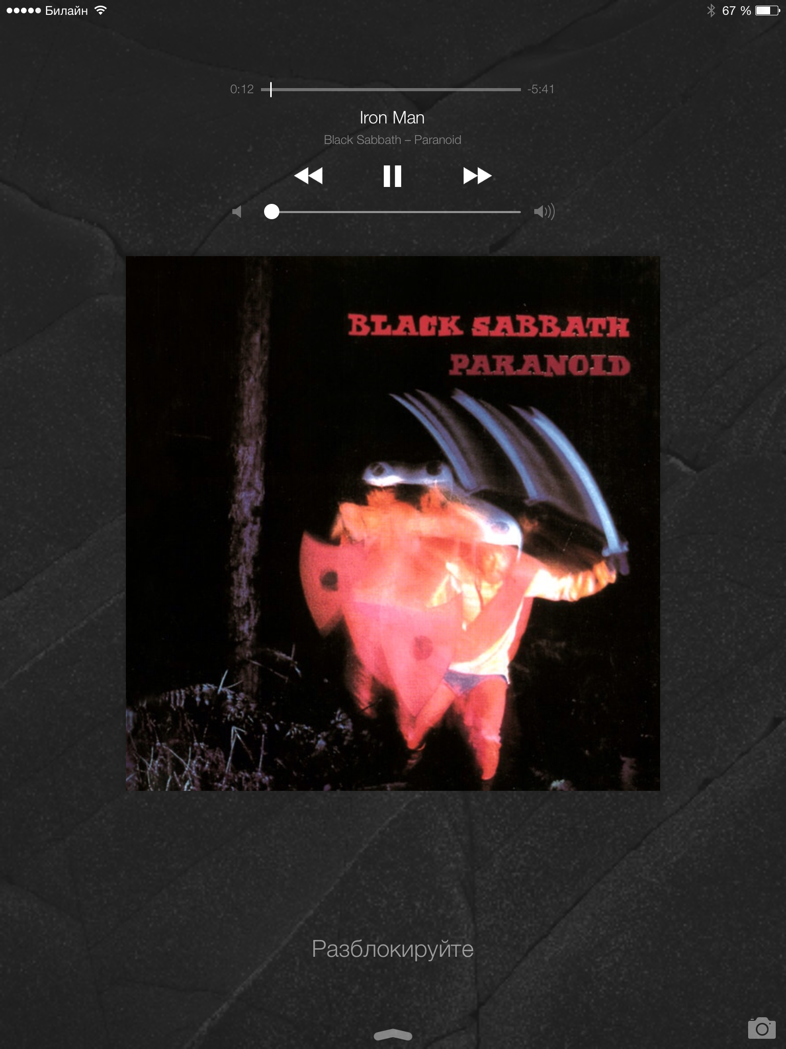
Player: When playback is turned on, the lock screen also changes - now there instead of the clock the player control and album cover are displayed: Photo: There was a rather interesting grouping by the location of the photos taken. For some cases, it’s very convenient.


Safari: The appearance is very different from Safari on the iPhone, although due to the larger available area for display, this solution is more convenient.

If anything else interests - ask, do not be shy.
The impressions of the first use are rather ambiguous: on the one hand, quite interesting features have appeared, such as a control point that allows you to quickly and with a minimum number of tapes enable or disable a certain function; and on the other hand - quite useless, for example, the same parallax effect (which is now called in the settings), dynamic wallpapers that do not carry any useful functionality, but only a dubious decoration.
Most of the innovations made in the first beta version have already been reviewed on the hub, but only regarding the iPhone. Now a similar review will be based on the iPad.
Main interface
The update from version 6.1.3 went pretty painlessly and quickly.
After installation, the standard initial setup procedure. Unfortunately, I forgot to take pictures, so I will describe the steps of the settings after the update in words:
- PIN entry
- Language selection
- Offer to set a password with iCloud KeyChain connectivity
Then, literally within a few seconds, our eyes come up with a iOS homescreen (images are clickable): No significant changes compared to the previous beta on the iPhone.
Alert center: Control center : It is worth noting that some of the functions available on the iPhone, such as a flashlight and a calculator, are absent here (due to their absence in principle). The Timer application icon has also been slightly changed.
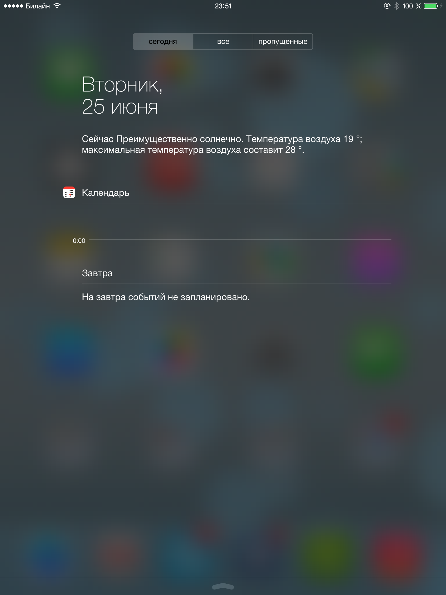

Spotlight (which is now located not to the left of the main screen, but is called up by swiping down on any of the screens): Lock screen: You can now call the camera by pulling the lower right corner (where the camera icon is located)


Multitasking: In the version for iPad, as I believe, it was quite possible to expand the number of simultaneously displayed applications to five. The feature of completing several tasks at the same time works (swipe up several applications at the same time), but due to the iPad's large screen size, doing this is slightly inconvenient.
Standard applications
Stopwatch: Timer (in my opinion, it looks better than in the previous beta): Camera: Traditionally, there are no panoramic shooting modes and the “Hello Instagram” effects (although the photo in the form of a square is still present, it’s not clear for what purpose) How You may notice that the HDR shooting mode has appeared. With the default settings on the device, two pictures are saved - the original and directly HDR. Rumor has it that the quality of the shooting was improved, but in fact I did not notice the differences. Shooting modes are switched by swipe up / down on the sidebar. A few examples:

You may notice that the photo in the “Square” mode remains with the usual aspect ratio. However, on the device itself, photos are displayed as intended (possibly a bug, but most likely a feature):
ITunes: It looks very sad compared to the iPhone, it is unclear even why the icons were removed - here they certainly do not take up much space, but give some kind of completeness to the lower menu. The view "we played around with fonts" in the top menu - here even words are no longer needed. Genius disappeared in the AppStore - this move is also completely unclear.
Player: When playback is turned on, the lock screen also changes - now there instead of the clock the player control and album cover are displayed: Photo: There was a rather interesting grouping by the location of the photos taken. For some cases, it’s very convenient.
Safari: The appearance is very different from Safari on the iPhone, although due to the larger available area for display, this solution is more convenient.
A bit of criticism
- First of all, I would like to express a huge FU to someone who developed the design of notes. The links became completely unreadable.

And although something else can be seen in the picture, it is almost impossible to distinguish it on a screen with bright backlight. - Although this is a beta version, leaving respring when viewing standard applications (which is not observed with third-parties) is very confusing.
- It’s completely not clear for whom and why “live wallpapers” and the parallax effect were invented (except for indulging Android users). They do not provide useful functionality, they are almost invisible to an outside observer (if you do not poke your nose). In general, they can be described as "useless battery eaters."
- Why remove the watch from the lockscreen when the user is listening to music? Can anyone explain at least one useful factor of this action?
If anything else interests - ask, do not be shy.