Design of familiar things: how to improve the interface on the example of YouTube

From the translator: today we bring to Habr's attention the translation of the article by the interface designer Kévin Eugène. He has been busy in this field for many years, so he has something to tell. YouTube is one of the most illustrative examples, because this service is well known to all of us.
Like all of you, I use YouTube quite often. Music, popular science broadcasts, viewing videos for relaxation - all this can be found on the service. Well, since it is well known to all of us, I tried to visually show a way to improve the interaction between humans and the platform.
Skillbox recommends: Practical two-month course "UX-design" .
We remind: for all readers of Habr - a discount of 10,000 rubles when writing to any Skillbox course on the promotional code "Habr".
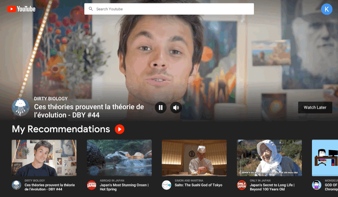
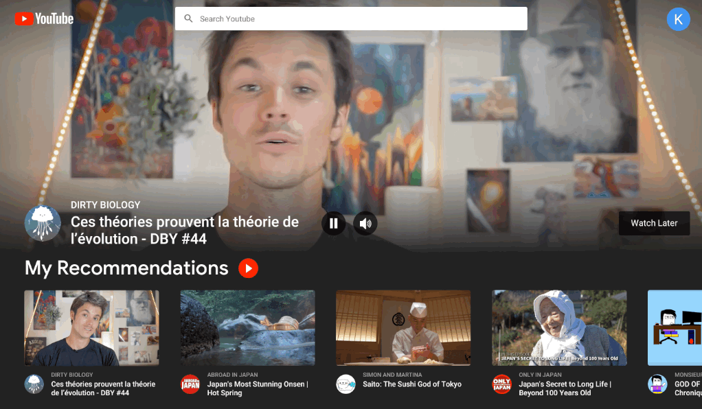
Home Page

In the new design of the start page, I would focus on the recommendations. While the first video of the recommended ones is playing in the background, the rest can be launched simply by clicking on them with the mouse. The background video can be stopped or silenced, and if the user liked it, then add it to the Watch Later list or start watching right away. The video starts from the point where the preview ends.
The user can quickly create a playlist with all the recommendations from a specific page: to do this, simply click on the button next to the My Recommendations plate. This is necessary in order to achieve the maximum level of interaction between the user and the machine learning algorithm.
In addition, in the new interface, dark tones must be used to make the content stand out, and it was easier for the eyes to focus on a specific video.
Player
I decided to change the panel in such a way that it fits the new interface. In fact, everything is sharpened for him.
Like and Dislike buttons
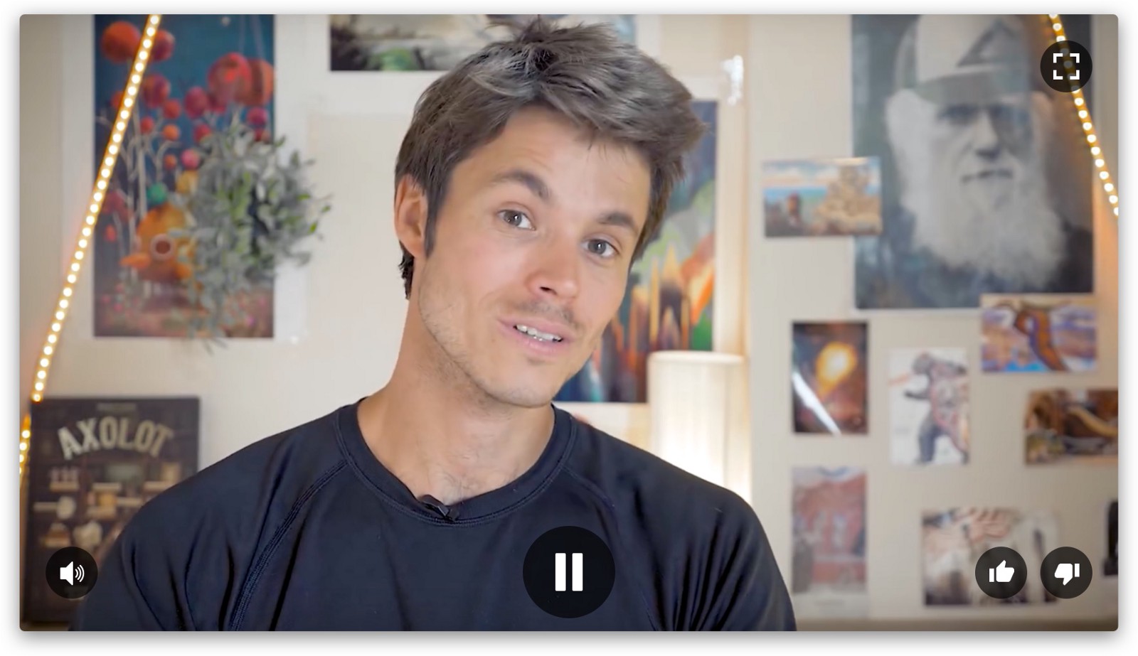
In this version, the problem with the buttons is that they are not available in full-screen mode, but most service users prefer to watch YouTube videos in this way. The worst thing is that in the current interface it is very easy to go to the next video: it turns on automatically. In the new concept, the buttons are located on top of the player, so you can use them at any time.

On the one hand, automatic playback is convenient, but on the other hand, I don’t have time to put a Like or Dislike. This should be avoided because the creators of video content do not receive well-deserved ratings. Well, I, as a user, can’t tell YouTube about my preferences, so it all ends with not very relevant offers. Sometimes I click on the "Like" button before viewing, but this can also confuse the algorithm.
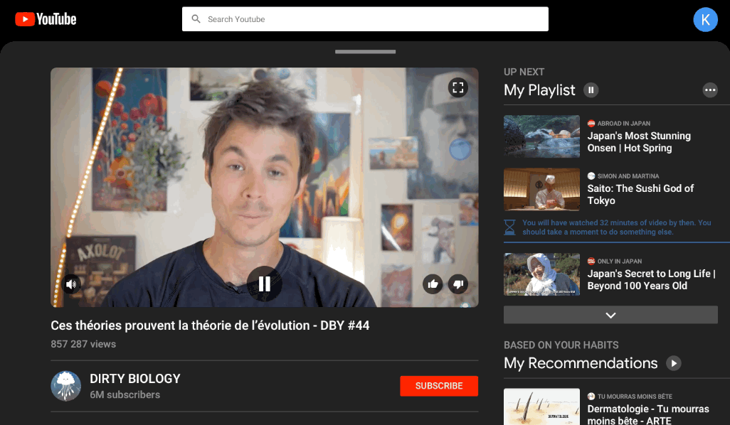
Right column
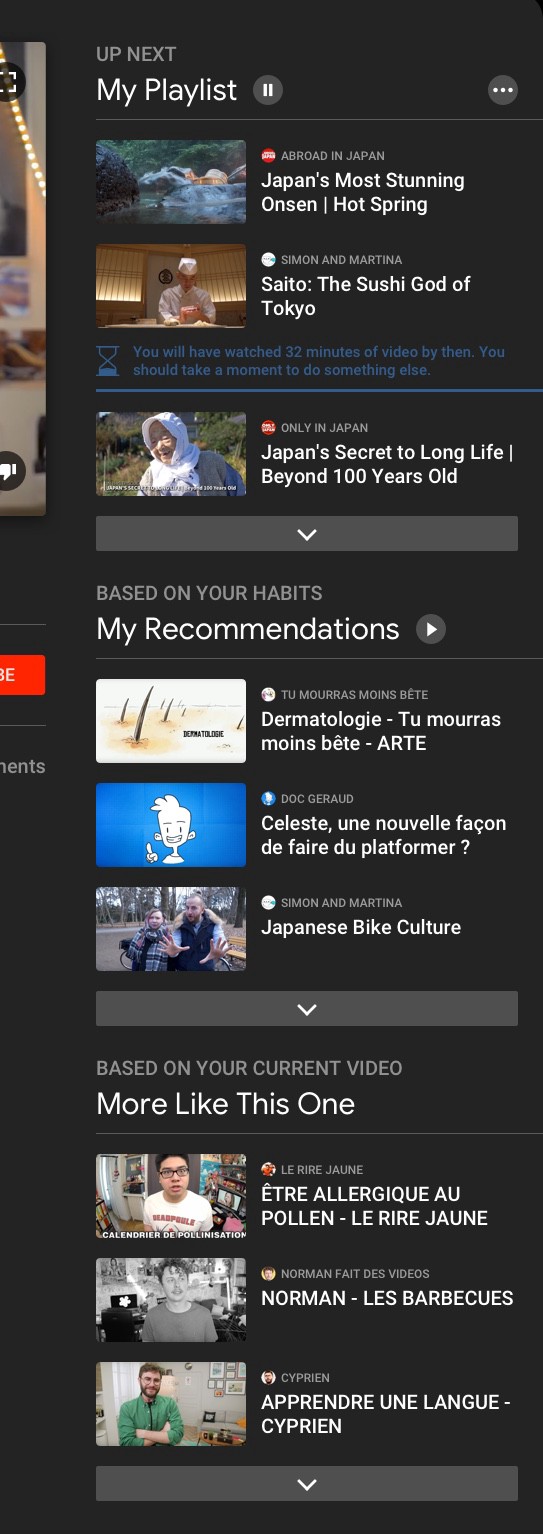
The right column shows videos relevant to the current video. In any case, that is what is meant. Proposals are divided into three categories:
My playlist
The videos in the active playlist are displayed here. It’s like a waiting queue that can be found in music apps like Spotify or Apple Music.
Videos from the categories below can be dragged into My Playlist, it’s easy to re-order or enable autoplay by simply pressing the appropriate button. You can edit the list without any problems using three white dots.
When a playlist has a name, “My Playlist” is replaced with it.
My recommendations
This section is based on the user's habits and does not depend directly on what he is viewing at the moment. I would like to make the recommendations easily accessible, and therefore from here the user has the opportunity to watch all the content from the very beginning to the end, since there is a play button next to the title.
When a user clicks on it, the recommended videos get into My playlist. “My recommendations” are not edited, as this is the result of the work of the algorithms, but the video can be dragged and placed in “My playlist” at will.
More similar to this video.
In the category, videos are shown that correspond to the video currently being watched by topic.
If you look at a similar section on YouTube, you will understand that there is no clear categorization or explanation of how the videos get here.

In the end, the user simply does not understand why this video is being shown to him - because it is from the same channel as the current one, or for another reason. In some cases, all of these recommendations look like an absolutely random choice. Moreover, if the video being watched is contained on the channel to which the user is subscribed, the right-hand column shows mainly the video from the current channel, which does not allow seeing more third-party recommendations.
In the new design, the three categories (My playlist, My recommendations and More similar to this video) are linked to each other and are displayed every time the video is played, even if My playlist is empty. It is worth explaining the differences between the categories briefly and clearly, so that the user understands their purpose precisely (“Based on your habits”, for example, or “Based on what you are watching now”).
By giving a clear description of the categories, we help the user to understand where to look for videos of interest to him.
Digital well-being and responsibility
It's great to build a platform with a huge amount of entertainment content, but if there is a threat of addiction (a digital drug of its kind), then companies are obliged to protect their users.
UI / UX designers are responsible for creating systems that are addictive in the true sense of the word. This makes it possible to manipulate the feelings of users.
The proposed YouTube design just bears a share of responsibility for users. And I will show it with a few examples.
For example, autoplay video can be activated only within the playlists that the user creates, and never in the list of recommended videos.
Also, viewing is limited in time - only half an hour. As soon as the limit has been reached, the system prompts the user to do something else - autoplay stops. This warning should be clear enough for the user to understand why he should stop watching videos.

Tools like this are extremely important for content-oriented platforms like Netflix and YouTube, because they are addictive. The user needs to be reminded of the importance of breaks.
Picture in Picture
Finally, picture-in-picture comes to the desktop. And it looks great.
Picture-in-Picture is automatically activated when the video panel is closed. The function can be activated either by dragging the video or by clicking the search bar. In the mini version of the video, the user can pause the playback, mute the sound, resize it, move it to another location, or return it to the video pane by clicking on it. When the thumbnail is played, the background video on the main page pauses.
Instant playlists
Here all the elements of the puzzle converge.
Instant Playlists - temporary playlists that the user can very quickly create, edit and view. They are based on drag-and-drop gestures.
When a user captures a video at the bottom of the screen, it is saved in the Instant Playlist and is located at the top in picture-in-picture mode. Playback does not start until the user decides to do this.

When you capture a video, it disappears from the list; instead, the next movie comes out on top. The user can add as many clips to the list of this type as he sees fit, simply “dropping” them down the screen.
As mentioned above, Instant Playlist is a temporary list. As soon as the user closes YouTube, such lists are deleted. If desired, they can be saved by opening the edit menu. The user can call their lists, delete videos from them, rearrange videos in places.

The concept of the lists can be compared with the user's behavior in the supermarket: he chooses products that he likes and adds to the cart in order to use them later.
The lists are good because you can save your favorite videos for a couple of seconds. In the old version of the interface this can not be done. Rather, you can save the video for viewing in the future, but it takes more time.
As output
Of course, all that is said above is not a dogma, but simply an attempt to solve some of the problems that I encountered while working with the platform. Please let me know in the comments what you think. Any suggestions for improvement are welcome. :)
Skillbox recommends:
- Practical course Mobile Application Design (feat. Redmadrobot!).
- Practical course "Fullstack Mobile Developer"
- Online course "Web Developer"