5 secrets of a good interface. Personal experience
Over the past few years, I have been closely developing interfaces for a wide variety of devices - from commonplace smartphones and tablets, to smartTV applications and some esoteric devices like set-top boxes for broadcasting music through a TV.
I admit honestly - I'm a bad theorist. It seems that I have not fully mastered a single book on the development or design of the interface and practically do not read the blogs of the popular usability evangelists. But, perhaps, for you there is a positive side to this - I have formed my own set of rules that I use to create the interface.
Under the cutscene, you will find a long text, two tips and three techniques, generously seasoned with examples from personal experience, in which I tried to step by step describe the process of creating good, intuitive applications and sites, and which, of course, involves many near-interface solutions.
The general concept is only in the head.
It sounds a little wild, but personally, quick sketches prevent me from covering the whole picture, and procrastination often does not even allow me to take up a notebook. When I pick up a pencil, and in simple cases, immediately a mouse, I should already know what I want to come to. Let this picture be with a bunch of white spots, let it change 20 times as it is embodied, but the first, still unconnected thought gives rise to ideas that never appear at the stage of sketching.

But how to make yourself think in the right direction? Thoughts disappear per second if you deliberately sit in a quiet place and meditate. There is a little secret. Imagine that all the work has already been done. Everything is ready, it works, thousands of users use your service every minute and praise without stopping.
What are they discussing? What words? How do you see this product yourself? Why do they want to use it? Take a look at this picture in your imagination. And at that moment it suddenly becomes crystal clear to you how this should work. Hold on to this thought - this is the last time you have crystal clear what you need to do :).
Sometimes it doesn’t work. If the product is too highly specialized, or if it does not inspire you personally. Social-network-catalog of means for cleaning sewers does not want to be visualized in the head. It’s bad, but it doesn’t matter - maybe you should talk with the customer / developer / someone from the target audience. These people with burning eyes tell you the secrets of their field and can seriously carry away and give a lot of inspiration. This has happened to me more than once - initially a very dubious idea suddenly turns into a super-service in my head, after one person enthusiastically retold it to me for the 50th time.
First, design, then mesh / wireframe.

Yes, a contradictory rule. It’s strange for me, from the fact that I write it - but it gives the result faster and with a higher level of quality than vice versa. After the idea and draft sketches, in order to capture the key points, you can start design. In no case do you need to try to make it all - you just need beautiful pictures of a pair of key screens. Better in several ways. Each subsequent design, the essence, is not just a new concept, but an iteration of work on an idea - successful moves go to the next, dubious ones leave.
If the project is quite simple from a logical point of view, and the design turned out to be very successful, then you can even skip the prototyping stage and immediately proceed to finalize the design and layout.
Why does it work?
First of allfree study of trifles that are not tied to a rigid grid of elements gives a much more creative approach and does not pinch the designer in the cell of the existing grid of elements. I draw mainly myself, but for a long time I worked in design communities in advertising agencies in order to know one of the killers of good design in the face - a bad sketch.
Secondly, at this stage there is a concentration on the main areas - which is why I mentioned the “key points”. There are no forms of logins and exhausting payment chains in 3 different ways, just the general style of the site / interface / application. If you succeed in creating a good style, this will greatly inspire the team for further work, including an interface developer.
Third, most important , you have something to show. Need to report to an investor? Look, here is a presentation, and here is a sketch. You can, on its basis, create several posters or banners to attract additional investment. Parents can brag.
But seriously, believe me, a good, presentable screenshot of your future service will greatly simplify your life in the future.
Another piece of news - most likely nothing will remain from the initial design in the final version. This is normal.
We pass to the practical part:
For myself, I have come up with several techniques that are somewhat commonplace, but effective in practice, when you do not know where to start and how to evaluate the result. It turned out that it was very difficult to formulate them, although I sincerely believed that the description of all three would take at most several paragraphs.

The application operates with a different number of elements. We need to estimate this quantity. There can be five of them, like instagram tabs, or maybe a billion, like Google search results. Each number of elements requires its own graphic and logical approach.
So, we estimate the number of elements:
About 5 - output of all elements with details.
If this menu, then the details for them will be very concise - just a signature under the icon.
Question to the customer - how many tire models do you have? If the answer is five, you do not need to do a drop-down list, a search with a hint, and smart auto-complete. Just show all these five tire types with specs. Everything. There is nothing to think about - any action with them will complicate the search for them.
7 - 15 - listing without details.
Categories, if any, are subordinate to the elements and are presented simply as information.
Anyone will rather view 10 elements faster than click on categories to see two or three elements. If you have 10 models of sofas, you do not need to create partitions for them - show them by hiding the details under the cut, if there are a lot of them.
All arguments about "think that we have a little, let's better make categories" nonsense. If a user opens the category “rattan furniture” and sees that there is already one element in it, this is much worse than simply bringing all the models to the main page. No pseudo-elements will deceive today's user, who sees these tricks a million a day.
15-25 elements - an expanded categorized or grouped list.
A classic example is the restaurant menu. There are 6 categories according to which, say, 18 dishes are distributed. Bad restaurants will do this: one page - one category - three dishes occupying three lines. Good - they will bring out the entire list of dishes in one spread, grouping them into categories - soups, hot dishes, drinks and so on.
25 - 150 items - closed categorized list.
Typical small online store, assortment of up to 150 products. It would be crazy to dump all this diversity on one page, but there is no point in doing a full-text search as a basis. Man will not find what he needs. Of course, an additional search will not be superfluous, but I'm talking about the main method that is offered to the user.
150-500 items - categorized catalog with filters.
Here you can include smart algorithms for predicting interesting and important elements for the user. For news, these are the latest materials from the right region, for the catalog of household appliances - promotions and popular offers.
500-10k items - categorized catalog with filters + required full-text search
All the same as in the previous case, but full-text search is becoming an indispensable element. An example is a catalog of old cards for MTG. This game contains a huge number of cards, most of which are of interest only to collectors. We can divide all the cards into editions and colors, but hundreds of cards wander from editor to editor, sometimes even disappearing from them, as the balance is corrected. Without a full-text search, you will have few chances to find something specific, but it would also be sadistic to require the player to keep the names of the cards in mind in order to just see some ancient set.
10k - 500k elements - full-text search + catalog with filters.
Everything is correct, as in the previous version, just the opposite. In design, from a change in terms of terms, the result changes. Search comes first and filters second to second. An example is Yandex.Market.
I will not dwell on large projects, each of them has its own specifics, and I have only one project behind (more precisely on my shoulders) with a base of the order of half a million positions - but a smart search that takes into account the maximum amount of known information is what you need.
Another caveat - such a base, usually, is no longer just part of the application, but this is already our application, and everything else revolves around it, like 14 satellites around jupiter.
Over 500k elements - smart full-text search and filters.
I don’t know if there is a global population base for our country, but if so, there should have been something similar there. A search string with a smart, ordered search result and many filters that cut off the results of the first searches.
For example, if we type the name "Loboda", we get a list of all people with this name. We specify the region, specify the gender, specify the age - and before us, sooner or later, that one will appear. Record. In the database.
I repeat - not vice versa. First a text search, and then filter clipping. You cannot first ask a region, and then find out that there is no such last name in this region. Maybe she is in the next. If there is no text and cannot be, then, of course, we proceed immediately to categorization.
Fuh, sort of sorted out. Let’s, for consolidation, I’ll explain the general rule - the user does not like to keep more than 21 elements in his head. I took this figure from the ceiling at the time of writing, but it seems to me closer to reality.
If you have a list of 76 categories, each of which has 300 results, try to break it down into at least 4 sections. There will be approximately 20 categories in each. Output 300 results per page, approximately 20 per page. It’s good to at least try to show the most relevant results already at the first.
Fuh. We move smoothly to the next big whale of good usability -

This is not at all what you thought about - but it’s not so easy to find the name of the abstraction that I use to create a good mesh. These are NOT user scripts, although they are somewhat reminiscent of them. We’ll leave the user scripts for testing - by the way, it can be done perfectly right at the design stage, but I hope this is already clear.
User profiles are a set of several abstract personalities who are our target audience and who use our interface. As a rule, it is better to take extremes - they have the most diametrical goals and the level of technical knowledge. Ordinary users will be somewhere in between.
In addition, subsequently, part of the profiles can be used to write custom scripts for an already finished application, revealing a number of disadvantages that are not obvious to the developer.
Now to the examples. To slightly dilute this huge sheet of text, I will try to come up with some peppy examples on the example of a non-trivial application.
For example, a social network for communication between bestiality and animals ... No ... An application for communicating with the dead ... No, also not that ... Ah, there is:

Given: iPhone one night sex partner search application.
Planned functionality: Registration, synchronization with social networks, uploading photos, a profile with personal data, determining location (geolocation), a system of text statuses, an ad unit that will pay for all this disgrace.
Customer expectations: A lot of downloads, a lot of ad views, a lot of money. Expectations of the customer, by the way, are also only one of the scenarios - I just assume that he wants this, in practice there are funny exceptions. But let's not complicate.
I'm starting to write profiles. Once again, these are just portraits of people who may be using your application.I always listen with interest to the conversations of people in cafes and fellow travelers, if they relate to some services and communicate with existing users with interest. I will not make water, about how to invent them and where to get psychological portraits of users. Experience and imagination will help you. If someone believes that he knows everything about how users will behave - this is a self-confident idiot, run away from him, they are more dangerous than just idiots.
I provided the profiles with aloud thoughts from our characters, for clarity, but it is clear that this is not necessary to prescribe .
So:
So, we have the first scenario ready. I suggested that I could make such a person fill out his profile and leave the application on his phone.
After compiling it, it becomes completely clear that registration in the social network cannot be made mandatory, and you can not force the user to fill out a profile before trying to search the directory. Similarly, you can’t show him an empty database at his potential request - in any of the three cases listed above, he simply uninstalls the application.
Let's go, write the following script.
The second scenario is ready. I don’t focus too much on those points that were already mentioned in other scenarios, but it’s advisable to duplicate them all the same - the more identical roles each role uses, the more attention should be paid to this functionality.
The third scenario. It turned out somewhat insanely, but in general, what is needed - based on the expectations of users, I predict the functionality and procedure for its use. In practice, of course, everything looks much more prosaic, but the general idea remains - the profile reveals to m the real needs of users. Here, marketing skills for creating surveys, as well as the ability to approximate a small sample on a larger scale, are very useful.
I hope I’ve clarified a little with the scripts, and now we turn to special cases, the answers to which we can’t get by using the script. Should I put this item in a separate button or add it to the main menu?

This is another fundamental rule - higher predictability, in fact, means more convenient . But why, even honestly keeping this rule in mind, can you create a terrible non-usable monster that users will complain about for years?
I add to this rule the concept of "calories" or just points. The amount of energy that a person needs to spend to perform an action. This is a synthetic value, which, very conditionally, I consider as points of difficulty in agile- 1, 2, 3, 5, 8, 13 and 21 .
click (or tap) is always 1 point. Minimally complicated action for the user. . Any other basic action, swipe, wright-click, ctrl + click, or any of the additional keys on the remote control is 2 . I also take into account the concept of a “complex” click when you need to get to a certain point located in an array of other elements. This will also add a penalty unit.
Reading one word or phrase is also 1 , but an entire sentence, a homogeneous list of several words or a tooltip after hovering is at least 3 .
Studying a complex sentence, a paragraph of text, or a heterogeneous / long list (let there be 7 elements), at least 5 points.
If a person finds himself in a situation where he does not know where to click and cannot find information about this element, here you can safely write out at least 13 , or even all 21 at once. An experienced user will follow the path of least resistance and simply flips all the menu items, spending only a few on clicks, but this one is not always available - when there are a lot of elements or if clicks can be irreversible - as is the case with payment systems.
By the way, when the user does not know whether the actions after the click are reversible, he will have to solve this problem, and if he cannot, he will have to ask for help from outsiders, more experienced users, or even abandon this venture. Do you recognize your mom ?:
Let’s now logically think about why it’s permissible for a cash register to simply make a set of pictures on the main page, but not on the menu on the site, which, in fact, represents the same assortment of products.
Naturally, the difference in user training. The cashier works all day with the cash register, she does not need to read the signatures, she already knows them. Therefore, she spends only a few on tap on the screen. Make her expand categories or read labels that are obvious from an experienced user’s point of view - and complicate the interface by exactly half.
The site user almost never knows the assortment of pictures and details. For him, each click will be accompanied by a reading of the accompanying inscription. And if it doesn’t exist, then by clicking, reading the inscription, returning to the main screen, which, of course, will not make the site more attractive to the user.
At the moment of the second and subsequent launch of the application, the user will already have a certain experience from the previous time, and the points will go away less and less each time until he goes into the category of experienced users, when reading the inscription or instructions will only complicate the use. This is due to the difference between an online store with a constant influx of new users and a professional application that is usually used for quite a long time.
I hope I was able to get the idea across. As I usually repeat the beginning - predictability is more important than clicks . If you manage to make the element's behavior more predictable by adding a couple of clicks, it's worth it.
Conclusion:
I will be glad if someone finds this text interesting, but doubly makes me happy if it helps someone create more convenient and high-quality products.
If you have already met a description of similar techniques in designing - please write to me, please, in the comments or in person, I will be happy to review and, perhaps, organize my knowledge by drawing something from smart people.
... and proud, proud of those who have read up to this place, thank you!
One of the interfaces mentioned in the article
I admit honestly - I'm a bad theorist. It seems that I have not fully mastered a single book on the development or design of the interface and practically do not read the blogs of the popular usability evangelists. But, perhaps, for you there is a positive side to this - I have formed my own set of rules that I use to create the interface.
Under the cutscene, you will find a long text, two tips and three techniques, generously seasoned with examples from personal experience, in which I tried to step by step describe the process of creating good, intuitive applications and sites, and which, of course, involves many near-interface solutions.
So, tip number 1.
The general concept is only in the head.
It sounds a little wild, but personally, quick sketches prevent me from covering the whole picture, and procrastination often does not even allow me to take up a notebook. When I pick up a pencil, and in simple cases, immediately a mouse, I should already know what I want to come to. Let this picture be with a bunch of white spots, let it change 20 times as it is embodied, but the first, still unconnected thought gives rise to ideas that never appear at the stage of sketching.
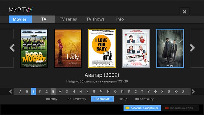
An example from life, about the picture on the main
В качестве примера могу привести каталог фильмов на smartTV на 5 000 позиций. Фактически в ТЗ стоял запрос на разработку поиска по ним. После часа размышлений становится ясно, что нам вообще не нужно концентрироваться на поиске – 5к фильмов это слишком мало, чтоб давать пользователю что-то релевантное его запросу. Никакие ухищрения с умными фильтрами не покажут пользователю того, что он хочет – нужных фильмов по полнотекстовому поиску просто не окажется в базе, а выборка по жанрам недостаточно умна, чтоб выдать что-то интересное без написания десятков дополнительных условий. Поэтому изначальная идея трансформировалась в своеобразную витрину – пользователю дается на выбор 5 топ-фильмов на первом экране и топ 50 рядом. Фильмы выбираются вручную свежайшие и, субъективно, интересные. Впоследствии «витрина» начинает учитывать вкусы пользователя, увеличивая процент фильмов, сходных с тем, что он просмотрел. А сам поиск, со всеми его фильтрами, уходит на второй план – для тех, кто знает, что хочет.
Эта система показала свою эффективность с первых же наработок – высокая конверсия, легкость для понимания, простой и приятный внешний вид, даже в рекламе первый экран фигурирует как хороший постер, а не как форма с фильтрами.
Чего бы все это стоило, если бы я начал с эскиза, сконцентрировавшись на поиске?
But how to make yourself think in the right direction? Thoughts disappear per second if you deliberately sit in a quiet place and meditate. There is a little secret. Imagine that all the work has already been done. Everything is ready, it works, thousands of users use your service every minute and praise without stopping.
What are they discussing? What words? How do you see this product yourself? Why do they want to use it? Take a look at this picture in your imagination. And at that moment it suddenly becomes crystal clear to you how this should work. Hold on to this thought - this is the last time you have crystal clear what you need to do :).
Sometimes it doesn’t work. If the product is too highly specialized, or if it does not inspire you personally. Social-network-catalog of means for cleaning sewers does not want to be visualized in the head. It’s bad, but it doesn’t matter - maybe you should talk with the customer / developer / someone from the target audience. These people with burning eyes tell you the secrets of their field and can seriously carry away and give a lot of inspiration. This has happened to me more than once - initially a very dubious idea suddenly turns into a super-service in my head, after one person enthusiastically retold it to me for the 50th time.
But what if it’s really bad?
Бывает, что всем на идею плевать. Программисты с ужасом ждут какого-то креатива, дизайнеры с отвращением представляют себе серый скучнейший эскиз на 100500 форм с автозаполнением, руководство следит чтоб никто не опаздывал на работу, а заказчика интересует только сможем ли мы набрать 1000 пользователей за 3 месяца, для отчета перед инвестором.
Тогда мы идем прямиком к конкурентам – я стараюсь использовать эту возможность в последнюю очередь, иначе, увлекшись копированием, можно пропустить что-то важное. Но если даже у конкурентов украсть нечего, все серым-серо, просто садимся и делаем что нибудь, потом гуляем час — и пытаемся это что-нибудь улучшить. Час гуляем – садимся улучшать. Или переделывать. И так, через N итераций, можно получить результат.
Тогда мы идем прямиком к конкурентам – я стараюсь использовать эту возможность в последнюю очередь, иначе, увлекшись копированием, можно пропустить что-то важное. Но если даже у конкурентов украсть нечего, все серым-серо, просто садимся и делаем что нибудь, потом гуляем час — и пытаемся это что-нибудь улучшить. Час гуляем – садимся улучшать. Или переделывать. И так, через N итераций, можно получить результат.
Second tip:
First, design, then mesh / wireframe.
picture from the cycle “the world is the other way around”
Yes, a contradictory rule. It’s strange for me, from the fact that I write it - but it gives the result faster and with a higher level of quality than vice versa. After the idea and draft sketches, in order to capture the key points, you can start design. In no case do you need to try to make it all - you just need beautiful pictures of a pair of key screens. Better in several ways. Each subsequent design, the essence, is not just a new concept, but an iteration of work on an idea - successful moves go to the next, dubious ones leave.
If the project is quite simple from a logical point of view, and the design turned out to be very successful, then you can even skip the prototyping stage and immediately proceed to finalize the design and layout.
Why does it work?
First of allfree study of trifles that are not tied to a rigid grid of elements gives a much more creative approach and does not pinch the designer in the cell of the existing grid of elements. I draw mainly myself, but for a long time I worked in design communities in advertising agencies in order to know one of the killers of good design in the face - a bad sketch.
Secondly, at this stage there is a concentration on the main areas - which is why I mentioned the “key points”. There are no forms of logins and exhausting payment chains in 3 different ways, just the general style of the site / interface / application. If you succeed in creating a good style, this will greatly inspire the team for further work, including an interface developer.
I sometimes mention the designer and interface developer as different people - but this does not always correspond to our realities, I understand perfectly. It can be one person, no problem, you just need to remember that these are different parts of the work, and they pursue different local goals. Such an option for a split personality is to enter into a contradiction with oneself.
Third, most important , you have something to show. Need to report to an investor? Look, here is a presentation, and here is a sketch. You can, on its basis, create several posters or banners to attract additional investment. Parents can brag.
But seriously, believe me, a good, presentable screenshot of your future service will greatly simplify your life in the future.
Another piece of news - most likely nothing will remain from the initial design in the final version. This is normal.
We pass to the practical part:
For myself, I have come up with several techniques that are somewhat commonplace, but effective in practice, when you do not know where to start and how to evaluate the result. It turned out that it was very difficult to formulate them, although I sincerely believed that the description of all three would take at most several paragraphs.
1. The rule of the number of elements.
The application operates with a different number of elements. We need to estimate this quantity. There can be five of them, like instagram tabs, or maybe a billion, like Google search results. Each number of elements requires its own graphic and logical approach.
So, we estimate the number of elements:
About 5 - output of all elements with details.
If this menu, then the details for them will be very concise - just a signature under the icon.
Question to the customer - how many tire models do you have? If the answer is five, you do not need to do a drop-down list, a search with a hint, and smart auto-complete. Just show all these five tire types with specs. Everything. There is nothing to think about - any action with them will complicate the search for them.
7 - 15 - listing without details.
Categories, if any, are subordinate to the elements and are presented simply as information.
Anyone will rather view 10 elements faster than click on categories to see two or three elements. If you have 10 models of sofas, you do not need to create partitions for them - show them by hiding the details under the cut, if there are a lot of them.
All arguments about "think that we have a little, let's better make categories" nonsense. If a user opens the category “rattan furniture” and sees that there is already one element in it, this is much worse than simply bringing all the models to the main page. No pseudo-elements will deceive today's user, who sees these tricks a million a day.
15-25 elements - an expanded categorized or grouped list.
A classic example is the restaurant menu. There are 6 categories according to which, say, 18 dishes are distributed. Bad restaurants will do this: one page - one category - three dishes occupying three lines. Good - they will bring out the entire list of dishes in one spread, grouping them into categories - soups, hot dishes, drinks and so on.
25 - 150 items - closed categorized list.
Typical small online store, assortment of up to 150 products. It would be crazy to dump all this diversity on one page, but there is no point in doing a full-text search as a basis. Man will not find what he needs. Of course, an additional search will not be superfluous, but I'm talking about the main method that is offered to the user.
You can add filters and subcategories if necessary, but if you divide 100 elements into five categories, it will be about 20 elements, which can be viewed without problems by simply scrolling through the screen. Most likely you will not have a good reason to filter these elements to a list of 3 positions. I repeat once again - additional filters can be made, but they should not be at the forefront. Gently, unobtrusively, somewhere behind the drop-down menu.
150-500 items - categorized catalog with filters.
Here you can include smart algorithms for predicting interesting and important elements for the user. For news, these are the latest materials from the right region, for the catalog of household appliances - promotions and popular offers.
500-10k items - categorized catalog with filters + required full-text search
All the same as in the previous case, but full-text search is becoming an indispensable element. An example is a catalog of old cards for MTG. This game contains a huge number of cards, most of which are of interest only to collectors. We can divide all the cards into editions and colors, but hundreds of cards wander from editor to editor, sometimes even disappearing from them, as the balance is corrected. Without a full-text search, you will have few chances to find something specific, but it would also be sadistic to require the player to keep the names of the cards in mind in order to just see some ancient set.
Someone may object that they can come up with a categorization for their catalog of unique alternative music, which has no genres or artists. Let's look a little wider - we still have a date (year of release), name (alphabet), long (up to 10 seconds, up to a minute, up to 10 minutes, up to an hour, longer than an hour), place of recording (country), a set of tools, number of downloads, user ratings ... You can continue for a long time. And this is even if we take some unique algorithms that evaluate the frequency and extent of sounding a strong beat, for example.
10k - 500k elements - full-text search + catalog with filters.
Everything is correct, as in the previous version, just the opposite. In design, from a change in terms of terms, the result changes. Search comes first and filters second to second. An example is Yandex.Market.
I will not dwell on large projects, each of them has its own specifics, and I have only one project behind (more precisely on my shoulders) with a base of the order of half a million positions - but a smart search that takes into account the maximum amount of known information is what you need.
For our project (application catalog) we use the following information for ranking: the number of reviews on the application, the number of comments on the app, users rating the application, release date, number of updates issued, and much more. But it seems to me that this is not enough and I want to take into account such things as the time spent by users on the application page and the conversion percentage (how many people went to the apple website after studying), social graphs and other costly algorithms.
Another caveat - such a base, usually, is no longer just part of the application, but this is already our application, and everything else revolves around it, like 14 satellites around jupiter.
Over 500k elements - smart full-text search and filters.
I don’t know if there is a global population base for our country, but if so, there should have been something similar there. A search string with a smart, ordered search result and many filters that cut off the results of the first searches.
For example, if we type the name "Loboda", we get a list of all people with this name. We specify the region, specify the gender, specify the age - and before us, sooner or later, that one will appear. Record. In the database.
I repeat - not vice versa. First a text search, and then filter clipping. You cannot first ask a region, and then find out that there is no such last name in this region. Maybe she is in the next. If there is no text and cannot be, then, of course, we proceed immediately to categorization.
Of course, there are still technical limitations - programmers look at the passage above with bewilderment. Is it not more logical to first outline the search area and not load the server with a search throughout the database, forcing the rest of users to wait because of insufficiently powerful hardware? If people really have to wait, then of course it’s more logical! But you need to remember that this is a technical limitation that must be taken into account. This is a topic for a separate article. But if our server capacity is guaranteed enough with a margin, then it is better to use a more convenient way.
Fuh, sort of sorted out. Let’s, for consolidation, I’ll explain the general rule - the user does not like to keep more than 21 elements in his head. I took this figure from the ceiling at the time of writing, but it seems to me closer to reality.
If you have a list of 76 categories, each of which has 300 results, try to break it down into at least 4 sections. There will be approximately 20 categories in each. Output 300 results per page, approximately 20 per page. It’s good to at least try to show the most relevant results already at the first.
A couple of examples that will not work as it seems at first glance
1. Возьмем минималистичную страницу сайта со смешными историями. Все, наверное, догадались, о чем я. Можно ли сделать цитат на ней 500, а не 21? Да, без проблем можно. Каждая цитата является конечной целью, никому не нужно удерживать в голове все 500 цитат, чтоб зачем-то потом выбрать из них одну. Т.е. этому материалу вообще не нужна категоризация или поиск, не усложняйте. Любая цитата может оказаться смешной, тем более что они прошли модерацию. Но если вы захотите показать смешную цитату своим друзьям, то вам гораздо удобнее будет примерно вспомнить на какой странице она была, чем перебрать все 500 на одной странице и тут это правило работает на отлично.
2. Новостной портал. Сколько там элементов? 100 тысяч? Что нам нужно для навигации по нему? Только поисковая строка? Нет. Давайте условно разделим его на новостную ленту и архивный материал. Ведь в сущности, новости это только что-то за последние несколько дней, если мы говорим о бытовых новостях, все остальное – архив. Теперь все становится на свои места. Порядка 30-40 новостей это и есть весь интересующий пользователя контент сайта, так что мы без проблем можем применить обычный вывод списком, а вот архив уже должен предоставить серьезные механизмы для навигации по нему.
2. Новостной портал. Сколько там элементов? 100 тысяч? Что нам нужно для навигации по нему? Только поисковая строка? Нет. Давайте условно разделим его на новостную ленту и архивный материал. Ведь в сущности, новости это только что-то за последние несколько дней, если мы говорим о бытовых новостях, все остальное – архив. Теперь все становится на свои места. Порядка 30-40 новостей это и есть весь интересующий пользователя контент сайта, так что мы без проблем можем применить обычный вывод списком, а вот архив уже должен предоставить серьезные механизмы для навигации по нему.
Fuh. We move smoothly to the next big whale of good usability -
2. User profiles.
This is not at all what you thought about - but it’s not so easy to find the name of the abstraction that I use to create a good mesh. These are NOT user scripts, although they are somewhat reminiscent of them. We’ll leave the user scripts for testing - by the way, it can be done perfectly right at the design stage, but I hope this is already clear.
User profiles are a set of several abstract personalities who are our target audience and who use our interface. As a rule, it is better to take extremes - they have the most diametrical goals and the level of technical knowledge. Ordinary users will be somewhere in between.
- Profiles will help us understand what is a key element of an interface and what is a special case. The more often an element is found in all invented profiles, the more it is worth paying attention to it.
- Profiles will help us put ourselves in the user's place and look at the world on the application with new eyes.
- Profiles will help give us food for ideas for further development of functionality, or vice versa, put something in the long box.
In addition, subsequently, part of the profiles can be used to write custom scripts for an already finished application, revealing a number of disadvantages that are not obvious to the developer.
I got the idea with profiles once a very long time ago in an interview with some harsh game developer from the world of a game maiden who even had names with them. It seems John, Stanley and Mike. The three basic archetypes of gamers are the winner, builder and collector of achievements.
Our coverage, as a rule, is wider - for example, for IPTV it can be a schoolboy, programmer and senior citizen.
Now to the examples. To slightly dilute this huge sheet of text, I will try to come up with some peppy examples on the example of a non-trivial application.
For example, a social network for communication between bestiality and animals ... No ... An application for communicating with the dead ... No, also not that ... Ah, there is:
very strange illustration
Given: iPhone one night sex partner search application.
(No, actually there is no such application, stop writing to me in PM, honestly :)
Planned functionality: Registration, synchronization with social networks, uploading photos, a profile with personal data, determining location (geolocation), a system of text statuses, an ad unit that will pay for all this disgrace.
Customer expectations: A lot of downloads, a lot of ad views, a lot of money. Expectations of the customer, by the way, are also only one of the scenarios - I just assume that he wants this, in practice there are funny exceptions. But let's not complicate.
I'm starting to write profiles. Once again, these are just portraits of people who may be using your application.I always listen with interest to the conversations of people in cafes and fellow travelers, if they relate to some services and communicate with existing users with interest. I will not make water, about how to invent them and where to get psychological portraits of users. Experience and imagination will help you. If someone believes that he knows everything about how users will behave - this is a self-confident idiot, run away from him, they are more dangerous than just idiots.
I provided the profiles with aloud thoughts from our characters, for clarity, but it is clear that this is not necessary to prescribe .
So:
Sasha, a marketer in a large company.
Хм, приложение для поиска подружки. Наверняка полная хрень, полная бородатых мужиков. Надо скачать и убедиться.
[заходит на аппстор и смотрит картинку приложения]
Хах, у них на превью приложения – сплошные секси девченки. Знают свою ЦА, молодцы.
[смотрит картинка на сайте, скачивает приложение на айфон].
Так, что здесь? Лицензионное согла… Да согласен, я, согласен, далее… [принимает лицензионное соглашение].
Туториал? Их пишут для идиотов, где тут кнопочка «пропустить»
[пропускает туториал]
Так, можно подключить аккаунт социальной сети. Ах, нет, знаю я этих мудо-разработчиков, потом вся стена вКонтакта будет в сообщениях от этого чудо-приложения. А у меня там мама в друзьях.
[отклоняет предложение о синхронизации с соц. сетями]
Теперь нужно заполнить анкету. Нет, я занятой человек, мне некогда заполнять анкету. И незачем, во-первых у меня есть подружка и я ее люблю, во-вторых мне все равно никто не напишет. Я просто хочу посмотреть на фотографии девченок нетяжелого поведения поблизости.
[клацает по всем вкладкам в поисках, хм, поиска ]
Так, вот тут, буквально в моем подьезде есть 8 предложений… А, ну да, нужно поставить что я мужчина и ищу женщин.
[возвращается в профайл, заполняет графу «пол» и «ориентация»]
Осталось два предложения, тоже неплохо. Ох, что ж это за ужас… А, ну да, нужно поставить возраст [возвращается в профайл, заполняет графу возраст, а также, заодно, остальные параметры. Рост, вес, цвет глаз, финансовый статус и обязательно сегодня вечером]
Мда, теперь осталось с десяток предложений на район. Нет, секс за деньги меня не интересует.
[ставит галочку «не готов стать спонсором встречи»]
Ну ясно, осталось одно предложение на район и то, там на аватарке вывеска массажного салона. Как я и думал. Везде обман, везде коммерция и бездельники. Пойду лучше скачаю новую игру.
[выходит из приложения, предусмотрительно не удаляя его, а вдруг кто-то напишет]
So, we have the first scenario ready. I suggested that I could make such a person fill out his profile and leave the application on his phone.
After compiling it, it becomes completely clear that registration in the social network cannot be made mandatory, and you can not force the user to fill out a profile before trying to search the directory. Similarly, you can’t show him an empty database at his potential request - in any of the three cases listed above, he simply uninstalls the application.
Let's go, write the following script.
Vovan, a schoolboy and a troll
Офигеть приложение для поиска ЧИКИ на НОЧЬ! Я знал, что где-то оно должно быть – иначе окуда в интернете столько ядерной порнухи!
(пользователь ставит приложение и пропускает туториал и регистрацию через вКонтакте)
Так, заполняем профайл. Мне все подходят, кроме, понятно, старух всяких. Старше 25 исключим. Мужиков тоже не нужно, у нас трудовик есть, если кому вдруг сильно нужно.
(заполняет профайл)
Омайгад. Тут Федорова есть… И Петрова! Странно, они по расположению совсем рядышком со мной живут? Я думал у меня рядом только Колян-Упырь живет. Стопудово Петрова у него в гостях просто. Ща я ей тоже напишу, пусть потом ко мне зайдет! Лучший день в моей жизни! (просматривает профайлы, статусы и использует систему приватных сообщений)
Блин, неудобно получилось. Вышел на улицу, как Петрова и просила, в одних шортах, резиновых сапогах, шапке-ушанке и с удочкой, а там стоял Колян-Упырь с пацанами и ржал. Еще и на камеру снимали. Овцы, блин. Я так тоже умею – ща зарегаю аккаунт от имени нашей класухи, сам ко мне придет. В ластах.
(удаляет аккаунт, перерегестрируется, вводит фейковые данные)
The second scenario is ready. I don’t focus too much on those points that were already mentioned in other scenarios, but it’s advisable to duplicate them all the same - the more identical roles each role uses, the more attention should be paid to this functionality.
Natasha, student
Ух ты! Приложеньице для поиска, ой, ну нет, я такое вслух даже подумать боюсь. Мне о нем Анька рассказывала. Нет, ну не может быть чтоб она таким пользовалась. Сейчас я ее там найду.
(скачивает приложение)
Так, вход через социальную сеть… Ну конечно, проще через вКонтакте зайти, чем вбивать там в миллионный раз какие-то данные потом. (подкючает соц. сеть)
Ахаха, вот она, ржачная какая фотография! Фуууууу! Дешевка! И Ирка тут есть! Вот от нее не ожидала! Это же просто праздик какой-то! Пойду расскажу Вике!
(просматривает профайлы своих друзей)
ОБОЖЕМОЙ! Мне написал какой-то мужик что хочет меня… что? Что это вообще такое за слово? Как удалить эту гадость!? Ужас еще один написал! А пока я его удаляла, написали еще 104 человека!
(разбирается с системой блокировки и удаления сообщений)
Да ну нет! Вика! Я просто туда посмотреть зашла! Это вирус какой-то наверное ко мне на телефон залез! Никого я там не искала! Спасибо, что никому большое не рассказала, я сейчас прям почищу все!
(разбирается с системой статусов, ставит себе «невидимку» )
The third scenario. It turned out somewhat insanely, but in general, what is needed - based on the expectations of users, I predict the functionality and procedure for its use. In practice, of course, everything looks much more prosaic, but the general idea remains - the profile reveals to m the real needs of users. Here, marketing skills for creating surveys, as well as the ability to approximate a small sample on a larger scale, are very useful.
I hope I’ve clarified a little with the scripts, and now we turn to special cases, the answers to which we can’t get by using the script. Should I put this item in a separate button or add it to the main menu?
3. Predictability of the result, points
This is another fundamental rule - higher predictability, in fact, means more convenient . But why, even honestly keeping this rule in mind, can you create a terrible non-usable monster that users will complain about for years?
I add to this rule the concept of "calories" or just points. The amount of energy that a person needs to spend to perform an action. This is a synthetic value, which, very conditionally, I consider as points of difficulty in agile- 1, 2, 3, 5, 8, 13 and 21 .
Several times I came across a definition - good usability = fewer clicks. Not. Good usability is, first of all, predictability of the result, and already in the second - fewer clicks.And now it’s expanded: A
click (or tap) is always 1 point. Minimally complicated action for the user. . Any other basic action, swipe, wright-click, ctrl + click, or any of the additional keys on the remote control is 2 . I also take into account the concept of a “complex” click when you need to get to a certain point located in an array of other elements. This will also add a penalty unit.
Reading one word or phrase is also 1 , but an entire sentence, a homogeneous list of several words or a tooltip after hovering is at least 3 .
Studying a complex sentence, a paragraph of text, or a heterogeneous / long list (let there be 7 elements), at least 5 points.
If a person finds himself in a situation where he does not know where to click and cannot find information about this element, here you can safely write out at least 13 , or even all 21 at once. An experienced user will follow the path of least resistance and simply flips all the menu items, spending only a few on clicks, but this one is not always available - when there are a lot of elements or if clicks can be irreversible - as is the case with payment systems.
By the way, when the user does not know whether the actions after the click are reversible, he will have to solve this problem, and if he cannot, he will have to ask for help from outsiders, more experienced users, or even abandon this venture. Do you recognize your mom ?:
Naturally, I don’t sit, calculating points for specific places - this is just something from the category of abstractions that must be taken into account when designing, so as not to forget that an extra click and an uninformative piece of text is a complication of life for the user, and also be able to choose two evils less.
Let’s now logically think about why it’s permissible for a cash register to simply make a set of pictures on the main page, but not on the menu on the site, which, in fact, represents the same assortment of products.
Naturally, the difference in user training. The cashier works all day with the cash register, she does not need to read the signatures, she already knows them. Therefore, she spends only a few on tap on the screen. Make her expand categories or read labels that are obvious from an experienced user’s point of view - and complicate the interface by exactly half.
The site user almost never knows the assortment of pictures and details. For him, each click will be accompanied by a reading of the accompanying inscription. And if it doesn’t exist, then by clicking, reading the inscription, returning to the main screen, which, of course, will not make the site more attractive to the user.
At the moment of the second and subsequent launch of the application, the user will already have a certain experience from the previous time, and the points will go away less and less each time until he goes into the category of experienced users, when reading the inscription or instructions will only complicate the use. This is due to the difference between an online store with a constant influx of new users and a professional application that is usually used for quite a long time.
I hope I was able to get the idea across. As I usually repeat the beginning - predictability is more important than clicks . If you manage to make the element's behavior more predictable by adding a couple of clicks, it's worth it.
Just in case, another example:
Допустим я хочу удалить товар, ошибочно добавленный в корзину магазина.
Давайте сделаем идеальное юзабилити для этого простого действия. Кажется, что самый простой вариант – в 1 клик – поменять кнопку «купить» на «отменить покупку» после нажатия. Чем же этот вариант плох? Причин много.
Во-первых непривычность. Магазины, обычно, так не делают
Но а вдруг они делают плохое юзабилити? А мы сделаем хорошее.
Нет! Помните про предсказуемость? Предсказуемость, это, в частности, привычка. Я не отрицаю прогресс, в том числе и в этой области, но если мы что-то меняем с привычного на непривычное, у нас должна быть на это веская причина.
Во-вторых это «подмена» значения кнопки. Человек запоминает кнопку не только по надписи и цвету, но еще и по месторасположению. В том числе относительно других кнопок. Даже если он видит этот интерфейс в первый раз, он все равно, подсознательно, запомнит ее место и значение.
Во-вторых, даже если пользователь отменит покупку этой кнопкой, он все равно предпочтет проверить свой список покупок – никто не захочет платить за не нужную вещь. Соответсвенно он все равно проверит свою корзину. Откуда мы знаем что захочет? Если у нас нет реальных данных, обратимся к сценариям из предыдущей главы. Возможно там будет что-то на этот счет.
Во-третьих, самое важное, это создаст проблемы для других пользователей, которые получают отличный шанс отменить свою покупку, продолжая быть уверенными, что она находится в корзине. Двойной клик по ссылке это далеко не самый редкая ошибка у windows-пользователей.
Давайте сделаем идеальное юзабилити для этого простого действия. Кажется, что самый простой вариант – в 1 клик – поменять кнопку «купить» на «отменить покупку» после нажатия. Чем же этот вариант плох? Причин много.
Во-первых непривычность. Магазины, обычно, так не делают
Но а вдруг они делают плохое юзабилити? А мы сделаем хорошее.
Нет! Помните про предсказуемость? Предсказуемость, это, в частности, привычка. Я не отрицаю прогресс, в том числе и в этой области, но если мы что-то меняем с привычного на непривычное, у нас должна быть на это веская причина.
Во-вторых это «подмена» значения кнопки. Человек запоминает кнопку не только по надписи и цвету, но еще и по месторасположению. В том числе относительно других кнопок. Даже если он видит этот интерфейс в первый раз, он все равно, подсознательно, запомнит ее место и значение.
Пример – лифт, который возит вас на 7 этаж. Казалось бы, как было бы отлично обойтись одной кнопкой – если мы на первом этаже, едем на седьмой, если на 7м – поехали на первый. А лифт нас узнает по лицу. Но попробуйте внедрить это в реальности – у человека просто взорвется мозг. Он упорно будет жать нижнюю кнопку, забывая, что она переехала вверх. Нет, конечно через месяцок привыкнет. Но будет путаться в других лифтах.
Во-вторых, даже если пользователь отменит покупку этой кнопкой, он все равно предпочтет проверить свой список покупок – никто не захочет платить за не нужную вещь. Соответсвенно он все равно проверит свою корзину. Откуда мы знаем что захочет? Если у нас нет реальных данных, обратимся к сценариям из предыдущей главы. Возможно там будет что-то на этот счет.
Во-третьих, самое важное, это создаст проблемы для других пользователей, которые получают отличный шанс отменить свою покупку, продолжая быть уверенными, что она находится в корзине. Двойной клик по ссылке это далеко не самый редкая ошибка у windows-пользователей.
Conclusion:
I will be glad if someone finds this text interesting, but doubly makes me happy if it helps someone create more convenient and high-quality products.
If you have already met a description of similar techniques in designing - please write to me, please, in the comments or in person, I will be happy to review and, perhaps, organize my knowledge by drawing something from smart people.
... and proud, proud of those who have read up to this place, thank you!