What Lebedev did not notice, or Size, area and volume in diagrams
It is rare for a humble programmer to catch SamKiKogo. Before us is a fresh "Business Lynch . "

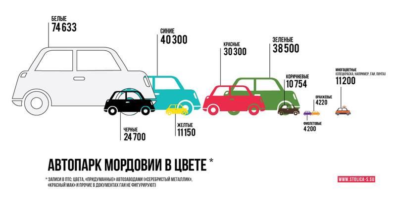
Let's look at the two largest cars, white and blue. It seems that white is 70 thousand, and blue is 40? In my opinion, no, three to four times the eye.
Quickly redrawn four values. I can only draw elephantswith a hat in a boa constrictor, so I took a typewriter from OpenClipArt and propagated it in Inskape.

In my opinion, the ratio of numbers worked out better. What I've done? I made the numbers proportional to the size of the machine (and the size to the square root of the number).
On school tables on history and geography, I also met such charts - to compare grain production, water supplies.

Yes, a large brick is in every way larger than a small one. Is it only visible in a flat drawing? Not. Hence the big rule.
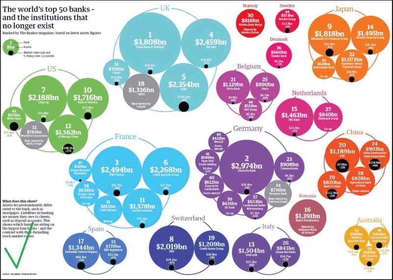
In the diagrams it is necessary to do so that the values are proportional to the shaded area. It is the area, and not the linear dimensions or volume of the pseudo-three-dimensional figure. Here, for example, is the correct infographic ( source ).

Corollary number of times. Make a three-dimensional bubble chart ( 3D bubbles ). Yes, the bubbles are three-dimensional, but their diameter should be equal to the square root of the number (and not the number itself or the cubic root). So this diagram is wrong.

And consequence number two. Three-dimensional sector diagram - basically a lie, provocation and swindle. Here is a classic example fromManipulative Chartology : Compare A and B!


Let's look at the two largest cars, white and blue. It seems that white is 70 thousand, and blue is 40? In my opinion, no, three to four times the eye.
Quickly redrawn four values. I can only draw elephants

In my opinion, the ratio of numbers worked out better. What I've done? I made the numbers proportional to the size of the machine (and the size to the square root of the number).
On school tables on history and geography, I also met such charts - to compare grain production, water supplies.

Yes, a large brick is in every way larger than a small one. Is it only visible in a flat drawing? Not. Hence the big rule.
In the diagrams it is necessary to do so that the values are proportional to the shaded area. It is the area, and not the linear dimensions or volume of the pseudo-three-dimensional figure. Here, for example, is the correct infographic ( source ).

Corollary number of times. Make a three-dimensional bubble chart ( 3D bubbles ). Yes, the bubbles are three-dimensional, but their diameter should be equal to the square root of the number (and not the number itself or the cubic root). So this diagram is wrong.

And consequence number two. Three-dimensional sector diagram - basically a lie, provocation and swindle. Here is a classic example fromManipulative Chartology : Compare A and B!

