 February 1, 2013 at 11:41
Essay on design and technology trends for 2013
All the holidays are behind, it's time to think about how the coming year will turn out. What will be in the trend, and what will forever leave the Internet and become only history - now we will try to find out. So, about the fastest-changing technologies and design in 10 paragraphs.
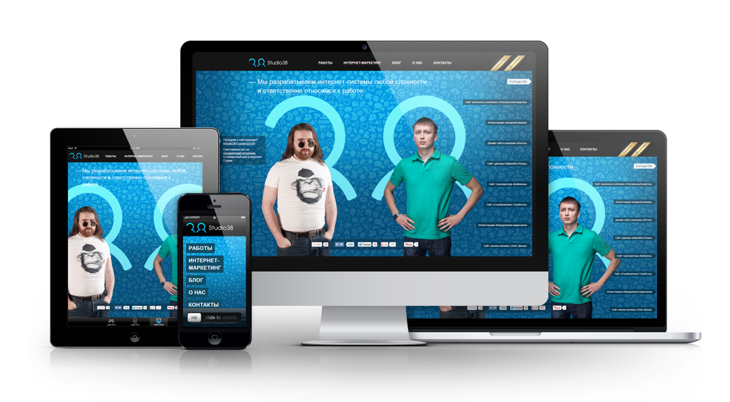

In the first place, deservedly is the most useful, in our opinion, trend - adaptive website design. For those who first come across this term, we’ll explain - this is a website design that provides good perception on various devices, whether it be a computer monitor, laptop, iPad, any other tablet, or mobile phone. Moreover, the development of individual versions of the site is not required, as was recently accepted, no pda.site.ru or m.site.com. When opened on the device, the site automatically determines how it is displayed correctly. Fantastically convenient!
To begin with, we explain skeuomorphism - a design element that is copied from the shape of another object. IPhone users should be familiar with it; most applications are implemented just by this principle.

Instead of this approach in design comes another - focused on typographic and "iconic" design of the user interface, the bright representative of which is Metro UI.

Not so long ago, Denis kortunov in his article very well described this trend, with all its pros and cons.
Most designers have recently chosen one-page website templates. They are more effective, users can easily focus their attention on the content. And using the HTML5 features in animation, you can easily create a dynamic and interesting design in a one-page template. This trend is gaining particular popularity with the increasing use of various touchscreen devices - tablets and mobile phones.

Large images are attractive and attract the attention of users. Increasingly, large brands, when designing their home pages, use full-screen images. This trend is gaining popularity further, we are sure that such sites will become more and more.

Another interesting area is the use of more white space. A clean design helps users easily focus on key elements and be less distracted.

New technologies, such as HTML5, CSS3, as well as good old JavaScript, are everywhere replacing Flash.

Flash is poorly applicable for search engine optimization of the site, it is difficult to update and most mobile devices do not support it. Most sites that currently use Flash are gradually abandoning it in their work.
The new CSS3 features allow you to control and change the transparency of any element on the page, making it possible to create elegant and responsive interfaces. And for all this, Photoshop is no longer needed.

It is also worth noting an interesting trend when the link hover (effect when you hover over the link) becomes smooth. Most authoritative design blogs, such as smashingmagazine.com, have been using this technique for a long time, and recently it can often be found on other sites.
Apple has presented the world with Retina-screens, the graphics of which are twice "denser" than conventional LCD monitors. A double sharper image means that the usual graphics on them will look bad. And with the increasing popularity of retina screens, this fact cannot be ignored.

A simple and elegant way, thanks to which the navigation bar “sticks” to the top of the screen when scrolling through the page and remains in front of the user's eyes. This method facilitates navigation, you no longer need to return to the top, the menu is always before your eyes.

Another design trend that needs to be mentioned here is the use of the up button, which appears when scrolling the page more than one screen. With its help, the user can quickly and easily return to the beginning of the article. Vkontakte, Kinopoisk or Habrahabr have long been using this technique in their work. We also use fixed navigation bars on our studio site .
Any design is always based on content. And more and more often, designers make out every page of the site, trying to present the content in the most understandable and accessible way to the user. There are more tools for this, this is infographics, magazine typesetting of sites, illustrations, and with the help of new HTML5 features, options and ways of presenting text, there are more and more.

Infographic is a visual representation of content, which is an excellent tool for presenting a large amount of complex data in a simple and understandable way. Interactive infographics allow the user to interact with this data. Using the new features that HTML5 introduces, you can create a form of presentation of information that will attract the attention of the user and even surprise him.

In fact, we live in a dynamic time when one technology replaces another very quickly. The trends that we have identified are the product of our own experience and observation.
1. Responsive design
In the first place, deservedly is the most useful, in our opinion, trend - adaptive website design. For those who first come across this term, we’ll explain - this is a website design that provides good perception on various devices, whether it be a computer monitor, laptop, iPad, any other tablet, or mobile phone. Moreover, the development of individual versions of the site is not required, as was recently accepted, no pda.site.ru or m.site.com. When opened on the device, the site automatically determines how it is displayed correctly. Fantastically convenient!
2. The end of skeuomorphism in design
To begin with, we explain skeuomorphism - a design element that is copied from the shape of another object. IPhone users should be familiar with it; most applications are implemented just by this principle.
Instead of this approach in design comes another - focused on typographic and "iconic" design of the user interface, the bright representative of which is Metro UI.
Not so long ago, Denis kortunov in his article very well described this trend, with all its pros and cons.
3. One-page templates
Most designers have recently chosen one-page website templates. They are more effective, users can easily focus their attention on the content. And using the HTML5 features in animation, you can easily create a dynamic and interesting design in a one-page template. This trend is gaining particular popularity with the increasing use of various touchscreen devices - tablets and mobile phones.
4. Large images and free space
Large images are attractive and attract the attention of users. Increasingly, large brands, when designing their home pages, use full-screen images. This trend is gaining popularity further, we are sure that such sites will become more and more.
Another interesting area is the use of more white space. A clean design helps users easily focus on key elements and be less distracted.
5. Widespread refusal of flash
New technologies, such as HTML5, CSS3, as well as good old JavaScript, are everywhere replacing Flash.
Flash is poorly applicable for search engine optimization of the site, it is difficult to update and most mobile devices do not support it. Most sites that currently use Flash are gradually abandoning it in their work.
6. Transparency and smoothness
The new CSS3 features allow you to control and change the transparency of any element on the page, making it possible to create elegant and responsive interfaces. And for all this, Photoshop is no longer needed.
It is also worth noting an interesting trend when the link hover (effect when you hover over the link) becomes smooth. Most authoritative design blogs, such as smashingmagazine.com, have been using this technique for a long time, and recently it can often be found on other sites.
7. Retina support
Apple has presented the world with Retina-screens, the graphics of which are twice "denser" than conventional LCD monitors. A double sharper image means that the usual graphics on them will look bad. And with the increasing popularity of retina screens, this fact cannot be ignored.
8. Fixed navigation blocks
A simple and elegant way, thanks to which the navigation bar “sticks” to the top of the screen when scrolling through the page and remains in front of the user's eyes. This method facilitates navigation, you no longer need to return to the top, the menu is always before your eyes.
Another design trend that needs to be mentioned here is the use of the up button, which appears when scrolling the page more than one screen. With its help, the user can quickly and easily return to the beginning of the article. Vkontakte, Kinopoisk or Habrahabr have long been using this technique in their work. We also use fixed navigation bars on our studio site .
9. Clever work with content
Any design is always based on content. And more and more often, designers make out every page of the site, trying to present the content in the most understandable and accessible way to the user. There are more tools for this, this is infographics, magazine typesetting of sites, illustrations, and with the help of new HTML5 features, options and ways of presenting text, there are more and more.
10. Interactive infographics
Infographic is a visual representation of content, which is an excellent tool for presenting a large amount of complex data in a simple and understandable way. Interactive infographics allow the user to interact with this data. Using the new features that HTML5 introduces, you can create a form of presentation of information that will attract the attention of the user and even surprise him.
In fact, we live in a dynamic time when one technology replaces another very quickly. The trends that we have identified are the product of our own experience and observation.