The principle of the inverted pyramid in analytics. We build a clear dashboard
- Tutorial

It is customary to think that the dashboards are a 2D plane on which the graphics are intuitively placed. We select the types of visualizations and color, write the title and somehow lay out the elements on the sheet. The eye reads it from left to right, or randomly. Dashboard looks like a dashboard in the cockpit, and the customer is reconciled with the fact that you need to devote an hour or two to delve into serious numbers.
Intuition works differently. Sometimes you have graphics literally "somehow." It’s good if you put it in order of importance: on the top left - the most cream, and on the bottom right - what they won't read. You can break the dashboard into 4 sections and in each open some part of the question. But are there any techniques to clearly organize the elements on the sheet, throw away the superfluous and in 5-6 seconds bring the main thing?
Inverted pyramid
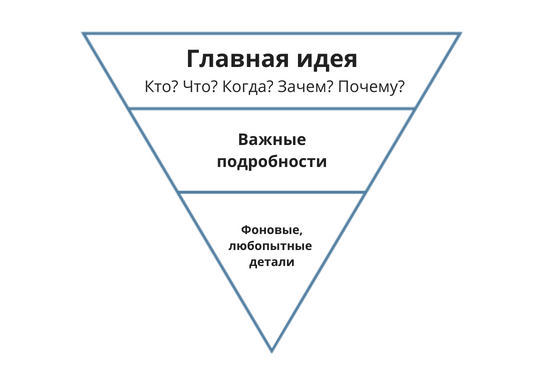
Journalists have long used the “Inverted Pyramid” metaphor to draw attention to the hot news. The material is divided into 3 levels. Each of them speaks about the same thing, but the detailing is narrowed.
First level. The answer to all who, what, why and why in a broad sense. Here is all the information to make a decision. In journalism, this is called a lead or cap. This is the first paragraph that catches the reader's attention. Here you can do without graphs, show the main metrics, compare with the previous period or goals. Do not regret the useful text and illustrations.
For example, in the application Yandex. One top hat is enough to figure out how to dress.

Second level. Useful information that clarifies the details. You can do without it, but it helps to understand the history and circumstances. Here it is best to place the trends and compare the data between the segments.
Third level. For especially inquisitive. Only narrow, background details. Usually, one person will even ask: “Who are all these people? What do they eat for lunch? What music is being listened to? ”These questions will not solve anything now, but suddenly there will be some kind of clue or idea? It is appropriate to give a breakdown by gender, age, preferences, or, for example, purchases from different types of devices.
This technique will not work if you want to intrigue and reveal the cards at the end of the dashboard. Or it happens that the customer likes the scale and he just needs the dashboard, then it is worth considering the circumstances. But most often the information needs to be issued with lightning speed, then the “Inverted Pyramid” is the most appropriate style.
We build a dashboard for the online recording system
Sochinim simple dashboard. Imagine that a fictional network of beauty salons has an online recording service. The manager is not clear what the benefits of this technology, whether it is worth the investment. Using online booking, he would like to reduce the workload of administrators and simplify the recording process. The main indicator here is how many entries are made through the site. The bigger, the better.
We collect the hat. We will show how many entries were from the site for the week and what percentage of the schedule was bought online. Compare with the previous week to understand how we grow. A target indicator in the form of a text note would be useful, for example: “We are striving for 50% of entries to be made via the Internet by the end of this year”. Such a cap is enough for the manager to quickly check the numbers and understand whether the online booking works well.

I did not use the conversion in the record, because the manager is important for the plan exactly the amount. Conversion rate is needed for analysts and marketers to optimize the site and advertising campaigns. But if you really want, you can add it to the second or even third level.
On the second layer, we will show how much is booked every day. The trend will help to understand whether there are any failures? Do you use online recording more often? Suddenly, the system was first used, but then they began to lose interest? I also want to know how the share of online entries in the schedule is growing. Ideally, if we compare the number of records in absolute values. Suddenly, the system gives additional customers? It is immediately clear if the online entry takes the load off administrators.

On the third layer, I will show the proportion of repeated and primary records, the most popular services. I find out from what types of devices the clients came and which salons are most often recorded. There is a whole mountain of ideas, but all this for such useful awareness. These numbers could be higher in the dashboard for other purposes, but here we will put them at the bottom. Another convenient if the dashboard will be filtered by these cuts. For this there are opportunities in Tableau and Data Studio.

Remember
Do not confuse detail with importance. It is not enough to simply position widgets in descending order of utility. It is necessary to change the perception and think not from left to right, but in depth. The same idea should reveal layer after layer.
It is not necessary to place the layers from top to bottom. Depths can be achieved in different ways. Layers can be arranged vertically from left to right. Dashboards can contain a single visualization, and if you click on the data, new layers will open. The main thing is not the position - but how you direct the customer and whether there will be some kind of slender chain in it.
The principle of the inverted pyramid is not the only way. This is one of the techniques of design and presentation of data, which spied on the journalists.
And here is a full dashboard, which we sketched in the article: look .
#######
I found a living example of dashboards in the style of an inverted pyramid. He posted on Tableau Public after I published this post. I glue: look.