Convert a menu to a drop-down list on small screens
- Transfer
- Tutorial

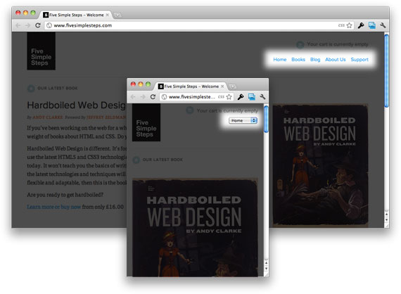
As an example of what we get as a result, you can see the site “Five Simple Steps” with adaptive layout. When the browser window is small in width, the menu in the upper right corner turns from the usual row of links into a drop-down menu.
When viewing the site on a small display (phone), by clicking on the drop-down menu you will see an interface for selecting a menu item, where each item is large and easy to select.

This is undoubtedly easier than trying to get your finger on a small link on the phone screen. Of course, so you have to click on the screen 2 times instead of one, but this is a controversial drawback, since, in the opposite case, you will first have to enlarge the page, and only then click on the link.
HTML
Here is the layout of this menu on the Five Simple Steps website:
CSS
By default, we should hide the menu with display: none; .
nav select {
  display: none;
}
Then, using media queries, we will switch the visibility of the select element and the regular menu depending on the screen width.
@media (max-width: 960px) {
  nav ul     { display: none; }
  nav select { display: inline-block; }
}
Syncing menu items using jQuery
Perhaps your menu is created dynamically, perhaps you create a menu manually, but it is always useful to be sure that the items on both menus are the same. To achieve uniformity of both menus, we will use the dynamic creation of a drop-down menu based on the original menu.
This can be done using the following jQuery code:
// Создаем основу для выпадающего меню
$("