How to improve the appearance of 3 good old footer articles?
Due to the fact that under the title of each article in the footer 33% is allocated, and the length of the titles is different, a couple of unpleasant effects appear:
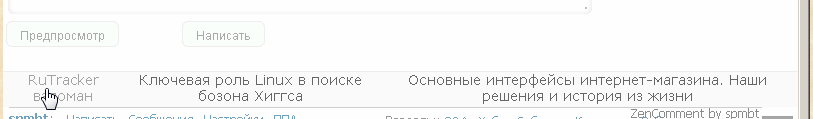
1) voids if the names are short and the adjacent one is long;
2) the names stick to the upper edge of the block;
3) you need to click only on the text, and not on the entire block.

For example, here in the middle link, as in all, you need to aim at the text.
What if a few ennoble them?

Even if you refine the look of the links - remove the underlines, making only a color change on hover, the difference in heights is not very pleasing (the version of ZenComment user styles has worked for the last 2 months). And you won’t be able to place them vertically in the center without a script, since these are divs, and even on the styles table - table-row - table-cellnot enough items. But what if you place 3 blocks in a table and not care about the width? The result is excellent: the width of the table is 100%, and the widths of the cells themselves are aligned according to the content.
In order for the link to be active across the entire field of the cell, it needs to map the {display: table-cell} property . Even if sometimes the table cannot completely align the contents (a completely regular case), then the {vertical-align: middle} cell property corrects the situation.

HTML code:
Basic CSS styles:
gaps between the cells are selected at 24 pixels, so the neighboring names never stick together:
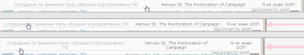
Here we gradually shift the edge of the window with a mouse, it becomes smaller, then a jump - and all 3 links took 2 lines, and the table was rebuilt. From the screenshot we see that it is enough to point anywhere in the block so that the link becomes selected.
You can see in action and use such footer styles (as well as fifty other improvements) in the ZenComment user styles in conjunction with the HabrAjax user script . The script here converts the HTML to the desired configuration, and the styles help to arrange everything.
Even if you use separately HabrAjax, the footer will also look good:

1) voids if the names are short and the adjacent one is long;
2) the names stick to the upper edge of the block;
3) you need to click only on the text, and not on the entire block.
For example, here in the middle link, as in all, you need to aim at the text.
What if a few ennoble them?
Even if you refine the look of the links - remove the underlines, making only a color change on hover, the difference in heights is not very pleasing (the version of ZenComment user styles has worked for the last 2 months). And you won’t be able to place them vertically in the center without a script, since these are divs, and even on the styles table - table-row - table-cellnot enough items. But what if you place 3 blocks in a table and not care about the width? The result is excellent: the width of the table is 100%, and the widths of the cells themselves are aligned according to the content.
In order for the link to be active across the entire field of the cell, it needs to map the {display: table-cell} property . Even if sometimes the table cannot completely align the contents (a completely regular case), then the {vertical-align: middle} cell property corrects the situation.
HTML code:
Basic CSS styles:
.rotated_posts{
	display: table;
	width: 100%;
}
.rotated_posts .rotTRow{
	display: table-row;
}
.rotated_posts .rotTRow a.grey{
	display: table-cell;
	padding:0 12px 4px;
	vertical-align: middle;
}
gaps between the cells are selected at 24 pixels, so the neighboring names never stick together:
Here we gradually shift the edge of the window with a mouse, it becomes smaller, then a jump - and all 3 links took 2 lines, and the table was rebuilt. From the screenshot we see that it is enough to point anywhere in the block so that the link becomes selected.
You can see in action and use such footer styles (as well as fifty other improvements) in the ZenComment user styles in conjunction with the HabrAjax user script . The script here converts the HTML to the desired configuration, and the styles help to arrange everything.
Even if you use separately HabrAjax, the footer will also look good: