Angular: Create a multiple checkbox component that is suitable for reuse.
Let's create an Angular component to create a set of checkboxes from a particular logical group. The component will be written with reuse ideas. What does it mean? Here is an example below:
Imagine that you have a task to do editing users. When editing, a form with all fields is usually opened. The user can have one or many roles from the list of “Adimin”, “Director”, “Professor”, “Student”.
To implement the multiple choice of roles, it was decided to draw on the form one checkbox for each role. Putting checkmarks or removing user roles will change.
To get started, let's create a parent component (that is, a page for the form) which will already contain our checkbox-group component.
As you can see here, I made a hardcode for all possible roles, but in a real application, roles will most likely be requested from the database. In order to simulate our HTTP to the server, I assigned the same values to another variable with a slight delay.
Now let's start creating a generic checkbox-group component that can be reused without any problems in all cases when a group from the checkbox is needed.
First we need such a class CheckboxItem.ts
It will be used by CheckboxComponent to render all possible choices (in our case, these are roles) and save from the state (selected or not). Note that the “checked” property is an optional parameter in the constructor and will default to false, that is, all values will not be selected first. This is suitable when we create a new user without a single role.
Next, we will modify our functionary simulated request to the server a bit, so as to make a mapping between the JSON response and Array
It does not matter which JSON structure the server will return to us. Each HTML checkbox is always set ( of value ) and a description ( label ). In our case, we do the mapping "id" with "value" and "name" with "label". Value will be used as a key or id for an option, and label is just a string describing which the user is reading.
The next step is to create a CheckboxGroupComponent. He looks like this:
This is not an Angular tutorial so I will not explain the specifics of the framework. Who needs can read in the official documentation.
The @Input property with the name options will contain a list of all possible values that are not selected by default. Our HTML component template will render as many checkboxes as there are in this list.
This is the html for CheckboxGroupComponent:
Notice that I used ngModel to bind each “checked” item property from the options list .
The final step is to add our newly created component to the parent AppComponent template.
The result should be this:

To get all the currently selected options, we will create an Output event that, on any click on one of the checkboxes, returns our list of selections.
Like this: [1,2,4] In the CheckboxGroupComponent template, we associate a change event with a new function.
It is time to implement this very function:
Subscribe to this event ( Output property called toggle ) in the AppComponent template.
And assign the return result (selected roles) in userModel.
Now on each click on the checkbox you will see in the console a list of the selected roles. More precisely, their id. For example, if I chose the Admin and Professor roles, I would get “Model roles: (2) [1, 3]”.
The component is almost complete and ready for reuse. The last thing left to do is support the initialization of the checkbox group. This is needed in the case when we will be editing the user. Before this we need to make a request to the server to get the current list of user roles and initialize the CheckboxGroupComponent.
We have two ways to do this. The first is to use the CheckboxItem class constructor and use the optional parameter “checked”. In the place where we did the mapping.
The second way is to add another selectedValues list to initialize our component.
Let's imagine that we have already made a request for the current user and a model with three roles came from the database.
In the CheckboxGroupComponent, we initialize all the “checked” properties of each checkbox to true if the role id is in the selectedValues list .
As a result, you should get the following result:
Here I used the styles from Angular Material.
When I start, there will be a delay of one second before Angular draws all the checkboxes on the page. This simulates the time spent loading roles from the database.
It is important to note that you can get all the selected roles using an event subscription (toggle) or simply use the “checked” property in each item object from the userRolesOptions list that is in the parent component. This happens because the link to the list is passed through @Input (binding) and all changes inside the object will be synchronized.
Such a component can be styled as you like and used for any task where multi-select is needed.
Thank you for reading this article! I hope you enjoyed making the component Angular for reuse ideas.
PS: If the article will be popular, I will publish the second small part, where the same example is written using Angular Reactive Forms.
Imagine that you have a task to do editing users. When editing, a form with all fields is usually opened. The user can have one or many roles from the list of “Adimin”, “Director”, “Professor”, “Student”.
To implement the multiple choice of roles, it was decided to draw on the form one checkbox for each role. Putting checkmarks or removing user roles will change.
To get started, let's create a parent component (that is, a page for the form) which will already contain our checkbox-group component.
exportclass AppComponent implements OnInit {
 private userRoles = [
  { id: 1, name: ‘Admin’ },
  { id: 2, name: ‘Director’ },
  { id: 3, name: ‘Professor’ },
  { id: 4, name: ‘Student’ }
 ];
 public userModel = {
   id: 0,
   name: "",
   roles: []
 };
 constructor(){ }ngOnInit(): void {
 }
}
As you can see here, I made a hardcode for all possible roles, but in a real application, roles will most likely be requested from the database. In order to simulate our HTTP to the server, I assigned the same values to another variable with a slight delay.
//app.component.ts
userRolesOptions = newArray<any>();
ngOnInit(): void {
 setTimeout(() => {
   this.userRolesOptions = this.userRoles;
 },
 1000);  //здесь мы добавляем задержку в 1 секунду
}
Now let's start creating a generic checkbox-group component that can be reused without any problems in all cases when a group from the checkbox is needed.
First we need such a class CheckboxItem.ts
export classCheckboxItem {
 value: string;
 label: string;
 checked: boolean;
 constructor(value: any, label: any, checked?: boolean) {
  this.value = value;
  this.label = label;
  this.checked = checked ? checked : false;
 }
}
It will be used by CheckboxComponent to render all possible choices (in our case, these are roles) and save from the state (selected or not). Note that the “checked” property is an optional parameter in the constructor and will default to false, that is, all values will not be selected first. This is suitable when we create a new user without a single role.
Next, we will modify our functionary simulated request to the server a bit, so as to make a mapping between the JSON response and Array
userRolesOptions = newArray<CheckboxItem>();
ngOnInit(): void {
 setTimeout(() => {
   this.userRolesOptions = this.userRoles.map(x =>new CheckboxItem(x.id, x.name));
 }, 1000);
}
It does not matter which JSON structure the server will return to us. Each HTML checkbox is always set ( of value ) and a description ( label ). In our case, we do the mapping "id" with "value" and "name" with "label". Value will be used as a key or id for an option, and label is just a string describing which the user is reading.
The next step is to create a CheckboxGroupComponent. He looks like this:
@Component({
 selector: 'checkbox-group',
 templateUrl: './checkbox-group.component.html',
 styleUrls: ['./checkbox-group.component.css']
})
export classCheckboxGroupComponentimplementsOnInit{
 @Input() options = Array<CheckboxItem>();
 constructor() { }
 ngOnInit() {}
 }
This is not an Angular tutorial so I will not explain the specifics of the framework. Who needs can read in the official documentation.
The @Input property with the name options will contain a list of all possible values that are not selected by default. Our HTML component template will render as many checkboxes as there are in this list.
This is the html for CheckboxGroupComponent:
<div *ngFor=”letitemofoptions”><inputtype=”checkbox” [(ngModel)]=”item.checked”>{{item.label}}
</div>
Notice that I used ngModel to bind each “checked” item property from the options list .
The final step is to add our newly created component to the parent AppComponent template.
// somewhere in AppComponent html template
<checkbox-group [options]=”userRolesOptions”></checkbox-group>
The result should be this:
To get all the currently selected options, we will create an Output event that, on any click on one of the checkboxes, returns our list of selections.
Like this: [1,2,4] In the CheckboxGroupComponent template, we associate a change event with a new function.
<div *ngFor=”letitemofoptions”><inputtype=”checkbox” [(ngModel)]=”item.checked” (change)=”onToggle()”>{{item.label}}</div>It is time to implement this very function:
exportclassCheckboxGroupComponentimplementsOnInit{
 @Input() options = Array<CheckboxItem>();
 @Output() toggle = new EventEmitter<any[]>();
 constructor() {}
 ngOnInit(){}
 onToggle() {
  const checkedOptions = this.options.filter(x => x.checked);
  this.selectedValues = checkedOptions.map(x => x.value);
  this.toggle.emit(checkedOptions.map(x => x.value));
 }
}
Subscribe to this event ( Output property called toggle ) in the AppComponent template.
<checkbox-group [options]=”userRolesOptions” (toggle)=”onRolesChange($event)”></checkbox-group>And assign the return result (selected roles) in userModel.
export classCheckboxGroupComponentimplementsOnInit {
 //..остальной код
onRolesChange(value) {
  this.userModel.roles = value;
  console.log('Model role:' , this.userModel.roles);
 }
}
Now on each click on the checkbox you will see in the console a list of the selected roles. More precisely, their id. For example, if I chose the Admin and Professor roles, I would get “Model roles: (2) [1, 3]”.
The component is almost complete and ready for reuse. The last thing left to do is support the initialization of the checkbox group. This is needed in the case when we will be editing the user. Before this we need to make a request to the server to get the current list of user roles and initialize the CheckboxGroupComponent.
We have two ways to do this. The first is to use the CheckboxItem class constructor and use the optional parameter “checked”. In the place where we did the mapping.
//AppComponent.ts
setTimeout(() => {
  this.userRolesOptions = this.userRoles.map(x =>new CheckboxItem(x.id, x.name, true));
}, 1000);
// в таком случае все роли будут сразу же выбраны
The second way is to add another selectedValues list to initialize our component.
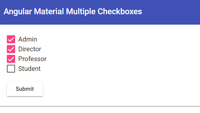
<checkbox-group [options]=”userRolesOptions” [selectedValues]=”userModel.roles” (toggle)=”onRolesChange($event)”></checkbox-group>Let's imagine that we have already made a request for the current user and a model with three roles came from the database.
//AppComponent.tspublic userModel = {
 id: 1,
 name: ‘Vlad’,
 roles: [1,2,3]
};
constructor(){ }//rest of the code
In the CheckboxGroupComponent, we initialize all the “checked” properties of each checkbox to true if the role id is in the selectedValues list .
//CheckboxGroupComponent.ts
ngOnInit() {
 this.selectedValues.forEach(value => {
  const element = this.options.find(x => x.value === value);
  if (element) {
    element.checked = true;
  }
 });
}
As a result, you should get the following result:
Here I used the styles from Angular Material.
When I start, there will be a delay of one second before Angular draws all the checkboxes on the page. This simulates the time spent loading roles from the database.
It is important to note that you can get all the selected roles using an event subscription (toggle) or simply use the “checked” property in each item object from the userRolesOptions list that is in the parent component. This happens because the link to the list is passed through @Input (binding) and all changes inside the object will be synchronized.
const checkedOptions = this.userRolesOptions.filter(x => x.checked);
Such a component can be styled as you like and used for any task where multi-select is needed.
Thank you for reading this article! I hope you enjoyed making the component Angular for reuse ideas.
PS: If the article will be popular, I will publish the second small part, where the same example is written using Angular Reactive Forms.