 August 16, 2012 at 19:55
Create a Qt interface style using a table example
- Tutorial
As you know, Qt offers developers almost unlimited possibilities for creating interfaces. In most cases, if you use standard widgets, the appearance of your application (and its interface elements) will correspond to the appearance of your operating system. To do this, Qt has a system of so-called styles - classes that are responsible for rendering standard interface elements. In this article, we will try to create our own style and apply it to a simple application in order to get a beautiful table based on the QTableWidget widget .
So, let's start with the theory. In Qt, there is an abstract class QStyle , responsible, as you might guess, for styling the application. A number of classes are inherited from it ( QWindowStyle , QMacStyle , etc.), which are styles that emulate the standard appearance of the operating system. We will make our own style for the application in their image and likeness. Qt requires custom styles to be inherited not directly from QStyle , but from one of its derived classes. The documentation recommends choosing the system style closest to the desired one and changing it “for yourself”. We will inherit our class from no less abstract than QStyle , class QCommonStyle.
So how do you draw elements inside a style? The QStyle class has a set of functions whose names begin with the word draw :
Each of them does its small part of the work of rendering elements.
drawComplexControl () is used to draw composite widgets, that is, those that contain several other widgets within themselves.
An example is QSpinBox , which, as you might guess, implements the usual SpinBox and consists of an input field and two small buttons:

drawControl () draws standard widgets like buttons and input fields.
drawPrimitive () draws the so-called primitive elements, for example, frames.
drawItemPixmap () and drawItemText ()have quite speaking names and do exactly what you might expect from them. Detailed descriptions of all functions, as well as their arguments, can be found very easily in the Qt documentation, so I won’t stop there.
In our example, we will style the QTableWidget element , which is an ordinary table. Styles for the rest of the elements are done in exactly the same way.
First of all, create a new C ++ class. When creating a class, Qt helpfully offers us to write its name, as well as the name of the class from which we want to inherit. Let's name it for simplicity myStyle , and specify inheritance from QCommonStyle . After that, Qt will create a couple of files for us (.h and .cpp), in which, for starters, we want to get something like this:
Our main () function will look like this:
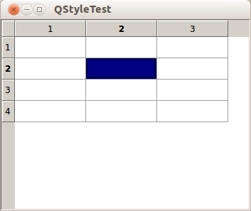
As you can see, all we do is set our style, create a widget and display it. At this stage, we only have an empty style inherited from QCommonStyle , so our table will look ... well, let's say, not very attractive:
Let's take a closer look at what the table consists of.
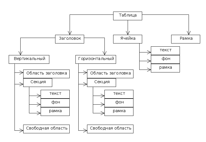
The structure, in general, is quite simple and straightforward. Is it worth it to stop for a second on the headlines. In Qt, two types of headers are separated: horizontal (the one on top) and vertical (the one on the left). By "Title Area" I mean the entire area on which the title will subsequently be displayed. A section is each specific header cell. An unallocated area is that part of the header where there are no sections (this happens when the total size of all sections is less than the size of the table).
So, armed with this knowledge, you can stylize each element. Let's start by adding functions to our class.
Let's start with the drawControl () function . Add the code to the implementation:
The key attribute of this function is element , which indicates the type of what we will draw. Inside switch 'a, we will add case ' y for each of those elements that we will draw ourselves. All others will be processed in the default section using a similar function of the parent class.
Let's start with the frame that surrounds our entire table. I will make a gradient frame. The upper and lower borders will be white, and the vertical borders will be drawn with a gradient: they will be white at the edges and light gray in the middle.
To do this, add the following code to the drawControl () function :
Now let's get down to the headlines. The header area itself ( CE_Header ) does not need to be processed. We will deal with sections and empty area. With an empty area, everything is very simple, we will fill it with a plain gray color:
With sections it will be somewhat more complicated. As we know, if you click on the table heading, either the entire row or the entire column is selected (depending on where we clicked). In this case, the header will change its appearance so that the user sees a change in his state. Typically, the title is either “pressed” or tinted. We want to keep this functionality. Moreover, I would like that when selecting cells or cells, the corresponding headers are also colored.
So, add the following code:
At this stage, we got a pretty nice headline. However, when selected, our cells are still painted with a pretty ugly color by default. In addition, the standard focus frame also does not look too pretty.
The CE_ItemViewItem attribute is responsible for rendering cells . Add the following code to it:
Since, when processing the cells, we call the drawPrimitive function for the PE_PanelItemViewItem element, we will render this element so that the selected cells are painted in some more pleasant color.
By analogy with drawControl () , add the exact same switch to drawPrimitive () , and immediately implement the cell highlighting we need:
Finally, change the font that will display the text. Add the following code to the drawItemText () function :
So, we have transformed a plain tile, and now it looks like this:
which in my opinion is much better than what it was originally.
Of course, creating styles for the entire application in this way is a very time-consuming task. The style for one element (as in this article) can be done very quickly, but if you want to take care of all the widgets (for example, if you want to spread your style so that other people can use it), it can take a lot of time. For example, I did not find a description of the elements that should be drawn for each individual widget, and I had to determine them using the “scientific poke” method. However, styling in this way has a number of significant advantages.
First, these styles apply to all elements. If you have 300 tables, then you do not need to configure each manually, the style for the application is applied in one line.
Secondly, the styles created in this way are convenient to change. This is perhaps the best way to give the user the opportunity to change the style of the application through the settings. In addition, you can be sure that the style you create will look the same every time.
Sources entirely:
Theoretical part
So, let's start with the theory. In Qt, there is an abstract class QStyle , responsible, as you might guess, for styling the application. A number of classes are inherited from it ( QWindowStyle , QMacStyle , etc.), which are styles that emulate the standard appearance of the operating system. We will make our own style for the application in their image and likeness. Qt requires custom styles to be inherited not directly from QStyle , but from one of its derived classes. The documentation recommends choosing the system style closest to the desired one and changing it “for yourself”. We will inherit our class from no less abstract than QStyle , class QCommonStyle.
So how do you draw elements inside a style? The QStyle class has a set of functions whose names begin with the word draw :
- drawComplexControl ()
- drawControl ()
- drawItemPixmap ()
- drawItemText ()
- drawPrimitive ()
Each of them does its small part of the work of rendering elements.
drawComplexControl () is used to draw composite widgets, that is, those that contain several other widgets within themselves.
An example is QSpinBox , which, as you might guess, implements the usual SpinBox and consists of an input field and two small buttons:
drawControl () draws standard widgets like buttons and input fields.
drawPrimitive () draws the so-called primitive elements, for example, frames.
drawItemPixmap () and drawItemText ()have quite speaking names and do exactly what you might expect from them. Detailed descriptions of all functions, as well as their arguments, can be found very easily in the Qt documentation, so I won’t stop there.
In our example, we will style the QTableWidget element , which is an ordinary table. Styles for the rest of the elements are done in exactly the same way.
Getting started
First of all, create a new C ++ class. When creating a class, Qt helpfully offers us to write its name, as well as the name of the class from which we want to inherit. Let's name it for simplicity myStyle , and specify inheritance from QCommonStyle . After that, Qt will create a couple of files for us (.h and .cpp), in which, for starters, we want to get something like this:
myStyle.h
#include
class myStyle : public QCommonStyle
{
	Q_OBJECT
public:
	explicit myStyle();
signals:
public slots:
};
myStyle.cpp
#include "mystyle.h"
myStyle::myStyle() :
	QCommonStyle()
{
}
Our main () function will look like this:
int main(int argc, char *argv[])
{
	QApplication::setStyle( new myStyle );
	QApplication a(argc, argv);
	QTableWidget w(4,3);
	w.setGeometry(QRect(0,0,300,250));
	w.show();
	return a.exec();
}
As you can see, all we do is set our style, create a widget and display it. At this stage, we only have an empty style inherited from QCommonStyle , so our table will look ... well, let's say, not very attractive:
Let's take a closer look at what the table consists of.
The structure, in general, is quite simple and straightforward. Is it worth it to stop for a second on the headlines. In Qt, two types of headers are separated: horizontal (the one on top) and vertical (the one on the left). By "Title Area" I mean the entire area on which the title will subsequently be displayed. A section is each specific header cell. An unallocated area is that part of the header where there are no sections (this happens when the total size of all sections is less than the size of the table).
So, armed with this knowledge, you can stylize each element. Let's start by adding functions to our class.
void drawControl(ControlElement element, const QStyleOption *opt, QPainter *p, const QWidget *w) const;
void drawItemText(QPainter *painter, const QRect &rect, int flags, const QPalette &pal, bool enabled, const QString &text, QPalette::ColorRole textRole) const;
void drawPrimitive(PrimitiveElement pe, const QStyleOption *opt, QPainter *p, const QWidget *w) const;
Let's start with the drawControl () function . Add the code to the implementation:
switch(element)
{
    default:
        QCommonStyle::drawControl(element, opt, p, w);
    break;
}
The key attribute of this function is element , which indicates the type of what we will draw. Inside switch 'a, we will add case ' y for each of those elements that we will draw ourselves. All others will be processed in the default section using a similar function of the parent class.
Let's start with the frame that surrounds our entire table. I will make a gradient frame. The upper and lower borders will be white, and the vertical borders will be drawn with a gradient: they will be white at the edges and light gray in the middle.
To do this, add the following code to the drawControl () function :
case CE_ShapedFrame:
{
        //создаем градиент
	QLinearGradient gradient(0, 0, 0, opt->rect.height());
	gradient.setColorAt(0, QColor(255,255,255));
	gradient.setColorAt(0.5, QColor(225,225,225));
	gradient.setColorAt(1, QColor(255,255,255));
	QPen pen;
	pen.setBrush( gradient );
	p->setPen(pen);
        //рисуем рамку
	p->drawRect( 0,0,opt->rect.width()-1, opt->rect.height()-1);
}
break;
a comment
So what is going on here. First, we create a linear gradient from top to bottom. Then we set the colors for the key points, which we have three: start, end and middle. As I said, we make the beginning and the end white, and the middle a little grayish.
After that, we create a pen and set our gradient to it. The pen in Qt is drawn with a brush ( QBrush ), which will be the gradient. Finally, with the drawRect () function, we draw our frame.
After that, we create a pen and set our gradient to it. The pen in Qt is drawn with a brush ( QBrush ), which will be the gradient. Finally, with the drawRect () function, we draw our frame.
Now let's get down to the headlines. The header area itself ( CE_Header ) does not need to be processed. We will deal with sections and empty area. With an empty area, everything is very simple, we will fill it with a plain gray color:
case CE_HeaderEmptyArea:
	p->fillRect( opt->rect, QBrush( QColor( 233, 233, 233 ) ) );
break;
With sections it will be somewhat more complicated. As we know, if you click on the table heading, either the entire row or the entire column is selected (depending on where we clicked). In this case, the header will change its appearance so that the user sees a change in his state. Typically, the title is either “pressed” or tinted. We want to keep this functionality. Moreover, I would like that when selecting cells or cells, the corresponding headers are also colored.
So, add the following code:
case CE_HeaderSection:
{
        //Активная секция
	if( opt->state & State_Sunken || opt->state & State_On )
	{
                //Закрашиваем секцию оранжевым цветом
		p->fillRect(opt->rect, QBrush( QColor(255,170,80) ));
		p->setPen( QPen( QColor( 170,170,170) ) );
                //и обрисовываем рамкой
		p->drawRect(opt->rect.x(), opt->rect.y(),opt->rect.width()-1,opt->rect.height()-1);
	}
	else//неактивная секция
	{
                //Создаем градиент для фона
		QLinearGradient gradient(0, 0, 0, opt->rect.height());
		gradient.setSpread(QGradient::PadSpread);
		gradient.setColorAt(0, QColor(255,255,255));
		gradient.setColorAt(1, QColor(220,220,220));
                //рисуем фон
		p->fillRect(opt->rect, QBrush( gradient ));
                //создаем градиент для границ секций
		gradient.setColorAt(0, QColor(230,230,230));
		gradient.setColorAt(0.5, QColor(175,175,175));
		gradient.setColorAt(1, QColor(230,230,230));
         	QPen pen;
		pen.setStyle(Qt::SolidLine);
		pen.setBrush(gradient);
		p->setPen(pen);
                //рисуем границы секций
		p->drawLine( opt->rect.width()  + opt->rect.x() - 1,
					 opt->rect.y() + 3,
					 opt->rect.width()  + opt->rect.x() - 1,
					 opt->rect.height() + opt->rect.y() - 3 );
	}
}
a comment
So, a section can be in two states: active and inactive. In order to determine this, we check its flags. The State_Sunken flag indicates that the section is pressed, and the State_On flag indicates that the cell belonging to the column (or row) of this section is selected. If at least one of them is set, we fill the section with a solid orange color, and also draw an entire border for it so that the orange section does not look rough against the background of other (not selected) light gray parts of the header.
If the section is inactive, we paint it with a gradient from white to light gray and draw a border. I decided to draw only the vertical borders of the sections, so all I need to do is draw a vertical strip to the right of each section. So that the strips do not look rough, we will draw them with a gradient almost the same as the frame of the entire table: the ends of the strips will be lighter and the middle darker. To do this, we reconfigure the gradient and set it to the pen, which will draw the strip.
If the section is inactive, we paint it with a gradient from white to light gray and draw a border. I decided to draw only the vertical borders of the sections, so all I need to do is draw a vertical strip to the right of each section. So that the strips do not look rough, we will draw them with a gradient almost the same as the frame of the entire table: the ends of the strips will be lighter and the middle darker. To do this, we reconfigure the gradient and set it to the pen, which will draw the strip.
At this stage, we got a pretty nice headline. However, when selected, our cells are still painted with a pretty ugly color by default. In addition, the standard focus frame also does not look too pretty.
The CE_ItemViewItem attribute is responsible for rendering cells . Add the following code to it:
case CE_ItemViewItem:
{
        //Вызываем отрисовку приметива, который отвечает за подсветку выделенных ячеек
	drawPrimitive(PE_PanelItemViewItem, opt, p, w);
        //Преобразовываем опции из указателя на базовый класс
        //в указатель на тот класс, которым они на самом деле являются.
	const QStyleOptionViewItemV4 * option = qstyleoption_cast(opt);
	if( !option )
	{
                //Если по каким-то причинам не получилось преобразовать, рисуем элемент по умолчанию
		QCommonStyle::drawControl(element, opt, p, w);
		return;
	}
        //Рисуем фокусную рамку в виде обычной серой рамки.
	if (option->state & QStyle::State_HasFocus)
    {
		QPen pen(QColor( 170,170,170 ));
		p->save();
		p->setPen(pen);
		p->drawRect(opt->rect.x(), opt->rect.y(), opt->rect.width()-1, opt->rect.height()-1);
		p->restore();
	}
        //Получаем размер области, на которой будет отображаться текст
	QRect textRect = subElementRect(SE_ItemViewItemText, option, w);
        //Сдвигаем немного, чтобы текст не "прилипал" к краям ячейки
	textRect.setX( textRect.x() + 5 );
	textRect.setY( textRect.y() + 5 );
	if( !option->text.isEmpty() )
	{
                //Рисуем текст.
		p->drawText(textRect, option->text);
	}
}
a comment
Here we had to do much more. First, the PE_PanelItemViewItem element , which is drawn in the drawPrimitive () function, is responsible for coloring the selected cells in a different color . Therefore, we must call this function by passing the parameters we have there. After that, we convert a pointer to a base class option QStyleOption in the required class QStyleOptionViewItemV4 . This is necessary, among other things, to obtain the text and the drawing area of this text.
If the cell we draw is selected
After that, we get the size of the area where the text should be displayed, and indent a little so that the text does not appear close to the upper left edge. Finally, we draw the text with the drawText () function .
If the cell we draw is selected
if (option->state & QStyle::State_HasFocus)After that, we get the size of the area where the text should be displayed, and indent a little so that the text does not appear close to the upper left edge. Finally, we draw the text with the drawText () function .
Since, when processing the cells, we call the drawPrimitive function for the PE_PanelItemViewItem element, we will render this element so that the selected cells are painted in some more pleasant color.
By analogy with drawControl () , add the exact same switch to drawPrimitive () , and immediately implement the cell highlighting we need:
switch( pe )
{
	case PE_PanelItemViewItem:
        //Просто преобразовываем указатель, и если ячейка выделена, закрашиваем ее серым.
		if (const QStyleOptionViewItemV4 *option = qstyleoption_cast(opt))
			if (option->state & QStyle::State_Selected)
                        {
				p->fillRect(option->rect, QBrush( QColor( 220,220,220,100 )));
			}
	break;
	default:
		QCommonStyle::drawPrimitive( pe, opt, p, w);
	break;
}
Finally, change the font that will display the text. Add the following code to the drawItemText () function :
painter->setPen( QPen( QColor( 30, 30, 30 )));
painter->setFont(QFont("Consolas"));
painter->drawText(rect, text);
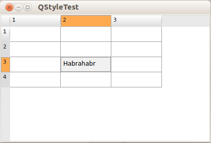
So, we have transformed a plain tile, and now it looks like this:
which in my opinion is much better than what it was originally.
Benefits of this approach
Of course, creating styles for the entire application in this way is a very time-consuming task. The style for one element (as in this article) can be done very quickly, but if you want to take care of all the widgets (for example, if you want to spread your style so that other people can use it), it can take a lot of time. For example, I did not find a description of the elements that should be drawn for each individual widget, and I had to determine them using the “scientific poke” method. However, styling in this way has a number of significant advantages.
First, these styles apply to all elements. If you have 300 tables, then you do not need to configure each manually, the style for the application is applied in one line.
Secondly, the styles created in this way are convenient to change. This is perhaps the best way to give the user the opportunity to change the style of the application through the settings. In addition, you can be sure that the style you create will look the same every time.
Sources entirely:
myStyle.h
#ifndef MYSTYLE_H
#define MYSTYLE_H
#include
#include
class myStyle : public QCommonStyle
{
	Q_OBJECT
public:
	explicit myStyle();
	void drawControl(ControlElement element, const QStyleOption *opt, QPainter *p, const QWidget *w) const;
	void drawItemText(QPainter *painter, const QRect &rect, int flags, const QPalette &pal, bool enabled, const QString &text, QPalette::ColorRole textRole) const;
	void drawPrimitive(PrimitiveElement pe, const QStyleOption *opt, QPainter *p, const QWidget *w) const;
signals:
public slots:
};
#endif // MYSTYLE_H
myStyle.cpp
#include "mystyle.h"
myStyle::myStyle() :
	QCommonStyle()
{
}
void myStyle::drawControl(QStyle::ControlElement element, const QStyleOption *opt, QPainter *p, const QWidget *w) const
{
	switch( element )
	{
		case CE_ShapedFrame:
		{
			QLinearGradient gradient(0, 0, 0, opt->rect.height());
			gradient.setColorAt(0, QColor(255,255,255));
			gradient.setColorAt(0.5, QColor(225,225,225));
			gradient.setColorAt(1, QColor(255,255,255));
			QPen pen;
			pen.setBrush( gradient );
			p->setPen(pen);
			p->drawRect( 0,0,opt->rect.width()-1, opt->rect.height()-1);
		}
		break;
		case CE_ItemViewItem:
		{
			drawPrimitive(PE_PanelItemViewItem, opt, p, w);
			const QStyleOptionViewItemV4 * option = qstyleoption_cast(opt);
			if( !option )
			{
				QCommonStyle::drawControl(element, opt, p, w);
				return;
			}
			if (option->state & QStyle::State_HasFocus) {
				QPen pen(QColor( 170,170,170 ));
				p->save();
				p->setPen(pen);
				p->drawRect(opt->rect.x(), opt->rect.y(), opt->rect.width()-1, opt->rect.height()-1);
				p->restore();
			}
			QRect textRect = subElementRect(SE_ItemViewItemText, option, w);
			textRect.setX( textRect.x() + 5 );
			textRect.setY( textRect.y() + 5 );
			if( !option->text.isEmpty() )
			{
				p->drawText(textRect, option->text);
			}
		}
		break;
		case CE_Header:
			QCommonStyle::drawControl(element, opt, p, w);
		break;
		case CE_HeaderEmptyArea:
			p->fillRect( opt->rect, QBrush( QColor( 233, 233, 233 ) ) );
		break;
		case CE_HeaderSection:
		{
			if( opt->state & State_Sunken || opt->state & State_On )
			{
				p->fillRect(opt->rect, QBrush( QColor(255,170,80) ));
				p->save();
				p->setPen( QPen( QColor( 170,170,170) ) );
				p->drawRect(opt->rect.x(), opt->rect.y(),opt->rect.width()-1,opt->rect.height()-1);
				p->restore();
			}
			else
			{
				QLinearGradient gradient(0, 0, 0, opt->rect.height());
				gradient.setSpread(QGradient::PadSpread);
				gradient.setColorAt(0, QColor(255,255,255));
				gradient.setColorAt(1, QColor(220,220,220));
				p->fillRect(opt->rect, QBrush( gradient ));
				gradient.setColorAt(0, QColor(230,230,230));
				gradient.setColorAt(0.5, QColor(175,175,175));
				gradient.setColorAt(1, QColor(230,230,230));
				QPen pen;
				pen.setStyle(Qt::SolidLine);
				pen.setBrush(gradient);
				p->setPen(pen);
				p->drawLine( opt->rect.width()  + opt->rect.x() - 1,
							 opt->rect.y() + 3,
							 opt->rect.width()  + opt->rect.x() - 1,
							 opt->rect.height() + opt->rect.y() - 3 );
			}
		}
		break;
		default:
			QCommonStyle::drawControl(element, opt, p, w);
		break;
	}
}
void myStyle::drawItemText(QPainter *painter, const QRect &rect, int flags, const QPalette &pal, bool enabled, const QString &text, QPalette::ColorRole textRole) const
{
	painter->setPen( QPen( QColor( 30, 30, 30 )));
	painter->setFont(QFont("Consolas"));
	painter->drawText(rect, text);
}
void myStyle::drawPrimitive(QStyle::PrimitiveElement pe, const QStyleOption *opt, QPainter *p, const QWidget *w) const
{
	switch( pe )
	{
		case PE_PanelItemViewItem:
			if (const QStyleOptionViewItemV4 *option = qstyleoption_cast(opt))
				if ((option->state & QStyle::State_Selected))
					p->fillRect(option->rect, QBrush( QColor( 220,220,220,100 )));
		break;
		default:
			QCommonStyle::drawPrimitive( pe, opt, p, w);
		break;
	}
}