Improving the 404th error page
- Transfer
If a user lands on the standard 404 error page, it is likely that he will leave the website and is unlikely to return. Custom 404 page, useful and attractive, contributes to the continued stay on your website.
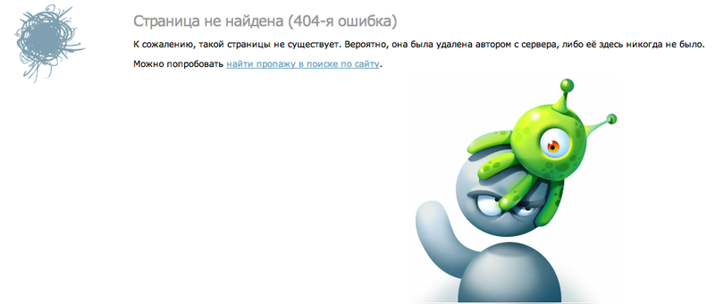
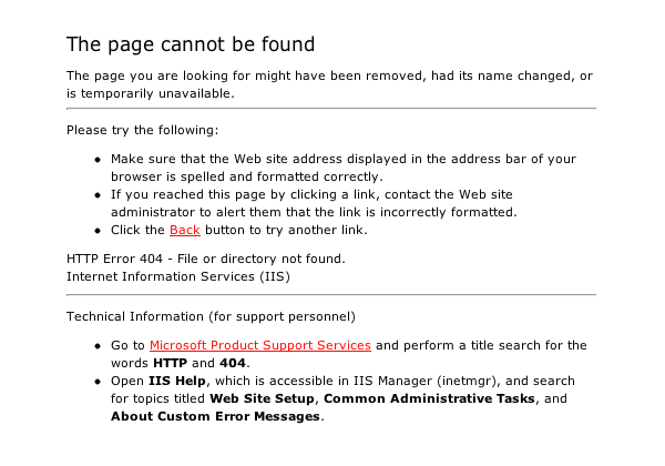
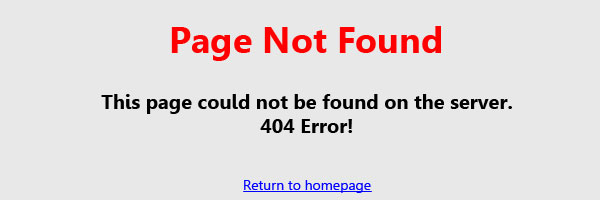
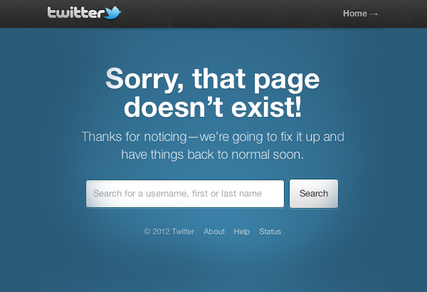
The answer is simple: that's it. Page 404, which only says "Page not found", will not be useful to the visitor; even the "Return to Home" link will not help.
The lack of a decent 404th page worsens the user experience. Visitors who are looking for a specific page on your site, but got a broken link, will be forced to return to the main page and start searching again. If they do not find what they are looking for, they will immediately leave the website. Ideally, the user will never encounter such errors, but the 404th page allows you to apologize to the user and help him find what he is looking for. A satisfied visitor is most likely to return to your website.
Even worse, when the 404th page is completely absent. The visitor will have no idea what is going on. The absence of such a page makes the site unprofessional and forces users to leave it.
The most important thing is to make the 404th error page simple and understandable to the user. Write that the page the visitor is looking for does not exist. Explain why it does not exist.
It is very important that the design of the 404th page does not differ from the rest of the website. This includes logo, navigation, color scheme, etc.
Page 404 of the error should be extremely useful to the user. To achieve the desired effect, you can apply the following elements:
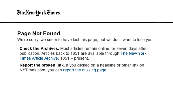
Do not think that everyone knows what the 404th error is. You need to explain what the problem is, in a friendly manner. It’s better to say this: “Oops! We cannot find the page you are looking for. ”Than so:“ 404th error. Page not found".

If you own a large website, such as Google, with many pages of different content, then page 404 with a site map, popular pages or a search form will not help the user.
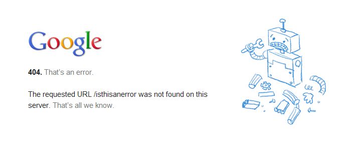
The 404th page can be simple and even funny. If your page is such, then it will undoubtedly delay visitors to your site. It is even possible that they will flip this page to their friends. This is exactly what happened with the 404th page of GitHub: The video is generally posted on nosh.com :

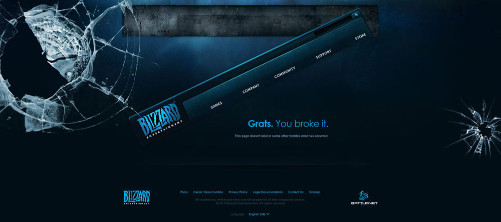

Your 404th error page may be effective and look great, but it’s obvious that it should not appear in search results. This can be done in two ways:
Just add the URL of any file to robots.txt and upload it to the server:
To use your own 404th error page, you need to create a .htaccess file and add the following line to it:
Now we know that instead of the boring and useless pages of the 404th error, we need to spend time creating our own informative page, which visitors will not want to leave the website upon seeing.
PS All comments regarding translation, spelling, etc. happy to accept in PM. Thanks!

Our goal: to improve page 404 !

What is wrong with the default 404 error page?
The answer is simple: that's it. Page 404, which only says "Page not found", will not be useful to the visitor; even the "Return to Home" link will not help.
The lack of a decent 404th page worsens the user experience. Visitors who are looking for a specific page on your site, but got a broken link, will be forced to return to the main page and start searching again. If they do not find what they are looking for, they will immediately leave the website. Ideally, the user will never encounter such errors, but the 404th page allows you to apologize to the user and help him find what he is looking for. A satisfied visitor is most likely to return to your website.
Even worse, when the 404th page is completely absent. The visitor will have no idea what is going on. The absence of such a page makes the site unprofessional and forces users to leave it.

Space for improvement
The most important thing is to make the 404th error page simple and understandable to the user. Write that the page the visitor is looking for does not exist. Explain why it does not exist.
Sorry friend. The page you requested is not in our database. Most likely you got into a broken link or were sealed when entering the URL. - A List Apart 404th page
Tip 1: Stick to Design
It is very important that the design of the 404th page does not differ from the rest of the website. This includes logo, navigation, color scheme, etc.

Tip 2: Maximize Your Benefits
Page 404 of the error should be extremely useful to the user. To achieve the desired effect, you can apply the following elements:
- Search form
- Link to the main page
- List of Most Popular Pages
- Link to site map
- Broken Link Message Button

Tip 3: Be Friendly and Friendly
Do not think that everyone knows what the 404th error is. You need to explain what the problem is, in a friendly manner. It’s better to say this: “Oops! We cannot find the page you are looking for. ”Than so:“ 404th error. Page not found".

Tip 4: Minimalistic design will work too
If you own a large website, such as Google, with many pages of different content, then page 404 with a site map, popular pages or a search form will not help the user.

Tip 5: Keep it Simple
The 404th page can be simple and even funny. If your page is such, then it will undoubtedly delay visitors to your site. It is even possible that they will flip this page to their friends. This is exactly what happened with the 404th page of GitHub: The video is generally posted on nosh.com :


searching results
Your 404th error page may be effective and look great, but it’s obvious that it should not appear in search results. This can be done in two ways:
- Make sure that the web server returns the correct status 404 HTTP, then the search engines will ignore this page.
- Add page 404 to the robots.txt file.
Just add the URL of any file to robots.txt and upload it to the server:
Disallow: /404.html
We use the page of the 404th error
To use your own 404th error page, you need to create a .htaccess file and add the following line to it:
ErrorDocument 404 /error/404-error.html
Conclusion
Now we know that instead of the boring and useless pages of the 404th error, we need to spend time creating our own informative page, which visitors will not want to leave the website upon seeing.
PS All comments regarding translation, spelling, etc. happy to accept in PM. Thanks!
