New Visual Studio 11 Interface
The developers of Visual Studio 11 showed the final interface of the future product. It differs markedly from the September preview . Designers worked very hard on the color scheme, the interface became almost monochrome, and they also greatly simplified the UI by removing the extra buttons.
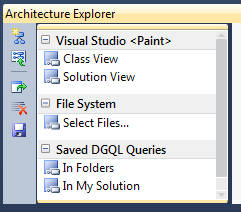
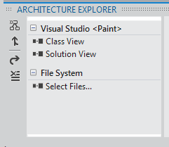
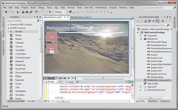
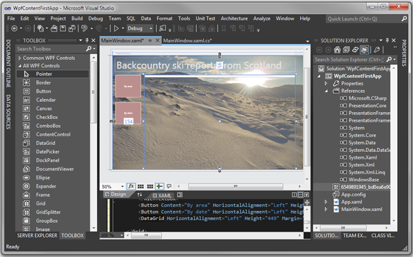
Default toolbar VS 2010 Default toolbar VS 11 A large number of colors in VS 2010 Monochrome color scheme VS 11 focuses on the content Light color scheme for VS 11 Dark color scheme VS 11 For other changes, see the official blog .


Default toolbar VS 2010 Default toolbar VS 11 A large number of colors in VS 2010 Monochrome color scheme VS 11 focuses on the content Light color scheme for VS 11 Dark color scheme VS 11 For other changes, see the official blog .


