Metrolinch and new materials in the metro hub on MSDN
In early December, we wrote about the launch of the metro hub on MSDN, which collects links to useful resources and articles on design for Windows Phone (and in the not too distant future of Windows 8).
We also launched a new series of articles - metro-lyncs, which are dedicated to practical recommendations for improving application design.
New materials
Themes and accents
About the themes and accents in Windows Phone and their consideration when designing the application interface.
Themes and accents are an important component of the Windows Phone platform, together with tiles, sociality and other elements that make it possible to personalize the phone for a specific person, his mood and personal preferences.
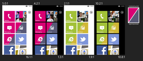
Contrast and accessibility.
An article on how to make interfaces accessible and choose the right colors.
... Suppose you use system brushes as the main colors in your application, that is, you use a system resource with foreground color for the text, background color for the background, and accent color for some important elements. What will happen in this case in terms of interface contrast?
Gradients and 16-bit
Learn why some images look worse in practice than in your favorite photoshop, and how to deal with emerging compression artifacts.
From time to time, I come across applications for Windows Phone that somehow use images with gradients in the background. Very often artifacts appear in such gradients caused by the mismatch between the application rendering mode used and the set bit width of the gradient (the number of bits used to store the color). On top of this, the features of storing images in jpg are superimposed, leading to the appearance of strips.
Navigation. Levels, backs and loops
An article about designing navigation in an application, taking into account the characteristic features of Windows Phone and how to make existing navigation better.
... An important role in the design of navigation is played by the information map of the application, showing which screens you have and how they are related. How to get into this or that screen? How many intermediate levels do you have to go through? How to go back? How are the various information related? All these questions are answered by the information card.
Metrolinci

We also opened a new section, Metrolynch (#metrolynch), in which I give recommendations on improving the design and usability of specific applications for Windows Phone (with the consent of the authors). Want to know how to do the navigation correctly, where to place indentation, how to make information more accessible, and the application more convenient? Everything is for you:
Short link to the metro hub: bit.ly/metrodesignhub