Interface help MTS Internet assistant

Hello.
Today we will talk about the interface of the Ukrainian MTS "Internet assistant" ( ihelper.mts.com.ua ). This online service is designed to help you use the 3G Internet service: check your account balance and the amount of traffic used, as well as much more. But it seems to me that the "Internet assistant" himself needs help ... With interfaces.
Why I decided to write this topic:
- I myself use 3G Internet from MTS. And I constantly have a number of problems when using the “Internet Assistant”. For example, I don’t know when the money is withdrawn from the account or how much traffic I have already used this month. It got to the point that I either wait until the Internet is turned off, or replenish the account in advance.
- Secondly, in the "assistant" there are many functions and features, the meaning of which is not entirely clear. But really important functions, no.
- I would like to draw the attention of MTS to this issue. It is clear that this is far from the most important interface on the site. But still this is a service that is designed to help and provide an opportunity to control your expenses. Now it’s completely not clear how to do this. Therefore, it is difficult to talk about the transparency of the service, which directly affects user loyalty.
- Based on the practice of communication on the hub, I am sure that in the comments wonderful ideas can be born to improve this service.
You can go to the authorization page by the link: ihelper.mts.com.ua . To get further you must be a user of MTS Connect. For this case, I scanned almost all of the interface screens and packed them into a prototype: webster.co.ua/prototypes/mts_helper
I did not link the pages, so use the menu on the left to navigate the pages (thanks, cap).

By the way, in chrome there may be problems with the opening of the prototype (until I figured out what the problem is). Therefore, it is better to use Firefox.
I identified a number of problems that I tried to eliminate in my version of the prototype:
- The main page provides information that rarely changes. In addition, it is of little use.
Solution: display on the home page the most relevant information for the user (payment reminder, statistics on used traffic, account status) - The left menu contains sections: with complex or useless settings (services_status, Account_details, acsses_level, history), as well as those in which there is no useful information at all (activate_services, deactivate_services, orders)
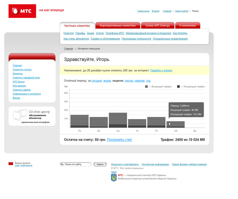
Solution: reorganize the sections and get rid of unnecessary functionality. Even if some of the sections are needed in some special cases, I think it makes no sense to display these sections to all subscribers. - Informing the user. Now it’s difficult to figure out: when to pay the bills, whether the user has exhausted all the traffic, how much money is now in the account.
Solution: to provide the necessary information so that people do not feel that they are being deceived somewhere. - By keeping track of used traffic is another problem. Due to the fact that now it is not known how much the user spends traffic, it is difficult to understand whether it is worth changing the tariff. For example, I have a "Unlimited" tariff (limited to 10,240 Mb). With the help of Kaspersky, I found out that I spend 130 Mb per day, and even less on weekends. If you multiply by the number of calendar days, then about 4 Gb comes out. It turns out that the “assistant” should know about it, but is silent and allows me to spend extra money.
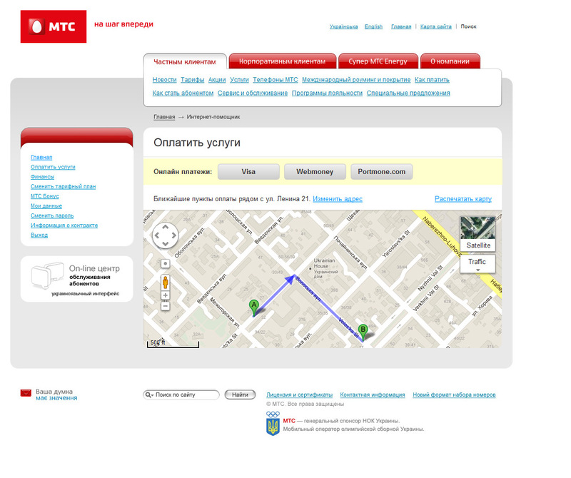
Solution: track traffic and offer users to switch to a suitable tariff, relying on statistics on traffic consumption. - To pay for services online, you need to go to mts.com.ua and select payment methods there.
Solution: give the opportunity to pay bills while in your account. - Now the interface is a bit messy. There is a difference in the processing of information between mts.com.ua and the “Internet assistant” .
Solution: put the display of information in order. Display only the necessary data (cap, do not sleep).
What came of all this?
On the main page, the user can get all the necessary information and pay bills.
On the page "Pay for services" in addition to online payment, it is possible to see the nearest points of payment for services.
On the tariff selection page, the “assistant” tells you that it is time to change the tariff.

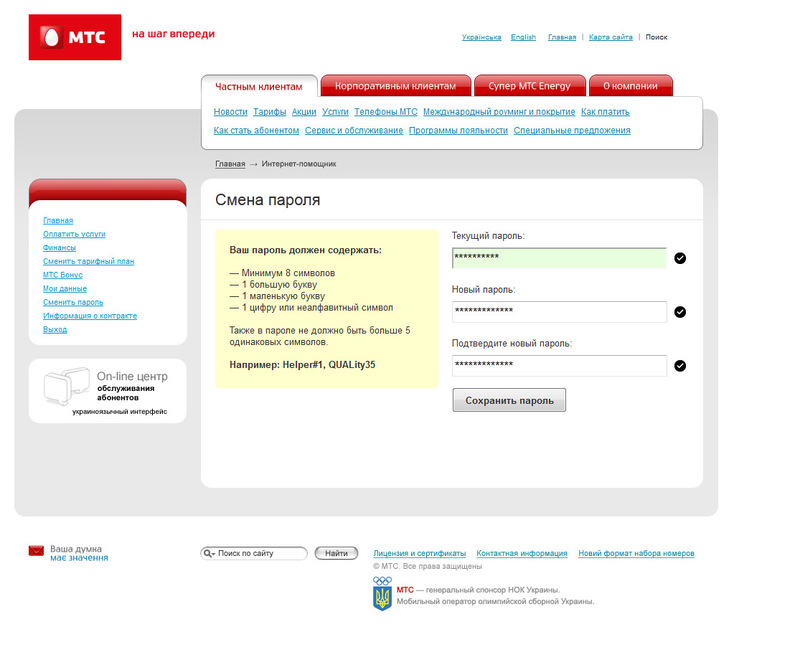
On the password change page, attention is paid to the rules for password selection in order to reduce the number of errors made.
Link to the dynamic prototype: webster.co.ua/prototypes/mts_new
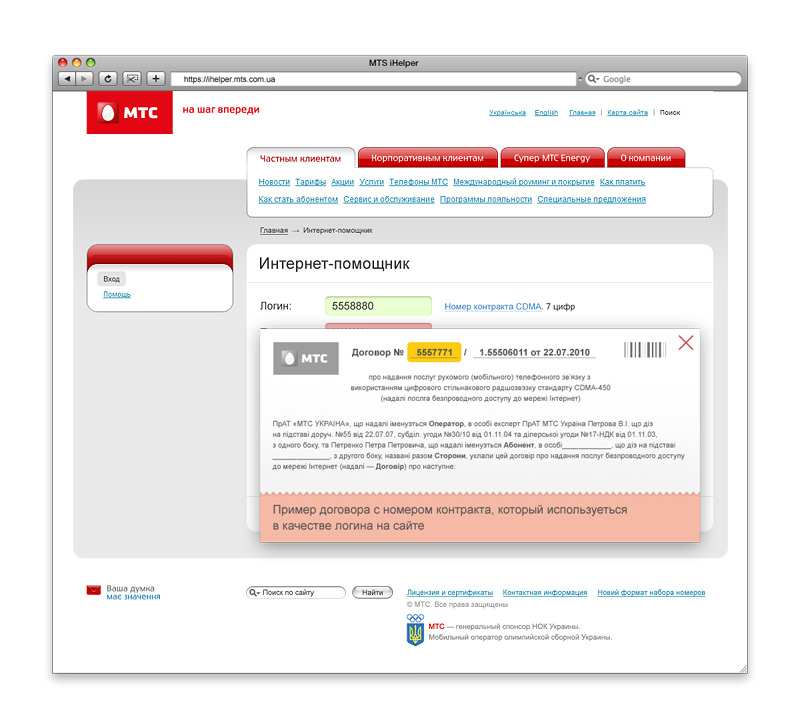
In the appendage, I redesigned the service authorization page, on which I constantly worry about captcha:

Hint where to look for the login, suddenly what.
It is interesting to hear your opinion and suggestions about the interface.