Easier is better
- Transfer
In his book, The Paradox of Choice by Barry Schwartz, Barry Schwartz comes to an interesting conclusion about how people make choices:
“People choose not based on what’s more important, but based on what’s easiest to evaluate.”
Common sense tells you that from all the options you should choose the one that is most important to you, although in fact people usually choose the one that is convenient for them, easy to understand. Very often we do this because we do not want to waste time researching, understanding the issue for making an informed decision. Politicians are rarely elected on the basis that most people conduct research about their political programs. They are elected because people remember the message that politicians spread, and because they heard about this policy before.
When it comes to developing our own design, we imagine people who will accept a conscious opinion based on knowledge, think about what they will do next. However, they have already taken over fifty decisions throughout the day, and these decisions were most likely more important than what they will do in our project.
Do you think most people understand that using a manual gearbox is an advantage over an automatic? Do you think they care? Automation is easier, so why bother with another choice? How often do we maintain a relationship with a person simply because it is easier for us to get used to the situation than to oppose ourselves and enter into conflict?
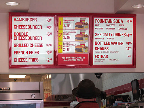
Have you ever been to In 'N Out Burger? I have heard many stories about this place, about their mythical hamburgers and french fries. The feature of this place is that they have a very limited menu. You order a Double Double, cheeseburger or hamburger. You can add french fries, milkshake or a drink if you want. That's all the options (unless you know about the secret menu). So, I was there and tried their food, and yes, it is good, but not very different from Wendy. The attraction of the place is that your choice is limited. It’s easy to place an order there, because you don’t have to decide which type of chicken sandwich is right for you right now.
Woot.com- Not a simple online store, it has its own "highlight". Instead of browsing hundreds and thousands of products, they offer you only one product per day. If you like it, you buy it, and if not, then wait until tomorrow to see what will be exhibited the next day. The site is a successful project, despite the fact that logic seems to tell us directly the opposite. However, if I have a store, is it not all the same that I sell 100 units of one name or one hundred different each? Woot makes buying goods easy, you only need to decide: yes or no.
How much less fun would you get from Angry Birds if you had to choose the birds you could use before each level? Hiding this choice from us and allowing us to focus only on how to use birds, the developers made the gameplay much more enjoyable.

How many of your friends decided to buy a computer of a certain modification for their home simply because they use the exact same one at work? Since they have exactly the same job, the use of a home computer is much easier for them. This does not mean that such equipment is the best - it’s just that set of devices and programs that is convenient for them. Our choice should not be the best, it just should be clear to us.
How often do you come across sites that offer you better features than their competitors, but they are not so easy to use? There is no reason to switch to a service that is more difficult to use, even if it has more features. If this functionality does not make my life easier, then what good can I find in such a service?
Previously, when image hosting was awesome, the best sites provided the ability to upload images without the need for registration or authorization. You just uploaded the image, that's all. Imgur is a great example of this, and it has become one of the most popular photo hosting sites in the world. This does not mean sites like Flickr, they can’t flourish - no, they just had to work a lot more in order to reach more users and show that it really makes sense to go through all the chores of registration.
In a recent article, Jared Spool published a study that showed that only 5% of users changed their MS Word settings. Being a computer geek, I was surprised because I would like to dive into the settings of all my applications to see what I can configure. And yet, the vast majority of people do not seem to want to change the settings - they just want to use the application:
“We started a little experiment. We asked people to send us their settings file for Microsoft Word. The fact is that MS Word stores all the settings in a file with the name like config.ini, so we asked people to find this file on the hard drive and send it to us. Several hundred people did just that.
Then we wrote a program for analyzing files, calculating how many people changed the settings (more than 150 options in total), and what parameters they changed.
We discovered something really interesting. Less than 5% of the users we surveyed changed the settings. While more than 95% left the initial settings without changing the configuration in which the program was installed. ”
It is great when developers provide the user with the opportunity to make changes to the settings, but the settings themselves are not an integral function. Creating a great product that just works should be a top priority, and as soon as you begin to understand what options can be changed, you can think about adding a dashboard.
Users suggest that you give them the settings that suit them best. Otherwise, they may consider your product to be a failure.
The paradox of choice says that the more options a person has, the more difficult it is to make a choice. For example, if samples of jam are offered in the store for tasting, then you are more likely to get people to buy a jar of jam when only six of the options are available than in the case of twenty-four options. More choices do not make the selection process easier for people. At the same time, the lack of choice takes away from them a part of the freedom that they think they have.
When you think which of the new iPhones you want to buy, you have the opportunity to get it in either black or white, plus three more different memory options. Add a few more options to the developers here, and the choice will become a little more difficult.
If the client tells you that you can make him the design that you like best, it will be more difficult than making the design with restrictions, since your possibilities are unlimited. We need a framework, a limited choice in everything we do. This makes decision making simpler, and the resulting design is easy to use.
If in some way you can make a simple product, and it will be the best product on the market, you are already a winner. You should think about how often we make choices in one day, and therefore it is in your interest to limit the solutions for the user, because today it is unlikely to be the most important decision for them.
This means that the design that is easiest to evaluate (fewer choices) will win in most cases. Funny t-shirts and bumper stickers are effective as they are understandable. I spend quite a bit of time choosing clothes in the mornings - don't make me try to decide which of the 250 standard avatars I should choose.
“People choose not based on what’s more important, but based on what’s easiest to evaluate.”
Common sense tells you that from all the options you should choose the one that is most important to you, although in fact people usually choose the one that is convenient for them, easy to understand. Very often we do this because we do not want to waste time researching, understanding the issue for making an informed decision. Politicians are rarely elected on the basis that most people conduct research about their political programs. They are elected because people remember the message that politicians spread, and because they heard about this policy before.
When it comes to developing our own design, we imagine people who will accept a conscious opinion based on knowledge, think about what they will do next. However, they have already taken over fifty decisions throughout the day, and these decisions were most likely more important than what they will do in our project.
Do you think most people understand that using a manual gearbox is an advantage over an automatic? Do you think they care? Automation is easier, so why bother with another choice? How often do we maintain a relationship with a person simply because it is easier for us to get used to the situation than to oppose ourselves and enter into conflict?
Have you ever been to In 'N Out Burger? I have heard many stories about this place, about their mythical hamburgers and french fries. The feature of this place is that they have a very limited menu. You order a Double Double, cheeseburger or hamburger. You can add french fries, milkshake or a drink if you want. That's all the options (unless you know about the secret menu). So, I was there and tried their food, and yes, it is good, but not very different from Wendy. The attraction of the place is that your choice is limited. It’s easy to place an order there, because you don’t have to decide which type of chicken sandwich is right for you right now.

Woot.com- Not a simple online store, it has its own "highlight". Instead of browsing hundreds and thousands of products, they offer you only one product per day. If you like it, you buy it, and if not, then wait until tomorrow to see what will be exhibited the next day. The site is a successful project, despite the fact that logic seems to tell us directly the opposite. However, if I have a store, is it not all the same that I sell 100 units of one name or one hundred different each? Woot makes buying goods easy, you only need to decide: yes or no.
How much less fun would you get from Angry Birds if you had to choose the birds you could use before each level? Hiding this choice from us and allowing us to focus only on how to use birds, the developers made the gameplay much more enjoyable.

How many of your friends decided to buy a computer of a certain modification for their home simply because they use the exact same one at work? Since they have exactly the same job, the use of a home computer is much easier for them. This does not mean that such equipment is the best - it’s just that set of devices and programs that is convenient for them. Our choice should not be the best, it just should be clear to us.
How often do you come across sites that offer you better features than their competitors, but they are not so easy to use? There is no reason to switch to a service that is more difficult to use, even if it has more features. If this functionality does not make my life easier, then what good can I find in such a service?
Previously, when image hosting was awesome, the best sites provided the ability to upload images without the need for registration or authorization. You just uploaded the image, that's all. Imgur is a great example of this, and it has become one of the most popular photo hosting sites in the world. This does not mean sites like Flickr, they can’t flourish - no, they just had to work a lot more in order to reach more users and show that it really makes sense to go through all the chores of registration.
User settings and selection
In a recent article, Jared Spool published a study that showed that only 5% of users changed their MS Word settings. Being a computer geek, I was surprised because I would like to dive into the settings of all my applications to see what I can configure. And yet, the vast majority of people do not seem to want to change the settings - they just want to use the application:
“We started a little experiment. We asked people to send us their settings file for Microsoft Word. The fact is that MS Word stores all the settings in a file with the name like config.ini, so we asked people to find this file on the hard drive and send it to us. Several hundred people did just that.
Then we wrote a program for analyzing files, calculating how many people changed the settings (more than 150 options in total), and what parameters they changed.
We discovered something really interesting. Less than 5% of the users we surveyed changed the settings. While more than 95% left the initial settings without changing the configuration in which the program was installed. ”
It is great when developers provide the user with the opportunity to make changes to the settings, but the settings themselves are not an integral function. Creating a great product that just works should be a top priority, and as soon as you begin to understand what options can be changed, you can think about adding a dashboard.
Users suggest that you give them the settings that suit them best. Otherwise, they may consider your product to be a failure.
The paradox of choice
The paradox of choice says that the more options a person has, the more difficult it is to make a choice. For example, if samples of jam are offered in the store for tasting, then you are more likely to get people to buy a jar of jam when only six of the options are available than in the case of twenty-four options. More choices do not make the selection process easier for people. At the same time, the lack of choice takes away from them a part of the freedom that they think they have.

When you think which of the new iPhones you want to buy, you have the opportunity to get it in either black or white, plus three more different memory options. Add a few more options to the developers here, and the choice will become a little more difficult.
If the client tells you that you can make him the design that you like best, it will be more difficult than making the design with restrictions, since your possibilities are unlimited. We need a framework, a limited choice in everything we do. This makes decision making simpler, and the resulting design is easy to use.
If in some way you can make a simple product, and it will be the best product on the market, you are already a winner. You should think about how often we make choices in one day, and therefore it is in your interest to limit the solutions for the user, because today it is unlikely to be the most important decision for them.
This means that the design that is easiest to evaluate (fewer choices) will win in most cases. Funny t-shirts and bumper stickers are effective as they are understandable. I spend quite a bit of time choosing clothes in the mornings - don't make me try to decide which of the 250 standard avatars I should choose.
