Scrolling and attention (2018 study)
- Transfer
I bring to your attention the translation of the article Therese Fessenden - Scrolling and Attention . The article is devoted to a new study of the use of scrolling when viewing sites. The previous study was conducted in 2010, the translation of the article on it was also posted on Habré .Summary: People scroll vertically more often than before, but new eye-tracking studies show that they are still looking at the “first screen” more than the others.
I apologize for any inaccuracies in the translation :)
Patterns of human behavior are fairly stable, and usability guidelines only occasionally change over time . But one pattern of behavior that has changed since the early days of web design is the use of scrolling. Initially, people rarely scrolled vertically; but in 1997, when long pages became common , they began to use scrolling. However, users were still most interested in the information on the “first screen”; and even in the recent 2010Our eye-tracking studies have shown that users spend 80% of the time looking through the “first screen” of the page.
Since 2010, with the advent of adaptive design and minimalism, designers have increasingly begun to create long pages with elements that are far from each other, thus covering several screens. It's time to find out if these trends have influenced user behavior.
Eye-tracking research data
About the study
To get answers to the questions, we analyzed the X and Y coordinates of more than 130 thousand fixtures on the screen with a resolution of 1920 x 1080 pixels. The study involved 120 people also participating in our recent eye-tracking study, which included thousands of sites on various topics. In this study, we focused on a wide range of user tasks, analyzing user behavior on news sites, e-commerce, blogs, FAQs and encyclopedia sites. Our goal was not to analyze specific sites, but to identify the characteristics of user behavior.
We compared the results of a new study with the results of the previous one, which used screens with a resolution of 1024 x 768 pixels.
Research results
Between our two studies there were two changes:
- Larger screens have been used
- There are new trends in web design and adaptability
We cannot reveal the relative influence of these two changes, but it doesn’t matter, since we cannot influence them.
In one of our recent studies, users spent 57% of their time on the “first screen” of the site. 74% of the time was spent on the two “first screens”, up to the mark of 2160 pixels along the Y axis (this analysis did not take into account the maximum page length, as the result may be affected by the short page length or the fact that people are bored with scrolling over two screens ).
These findings are significantly different from the findings of the 2010 study : users spent 80% of their time on viewing the “first screen” of the page. However, the trend of drastically reducing attention on screens after the firstremains unchanged in 2018.
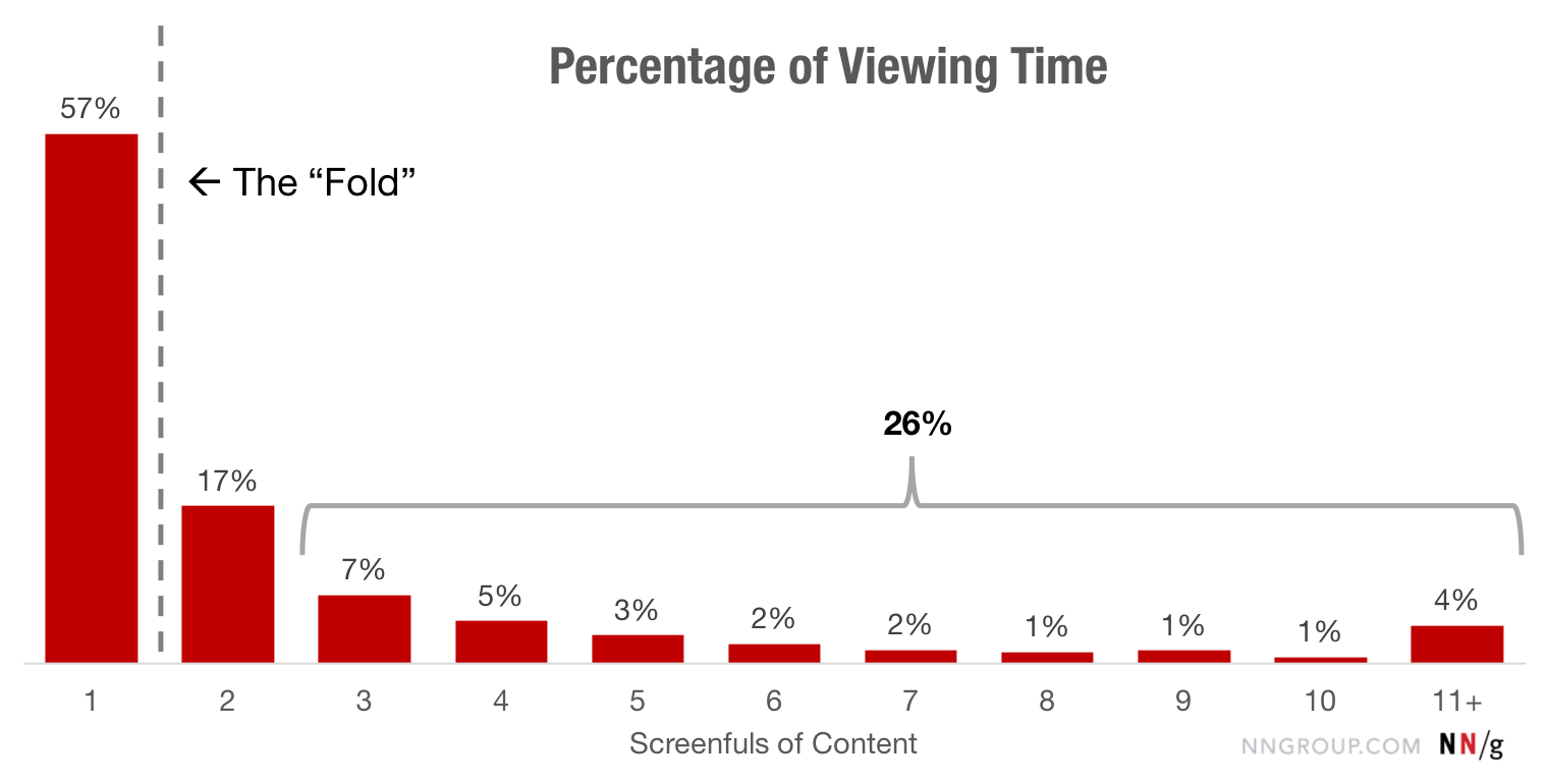
The “first screen” gets the maximum amount of attention. About 74% of the time is spent on the first two screens (the content on the “first screen” and what immediately goes after it). The remaining 26% is for the rest of the page.
It is clear that all pages are different in length. To determine how people distribute their view of the page (no matter how long it is), we divided the pages into 20% segments (⅕ of each page). On shared websites, more than 42% of the browsing time was in the top 20% of the page, and more than 65% of the time was spent on the top 40% of the page. On search results pages that we did not separate from other types of pages in the findings of the 2010 study, 47% of the time was spent on the top 20% of the page and more than 75% on the top 40% - this is probably an indicator that users tend to look only on the top search results.
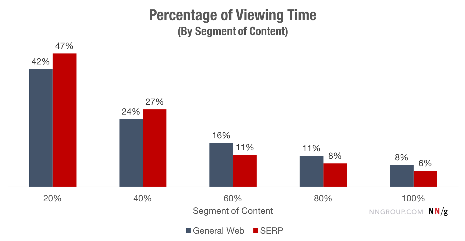
Study participants spent a disproportionately longer time viewing the top 20% of a page.
If we pay attention to the “first screen”, the information in its upper part of the screen received more attention than in the lower one. More than 65% was spent on viewing just the top of the "first screen". On the search results pages, the top “first screen” areas take up more than 75% of user attention. The old truth that is not a sin to repeat: be it the 1st or the 2nd in Google, or you almost do not exist on the Internet. Trust in Google remains as strong as it was 10 years ago when we defined this pattern of user behavior.
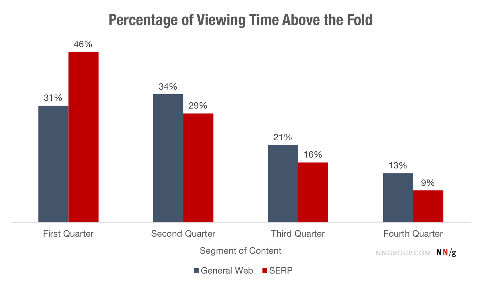
Even on the “first screen”, users' attention is focused on the top of the screen, especially on the search results pages.
Scan and read patterns
We determined that the content on the "first screen" takes the lion's share of attention (57%); the second screen gets a third of this value (17%); The remaining 26% fall on everything below. In other words, the closer the information is to the top of the page, the higher the chance that it will be read.
Individual reading patterns confirm these findings. Many users study pages with poorly structured content according to the F-template - they tend to pay more attention to the text at the top of the page (the first few paragraphs of the text), and focus less and less on the information below.
But even if the information on the page is well structured, people look intently at its top (and therefore spend time on it), because they need to understand how the page is organized. And as soon as they understand this, they, as a rule, maximally focus on relevant information, thereby paying less attention (and spending less time) to content located far from far from the top of the page.
This snapshot shows that the majority of users are focused on the “first screen” of the page, although not always on its upper part. The actual distribution of gaze fixations depends on the design of a particular page and the goals of users when visiting it. Occasionally, the user may even read a little, if the information seems interesting to him, but mostly to the bottom of the page views becomes smaller.
2010 vs. Now
In 2010, 80% of their time users spent on the "first screen". Today this number is 57%, which is probably the result of the omnipresence of long pages. What does this mean?
Firstly, it is possible that, in general, designers do an excellent job of creating elements that call for scrolling, thereby confronting the illusion of reaching the end of the page . In other words, they are aware of the shortcomings of long pages and try to at least soften them.
Secondly, this may mean that users simply learned to constantly scroll - the prevalence of pages requiring scrolling strengthened this pattern of behavior in us.
However, people still do not like scrolling very much - they rarely reach content below the third screen. In fact, the gap between the screens as a barrier was shifted down to the third screen - 8 years ago, 80% of the time was spent watching the “first screen”, and today 81% is spent on the first 3 screens.
We have always said that people will scroll if they have a reason. Attention is still concentrated at the top of the page - this is the most visible part of the content, and most likely it will be read by your users. The “interaction cost” of scrolling reduces the likelihood that content at the bottom of the page will be viewed by the user.
It is noteworthy that increasing the screen resolution did not lead to a decrease in scrolling, as might be expected. This is most likely because designers and developers do not adapt their work for large screens, and instead simply place the content farther apart. Good or bad, but now users are called to scroll more than before, but not by much. Information density was probably too high in the early period of Internet development (which made the pages “close”), but the current design is definitely not the same - the density is lower, the content is sparse.
findings
By allowing users to spend more time at the top of the page, especially on the “first screen,” you should remember the following:
- Leave the top of the page for the highest priority content - the one that contributes to the achievement of key business goals and users . The bottom of the page may include additional or related information. Keep important STAs on the “first screen”.
- Use the appropriate font style to draw attention to important content . Elements such as headlines and bold type make it clear to users that this information is important. Make sure that these elements are visually different from others and are equally stylized on all pages of the site so that users can easily find them.
- Avoid the false end of the page, which is increasingly common in modern minimalist design . The illusion of reaching the end of the page can cause people not to scroll below. Use symbols (for example, hiding the text under the cat) to prompt people that there is also content below.
- Test your design on representatives of the target audience of the product in order to determine the optimal page length and make sure that the information that users need is clearly visible.
Conclusion
Despite the fact that modern web pages are long and the density of information on them is low, and that users tend to scroll more than before, they still spend most of their time browsing the top of the page.
- Setting priorities in content is a key step in your content strategy.
- Good visual signs can entice users to scroll down and explore the content below the “first screen”.
- To determine the optimal page length, test the design on users and remember that too long pages lead to a loss of interest from your users.