Creating a coloring application on Unity3D
This story began on a frosty spring evening when the question came to my mind: is there a way to determine the degree of filling an arbitrary geometric figure with paint (that is, by how many percent is it painted at the moment)? So much so that it does not just slow down, but fly 60 fps on the weakest mobile devices.
For those who did not immediately understand what they were talking about, I will explain: the problem is possible as a raster approach, and ... not a raster approach.
In the first case, everything is simple, the theme of the flood fill and associated algorithms have been successfully studied and implemented in PL for every taste. There is an array of pixels to be filled, there are their borders. We count the number of filled points, divide by the total number, and voila - we have the coveted percentage of the output. But - with a large number of pixels (and you yourself know which ppi on modern devices), plus - if there are many such figures, we run into a bunch of calculations in each frame, which pleasantly heat the device, but not the soul.
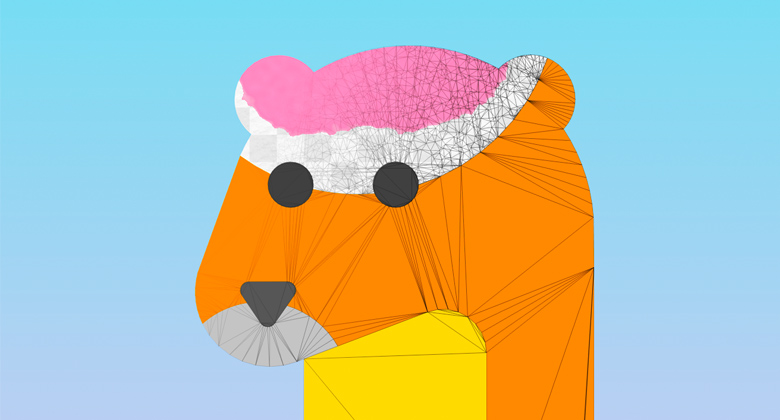
Anyway, working with raster seemed to be unsportsmanlike. The gaze was directed towards the omnipotent polygons. A few exciting hours of relaxed-hard coding proved the hypothesis: you can use such a thing as “ vertex color"- vertex color.
A little bit about vertex color
Нативно дополнительный канал информации, доступный в структуре данных треугольника — тот самый mesh.colors. Теоретически, его можно использовать для любых целей, смотря что прописать в шейдере, но в данном случае заветный байт будет хранить именно текущее значение заполненности цветом для каждой вершины. Его же шейдер использует при отрисовке, и тогда с одним материалом Unity можно создавать неограниченное количество разноцветных мешей с одним материалом на всех. Самое интересное — значения vertex color аппаратно интерполируются между собой, что позволяет делать лёгкие градиенты.
I think it is worth mentioning why it took the notorious percentage of filling, from which the article began. The basic idea of the coloring application was the following: the final image consists of a set of polygons. The application will sequentially and automatically push the user element by element . Accordingly, until you paint one piece to the end, you will not proceed to the next. Such a decision seemed to me to be very elegant, enticing, and in the light of the global dominance of the “pixel” colorings in the pages - also fresh.
The first steps
Needless to
The first step was to do a human tessellation(splitting a large polygon consisting of a set of triangles into a stochastic heap of small triangles). After all, if we set up an array of vertices, and we write there vertex color as we paint, we can simply determine whether the figure is completely painted over and what other pieces are left blank — just like a pixel algorithm, but with much more freedom .
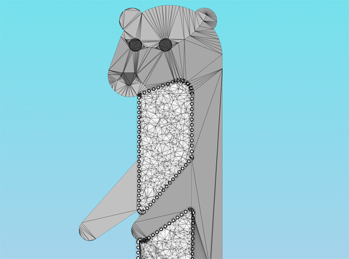
Then began a fascinating journey into the world of shaders. As you understand, I can’t open all the finds and secrets entirely, but I’ll say that by interacting with the Unity noise map and old-school emission of Unity rays from the fingers, the brush effect was achieved, and even with some paint spreading along the triangles from the finger. Using vertex color provided an opportunity to get byone Unity material for absolutely all components of the figure and therefore draw calls in the finished program does not exceed 5-7 (depending on the availability of the menu and particles).
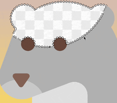
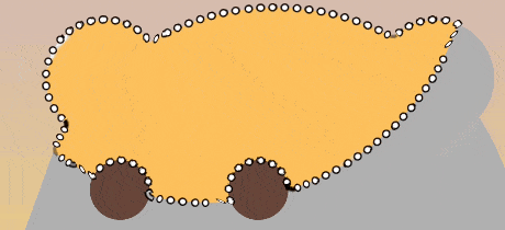
The stroke is made usual Unity Line Renderer, which is treacherously buggy on some figures, moving down and showing flaws at the joints. It could not be defeated, so the priority task is to rewrite the component from scratch. Fingerprinting is also a standard Trail Renderer, but its shader uses a z-check to prevent trace elements from overlapping each other, creating ugly artifacts. The “chess” texture of the background helps, in particular, to estimate the size of the element being painted : the more it is, the smaller the size of the cells.
Functional, which did not wait
During testing, it turned out that often somewhere in the corners of the figure there were empty peaks, which was difficult to determine visually. Despite the fact that the trigger for switching to the next element worked with a fill rate of 97%, the situation “ what to do next? "- with a degree of occupancy from 90% to 97% - there were quite often and confused users (who were mostly no more than 12 years old). I didn’t want to set the trigger to less than 97%, because then the effect “ I haven’t redrawn, but it has already jumped ” appeared.
So I reluctantly met Madame Clustering. Imagine: a polygon, a bunch of points inside, there are some "special", sometimes separately, sometimes - in groups. It is necessary to find and designate the largest "group". The usual such mathematical task. None of the traditional algorithms I found came up for various reasons, I had to make my own. Hack on hack, but it worked - and the under-painted areas began to stand out with a beautiful dynamic circle. In order to optimize, this algorithm is triggered every 3 seconds, and only after the user pulls his finger off the screen in the “what to do next” style. It looks quite organic.
After such a brainstorming session, make, according to the testers' requirements, a variable “coloring list”- namely, to give the user the opportunity to choose in what sequence he wants to color the elements - was a matter of one evening. Just need to determine the geometric centers of each mesh and build them as we need: from left to right, from top to bottom, etc. For greater clarity, the particles were implemented on the background, which show the direction of the queue.
Illustration of a queue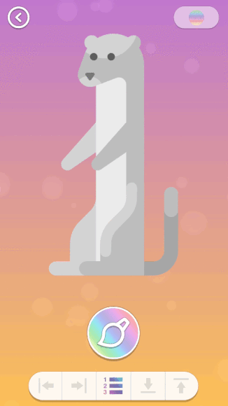
Здесь показана дефолтная очередь (так, как задумал художник). Если включить режим "очередь по направлению" нажатием на одну из кнопок внизу, очередь раскрашивания изменится, и частицы поедут в указанную сторону.
Здесь показана дефолтная очередь (так, как задумал художник). Если включить режим "очередь по направлению" нажатием на одну из кнопок внизу, очередь раскрашивания изменится, и частицы поедут в указанную сторону.
UX & UI
I am generally impressed by the idea of controlled automatism in applications, and therefore each element is centered and scaled so that it can be painted over with a finger without the need to scroll the screen . The disadvantage of this approach is that it is not always clear what part of the figure is now on the screen. As it turned out, users even like such a small challenge, as it trains short-term memory and correlation of information - you need to keep the big picture in mind. Well, you can get to the “bird's eye view of the figure” in two ways - with a pinch gesture or by pressing the zoom button.
Following the covenants of Apple Interface Guidelines , it was decided to reduce the number of buttons on the screen to a minimum. In addition to the zoom in / out buttonand the obvious exit button in the menu, there is still a call to the palette - you can paint both with the “default” color set by the artist, and of your own choice.
In addition, in the “out of bird's eyes” mode, you can change the background gradient (each press is randomly generated) or enter the “repainting” mode, which allows you to correct an already painted element. Yes, I had to hide this functionality, but it is quite justified - for all the testing, no one has ever asked how to do it.
About the palette
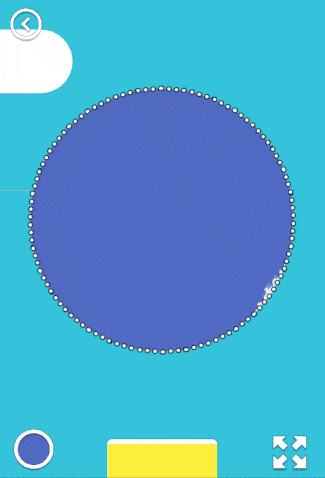
By itself, the palette was altered twice. At first, I just placed on the screen a certain number of squares with flowers, but users asked for more colors. I didn’t want to do scrolling in the interface, and so the “color-shade” scheme appeared , that is, the user first selects the base color by pressing, and then one of its shades. The palette is removed with a button or an impressive swipe down. And when it appears on the screen, the workspace of the artist is reduced by 1/3, which makes it necessary to “rescale” the current figure to the changed size of the viewport.

For sweet
The key missing link in the whole picture was the reward - a kind of visual and psychological reward that the user receives upon completion of the coloring process. The idea

Of course, timelapse when playing is recorded in the video, and after the visual extravaganza, the user is prompted to save / share the newly created masterpiece. Fortunately, a plug-in appeared in the Asset Store just in the spring, which allows you to capture video from the screen fully and multiplatformly (after some settings), because writing such a tool from scratch goes far beyond my programming skills
Instead of conclusion
На этом тысяча слов, отведенных мной на первый опус, заканчивается. В следующих частях планируется поведать про героические сражения с Unity UI при разработке второй части приложения — меню выбора картинок, а также посчитать набитые шишки в нелегком деле ASO.