Review of the BlackBerry PlayBook from Engadget
- Transfer
Following the topic of the topic about tablets that are waiting for us in 2011 , I present to your attention a translation of the BlackBerry PlayBook review conducted by the Engadget team .
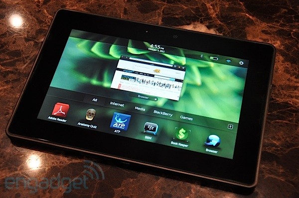
We just happened to touch a wonderful tablet, but it didn’t work on Android, webOS, iOS or Windows. It had a real-time operating system called QNX (which RIM bought in April), combined with a WebKit browser with Flash support. The release of the tablet is expected in the first quarter of 2011. The BlackBerry PlayBook turned out to be surprisingly polished and responsive at this stage, even taking into account the fact that according to RIM there is still a lot of work. In fact, the only thing that upset us after about a 30-minute acquaintance with the tablet (under the supervision of Mike Lazaridis) is that at the moment you can not buy a BlackBerry smartphone, which would be as nice to use as this tablet. Stay with us, after the break we will go through the entire product,

The PlayBook is much smaller than what it looks in the pictures, and it is without a doubt smaller than its closest 7-inch rival, the Galaxy Tab. The matte back wall is flat and the device looks very “serious” - a kind of “ThinkPad among tablets”. In the middle is the camera and the classic BlackBerry logo - and that’s it.
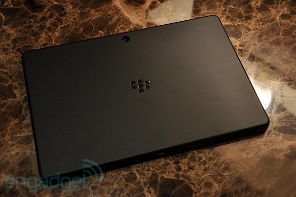
On the upper end there are small but easily pressed buttons (the only physical buttons of the device): volume, “play / pause” and “enable / disable”. At the bottom there is mini-HDMI, micro-USB and a charging port. There are no visible controls on the front surface, but capacitive sensors are actually located along the frame that track gestures from the edge of the screen (similar to Palm Pre). Above the screen, right in the middle is the second camera.
The screen is gorgeous. Very bright, the colors are perfect, and the viewing angle does not allow much to be desired (at the iPad level or even better). The pixel density at 1024x600 is simply excellent, the same 170 dpi as the Galaxy Tab (versus 132 on the iPad). Responsiveness to touch is mostly excellent, but we had some problems with some small controls, although at this stage it can be attributed to software problems.

We were in a rather dark room, but the 5-megapixel rear camera produced pretty good, but terribly grainy images - we hope that in the best conditions it will cope better.
The base model will only ship with a WiFi module, but in the summer a model with a WiMAX module will be released. You can also “pair” the tablet with your BlackBerry-smartphone via Bluetooth, if you are tightly hooked on BB Messenger and you are satisfied with only a 7-inch keyboard.
Under the hood is a dual-core GHz processor ARM Cortex A9.
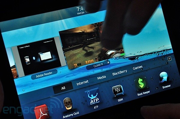
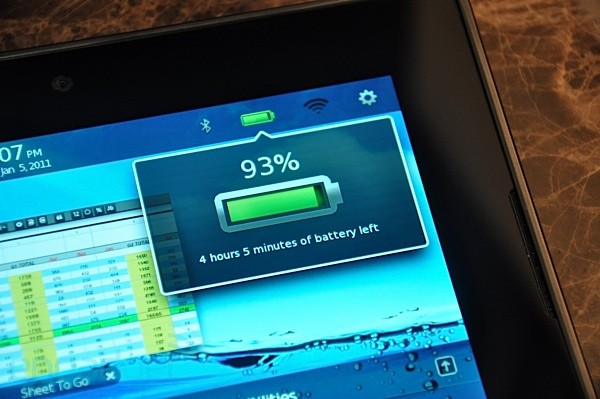
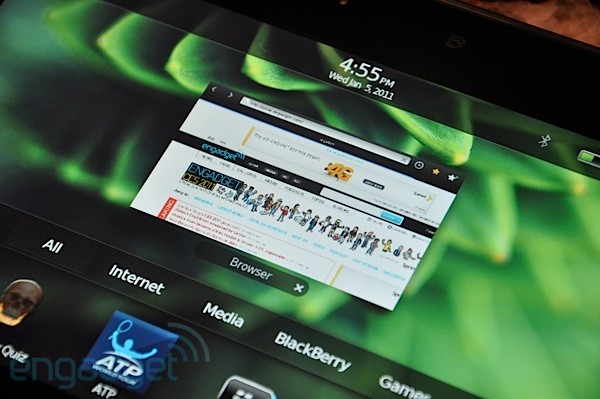
The operating system is a lot like webOS. Some may say too similar, but we will not complain. The famous webOS “gesture up” has been improved and expanded to all 4 borders of the screen: a gesture from the upper border displays technical details (battery charge, wireless status, shortcut to settings); a gesture from the lower border brings up the main screen with a set of “cards” (this is our term / Palm, not RIM) in the center, with technical information displayed at the top and access to different categories of applications below; finally, gestures from the left / right borders of the screen put the PlayBook in the “cards” mode in full screen.
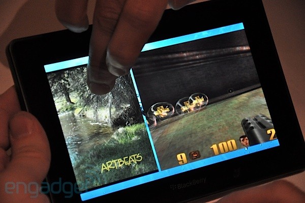
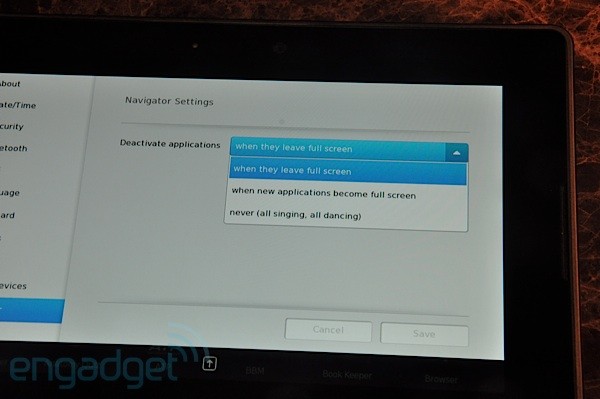
The “cards” themselves, of course, are not the most original innovation from RIM, but they perfectly demonstrate the technical power of QNX, because they can remain “alive” while you are flipping through “cards” and even when you switch to other applications. You can watch the video with our stress test, we were not able to reach the limit of the device, even despite the simultaneous playback of 1080p video, playing in real time in Quake 3, playing a song in a music player and viewing photos in a slideshow mode (although in the end everything it became a little lag). Fortunately, you can configure multitasking to your liking: pause the application during the transition to the "cards", pause when switching to another application, or the "everyone dance and dance" mode when everything works simultaneously.
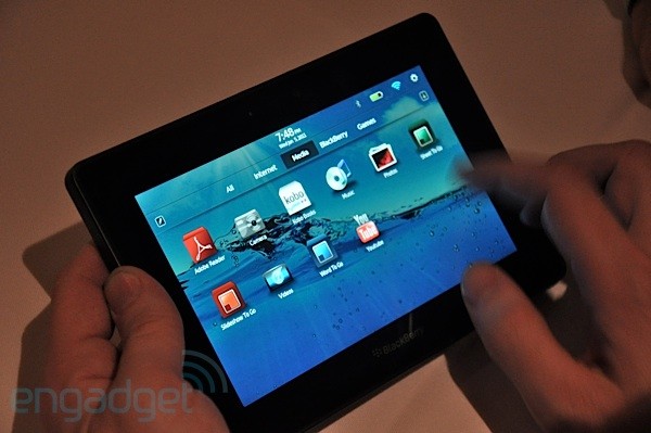
A gesture up on the main screen opens a full-screen application browser, which currently houses mostly applications on Adobe AIR. We were not able to find the original BlackBerry applications (like BBM, Calendar, Messages), because they require a Bluetooth connection to the BlackBerry smartphone, and RIM was not ready to demonstrate it. Although maybe Mike L. just for some reason did not want us to look at his personal mail.
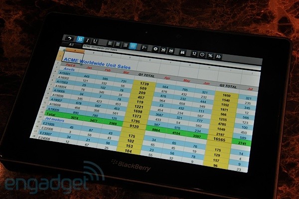
The music application turned out to be not bad, but we did not find any special functionality in it. Documents To Go Sheets To Go are quite worthy from the point of view of features, but from the point of view of UI they looked rather rustic - more like a web application than a real application. There is an official Adobe PDF Reader, which was pretty fast, but here we will throw one more stone into the garden of the UI department. Do not get us wrong, everything was fine, we just didn’t find any innovations exactly in the area of “how it should look on a tablet”.
The best application turned out to be a browser showing a panel with tabs when gesturing from the top of the screen. Level performance, including smooth zoom and scrolling.
The on-screen keyboard is well-designed and responsive, and the sound of typing keys is arguably the best ever. Unfortunately, word suggestions and auto-correction are not implemented at the moment, but we hope that RIM will port these features from the main OS before launch.
If you still do not understand, then we were impressed. In general, the device is damn fast, convenient in the hand and intuitive to use. Our main gripe is the application. RIM makes a big bet on ported applications on Adobe AIR, but as the Android example demonstrated, the native SDK is very important for games, and we don’t yet know what RIM has in store for this - although we were assured that writing under QNX is very simple, and this is one of the reasons why the company managed to turn around with this project so quickly. They also promised to keep us informed.
If RIM gives a fairly aggressive price, chooses a good “quiet moment” to start (before Xoom or, possibly, iPad2 comes out), and deals with minor issues, we will see a really successful product.
Photos taken from the original article. Also on the link you will find a 3.5-minute video.

We just happened to touch a wonderful tablet, but it didn’t work on Android, webOS, iOS or Windows. It had a real-time operating system called QNX (which RIM bought in April), combined with a WebKit browser with Flash support. The release of the tablet is expected in the first quarter of 2011. The BlackBerry PlayBook turned out to be surprisingly polished and responsive at this stage, even taking into account the fact that according to RIM there is still a lot of work. In fact, the only thing that upset us after about a 30-minute acquaintance with the tablet (under the supervision of Mike Lazaridis) is that at the moment you can not buy a BlackBerry smartphone, which would be as nice to use as this tablet. Stay with us, after the break we will go through the entire product,
Iron

The PlayBook is much smaller than what it looks in the pictures, and it is without a doubt smaller than its closest 7-inch rival, the Galaxy Tab. The matte back wall is flat and the device looks very “serious” - a kind of “ThinkPad among tablets”. In the middle is the camera and the classic BlackBerry logo - and that’s it.

On the upper end there are small but easily pressed buttons (the only physical buttons of the device): volume, “play / pause” and “enable / disable”. At the bottom there is mini-HDMI, micro-USB and a charging port. There are no visible controls on the front surface, but capacitive sensors are actually located along the frame that track gestures from the edge of the screen (similar to Palm Pre). Above the screen, right in the middle is the second camera.
The screen is gorgeous. Very bright, the colors are perfect, and the viewing angle does not allow much to be desired (at the iPad level or even better). The pixel density at 1024x600 is simply excellent, the same 170 dpi as the Galaxy Tab (versus 132 on the iPad). Responsiveness to touch is mostly excellent, but we had some problems with some small controls, although at this stage it can be attributed to software problems.

We were in a rather dark room, but the 5-megapixel rear camera produced pretty good, but terribly grainy images - we hope that in the best conditions it will cope better.
The base model will only ship with a WiFi module, but in the summer a model with a WiMAX module will be released. You can also “pair” the tablet with your BlackBerry-smartphone via Bluetooth, if you are tightly hooked on BB Messenger and you are satisfied with only a 7-inch keyboard.
Under the hood is a dual-core GHz processor ARM Cortex A9.
Software


The operating system is a lot like webOS. Some may say too similar, but we will not complain. The famous webOS “gesture up” has been improved and expanded to all 4 borders of the screen: a gesture from the upper border displays technical details (battery charge, wireless status, shortcut to settings); a gesture from the lower border brings up the main screen with a set of “cards” (this is our term / Palm, not RIM) in the center, with technical information displayed at the top and access to different categories of applications below; finally, gestures from the left / right borders of the screen put the PlayBook in the “cards” mode in full screen.

The “cards” themselves, of course, are not the most original innovation from RIM, but they perfectly demonstrate the technical power of QNX, because they can remain “alive” while you are flipping through “cards” and even when you switch to other applications. You can watch the video with our stress test, we were not able to reach the limit of the device, even despite the simultaneous playback of 1080p video, playing in real time in Quake 3, playing a song in a music player and viewing photos in a slideshow mode (although in the end everything it became a little lag). Fortunately, you can configure multitasking to your liking: pause the application during the transition to the "cards", pause when switching to another application, or the "everyone dance and dance" mode when everything works simultaneously.

A gesture up on the main screen opens a full-screen application browser, which currently houses mostly applications on Adobe AIR. We were not able to find the original BlackBerry applications (like BBM, Calendar, Messages), because they require a Bluetooth connection to the BlackBerry smartphone, and RIM was not ready to demonstrate it. Although maybe Mike L. just for some reason did not want us to look at his personal mail.


The music application turned out to be not bad, but we did not find any special functionality in it. Documents To Go Sheets To Go are quite worthy from the point of view of features, but from the point of view of UI they looked rather rustic - more like a web application than a real application. There is an official Adobe PDF Reader, which was pretty fast, but here we will throw one more stone into the garden of the UI department. Do not get us wrong, everything was fine, we just didn’t find any innovations exactly in the area of “how it should look on a tablet”.
The best application turned out to be a browser showing a panel with tabs when gesturing from the top of the screen. Level performance, including smooth zoom and scrolling.
The on-screen keyboard is well-designed and responsive, and the sound of typing keys is arguably the best ever. Unfortunately, word suggestions and auto-correction are not implemented at the moment, but we hope that RIM will port these features from the main OS before launch.
Conclusion

If you still do not understand, then we were impressed. In general, the device is damn fast, convenient in the hand and intuitive to use. Our main gripe is the application. RIM makes a big bet on ported applications on Adobe AIR, but as the Android example demonstrated, the native SDK is very important for games, and we don’t yet know what RIM has in store for this - although we were assured that writing under QNX is very simple, and this is one of the reasons why the company managed to turn around with this project so quickly. They also promised to keep us informed.
If RIM gives a fairly aggressive price, chooses a good “quiet moment” to start (before Xoom or, possibly, iPad2 comes out), and deals with minor issues, we will see a really successful product.
Photos taken from the original article. Also on the link you will find a 3.5-minute video.
