Testing various ICQ clients on the Android platform

Surely, many users of devices based on the Android operating system think that there is not a single worthy ICQ client for their platform. But is it? Is it easy to independently separate the grain from the chaff in the application store, which is now breaking all records in terms of growth? Let's try to figure it out.
For those who want to choose a client for their needs and preferences, and this test is prepared. The review included 18 different customers. All tests were conducted on the device HTC Hero (official firmware Android Eclair). There are many screenshots under the cut, so be careful if your traffic is limited.
List of ICQ-clients participating in testing
1. Agile Messenger
2. Asia
3. eBuddy
4. Fring
5. Goober
6. ICQ Mobile
7. ICQLive
8. IM Easy
9. IM + 2.0.4
10. IM + 3.0.11
11. Beejive IM
12. Imo.im
13. Jimm Aspro (Multi)
14. Meebo IM
15. Mundu IM
16. Nimbuzz
17. Slick
18. Trillian
Clients, of course, for obvious reasons, not all were taken for the test, so if you have experience dealing with any of the clients not listed in this list - welcome in the comments.
1. Agile Messenger

Go to the official website
With the help of this client we get a rare opportunity (although not a very necessary one) - to write and look under your feet. The image from the camera is set as the background, but this only affects the contact list, while the keyboard itself remains opaque. Funny thing, but nothing more. Alas, messages in Russian with a warped encoding often come, and the client interface itself slows down.

 Pros and cons of the client
 Background broadcast from the device’s camera Distorted
  encoding
  Few features
  Slow down interface
2. Asia

The official website
The client with the Asya cat is quite good, it supports advanced statuses, history, tabs. Fits most of the criteria of a modern ICQ client, unless files are transferred. It is very pleasant that it is being developed by our compatriot. I would like that in addition to a simple notification in the status bar of a received message, an icon of the application itself is added to understand that the client is running. When connected to the ICQ service, it plays a sound for each contact located on the network, because of which everything starts up a bit when starting. It is also noted that separately in the settings you can’t turn off the sound, so you need to turn on silent mode in the phone itself. If the project continues to develop, then soon we will be waiting for just a great client.
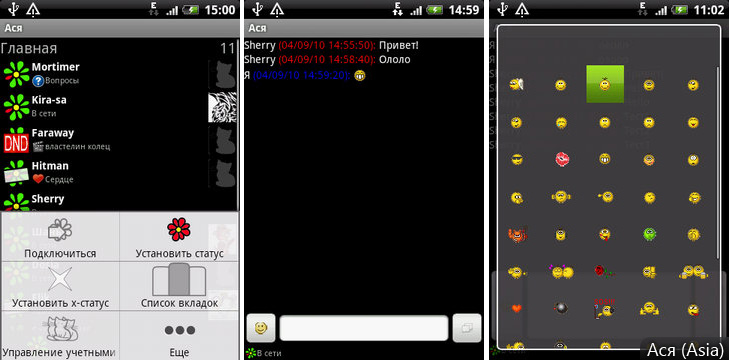
 Pros and cons of the client
 Message history, tabs
  Advanced statuses, many smiles
  There is no silent mode
  Minor flaws in the interface
3. eBuddy

Go to the official website.
This client has a very nice interface, but does not support history. Scrolling through the contact list and texting in eBuddy is simply pleasing to the eye. A strange feature: avatars are downloaded only if you look at the contact information separately, but after exiting the application, the avatars are not saved. At the same time, such a convenient and stylish interface can "bribe" many.
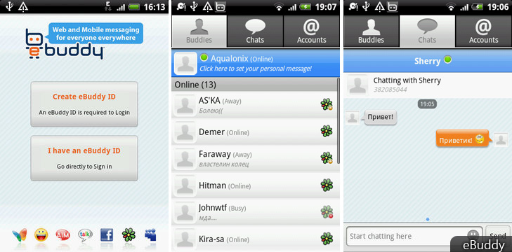
 Pros and cons of the client
 Beautiful interface
  Not optimal traffic usage
  No message history, warped encoding
4. Fring

Go to the official website of the
Messenger with a hand-drawn interface, but it is not suitable for use as ICQ, Fring itself is more focused on calls. It is very simple, although it performs the basic functions reliably. However, a large amount of advertising was noticed behind him.
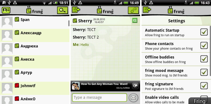
 Pros and cons of the client
 Beautiful interface
  Few opportunities
  A lot of advertising
5. Goober

Go to the official website.
For permanent use, it has a strange menu structure; when you select a contact, a menu appears with three actions: actually start a chat, show a profile and delete the chat history. This is very interfering, and receiving messages with warped encoding also discourages the desire to use.
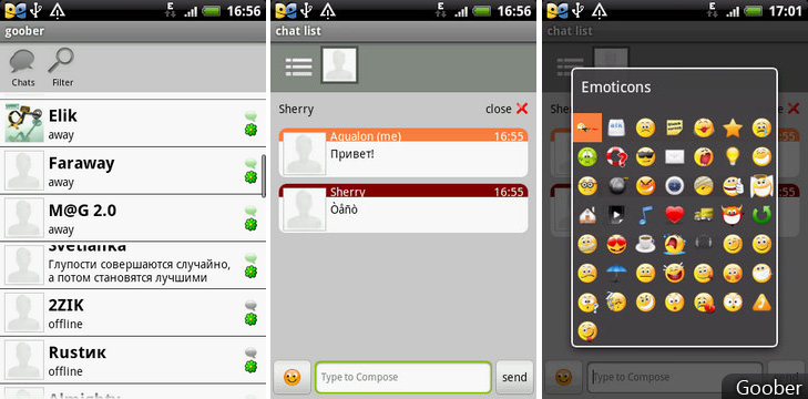
 Pros and cons of the client
 Fast work
  Distorted encoding
  Inconvenient interface
6. ICQ Mobile

Go to the official website
The official ICQ client has meager settings and sometimes crashes, but it performs its basic functions with dignity, though someone may not like such a greenish interface. The application is fully translated into Russian.
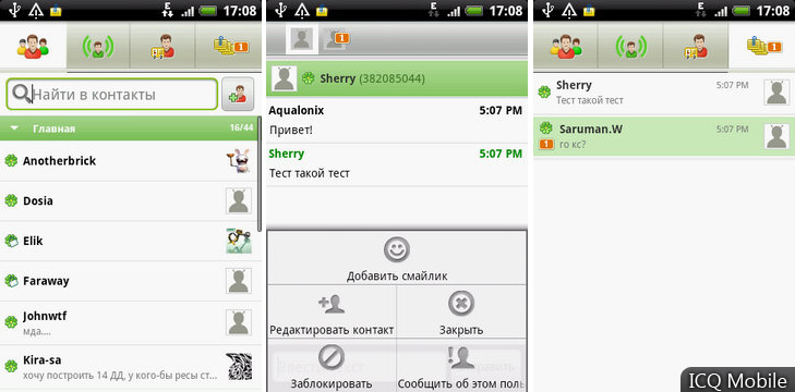
 Pros and cons of the client
 Many features
  User-friendly interface
  No message history
7. ICQLive

Go to the official website
One of the most popular clients, supports advanced statuses, history, has a large number of settings, but, alas, is very unstable. If it were not for the constant messages “Application unexpectedly stopped” and disconnects - the client would be the best, but the project stopped developing, so there is no need to wait for corrections yet.
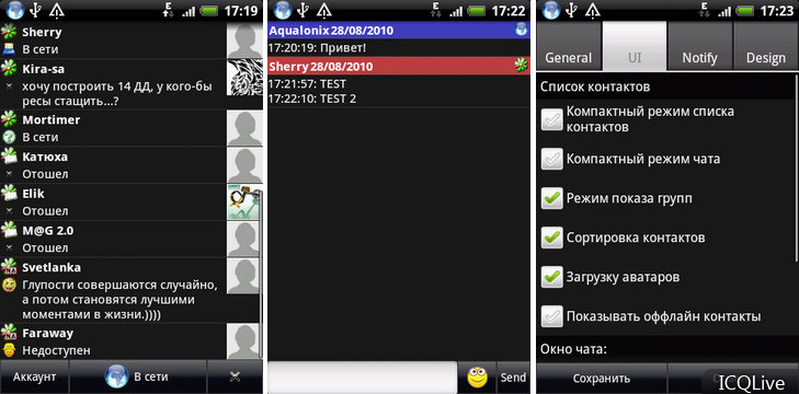
 Pros and cons of the client
 Many possibilities.
  Unstable work.
  Project abandoned by the author.
8. IM Easy

Go to the official website.
Has a stylish interface, wide settings for choosing themes and cool emoticons. I expected that there would be a very good client, but after several messages arrived in Russian, I changed my mind. Alas, encoding problems make it difficult to read messages.
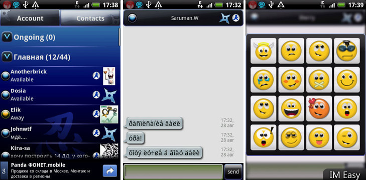
 Pros and cons of the client
 Support for themes
  Twisted encoding
9. IM + 2.0.4

Go to the official website.
Perhaps one of the best customers that exist. The application’s contact list is very convenient, there is support for pop-up alerts, both in the status bar and on top of any other application. True, the correspondence interface could be made more beautiful. He is very good friends with encodings, the appearance of messages with a warped encoding was not noticed. It is possible to switch between chat windows with a trackball or trackpad. The client is very stable, but it does not always connect the first time.
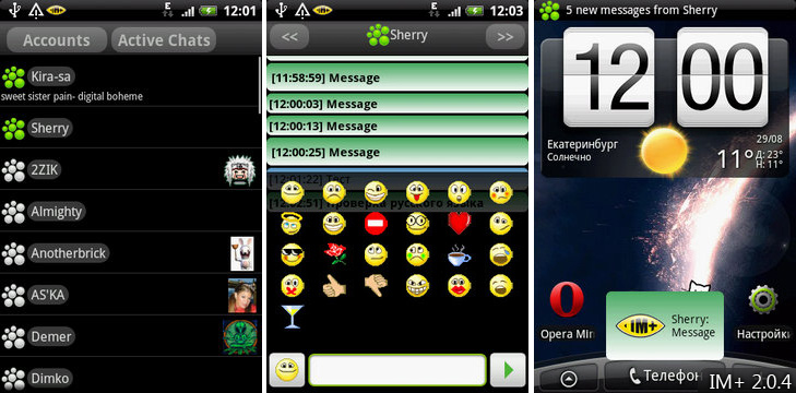
 Pros and cons of the client
 Pop-up alerts
  Many features
  The interface is ugly
10. IM + 3.0.11

Go to the official website
Starting with the third version, the interface has changed a lot, from a black palette to a white one, which negatively affected both the beauty of the application and its performance. The correspondence interface was redesigned and became more convenient, but the application stopped using the native android interface and switched to its own graphics, which is why scrolling in the contact list is not so smooth. However, the developers promise support for skins in future releases, so we will not consider this a serious minus. As for functionality, the developers cut out the support for pop-up alerts on top of another application and this is not enough. And, it would seem, updates should improve applications.

 Pros and cons of the client
 Convenient
  chat interface Cut pop-up notifications
  Slow work
11. Beejive IM

Go to the official website.
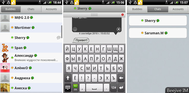
The client, which appeared recently, turned out to be very good for verification. It has a fairly smooth animation, a nice contact list interface and chat windows, but it carries one unpleasant bug. When writing a message, it is displayed in a separate pop-up window, which is practically not visible when the on-screen keyboard is called. Because of what, it is impossible to consider what you wrote. Also, you can not leave the application without assistance - only through the taskkiller. Otherwise, everything is convenient, especially switching between the conversation windows.
 Pros and cons of the client
 Stable operation
  User-friendly interface
  Problems with viewing the entered message in the chat and exiting the application
12. Imo.im

Go to the official website. The
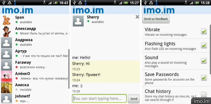
application has a rather confusing interface, a small number of functions, but it reads extended statuses perfectly. Of course, it will not be possible to establish one’s status, but to see strangers is easy. It can store history on its server, which is not very useful. Alas, even the simplest emoticons do not understand.
 Pros and cons of the client
 Perfectly reads extended statuses.
  Few opportunities.
  Stores history on its server.
13. Jimm Aspro

Go to the official website
Direct port of ordinary jimma from Java (Java), the interface is not redesigned, so usability is very lame. For each action with the usual touch interface, you have to do one or more movements here. A long press on a contact does not lead to anything, and to see the context menu, you need to use the “KM” button. However, such disadvantages pay off with some advantages: there are all the features of “large” clients, even anti-spam, but the sound notification does not work. If you miss ICQ from a regular non-touch phone, then install this application, if you want convenience - choose something else.

 Pros and cons of the client
 Antispam
  Many possibilities
  Inconvenient interface for the touch screen
  Lack of notification through sound signals
14. Meebo IM

Go to the official site
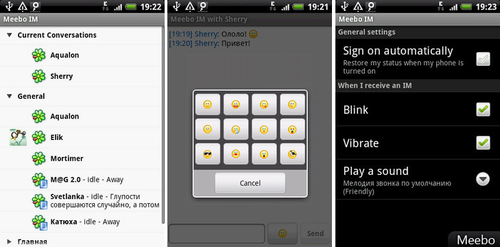
Another ordinary client with average capabilities, works smartly, but has a minimum of settings, supports more than one ICQ account at a time. Cannot save history locally, stores it on its own server, which leads to increased traffic.
 Pros and cons of the client
 Multiple account support
  Few features
  Stores history on its server
15. Mundu IM

Go to the official website
Has a pretty nice looking interface, but unpleasant brakes when scrolling through the contact list. There are two icons on the left and right: established accounts and conversations, respectively. If not for the brakes, we would get another stylish messenger with good features.

 Pros and cons of the client
 File transfer through own server is possible.
  Slow speed of work.
16. Nimbuzz

Go to the official website
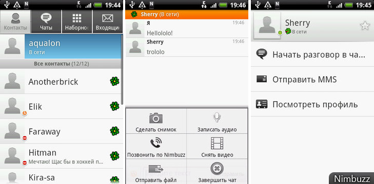
Like Goober, it has a different structure for starting a conversation. When you click on a contact, a menu appears with the options: start a conversation, send MMS, or see a profile. With a long press on a contact, you can skip this menu and immediately go on to write a message. If you swap these actions, it would turn out more convenient and faster. The interface itself is not bad - large fonts and a calm color scheme.
 Pros and cons of the client
 User-friendly interface
  Strange procedure for starting conversations
17. Slick

Go to the official website
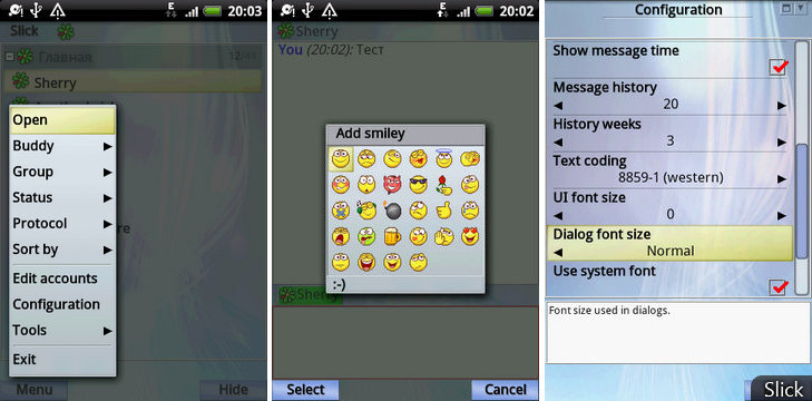
Weak client. Little can do it. It doesn’t work in the background, the bottom buttons are not pressed, notifications in the status bar are not shown, even there is no kinetic scrolling. On the Symbian, he was even more able, even if the background blurred for beauty.
 Pros and cons of the client
 File transfer possible
  Few possibilities
  Inconvenient to use
18. Trillian

Go to the official website of the
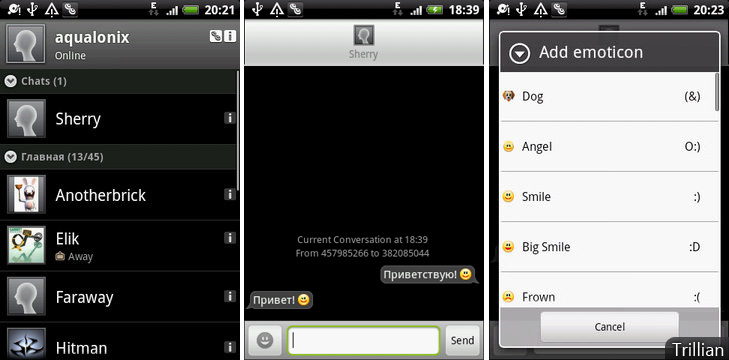
Client with an attractive interface. Despite the lack of some functions, it is very promising, since it was released relatively recently. Add developers at least a story - you get one of the best customers. But this is only beta, so we are waiting for new builds.
 Pros and cons of the client
 Nice interface
  Lack of some features
Summary
In order to fully summarize, I will give a comparative table of functionality: Each of the clients has its own pluses and minuses and you need to choose only by independently familiarizing yourself with the most promising samples. I just provided the results of my own testing, in the form of this albeit a bit chaotic review. The choice is yours.

