Colors in Web Design: Choosing the Right Combination for Your Website
 Color is certainly an important source of emotion. Colors can set the right tone and convey the necessary emotions to visitors, can excite, arouse many feelings and stimulate action. It is an extremely powerful user impact factor.
 When choosing a color scheme for a site, it is important to do it right, guided by the basic principles of color theory. The article discusses the most significant aspects when choosing, the basic principles of combination, the purpose of color in web-design and its symbolic meaning. In addition, you will see some good examples in accordance with the prevailing colors, as well as some useful tips to use colors effectively when creating a website.
So, let's get acquainted with the magic of color ...
Color theory: basic principles. The ability to combine colors
It’s good when you have a sense of taste, and you can easily choose the color scheme of the site. Not all people can do this easily. For those who are not sure how to combine colors when creating a website, I would recommend that you familiarize yourself with the basics of color theory.
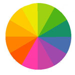
Consider the color wheel.
A bit of history: Isaac Newton invented the color wheel. Having substantiated the theory of light and colors in 1666. It was she who laid the foundation for the formation and development of modern optics, a small and integral part of which is web design. Newton, using a trihedral glass prism, spread white light into seven colors (into the spectrum), thereby proving its complexity (the phenomenon of dispersion), discovered chromatic aberration.
The color wheel is an indispensable attribute of many designers and artists around the world. This is an ideal proof of the theory that ingenious is always simple. The circle allows you to choose colors that harmonize together. It consists of 6 primary colors: red, orange, yellow, green, blue, violet and complementary colors.
To find the correct color scheme, it is necessary to use any two colors opposite each other, any three colors at equal distance when forming a triangle, or any of the four colors forming a rectangle (two color pairs opposite each other). Color schemes remain correct regardless of the angle of rotation.
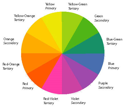
Primary colors
There are three primary colors: red (# ff0000 in HTML or # F00 in CSS), yellow (# FFFF00 in HTML or # ff0 in CSS) and cyan (# 0000FF in HTML or # 00f in CSS). You can not get them by mixing other colors. Complementary colors can be formed by combining these three colors.
Compound colors
There are also three primary colors : orange (# ff9900 in HTML or # F90 in CSS), green (# 00FF00 in HTML or # 0f0 in CSS) and purple (# FF00FF in HTML or # f0f in CSS). You can get them by mixing red and yellow (orange), yellow and blue (green) and blue and red (purple).
Tertiary colors
In order to obtain one of the tertiary colors, one primary color and one secondary color must be mixed. The possibilities for tertiary colors are endless.
Complementary colors
Complementary colors are located directly opposite each other on the color wheel: red and green, blue and orange, purple and yellow. Combined with each other, they make a stark contrast. Such combinations are typically used to highlight some elements on a website.
Similar colors.
These colors are located next to each other on the color wheel. They usually look very good together. The use of such color combinations causes a feeling of comfort among visitors to your site.
Colors in different cultures: symbolism
When choosing a gamut for your site, it is necessary to take into account the fact that color can have all kinds of meanings in different cultures. The cultural dimension for color symbolism can be very strong, so you need to know what the site’s audience is.
Let's find out what meaning colors have in different cultures:
Red
- China: the color of the bride, good luck, celebration
- India: cleanliness
- South Africa: Mourning Colors
- East: joy (combined with white)
- West: arousal, love, passion
- USA: Christmas (with green), Valentine's Day (with white)
- Hebrew: sacrifice, sin
- Japan: life
- Christianity: sacrifice, passion, love
- Feng Shui: Yang, fire, luck, respect, protection, vitality, money, recognition
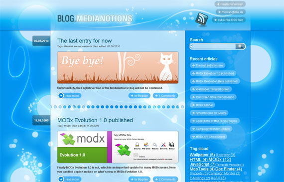
Blue
- Europe: reassurance
- Iran: mourning, the color of the sky and spirituality
- China: immortality
- Hinduism: the color of Krishna
- Judaism: Holiness
- Christianity: the color of Christ
- Catholicism: the colors of Mary's clothes
- Middle East: protection
- In the world: security color
- Feng Shui: Yin, water, calm, love, healing, relaxation, trust, adventure
- West: sadness, depression
Yellow
- Europe: happiness, hope, joy, cowardice in dangers, weakness
- Asia: imperial color
- Egypt: Mourning
- Japan: courage
- India: Merchants
- Buddhism: Wisdom
- Feng Shui: Yang, Earth, auspicious, sunbeams, heat, movement
Orange
- Europe: autumn, harvest, creativity
- Ireland: Protestants (religious)
- USA: Halloween (with black), cheap items
- Hinduism: saffron (peach orange) sacred color
- Feng Shui: Yang, Earth, goals, enhances concentration
Brown
- Colombia: Sales Obstacle
- Australian aborigines: colors of the earth, solemn ocher
- Feng Shui: Yan, Earth, Industry
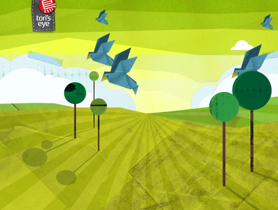
Green
- Japan: life
- Islam: hope, virtue
- Ireland: a symbol of the whole country
- Europe / USA: spring, new birth, St. Patrick's Day, Christmas (with red)
- USA: money
- India: Islam
- Feng Shui: Yin, tree, healing, health, soothing
Purple
- Thailand: Mourning (Widows)
- Catholicism: death, mourning, crucifixion
- Feng Shui: Yin, the color of physical and mental healing
White
- Europe: marriage, angels, doctors, hospital, peace
- Japan: mourning, white carnation symbolizes death
- China: mourning, death,
- India: misfortunes
- East: funeral
- Feng Shui: Yang, metal, death, ghosts, mourning, balance, confidence
The black
- Europe: mourning, funeral, death, rebellion, calm
- Thailand: misfortune, evil
- Judaism: misfortune, evil
- Australian Aborigines: People's Color
- Feng Shui: Yin, water, money, career success, income, stability, emotional protection, strength
Color meaning
Let's see what feelings each color can cause and look at some ready-made solutions.
Red
Mainly associated with passion, courage and desire. The red color of love, strength, energy, leadership and excitement. This is a strong color, and you should know about some of his negative emotions: danger, anxiety.

Blue
Patience, peace, tranquility, reliability, love, stability. One of the most beloved flowers, especially in men. This is due to stability and depth, professionalism, trust.
Yellow
The color that is most often associated with liveliness. Energetic, gives a feeling of happiness. In addition, he is associated with curiosity, entertainment, joy, intelligence, caution.

Orange
Vigor and creativity. Associated with friendliness, confidence, playfulness, courage, stamina.

Purple
Traditionally associated with power, nobility and wealth. Wisdom, independence, nobility, luxury, ambition, dignity, magic and secrets.

Green
The color of harmony, nature, healing, life, nutrition and health. It is also often associated with money.
Brown
The color of relaxation and confidence. Brown means earthiness, nature, durability, comfort, reliability.

Gray
It evokes a sense of seriousness, conservatism and traditionalism. Excites a feeling of purity and innocence.

Pink
Expresses tenderness, romance, femininity, passivity, affection, education, weakness.

The black
Stylish and elegant color, associated with power, sophistication. If you do not want your site to cause heavy feelings, try not to use it in large quantities. On the other hand, if you make a black background, it can increase perspective and depth.

White
White is associated with purity, simplicity, freshness, kindness, innocence.
Conclusion
There are some helpful tips to help you choose the right color scheme for your site. These little tips are widely used by professional web designers.
- If you want text content to be easy to read, choose contrasting colors.
- The optimal number of colors. Do not make a circus from your site.
- Use the required number of colors. The minimum number of colors can contribute to the grayness of your site.
- If you need to attract a visitor, use intense colors.
- You can find additional color schemes by joining more often to nature.
Useful links on the topic:
- en.wikipedia.org/wiki/Color_theory
- joehallock.com/edu/COM498/index.html
- www.sibagraphics.com/colour.php
- www.bwwsociety.org/feature/color.htm
- colortheory.liquisoft.com
- webdesign.about.com/od/color/Designing_With_Color.htm
- www.webdesign.org/web-design-basics/color-theory
Source: Colors in Web Design: Choosing a right combination for your Website