Creating an Android-style app
Often, the interface of even very popular Android applications is somehow designed and it seems that most developers have not even heard of the User Interface Guidelines. But following the recommendations is not very difficult, and sometimes it even saves development time. In order to show that this is indeed so, I suggest going through several key elements of designing the application interface using the slightly advanced “Hello World” as an example.
The article is intended for beginner Android developers. The source code can be downloaded from the link at the end, and the explanations will concern:
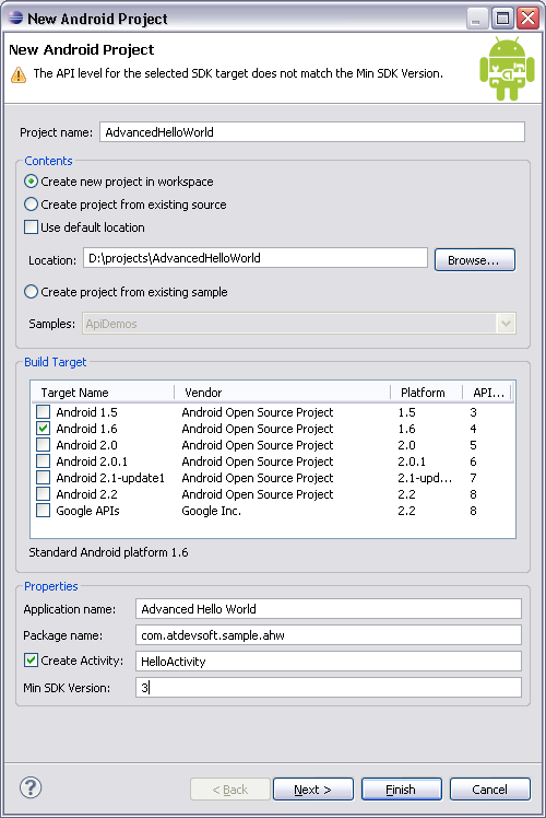
1. Create the AdvancedHelloWorld application. For programs that do not use the specific functionality of a certain version of the OS, I prefer to install BuildTarget - Android 1.6, and Min SDK Version - 3. In this case, the separation of resources by screen density will work (on hdpi, mdpi, ldpi), but also Android users 1.5 will not stand aside.
2. In res / layout / main.xml we make one button “Say hello”.
3. Using the wonderful Android Asset Studio project, we make a nice icon.
4. As a handler for clicking a button, we write a code that displays a Toast message with the phrase “Hello World”.
An open source online project whose value is hard to overestimate. Allows you to quickly create application icons (launcher icons), menu icons, bookmarks and alerts. To work, he asks for Chrome 6, in other browsers some elements do not work. Link at the end of the article.
In my opinion, the most rational choice is the use of a separate set of graphics for hdpi devices and a separate one for all others, in a resolution adapted for mdpi. Yes, we do not use the ability to adapt to ldpi, but these devices are relatively few and you can leave the full adaptation for a “snack” when all the graphic design has already settled down. In any case, since we declared support for Android 1.5, in the drawable folder should be all the graphic elements used. The rest is optional.
The menus are described, as you might guess, in xml files. We will create one such file for our main window: res \ menu \ main_menu.xml Two points: If the number of menu items is more than 6, the 6th and the following elements are combined into an additional menu. An example can be viewed in a standard browser. The menu can be nested, but no more than one level. To describe the submenu, the menu tag is added as a child of the element that will be "expanded". When creating a menu, the first thing to do is look for the icons in the standard set. All of them are in the installed SDK - android-sdk-windows \ platforms \ android-1.6 \ data \ res \ drawable \ ic_menu _ *. Png
It’s not difficult to select the settings and exit icon, but, for illustration, I added a menu item “theme”, which will switch the background from black to white and back. Even having very basic skills in computer graphics, it is not difficult to draw a template for this point. For example:
Using the same Android Asset Studio, you get a pretty good icon:

Actual creation of menu items occurs in onCreateOptionsMenu: Processing of clicks - in onOptionsItemSelected:
And again, the main work in xml. In res \ xml, create settings.xml: The set of supported settings is not very wide, but it will cover the basic needs. By setting the “persistent” flag we don’t even have to encode the save / load. It is enough to read the desired value from SharedPreferences: As additional pleasant moments, you can note the dependencies (android: dependency), which allow you to “include” certain items only in case of a marked “leading” element, as well as simple work with nested sets that look like in the application separate windows. For the settings window, its own PreferenceActivity descendant class is created, in the constructor of which our xml prototype is read:
PreferenceActivity defies stylization. You can, of course, add android: theme = "@ android: style / Theme.Light" for the corresponding tag in AndroidManifest.xml, but for the nested settings you get a mess. The discussion of this problem on Stackoverflow comes down to the idea that, in the general case, it is better to leave everything as it is, on a black background.
Nine-patch is a standard method that allows you to make graphics in an Android application independent of resolution and screen size. In fact, this is a regular PNG image with a single-pane utility frame. To work correctly with this frame, the SDK includes a special draw9patch utility. A black line 1 pixel thick at the top and left marks the area that will be duplicated when the image is enlarged. The lines to the right and bottom define the “work area”. For a regular button, for example, this is the place for text.
In words, it’s quite difficult to explain the capabilities of 9patch, so it’s better to experiment and watch, especially since when editing 9patch areas you can immediately see the result in the preview window. Here is the background of the standard button in the editor:

For training, we will make the button in AdvancedHelloWorld non-standard, having prepared 3 9patch images for the usual button, the pressed state and the button in focus. Occupation rather tedious, but opens up great opportunities.
An important point: all 9patch images must have the extension .9.png, otherwise our application will not know that the image can be scaled according to the rules of 9patch. There is one more limitation: in the resource folder there cannot be two files at the same time with the same name and the extensions .png and .9.png (for example, button.png and button.9.png conflict because they actually have the same resource name - button) .
Android Asset Studio on Googlecode: http://android-ui-utils.googlecode.com/hg/asset-studio/dist/index.html
Official documentation for creating submenus: http://developer.android.com/guide/ topics / ui / menus.html # submenu
An example with a complete list of settings types: http://www.kaloer.com/android-preferences
Settings styling problem: http://stackoverflow.com/questions/2615528/preferenceactivity-and-theme -not-applying
Source Codes .
The article is intended for beginner Android developers. The source code can be downloaded from the link at the end, and the explanations will concern:
- Create popup menu
- Design window settings
- Work with Nine-patch graphics
Preliminary preparation
1. Create the AdvancedHelloWorld application. For programs that do not use the specific functionality of a certain version of the OS, I prefer to install BuildTarget - Android 1.6, and Min SDK Version - 3. In this case, the separation of resources by screen density will work (on hdpi, mdpi, ldpi), but also Android users 1.5 will not stand aside.
2. In res / layout / main.xml we make one button “Say hello”.
3. Using the wonderful Android Asset Studio project, we make a nice icon.
4. As a handler for clicking a button, we write a code that displays a Toast message with the phrase “Hello World”.
About Android Asset Studio
An open source online project whose value is hard to overestimate. Allows you to quickly create application icons (launcher icons), menu icons, bookmarks and alerts. To work, he asks for Chrome 6, in other browsers some elements do not work. Link at the end of the article.
Resource Note
In my opinion, the most rational choice is the use of a separate set of graphics for hdpi devices and a separate one for all others, in a resolution adapted for mdpi. Yes, we do not use the ability to adapt to ldpi, but these devices are relatively few and you can leave the full adaptation for a “snack” when all the graphic design has already settled down. In any case, since we declared support for Android 1.5, in the drawable folder should be all the graphic elements used. The rest is optional.
Pop-up menu
The menus are described, as you might guess, in xml files. We will create one such file for our main window: res \ menu \ main_menu.xml Two points: If the number of menu items is more than 6, the 6th and the following elements are combined into an additional menu. An example can be viewed in a standard browser. The menu can be nested, but no more than one level. To describe the submenu, the menu tag is added as a child of the element that will be "expanded". When creating a menu, the first thing to do is look for the icons in the standard set. All of them are in the installed SDK - android-sdk-windows \ platforms \ android-1.6 \ data \ res \ drawable \ ic_menu _ *. Png
It’s not difficult to select the settings and exit icon, but, for illustration, I added a menu item “theme”, which will switch the background from black to white and back. Even having very basic skills in computer graphics, it is not difficult to draw a template for this point. For example:
Using the same Android Asset Studio, you get a pretty good icon:
Actual creation of menu items occurs in onCreateOptionsMenu: Processing of clicks - in onOptionsItemSelected:
 @Override

 public boolean onCreateOptionsMenu(Menu menu) {

 MenuInflater inflater = getMenuInflater();

 inflater.inflate(R.menu.main_menu, menu);

 return true;

 }
@Override

 public boolean onOptionsItemSelected(MenuItem item) {

 switch (item.getItemId()) {

 case R.id.menu_preferences:

 ...

 default:

 return super.onOptionsItemSelected(item);

 }

 }
Designing the settings window
And again, the main work in xml. In res \ xml, create settings.xml: The set of supported settings is not very wide, but it will cover the basic needs. By setting the “persistent” flag we don’t even have to encode the save / load. It is enough to read the desired value from SharedPreferences: As additional pleasant moments, you can note the dependencies (android: dependency), which allow you to “include” certain items only in case of a marked “leading” element, as well as simple work with nested sets that look like in the application separate windows. For the settings window, its own PreferenceActivity descendant class is created, in the constructor of which our xml prototype is read:
 xmlns:android="http://schemas.android.com/apk/res/android">

 android:title="@string/settings_general">

 android:key="center_message"

 android:title="@string/center_message"

 android:summary="@string/center_message_summary"

 android:persistent="true"

 android:defaultValue="true"/>

 android:key="text_message"

 android:title="@string/text_message"

 android:summary="@string/text_message_summary"

 android:defaultValue="@string/hello_world"

 android:persistent="true"/>
 SharedPreferences settings = PreferenceManager.getDefaultSharedPreferences(context);

boolean bCenter = settings.getBoolean("center_message", true); addPreferencesFromResource(R.xml.settings);PreferenceActivity defies stylization. You can, of course, add android: theme = "@ android: style / Theme.Light" for the corresponding tag in AndroidManifest.xml, but for the nested settings you get a mess. The discussion of this problem on Stackoverflow comes down to the idea that, in the general case, it is better to leave everything as it is, on a black background.
Work with Nine-patch graphics
Nine-patch is a standard method that allows you to make graphics in an Android application independent of resolution and screen size. In fact, this is a regular PNG image with a single-pane utility frame. To work correctly with this frame, the SDK includes a special draw9patch utility. A black line 1 pixel thick at the top and left marks the area that will be duplicated when the image is enlarged. The lines to the right and bottom define the “work area”. For a regular button, for example, this is the place for text.
In words, it’s quite difficult to explain the capabilities of 9patch, so it’s better to experiment and watch, especially since when editing 9patch areas you can immediately see the result in the preview window. Here is the background of the standard button in the editor:
For training, we will make the button in AdvancedHelloWorld non-standard, having prepared 3 9patch images for the usual button, the pressed state and the button in focus. Occupation rather tedious, but opens up great opportunities.
An important point: all 9patch images must have the extension .9.png, otherwise our application will not know that the image can be scaled according to the rules of 9patch. There is one more limitation: in the resource folder there cannot be two files at the same time with the same name and the extensions .png and .9.png (for example, button.png and button.9.png conflict because they actually have the same resource name - button) .
useful links
Android Asset Studio on Googlecode: http://android-ui-utils.googlecode.com/hg/asset-studio/dist/index.html
Official documentation for creating submenus: http://developer.android.com/guide/ topics / ui / menus.html # submenu
An example with a complete list of settings types: http://www.kaloer.com/android-preferences
Settings styling problem: http://stackoverflow.com/questions/2615528/preferenceactivity-and-theme -not-applying
Source Codes .