Interface designers discuss new Gmail button
- Transfer
Recently a new element has appeared in the Gmail web interface (to the left of Archive ).

By clicking on the checkbox, all mail is highlighted, and if you click the arrow, a drop-down menu appears.
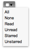
I must say that this element is very unusual and unique in its way. Gmail is the first application to use it. Many users perceived it with bewilderment . And even Gmail's chief UI designer, Michael Leggett , admits that the widget is definitely strange .
But why is it still implemented by default? The same chief UI designer Gmail explains that despite all its oddities, this element proved to be excellent during testing. The developers themselves, who at first glance hated this widget, immediately intuitively understood how to use it.
What is most interesting - everyone who saw him was surprised and immediately understood how to use it - he was sure that most ordinary users would not understand this. However, preliminary tests showed that the professionals were wrong. Almost all users accepted the new functionality without problems.
This case is an excellent confirmation of the words of Jacob Nielsen that the likelihood of making the right decision in the design of interfaces is greatly increased after collecting a lot of data.
You can add only one thing that all developers should understand: users rarely behave as we expect (or want) from them. Testing often reveals things that we could not even imagine by simply analyzing the design.
By clicking on the checkbox, all mail is highlighted, and if you click the arrow, a drop-down menu appears.
I must say that this element is very unusual and unique in its way. Gmail is the first application to use it. Many users perceived it with bewilderment . And even Gmail's chief UI designer, Michael Leggett , admits that the widget is definitely strange .
But why is it still implemented by default? The same chief UI designer Gmail explains that despite all its oddities, this element proved to be excellent during testing. The developers themselves, who at first glance hated this widget, immediately intuitively understood how to use it.
What is most interesting - everyone who saw him was surprised and immediately understood how to use it - he was sure that most ordinary users would not understand this. However, preliminary tests showed that the professionals were wrong. Almost all users accepted the new functionality without problems.
This case is an excellent confirmation of the words of Jacob Nielsen that the likelihood of making the right decision in the design of interfaces is greatly increased after collecting a lot of data.
You can add only one thing that all developers should understand: users rarely behave as we expect (or want) from them. Testing often reveals things that we could not even imagine by simply analyzing the design.