About links
I believe links do not have to be underlined. But unstressed links sucks. Sucks because an underlined link is a sign of a small site. But first things first.
Anyone who thinks at least a little about the usability (prastigospadi) of the site knows the idea that the link should show in its appearance that it wants to be responded by the user. There are three (known to me) ways to do this:
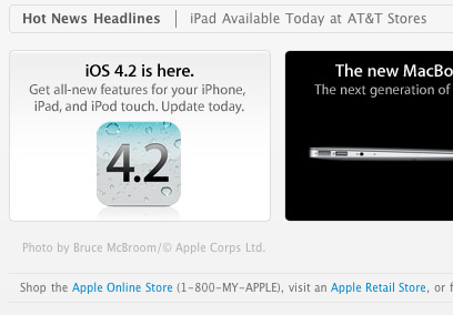
The guys from Apple and others like them go this way. The menu on their website is an analog of the menu of any program in the Mac Axis. The method is completely worthless, but there is one problem: this method is suitable only for small sites with 2-3 pages. I can’t imagine a catalog site, where the dump of links are decorated like buttons, with bulbs, shadows and more. Apple's site, I agree, is rather big, so they use the second trick to highlight links.
It’s also a good way, but often, it’s not possible to make all links the same color. On the same Apple, look - in some places the links are blue, and somewhere quite the opposite is gray.
In addition, there is another big problem with the color identification of links. Even if you managed to maintain all the links in one color on your site (and for this your site should be very flat with a solid background), this means that you forgot about the excellent link property known as Visited, that is, the ability of a link to change the style when visit. Usually the visited link changes color, automatically breaking out of the general style of links. And for large non-linear sites you need to show visited links so as not to get lost.
This, in my opinion, is the most universal way to highlight a link. Firstly, underlined links you can easily arrange directories (dumps of links), and secondly, you can not be afraid to use as many link colors as your heart desires.
And to combine these three methods, I believe, generally mockery of the user. Instead of looking for the information he needs, he needs to understand the subtle idea of a designer.
It turns out that the first and second methods are not suitable for large sites, but on small sites it is quite acceptable. I do not consider web services now, for example, Gmail, although this also sucks. Yandex.mail somehow got out of it by making a desktop-oriented service, but at the same time retaining the underlined links, for which they respect.
And all would have been nothing if customers who ordered portals and were firmly convinced that it was not necessary to come across constantly did not come across. And some give an amusing argument: underlining looks garbage :) They would have to paint pictures, not sites to do.
Anyone who thinks at least a little about the usability (prastigospadi) of the site knows the idea that the link should show in its appearance that it wants to be responded by the user. There are three (known to me) ways to do this:
1. Make the link as a button
The guys from Apple and others like them go this way. The menu on their website is an analog of the menu of any program in the Mac Axis. The method is completely worthless, but there is one problem: this method is suitable only for small sites with 2-3 pages. I can’t imagine a catalog site, where the dump of links are decorated like buttons, with bulbs, shadows and more. Apple's site, I agree, is rather big, so they use the second trick to highlight links.
2. Select all links in one color
It’s also a good way, but often, it’s not possible to make all links the same color. On the same Apple, look - in some places the links are blue, and somewhere quite the opposite is gray.
In addition, there is another big problem with the color identification of links. Even if you managed to maintain all the links in one color on your site (and for this your site should be very flat with a solid background), this means that you forgot about the excellent link property known as Visited, that is, the ability of a link to change the style when visit. Usually the visited link changes color, automatically breaking out of the general style of links. And for large non-linear sites you need to show visited links so as not to get lost.
3. Finally, emphasize
This, in my opinion, is the most universal way to highlight a link. Firstly, underlined links you can easily arrange directories (dumps of links), and secondly, you can not be afraid to use as many link colors as your heart desires.
And to combine these three methods, I believe, generally mockery of the user. Instead of looking for the information he needs, he needs to understand the subtle idea of a designer.
It turns out that the first and second methods are not suitable for large sites, but on small sites it is quite acceptable. I do not consider web services now, for example, Gmail, although this also sucks. Yandex.mail somehow got out of it by making a desktop-oriented service, but at the same time retaining the underlined links, for which they respect.
And all would have been nothing if customers who ordered portals and were firmly convinced that it was not necessary to come across constantly did not come across. And some give an amusing argument: underlining looks garbage :) They would have to paint pictures, not sites to do.