Features of national typography
I don’t know why, but for some reason I’m very interested in all these squiggles and badges, like commas, dashes, quotation marks, dots, and other, seemingly senseless nonsense that is not taken seriously by most people. It is easy to guess that this interest developed after becoming acquainted with Kovodstvo, which included a popularized and visual explanation of the basic norms for using these typographic signs in Russian. And when I began to study English more or less deeply, I began to pay attention to the peculiarity of its rules in this area and certain differences, many of which at first glance seem very unusual. I want to tell about this; perhaps it will seem curious to someone, and maybe even useful.
However, I must emphasize that all of the following are only observations and the results of interrogations of “local”, but not formulated rules. I will be glad to the comments of people who really understand the issue.
Well, I want to say that we will not only talk about punctuation marks, but generally about the details of the style in which English-language texts are drawn.
In MS Word, as far as I remember, there is a function of automatic capitalization of every first letter of a word in a certain fragment of text. A similar feature is in CSS (text-transform: capitalize) . It would seem, why is this necessary? Here is just for fulfilling this norm. Very often (though not always) in the title, each word (usually, with the exception of prepositions) is capitalized. “Because ... because it's a heading!” - so one of the teachers explained this to us. The sacred meaning of this remains in question.
Sometimes capitalization is avoided not only by prepositions, but also auxiliary verbs (well, you understand: all of you dearly loved from school English lessons is , do , does , didand the rest), as well as articles ( the , a , an ). However, the latter very often are generally omitted as not carrying significant information in cases where you need to convey the message quickly and in the shortest possible form (of course, provided that this does not create the possibility of discrepancies). Examples: newspaper headlines and road signs. When repair work is underway on the side of the highway and it is closed for use (usually cyclists move there), they hang the corresponding sign with the signature SHOULDER CLOSED, although SHOULDER IS CLOSED would be grammatically correct. However, nobody cares: the meaning of the message is clear and so, and takes up less space.
The same rule follows the indication of the name of works: films, books, music albums and so on.
Not a particularly noticeable and interesting feature, but it still has a place to be. It is mainly found in books with fiction: the first paragraph of each new chapter is not indented on the first line; having an initial letter or another alternative way of filling out a paragraph is not necessary at all. The appointment of the reception is again not clear.
As you know, in Russian typography it is customary to use two types of quotation marks:
In a letter, we usually mark quotes as something like this:
In English, everything is somewhat different:
Thus, it becomes clear why in Russian it is more important to use “correct” quotes in printed and published on the Internet texts instead of “pseudo-quotes” than in English - the differences here are not very striking.
Another point. The second type of Russian quotation marks (“...”) is rather rarely used, we usually use it only for alternation with enclosed quotes or other cases like this:
However, in English, both doubles and single quotes are roughly equal and are used equally often. I did not catch any patterns and rules in this area - apparently, the type of quotation marks does not really matter.
In a letter, quotation marks are simply indicated as two strokes at the top of the word on the right and left, which makes them even more similar to “incorrect quotation marks”.
In the Russian language quotes separate enclosed text from the rest of the sentence in such a way that, if at the junction with them is another punctuation mark (comma or period), it should always be after them.
Exceptions: question mark and exclamation point, if a single question mark or exclamation point is enclosed in quotation marks, respectively.
In English, the punctuation mark following the quotation mark always appears inside quotation marks, even if it is illogical from the point of view of Russian grammar.
Such is the barbaric language.
This is a difficult issue requiring a separate and professional study-comparison. What can I say: it is full of cases when, according to the rules of Russian grammar, a comma should be in a complex sentence, but in the English version there is none. For instance:
However:
Thus, if you are not very good at punctuation rules in complex sentences in the Russian language, you have nothing to worry about if you are going to learn English. If you know them well and the above sentence, without a comma in the expected place, hurts your eye, then ... you have to put up with it.
Another point that I discovered is that if an enumeration of long concepts of several words is going on, then when this enumeration ends with the addition of and + the last element , a comma can be placed before and, although by strict rules it should not be there.
Is nothing clear? See an example:
Ordinary transfer; all punctuation marks, as in Russian.
The comma here helps to visually separate the last two elements of the enumeration from each other, although its position there is not quite correct grammatically. This example perfectly illustrates the whole ideology of modern written English: first of all, it is the reader’s convenience of perception, and then the rules. You can argue about the pros and cons of such a position, but this is not included in the scope of this article ...
Very curious moment. In Russian, when writing decimal fractions, we use a comma to separate an integer and a fraction. Writing down the number of more than a thousand, we either do not separate the digits from each other, and if we separate them, then rather a space.
In the English language (and indeed, as I understand it, in all European countries and America), it is customary to use a dot in decimal fractions and commas to separate the digits in large numbers.
Thus, it’s very easy for a person who is accustomed to the Russian system to get confused ... Sometimes it takes more time to “digest” the next number and figure it out: a thousand is separated or the whole part.
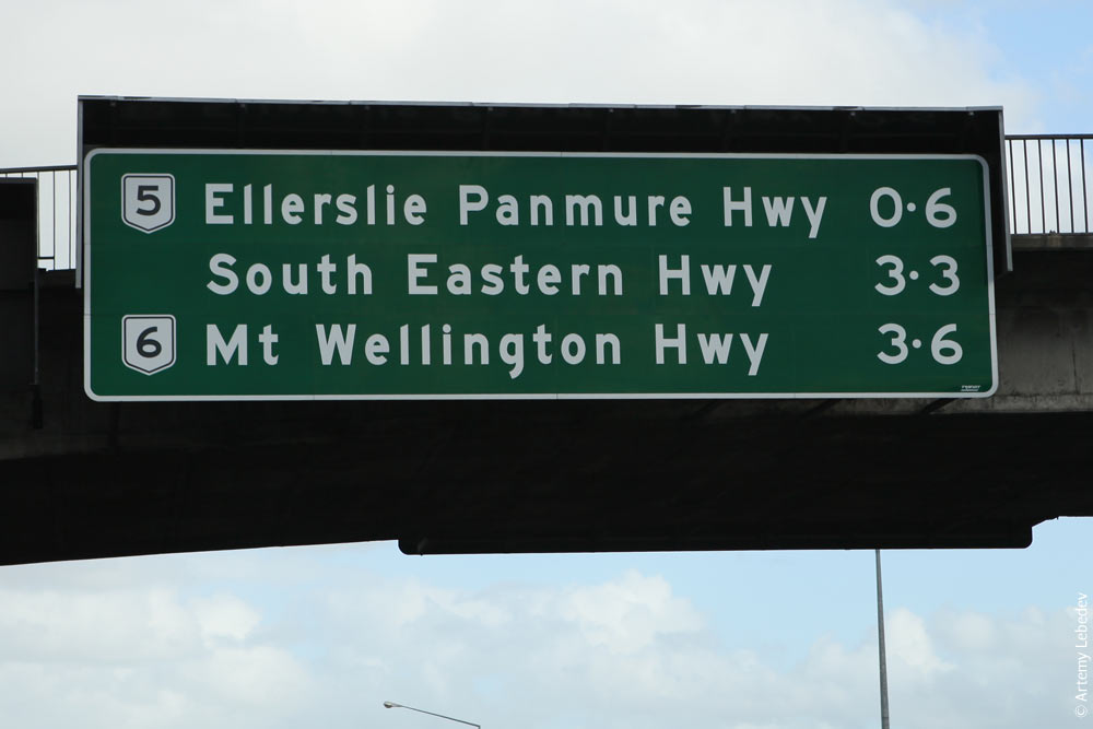
Plus, there is an even more peculiar way to display decimal fractions, the most common on New Zealand road signs - to use the middle dot instead of the standard point:
It looks very wild, but, as I found out, it’s quite normal for the locals. However, the application of this in practice I saw only, again, on road signs and in the textbook Basic English Usage of the 1988 edition.
And yet, if you paid attention to writing numbers above with words - the words a thousand (a thousand) and a hundred (a hundred) are not used in the plural, even if there are several.
However, this is only when writing numbers, in other cases the plural is used calmly:
It is used quite rarely, although the scope of its application is approximately similar to that adopted in Russian grammar: consequence, explanation, generalization, as a replacement for brackets, etc. Most likely, the fact is that English speakers do not like to construct complex ramified sentences, which is why non-standard punctuation marks is rare.
An interesting point: if in Russian typography the dash always breaks with spaces from the next and previous words, then in English it is absolutely not necessary.
Plus, the dash in the English language has another peculiar function. In certain cases, it replaces our ellipsis: when the hero’s speech or the author’s thoughts are abruptly interrupted by something (in the middle of a word or phrase - it doesn’t matter).
The last interesting thing that I will talk about is the use of the @ sign. For some reason, in the Russian language it happened to call him “dog”; in English it is pronounced as at and in some cases successfully replaces the corresponding preposition.
Here's why they were lazy: an excuse of two letters, where possible, shamelessly reduced to one character ...
So far, I can not decide to draw any conclusions - this note was only a record of my observations. Since it happened to me with this language, now I have to deal constantly, I’m sure that I will continue them.Therefore, therefore, after a while I may have accumulated enough material to conduct any analysis.
Thanks to all.
The same article, but with ruffles
However, I must emphasize that all of the following are only observations and the results of interrogations of “local”, but not formulated rules. I will be glad to the comments of people who really understand the issue.
Well, I want to say that we will not only talk about punctuation marks, but generally about the details of the style in which English-language texts are drawn.
Uppercase Letters
In MS Word, as far as I remember, there is a function of automatic capitalization of every first letter of a word in a certain fragment of text. A similar feature is in CSS (text-transform: capitalize) . It would seem, why is this necessary? Here is just for fulfilling this norm. Very often (though not always) in the title, each word (usually, with the exception of prepositions) is capitalized. “Because ... because it's a heading!” - so one of the teachers explained this to us. The sacred meaning of this remains in question.
Sometimes capitalization is avoided not only by prepositions, but also auxiliary verbs (well, you understand: all of you dearly loved from school English lessons is , do , does , didand the rest), as well as articles ( the , a , an ). However, the latter very often are generally omitted as not carrying significant information in cases where you need to convey the message quickly and in the shortest possible form (of course, provided that this does not create the possibility of discrepancies). Examples: newspaper headlines and road signs. When repair work is underway on the side of the highway and it is closed for use (usually cyclists move there), they hang the corresponding sign with the signature SHOULDER CLOSED, although SHOULDER IS CLOSED would be grammatically correct. However, nobody cares: the meaning of the message is clear and so, and takes up less space.
How much do you need to retire?
The same rule follows the indication of the name of works: films, books, music albums and so on.
Love at first sting
Missing red line in the first paragraph of text
Not a particularly noticeable and interesting feature, but it still has a place to be. It is mainly found in books with fiction: the first paragraph of each new chapter is not indented on the first line; having an initial letter or another alternative way of filling out a paragraph is not necessary at all. The appointment of the reception is again not clear.
Quotes
As you know, in Russian typography it is customary to use two types of quotation marks:
“Convergent” means “convergence related”.
In a letter, we usually mark quotes as something like this:
I am writing a letter to Murzilka.
In English, everything is somewhat different:
'Disinterested' means “having no interest in something”.
Thus, it becomes clear why in Russian it is more important to use “correct” quotes in printed and published on the Internet texts instead of “pseudo-quotes” than in English - the differences here are not very striking.
Another point. The second type of Russian quotation marks (“...”) is rather rarely used, we usually use it only for alternation with enclosed quotes or other cases like this:
"The novel" Dune "is a classic of its genre."
However, in English, both doubles and single quotes are roughly equal and are used equally often. I did not catch any patterns and rules in this area - apparently, the type of quotation marks does not really matter.
In a letter, quotation marks are simply indicated as two strokes at the top of the word on the right and left, which makes them even more similar to “incorrect quotation marks”.
Quotation marks next to other punctuation marks
In the Russian language quotes separate enclosed text from the rest of the sentence in such a way that, if at the junction with them is another punctuation mark (comma or period), it should always be after them.
He finished work on the book How I Spent the Summer at Sixteen when he was eighty-three.
The best restaurant in town is Uncle Koli's Tavern.
Exceptions: question mark and exclamation point, if a single question mark or exclamation point is enclosed in quotation marks, respectively.
In English, the punctuation mark following the quotation mark always appears inside quotation marks, even if it is illogical from the point of view of Russian grammar.
“Good-bye,” she said. “Be careful.”
“The Year of the Plague,” by Roger Leie, filled his ears.
Such is the barbaric language.
Comma Setting Rules
This is a difficult issue requiring a separate and professional study-comparison. What can I say: it is full of cases when, according to the rules of Russian grammar, a comma should be in a complex sentence, but in the English version there is none. For instance:
It was clear to everyone that I was a foreigner.
However:
Everybody realized that I was a foreigner.
Thus, if you are not very good at punctuation rules in complex sentences in the Russian language, you have nothing to worry about if you are going to learn English. If you know them well and the above sentence, without a comma in the expected place, hurts your eye, then ... you have to put up with it.
Another point that I discovered is that if an enumeration of long concepts of several words is going on, then when this enumeration ends with the addition of and + the last element , a comma can be placed before and, although by strict rules it should not be there.
Is nothing clear? See an example:
I went to Spain, Italy, Switzerland, Austria and Germany.
Ordinary transfer; all punctuation marks, as in Russian.
I spent yesterday watching TV, listening to jazz records, and talking about the meaning of life.
The comma here helps to visually separate the last two elements of the enumeration from each other, although its position there is not quite correct grammatically. This example perfectly illustrates the whole ideology of modern written English: first of all, it is the reader’s convenience of perception, and then the rules. You can argue about the pros and cons of such a position, but this is not included in the scope of this article ...
Record numbers
Very curious moment. In Russian, when writing decimal fractions, we use a comma to separate an integer and a fraction. Writing down the number of more than a thousand, we either do not separate the digits from each other, and if we separate them, then rather a space.
Twenty-four and a half = 24.5
Three thousand, eight hundred and forty-seven = 3,847
Million, forty-five thousand, three hundred and fifty-two = 1,045,352
In the English language (and indeed, as I understand it, in all European countries and America), it is customary to use a dot in decimal fractions and commas to separate the digits in large numbers.
Twenty-four and a half (twenty-four point five) = 24.5
Three thousand, eight hundred and forty-seven = 3,847
One million, forty-five thousand, three hundred and fifty-two = 1,045,352
Thus, it’s very easy for a person who is accustomed to the Russian system to get confused ... Sometimes it takes more time to “digest” the next number and figure it out: a thousand is separated or the whole part.
Plus, there is an even more peculiar way to display decimal fractions, the most common on New Zealand road signs - to use the middle dot instead of the standard point:
24.5
It looks very wild, but, as I found out, it’s quite normal for the locals. However, the application of this in practice I saw only, again, on road signs and in the textbook Basic English Usage of the 1988 edition.
And yet, if you paid attention to writing numbers above with words - the words a thousand (a thousand) and a hundred (a hundred) are not used in the plural, even if there are several.
... eight hundred (NOT eight hundreds) ...
However, this is only when writing numbers, in other cases the plural is used calmly:
It costs thousands of dollars.
Dash
It is used quite rarely, although the scope of its application is approximately similar to that adopted in Russian grammar: consequence, explanation, generalization, as a replacement for brackets, etc. Most likely, the fact is that English speakers do not like to construct complex ramified sentences, which is why non-standard punctuation marks is rare.
An interesting point: if in Russian typography the dash always breaks with spaces from the next and previous words, then in English it is absolutely not necessary.
There are three things I can never remember — names, faces, and I've forgot the other.
Plus, the dash in the English language has another peculiar function. In certain cases, it replaces our ellipsis: when the hero’s speech or the author’s thoughts are abruptly interrupted by something (in the middle of a word or phrase - it doesn’t matter).
He held up the watch and looked at it. Three o'clock. Plenty of time to—
He jerked up the watch and held it against his ear, his heart suddenly jumping.
The watch had stopped.
@
The last interesting thing that I will talk about is the use of the @ sign. For some reason, in the Russian language it happened to call him “dog”; in English it is pronounced as at and in some cases successfully replaces the corresponding preposition.
Account Credit balance @ 19-Feb-08: $ 1,000,000.00
Here's why they were lazy: an excuse of two letters, where possible, shamelessly reduced to one character ...
Conclusion
So far, I can not decide to draw any conclusions - this note was only a record of my observations. Since it happened to me with this language, now I have to deal constantly, I’m sure that I will continue them.
Thanks to all.
see also
The same article, but with ruffles