About diacritics
- Transfer
Translation of an entertaining article On diacritics (David Březina) from I love typography .
The problem of diacritics used in central Europe is not very relevant for most of us (with our dashes and dots over “Y” and “Y” it seems to be a good deal), but for designers working with foreign clients, it will be very informative . Anyway, as they say, for general development ...
Regarding mistakes and other things - scold the translator (that is, me). But not much. I am writing and translating as I can :)
Published with permission of the author.
The globalization of the printing market and the increasing interest in creating multilingual font design is a source of great optimism among designers and printers. But, despite the wide spread of new beautiful fonts, many still do not support a number of European languages (about Cyrillic fonts in general, a separate song - approx. Transl.) And only a few support African and Asian languages. It turns out the classic contradiction between the advertising statements of the creators and the really supported languages.
The purpose of this article is to explain the main features of the use and design of Latin diacritics, to help designers make more informed choices in their use. The article uses diacritics used in central Europe for several reasons:
1) they are not very well known to Western designers. Czech printer Tomáš Brousil said: “For Western designers, our diacritics are as alien as Arabic inscriptions.” The fact that they see these signs only as a complement to familiar Latin letters often leads to an underestimation of their importance;
2) they are well known to the author of the article;
3) many Central European languages and Czech in particular were among the first to use diacritics for Latin letters (the idea of replacing digraphs with diacritics was proposed by Jan Gus in his De Ortographia Bohemica in 1412).

Arabic Vocalization
At different times, characters drawn up to letters or located next to each other were used in many different writing systems. The Greeks used them to vividly express the tonality (Greek politonics), the Arabs and the Jews to indicate vowels. In some Indian syllabic scripts, they were used to change the sound of a syllable (i.e., the original vowel sound of that syllable was changed).
In the Latin alphabet, diacritics are most often a tool for expanding the main alphabet for use in a particular language. This is done to represent compound letters (graphemes) or to indicate sounds (phonemes) of a particular language, in cases where it is not possible to compose them from the letters of the main alphabet or such a replacement is cumbersome(try to spell the Russian letter "u" in Latin. It somehow turns out long - approx. transl.) . Roughly speaking, diacritics are used when letters end in the main Latin alphabet or if you want to show specific behavior (for example, convey softness, length, stress, etc.). Some Latin diacritics (pdf version by click) Actually, diacritics is far from the only way to expand the recording system. You can come up with new letters (for example, ß (escet) in German), create clusters of letters (digraphs, trigraphs), as is done in some languages (for example, in Welsh ) (a closer example for us: the letters "j" and "DZ" in the Belarusian language - approx. Transl.) .
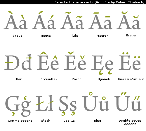
Nowadays, diacritics are used in most European languages (a good “Beyond ASCII” poster on the FontShop website). An extended version of the Latin alphabet is used in a number of African countries, in Vietnam. A large number of diacritics are used in transliteration (for example, Pinyin for Chinese). Another famous Latin extension is the International phonetic alphabet (IPA).
Very often (but by no means always) letters with diacritics are full members of the national alphabet. For example, in Danish, the alphabet consists of “a – z, æ, ø, å”. Diacritical letters are compound: they contain a symbol and a diacritic. Those. diacritical marks are the same integral parts of the letter as the main strokes and semi-ovals. And although very often diacritics are separated from the main letter, this does not make them less important or an element of punctuation.
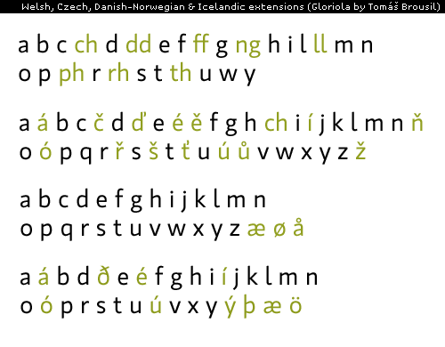
Welsh, Czech, Danish-Norwegian and Icelandic language extensions.
The last statement is very abstract and worth explaining. Punctuation is a way of separating and structuring sentences. The style of punctuation marks may differ (and often always necessarily) from the stylistic principles of building letters. But diacritics must be in harmony with the letters to which they refer, since their task, together with the letters, is to convey the meaning or sound of individual words.
This can be illustrated by the example of an alternative caron. In Czech and Slovak languages, Karon has a special vertical form for use in high letters (ď, ť, ľ, Ľ). Undoubtedly, its appearance is a solution to the problem of limited vertical space on a metal letter. An ordinary caron (ě, š, č, ň, ...) cannot be placed above the capital letters, so its alternative form is placed next to the letter. Very often it is mistakenly called a sign similar to an apostrophe or even an apostrophe. But an alternative caron is not an apostrophe, although their external resemblance can be confusing. The Czech word “rozhoď” (d with Karon) is the imperative form of the verb “scatter”, and the word “rozhod '” (apostrophe at the end of the word) means “[he] decided” in an informal spelling, which is also common in literature.(I can’t vouch for the accurate translation of both words, because it is translated from English, there may be the effect of a “damaged phone.” Nevertheless, I think the idea is clear: a different sign - a different meaning. Note transl.)
The problem of a possible misreading text makes designers find different ways to visually separate the caron and the apostrophe. The solution used by most modern designers is based on the closest possible location of the diacritical sign with the letter (see, for example, the font Greta (Peter Biľak) or the fonts from František Štorm ). Karon is designed as a simple vertical wedge, while the apostrophe is larger and retains its shape, similar to a comma. So here the problem between letters and punctuation marks is solved.
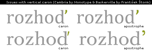
The nuances of the vertical caron.
At the dawn of the development of computers and the Internet, there were problems with the coding of letters of the non-Latin alphabet, and many were used to ignoring diacritics in letters, chats, etc. But this does not mean that diacritics have lost their relevance and their use is optional in modern design. They are still required in the design of the text and to achieve maximum readability.
The problem with diacritical marks is that it is not clear how a designer who is not very familiar with this language can evaluate the result. It is also worth noting that for the same characters, the expected result may differ depending on the language or geographic region. Today's major font manufacturers are creating nearly identical sets of diacritics for all fonts created. This dubious in-line production leads to design errors and further confuses the situation. On the other hand, there are traditional rules for creating the correct diacritical marks. Such diacritics provides better text readability and aesthetic appeal for native speakers. The nuances discussed below will help designers determine the correct design of diacritics.
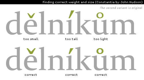
Looking for the right saturation and size. (pdf-version by click)
As mentioned above, diacritics are part of the letter. Therefore, they should not stand out (be lighter or darker) from the letter itself. Moreover, letters with and without diacritics have the same semantic importance, so the importance of the diacritic should not be reduced by reducing its size. This becomes even more important for small font sizes of 10-12 pt. Font writers often evaluate diacritics in large sizes, without paying attention to their quality with the smaller ones used in the main text. The smaller the font, the larger the diacritical mark should be in comparison with the main letter.
Horizontal and vertical positioning.
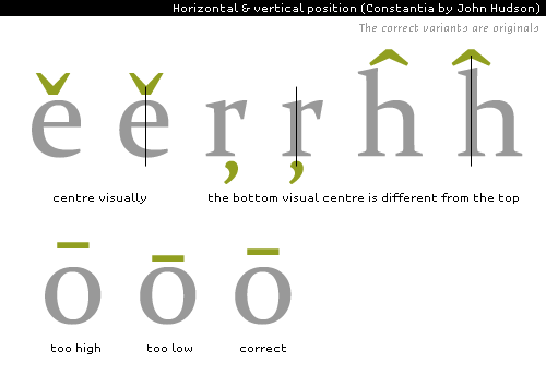
The location of the diacritical mark is very important, because the character must refer to the correct letter when reading. Many characters are located in the visual center above or below the letter. However, there are a number of exceptions when the diacritical mark is located to the right of the letter (for example, the light in the letters -a, e, u-) or behind the letter (the alternative caron mentioned above). Correct positioning of nearby characters is important, but in practice can turn into a big problem. The result can vary greatly when resizing or when using italics. In addition, different designers have different opinions about positioning. The general rule is simple: diacritics should not “fall out” of the base letter. They should also be visually attached to it.

Twinkle
Saturation and positioning, of course, are more important than the harmony of style. But, nevertheless, it should not be underestimated. In practice, diacritics should be in some contrast with the base letter. Font designers, often overdoing it, use the same contrast and voltage axis as for regular letters. But diacritical signs are not small letters, so the increased contrast in such signs as an acute, grave or caron may emphasize it too much relative to the base letter.

Diacritical Mark Style
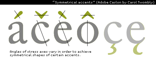
To achieve high clarity and expression of forms, designers often use the so-called "symmetric diacritics" in their fonts (see figure below). In this way, a good balance of stylistic unity and readability is achieved. The stress axes in such diacritics are different, but have one purpose: creating symmetrical forms. Creating and positioning asymmetric diacritics is already for the masters. Such diacritics look good in fonts based on calligraphic writing with a wide brush (here the author refers to the example above, by Robert Slimbach, but I did not find one in the original - approx. Transl.) .
"Symmetric diacritics"
It is recommended to reduce the contrast between thick and thin lines of the diacritical mark, because they are smaller than letters and thin parts become excessively thin, weak. Other principles also deserve mention: the style of the ends of strokes should be the same as in the letters. More refined options (such as serifs, semicircular endings, etc.) are usually not used in diacritics.
If the font uses open intra-letter space, then diacritics (cedilla, light) should also look similar.
Since there is very limited space above the capital letters, special diacritics must be used for them. They are smaller, lower and better combined with capital letters. Some designers additionally create diacritics for capitals. This is highly recommended if the style of uppercase (including capitals) and lowercase letters is significantly different. In cases of minor differences, the diacritic used in lowercase letters is also used for capital.
Last but not least, the diacritical marks should not be overly alike. An overly flat “´” can easily be confused with the ¯. Too rounded caron "ˇ" is easily confused with the "˘" log. For this reason, when creating diacritical marks, one should not strongly move away from the original generally accepted forms.
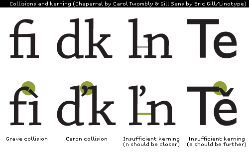
Diacritical signs should not touch, and layered, create illegible forms. Therefore, a careful fit is often required. No font designer can predict and take into account all possible combinations of diacritics, so it is recommended to customize the letters according to your opinion and taste. Collisions and kerning. (pdf version by click)
Most of the problems when dealing with diacritics have remained aloof from this fact-finding article. But from the above it should be clear that diacritics are not just an addition to the letters of the main alphabet. They form letters.
The images provided here focus on those fonts for which, for obvious reasons, higher demands are made. A careful study and understanding of the purpose, aesthetics will help designers choose fonts with well-developed diacritics (or at least be aware of a lack of something). This improves the quality of texts in their native languages.
The problem of diacritics used in central Europe is not very relevant for most of us (with our dashes and dots over “Y” and “Y” it seems to be a good deal), but for designers working with foreign clients, it will be very informative . Anyway, as they say, for general development ...
Regarding mistakes and other things - scold the translator (that is, me). But not much. I am writing and translating as I can :)
Published with permission of the author.
The globalization of the printing market and the increasing interest in creating multilingual font design is a source of great optimism among designers and printers. But, despite the wide spread of new beautiful fonts, many still do not support a number of European languages (about Cyrillic fonts in general, a separate song - approx. Transl.) And only a few support African and Asian languages. It turns out the classic contradiction between the advertising statements of the creators and the really supported languages.
The purpose of this article is to explain the main features of the use and design of Latin diacritics, to help designers make more informed choices in their use. The article uses diacritics used in central Europe for several reasons:
1) they are not very well known to Western designers. Czech printer Tomáš Brousil said: “For Western designers, our diacritics are as alien as Arabic inscriptions.” The fact that they see these signs only as a complement to familiar Latin letters often leads to an underestimation of their importance;
2) they are well known to the author of the article;
3) many Central European languages and Czech in particular were among the first to use diacritics for Latin letters (the idea of replacing digraphs with diacritics was proposed by Jan Gus in his De Ortographia Bohemica in 1412).

Arabic Vocalization
At different times, characters drawn up to letters or located next to each other were used in many different writing systems. The Greeks used them to vividly express the tonality (Greek politonics), the Arabs and the Jews to indicate vowels. In some Indian syllabic scripts, they were used to change the sound of a syllable (i.e., the original vowel sound of that syllable was changed).
In the Latin alphabet, diacritics are most often a tool for expanding the main alphabet for use in a particular language. This is done to represent compound letters (graphemes) or to indicate sounds (phonemes) of a particular language, in cases where it is not possible to compose them from the letters of the main alphabet or such a replacement is cumbersome(try to spell the Russian letter "u" in Latin. It somehow turns out long - approx. transl.) . Roughly speaking, diacritics are used when letters end in the main Latin alphabet or if you want to show specific behavior (for example, convey softness, length, stress, etc.). Some Latin diacritics (pdf version by click) Actually, diacritics is far from the only way to expand the recording system. You can come up with new letters (for example, ß (escet) in German), create clusters of letters (digraphs, trigraphs), as is done in some languages (for example, in Welsh ) (a closer example for us: the letters "j" and "DZ" in the Belarusian language - approx. Transl.) .

Nowadays, diacritics are used in most European languages (a good “Beyond ASCII” poster on the FontShop website). An extended version of the Latin alphabet is used in a number of African countries, in Vietnam. A large number of diacritics are used in transliteration (for example, Pinyin for Chinese). Another famous Latin extension is the International phonetic alphabet (IPA).
Using diacritics
Very often (but by no means always) letters with diacritics are full members of the national alphabet. For example, in Danish, the alphabet consists of “a – z, æ, ø, å”. Diacritical letters are compound: they contain a symbol and a diacritic. Those. diacritical marks are the same integral parts of the letter as the main strokes and semi-ovals. And although very often diacritics are separated from the main letter, this does not make them less important or an element of punctuation.

Welsh, Czech, Danish-Norwegian and Icelandic language extensions.
The last statement is very abstract and worth explaining. Punctuation is a way of separating and structuring sentences. The style of punctuation marks may differ (and often always necessarily) from the stylistic principles of building letters. But diacritics must be in harmony with the letters to which they refer, since their task, together with the letters, is to convey the meaning or sound of individual words.
This can be illustrated by the example of an alternative caron. In Czech and Slovak languages, Karon has a special vertical form for use in high letters (ď, ť, ľ, Ľ). Undoubtedly, its appearance is a solution to the problem of limited vertical space on a metal letter. An ordinary caron (ě, š, č, ň, ...) cannot be placed above the capital letters, so its alternative form is placed next to the letter. Very often it is mistakenly called a sign similar to an apostrophe or even an apostrophe. But an alternative caron is not an apostrophe, although their external resemblance can be confusing. The Czech word “rozhoď” (d with Karon) is the imperative form of the verb “scatter”, and the word “rozhod '” (apostrophe at the end of the word) means “[he] decided” in an informal spelling, which is also common in literature.(I can’t vouch for the accurate translation of both words, because it is translated from English, there may be the effect of a “damaged phone.” Nevertheless, I think the idea is clear: a different sign - a different meaning. Note transl.)
The problem of a possible misreading text makes designers find different ways to visually separate the caron and the apostrophe. The solution used by most modern designers is based on the closest possible location of the diacritical sign with the letter (see, for example, the font Greta (Peter Biľak) or the fonts from František Štorm ). Karon is designed as a simple vertical wedge, while the apostrophe is larger and retains its shape, similar to a comma. So here the problem between letters and punctuation marks is solved.

The nuances of the vertical caron.
At the dawn of the development of computers and the Internet, there were problems with the coding of letters of the non-Latin alphabet, and many were used to ignoring diacritics in letters, chats, etc. But this does not mean that diacritics have lost their relevance and their use is optional in modern design. They are still required in the design of the text and to achieve maximum readability.
Diacritical Mark Design
The problem with diacritical marks is that it is not clear how a designer who is not very familiar with this language can evaluate the result. It is also worth noting that for the same characters, the expected result may differ depending on the language or geographic region. Today's major font manufacturers are creating nearly identical sets of diacritics for all fonts created. This dubious in-line production leads to design errors and further confuses the situation. On the other hand, there are traditional rules for creating the correct diacritical marks. Such diacritics provides better text readability and aesthetic appeal for native speakers. The nuances discussed below will help designers determine the correct design of diacritics.
1. Saturation and size

Looking for the right saturation and size. (pdf-version by click)
As mentioned above, diacritics are part of the letter. Therefore, they should not stand out (be lighter or darker) from the letter itself. Moreover, letters with and without diacritics have the same semantic importance, so the importance of the diacritic should not be reduced by reducing its size. This becomes even more important for small font sizes of 10-12 pt. Font writers often evaluate diacritics in large sizes, without paying attention to their quality with the smaller ones used in the main text. The smaller the font, the larger the diacritical mark should be in comparison with the main letter.
2. Positioning

Horizontal and vertical positioning.
The location of the diacritical mark is very important, because the character must refer to the correct letter when reading. Many characters are located in the visual center above or below the letter. However, there are a number of exceptions when the diacritical mark is located to the right of the letter (for example, the light in the letters -a, e, u-) or behind the letter (the alternative caron mentioned above). Correct positioning of nearby characters is important, but in practice can turn into a big problem. The result can vary greatly when resizing or when using italics. In addition, different designers have different opinions about positioning. The general rule is simple: diacritics should not “fall out” of the base letter. They should also be visually attached to it.

Twinkle
3. Harmony of style
Saturation and positioning, of course, are more important than the harmony of style. But, nevertheless, it should not be underestimated. In practice, diacritics should be in some contrast with the base letter. Font designers, often overdoing it, use the same contrast and voltage axis as for regular letters. But diacritical signs are not small letters, so the increased contrast in such signs as an acute, grave or caron may emphasize it too much relative to the base letter.

Diacritical Mark Style
To achieve high clarity and expression of forms, designers often use the so-called "symmetric diacritics" in their fonts (see figure below). In this way, a good balance of stylistic unity and readability is achieved. The stress axes in such diacritics are different, but have one purpose: creating symmetrical forms. Creating and positioning asymmetric diacritics is already for the masters. Such diacritics look good in fonts based on calligraphic writing with a wide brush (here the author refers to the example above, by Robert Slimbach, but I did not find one in the original - approx. Transl.) .

"Symmetric diacritics"
It is recommended to reduce the contrast between thick and thin lines of the diacritical mark, because they are smaller than letters and thin parts become excessively thin, weak. Other principles also deserve mention: the style of the ends of strokes should be the same as in the letters. More refined options (such as serifs, semicircular endings, etc.) are usually not used in diacritics.
If the font uses open intra-letter space, then diacritics (cedilla, light) should also look similar.
Since there is very limited space above the capital letters, special diacritics must be used for them. They are smaller, lower and better combined with capital letters. Some designers additionally create diacritics for capitals. This is highly recommended if the style of uppercase (including capitals) and lowercase letters is significantly different. In cases of minor differences, the diacritic used in lowercase letters is also used for capital.
Last but not least, the diacritical marks should not be overly alike. An overly flat “´” can easily be confused with the ¯. Too rounded caron "ˇ" is easily confused with the "˘" log. For this reason, when creating diacritical marks, one should not strongly move away from the original generally accepted forms.
4. Fitting and kerning
Diacritical signs should not touch, and layered, create illegible forms. Therefore, a careful fit is often required. No font designer can predict and take into account all possible combinations of diacritics, so it is recommended to customize the letters according to your opinion and taste. Collisions and kerning. (pdf version by click)

Conclusion
Most of the problems when dealing with diacritics have remained aloof from this fact-finding article. But from the above it should be clear that diacritics are not just an addition to the letters of the main alphabet. They form letters.
The images provided here focus on those fonts for which, for obvious reasons, higher demands are made. A careful study and understanding of the purpose, aesthetics will help designers choose fonts with well-developed diacritics (or at least be aware of a lack of something). This improves the quality of texts in their native languages.
