3D interfaces are usually worse than 2D interfaces
- Transfer
The author of the article is John Carmack, an engineer in the fields of computer science, aerospace technology and virtual reality, co-founder and co-owner of id Software. Since August 2013 - Technical Director of Oculus VR.
I sent this note to employees in 2017, but my position only strengthened in subsequent years.
Last year, I said that cylindrical panels were surprisingly effective, and they need to be implemented in the VR Shell interface [VR browser shell for viewing the web - approx. trans.]. Many were opposed to abandon the free placement of 3D interfaces and even further reduce the use of 3D interfaces in the future, but the objectively higher quality of the native projection of the TimeWarp layer is not just an abstract design issue.
Last week, looking at the job description before the interview, I noticed that one of the duties for the post of project manager was indicated: "Create a new 3D interaction paradigm instead of 2D."
How is it ... Okay, I’ll try to more clearly state the abstract arguments against the paradigm of 3D interactions.
Obviously, a three-dimensional interface is necessary for interacting with 3D objects, such as Medium, Quill or 3D data visualization. But I argue that the bulk of web browsing, settings, and choice of interactions benefit from 2D design.
Separating information into several layers in depth is harmful because the eye has to refocus. This is easy to demonstrate in practice. If you have a poster hanging on the wall in your field of view, try raising your gaze from the monitor. Do this several times, and then compare with a simple eye translation between the icons on the panel at the bottom of the monitor.
In VR, the situation is even worse, because you have to deal with the lack of an actual change in focus. In the varifocal system, we only emulate the bad real world, but do not improve it. This fact is fundamental for convenience in everyday work.
There is an opinion that varifocal is a hardware function necessary for good readability of the text. It is not right. It is important only for improving the readability of texts that are at a great distance from each other: like a sheet of paper before your eyes and a billboard in the distance. HMD static optics can focus anywhere, and we need to set it to a UI distance.
If it is possible to place the interface at any distance, as in VR, you will not place it at the distance of the usual reading / monitor. “Reading glasses” are needed precisely because older people can no longer focus at such close range. The exact focusing distance of a relaxed eye varies among different people, but this is usually a few meters.
This is the advantage of VR! Focusing on close monitors all day is eye strain. It can be removed. If you want to scan information as quickly and comfortably as possible, it should be at the same distance from the reader and not too close.
The depth signal (distance to the object) provides important information when you understand the environment and move relative to its elements. If you want to hit something with a spear or dodge a projectile, this is valuable information. Actions in the UI almost never benefit from this.
Your idea of the 3D environment is a couple of 2D projections. If you are not particularly moving about the environment, then they remain essentially the same 2D projections. Even if you have developed a truly three-dimensional interface, you will have to take care that the 3D elements do not overlap each other in the projection.
I think that 3D provides some benefit in the design of individual UI elements: slightly convex 3D buttons that protrude from the surface where otherwise color changes or artificial 3D effects, such as bevels or shadows, would have to be used. 3D modeling of the icons at the user interface level is possible, but all this is usually at a distance of several centimeters from the UI plane. Visual scanning and interaction is still based on 2D, but there is another channel of information that the eye naturally picks up. But this is inconvenient to design in an environment such as VrShell.
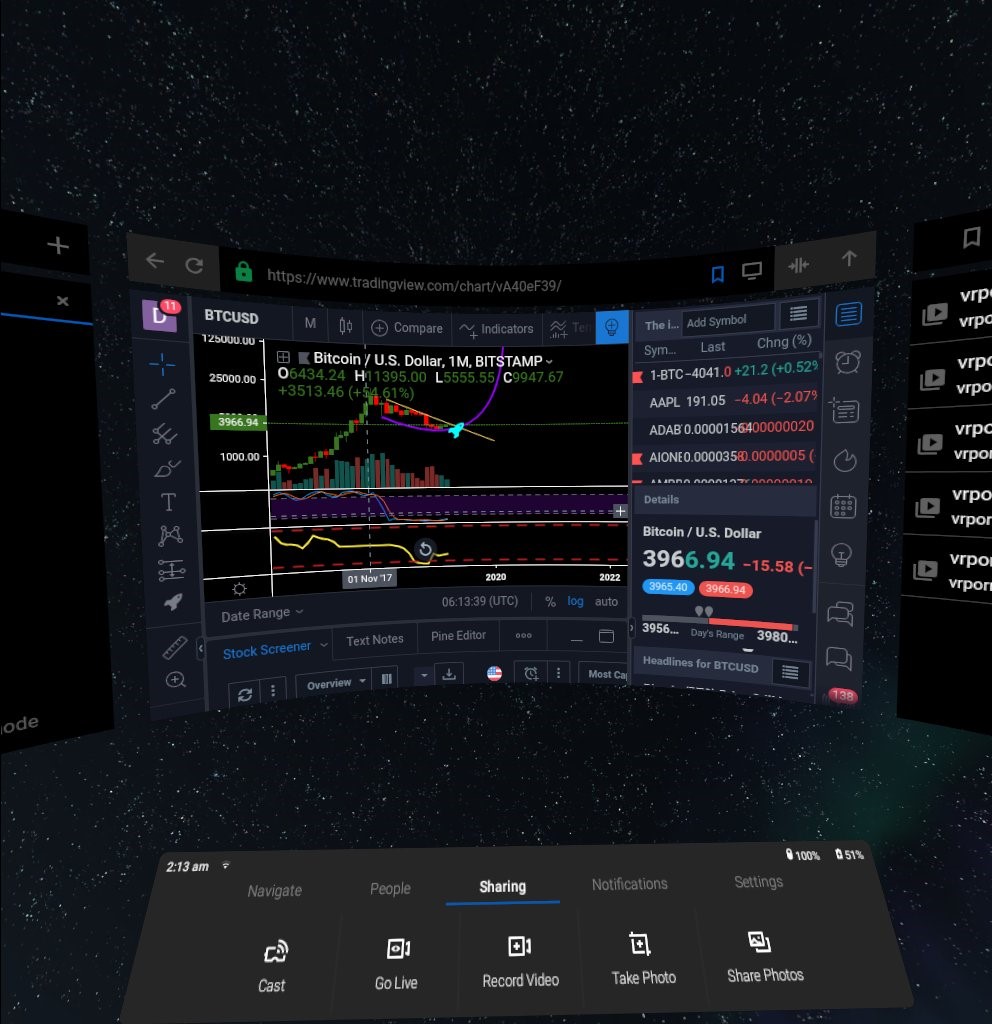
This does not mean that VR interfaces should just be “floating screens” - I really did not like that our first Home design was basically a UI console floating in the middle of the screen, along with “safe areas” around.
From the point of view of the user interface, the main advantage of VR is the ability to use the entire field of view and allow it to expand, "looking" to the sides.
I always urge you to take away the selection of content from the edges of the screen and leave a place on each edge so that when you look ahead you can see half of the next tile. If half of the tile is of interest to the user, he will look to see the rest. In fact, it is not very convenient for the user to interact with UI elements that are located in corners far from the center. If you do not rotate the whole body, then long-term work with the edge of the screen is a load on the neck, which is always in a rotated state. Therefore, the idea is to take a look - and scroll the tile to the center.
Another key element is to place rarely used UI elements on the sides and behind the main screen. The void theater button in Netflix or the old Skip New User Intro button in Home are good examples of how you can easily move the options menu aside.
However, for this we need to “wean” users a bit from familiar behavior. Today's options for hiding options in computer UIs are clearly unintuitive: how do I know that clicking on this obscure icon will open a whole window of other options? It trains people to look for hidden values in UI elements, rather than looking around.
I sent this note to employees in 2017, but my position only strengthened in subsequent years.
Last year, I said that cylindrical panels were surprisingly effective, and they need to be implemented in the VR Shell interface [VR browser shell for viewing the web - approx. trans.]. Many were opposed to abandon the free placement of 3D interfaces and even further reduce the use of 3D interfaces in the future, but the objectively higher quality of the native projection of the TimeWarp layer is not just an abstract design issue.
Last week, looking at the job description before the interview, I noticed that one of the duties for the post of project manager was indicated: "Create a new 3D interaction paradigm instead of 2D."
How is it ... Okay, I’ll try to more clearly state the abstract arguments against the paradigm of 3D interactions.
Obviously, a three-dimensional interface is necessary for interacting with 3D objects, such as Medium, Quill or 3D data visualization. But I argue that the bulk of web browsing, settings, and choice of interactions benefit from 2D design.
Separating information into several layers in depth is harmful because the eye has to refocus. This is easy to demonstrate in practice. If you have a poster hanging on the wall in your field of view, try raising your gaze from the monitor. Do this several times, and then compare with a simple eye translation between the icons on the panel at the bottom of the monitor.
In VR, the situation is even worse, because you have to deal with the lack of an actual change in focus. In the varifocal system, we only emulate the bad real world, but do not improve it. This fact is fundamental for convenience in everyday work.
There is an opinion that varifocal is a hardware function necessary for good readability of the text. It is not right. It is important only for improving the readability of texts that are at a great distance from each other: like a sheet of paper before your eyes and a billboard in the distance. HMD static optics can focus anywhere, and we need to set it to a UI distance.
If it is possible to place the interface at any distance, as in VR, you will not place it at the distance of the usual reading / monitor. “Reading glasses” are needed precisely because older people can no longer focus at such close range. The exact focusing distance of a relaxed eye varies among different people, but this is usually a few meters.
This is the advantage of VR! Focusing on close monitors all day is eye strain. It can be removed. If you want to scan information as quickly and comfortably as possible, it should be at the same distance from the reader and not too close.
The depth signal (distance to the object) provides important information when you understand the environment and move relative to its elements. If you want to hit something with a spear or dodge a projectile, this is valuable information. Actions in the UI almost never benefit from this.
Your idea of the 3D environment is a couple of 2D projections. If you are not particularly moving about the environment, then they remain essentially the same 2D projections. Even if you have developed a truly three-dimensional interface, you will have to take care that the 3D elements do not overlap each other in the projection.
I think that 3D provides some benefit in the design of individual UI elements: slightly convex 3D buttons that protrude from the surface where otherwise color changes or artificial 3D effects, such as bevels or shadows, would have to be used. 3D modeling of the icons at the user interface level is possible, but all this is usually at a distance of several centimeters from the UI plane. Visual scanning and interaction is still based on 2D, but there is another channel of information that the eye naturally picks up. But this is inconvenient to design in an environment such as VrShell.
This does not mean that VR interfaces should just be “floating screens” - I really did not like that our first Home design was basically a UI console floating in the middle of the screen, along with “safe areas” around.
From the point of view of the user interface, the main advantage of VR is the ability to use the entire field of view and allow it to expand, "looking" to the sides.
I always urge you to take away the selection of content from the edges of the screen and leave a place on each edge so that when you look ahead you can see half of the next tile. If half of the tile is of interest to the user, he will look to see the rest. In fact, it is not very convenient for the user to interact with UI elements that are located in corners far from the center. If you do not rotate the whole body, then long-term work with the edge of the screen is a load on the neck, which is always in a rotated state. Therefore, the idea is to take a look - and scroll the tile to the center.
Another key element is to place rarely used UI elements on the sides and behind the main screen. The void theater button in Netflix or the old Skip New User Intro button in Home are good examples of how you can easily move the options menu aside.
However, for this we need to “wean” users a bit from familiar behavior. Today's options for hiding options in computer UIs are clearly unintuitive: how do I know that clicking on this obscure icon will open a whole window of other options? It trains people to look for hidden values in UI elements, rather than looking around.