Pixel art: from draft to game asset
- Transfer
 →
→ 
In this article I will try to visualize the general approach to work. So, you decided to study art : you downloaded some software, launched it and saw all these options, endless colors and much more, quickly closed everything, deleted the program and threw your laptop out the window.
Perhaps after a few months you will repeat this. Sometimes you try to draw a couple of lines that look like a child’s pencil drawing, or even worse, and decide to drop it.
If this is familiar to you, then this article is just for you, so keep reading.
Independent game developers quite often complain that they cannot create graphics, because they are programmers, and they don’t have money to pay for artists.
And although studying art can seem like a daunting task, in reality you can rise to a very decent level by spending at least one year on practice.
If you take up the work very diligently, you may get good results in a few months.
Get ready for pixel art
In this article, I will discuss pixel art. Do you think that he has long become cliché and everyone is tired of him?
Well, in fact, pixel art is an excellent tool for becoming an artist. You will find that having mastered pixel art quite well, you can very easily switch to other graphic styles.
Another major advantage is that you only need a mouse and you don’t have to spend money on a graphics tablet. In fact, most people who draw pixel art prefer to use the mouse for increased accuracy.
Often they say about pixel art and this: "it can look beautiful, but most of the pixel art of indie developers is terrible."
And I can agree with this, but if you follow the rules of this article, your pixel art will be above average, do not worry.
10 steps to create pixel art
The best way to improve your skill is to first learn the rules. You can break them later, but when you learn something new, following the rules gives you a strong push forward.
In this article, I will tell you about ten steps and a couple of rules to help you get started. You can repeat them with any pixel art graphics you need to create.
For the game to look good, it needs a confident graphic style, and if you follow my recommendations, you will achieve it.
Stage 1 - the palette
Never choose colors yourself. Color is an art in itself, but, fortunately, we can let professionals do it. Take a look here and choose a color palette.
Please note that the number of colors in the palettes may be different. I do not recommend using palettes with more than 32 colors, and for a start, even 16 colors.
For this article I will choose such a palette . It was possible to take any other, I randomly selected it from the list.

Stage 2 - Resolution
To get started, choose a small resolution. If you are a beginner, then hit the retro and create sprites in the size 16x16 or 32x32, no more.
You can use other ratios, for example 24x32, most importantly, not too much of this.

Stage 3 - Outlines
When drawing an object, first draw in one color, for example black, its outline. No other colors are allowed at this stage.
It is recommended that you always have a reference before your eyes (reference image). You should be able to see the reference while drawing, and not constantly switch windows.
Also check that there are no holes in the circuit; at this stage this is the most important.
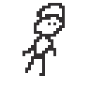
I drew such a guy with a resolution of 32x32. It looks awful.
At least now you won’t complain that I didn’t start from the very beginning!
Stage 4 - Colors
After making sure that the contour is good enough, you can begin to fill the inner part. Most programs have the Color Fill tool, and this is the fastest way to fill the interior areas with the desired color.
Here again, use as few colors as possible, and only from the palette that you have selected. A good character design will have at least three different ranges. In fact, a range (ramp) is a way of arranging palette colors according to families of shades, from dark to light.
Usually at this stage you need to choose colors from the middle of each range, that is, not very dark and not very light, only if for some reason you draw an object or character for which they are needed.

Here is an example of the possible ranges of the palette I previously selected. Note that I did not add all the colors from the palette, only some so that you understand the principle.
It is also seen in the picture that the color can be used in several ranges, becoming either the initial or final color.

So, I selected several colors from the palette and painted my character.
Remember, I said it’s important not to leave holes?
Stage 5 - Shades
At this stage, many can get stuck, and in fact, you can create a beautiful looking game only on the basis of the previous stages, without shades. It is enough to adhere to the rules of the color palette, maintain the integrity of the artistic style, and your game will already look better than most others.
But to grow as an artist, you need to master the shading skill.
To begin with, there is a simple trick: you need to choose the direction of lighting in the game - left or right, and then stick to it when creating each sprite, tile and everything else.
Note
This means that if you have a character looking to the right, so that he looks to the left, you can’t just mirror it in the code. It needs to be redrawn taking into account the fixed direction of light.

The main idea of shading is that the parts of the image onto which direct light falls become brighter, and the parts that do not fall light remain in the shadow, so they become darker. Very simple, right?
But if you are new to graphics, you most likely don’t understand how to do this, and most of the tutorials don’t explain this, because just reading the words doesn’t teach you how.
So here's the trick for you. In my example, I will take the lighting falling on the right.
To begin with, I will select a lighter color for each character color, and color one pixel of each edge located to the right or top.
Then, for each character color, I will choose a darker color and color them with each pixel of each edge located to the left or bottom.

I know that this looks pretty awful, but keep reading and we will improve the situation soon.
If for some reason this stage seems too complicated for you, then zoom in and see how I did it - two additional shades for blue, red and beige colors were added. All of them are selected from the palette and plotted with the rule “top-right” / “left-bottom”.
Stage 6 - Proportions
This is another source of failure for a novice artist. Fortunately, low-resolution pixel art greatly simplifies it.
At this stage, everything becomes quite subjective. This may surprise you, but to become a good artist, you need to practice not with your hands, but with your eyes.
Your main task is to wake up in yourself something called the “gaze of the artist”. This is a special skill that allows you to look at things and decompose them into components, and then fold them yourself.
"Artist's View" is revealed by a combination of creating your own graphics and studying the works of other people. Both steps are necessary: if you just continue to draw without looking at the work of others, or just study others without drawing, this look will not develop.
Let's check your own eyes - look again at this terrible sprite and tell me what parts of it look stupid.
(Do not waste time looking for differences between this and the previous image, they are the same, I just repeated it here for convenience.)
The first thing that comes to mind is that our character seems to fall. Let's help him.

The only thing I did here is to move a few pixels horizontally. From this we can understand that creating drawings is a very iterative process. You will not be able to do everything right the first time, you have to make a bunch of revisions.
Let’s take another look at this version and think about what’s wrong with it now?
It seems to me that the poor character is dancing, but he should not dance, so let's fix it.

Great, the pose has become better, and I also added pants to him.
Note
You can use thousands of references from the Internet to create poses. Even some random photos may well be enough.
Do not think that artists draw only from their imagination, they look at the references!
This is similar to how encoders visit Google or Stack Overflow every day - no one cares.
Stage 7 - clean the blocks
See these ugly black clusters of pixels?
Let's get rid of them all and create a rule that a pixel can touch a maximum of two other pixels.

The character has become cleaner. For some reason, this change made me realize that he should have a long nose, so add it.
Sometimes the editing process itself gives us inspiration.
Note
When deleting clusters of pixels, there are some exceptions: sometimes you cannot delete a specific pixel, even if it forms a cluster, because otherwise a hole will appear in the outline.

I added a nose and slightly changed the shape of the head to better fit the nose.
I also added contours around the legs to fit the rest of the legs. All art in the game must be holistic!
Stage 8 - clean the shades
The trick we used when shading worked, but in some parts the character still looks a little ugly.
If your view of the artist has already been activated, then you will have a preference for replacing dark and light pixels with a more neutral shade.

Here I did a couple of actions - replaced all the bright and dark pixels that seemed out of place, and then changed the outer contours.
Pixel art has such a low resolution that the contours take up the space needed for the details. In some important places they are needed, but not in this case.
I also added to the character arms and legs, more consistent with the style of its other parts.

A slight change: I changed his pants and moved a couple of pixels. But something still seems strange, I don’t quite understand what to do next.
Let's try to remove the outlines, replacing them with the colors of the nearest pixels.

If you look at the character now, then the legs look strange, like a centaur. And he has a strange face - his nose looks in one direction, and his eyes in the other.
Artists use a trick that allows the brain to look for mistakes - they look at the picture from a different angle.
A fresh look allows you to notice what I did not see before, and when I cleaned the contours, you could just look at the inverted image!

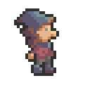
So, I redid many parts of his head, arms and legs. He already looks completely different, a little more correct.
But wait, why doesn't he have ears? And why does it seem that his hat is hanging in the air, and not connected to his head?

We fixed it, and now the character began to look much more professional. Look at the shading on the hat. Do you understand how it works?
It just applies the same rule - light on one side, shadow on the other. When implemented correctly, the character looks almost three-dimensional.
To make the shading look right, if you have not yet opened the “artist's eye”, then just try different combinations of dark, neutral and light pixels.
Always stick with three shades. It's hard to make a mistake here, because when working with low-resolution sprites, there are very few changes.
However, the appearance of shading can sometimes be highly dependent on a single pixel. You will understand this with time and practice.
Note
Once you begin to understand how shading works, you can better create objects that have volume, which is the main task of shading.
However, it is worth remembering that the system we are studying with three shades is more than enough for most low-resolution pixel art. Adding more shades makes pixel art more messy and noisy.

Stage 9 - debugging
Yes, the character can already be used, but let's continue to improve it.
Another simple trick that allows you to add volume is the knowledge that in the far parts of objects you need to use darker shades.

Therefore, I made one of the hands and one of the legs of a darker shade, everything is simple.
Let's improve something else!
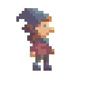
Here I changed the position of the hands a little. It is perfectly normal to redraw parts of a character until you are completely satisfied. The more you practice, the faster you will get a high-quality result and the less alteration will be needed.
I also added a scarf and hair. Note that if you add different elements that are close to each other and have the same or similar colors, then this will be confusing.
In our case, the scarf allows you to add contrast to separate the hair from the shirt.
I also changed the color of the eyes a bit, this is already related to the character design - it seemed to me that the black eyes do not correspond to the rest of the parts.
And then you need two dark pixels in the middle of the shirt?
Mostly for the sake of experiment: I tried it and I liked the result. Since low-resolution pixel art requires a little imagination, these two pixels allude to folds in clothing, or that the character is wearing a turtleneck, or that he is female.

Finally, I returned the outline again, drawing one pixel at a time and avoiding creating clusters of pixels.
To draw contours or not is basically a matter of preference. But they help create a contrast between the characters and the background.

A circuit does not have to always be black. Here's an alternative way to create a path - we look at the pixels adjacent to the path and select a slightly darker shade.
Of course, I always use only the colors from the original palette, do not forget about it!
This latest version may look better, but the more colors, the more time will be spent on the animation. Therefore, here I will return to the black outline again.
Note
If you compare the version with the circuit and the version without the circuit, then the circuit may look “heavy”.
The choice of one or another option depends on the effect that is needed for your graphic style.
Stage 10 - Animation
In essence, the animation is as follows: we take our sprite and create slightly different frames in other poses.
The low resolution of pixel art also helps in teaching animation. Let's start with the idle animation, the easiest of all kinds of animations.


In fact, I just selected half of the sprite and moved it down. If you are a lazy developer, then this will be enough for you, but not for me!


This time I moved a few more pixels, moving my hair, hat and nose up. This is done because when you move your head down, everything else also moves down, but not instantly, which adds a delay to these parts.
I shifted both arms slightly to the left to simulate a slight secondary movement. This is not some specialized term, it simply means that it is an independent action, not connected in any way with the vibrations of the head.
Stage 10 - Subpixel Animation
If you get here, you are already entering the territory of more complex tasks.
So far, low resolution has helped to hide the fact that we are studying graphics, but sometimes it works against us.
The last shot was a good example: hat and nose movements are too strong. But we only moved them one pixel up!
Now, if we could move them less than a pixel to make the movement smoother ... But alas, a pixel is the smallest value.
However, there is one trick - instead of moving pixels, we can move colors!

Therefore, I returned the nose and hat to their original place, and instead I only change the colors, filling them with the corresponding dark and light shades as it seemed to me correct.
And this trick also depends on your "look of the artist." Train him actively, and gradually you will start to work easier and faster!
Conclusion
I hope you enjoyed watching me turn a completely shapeless figure from sticks and circles into a character that can be used in the game. I tried to show all the stages and explain why and how I performed them, so that this does not turn into another tutorial “draw the rest of the owl”.

I plan to release similar articles on other topics, for example, tilesets, low-poly models or even music, it all depends on free time and motivation.
Also, be sure to read my article on pixel perfect graphics , which is also very important for creating a coherent graphic style.