Using dot charts to visualize data
Hi, Habr! I present to your attention the translation of the article “Everything you need to know about Scatter Plots for Data Visualization” by George Seif.
If you are engaged in the analysis and visualization of data, then rather you will have to deal with scatter charts. Despite its simplicity, scatter plots are a powerful tool for visualizing data. By manipulating colors, sizes and shapes, one can ensure the flexibility and representativeness of the dot charts.
In this article, you will learn almost everything you need to know about data visualization using scatter plots. We will try to parse all the necessary parameters in their use in the python code. You can also find a few practical tricks.
Even the most primitive use of a scatter chart already gives a tolerable overview of our data. In Figure 1, we can already see islands of aggregated data and quickly isolate outliers.
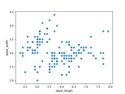
Picture 1
Appropriately carried out regression lines visually simplifies the task of identifying points close to the middle. In Figure 2 we have a linear graph. It is fairly easy to see that in this case the linear function is not representative, since many points are quite far from the line.

Figure 2
Figure 3 uses a polynomial of order 4 and looks much more promising. It looks like we’ll definitely need a polynomial of order 4 to simulate this data set.
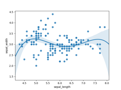
Figure 3
Color and shape can be used to visualize the various categories in your dataset. Color and shape are visually very clear. When you look at the graph where the groups of points have different colors of our figures, it immediately becomes obvious that the points belong to different groups.
Figure 4 shows the classes grouped by color. Figure 5 shows the classes, separated by color and shape. In both cases, it is much easier to see the grouping. We now know that it will be easy to separate the setosa class , and what we should focus on. It is also clear that a single line graph will not be able to separate the green and orange points. Therefore, we need to add something to display more dimensions.
The choice between color and shape becomes a matter of preference. Personally, I find the color a little clearer and more intuitive, but the choice is always yours.
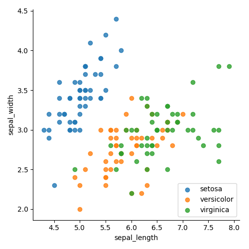
Figure 4

Figure 5
An example of a chart with marginal histograms is shown in Figure 6. Marginal histograms are superimposed on the top and side, representing the distribution of points for objects along the abscissa and ordinate. This small addition is great for more accurate determination of point distribution and outliers.
For example, in Figure 6, we obviously see a high concentration of points around the 3.0 markup. And thanks to this histogram you can determine the level of concentration. In the right side, it can be seen that around markup 3.0 there are at least three times more points than for any other discrete range. Also, using the right side histogram, you can clearly recognize that obvious outliers are above the 3.75 mark. The upper diagram shows that the distribution of points along the X axis is more uniform, with the exception of emissions in the right-most corner.
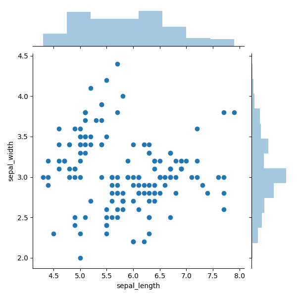
Figure 6
Using bubble charts, we need to use several variables to encode information. The new parameter, peculiar to this type of visualization, is size. In Figure 7, we show the number of eaten potato fries in terms of height and weight of people who ate. Note that the scatter chart is only a two-dimensional visualization tool, but when using bubble charts, we can skillfully display information with three dimensions.
Here we use color, position and size.where the position of the bubbles determines the height and weight of the person, the color determines the sex, and the size is determined by the number of eaten french fries. A bubble chart easily allows us to conveniently combine all attributes into one graph so that we can see large information in a two-dimensional view.

Figure 7
If you are engaged in the analysis and visualization of data, then rather you will have to deal with scatter charts. Despite its simplicity, scatter plots are a powerful tool for visualizing data. By manipulating colors, sizes and shapes, one can ensure the flexibility and representativeness of the dot charts.
In this article, you will learn almost everything you need to know about data visualization using scatter plots. We will try to parse all the necessary parameters in their use in the python code. You can also find a few practical tricks.
Building regression
Even the most primitive use of a scatter chart already gives a tolerable overview of our data. In Figure 1, we can already see islands of aggregated data and quickly isolate outliers.
Picture 1
Appropriately carried out regression lines visually simplifies the task of identifying points close to the middle. In Figure 2 we have a linear graph. It is fairly easy to see that in this case the linear function is not representative, since many points are quite far from the line.
Figure 2
Figure 3 uses a polynomial of order 4 and looks much more promising. It looks like we’ll definitely need a polynomial of order 4 to simulate this data set.
Figure 3
import seaborn as sns
import matplotlib.pyplot as plt
df = sns.load_dataset('iris')
# A regular scatter plot
sns.regplot(x=df["sepal_length"], y=df["sepal_width"], fit_reg=False)
plt.show()
# A scatter plot with a linear regression fit:
sns.regplot(x=df["sepal_length"], y=df["sepal_width"], fit_reg=True)
plt.show()
# A scatter plot with a polynomial regression fit:
sns.regplot(x=df["sepal_length"], y=df["sepal_width"], fit_reg=True, order=4)
plt.show()
Color and shape of dots
Color and shape can be used to visualize the various categories in your dataset. Color and shape are visually very clear. When you look at the graph where the groups of points have different colors of our figures, it immediately becomes obvious that the points belong to different groups.
Figure 4 shows the classes grouped by color. Figure 5 shows the classes, separated by color and shape. In both cases, it is much easier to see the grouping. We now know that it will be easy to separate the setosa class , and what we should focus on. It is also clear that a single line graph will not be able to separate the green and orange points. Therefore, we need to add something to display more dimensions.
The choice between color and shape becomes a matter of preference. Personally, I find the color a little clearer and more intuitive, but the choice is always yours.
Figure 4
Figure 5
import seaborn as sns
import matplotlib.pyplot as plt
df = sns.load_dataset('iris')
# Use the 'hue' argument to provide a factor variable
sns.lmplot( x="sepal_length", y="sepal_width", data=df, fit_reg=False, hue='species', legend=False)
plt.legend(loc='lower right')
plt.show()
sns.lmplot( x="sepal_length", y="sepal_width", data=df, fit_reg=False, hue='species', legend=False, markers=["o", "P", "D"])
plt.legend(loc='lower right')
plt.show()
Marginal histogram
An example of a chart with marginal histograms is shown in Figure 6. Marginal histograms are superimposed on the top and side, representing the distribution of points for objects along the abscissa and ordinate. This small addition is great for more accurate determination of point distribution and outliers.
For example, in Figure 6, we obviously see a high concentration of points around the 3.0 markup. And thanks to this histogram you can determine the level of concentration. In the right side, it can be seen that around markup 3.0 there are at least three times more points than for any other discrete range. Also, using the right side histogram, you can clearly recognize that obvious outliers are above the 3.75 mark. The upper diagram shows that the distribution of points along the X axis is more uniform, with the exception of emissions in the right-most corner.
Figure 6
import seaborn as sns
import matplotlib.pyplot as plt
df = sns.load_dataset('iris')
sns.jointplot(x=df["sepal_length"], y=df["sepal_width"], kind='scatter')
plt.show()
Bubble charts
Using bubble charts, we need to use several variables to encode information. The new parameter, peculiar to this type of visualization, is size. In Figure 7, we show the number of eaten potato fries in terms of height and weight of people who ate. Note that the scatter chart is only a two-dimensional visualization tool, but when using bubble charts, we can skillfully display information with three dimensions.
Here we use color, position and size.where the position of the bubbles determines the height and weight of the person, the color determines the sex, and the size is determined by the number of eaten french fries. A bubble chart easily allows us to conveniently combine all attributes into one graph so that we can see large information in a two-dimensional view.
Figure 7
import numpy as np
import matplotlib.pyplot as plt
import matplotlib.patches as mpatches
x = np.array([100, 105, 110, 124, 136, 155, 166, 177, 182, 196, 208, 230, 260, 294, 312])
y = np.array([54, 56, 60, 60, 60, 72, 62, 64, 66, 80, 82, 72, 67, 84, 74])
z = (x*y) / 60for index, val in enumerate(z):
    if index < 10:
        color = 'g'else:
        color = 'r'
    plt.scatter(x[index], y[index], s=z[index]*5, alpha=0.5, c=color)
red_patch = mpatches.Patch(color='red', label='Male')
green_patch = mpatches.Patch(color='green', label='Female')
plt.legend(handles=[green_patch, red_patch])
plt.title("French fries eaten vs height and weight")
plt.xlabel("Weight (pounds)")
plt.ylabel("Height (inches)")
plt.show()