Monitor Reviews: What to Look For
Hello GT! Yesterday we chose components for a silent PC , and today we’ll talk about such a thing as monitors. Reviews of various displays appear both here and on resources that are 100% dedicated to hardware, and often they are full of incomprehensible pictures, graphs and complex words in the conclusions.
Let's try to figure out what is important, what is not important, why some research methods are bad and how to choose a monitor in general in a crisis.
Any kind of matrix can be inside the monitor, at least TN, at least IPS with any letters before and after (such as AH-IPS), at least PLS or any combination of * VA (PVA, AMVA, MVA). The essence remains approximately the same: each image point consists of three subpixels: red, green and blue. The type of matrix depends on how the “gates” of liquid crystals are located and how they are controlled, and at the same time its characteristics. We will not go into these details now, otherwise the article can be read by tomorrow. In a nutshell: the TN matrix has the highest “switching” speed from one state to another, but there are problems with both completely “turning off” the transmission of light and the accuracy of crystal rotation. IPS has solved these problems, but the matrix uses much more complex and expensive structures, and for control it is necessary to use higher voltages, because of which IPS wins in picture quality, but it works much slower than TN. * VA - a kind of compromise between speed and color accuracy. * VA-matrices have excellent black color, rather high response speed, but, unfortunately, there are some limitations in the field of horizontal viewing angles.
When you look at any monitor review (take, for example, our review of the "frameless" Eizo), it usually encounters several characteristic pictures:
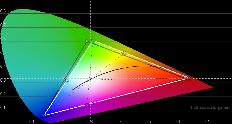
Color Triangle
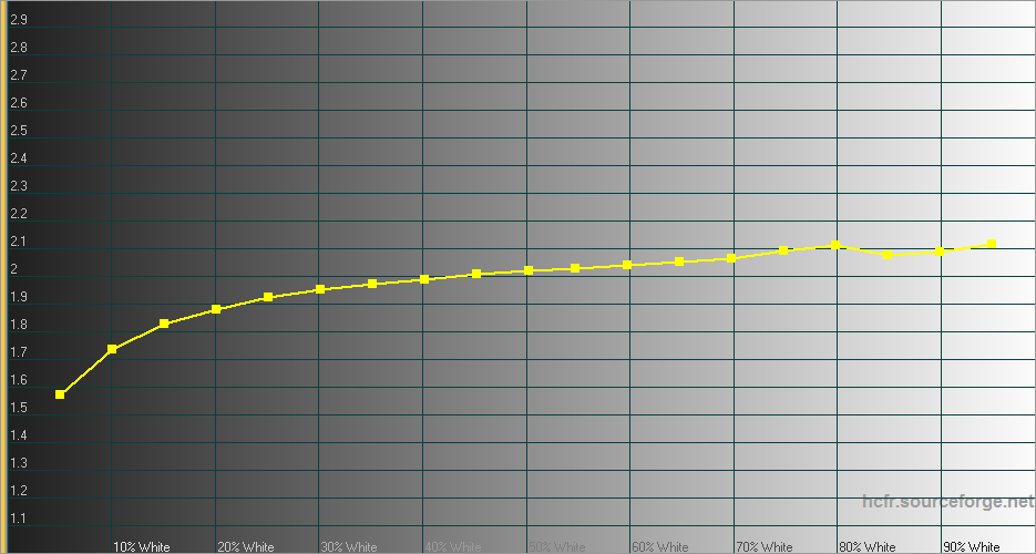
Gamma curve
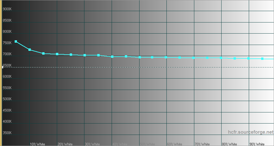
Color Temperature
Together they show how accurately the monitor reproduces colors. I want to note right away that “for sure” is a very loose concept. Firstly, “exactly” depends on what we take as a reference point. If you take the widespread color gamut sRGB (which runs the entire Web-design and 99% of the rest of the technology), the results will be the same. If we consider AdobeRGB, here you will find an unpleasant surprise - this color space is rarely used (mainly with expensive printing), and in everyday use on Windows you will get a nightmare on Elm Street (red faces) in all applications that do not know how to work with AdobeRGB
Secondly, “exactly” depends on the signal source. If your monitor can display 8 or 10 bits per channel, and the signal source, for example, 6-bit, by itself, accuracy will suffer. However, now the market situation is usually the opposite - many monitors have a 6-bit matrix with the FCR (Frame Rate Control) function, which shows two “intermediate” frames in order to get the required eight-bit color.
To buy a “home” monitor that copes relatively well with all tasks: working with amateur-level graphics, toys, movies and everyday use, attention should be paid to the following characteristics.
By itself, the contrast ratio characterizes the maximum ratio of the brightest and darkest of the shades displayed by the monitor. It is considered simple: they take an indicator of the brightness of the brightest (i.e. white) and the darkest (black), divide one into another, and get some value, for example, 260: 1. Unfortunately, manufacturers are often tricky - they draw “dynamic” contrast on the boxes (black is measured at the minimum brightness of the backlight, and white is measured at the maximum), but we are interested in the static measured at a certain brightness. As a rule, measurements are made at 100% brightness or 66%, depending on the measurement technique.
Now briefly about the important. As is clear from the formula (max brightness / min brightness), you can achieve good contrast indicators in two ways: by increasing the numerator or by decreasing the denominator. It is much easier to install bright backlight LEDs than to put a high-quality matrix with deep black color. So if the monitor shows a decent 1200: 1, look at the maximum brightness: sitting in front of the panel with a brightness of 400-500 nits is a dubious pleasure.

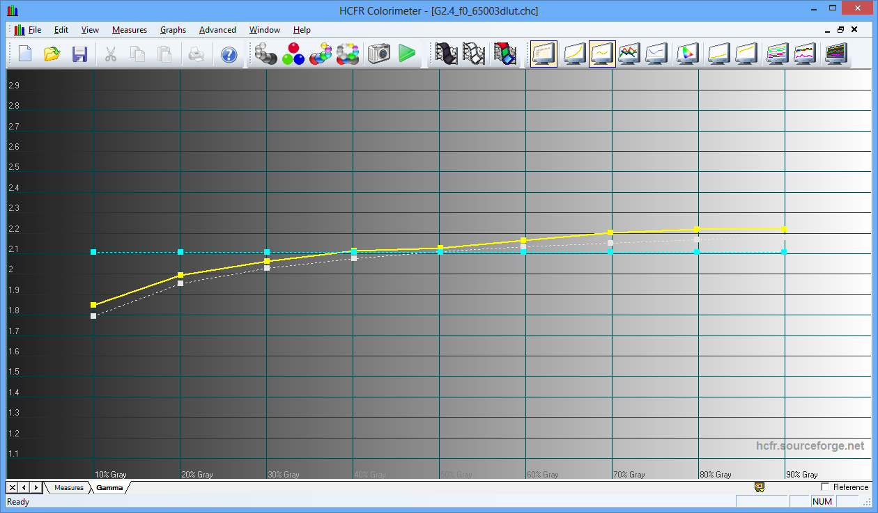
The fact that such a gamma correction is well described on the cambridge in color website, just do not add or subtract. For LCD displays, the gamma curve is set by the manufacturer in the built-in calibration table, and, often, can be changed in the settings between the given values. Nevertheless, the abstract values indicated in the menu can differ quite a lot from the “reference” ones due to certain limitations: both technological and marketing. The most interesting for the user is not so much “ideal” 2.2 (you can also live with 2.4 and 2.1), but the maximum closeness of the measured curve to the “reference” one: this will make sure that the monitor does not distort colors and does not change the image contrast depending from the brightness of certain sections. Here is an example of a not perfect, but not bad gamma curve:
“Triangulated” is loved by many manufacturers, but, unfortunately, the “triangle” itself is of little use, because Displays color gamut only at maximum brightness. The real color space looks like a complex three-dimensional figure:
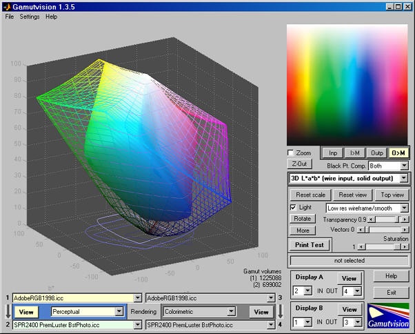
Few reviews compare full coverage at all brightnesses, and only a part of the color gamut can be estimated from a simple “triangle”. However, this information is not 100% useless. If the color gamut is close to sRGB and the “triangle” of the monitor is not much distorted relative to the standard, then everything is more or less good. If one of the peaks strongly protrudes relative to the others, and the shape of the triangle is far from sRGB - the device will obviously “lure” towards the bulging peak.
The standard indicator of color temperature(the so-called "daylight") is considered 6500 Kelvin. Values greater than 6500 cause the monitor to “chill” (that is, go blue), values less than 6500 - the monitor “warms” colors, showing instead of white and gray shades yellowish and then orange shades. Color temperature is easy to fix, the most interesting for you. as for the user - uniformity of color temperature. If in the “shadows” you have 8000K, in the middle segment - 6500K, and in light shades - 5000K, then the “average”, of course, 6500K. The trouble is that working with such a monitor is quite difficult, so the main thing is the uniformity of the color temperature - even if it is slightly overestimated or underestimated, but it’s more or less the same throughout the coverage. This also includes the uniformity of color temperature over the field of the matrix.
Often in a review it may be written that a number of indicators can be improved by resorting to calibration. Color rendering can be done in two places: on the monitor itself and on the video card. The display settings are preferred. In professional and expensive models, the so-called LUT (correction table) has 10 or 12 digits for each of the adjustable values, and calibration allows you to most accurately and without any problems adjust the monitor. LUT video cards are usually eight-bit, which means that you have only 255 values, and strong adjustments will lead to a significant reduction in the number of colors displayed.
There is another important point. Correction can be made only with a colorimeter or a photo spectrometer. We use ColorMunki Photowhose price tag as a whole is quite far from humane, especially if you choose a monitor with a modest budget. The most inexpensive and adequate option - ColorMunki Smile - costs about eight and a half thousand rubles. Perhaps there are models on the market that, when calibrated, become much better than their competitors, who have a price tag of 8,500 rubles more, but experience suggests that this is possible only in the professional segment. And there, people usually already have colorimeters, and a clear understanding of what they need and + - 10,000 rubles do not play a special role.
Calibrating the monitor allows you to “pull” it to the level of reliably reproducible colors, but requires special equipment and a clear understanding of what you are doing and why. In the case of buying a "just universal monitor for the home" it is better to pay attention to models with good factory settings than to take a "potentially good" monitor for fine-tuning.
In addition to color gamut and monitor characteristics, you should pay attention to how the backlight is implemented. Its unevenness is usually well shown, and if the review does not say anything very bad about it, in general you can “score” and not take a steam bath on this topic. It is better to pay attention to the PWM characteristic: there are still models that unpleasantly “flicker” with a backlight at a certain brightness, which is why their eyes get tired, and it can be difficult to adjust a comfortable backlight level. Ideally, full Flicker Free highlighting.

We hope these tips will help you adequately assess the characteristics of monitors and choose the right hardware . Remember that the monitor directly affects your vision, so it’s definitely not worth it to be irresponsible to the choice. Ask questions, we will try to answer everything. :)
Technology
Any kind of matrix can be inside the monitor, at least TN, at least IPS with any letters before and after (such as AH-IPS), at least PLS or any combination of * VA (PVA, AMVA, MVA). The essence remains approximately the same: each image point consists of three subpixels: red, green and blue. The type of matrix depends on how the “gates” of liquid crystals are located and how they are controlled, and at the same time its characteristics. We will not go into these details now, otherwise the article can be read by tomorrow. In a nutshell: the TN matrix has the highest “switching” speed from one state to another, but there are problems with both completely “turning off” the transmission of light and the accuracy of crystal rotation. IPS has solved these problems, but the matrix uses much more complex and expensive structures, and for control it is necessary to use higher voltages, because of which IPS wins in picture quality, but it works much slower than TN. * VA - a kind of compromise between speed and color accuracy. * VA-matrices have excellent black color, rather high response speed, but, unfortunately, there are some limitations in the field of horizontal viewing angles.
Graphs and specifications
When you look at any monitor review (take, for example, our review of the "frameless" Eizo), it usually encounters several characteristic pictures:
Color Triangle
Gamma curve
Color Temperature
Together they show how accurately the monitor reproduces colors. I want to note right away that “for sure” is a very loose concept. Firstly, “exactly” depends on what we take as a reference point. If you take the widespread color gamut sRGB (which runs the entire Web-design and 99% of the rest of the technology), the results will be the same. If we consider AdobeRGB, here you will find an unpleasant surprise - this color space is rarely used (mainly with expensive printing), and in everyday use on Windows you will get a nightmare on Elm Street (red faces) in all applications that do not know how to work with AdobeRGB
Secondly, “exactly” depends on the signal source. If your monitor can display 8 or 10 bits per channel, and the signal source, for example, 6-bit, by itself, accuracy will suffer. However, now the market situation is usually the opposite - many monitors have a 6-bit matrix with the FCR (Frame Rate Control) function, which shows two “intermediate” frames in order to get the required eight-bit color.
To buy a “home” monitor that copes relatively well with all tasks: working with amateur-level graphics, toys, movies and everyday use, attention should be paid to the following characteristics.
Contrast ratio and how it is achieved
By itself, the contrast ratio characterizes the maximum ratio of the brightest and darkest of the shades displayed by the monitor. It is considered simple: they take an indicator of the brightness of the brightest (i.e. white) and the darkest (black), divide one into another, and get some value, for example, 260: 1. Unfortunately, manufacturers are often tricky - they draw “dynamic” contrast on the boxes (black is measured at the minimum brightness of the backlight, and white is measured at the maximum), but we are interested in the static measured at a certain brightness. As a rule, measurements are made at 100% brightness or 66%, depending on the measurement technique.
Now briefly about the important. As is clear from the formula (max brightness / min brightness), you can achieve good contrast indicators in two ways: by increasing the numerator or by decreasing the denominator. It is much easier to install bright backlight LEDs than to put a high-quality matrix with deep black color. So if the monitor shows a decent 1200: 1, look at the maximum brightness: sitting in front of the panel with a brightness of 400-500 nits is a dubious pleasure.
A normal value is about 220-250 nits and a contrast ratio of about 800-1000: 1.
Gamma curve
The fact that such a gamma correction is well described on the cambridge in color website, just do not add or subtract. For LCD displays, the gamma curve is set by the manufacturer in the built-in calibration table, and, often, can be changed in the settings between the given values. Nevertheless, the abstract values indicated in the menu can differ quite a lot from the “reference” ones due to certain limitations: both technological and marketing. The most interesting for the user is not so much “ideal” 2.2 (you can also live with 2.4 and 2.1), but the maximum closeness of the measured curve to the “reference” one: this will make sure that the monitor does not distort colors and does not change the image contrast depending from the brightness of certain sections. Here is an example of a not perfect, but not bad gamma curve:
Gamma coefficient should ideally be 2.2, small changes are allowed both in that and in the other direction. The main thing is that the gamma curve does not differ from the reference, especially in the "middle" curve - where the greatest number of "working" shades of the monitor is located.
Color gamut
“Triangulated” is loved by many manufacturers, but, unfortunately, the “triangle” itself is of little use, because Displays color gamut only at maximum brightness. The real color space looks like a complex three-dimensional figure:
Few reviews compare full coverage at all brightnesses, and only a part of the color gamut can be estimated from a simple “triangle”. However, this information is not 100% useless. If the color gamut is close to sRGB and the “triangle” of the monitor is not much distorted relative to the standard, then everything is more or less good. If one of the peaks strongly protrudes relative to the others, and the shape of the triangle is far from sRGB - the device will obviously “lure” towards the bulging peak.
The color gamut that best matches sRGB is good. At the same time, 85% and 80% of coverage is not a crime, it is important to understand that the “triangle” should resemble the reference one as much as possible, then there will be no problems with color distortion. Ideally, the review should show a three-dimensional color gamut, but few people bother with such measurements.
Colour temperature
The standard indicator of color temperature(the so-called "daylight") is considered 6500 Kelvin. Values greater than 6500 cause the monitor to “chill” (that is, go blue), values less than 6500 - the monitor “warms” colors, showing instead of white and gray shades yellowish and then orange shades. Color temperature is easy to fix, the most interesting for you. as for the user - uniformity of color temperature. If in the “shadows” you have 8000K, in the middle segment - 6500K, and in light shades - 5000K, then the “average”, of course, 6500K. The trouble is that working with such a monitor is quite difficult, so the main thing is the uniformity of the color temperature - even if it is slightly overestimated or underestimated, but it’s more or less the same throughout the coverage. This also includes the uniformity of color temperature over the field of the matrix.
The uniformity of color temperature is more important than its numerical value. You can correct the temperature, but the unevenness is very difficult.
Calibration and Setup
Often in a review it may be written that a number of indicators can be improved by resorting to calibration. Color rendering can be done in two places: on the monitor itself and on the video card. The display settings are preferred. In professional and expensive models, the so-called LUT (correction table) has 10 or 12 digits for each of the adjustable values, and calibration allows you to most accurately and without any problems adjust the monitor. LUT video cards are usually eight-bit, which means that you have only 255 values, and strong adjustments will lead to a significant reduction in the number of colors displayed.
There is another important point. Correction can be made only with a colorimeter or a photo spectrometer. We use ColorMunki Photowhose price tag as a whole is quite far from humane, especially if you choose a monitor with a modest budget. The most inexpensive and adequate option - ColorMunki Smile - costs about eight and a half thousand rubles. Perhaps there are models on the market that, when calibrated, become much better than their competitors, who have a price tag of 8,500 rubles more, but experience suggests that this is possible only in the professional segment. And there, people usually already have colorimeters, and a clear understanding of what they need and + - 10,000 rubles do not play a special role.
Calibrating the monitor allows you to “pull” it to the level of reliably reproducible colors, but requires special equipment and a clear understanding of what you are doing and why. In the case of buying a "just universal monitor for the home" it is better to pay attention to models with good factory settings than to take a "potentially good" monitor for fine-tuning.
Important Features
In addition to color gamut and monitor characteristics, you should pay attention to how the backlight is implemented. Its unevenness is usually well shown, and if the review does not say anything very bad about it, in general you can “score” and not take a steam bath on this topic. It is better to pay attention to the PWM characteristic: there are still models that unpleasantly “flicker” with a backlight at a certain brightness, which is why their eyes get tired, and it can be difficult to adjust a comfortable backlight level. Ideally, full Flicker Free highlighting.
Conclusion
We hope these tips will help you adequately assess the characteristics of monitors and choose the right hardware . Remember that the monitor directly affects your vision, so it’s definitely not worth it to be irresponsible to the choice. Ask questions, we will try to answer everything. :)