Non-linear and interactive presentations
Presentations are perhaps the most popular form of visualization of communications in life. Presentations are not disdained by students or top management. And the most common format is a slide, and a slide after it.
Let's look at creating presentations from the creative and professional.
1. Classical amateur presentation - a person who is far from design, understanding the psychology of perception and technical means sculpts everything that seems appropriate to him. It turns out something like this:

Here you are waiting for a rip-eye colors, shadows, gradients, cliparts, a ton of text on the entire slide, poor formatting, inappropriate seals.
2. Classic and quite professional presentation- its creator already better understands what's what, uses templates, readable fonts, adds animations, transitions between slides.

PowerPoint (hereinafter: PP) is replete with examples of such presentations in the form of templates. So you don’t really have to bother here. In general, it is already pleasant to watch such a presentation, but boring.
3. Therefore, sophisticated amateurs to amaze their audience will seek new tools for creating presentations. And in this paragraph there is already less sense, but more emotions. A non-standard presentation ... once this wanted to please us with the same software in 2010 with "streaming" animation, but it was somehow forgotten. Here is the old video:
Prezi is sitting on the palm of non-standard presentations, with their completely different concept - now the canvas is instead of slides:
Effectively, fresh.
By the way, once a long time ago in a day I made a similar engine on .NET and WPF under Windows:
Moreover, there are few options than bothering with PP or Prezi. There are editors for launching in the browser and desktop versions, but a fundamentally revolutionary minimum in them. Let's not be upset - there is still something to say on this topic.
The described cases of presentations are united by one common property - they are linear . Whether it is a slide or a smooth transition with a zoom like in Prezi, but we still linearly move from point to point.
But what about life when a presentation goes along with a lively discussion and you need to move from slide to slide from different parts of the document? Or if the content of the presentation is so structurally confused that it is difficult to combine into a linear structure?
There are non-linear presentations for this .

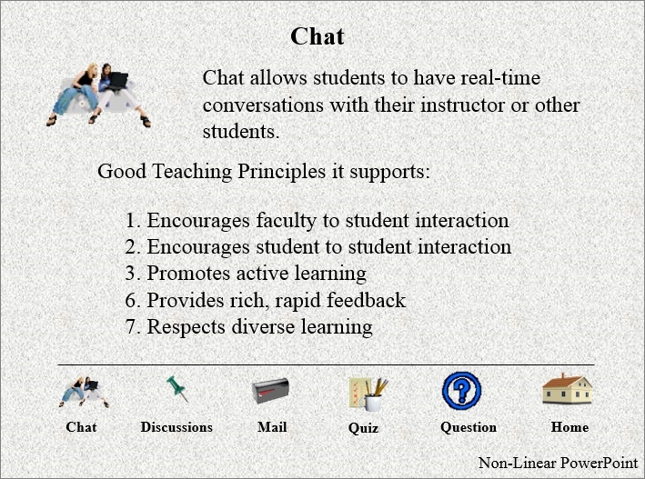
Here in the PP below added a semblance of a menu that switches slides. Simple and already effective.
But if you want something more, so that it is non-linear, and with animation, and beautiful - for this I created the InForm software.
This product as a program may seem a little strange - there is no editor, not even a window. The application launches in full screen. Instead of the slide editor, you are invited to use Photoshop or similar editors in which pictures of the content are drawn. These pictures then simply drop into the program folder and magically appear on the screen in a single interface of interactive non-linear presentation .
To understand the essence, it is better to just watch the video:
This is demo content. And this is an example with already real content:
And another alternative look at creating a presentation is again slides , but in parallax and with active areas :
Such a presentation is partially non-linear and completely interactive. Slides are created according to the same principle as in the previous case - we draw separately.
A separate item is the presentation for a couple of millions :
In this case, everything will be done for you - animation, video, non-linearity, interactivity and control from a huge tac-screen.
If you missed any other unusual means for creating presentations - please write in the comments.
Let's look at creating presentations from the creative and professional.
1. Classical amateur presentation - a person who is far from design, understanding the psychology of perception and technical means sculpts everything that seems appropriate to him. It turns out something like this:

Here you are waiting for a rip-eye colors, shadows, gradients, cliparts, a ton of text on the entire slide, poor formatting, inappropriate seals.
2. Classic and quite professional presentation- its creator already better understands what's what, uses templates, readable fonts, adds animations, transitions between slides.

PowerPoint (hereinafter: PP) is replete with examples of such presentations in the form of templates. So you don’t really have to bother here. In general, it is already pleasant to watch such a presentation, but boring.
3. Therefore, sophisticated amateurs to amaze their audience will seek new tools for creating presentations. And in this paragraph there is already less sense, but more emotions. A non-standard presentation ... once this wanted to please us with the same software in 2010 with "streaming" animation, but it was somehow forgotten. Here is the old video:
Prezi is sitting on the palm of non-standard presentations, with their completely different concept - now the canvas is instead of slides:
Effectively, fresh.
By the way, once a long time ago in a day I made a similar engine on .NET and WPF under Windows:
Moreover, there are few options than bothering with PP or Prezi. There are editors for launching in the browser and desktop versions, but a fundamentally revolutionary minimum in them. Let's not be upset - there is still something to say on this topic.
The described cases of presentations are united by one common property - they are linear . Whether it is a slide or a smooth transition with a zoom like in Prezi, but we still linearly move from point to point.
But what about life when a presentation goes along with a lively discussion and you need to move from slide to slide from different parts of the document? Or if the content of the presentation is so structurally confused that it is difficult to combine into a linear structure?
There are non-linear presentations for this .

Here in the PP below added a semblance of a menu that switches slides. Simple and already effective.
But if you want something more, so that it is non-linear, and with animation, and beautiful - for this I created the InForm software.
This product as a program may seem a little strange - there is no editor, not even a window. The application launches in full screen. Instead of the slide editor, you are invited to use Photoshop or similar editors in which pictures of the content are drawn. These pictures then simply drop into the program folder and magically appear on the screen in a single interface of interactive non-linear presentation .
To understand the essence, it is better to just watch the video:
This is demo content. And this is an example with already real content:
And another alternative look at creating a presentation is again slides , but in parallax and with active areas :
Such a presentation is partially non-linear and completely interactive. Slides are created according to the same principle as in the previous case - we draw separately.
A separate item is the presentation for a couple of millions :
In this case, everything will be done for you - animation, video, non-linearity, interactivity and control from a huge tac-screen.
If you missed any other unusual means for creating presentations - please write in the comments.
