Kobo Aura One E-Book Reader
My wife has been using the PocketBook (PB) 301 reader for almost 7 years now. Over the past few years, I have been tracking promising replacement candidates in specialized forums. The main requirement for such devices is an extremely high-quality screen.
I myself have long been reading from the monitor (on the road - from the tablet in "night" mode), but my wife flatly refuses to read it. Trying to give (successful, fortunately) to her PB 301 cost me a bunch of gray hair. True, after about a month of use, many thanks began. Which do not stop until now. Thanks are mainly due to the fact that thousands of thousands of books can be poured onto a small gadget.
RV is still working, although the battery has been holding a charge not for several weeks (almost a month), but for 3-4 days (with a new one still to be searched). But - most importantly - I was interested in real progress in the quality and size of screens such as E-Inc.
As you know, after the first generation of such screens, there was a second (Pearl), and then a third (Carta). But the screens remained either small (standard 6 inches) or low resolution. More often both. Those. Replacement PB 301 was not visible.
A breakthrough - from my point of view - was the appearance of the Kobo Aura One reader. I will give formal characteristics:
Screen
As mentioned above, it is 1.8 inches larger than the standard 6 and at the same time is characterized by high resolution.
I will illustrate with photographs.
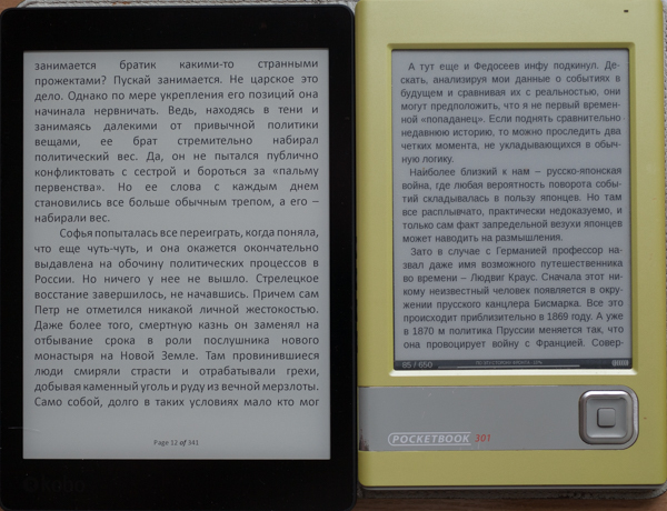
This is a comparison of Cobo with the PB301 without the backlight turned on on the first reader.
And this is with the backlight turned on (7%) on the left reader:
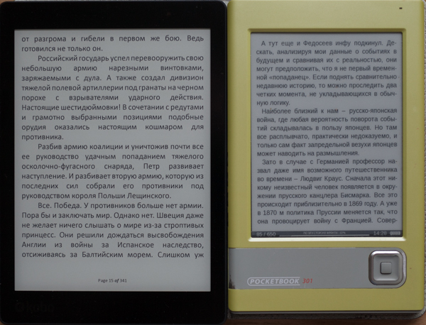
Even a small backlight (in conditions of sufficient light) improves the contrast, the substrate becomes not grayish, but white). Kobo is a frame of the screen through a macro lens:
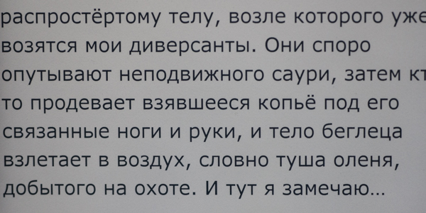
Ie almost typographic text without any stretch. This is a PB301 frame using the same technique: The
steps are clearly visible on the curves. Different fonts are displayed on devices, on Kobo custom, on RV - pre-installed, so the letter sizes are different.
A useful feature is the presence of backlight. At first, I was dismissive of this option, as believed that it was for fans to read in the dark (I'm not interested). Only later I saw how much better the screen of a reader with a low (3-7%) backlight level looks.
The backlight on Kobo is implemented a little crookedly, here is a photo:
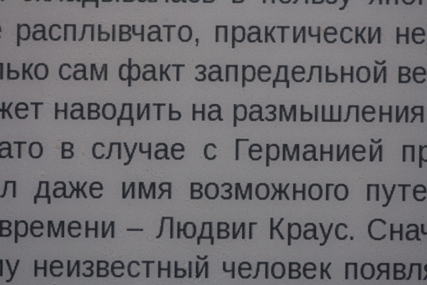
It is clear that nothing is noticeable at low levels. But at 50% and above, uneven color temperature is clearly visible. The figure in green numbers shows the specific values in the respective areas. Those. the warmest BB above, the lower it is, the colder it is.
Unfortunately, this is not a feature of my copy, this phenomenon is discussed on the network (including in the review on youtube). I repeat, in order to notice this, the backlight level should be tens of percent. Then, people who constantly read high-quality reviews of monitors know that this is a common thing even on very decent models.
A special feature of this particular model is the manufacturer calls the ability to adjust the color temperature of the backlight. In principle, it works well, here is a photo:
The figure shows the backlight control panel (brightness and temperature). Both parameters can be adjusted automatically (Auto). In this case, for clarity and ease of shooting in the dark, the brightness is set to 100%, and the temperature is the “coldest”. It can be seen that this is 4950 K.
The temperature controller in the middle position:
The temperature is really “warmer”, 3650 K. The regulator is in the rightmost position: It is
really “warm”, as much as 2000 K (which roughly corresponds to the light of a candle).
Separately, I note that the brightness adjustment is better implemented: by clicking on the extreme icons, you can change it in increments of 1%. Temperature control works worse, you have to "drag" the circle on the scale with your finger, choosing the most comfortable temperature.
The book turns off by briefly pressing the blue button on the back of the case. At the same time, the screen takes on the following form:

It can be seen that the book is not turned off, but “sleeps”. You can continue reading from this mode after a few seconds.
Library
As you know, everyone wants to "monetize" everything. In his own favor, of course. The book is designed to receive content from its own bookstore by Kobo. You can use others. But the book is not designed for simple file downloads. She indulgently "allows."
After connecting to a computer (the cable is attached, the process runs smoothly, the battery is charging at the same time), the easiest way is to create the “books” folder in the root (there is a Linux version on the reader) (I remind you that the book is not Russified) and put books using any file manager there. For understanding and visibility of the file structure it is more convenient in folders. Unfortunately, the folder structure for the reader does not mean anything, he "does not see them."
This is not very good, but not fatal. First, even on a desktop computer using the powerful Caliber program it is not easy to search for something among 10,000 items. Especially if you don’t remember what you are looking for (title, author or other metadata). Therefore, in recent years I have been adding books in portions, I immediately destroy the bad ones, and I lay out the good ones using different Caliber tools (or plugins, of which there are many for this program).
I propose approximately the same strategy for the described book. Upload a little according to a certain principle (author, series, subject). The software allows you to create collections.
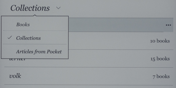
Those. you create a new collection, give it a meaningful name and put there those books that you consider necessary to be included in this collection. Obviously, one book can be included in several collections.
By default, the reader will show all the books:
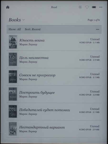
(its presentation can be changed using the "..." button). It is important that there are sorting options:
• Show (with several options, including according to the source of the file, that is, manually downloaded to disk can be separated from purchased on the network)
• Sort
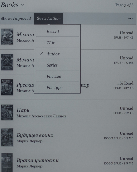
Unfortunately, the search by title and author is not It is especially useful for Russian-language books (for example, in the figure above it can be seen that sorting by authors in alphabetical order - but at the same time, “Michael” first, and only then “Marik”). However, some species are quite useful.
Those. if you don’t upload thousands of files to the book at once, it’s reasonable to group them into collections and use the sorting options, then you can work with a small (say, up to 1000 copies) library quite comfortably.
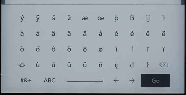
I’ll separately mention the promising Search field at the top of the screen (Search Kobo). Unfortunately, the on-screen keyboard opens, in which the Russian letters are not displayed correctly.
But the "ambush" is not even that, with the help of the patch you can make a normal Russian font.
The manufacturer implemented this search in his online bookstore (and not by the metadata of books uploaded to the reader). Those. I did not find any benefit from it.
Preparing fonts, files and reading settings.
It is easy to add new TTF fonts to the reader.. The fonts folder is created in the root, files with the ttf extension of those fonts that you like are put there. Personally, in recent years I got used to chopped fonts like Arial, Verdana and, especially, Calibri (although I used to love various "excesses" like Garamond or Palatino). I put them in this folder. Now, when you call the reading menu, you can select the desired font from the drop-down list. There are separate patches that, after installation, allow you to work with fonts even more flexibly.
File preparationThis is necessary because the most popular fb2 format in Russia in the reader, although it is supported, is not perfect: the file takes a long time to load, a little “strange” is displayed on the screen. You can read, but it is better, in my opinion, to switch to the ePub format, since the conversion is possible directly from Calibri. By the way, when working with this reader, it makes sense to install a couple of specialized plugins (you need to search for them using the word “Kobo”), as well as the “Modify ePub” plugin.
Then, when converting from fb2, it turns out not just ePub, but a specific version of Kobo ePub (sometimes abbreviated as kepub).
The figure shows that the first 4 books that I converted before installing the plugins are recognized as EPUB. And 2 books at the bottom of the list are already KOBO EPUB. These files open faster, display correctly, all the "chips" of the reader work.
Preparation for reading is reduced to calling the on-screen menu. In the reader settings, you can choose the most convenient version of this action for you.
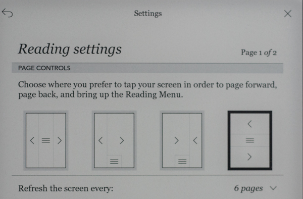
I chose the rightmost one (highlighted with a black frame). In this case, to go to the next page, just touch the screen in the lower third. In the middle part, clicking opens the menu. And to flip a page back, you need to touch the screen in the upper third.
Calling up the menu causes the toolbars to appear at the top and bottom.
From the top panel:
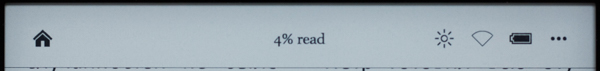
... you can return to the main page, see how much% of the book has been read, go to the backlight, Wi-Fi settings and advanced device settings (using the "..." button).
On the bottom panel:
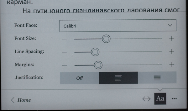
... you can return to the main page (Home button), go to the desired page or table of contents with the <--> button (a separate panel opens), call up the font and paragraph options panel.
We talked about customizing the font. In the previous figure, the corresponding settings panel is shown. You can choose a font based on the contents of the fonts folder (see above, the Calibri font is selected here). You can change the size of the font (there is a patch that allows you to do this with step 1). You can change line spacing and margins. There are many questions with the fields and, accordingly, there are different patches for every taste. I believe that the version of the manufacturer is fully functional and convenient. Aligning the paragraph “left” for some reason gives a more acceptable image than aligning it at both edges.
Thus, the settings for the backlight and font allow you to qualitatively personalize the reader interface.
Other settings The
reader has a built-in Wi-Fi module that works well. He is “sharpened” for 2 tasks: updating the program and accessing the Kobo online bookstore. If everything else can be done, then after the "dancing with a tambourine." The browser (by the way, it also has patches for it) formally works, but I constantly want to squeeze the gadget on the floor and forget about such “surfing”.
There is quite a lot of information on the network about the possibilities of modifying the device. Naturally, in its entirety, at your responsibility.
Conclusions
From the pros:
Of the minuses:
The conclusion I have is this. The perfectionist this gadget, most likely, will call "unfinished". For a person who likes to just read at home in his favorite chair and not really worry about his eyesight, this is one of the best devices on the market at the moment.
Separately, I will say about the price. I bought a reader in Italy last week at a bookstore (which is typical, the store’s logo appears as a splash screen when you turn on the book). The price is 229 euros, minus 27 euros of tax refund at the airport, total 12,500 rubles. at the rate of my bank It's not cheap. But RV 301 with a leather cover 7 years ago cost me, if I am not mistaken, 11,000 rubles (and the course was completely different). Secondly, the price in our retail is very frustrating. Those. 24,000 rubles for this gadget is a pity. And for 12,500 he is quite imagined.
I myself have long been reading from the monitor (on the road - from the tablet in "night" mode), but my wife flatly refuses to read it. Trying to give (successful, fortunately) to her PB 301 cost me a bunch of gray hair. True, after about a month of use, many thanks began. Which do not stop until now. Thanks are mainly due to the fact that thousands of thousands of books can be poured onto a small gadget.
RV is still working, although the battery has been holding a charge not for several weeks (almost a month), but for 3-4 days (with a new one still to be searched). But - most importantly - I was interested in real progress in the quality and size of screens such as E-Inc.
As you know, after the first generation of such screens, there was a second (Pearl), and then a third (Carta). But the screens remained either small (standard 6 inches) or low resolution. More often both. Those. Replacement PB 301 was not visible.
A breakthrough - from my point of view - was the appearance of the Kobo Aura One reader. I will give formal characteristics:
- Operating System : Linux
- Screen Type : E-Ink Carta HD
- Screen Size , inches: 7.8 "
- Screen Resolution : 1872 x 1404; 300 dpi
- Touch Screen : Yes (Capacitive)
- Built-in backlight : Yes, with color temperature adjustment
- Supported text formats : EPUB DRM, EPUB, PDF, TXT, HTML, RTF, PRC (MOBI)
- Supported image formats : JPEG, BMP, PNG, TIFF, GIF, CBZ, CBR
- Audio Support : No
- Built-in memory : 8 GB (6890 MB available to the user)
- Memory Card Support : No
- Bluetooth Support : No
- Wi-Fi Support : Yes
- Text-to-Speech Support : No
- Battery : up to 1 month
- Dimensions , mm (W x H x T): 195.1 x 138.5 x 6.9
- Weight : 230 g (weighted by me, exactly matches the manufacturer's data)
- Other : Ability to add custom fonts.
- Manufacturer Website : www.kobo.com
Screen
As mentioned above, it is 1.8 inches larger than the standard 6 and at the same time is characterized by high resolution.
I will illustrate with photographs.
This is a comparison of Cobo with the PB301 without the backlight turned on on the first reader.
And this is with the backlight turned on (7%) on the left reader:
Even a small backlight (in conditions of sufficient light) improves the contrast, the substrate becomes not grayish, but white). Kobo is a frame of the screen through a macro lens:
Ie almost typographic text without any stretch. This is a PB301 frame using the same technique: The
steps are clearly visible on the curves. Different fonts are displayed on devices, on Kobo custom, on RV - pre-installed, so the letter sizes are different.
A useful feature is the presence of backlight. At first, I was dismissive of this option, as believed that it was for fans to read in the dark (I'm not interested). Only later I saw how much better the screen of a reader with a low (3-7%) backlight level looks.
The backlight on Kobo is implemented a little crookedly, here is a photo:
It is clear that nothing is noticeable at low levels. But at 50% and above, uneven color temperature is clearly visible. The figure in green numbers shows the specific values in the respective areas. Those. the warmest BB above, the lower it is, the colder it is.
Unfortunately, this is not a feature of my copy, this phenomenon is discussed on the network (including in the review on youtube). I repeat, in order to notice this, the backlight level should be tens of percent. Then, people who constantly read high-quality reviews of monitors know that this is a common thing even on very decent models.
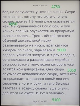
A special feature of this particular model is the manufacturer calls the ability to adjust the color temperature of the backlight. In principle, it works well, here is a photo:
The figure shows the backlight control panel (brightness and temperature). Both parameters can be adjusted automatically (Auto). In this case, for clarity and ease of shooting in the dark, the brightness is set to 100%, and the temperature is the “coldest”. It can be seen that this is 4950 K.
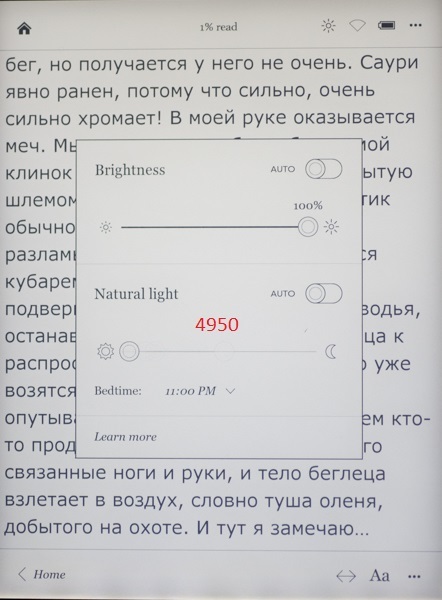
The temperature controller in the middle position:
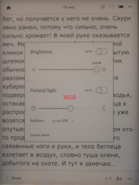
The temperature is really “warmer”, 3650 K. The regulator is in the rightmost position: It is
really “warm”, as much as 2000 K (which roughly corresponds to the light of a candle).
Separately, I note that the brightness adjustment is better implemented: by clicking on the extreme icons, you can change it in increments of 1%. Temperature control works worse, you have to "drag" the circle on the scale with your finger, choosing the most comfortable temperature.
The book turns off by briefly pressing the blue button on the back of the case. At the same time, the screen takes on the following form:
It can be seen that the book is not turned off, but “sleeps”. You can continue reading from this mode after a few seconds.
Library
As you know, everyone wants to "monetize" everything. In his own favor, of course. The book is designed to receive content from its own bookstore by Kobo. You can use others. But the book is not designed for simple file downloads. She indulgently "allows."
After connecting to a computer (the cable is attached, the process runs smoothly, the battery is charging at the same time), the easiest way is to create the “books” folder in the root (there is a Linux version on the reader) (I remind you that the book is not Russified) and put books using any file manager there. For understanding and visibility of the file structure it is more convenient in folders. Unfortunately, the folder structure for the reader does not mean anything, he "does not see them."
This is not very good, but not fatal. First, even on a desktop computer using the powerful Caliber program it is not easy to search for something among 10,000 items. Especially if you don’t remember what you are looking for (title, author or other metadata). Therefore, in recent years I have been adding books in portions, I immediately destroy the bad ones, and I lay out the good ones using different Caliber tools (or plugins, of which there are many for this program).
I propose approximately the same strategy for the described book. Upload a little according to a certain principle (author, series, subject). The software allows you to create collections.
Those. you create a new collection, give it a meaningful name and put there those books that you consider necessary to be included in this collection. Obviously, one book can be included in several collections.
By default, the reader will show all the books:
(its presentation can be changed using the "..." button). It is important that there are sorting options:
• Show (with several options, including according to the source of the file, that is, manually downloaded to disk can be separated from purchased on the network)
• Sort
Unfortunately, the search by title and author is not It is especially useful for Russian-language books (for example, in the figure above it can be seen that sorting by authors in alphabetical order - but at the same time, “Michael” first, and only then “Marik”). However, some species are quite useful.
Those. if you don’t upload thousands of files to the book at once, it’s reasonable to group them into collections and use the sorting options, then you can work with a small (say, up to 1000 copies) library quite comfortably.
I’ll separately mention the promising Search field at the top of the screen (Search Kobo). Unfortunately, the on-screen keyboard opens, in which the Russian letters are not displayed correctly.
But the "ambush" is not even that, with the help of the patch you can make a normal Russian font.
The manufacturer implemented this search in his online bookstore (and not by the metadata of books uploaded to the reader). Those. I did not find any benefit from it.
Preparing fonts, files and reading settings.
It is easy to add new TTF fonts to the reader.. The fonts folder is created in the root, files with the ttf extension of those fonts that you like are put there. Personally, in recent years I got used to chopped fonts like Arial, Verdana and, especially, Calibri (although I used to love various "excesses" like Garamond or Palatino). I put them in this folder. Now, when you call the reading menu, you can select the desired font from the drop-down list. There are separate patches that, after installation, allow you to work with fonts even more flexibly.
File preparationThis is necessary because the most popular fb2 format in Russia in the reader, although it is supported, is not perfect: the file takes a long time to load, a little “strange” is displayed on the screen. You can read, but it is better, in my opinion, to switch to the ePub format, since the conversion is possible directly from Calibri. By the way, when working with this reader, it makes sense to install a couple of specialized plugins (you need to search for them using the word “Kobo”), as well as the “Modify ePub” plugin.
Then, when converting from fb2, it turns out not just ePub, but a specific version of Kobo ePub (sometimes abbreviated as kepub).
The figure shows that the first 4 books that I converted before installing the plugins are recognized as EPUB. And 2 books at the bottom of the list are already KOBO EPUB. These files open faster, display correctly, all the "chips" of the reader work.
Preparation for reading is reduced to calling the on-screen menu. In the reader settings, you can choose the most convenient version of this action for you.
I chose the rightmost one (highlighted with a black frame). In this case, to go to the next page, just touch the screen in the lower third. In the middle part, clicking opens the menu. And to flip a page back, you need to touch the screen in the upper third.
Calling up the menu causes the toolbars to appear at the top and bottom.
From the top panel:
... you can return to the main page, see how much% of the book has been read, go to the backlight, Wi-Fi settings and advanced device settings (using the "..." button).
On the bottom panel:
... you can return to the main page (Home button), go to the desired page or table of contents with the <--> button (a separate panel opens), call up the font and paragraph options panel.
We talked about customizing the font. In the previous figure, the corresponding settings panel is shown. You can choose a font based on the contents of the fonts folder (see above, the Calibri font is selected here). You can change the size of the font (there is a patch that allows you to do this with step 1). You can change line spacing and margins. There are many questions with the fields and, accordingly, there are different patches for every taste. I believe that the version of the manufacturer is fully functional and convenient. Aligning the paragraph “left” for some reason gives a more acceptable image than aligning it at both edges.
Thus, the settings for the backlight and font allow you to qualitatively personalize the reader interface.
Other settings The
reader has a built-in Wi-Fi module that works well. He is “sharpened” for 2 tasks: updating the program and accessing the Kobo online bookstore. If everything else can be done, then after the "dancing with a tambourine." The browser (by the way, it also has patches for it) formally works, but I constantly want to squeeze the gadget on the floor and forget about such “surfing”.
There is quite a lot of information on the network about the possibilities of modifying the device. Naturally, in its entirety, at your responsibility.
Conclusions
From the pros:
- Great screen
- Quality manufacturing
- Well implemented backlight
- Enough built-in memory
- Enough personalization options
- Lightweight (230 grams versus 330 grams in PB 301 with a leather cover)
Of the minuses:
- "Roughness" firmware
- There is no way to add memory
- Using Linux instead of Android (in terms of access to Google Play)
- Insufficient library structuring capabilities
The conclusion I have is this. The perfectionist this gadget, most likely, will call "unfinished". For a person who likes to just read at home in his favorite chair and not really worry about his eyesight, this is one of the best devices on the market at the moment.
Separately, I will say about the price. I bought a reader in Italy last week at a bookstore (which is typical, the store’s logo appears as a splash screen when you turn on the book). The price is 229 euros, minus 27 euros of tax refund at the airport, total 12,500 rubles. at the rate of my bank It's not cheap. But RV 301 with a leather cover 7 years ago cost me, if I am not mistaken, 11,000 rubles (and the course was completely different). Secondly, the price in our retail is very frustrating. Those. 24,000 rubles for this gadget is a pity. And for 12,500 he is quite imagined.