React Part 8 Training Course: Continuing Work on a TODO Application, Introduction to Component Properties
- Transfer
- Tutorial
Today’s lessons on the React course we are translating are devoted to continuing to work on the TODO application and the properties of the components.
→ Part 1: course overview, reasons for the popularity of React, ReactDOM and JSX
→ Part 2: functional components
→ Part 3: component files, project structure
→ Part 4: parent and child components
→ Part 5: starting work on a TODO application, basics of styling
→ Part 6: about some features of the course, JSX and JavaScript
→ Part 7: inline styles
→ Part 8: continued work on a TODO application, familiarity with the properties of components
→

Part 9: properties of components
→ Part 10: workshop on working with properties of components and styling
→ Part 11: dynamic markup generation and the array method map
→ Part 12: workshop, third stage of working on a TODO application
→ Part 13: class-based components
→ Part 14: a workshop on class-based components, state of components
→ Part 15: workshops on working with the state of components
→ Part 16: fourth stage of working on a TODO application, event processing
→ Part 17: fifth stage of working on a TODO application, modification status Components
→Part 18: the sixth stage of working on a TODO application
→ Part 19: methods of component life cycle
→ Part 20: the first lesson on conditional rendering
→ Part 21: the second lesson and practice on conditional rendering
→ Part 22: the seventh stage of working on a TODO application, loading data from external sources
→ Part 23: first lesson on working with forms
→ Part 24: second lesson on working with forms
→ Part 25: practical work on working with forms
→ Part 26: application architecture, Container / Component pattern
→ Part 27: coursework project
→ Original
Here it is assumed that you continue to work on an application based on a standard project that is created by means
Let's create, in the same folder where this file is located, the file
This can be done later, when the time comes to use the component code
Pay attention to two things. First, this component returns two elements — so they are wrapped in an element
Now we go back to the file
As a result, the page that the application generates will look like the one below.
Appearance of the application in the browser
Actually, its appearance, in comparison with the previous version, has not changed, but the fact that the component is now used to form pairs of elements opens up great opportunities for us, which we will use later.
Now let's do the second task, styling the application using CSS classes. To do this, we will bring the component code
Here we assigned a class name to the element
Now let's include the CSS file
Add to the
This is how the application page will now look in the browser.
Appearance of the application in the browser
You can independently analyze and edit these styles.
If we talk about the features of the code used in styling, note that the keyword is used to assign classes to elements
Draft application in VSCode
If you experiment now with what we have done, it turns out that the checkboxes react to user input .

The checkboxes react to user input.
But at the same time, the application code knows nothing about the changes that occur with these flags. If the code is aware of what is happening in the application interface, this will allow us to organize its reaction to various events. For example, an item in the to-do list in which the checkbox is set, indicating that the corresponding task has been completed, can be somehow changed. We will talk about how to do this in the following classes.
→ Original
Let's talk about the concept of properties in React. Let's start with an example of the HTML code of a certain page:
As you can see, there is nothing related to React. Before us is the usual HTML markup. Note the three elements are present in the body of the page described by this markup:
The problem here is that all these elements do not perform their inherent functions. The link described by the tag
By editing the above code, we can bring it to the following form:
In this form, it is still not completely normal, but here we, at least, set values for some attributes of HTML elements, and designated places where you can enter values for some more attributes.
As a matter of fact, if you understand the concept of attributes of HTML elements described above, then you can easily understand the concept of properties of React components. Namely, we are talking about the fact that we, in React-applications, can use components of our own design, and not just standard HTML tags. When working with components, we can assign them properties that, when processed in components, can change their behavior. For example, such properties allow you to customize the appearance of components.
→ Original
Before we start talking about using properties in React, consider another conceptual concept. Take a look at the YouTube homepage.
YouTube homepage
I’m sure that React doesn’t use it on this page, since Google is developing the Angular framework, but the principles we’ll look at in this example are universal.
Think about how such a page could be built using React features. Perhaps the first thing you notice is that this page can be divided into fragments represented by independent components. For example, it is easy to see that the elements in which information about the video clips, highlighted in the figure below, are displayed, are very similar to each other.
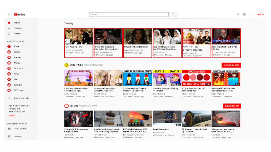
The YouTube homepage, elements that look like each other
If you look closely at these elements, it turns out that there is an image at the top of each of them, and that all these images are the same size. Each of these elements has a heading in bold and immediately below the image. Each element contains information about the number of views of the corresponding video, about the date of its publication. In the lower right corner of each image present on the element, there is information about the duration of the corresponding video clip.
It is quite clear that the one who created this page did not deal with something like copying, pasting and modifying code to represent each of the elements displayed on it. If such a page was created React means, it would be possible to imagine that the video cards are instances of a component, say
The above leads us to the idea that for the formation of such a page was developed a single component, which is a video clip card. At the same time, many instances of this component were displayed on the page, each of which displays unique data. That is, when developing such a component, it is necessary to foresee the possibility of changing certain properties, such as image URLs, affecting its appearance and behavior. As a matter of fact, our next lesson is devoted to this. But, before we get to it, I would like you to get comfortable with the idea of using components in React.
Recall the lesson in which we discussed parent and child components, and that components can form structures that have a large depth of nesting. For example, in our case, on the page you can select horizontal groups of video clip cards, which are probably located in this way with the help of some service component for displaying lists of items. These elements are video clip cards, which, in turn, display a certain number of other elements representing information about a particular clip.
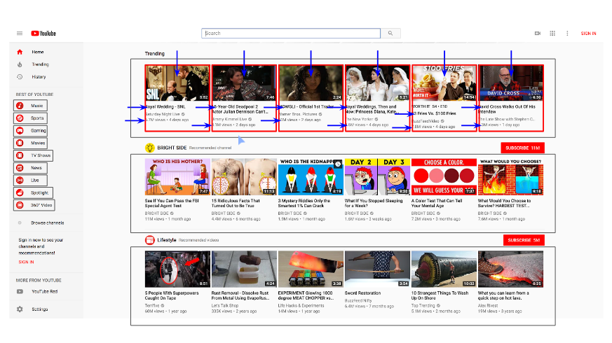
YouTube home page, parent and child components.
In addition, on the left side of the page you can see a vertical group of similar elements. Most likely, they are instances of the same component. In addition, each of them has its own image and text.
The fact that modern frameworks for developing web interfaces, such as React, Angular or Vue, allow creating a component once, reusing it, setting its properties, is one of the reasons for the popularity of these frameworks. This makes development much easier and faster.
In this lesson, we continued to work on the TODO application and discussed topics related to attributes of HTML elements and the idea of component reuse, leading us to work with the properties of React components. This is what we will do next time.
Dear readers! Do you understand the concept of component properties?

Part 9: properties of components
→ Part 10: workshop on working with properties of components and styling
→ Part 11: dynamic markup generation and the array method map
→ Part 12: workshop, third stage of working on a TODO application
→ Part 13: class-based components
→ Part 14: a workshop on class-based components, state of components
→ Part 15: workshops on working with the state of components
→ Part 16: fourth stage of working on a TODO application, event processing
→ Part 17: fifth stage of working on a TODO application, modification status Components
→Part 18: the sixth stage of working on a TODO application
→ Part 19: methods of component life cycle
→ Part 20: the first lesson on conditional rendering
→ Part 21: the second lesson and practice on conditional rendering
→ Part 22: the seventh stage of working on a TODO application, loading data from external sources
→ Part 23: first lesson on working with forms
→ Part 24: second lesson on working with forms
→ Part 25: practical work on working with forms
→ Part 26: application architecture, Container / Component pattern
→ Part 27: coursework project
Session 16. Workshop. TODO application. Stage 2
→ Original
▍Job
- By performing the previous workshop , you created a React-application, a component of
Appwhich displays a set of pairs of elements - flags (elements<input type="checkbox" />) and their descriptions (elements<p> </p>). Arrange the elements of this set as a separate component -<TodoItem />and use it to form a list in the componentApp. In this case, do not pay attention to the fact that all the elements of this list will look the same (later we will talk about how to fill them with different data). - Stylize the page as you like, using CSS files, inline styles, or a combination of these methods to style React applications.
▍Decision
Here it is assumed that you continue to work on an application based on a standard project that is created by means
create-react-app. This is how the component code was Appbefore the task was completed.import React from"react"functionApp() {
return (
<div>
<input type="checkbox" />
<p>Placeholder text here</p>
<input type="checkbox" />
<p>Placeholder text here</p>
<input type="checkbox" />
<p>Placeholder text here</p>
<input type="checkbox" />
<p>Placeholder text here</p>
</div>
)
}
export default AppLet's create, in the same folder where this file is located, the file
TodoItem.jsin which the component code will be stored TodoItem. Now import this file into the file with the App.jsfollowing command:import TodoItem from"./TodoItem"This can be done later, when the time comes to use the component code
TodoItem(not yet written). This code, we now do. This is how it will be:import React from"react"functionTodoItem() {
return (
<div>
<inputtype="checkbox" />
<p>Placeholder text here</p>
</div>
)
}
export default TodoItemPay attention to two things. First, this component returns two elements — so they are wrapped in an element
<div>. Secondly, what it returns is a copy of one of the pairs of checkbox / description elements from a file App.js. Now we go back to the file
App.jsand, instead of the checkbox / description pairs, use the component instances in the markup returned to them TodoItem:import React from"react"import TodoItem from"./TodoItem"functionApp() {
return (
<div>
<TodoItem />
<TodoItem />
<TodoItem />
<TodoItem />
</div>
)
}
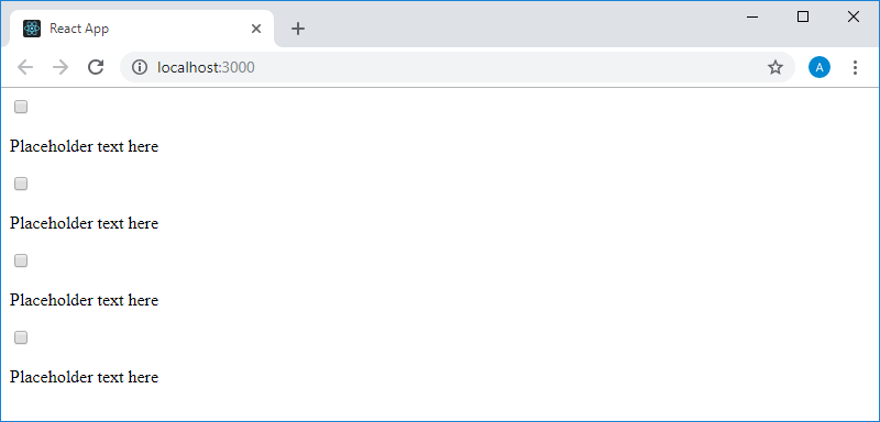
exportdefault AppAs a result, the page that the application generates will look like the one below.
Appearance of the application in the browser
Actually, its appearance, in comparison with the previous version, has not changed, but the fact that the component is now used to form pairs of elements opens up great opportunities for us, which we will use later.
Now let's do the second task, styling the application using CSS classes. To do this, we will bring the component code
Appto the following form:import React from"react"import TodoItem from"./TodoItem"functionApp() {
return (
<divclassName="todo-list">
<TodoItem />
<TodoItem />
<TodoItem />
<TodoItem />
</div>
)
}
exportdefault AppHere we assigned a class name to the element
<div>. Similarly, let's work with the component code TodoItem:import React from"react"functionTodoItem(){
return (
<divclassName="todo-item">
<inputtype="checkbox" />
<p>Placeholder text here</p>
</div>
)
}
export default TodoItemNow let's include the CSS file
index.cssthat already exists in the project, as it was created using the tools create-react-appin the file index.js:import React from"react"import ReactDOM from"react-dom"import"./index.css"import App from"./App"
ReactDOM.render(
<App />,
document.getElementById("root")
)Add to the
index.cssfollowing style description:body {
background-color: whitesmoke;
}
.todo-list {
background-color: white;
margin: auto;
width: 50%;
display: flex;
flex-direction: column;
align-items: center;
border: 1px solid #efefef;
box-shadow:
/* The top layer shadow */
01px 1px rgba(0,0,0,0.15),
/* The second layer */
010px 0-5px #eee,
/* The second layer shadow */
010px 1px -4px rgba(0,0,0,0.15),
/* The third layer */
020px 0-10px #eee,
/* The third layer shadow */
020px 1px -9px rgba(0,0,0,0.15);
padding: 30px;
}
.todo-item {
display: flex;
justify-content: flex-start;
align-items: center;
padding: 30px 20px 0;
width: 70%;
border-bottom: 1px solid #cecece;
font-family: Roboto, sans-serif;
font-weight: 100;
font-size: 15px;
color: #333333;
}
input[type=checkbox] {
margin-right: 10px;
font-size: 30px;
}
input[type=checkbox]:focus {
outline: 0;
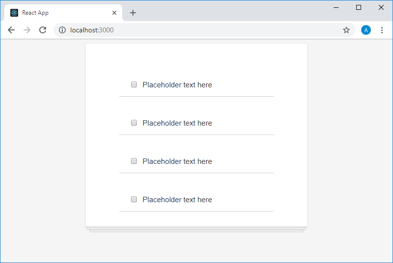
}This is how the application page will now look in the browser.
Appearance of the application in the browser
You can independently analyze and edit these styles.
If we talk about the features of the code used in styling, note that the keyword is used to assign classes to elements
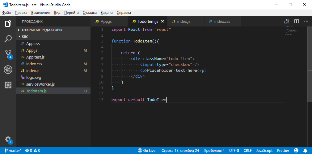
className, and that React supports inline styles. Here is how at this stage the project of our application in VSCode looks.Draft application in VSCode
If you experiment now with what we have done, it turns out that the checkboxes react to user input .
The checkboxes react to user input.
But at the same time, the application code knows nothing about the changes that occur with these flags. If the code is aware of what is happening in the application interface, this will allow us to organize its reaction to various events. For example, an item in the to-do list in which the checkbox is set, indicating that the corresponding task has been completed, can be somehow changed. We will talk about how to do this in the following classes.
Lesson 17. Properties, Part 1. Attributes of HTML elements
→ Original
Let's talk about the concept of properties in React. Let's start with an example of the HTML code of a certain page:
<html>
    <head></head>
    <body>
        <a>This is a link</a>
        <input />
        <img />
    </body>
</html>
As you can see, there is nothing related to React. Before us is the usual HTML markup. Note the three elements are present in the body of the page described by this markup:
<a>, <input />and <img />, and think about what is wrong with them. The problem here is that all these elements do not perform their inherent functions. The link described by the tag
<a>leads nowhere. This tag must be assigned an attribute (property) hrefthat contains a certain address that will be followed by a click on the link. The same problem is typical for the tag <img />from our example. No attribute assigned to itsrc, specifying an image, local, or accessible by the URL that will display this element. As a result, it turns out that to ensure the correct operation of the elements <a>, <img>it is necessary, respectively, to set their properties hrefand src. If we talk about an item <input>, he, without setting its attributes, will lead to a page input field, but in this form it is not usually used by adjusting its properties placeholder, name, type. The last property, for example, allows you to drastically change the appearance and behavior of an element <input>, turning it from a text entry field into a checkbox, into a radio button, or into a button to send a form. It should be noted that the terms “attribute” and “property” are used interchangeably here.By editing the above code, we can bring it to the following form:
<html>
    <head></head>
    <body>
        <ahref="https://google.com">This is a link</a>
        <input placeholder="First Name" name="" type=""/>
        <imgalign="center"src=""/>
    </body>
</html>
In this form, it is still not completely normal, but here we, at least, set values for some attributes of HTML elements, and designated places where you can enter values for some more attributes.
As a matter of fact, if you understand the concept of attributes of HTML elements described above, then you can easily understand the concept of properties of React components. Namely, we are talking about the fact that we, in React-applications, can use components of our own design, and not just standard HTML tags. When working with components, we can assign them properties that, when processed in components, can change their behavior. For example, such properties allow you to customize the appearance of components.
Lesson 18: Properties, Part 2. Reusable Components
→ Original
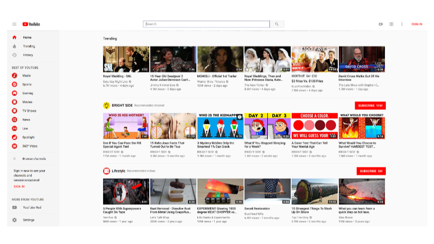
Before we start talking about using properties in React, consider another conceptual concept. Take a look at the YouTube homepage.
YouTube homepage
I’m sure that React doesn’t use it on this page, since Google is developing the Angular framework, but the principles we’ll look at in this example are universal.
Think about how such a page could be built using React features. Perhaps the first thing you notice is that this page can be divided into fragments represented by independent components. For example, it is easy to see that the elements in which information about the video clips, highlighted in the figure below, are displayed, are very similar to each other.
The YouTube homepage, elements that look like each other
If you look closely at these elements, it turns out that there is an image at the top of each of them, and that all these images are the same size. Each of these elements has a heading in bold and immediately below the image. Each element contains information about the number of views of the corresponding video, about the date of its publication. In the lower right corner of each image present on the element, there is information about the duration of the corresponding video clip.
It is quite clear that the one who created this page did not deal with something like copying, pasting and modifying code to represent each of the elements displayed on it. If such a page was created React means, it would be possible to imagine that the video cards are instances of a component, say
<VideoTile />. At the same time, such a component includes a number of other components, which are an image, a title, information about the clip duration, and other elements of a video clip card.The above leads us to the idea that for the formation of such a page was developed a single component, which is a video clip card. At the same time, many instances of this component were displayed on the page, each of which displays unique data. That is, when developing such a component, it is necessary to foresee the possibility of changing certain properties, such as image URLs, affecting its appearance and behavior. As a matter of fact, our next lesson is devoted to this. But, before we get to it, I would like you to get comfortable with the idea of using components in React.
Recall the lesson in which we discussed parent and child components, and that components can form structures that have a large depth of nesting. For example, in our case, on the page you can select horizontal groups of video clip cards, which are probably located in this way with the help of some service component for displaying lists of items. These elements are video clip cards, which, in turn, display a certain number of other elements representing information about a particular clip.
YouTube home page, parent and child components.
In addition, on the left side of the page you can see a vertical group of similar elements. Most likely, they are instances of the same component. In addition, each of them has its own image and text.
The fact that modern frameworks for developing web interfaces, such as React, Angular or Vue, allow creating a component once, reusing it, setting its properties, is one of the reasons for the popularity of these frameworks. This makes development much easier and faster.
Results
In this lesson, we continued to work on the TODO application and discussed topics related to attributes of HTML elements and the idea of component reuse, leading us to work with the properties of React components. This is what we will do next time.
Dear readers! Do you understand the concept of component properties?