Interfaces: how to tell the user if “Oops, something went wrong”
Here you will not see a single line of code. We will talk about ordinary people - about our users, more precisely, about how to inform them if some unforeseen situation arises in the system.
The article is based on a report by Antonina Khisametdinova from Heisenbug 2017 Moscow, which designs user interfaces in the Dog Pavlova company .
In addition, the Medium has a series of articles entitled “Design Guide for Errors” . The cycle has not yet been completed, but gives a more complete and complete picture on the topic of the article.
Time after time we design the main scenarios of a wide variety of services. In the case of an online store, the main one will be:
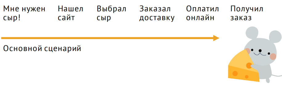
A person visits the site, selects a product, orders its delivery; pays and receives the order.
We are so focused on the main scenarios that we forget one very important thing: there are alternative scenarios and thousands of ways how the main scenario can be interrupted.
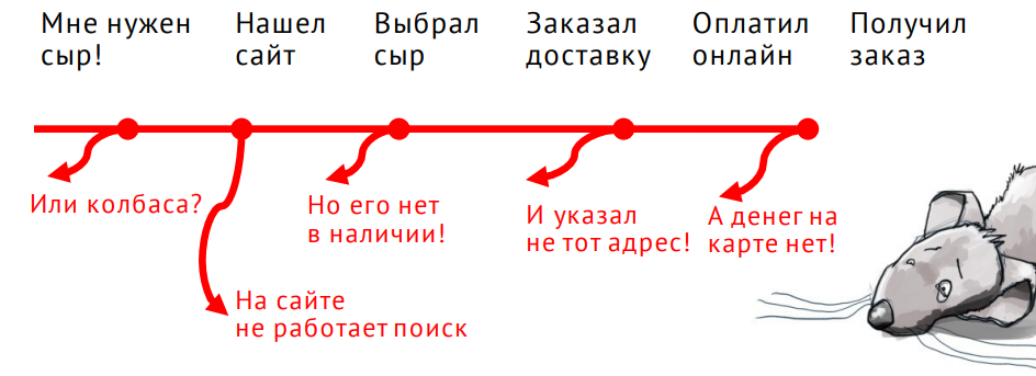
All of these are erroneous scenarios that arise when something goes wrong.
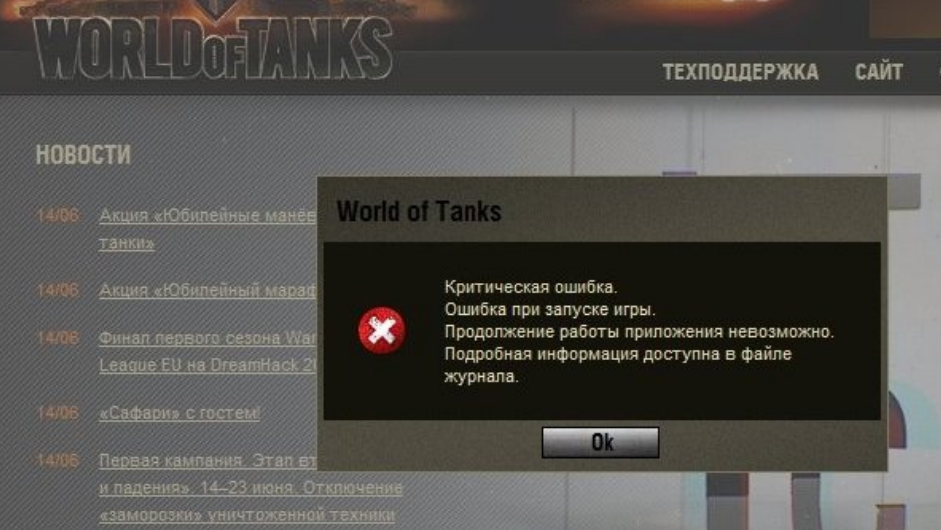
Product teams often do not pay enough attention to such scenarios. For example, a very typical story: “Something went wrong. We have problems, so just close this message. "

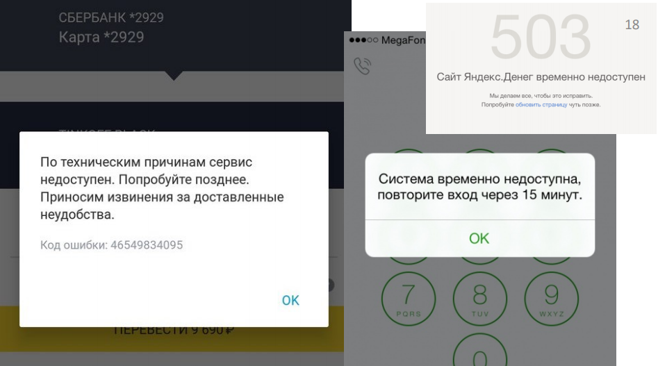
Another example: “We have a mistake. Please try again later. ”:
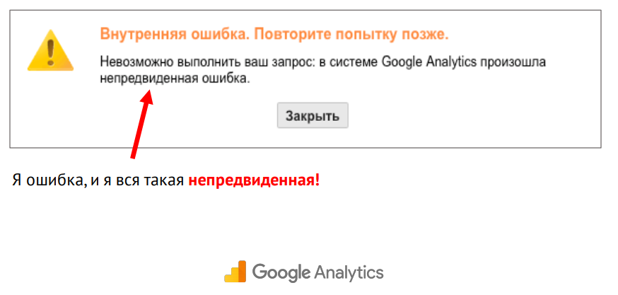
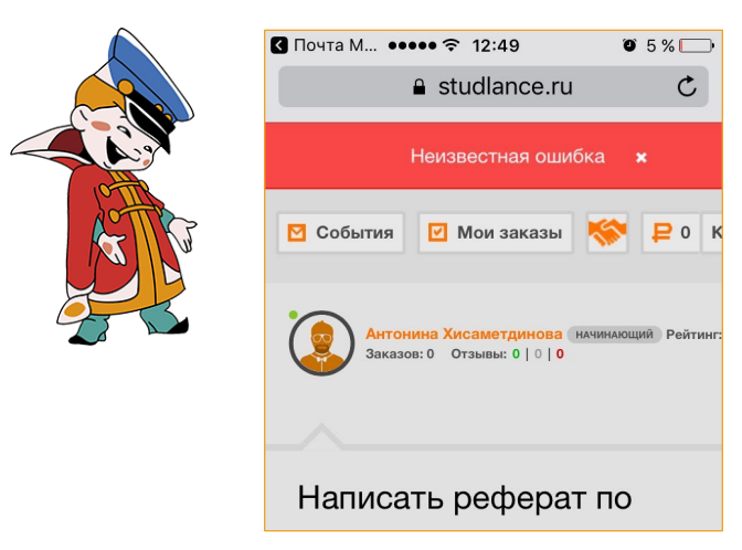
And another category of errors is my favorite: unknown errors.
It is very difficult to justify business the need to work out erroneous scenarios. Why should we go back and fix something when we have new features ahead? But I have four iron arguments that will help demonstrate to your product owner or business the need for such work.
The slide shows some numbers from one of our customers. This is the number of user calls to tech support per month. Calls are connected with problems of a certain kind:
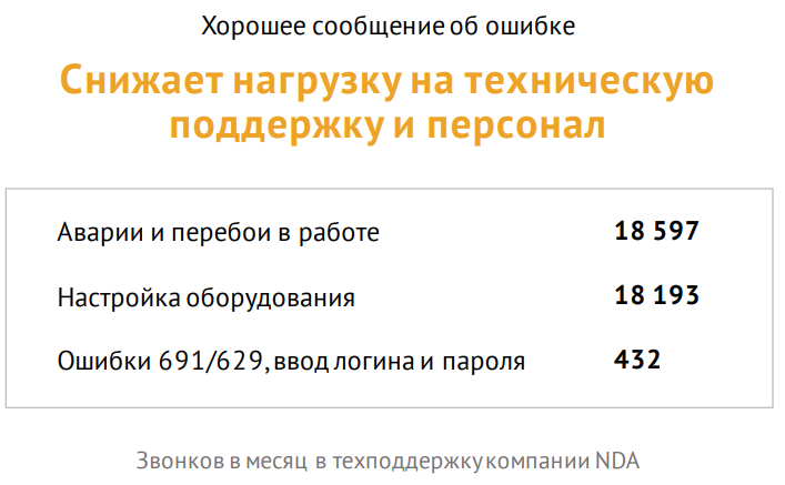
Please note that 400 people call a month simply because they cannot log in or correctly enter their login / password in the appropriate form on the site.
If the error message is correctly composed, it returns it to the main scenario, even if a session break occurs.

You may not even need to create onboarding or some training videos, the development of which, incidentally, also costs decent money.

This is the last but not least argument.

In general, the topic of trust "man-technology" has been investigated for a long time. Now we already have enough trust in technology. For example, we will never double-check whether the messenger sent a message to the addressee, or how the calculator added or multiplied three-digit numbers (unfortunately, not all services can boast such a level of trust as calculators).
We trust our lives with dozens of different types of software, flying in airplanes. But this trust is very easy to destroy. Even the smallest mistake can make it. And such errors happen both in small and very large companies.
I mentioned “good error message” several times. It's time to talk about what that means. And to begin with, we’ll figure out why, in principle, errors occur.
But that is far from all. There is also:
This is not an attempt to classify. In fact, there are far from six types of errors; there may be hundreds or even more. But in the context of interface design, these errors are the most significant.
Let's start with a situation where your service is completely unavailable.
Unfortunately, such errors can occur in any services, from online games to complex exchange professional tools.
Good question: what to do in such a situation?
While developers hastily repair some tools, unfortunate users receive strange error messages and get your tech support, write unpleasant posts on Twitter:

Let's look at the messages that are displayed at this moment:
They are quite simple and some of them even honestly apologize. But users still feel uncomfortable and try to understand what’s the matter; repeat the entry is not in 15 minutes; poke anywhere.
How to help them?
If you don’t know what the consequences of a global failure are, just go to tech support. Because at this moment the guys there are raking in full. And they will share this pain with you with pleasure.
Many in such situations are limited to the message: yes, we have a problem and we will fix it soon:
But “soon” is when?
The user does not need to know when you will correct everything, accurate to the minute. But they need to understand some significant time reference, for example, 15 minutes, one hour, five hours, or even a day. This will help them navigate the space and plan their money management.
Another reasonable question (from the perspective of financial services): do cards work?
And a good error message will be able to answer it. Even if the cards do not work, it’s better to talk about it anyway, because this is very important information.
Another story - there should be a salary or transfer; and when will this money come?
It seems to be nothing critical, but when a person cannot check the balance, he begins to panic greatly. Therefore, suggest checking the balance with alternative methods, if this is, of course, possible.
And the last, very serious situation, when a person really needs his money urgently. If possible, tell me how to withdraw money or find the nearest office, if you have such a service:
It’s important to understand that global failure is your problem, not your problem. No need to shift thought processes to it. Offer ready-made options right away.
Not all users are ready to log into their account right now, and not all users will log in and notice an error. But if you warn them in advance (for example, a post on Twitter, SMS-message or e-mail), then when they encounter an error message, they will be ready.
Separately, it is worth mentioning about professional services, on which the user’s work depends daily. For example, the Anti-Plagiarism service sometimes displays such a message about carrying out technical work:
Please note that the exact date and the exact time range are indicated - this will help the user plan his work in your service.
The subject of error warnings is indirectly related to maintaining trust. It might seem that the next warning about an error will make some users doubt the reliability of the service (perhaps they would not have used the service at that moment, that is, in principle, would not have known about the error). But the perception of the warning as a concern or as an extra stone in the garden of a service depends, inter alia, on how often you say that you have problems. Plus there are completely different services. Internet banking is one thing. But, for example, if you have an online store, you do not need to write to the user every time about problems, because he does not visit you so often.
However, if we are talking about professional tools on which the user really depends every day from morning to evening, it is very strange not to warn about the problem (and the frequency with which it is permissible to inform the user about problems, it depends on the industry).
Testers and product teams generally catch on time and do not allow a very large share of bugs to be displayed to the user. But, unfortunately, errors happen everywhere, and it is not always possible to avoid them.
For us, bugs are a familiar story. We clearly classify them according to various parameters: the degree of danger, the need for correction, etc.
But users when they notice a bug, in principle, do not understand what they are faced with. Many do not even know this term. For them, the bugs actually look like this:

We assume that if the user suddenly noticed something strange, he would certainly tell us about it. He has five or more ways to do this:
We assume that the user will someday scroll the page down to the basement and find the Contacts tab there. In the contacts section, among the cards, departments, sales offices and other things, he will find a small button “Feedback”, click on it, select the topic of contact. He will write a detailed letter on how to reproduce this error, attach screenshots and send.
Yes, indeed, such letters come. But if the error is very bad, a person can immediately leave a review with a low rating on the App Store, where he will also write in detail why he does not like your service.
All these channels of calls have one very big problem: they take the user out of context, make him distracted by the fact that, in fact, help you. Therefore, most users prefer to wait until the problem disappears itself (until you notice it yourself):

Or they may stop using your service altogether, as a broken one.
Therefore, such a ticket is called in the VKontakte bug tracker, which is called the “absence of the“ Report a bug ”button:
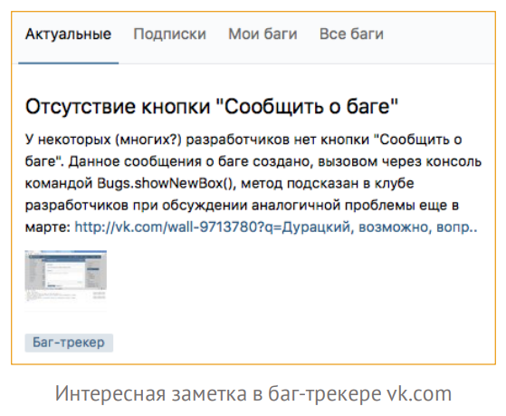
Indeed, this is a problem of so many services.
But there are positive examples, for example, Semrush. Almost all the service has special windows that are aimed at taking feedback from a person.

In such a situation, the user needs less effort to write to you about some kind of error or feedback. This is especially true for beta testing.
Unfortunately, there are situations when you cannot fix a bug quickly. You can simply warn the user about this - as in the previous part of the report.
As an example, here is a screenshot where, using completely ordinary windows, the developers of the icon font material design warn users that there is a compatibility problem and apologize:

Please note that they provide a link for those who have these problems. Click here for instructions on how to fix it.
The most important thing to remember about specific bugs is the need for a quality feedback. Therefore, create special windows to receive this information from users as quickly as possible. Well and the second - of course, warn if you know any bug, but you cannot fix it.
Unfortunately, many developers believe that user errors are the user's business. But in fact, the more users make a mistake at a certain point in the product, the more the service itself is to blame at this point. In the context of error designing, I can offer five chips to help you improve your user experience in such places.
The first example of a bottleneck of many services is, of course, login / registration:
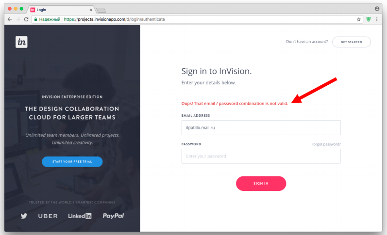
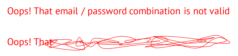
For example, the login field in InVision. The little red bar is basically the whole error message. Probably, when the designer drew it, he thought that the user could easily read the message: "Oops, the combination of email and password is incorrect." Check email first, then password, and then press the enter button again. But statistics suggest that the user makes several attempts to enter and enter a password, before realizing that the problem is in the email address.
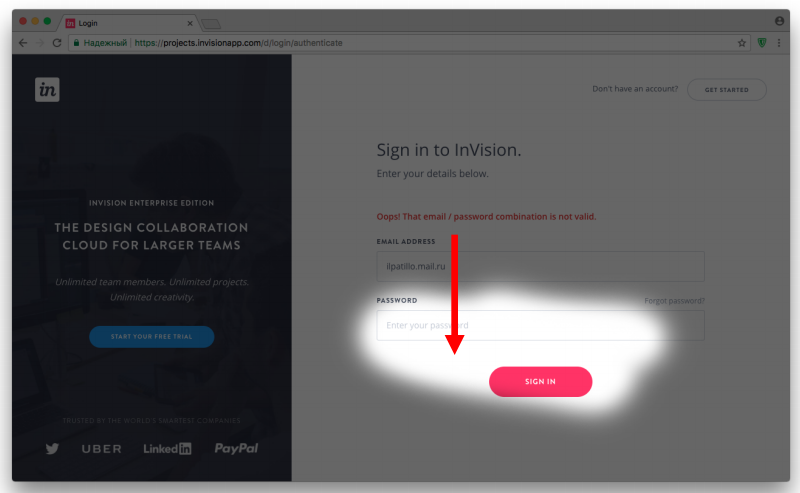
This happens because the user's attention at the time of entry is concentrated in one very narrow area - it is called the focus of attention:
As you can see, the error message is quite high and the user may simply not notice it when the page is refreshed. InVision also erases the password (you need to help the user ...). And wiggling in the area of the password focuses the user's attention even more; he thinks the mistake is there.
The same guys from InVision in another part of the product provided the error information in a slightly different way. Firstly, they highlighted both fields. Secondly, they don’t erase the password, because it can be correct (they assume that the user will notice where the error is and will make the decision):

Highlighting both fields - this is the second chip.
But this does not always help.
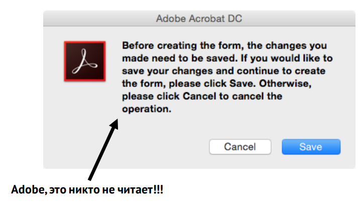
For example, Adobe designers believe that users really read it all:
Another classic example is offered by Xiaomi:

Or, for example, the State Service website (like many others) simply duplicates the title of the header field in error:

In the examples above, the whole problem is in letters. Therefore, you need to think about how to make the wording shorter and more understandable. We can easily read this message when we see it on a huge screen and focus on reading:

But surrounded by the interface and current tasks for users, it looks like this:
And they don’t finish to the end. When the user reads a line, he focuses on the beginning of the line. And to read further, he needs to make an effort:

He is reluctant to read your texts, he wants to continue to solve his problems.
Therefore, reducing the wording and placing the message in the focus area, we can quickly convey the meaning.

Who faced self-checkout counters?

Modern self-checkout counters, of course, are built in different ways. But the very first of them were built according to this scenario: I put the basket on one side, take the goods in turn, scan the bar code and put them on the other side so that the system knows that I really scanned the entire basket (by weight). At the moment when I put the goods on the left side, the system understands that I scanned it and adds it to the check. Cash register developers drew attention to a very interesting problem: people take a small product (for example, a bottle of water), scan it, then immediately take a second product and try to carry it out. At the same time, the system does not react in any way, the scanner does not work, and users look through the eyes of assistants and strain the retailer’s staff.
What was the problem? Users forget to put small products on the other side. Therefore, the developers added a sound signal, after which in 90% of such situations, buyers began to do without an assistant. The signal forced a person to look up at the cash register screen and get out of the state when he scans his huge shopping basket: “Exactly, I didn’t put water.”
This error message has two of the listed “tricks”: it tells where exactly the error is and teaches you how to use the service.
Last but most interesting.
Let's get an example right away. This is a piece of the registration path (once again I remind you that registration is a rather weak spot in so many services):

In order to start using the Revolut financial service, I must first confirm my phone number. Please note that they have already automatically identified and substituted the country code. Thanks guys.
Next I have to enter my first and last name. Well, once they have identified my country, then I start typing automatically in Russian, and when I already click "Next", filling out the entire form, the service says to me: "Please use Latin letters." Automatic validation has long been known to everyone, and it must be applied! But this does not end there. I need to fill out the address information, and, pay attention, the country is already set up automatically and is written in Cyrillic.
But you can’t deceive me - I enter the address in Latin letters, click Continue. And what do you think is going on?
At such moments, I really want to throw the phone somewhere. But this, of course, is an exceptional case. However, this example also shows that unnecessary and any repeated actions are very stressful for the user, make him nervous and negatively affect the image of your product.
Therefore, do not force the user to enter any fields again, use as much automation as possible.
The other day I came across an interesting report on the APIFortress website. There was a story about a company that supplied stock images to its partners. One of them was an agency that was engaged in a souvenir with pugs.
Once this pug partner called the stock company and complained about a service failure.
It turned out that the stock company that day released a minor API update in the morning, which did not affect most customers, but hit the pug company very hard. Their site was built in such a way that the update caused some kind of critical failure of the search. End users saw that nothing was found or some unknown error. Therefore, you need to pay close attention to connected services.
Sometimes it’s not enough just to know that you have a problem somewhere, because users will see strange windows that will not help them:

And this problem cannot be solved in the interface.
Therefore, it is very important to invest effort in teaching your service to discern the causes of API problems.
A very good example is the ifthisthenthat service automation tool. Using API bundles of various services (for example, smart home or social networks), they force third-party services to do certain things. For example, if I published a post on Instagram, it automatically goes to my Facebook. Or, if I left home, the service determines by my geo-location that I am in the office and checks if I turned off all my smart irons. And if you don’t turn it off, then it turns it off.
These guys did a great job, and not just in the interface.
First, they highlight a separate tab for errors. All failed operations are collected in this log.
They identify different types of errors:
In the first case, the Instagram service is offline, and we understand what the problem is. We may have temporarily left the network coverage area.
If the user can not contribute to the solution of the problem, just an alert is displayed.
What are external issues in my user understanding?

All software is tied to hardware, sensors, etc. All this is also created by people and may not work. Therefore, it is very important to report this to the user. A good service can report errors such as its own.
A good example is the lack of an Internet connection in the Slack device. If the Internet fell off during work, I see this message from above:
As we remember about user error messages, at the moment of entering some text, the user is concentrated in this area:

Slack does not forget about it and highlights the field in yellow.
However, he does not block my message set. I can continue to write it further, but when I try to send it, the Slack bot sends me this message:
And in principle, it very clearly explains what the problem is. I will notice such a mistake quickly enough.
The big problem with external errors that came to us from the “ancient” times when products were created by engineers for engineers is the content of error texts:
They are written in such a language, as if we still mean that the user knows what firewall, ftp, dll, kernel, kernel, and so on are.
We show one information to a technician, and another to the user.
It’s probably worth mentioning separately about how people, in principle, communicate with technical support.

For many, this is really a lot of stress. Most error messages do not mean that they should be understood. A man who does not even know English is trying to somehow explain: something broke down there. He is very uncomfortable. And all this affects in general his experience in communicating with your service. Therefore, try to create messages that the user can understand and pass on technical support in their own words.
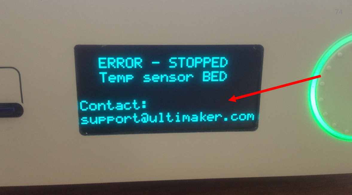
For example, this is a photo of a 3D printer, which clearly and clearly (using a small screen) says that the temperature sensor has deteriorated - an error occurred, so it stopped. Contact tech support. The user can easily understand what is the matter, and it is not difficult for him to describe this problem in his own words without technical terms:
What does it mean?
Consider this example: most of the machines already have screens where we can display text (not what we used to). But it seems as if the developers copy-paste the text of the error description from the old instructions, which are completely incomprehensible and require a long reading:

In this situation, the user does not understand what to do. Some novice drivers, instead of reading the instructions, just continue to drive, thinking that everything is in order. And others, on the contrary, begin to panic - they are trying to call a tow truck.
And there’s another category: “I have a week before my salary ... nothing will happen?”
Therefore, it is very important to enable the user to assess the danger of this problem. The user at this moment does not want to get into any complicated instructions. If something terrible really happened, it is important to indicate one thing - the severity of the problem. Sometimes “operation cannot be continued,” and sometimes it’s true that you can wait until your salary.
There is a situation, as on the chart. What caused such a sharp jump? For example, is the temperature in the engine increased? Or is it just some kind of sensor has flashed?
In such situations, it is best for the user to let them decide for themselves what it was.
An example is a good long story. In September of this year, the PewDiePie video blogger, while streaming for several hundred thousand people, called his black opponent a word that, in principle, should not be called in the English-speaking world. Of course, he later apologized, but there was still a scandal. Manufacturers of various games, including Sean Vanaman, filed a complaint with YouTube asking them to remove all videos of how PewDiePie played their games.
But PewDiePie also had a large support army. And Sean Vanaman’s games on Steam (a service that sells these games) rained hundreds of negative reviews. These reviews did not reflect the quality of the game, but could adversely affect its sales. And Steam did just amazing work: they drew the user's attention that it happened that an atypical amount of negative reviews was noticed since September 11:

At the same time, they allow the user to decide whether to exclude these reviews or consider them. The user can decide for himself how important these reviews are for him in the context of buying a game. Such work on bugs delights me both as a usabilist and as a user of this service.
Not all errors are just bugs. Many have hidden potential. Let's talk about this a little bit.
First, as I said earlier, through mistakes you can and should be taught.
For example, the Skyeng service is an online English language school that works only through the Google Chrome browser. This browser automatically (by default) sometimes blocks incoming video calls or audio recordings. And in such a situation, Skyeng hangs up a button that leads to a very detailed instruction:
This solution also has some problems. If there will be a lot of such buttons in your service, all these instructions will be simply unbearable, expensive and difficult to keep up to date. And the user doesn’t really like to read any instructions.
Another example is SEMrush. This is the service login window:
It is displayed if I clicked on a link that requires authorization from me. Most of the services in this situation gives a 404 error, the user leaves and no longer returns from this link. But at SEMrush, they are not limited to just the login form. They show additional pictures and a description of the work in that part of the service where this link leads. Thus, the user enters the context. He understands where he will go if the service is familiar to him. And if the service is not familiar, he will get a cursory idea of what awaits him after entering.
Another potential for error reporting is breaking the deadlock.
Often errors are absolutely deadlocked scenarios. The user needs to remember the context and return to the script above.
For example, take the Avito service. There is a tab "Saved Searches":
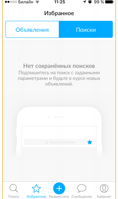
If there is nothing there, the user is forced to return back to the search bar. In accordance with the instructions presented here, which he must somehow remember, he must save the search somewhere there on the page.
And it could be done like this:
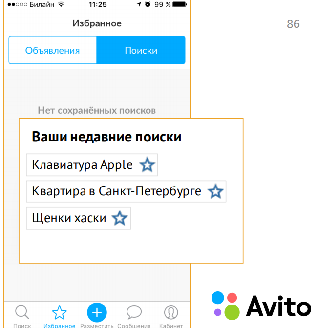
We know (save) the story and display it here so that the user, without looking up from the context, clicks the asterisk and saves some search he needs. In this way, we turn the deadlock scenario back into the main path.
There is another important topic that I wanted to discuss is the availability of interfaces.

I am very pleased that recently they began to talk a lot about this, and they began to do a lot in this direction. For example, recently UsabilityLab tested the availability of online banking for people with visual and hearing impairments.
But in the context of mistakes, we sometimes forget about the difference in perception and do some things that cannot be done.
For example, many use only a color error indication. This is not worth doing, because there are color blind:

Many designers will say: "I checked everything in a special service that shows how the color blind sees." But in fact, these services will never show the exact picture, because all color blind people see differently. And even if you select the brightness / contrast, there is still a risk that the color blind user will not recognize this error.
For example, the registration field in Wrike contains just such an error:
They have implemented purely color differentiation - in case of an error, the outline and text inside the field are highlighted in red. It’s best to add some kind of text message or character.
Another problem is gray or too small labels. If you see a small gray italic font on a gray background in your interface, you can safely go to the designer and force him to redo it, because there are different monitors and sometimes such things are not visible on cheap ones:
A person will simply break his eyes when trying to read such text.
When I showed this report to my fellow manager, he said: "I did not convince." Because it’s long, expensive and completely unprofitable for a business to do such a great job of mistakes. In the context of interface design, I would like to say that I do not urge you to work out all the erroneous situations like this.
What do we have to do? My colleague arranged the work in his team as follows. All errors that arise are first collected in one single large bag (log). Only those errors that are repeated are singled out from there.
Duplicate errors already have business value. These are the mistakes that are worth the time.
But it is far from always necessary to rush and immediately make an error on the interface, because very often the occurrence of such errors can generally be prevented by rewriting a bit of code, going to the front-end and fixing something. And only if you can’t avoid getting the error out to the user, is it really worth thinking about some interface messages.
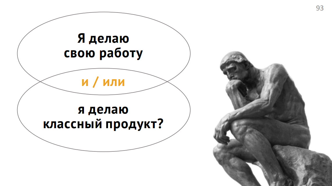
I understand that an interface is not always part of your work. And even not all product owners are eager to build work with errors in their team, because it is not always profitable (the benefit, if any, is sometimes not immediately visible). But my goal is to expand your way of thinking a little and ask a question: are you only doing your job or are you doing a cool product?
Because a cool product can report bugs. He cares about the user, even when something goes wrong.
There are several links here:
In conclusion, I want to say, probably, only one thing: mistakes are also experience. Design it.
If the topic of testing and error handling is as close to us as we are, you will probably be interested in these reports at our May Heisenbug 2018 Piter conference :
The article is based on a report by Antonina Khisametdinova from Heisenbug 2017 Moscow, which designs user interfaces in the Dog Pavlova company .
In addition, the Medium has a series of articles entitled “Design Guide for Errors” . The cycle has not yet been completed, but gives a more complete and complete picture on the topic of the article.
Wrong script
Time after time we design the main scenarios of a wide variety of services. In the case of an online store, the main one will be:
A person visits the site, selects a product, orders its delivery; pays and receives the order.
We are so focused on the main scenarios that we forget one very important thing: there are alternative scenarios and thousands of ways how the main scenario can be interrupted.
All of these are erroneous scenarios that arise when something goes wrong.
Product teams often do not pay enough attention to such scenarios. For example, a very typical story: “Something went wrong. We have problems, so just close this message. "
Another example: “We have a mistake. Please try again later. ”:
And another category of errors is my favorite: unknown errors.
Why work on erroneous scenarios?
It is very difficult to justify business the need to work out erroneous scenarios. Why should we go back and fix something when we have new features ahead? But I have four iron arguments that will help demonstrate to your product owner or business the need for such work.
A good error message reduces the load on technical support and staff
The slide shows some numbers from one of our customers. This is the number of user calls to tech support per month. Calls are connected with problems of a certain kind:
Please note that 400 people call a month simply because they cannot log in or correctly enter their login / password in the appropriate form on the site.
A good error message helps the user not get lost in the conversion funnel
If the error message is correctly composed, it returns it to the main scenario, even if a session break occurs.
A good error message teaches you how to use the service
You may not even need to create onboarding or some training videos, the development of which, incidentally, also costs decent money.
A good error message allows you to maintain trust in the service in difficult times
This is the last but not least argument.
In general, the topic of trust "man-technology" has been investigated for a long time. Now we already have enough trust in technology. For example, we will never double-check whether the messenger sent a message to the addressee, or how the calculator added or multiplied three-digit numbers (unfortunately, not all services can boast such a level of trust as calculators).
We trust our lives with dozens of different types of software, flying in airplanes. But this trust is very easy to destroy. Even the smallest mistake can make it. And such errors happen both in small and very large companies.
What causes errors
I mentioned “good error message” several times. It's time to talk about what that means. And to begin with, we’ll figure out why, in principle, errors occur.
- the first thing that comes to mind is some kind of global failure or technical work on the service ;
- specific bugs ;
- user errors .
But that is far from all. There is also:
- problems on the side of connected services ;
- external problems ;
- extremely unusual user or service behavior .
This is not an attempt to classify. In fact, there are far from six types of errors; there may be hundreds or even more. But in the context of interface design, these errors are the most significant.
Global crashes
Let's start with a situation where your service is completely unavailable.
Unfortunately, such errors can occur in any services, from online games to complex exchange professional tools.
Good question: what to do in such a situation?
While developers hastily repair some tools, unfortunate users receive strange error messages and get your tech support, write unpleasant posts on Twitter:
Let's look at the messages that are displayed at this moment:
They are quite simple and some of them even honestly apologize. But users still feel uncomfortable and try to understand what’s the matter; repeat the entry is not in 15 minutes; poke anywhere.
How to help them?
Think about the consequences
If you don’t know what the consequences of a global failure are, just go to tech support. Because at this moment the guys there are raking in full. And they will share this pain with you with pleasure.
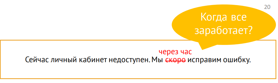
Many in such situations are limited to the message: yes, we have a problem and we will fix it soon:
But “soon” is when?
The user does not need to know when you will correct everything, accurate to the minute. But they need to understand some significant time reference, for example, 15 minutes, one hour, five hours, or even a day. This will help them navigate the space and plan their money management.
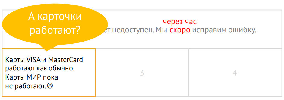
Another reasonable question (from the perspective of financial services): do cards work?
And a good error message will be able to answer it. Even if the cards do not work, it’s better to talk about it anyway, because this is very important information.
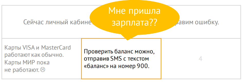
Another story - there should be a salary or transfer; and when will this money come?
It seems to be nothing critical, but when a person cannot check the balance, he begins to panic greatly. Therefore, suggest checking the balance with alternative methods, if this is, of course, possible.
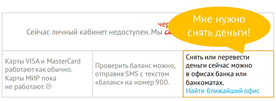
And the last, very serious situation, when a person really needs his money urgently. If possible, tell me how to withdraw money or find the nearest office, if you have such a service:
It’s important to understand that global failure is your problem, not your problem. No need to shift thought processes to it. Offer ready-made options right away.
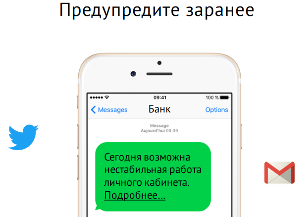
Warn in advance
Not all users are ready to log into their account right now, and not all users will log in and notice an error. But if you warn them in advance (for example, a post on Twitter, SMS-message or e-mail), then when they encounter an error message, they will be ready.
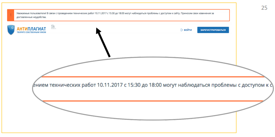
Separately, it is worth mentioning about professional services, on which the user’s work depends daily. For example, the Anti-Plagiarism service sometimes displays such a message about carrying out technical work:
Please note that the exact date and the exact time range are indicated - this will help the user plan his work in your service.
The subject of error warnings is indirectly related to maintaining trust. It might seem that the next warning about an error will make some users doubt the reliability of the service (perhaps they would not have used the service at that moment, that is, in principle, would not have known about the error). But the perception of the warning as a concern or as an extra stone in the garden of a service depends, inter alia, on how often you say that you have problems. Plus there are completely different services. Internet banking is one thing. But, for example, if you have an online store, you do not need to write to the user every time about problems, because he does not visit you so often.
However, if we are talking about professional tools on which the user really depends every day from morning to evening, it is very strange not to warn about the problem (and the frequency with which it is permissible to inform the user about problems, it depends on the industry).
Specific bugs
Testers and product teams generally catch on time and do not allow a very large share of bugs to be displayed to the user. But, unfortunately, errors happen everywhere, and it is not always possible to avoid them.
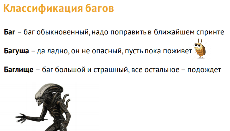
For us, bugs are a familiar story. We clearly classify them according to various parameters: the degree of danger, the need for correction, etc.
But users when they notice a bug, in principle, do not understand what they are faced with. Many do not even know this term. For them, the bugs actually look like this:
We assume that if the user suddenly noticed something strange, he would certainly tell us about it. He has five or more ways to do this:
- section "Contacts" and feedback ;
- online consultant and technical support call;
- company social networks and chats;
- reviews (App Store and Play Market) !!!
- blogs and forums.
We assume that the user will someday scroll the page down to the basement and find the Contacts tab there. In the contacts section, among the cards, departments, sales offices and other things, he will find a small button “Feedback”, click on it, select the topic of contact. He will write a detailed letter on how to reproduce this error, attach screenshots and send.
Yes, indeed, such letters come. But if the error is very bad, a person can immediately leave a review with a low rating on the App Store, where he will also write in detail why he does not like your service.
All these channels of calls have one very big problem: they take the user out of context, make him distracted by the fact that, in fact, help you. Therefore, most users prefer to wait until the problem disappears itself (until you notice it yourself):
Or they may stop using your service altogether, as a broken one.
Therefore, such a ticket is called in the VKontakte bug tracker, which is called the “absence of the“ Report a bug ”button:
Indeed, this is a problem of so many services.
Create custom feedback collection windows
But there are positive examples, for example, Semrush. Almost all the service has special windows that are aimed at taking feedback from a person.
In such a situation, the user needs less effort to write to you about some kind of error or feedback. This is especially true for beta testing.
If you can’t fix the bug quickly, warn about it.
Unfortunately, there are situations when you cannot fix a bug quickly. You can simply warn the user about this - as in the previous part of the report.
As an example, here is a screenshot where, using completely ordinary windows, the developers of the icon font material design warn users that there is a compatibility problem and apologize:
Please note that they provide a link for those who have these problems. Click here for instructions on how to fix it.
The most important thing to remember about specific bugs is the need for a quality feedback. Therefore, create special windows to receive this information from users as quickly as possible. Well and the second - of course, warn if you know any bug, but you cannot fix it.
User Errors
Unfortunately, many developers believe that user errors are the user's business. But in fact, the more users make a mistake at a certain point in the product, the more the service itself is to blame at this point. In the context of error designing, I can offer five chips to help you improve your user experience in such places.
The first example of a bottleneck of many services is, of course, login / registration:
For example, the login field in InVision. The little red bar is basically the whole error message. Probably, when the designer drew it, he thought that the user could easily read the message: "Oops, the combination of email and password is incorrect." Check email first, then password, and then press the enter button again. But statistics suggest that the user makes several attempts to enter and enter a password, before realizing that the problem is in the email address.
This happens because the user's attention at the time of entry is concentrated in one very narrow area - it is called the focus of attention:
As you can see, the error message is quite high and the user may simply not notice it when the page is refreshed. InVision also erases the password (you need to help the user ...). And wiggling in the area of the password focuses the user's attention even more; he thinks the mistake is there.
Chip 1. Place the message in focus
The same guys from InVision in another part of the product provided the error information in a slightly different way. Firstly, they highlighted both fields. Secondly, they don’t erase the password, because it can be correct (they assume that the user will notice where the error is and will make the decision):
Chip 2. Show exactly where the error
Highlighting both fields - this is the second chip.
But this does not always help.
For example, Adobe designers believe that users really read it all:
Another classic example is offered by Xiaomi:
Or, for example, the State Service website (like many others) simply duplicates the title of the header field in error:
Chip 3. Use clear and short wording
In the examples above, the whole problem is in letters. Therefore, you need to think about how to make the wording shorter and more understandable. We can easily read this message when we see it on a huge screen and focus on reading:
But surrounded by the interface and current tasks for users, it looks like this:
And they don’t finish to the end. When the user reads a line, he focuses on the beginning of the line. And to read further, he needs to make an effort:
He is reluctant to read your texts, he wants to continue to solve his problems.
Therefore, reducing the wording and placing the message in the focus area, we can quickly convey the meaning.
Chip 4. Tell me how to fix the error
Who faced self-checkout counters?
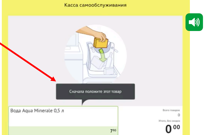
Modern self-checkout counters, of course, are built in different ways. But the very first of them were built according to this scenario: I put the basket on one side, take the goods in turn, scan the bar code and put them on the other side so that the system knows that I really scanned the entire basket (by weight). At the moment when I put the goods on the left side, the system understands that I scanned it and adds it to the check. Cash register developers drew attention to a very interesting problem: people take a small product (for example, a bottle of water), scan it, then immediately take a second product and try to carry it out. At the same time, the system does not react in any way, the scanner does not work, and users look through the eyes of assistants and strain the retailer’s staff.
What was the problem? Users forget to put small products on the other side. Therefore, the developers added a sound signal, after which in 90% of such situations, buyers began to do without an assistant. The signal forced a person to look up at the cash register screen and get out of the state when he scans his huge shopping basket: “Exactly, I didn’t put water.”
This error message has two of the listed “tricks”: it tells where exactly the error is and teaches you how to use the service.
Chip 5. Save user work
Last but most interesting.
Let's get an example right away. This is a piece of the registration path (once again I remind you that registration is a rather weak spot in so many services):
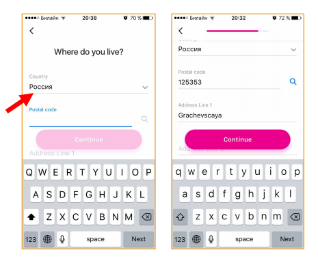
In order to start using the Revolut financial service, I must first confirm my phone number. Please note that they have already automatically identified and substituted the country code. Thanks guys.
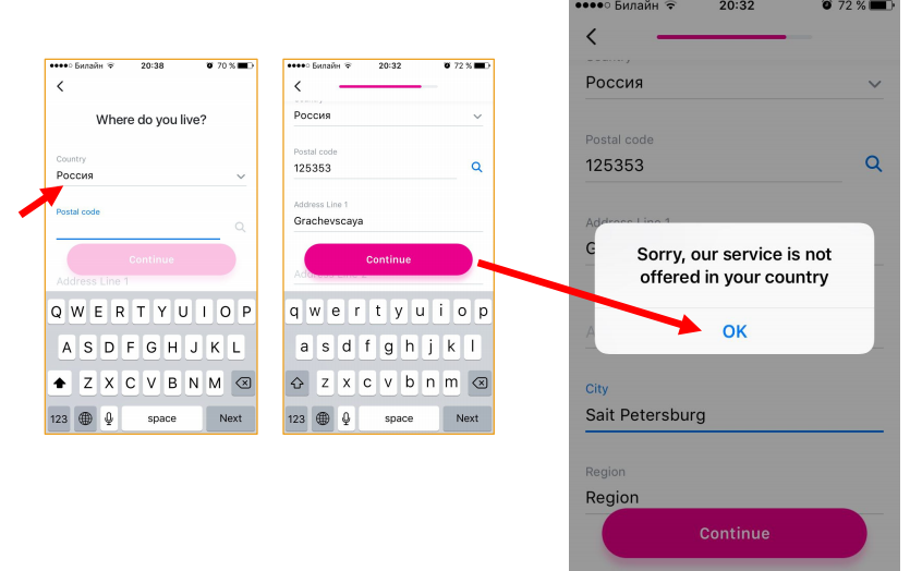
Next I have to enter my first and last name. Well, once they have identified my country, then I start typing automatically in Russian, and when I already click "Next", filling out the entire form, the service says to me: "Please use Latin letters." Automatic validation has long been known to everyone, and it must be applied! But this does not end there. I need to fill out the address information, and, pay attention, the country is already set up automatically and is written in Cyrillic.
But you can’t deceive me - I enter the address in Latin letters, click Continue. And what do you think is going on?
At such moments, I really want to throw the phone somewhere. But this, of course, is an exceptional case. However, this example also shows that unnecessary and any repeated actions are very stressful for the user, make him nervous and negatively affect the image of your product.
Therefore, do not force the user to enter any fields again, use as much automation as possible.
Connected Service Issues
Test the connected services API
The other day I came across an interesting report on the APIFortress website. There was a story about a company that supplied stock images to its partners. One of them was an agency that was engaged in a souvenir with pugs.
Once this pug partner called the stock company and complained about a service failure.
It turned out that the stock company that day released a minor API update in the morning, which did not affect most customers, but hit the pug company very hard. Their site was built in such a way that the update caused some kind of critical failure of the search. End users saw that nothing was found or some unknown error. Therefore, you need to pay close attention to connected services.
Teach them to distinguish problems
Sometimes it’s not enough just to know that you have a problem somewhere, because users will see strange windows that will not help them:
And this problem cannot be solved in the interface.
Therefore, it is very important to invest effort in teaching your service to discern the causes of API problems.
Provide a problem notification in the interface
A very good example is the ifthisthenthat service automation tool. Using API bundles of various services (for example, smart home or social networks), they force third-party services to do certain things. For example, if I published a post on Instagram, it automatically goes to my Facebook. Or, if I left home, the service determines by my geo-location that I am in the office and checks if I turned off all my smart irons. And if you don’t turn it off, then it turns it off.
These guys did a great job, and not just in the interface.
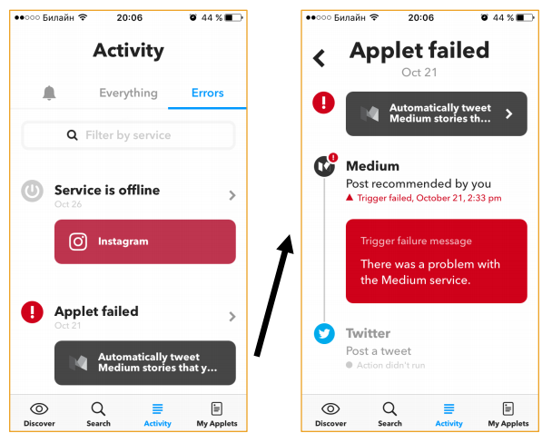
First, they highlight a separate tab for errors. All failed operations are collected in this log.
They identify different types of errors:
In the first case, the Instagram service is offline, and we understand what the problem is. We may have temporarily left the network coverage area.
If the user can not contribute to the solution of the problem, just an alert is displayed.
External issues
What are external issues in my user understanding?
All software is tied to hardware, sensors, etc. All this is also created by people and may not work. Therefore, it is very important to report this to the user. A good service can report errors such as its own.
Let me know what actions in your service are unavailable due to external problems
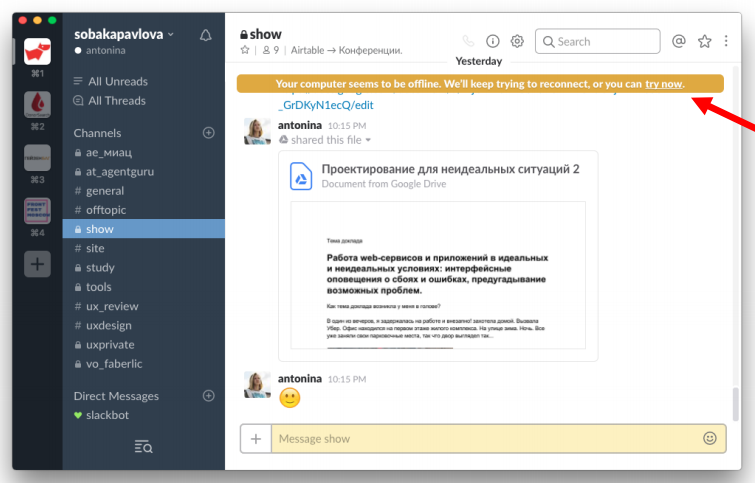
A good example is the lack of an Internet connection in the Slack device. If the Internet fell off during work, I see this message from above:
As we remember about user error messages, at the moment of entering some text, the user is concentrated in this area:
Slack does not forget about it and highlights the field in yellow.
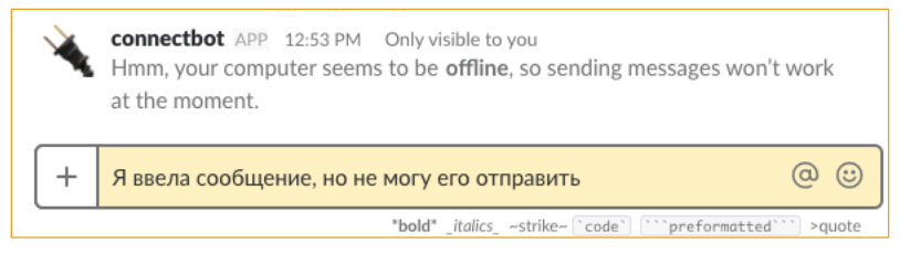
However, he does not block my message set. I can continue to write it further, but when I try to send it, the Slack bot sends me this message:
And in principle, it very clearly explains what the problem is. I will notice such a mistake quickly enough.
The big problem with external errors that came to us from the “ancient” times when products were created by engineers for engineers is the content of error texts:
They are written in such a language, as if we still mean that the user knows what firewall, ftp, dll, kernel, kernel, and so on are.
Clearly divide competency levels
We show one information to a technician, and another to the user.
It’s probably worth mentioning separately about how people, in principle, communicate with technical support.
For many, this is really a lot of stress. Most error messages do not mean that they should be understood. A man who does not even know English is trying to somehow explain: something broke down there. He is very uncomfortable. And all this affects in general his experience in communicating with your service. Therefore, try to create messages that the user can understand and pass on technical support in their own words.
For example, this is a photo of a 3D printer, which clearly and clearly (using a small screen) says that the temperature sensor has deteriorated - an error occurred, so it stopped. Contact tech support. The user can easily understand what is the matter, and it is not difficult for him to describe this problem in his own words without technical terms:
Help the user prioritize the problem
What does it mean?
Consider this example: most of the machines already have screens where we can display text (not what we used to). But it seems as if the developers copy-paste the text of the error description from the old instructions, which are completely incomprehensible and require a long reading:
In this situation, the user does not understand what to do. Some novice drivers, instead of reading the instructions, just continue to drive, thinking that everything is in order. And others, on the contrary, begin to panic - they are trying to call a tow truck.
And there’s another category: “I have a week before my salary ... nothing will happen?”
Therefore, it is very important to enable the user to assess the danger of this problem. The user at this moment does not want to get into any complicated instructions. If something terrible really happened, it is important to indicate one thing - the severity of the problem. Sometimes “operation cannot be continued,” and sometimes it’s true that you can wait until your salary.
Extremely unusual user or service behavior.
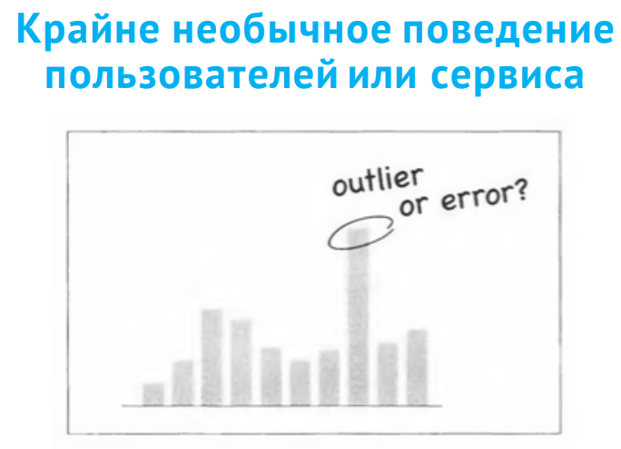
There is a situation, as on the chart. What caused such a sharp jump? For example, is the temperature in the engine increased? Or is it just some kind of sensor has flashed?
In such situations, it is best for the user to let them decide for themselves what it was.
An example is a good long story. In September of this year, the PewDiePie video blogger, while streaming for several hundred thousand people, called his black opponent a word that, in principle, should not be called in the English-speaking world. Of course, he later apologized, but there was still a scandal. Manufacturers of various games, including Sean Vanaman, filed a complaint with YouTube asking them to remove all videos of how PewDiePie played their games.
But PewDiePie also had a large support army. And Sean Vanaman’s games on Steam (a service that sells these games) rained hundreds of negative reviews. These reviews did not reflect the quality of the game, but could adversely affect its sales. And Steam did just amazing work: they drew the user's attention that it happened that an atypical amount of negative reviews was noticed since September 11:
At the same time, they allow the user to decide whether to exclude these reviews or consider them. The user can decide for himself how important these reviews are for him in the context of buying a game. Such work on bugs delights me both as a usabilist and as a user of this service.
Additional features - hidden potential
Not all errors are just bugs. Many have hidden potential. Let's talk about this a little bit.
Train through mistakes
First, as I said earlier, through mistakes you can and should be taught.
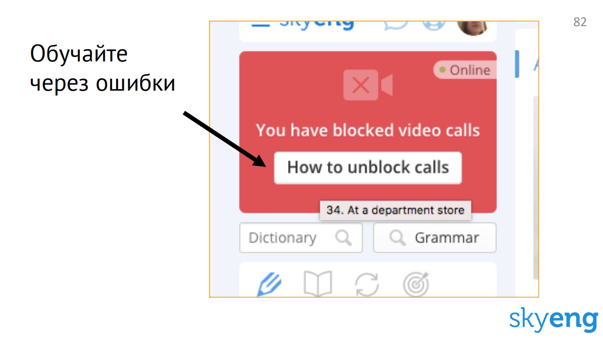
For example, the Skyeng service is an online English language school that works only through the Google Chrome browser. This browser automatically (by default) sometimes blocks incoming video calls or audio recordings. And in such a situation, Skyeng hangs up a button that leads to a very detailed instruction:
This solution also has some problems. If there will be a lot of such buttons in your service, all these instructions will be simply unbearable, expensive and difficult to keep up to date. And the user doesn’t really like to read any instructions.
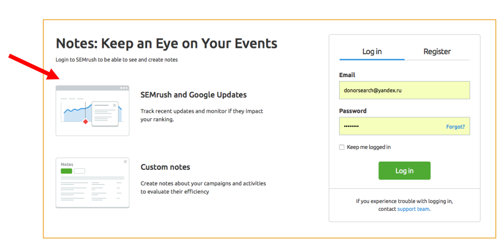
Another example is SEMrush. This is the service login window:
It is displayed if I clicked on a link that requires authorization from me. Most of the services in this situation gives a 404 error, the user leaves and no longer returns from this link. But at SEMrush, they are not limited to just the login form. They show additional pictures and a description of the work in that part of the service where this link leads. Thus, the user enters the context. He understands where he will go if the service is familiar to him. And if the service is not familiar, he will get a cursory idea of what awaits him after entering.
Get out of the impasse
Another potential for error reporting is breaking the deadlock.
Often errors are absolutely deadlocked scenarios. The user needs to remember the context and return to the script above.
For example, take the Avito service. There is a tab "Saved Searches":
If there is nothing there, the user is forced to return back to the search bar. In accordance with the instructions presented here, which he must somehow remember, he must save the search somewhere there on the page.
And it could be done like this:
We know (save) the story and display it here so that the user, without looking up from the context, clicks the asterisk and saves some search he needs. In this way, we turn the deadlock scenario back into the main path.
Availability
There is another important topic that I wanted to discuss is the availability of interfaces.
I am very pleased that recently they began to talk a lot about this, and they began to do a lot in this direction. For example, recently UsabilityLab tested the availability of online banking for people with visual and hearing impairments.
But in the context of mistakes, we sometimes forget about the difference in perception and do some things that cannot be done.
For example, many use only a color error indication. This is not worth doing, because there are color blind:
Many designers will say: "I checked everything in a special service that shows how the color blind sees." But in fact, these services will never show the exact picture, because all color blind people see differently. And even if you select the brightness / contrast, there is still a risk that the color blind user will not recognize this error.
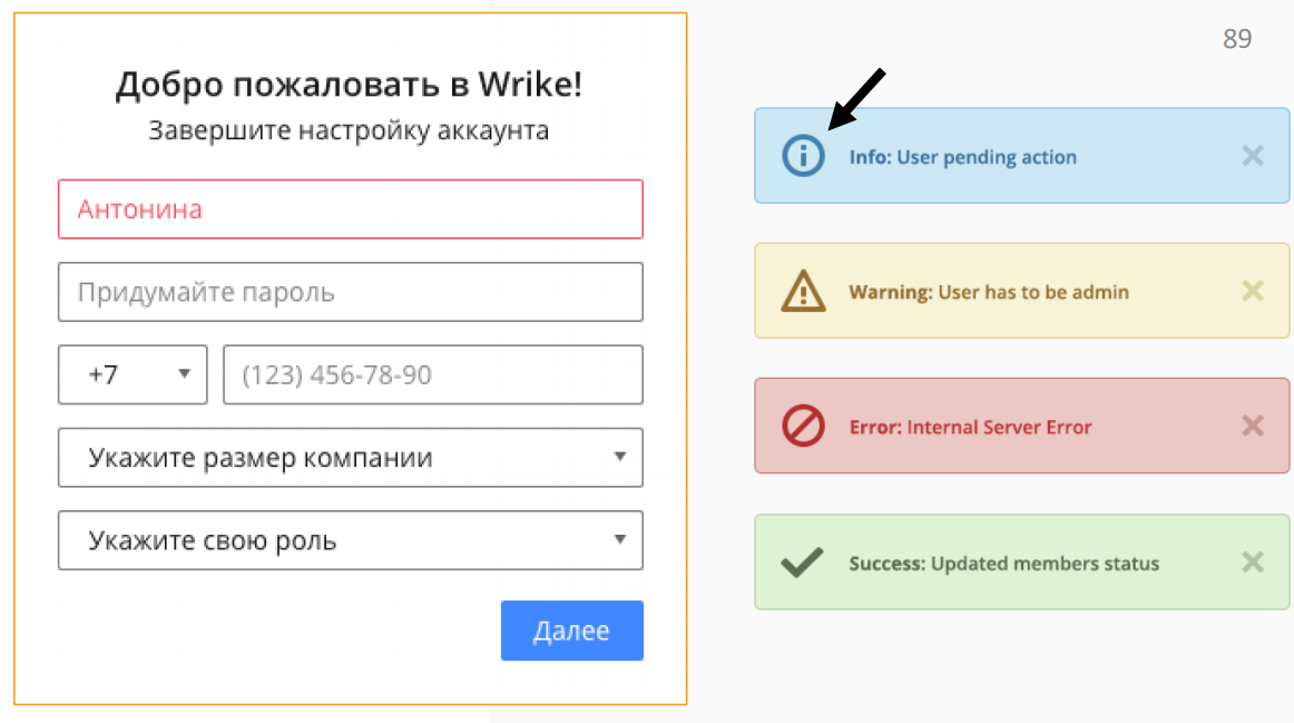
For example, the registration field in Wrike contains just such an error:
They have implemented purely color differentiation - in case of an error, the outline and text inside the field are highlighted in red. It’s best to add some kind of text message or character.
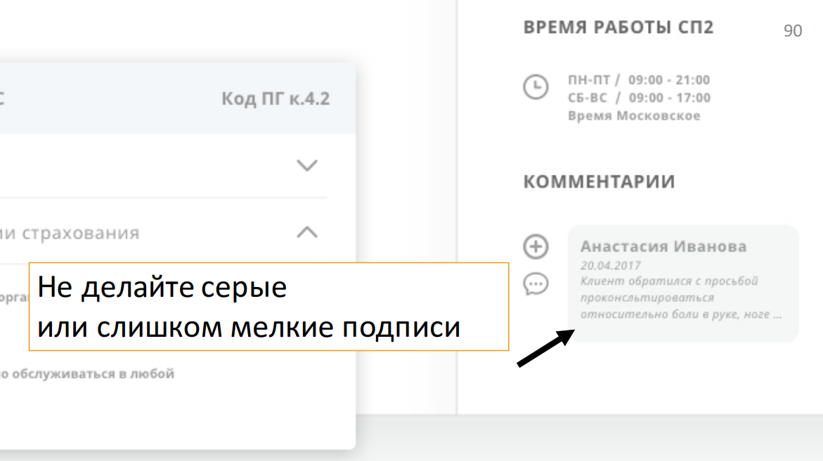
Another problem is gray or too small labels. If you see a small gray italic font on a gray background in your interface, you can safely go to the designer and force him to redo it, because there are different monitors and sometimes such things are not visible on cheap ones:
A person will simply break his eyes when trying to read such text.
Conduct Accessibility testing for error scenarios
Business value
When I showed this report to my fellow manager, he said: "I did not convince." Because it’s long, expensive and completely unprofitable for a business to do such a great job of mistakes. In the context of interface design, I would like to say that I do not urge you to work out all the erroneous situations like this.
What do we have to do? My colleague arranged the work in his team as follows. All errors that arise are first collected in one single large bag (log). Only those errors that are repeated are singled out from there.
Duplicate errors already have business value. These are the mistakes that are worth the time.
But it is far from always necessary to rush and immediately make an error on the interface, because very often the occurrence of such errors can generally be prevented by rewriting a bit of code, going to the front-end and fixing something. And only if you can’t avoid getting the error out to the user, is it really worth thinking about some interface messages.
I understand that an interface is not always part of your work. And even not all product owners are eager to build work with errors in their team, because it is not always profitable (the benefit, if any, is sometimes not immediately visible). But my goal is to expand your way of thinking a little and ask a question: are you only doing your job or are you doing a cool product?
Because a cool product can report bugs. He cares about the user, even when something goes wrong.
Summary
What do I suggest you do with all this information?
- When you get to work, discuss the report with the team and product owner. It’s especially useful to go to UXers or designers.
- Check how helpful your error messages are to users.
- After that, you will be able to comprehensively look at your product, find its weak points that you might not have noticed before, and improve erroneous scenarios.
- And one more very important point in the context of testing - erroneous scripts also need to be tested and often on equal terms with the others.
What to read?
There are several links here:
- Release It !: Design and Deploy Production-Ready Software, Michael T. Nygard
- "How to write a great error message", Thomas Fuchs, https://goo.gl/4L8YWo
- Architecting Your Software Errors For Better Error Reporting, Nick Harley, https://goo.gl/7em6cQ
In conclusion, I want to say, probably, only one thing: mistakes are also experience. Design it.
If the topic of testing and error handling is as close to us as we are, you will probably be interested in these reports at our May Heisenbug 2018 Piter conference :
- We are writing UI tests for Web, iOS and Android simultaneously # python (Igor Balagurov, Uptick)
- Web Security Testing Starter Kit (Andrey Leonov, SEMrush)
- Beta testing VKontakte (Anastasia Semenyuk, VKontakte)