Power BI Tooltips - New Feature for Desktop
- From the sandbox
- Tutorial
In mid-March, the next Power BI Desktop update was released . Microsoft added a couple of interesting features, including the ability for users to create tooltips themselves - Tooltips.
In this article, I will show a simple example of working with this functionality.
The tooltip function is at the preview stage and needs to be connected / disconnected manually.
This means that this function is not yet fully integrated into the Power BI platform, tooltips will not work when viewing reports on mobile applications, when publishing on the Internet, as well as tooltips are not supported for custom visual elements.
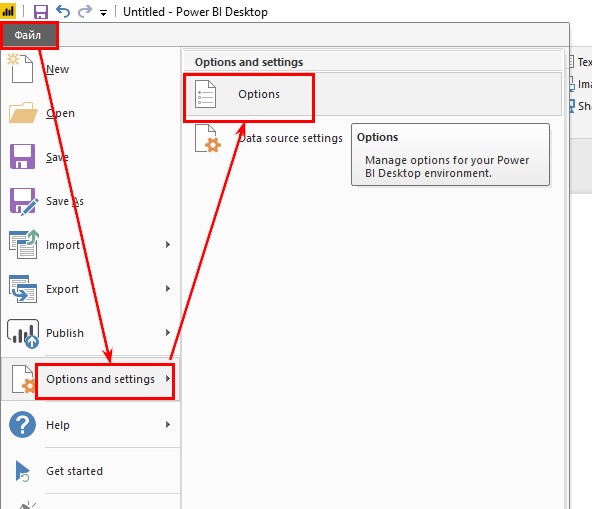
To enable it, go to the menu:
“File” - “Options and settings” - “Options” (Options)
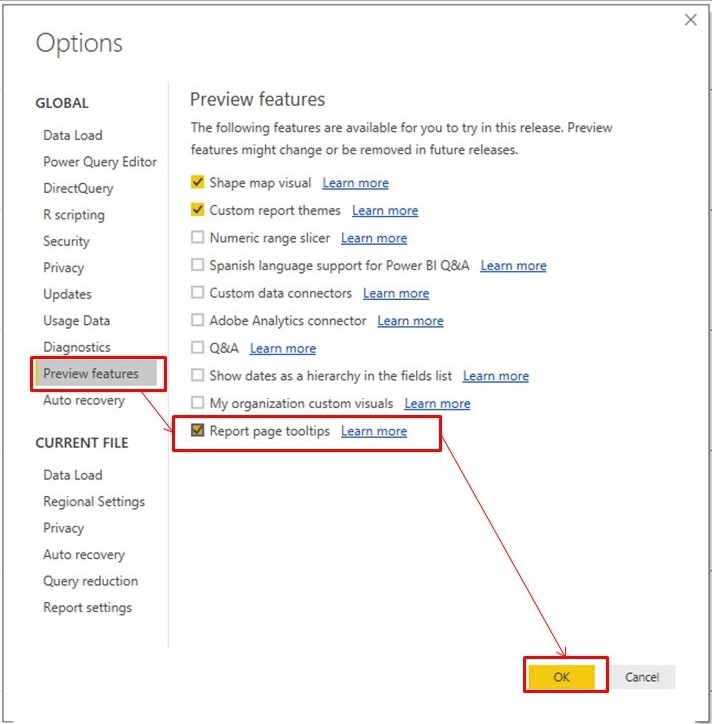
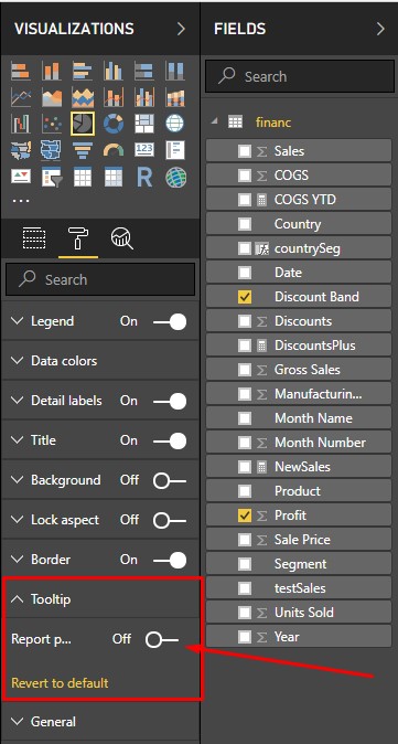
In the options window, go to the “Preview features” tab and check “ Tooltips ”(Report page tooltips). After that, we reboot Power BI Desktop.
The meaning of this function is that it becomes possible to display the necessary information on miniature pages that appear when you hover over the visual. Functionality allows you to use any standard visualization for this task, including maps.
As an example, I took the “Financial Sample” dataset and created some visual elements.
Next, I create a new report page. On the right side panel of Visualizations on the Format tab, select the page information tab and turn on the tooltip.
Also here you can immediately set the page name (Name). On it, I will then find a hint in the visual settings.
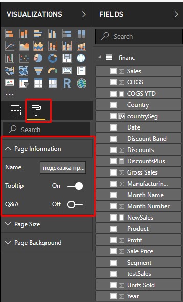
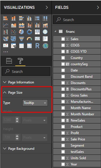
Now the tab “Page size”, I change the size type to “Tooltip”. The canvas will be very small and the visual element will fit the entire page.
Now I’ll build a visual. I will not describe how to create a visual element that will be my tooltip. Everything is quite clear in the picture. The visual can be assembled as you like.
Now, you need to bind the tooltip to the column from the table list. The tooltip works through an anchored field or measure. This means that a tooltip will appear if you use this field in the graphs in the report. The generated tooltip will be used in place of the default Power BI tooltip.
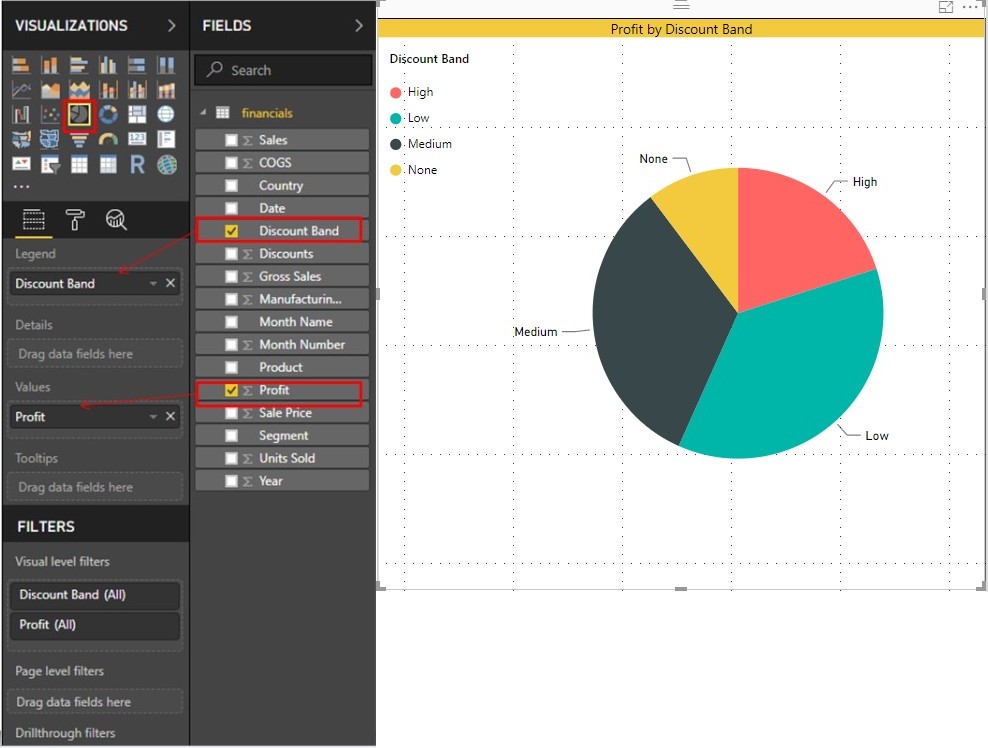
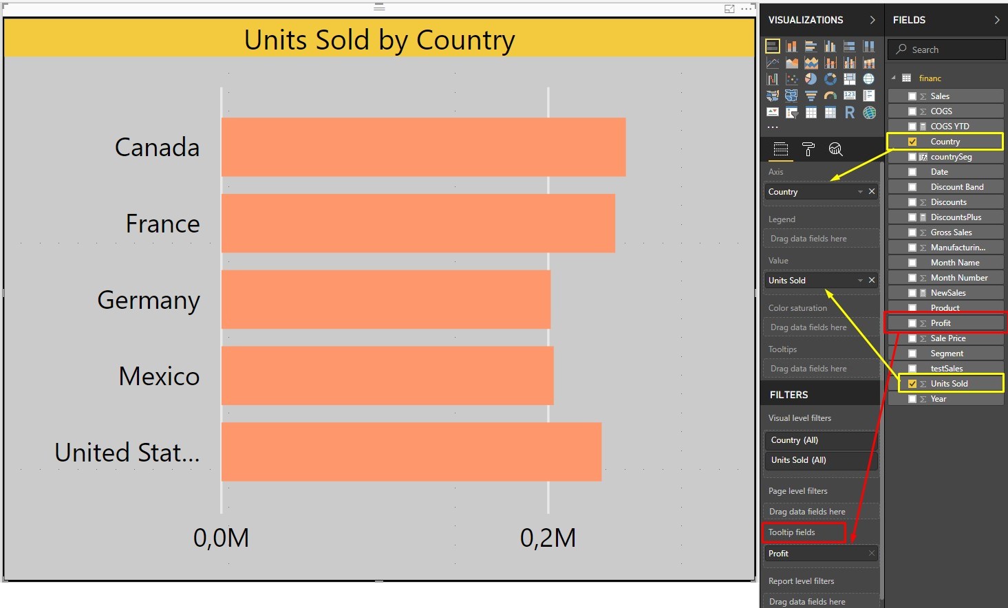
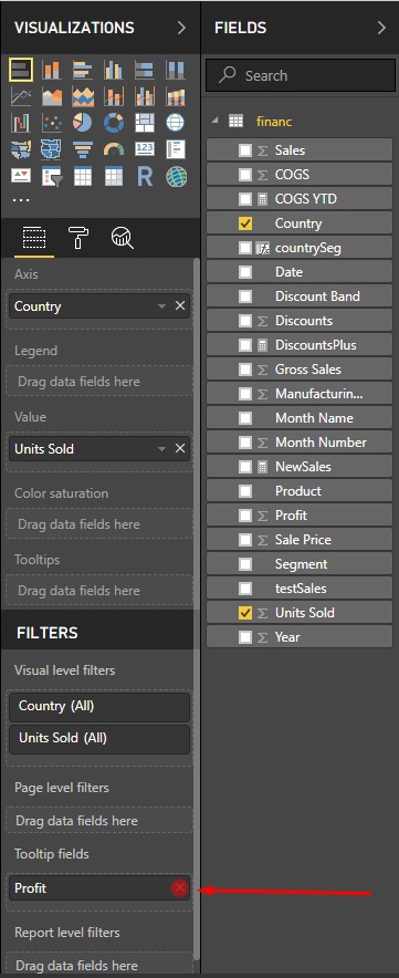
To do this, I dragged the “Profit” column into the “Tooltip fields” field in the Filters panel.
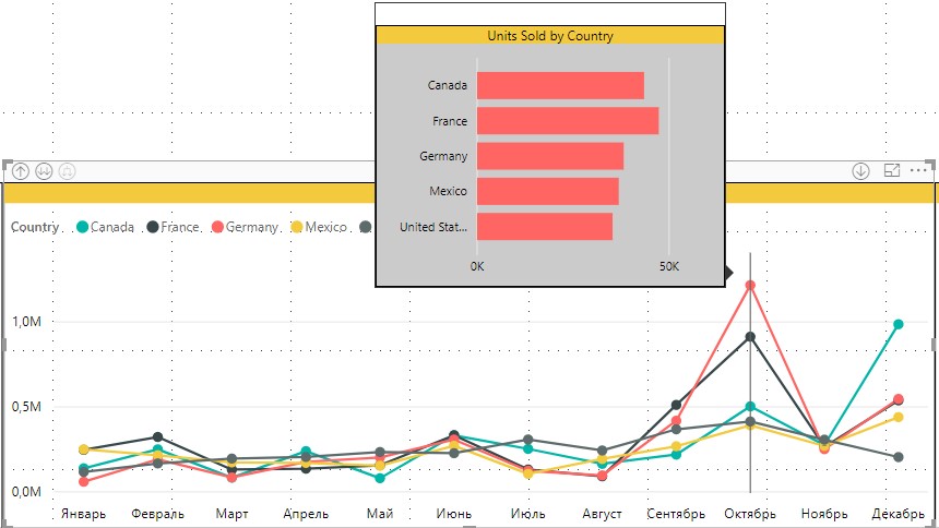
Go to the main page of the report and hover over the pie chart.
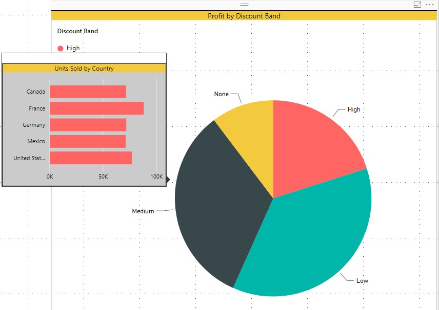
The tooltip shows a visual element from the tooltip page, filtered by Discount Band - Medium.
When hovering over other areas of the chart, the visual help will be filtered based on the division into areas.
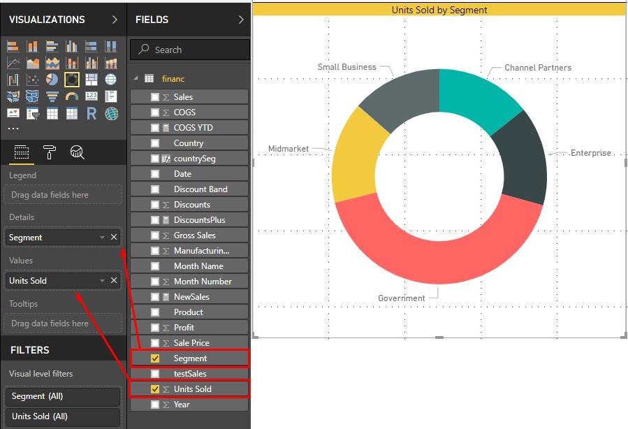
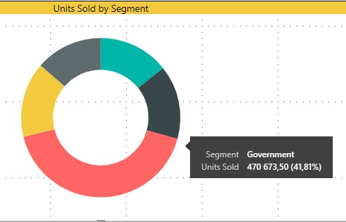
At the same time, a standard tooltip will be used on the Units sold by segment chart, as before, because the Profit field was not used to construct this visual object.
On a line chart, the behavior of the tooltip is slightly different.
On the X-axis, I made the dates in categories with a recess to the level of the “Month” display.
On the Y-axis, I used the “Profit” field.
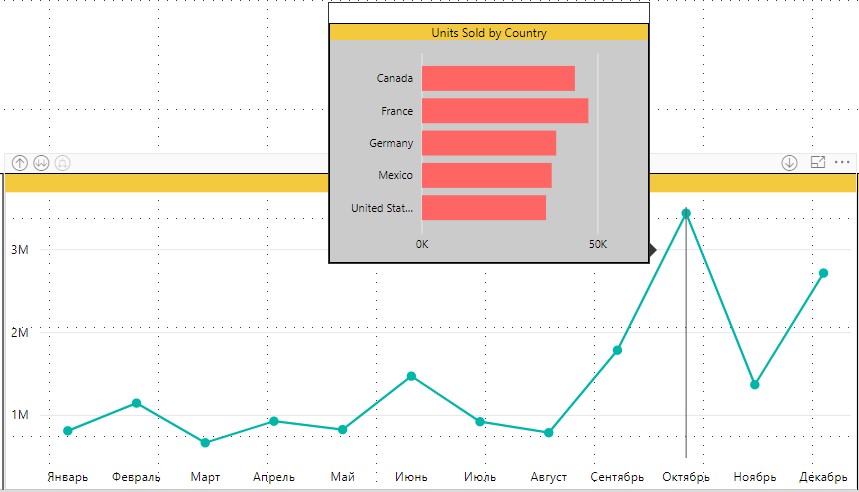
The tooltip also appears, as in previous charts, when you hover over the chart area.
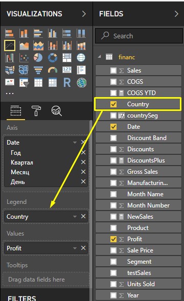
But if we add a field to the Legend, for example, “Country”
and move the cursor over the chart area, we will notice exactly the same tooltip.
The reason is that, the field in the legend does not go through the filter in the tooltip.
When you want to use the custom pop-up tooltip on a line chart, you will see a tooltip for all the lines in the chart. The hint will only change when moving along the axis with dates.
There is another way to associate a tooltip with visual objects.
Once again, I’ll go to the help page, select the visual element and remove the “Profit” field from the “Tooltips fields” filter.
Now on all charts the tooltip will return to its normal state.
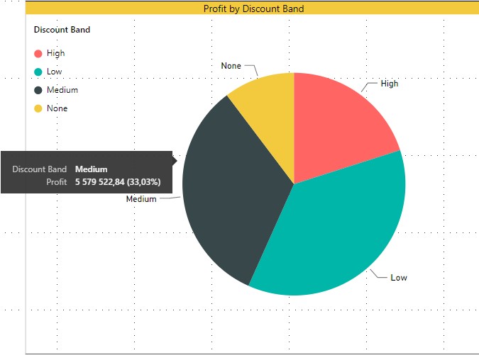
For example, a pie chart:
But there is a way to manually select a tooltip from previously created ones.
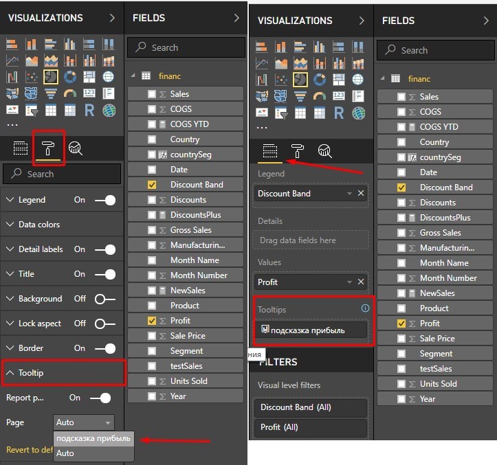
I will choose a pie chart. On the “Tooltip” tab, you can choose from the list which page with tips to display for a pie chart. In my case, there is only a profit tip page.
Now moving the cursor over the pie chart, we can again see the created tooltip.
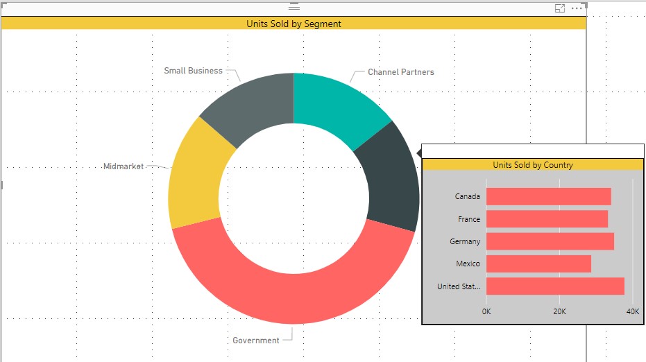
In the same way, I can assign this hint to the Units sold by segment diagram and get the same hint.
That is, it is not necessary to include in the visual element of the report, the field specified in the tooltip filter, it is enough to indicate the page on which it is built.
If the created tooltips are not needed at all, you can completely disable them in the chart settings using the switch in the tooltip field. This will force the chart to use the default Power BI tooltip, even if the report has matching tooltips.
Such hints are convenient to use when you need to show data in different forms, in the form of a table or a bar chart, or in the form of a KPI card. You can not overload the report canvas with unnecessary visuals, but simply create a few additional ones in the form of tips, displaying them when you hover over specific elements of the report.
In this article, I will show a simple example of working with this functionality.
Enabling the tooltip feature in Power BI Desktop
The tooltip function is at the preview stage and needs to be connected / disconnected manually.
This means that this function is not yet fully integrated into the Power BI platform, tooltips will not work when viewing reports on mobile applications, when publishing on the Internet, as well as tooltips are not supported for custom visual elements.
To enable it, go to the menu:
“File” - “Options and settings” - “Options” (Options)
In the options window, go to the “Preview features” tab and check “ Tooltips ”(Report page tooltips). After that, we reboot Power BI Desktop.
Create and configure tooltips
The meaning of this function is that it becomes possible to display the necessary information on miniature pages that appear when you hover over the visual. Functionality allows you to use any standard visualization for this task, including maps.
As an example, I took the “Financial Sample” dataset and created some visual elements.
- Pie chart: Profit by Discount Band
- Donut Chart: Units Sold by Segment. (Units sold by Segment)
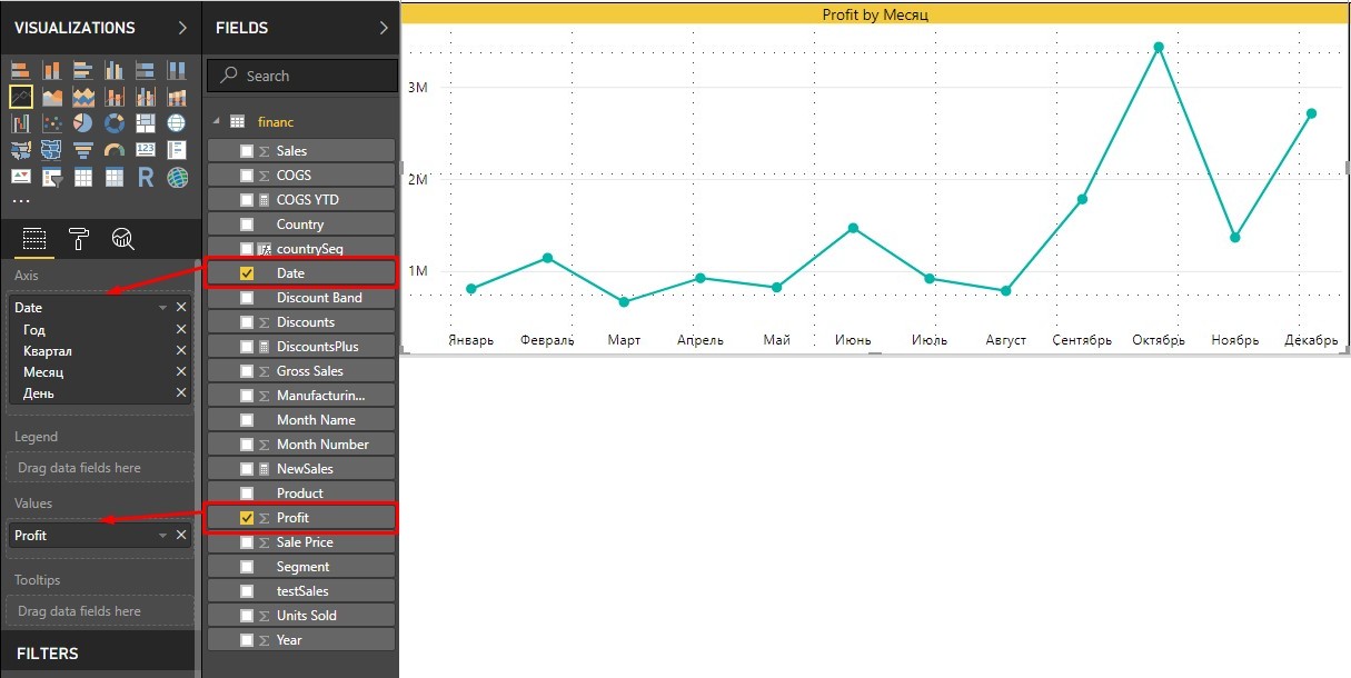
- Line Chart: Profit by month (Monthly Profit)
Next, I create a new report page. On the right side panel of Visualizations on the Format tab, select the page information tab and turn on the tooltip.
Also here you can immediately set the page name (Name). On it, I will then find a hint in the visual settings.
Now the tab “Page size”, I change the size type to “Tooltip”. The canvas will be very small and the visual element will fit the entire page.
Now I’ll build a visual. I will not describe how to create a visual element that will be my tooltip. Everything is quite clear in the picture. The visual can be assembled as you like.
Now, you need to bind the tooltip to the column from the table list. The tooltip works through an anchored field or measure. This means that a tooltip will appear if you use this field in the graphs in the report. The generated tooltip will be used in place of the default Power BI tooltip.
To do this, I dragged the “Profit” column into the “Tooltip fields” field in the Filters panel.
Go to the main page of the report and hover over the pie chart.
The tooltip shows a visual element from the tooltip page, filtered by Discount Band - Medium.
When hovering over other areas of the chart, the visual help will be filtered based on the division into areas.
At the same time, a standard tooltip will be used on the Units sold by segment chart, as before, because the Profit field was not used to construct this visual object.
On a line chart, the behavior of the tooltip is slightly different.
On the X-axis, I made the dates in categories with a recess to the level of the “Month” display.
On the Y-axis, I used the “Profit” field.
The tooltip also appears, as in previous charts, when you hover over the chart area.
But if we add a field to the Legend, for example, “Country”
and move the cursor over the chart area, we will notice exactly the same tooltip.
The reason is that, the field in the legend does not go through the filter in the tooltip.
When you want to use the custom pop-up tooltip on a line chart, you will see a tooltip for all the lines in the chart. The hint will only change when moving along the axis with dates.
There is another way to associate a tooltip with visual objects.
Once again, I’ll go to the help page, select the visual element and remove the “Profit” field from the “Tooltips fields” filter.
Now on all charts the tooltip will return to its normal state.
For example, a pie chart:
But there is a way to manually select a tooltip from previously created ones.
I will choose a pie chart. On the “Tooltip” tab, you can choose from the list which page with tips to display for a pie chart. In my case, there is only a profit tip page.
Now moving the cursor over the pie chart, we can again see the created tooltip.
In the same way, I can assign this hint to the Units sold by segment diagram and get the same hint.
That is, it is not necessary to include in the visual element of the report, the field specified in the tooltip filter, it is enough to indicate the page on which it is built.
If the created tooltips are not needed at all, you can completely disable them in the chart settings using the switch in the tooltip field. This will force the chart to use the default Power BI tooltip, even if the report has matching tooltips.
Such hints are convenient to use when you need to show data in different forms, in the form of a table or a bar chart, or in the form of a KPI card. You can not overload the report canvas with unnecessary visuals, but simply create a few additional ones in the form of tips, displaying them when you hover over specific elements of the report.