37 million VS election logo. for 75 thousand

" Logomashina " presented its concept of style "choice", making it 500 times cheaper
Remember the scandal surrounding the logo of the presidential election for 37 million rubles?

The approved logo of the presidential election - 2018
The logo provoked a stormy negative reaction in social networks and the media: it was called “primitive” and even “stolen”:
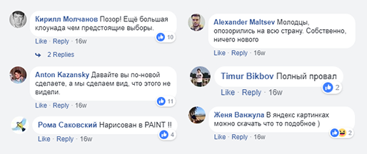
Public reaction
Yes, our studio also doesn’t like this design, and now that the hype has subsided, we can take a look to this event in terms of design and offer your vision of a good style of “Elections 2018”.
Original Logo Problems
In short: readability, adaptability, idea
Problem 1: readability
That is the criterion by which each of us can evaluate the schedule: "how well visible elements in a small amount and blurring"
carry out a simple test for readability:

When blurring pony merges into porridge, exactly like the "fat" letters in the title

After passing this it’s impossible to understand what the banner was about.
The fact is that we most often see logos on the go and / or from afar, so it’s important to consider this when developing.
Problem 2: adaptability
The lion's share of readability issues is due to adaptability issues. With the election logo, the designers clearly did not think how to use it in a small format:

Well, you can’t see anything.

Because of the problems with adaptability, the style is very difficult to use on company media
Problem 3: poor understanding of the goal
Here are the important things to remember when developing branding: an idea, a message, a goal.
The goal of election branding is to remind and motivate.
In our opinion, the current design does not cope with any of these tasks: due to a bunch of technical problems and lack of thought, the style looks boring and does not motivate to be involved in the elections.
What do we offer
Based on the problems of the original logo, we propose to simplify the sign and consider adaptability, as well as add an idea.
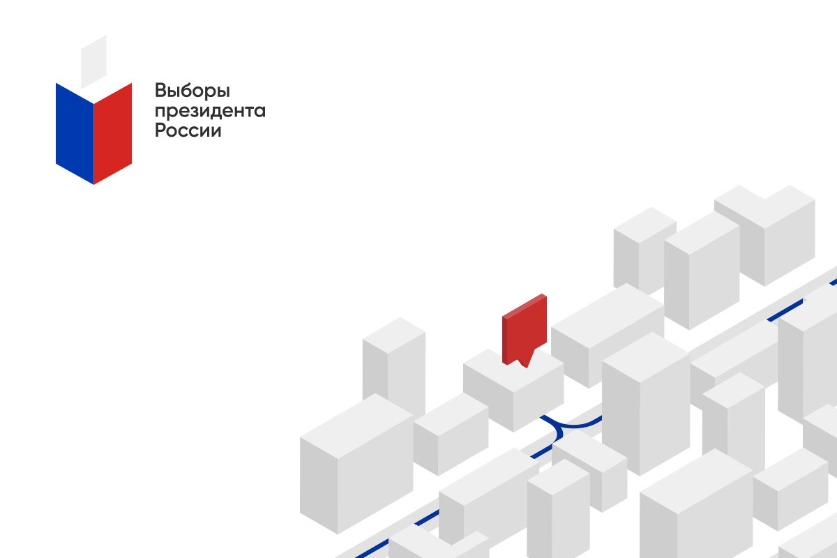
Concept 1: Simplify Sign
We leave the Russian tricolor in favor of continuity, but we noticeably refresh the style:

Before / After
Thanks to the modern minimalist style, the logo has become easier to use. Now the sign can "live" separately from the name:

Adaptability is obvious

Example of an icon
This style is easy to use on the website, in the application or on other media for navigation:
Example of marking the nearest polling station
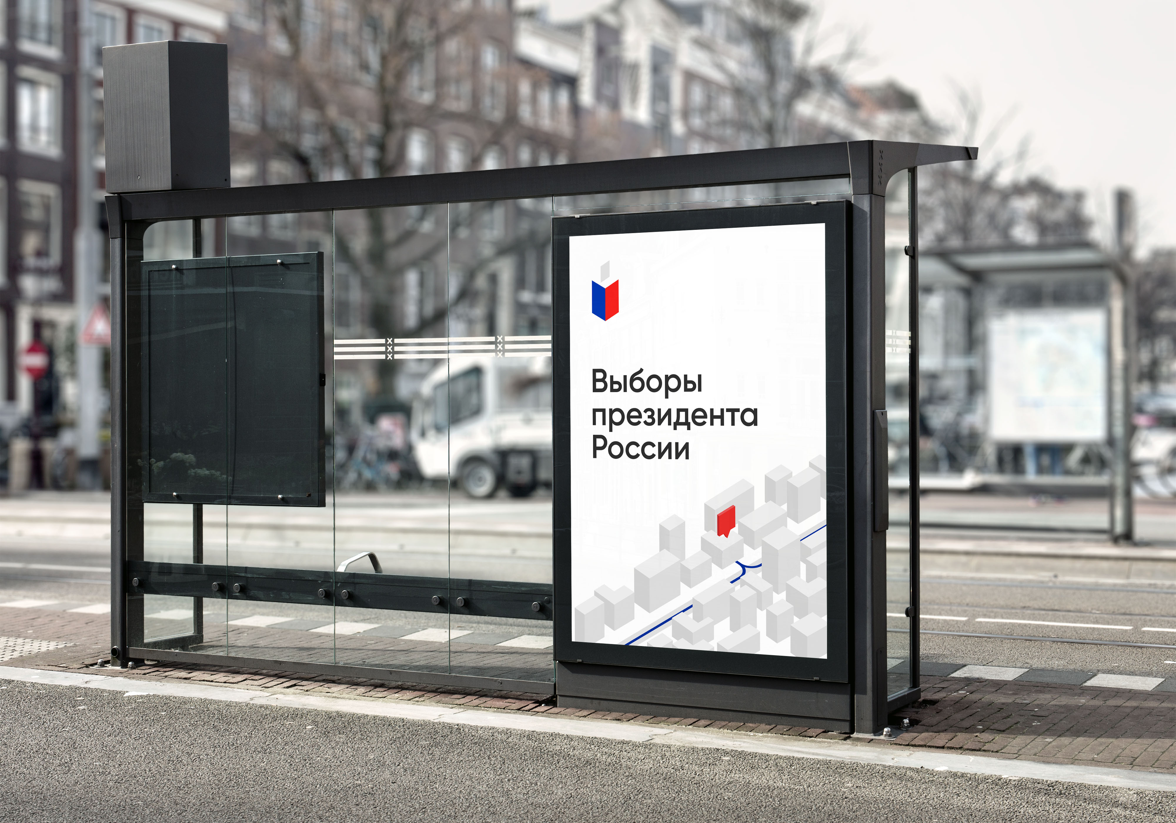
Example of a banner at a stop
Besides, this style looks clean on any type of documentation :
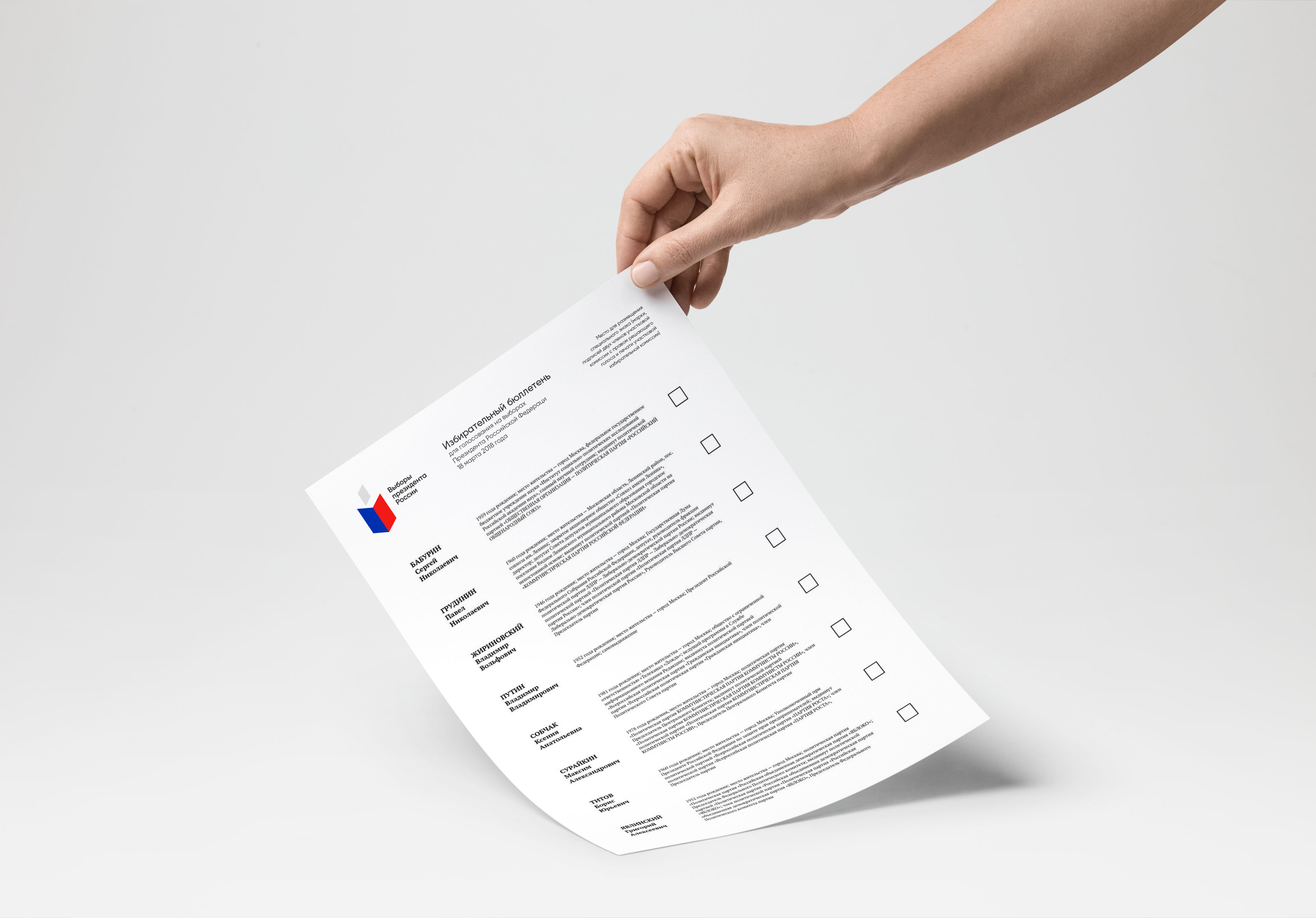
We cleaned the notorious newsletter
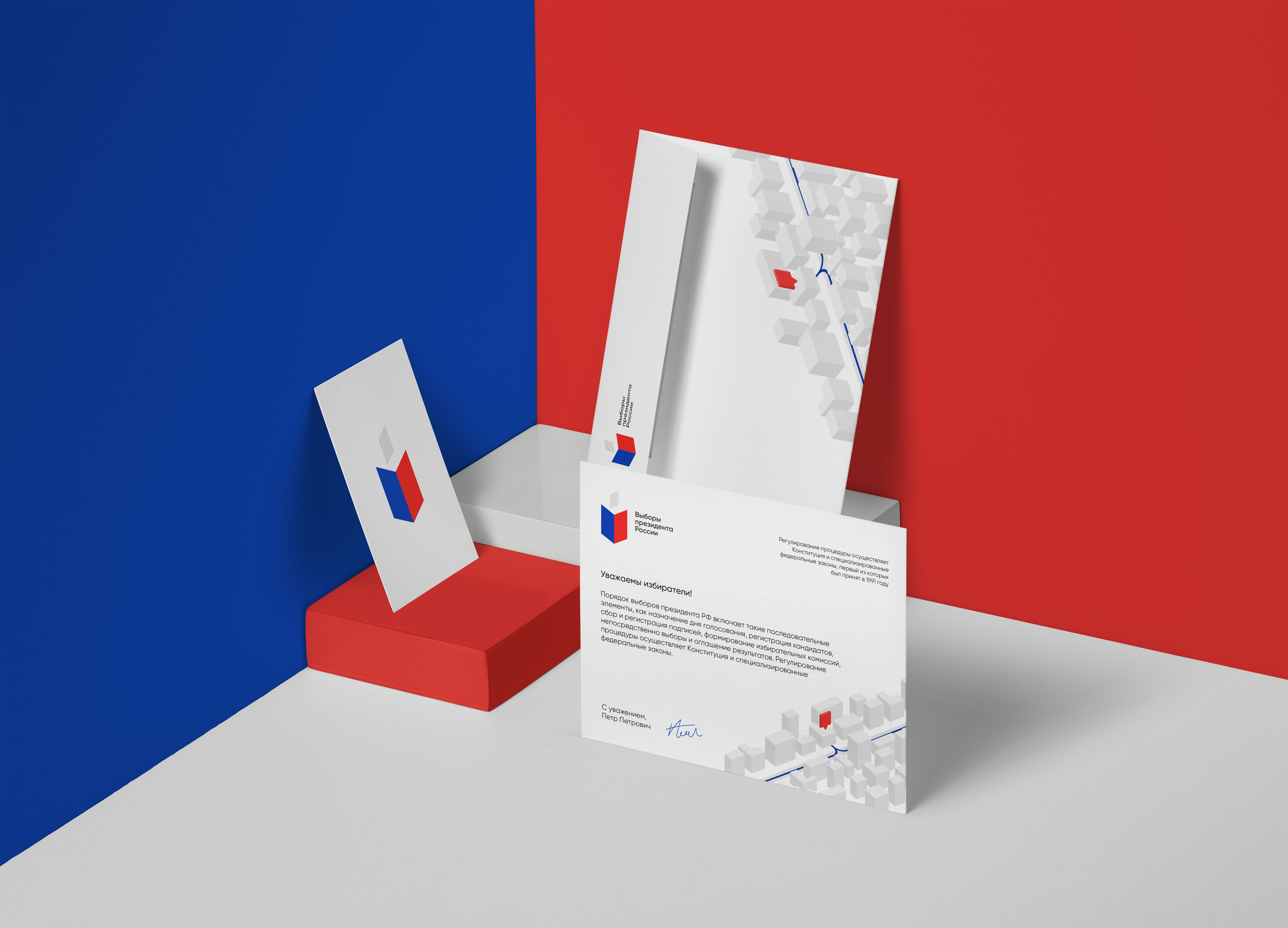
Printing

Sample on a transparent bag
Concept 2: focus on the idea
To make the style different from any other state project, he needs at least some uniqueness and his own idea in addition to the general slogans on the posters.
We liked the idea with the hands of people of different professions and occupations on large media such as propaganda posters and banners.
At such large media can be completely abandon the use of the logo, and to focus on the images and figures 2018:

Propaganda poster

concept of large posters

Propaganda Banner

Banner on the sidewalk

concept poster, blending smoothly into the minimalist bench

decoration booths
Conclusion
It is obvious to us that the designers approached the task through their sleeves, and after all, we did not show all the ways that we could go to make it better. There is a suspicion that for such a lot of money it would be possible to develop a more thoughtful and holistic corporate identity, so if you saw it, ask for a design in some good studio.