Create an asymmetric grid using the grid layout

At the moment, according to Can I Use , 84% of browsers support Grid Layout . Every month this number is growing. But just recently, this module was behind the flag. Therefore, if you are not yet familiar with the opportunities that it provides, then it's time to fix it.
As an example, I chose the gallery of images from the Kinopoisk website, which was created using relative positioning. During implementation, we will be guided by the principle of “steal, but improve”, so our gallery will be flexible and adapted to various resolutions.
The first step is to create a container for the photo. Each element will be assigned two classes: common, for all photos, and unique (I hope you do not use identifiers, right?).
<divclass="container"><divclass="photo photo1"></div><!-- Остальные элементы --><divclass="photo photo20"></div></div>We ask our parent element to act like a
Distribution of elements in a grid container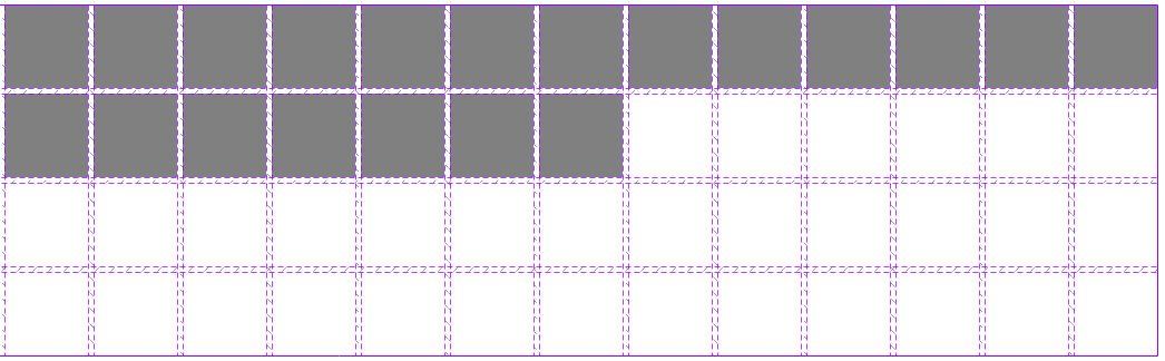
Then create an asymmetric grid from the available elements. We will do this by indicating the start and end coordinates of the tracks (stripes between cells).
.photo1 {
  /* от какой строки */grid-row-start: 1;
  /* до какой строки */grid-row-end: 3;
  /* от какого столбца */grid-column-start: 1;
  /* до какого столбца */grid-column-end: 3;
}
It looks bulky. Don't you think?
.photo1 {
  grid-row: 1 / 3;
  grid-column: 1 / 3;
}
Already better, but possible even shorter.
.photo1 {
  grid-area: 1 / 1 / span 2 / span 2;
}
You certainly noticed that we have also replaced triples with span 2 . This is to not count the tracks. We simply tell the browser how many cells the element will be stretched through. And now we need to do this for each block. By the way, if you do not specify the final position, then the element will occupy exactly one cell.
After that, add a background image to the elements, which will be scaled while maintaining the proportions.
.photo {
  background-size: cover;
}
.photo1 {
  background-image: url(...);
}

Visual numbering of tracks. Oh yes, you can read them from the end, only before the value you need to remember to specify a minus.
We will carry out the same operation for the next breakpoint, where our gallery will have dimensions of 10 by 5. All we did was change the value of the grid-area property ofthe elements and add one image due to the fact that when overriding the grid we formed empty area. Unfortunately, youcannot use the calc functionwhen creating a media expression(at the time of writing, this feature has been implementedonly in Chrome 66, Firefox 59 and Opera 53), so the calculations are given in the comments to the code. It is considered so: the sum of the width of the element and its indentation multiplied by the number of columns in the previous breakpoint.
/* (75px + 5px) * 13 columns = 1040px */
@media (max-width: 1040px) {
  .container {
    grid: repeat(5, 75px) / repeat(10, 75px);
  }
  /* Здесь будет новое определение позиций для остальных элементов */.photo20 {
    grid-area: 4 / 9 / span 2 / span 2;
  }
}
At the very last breakpoint, all our images will be the same size, which means they will occupy exactly one cell. To implement this behavior, we will redefine the number of elements in the container by 20 and set the class photo (each class has this class) the grid-area property to the default value - auto . Thus, we reset the parameters set in the previous breakpoint. Now our blocks are automatically distributed in cells from left to right.
/* (75px + 5px) * 10 columns = 800px */
@media (max-width: 800px) {
  .container {
    grid: repeat(4, 75px) / repeat(5, 75px);
  }
  .photo {
    grid-area: auto / auto;
  }
}
Conclusion
As you can see, the new CSS module is quite flexible and easy to learn. Of course, I did not take advantage of all the opportunities that it provides in this article. But already with this example the power of this tool is clearly demonstrated. I hope that for you this will become a breakaway point in the study of Grid Layout , and you will be ready to use it as soon as your blog / website can afford to stop supporting old browsers.
UPD: Thanks to the user of Loki3000 , a solution was found that is more elegant. You can read about its benefits in the comments to this publication.