Vertical rhythm
- Transfer

The 8pt grid is a powerful system for creating consistent and visually appealing user interfaces. This post is about how to set the vertical rhythm and typography in an 8pt grid. For a better understanding of the material, check out the article " Introduction to the 8pt Grid System " and " 8pt-Based Grid: Stroke and Layout ."
What is vertical rhythm and why is it so important
The rhythm is achieved when the elements of your design consist of repeating patterns. This allows your final design to look deliberate, professional and consistent.

The use of repeated intervals in our projects creates a familiar and predictable experience. Zell Lew 's article on why vertical rhythm is important perfectly describes this:
“Repetition breeds awareness. It has the ability to create the feeling that things should be together. It’s starting to seem that someone has thought of everything, that this is part of the plan. ” - Zell Lew.
What is a baseline grid
You will often hear the term “baseline grid” when talking about achieving vertical rhythm. The grid of baselines allows us to track the vertical distances between the type and other objects in the design, and I highly recommend using it to achieve vertical rhythm. However, remember that web browsers measure typographic markup a bit differently. This can lead to a kind of ambiguity for designers and developers, depending on the development tools and platform.
How to measure using baselines
A baseline is a line running along the bottom edge of straight lines. This is a general term in print design, and many classic design programs are designed for it. The experience of using native applications is usually built outside the baseline.

The measurement of the space from the baseline to the baseline in the text is called the lead. In many design programs, it will be automatically installed (Photoshop, Illustrator, InDesign).
How to measure line height
Line height is a bounding box created around text on websites or in design programs such as Sketch or Figma. In CSS line height, you can give the pixel size, coefficient, or percentage.
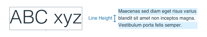
In the example above, the right paragraph is
font-size16px and the value line-heightcan be written as 24px, 1.5, or 150% in CSS.If printing can be measured in two different ways, which one to use
We found that the web environment will measure typography in different ways, and some people have different opinions about which path is right. Both are correct for their own reasons. So there were three approaches:
- Measure everything on the baseline.
- Your embedded applications already have this feature. But with the browser, everything is more complicated. You will have to work on a baseline basis and then use very specific intervals to keep your content aligned. I would not recommend this method for systems with a large surface area. If you are interested in this approach and want to know more, there is an excellent article in Smashing Magazine.
- Measure everything by row height.
- This is the natural state of the web browser. Embedded applications can also measure by this method, although some argue that the result is not so accurate.
- Let the web environment solve everything for you.
- Realize that different platforms will take different types of measurements. Well and hammer. It is better to achieve a consistent sequence instead of carefully examining pixel differences.

Choosing your approach
You will need to make this decision for your company and / or product based on your requirements and goals. This decision should take into account: your experience in the web environment, the number of contributors, and the core competencies of the team. The larger the team size, the more difficult it is to follow the rules.
How can you reduce the number of decisions your team needs to make?
Keep in mind that a sequential system is better than not having it. You can always iterate through the system, but one-time solutions will be expensive.
“Achieving consistent vertical rhythm is the most important part of design.” - Joel Bijkelman
Creating a vertical rhythm
Using an 8pt grid to measure the height of your elements is a great start to create a vertical rhythm. Anthony Collurafici 's post on the 8pt grid talks about how it works in Sketch.
The general question I get regarding the 8pt grid is how I adjust my grids in Sketch or Illustrator. In truth, I usually don’t use these features when dealing with user interface elements. I'm generally a fan of grid layouts and respect code as a source of truth. I will use spacing elements in my files to make a basic grid layout, but I usually just measure each element. I use 8pt grid as a relative spatial system, not a strict grid.
Additional reading
Here are some articles and resources that have helped me answer some difficult questions.
- Zell Liew's Why is Vertical Rhythm an Important Typography Practice?
- Wilson Miner's Setting Type on the Web to a Baseline Grid
- Priyanka Godbole's A framework for creating a predictable & harmonious spacing system for faster design-dev handoff
- Anthony Collurafici's Sketch Workflow - 8-point Soft Grids
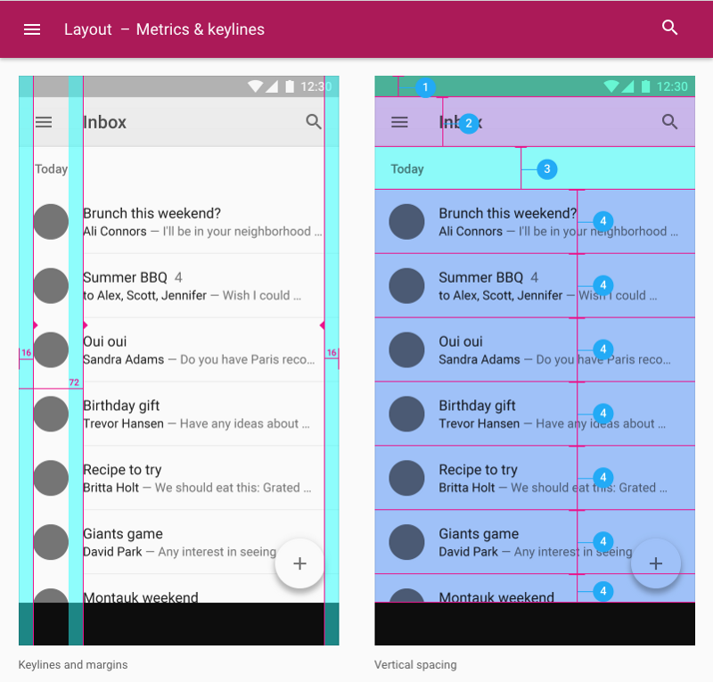
- Google's Material Design Guidelines about Metrics & Keylines
- Vincent De Oliveira's Deep dive CSS: font metrics, line-height and vertical-align
- Leigh Taylor - The Grid: Website post where you can download examples.
The translation was supported by the EDISON Software company , which professionally develops websites of government agencies on Bitrix and creates a useful web application for administering the electronic library .