10 famous logos drawn from memory
How accurately can you recall the logos of famous brands?
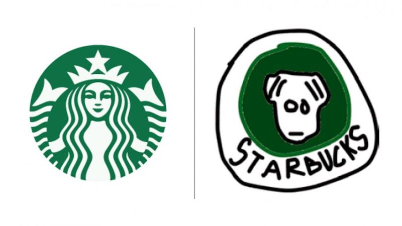
Well, almost a mermaid.
Being recognizable and memorable - these are important goals when creating a logo. The world's most famous logos from Apple to McDonalds have been carefully designed to be associated with your brand at a glance.
So how deeply rooted are these logos in our minds? To find out, Signs.com asked 156 Americans to draw 10 well-known logos from memory, and it took half an hour to draw.
The results turned out to be funny and funny in some places, there were a lot of variations on the theme, some elements of the logos were distorted, painted in a free version, but there were options close to the originals.
Almost every third participant painted the stem for the Apple logo (and he doesn’t have it), 22% “bit off” a piece of apple on the wrong side; while one out of 10 people used the adidas shamrock, which was born back in 1971 instead of the three bands used since 1997. Almost half of the people surveyed were sure that the Starbucks mermaid does not wear a crown (and she is on it).
So what can we learn from this study? First of all, brand colors are remembered more easily than the form itself - most people can correctly remember a color palette than any other element. The most successful logos use color (and color theory) to differ from competitors.
Karen Haller, a leading specialist in the field of applied psychology of color, emphasizes the importance of the problem of color choice faced by designers in the development of logos.
“Initially, an emotional connection is established with color, then we perceive the form, the entire logo, read the words,” says Haller. “If color evokes a lack of confidence, the logo will not be accepted, despite the beautifully written words.”
Could you draw logos better? First, check out some of the masterpieces drawn by participants in an interesting Signs.com study, confident in their abilities? Take the test yourself, for this you will need a minimum - pencils and a piece of paper.
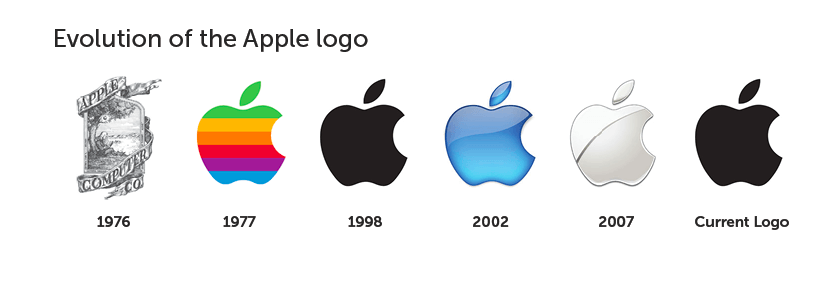
In the pocket, on the wrist - wherever you can find Apple devices, about 600 million people around the world use this brand. It would seem that with such a frequent contemplation of the logo, it will be easy to recall its elegantly simple features. In the end (and unlike Starbucks or Foot Locker), the logo design key is in the name itself! In fact, only 20% of the participants were able to perfectly draw the Apple logo.
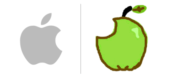
The most common mistake made by almost one in three is the stem, in fact it is missing from the logo. 15% depicted a leaf, some in the wrong direction, some in the wrong shape.
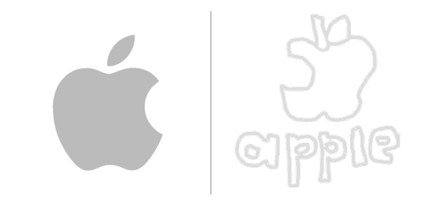
The Apple logo was developed by Regis McKenna advertising agency in 1977. The task of art director Rob Janov was to create a business-style logo (previously it was Isaac Newton sitting under an apple tree), and, according to Steve Jobs’s request, it was “not nice” to make a logo. The bite - an iconic feature of the logo - was made so that the apple did not look like a cherry. 84% remembered the bite, but 1 out of 5 mistakenly painted it on the left side, and not on the right.
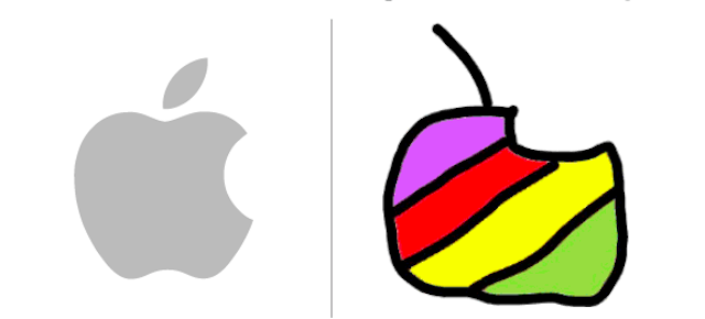
Of the 156 people, 5 participants over the age of 40 (3%) depicted the logo in the form of rainbow stripes, which it was from 1977 to 1998. Perhaps they took from their memory the logo of their youth. 6% of the participants gave the logo red colors (perhaps thinking of a red apple), 72% used black or gray.

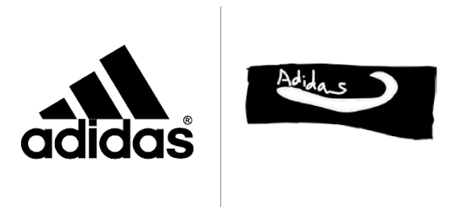
Adidas is the second-largest sports company in the world; in 1952, the company bought its logo with three stripes from the Karhu Sports shoe brand for two bottles of whiskey in the equivalent of 2 thousand US dollars. 65 years of iconic stripes flaunted on the clothing of hundreds of professional athletes and hundreds of millions of consumers.
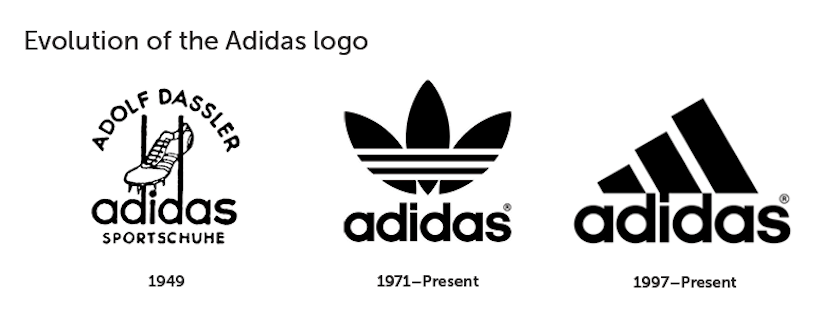
Despite its ubiquity, only 12% of the study participants were able to portray the perfect versions of the Adidas logo from memory. Ideally in this case it meant: three bands (not four or more, as 11% of the participants considered), the word “adidas” was written in whole and not in capital letters (21% used the capital A).
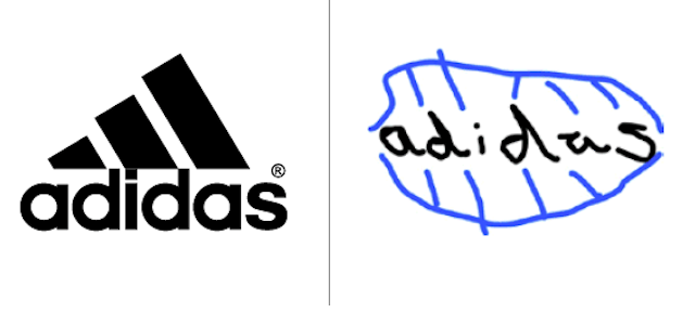
About 1 out of 10 people depicted the Adidas trefoil logo. This symbol was used in the beginning of 70 and designated three continents: America, Europe, Africa and Asia. The trefoil logo is still used on some of the company's products (Adidas Originals line).
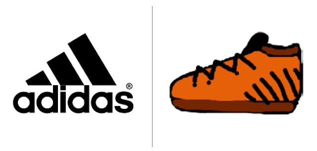
The Adidas logo is usually black, 8% of participants added blue colors to their drawings. Blue is not the primary color of the logo, although it is widely used on Adidas packaging.
Are you the logo of the new Adinike brand?
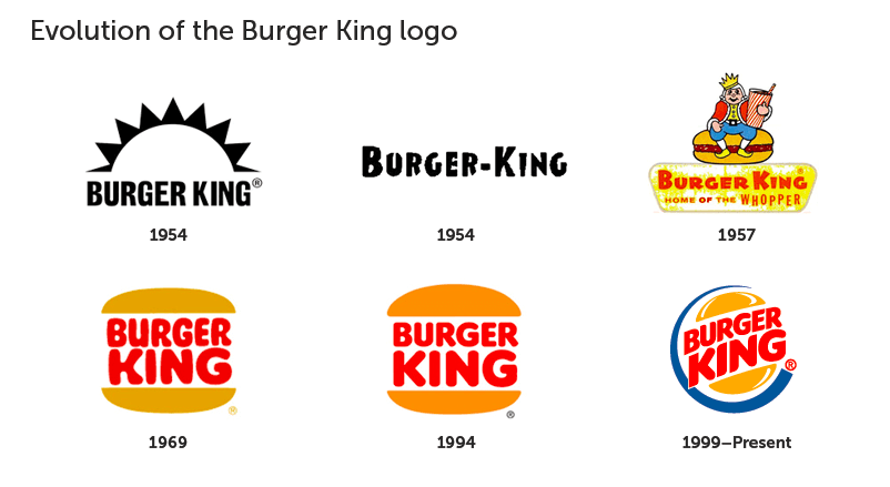
Unlike the minimalist and monochrome logos of Apple and Adidas, the Burger King is more complex, combines three different components (text, half a roll and a crescent) and three colors (red, yellow and blue).
Perhaps Burger King
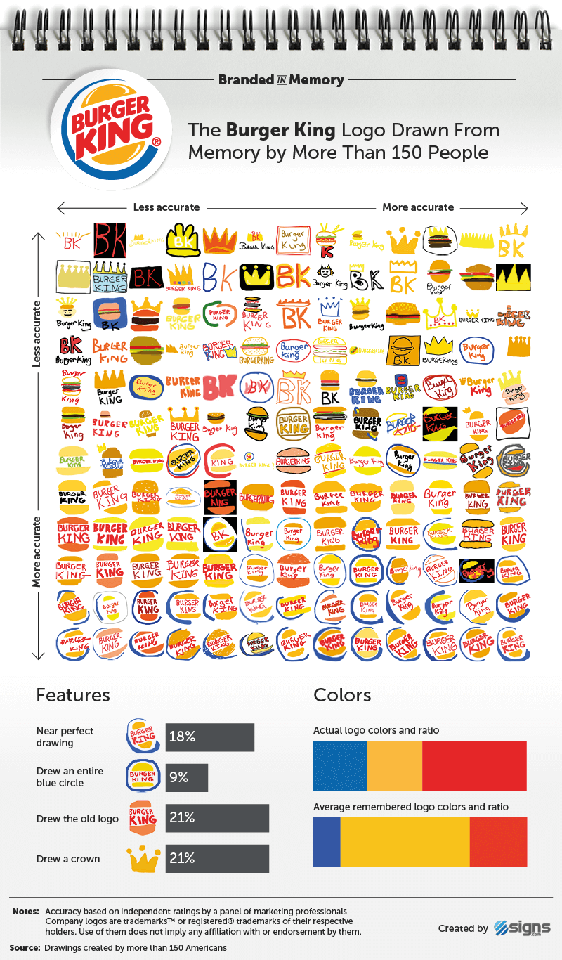
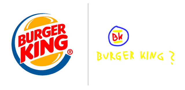
18% of the participants could almost ideally depict the Burger King logo from memory, which is already a good indicator compared to 20% Apple and 12% Adidas.
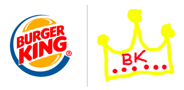
One of the most interesting results of the experiment is that people often mistakenly recall elements taken from brand advertising. 21% of the participants drew the crown, despite the fact that only in the period from 1957 to 1969 the king sitting on the burger was depicted in the Burger King logo.
Participants with an average age of 34 years are unlikely to have painted a 48-year-old non-existent logo in place of the current version. Most likely, they could not completely remember what the logo looks like, so they depicted the crown, relying on the word “king” in the brand name, the king’s character in advertisements and paper crowns that are issued in restaurants.
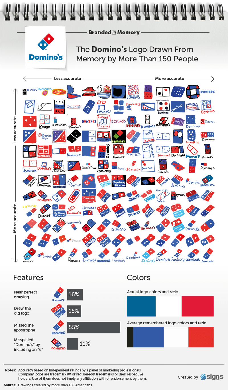
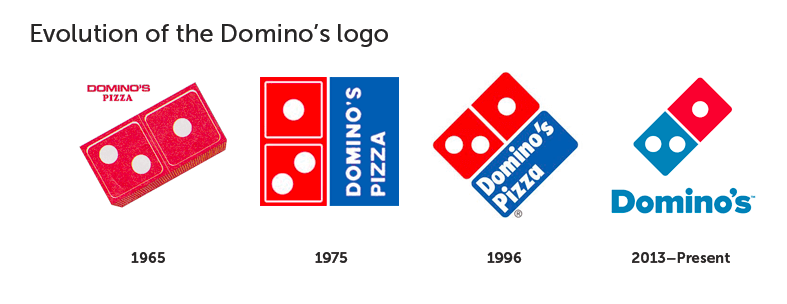
The three dots featured on Domino's Pizza's original logo are a symbol of the first three stores owned by their founders Tom and James Monaghan in the 1960s. The plans were to add a point at the opening of another store, but the rapid increase in the number of outlets did not make adjustments to the logo.

28% of the participants remembered that the Dominos logo had three dots and correctly positioned them (two in the lower square, one in the upper part). 37% depicted more than three points, while 14% completely forgot about their presence. 16% approached the ideal features of the Dominos logo, 28% successfully tried to reach the “good” mark.
15% of the participants accurately painted the square with a slope Dominos logo, which was used from 1996 to 2012.
Two-thirds of the participants drew the brand name, although by mistake the hour: 55% forgot about the apostrophe, and 11% added the letter e: Dominoe's.

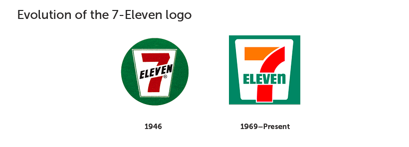
The 7-Eleven logo has not changed much since 1946. It depicts the number 7, which intersects with the word "Eleven", all this is placed in a white trapezoid on a green background. The only significant change was made in 1969: the top of the “7” turned orange, and the bottom remained red.
19% of the participants were able to draw the 7-Eleven logo almost perfectly, and 46% made some minor mistakes. Two of the most common mistakes were to write “Eleven” as a number (31%) and to write the word “Eleven” under “7” (56%).
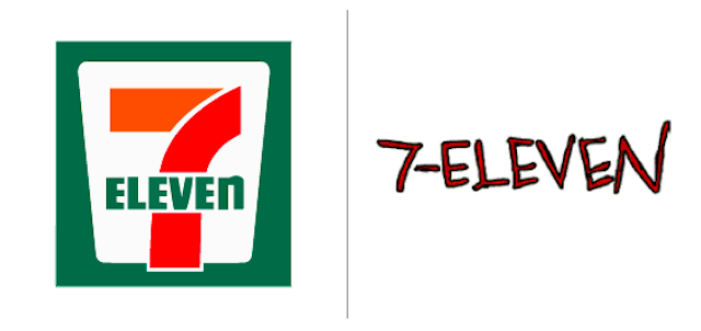
Feature of the 7-Eleven logo: “Eleven” is written “ELEVEn” - in upper case, except for the letter “n”. Only two of the 156 participants (about 1%) were able to recall this nuance.
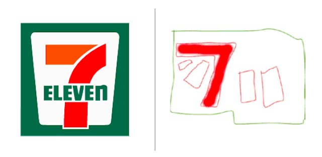
Despite the fact that for 50 years the 7-Eleven logo has not changed much, it contains too many elements that can be forgotten or mixed up in people's memory.
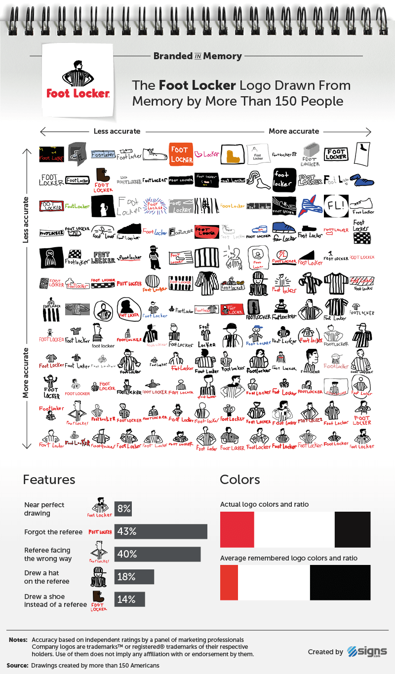
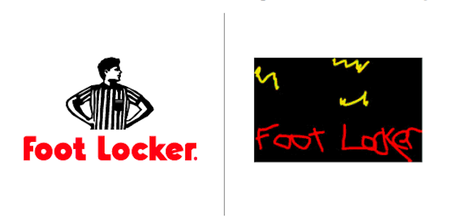
Foot Locker and Starbucks are the only brands in this experiment that show people in their logos. The character (referee) was displayed least accurately from memory.
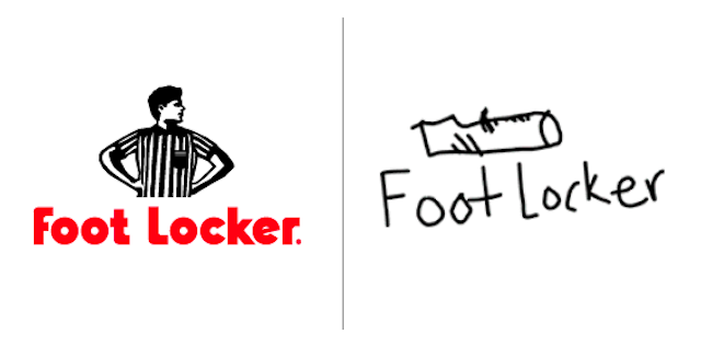
The logo has been used since 1988, but it is not displayed on the windows of every Foot Locker store (it has more than 3,300 worldwide). More often only the brand name is depicted in red, and the judge can be seen on the bags from Foot Locker.
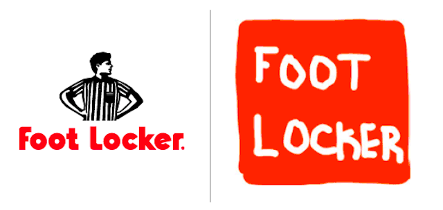
Only 8% of the participants were able to get the almost perfect Foot Locker logo from their memory, making it the second in the list of hard-to-remember logos of the 10 tested. Many drew a hat on the referee (18%), a striped shirt without the referee (9.7%), shoes or foot (14%).
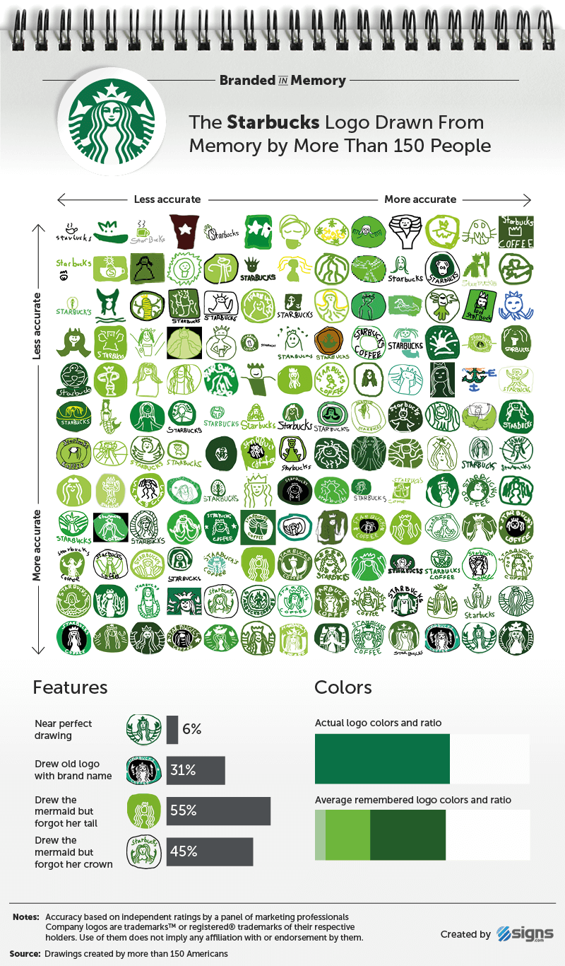
Since its inception (1971), Starbucks has used three logos, each of which depicted a mermaid in a different design (a siren from Greek mythology). In the first version of the logo, the mermaid was top loess, but in 1987 the logo was simplified, the breasts were covered with hair and the main color - brown - was replaced with green.

The current logo (from 2011) with a simplified version of the siren no longer contains the text “Starbucks Coffee”, a pure green color is used. Despite this simplification, only 6% of participants were able to accurately depict the perfect Starbucks logo from memory.
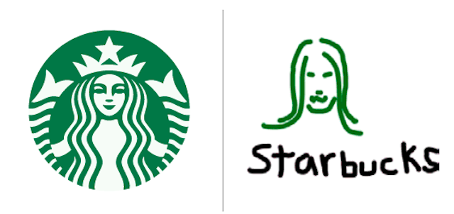
There is no doubt that the Starbucks mermaid is a very memorable element (90% thought of it), but it’s very difficult to convey it in the picture, accurately depicting all the details and shape. 45% forgot that she wears a crown, 16% who draw a crown depicted a star in the center, and 55% lost sight of her forked tails. 31% of participants transferred elements of the old logo, which featured the brand name and the black circle, into the 2011 Starbucks logo.
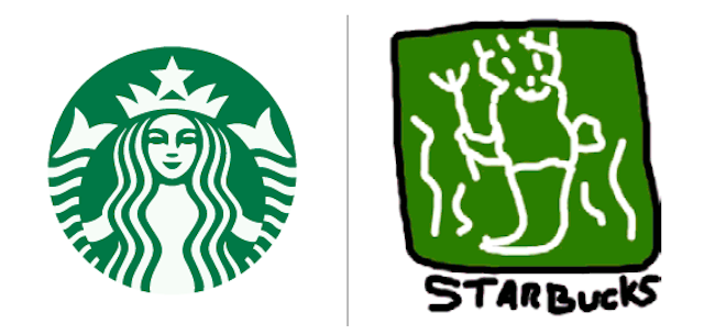
It turns out that despite the fact that Starbucks daily sells about 18 million cups of coffee, the logo rightfully ranks first in the “least remembered” category of the 10 brands that were taken for research.


Walmart is the world's largest company, with 11,500 stores in 28 countries. The first logo (from 1962 to 1964) was basic, consisted of simple inscriptions without serifs and without symbols. The font was later replaced with “Frontier Font”, somewhat reminiscent of the Wild West, but in 1981 the company returned to a simple spelling between “Wal” and “Mart”. One out of ten participants dashed in their images.
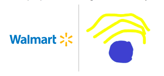
In 1992, the star replaced the hyphen (7% of the participants recalled it in their drawings). In 2008, Walmart designed the logo more friendly, removing the hyphen, adding a text name and the symbol "solar charge". 68% of participants remembered the sun.

12% of participants pulled out the nearly perfect Walmart logo. As for color and text, the Walmart logo is very simple. But the symbol of sunlight is something that is hard to remember. Many were confused in the number and location of the rays.

The confusion between the old and the new version of the logo prevented images from becoming close to perfection.
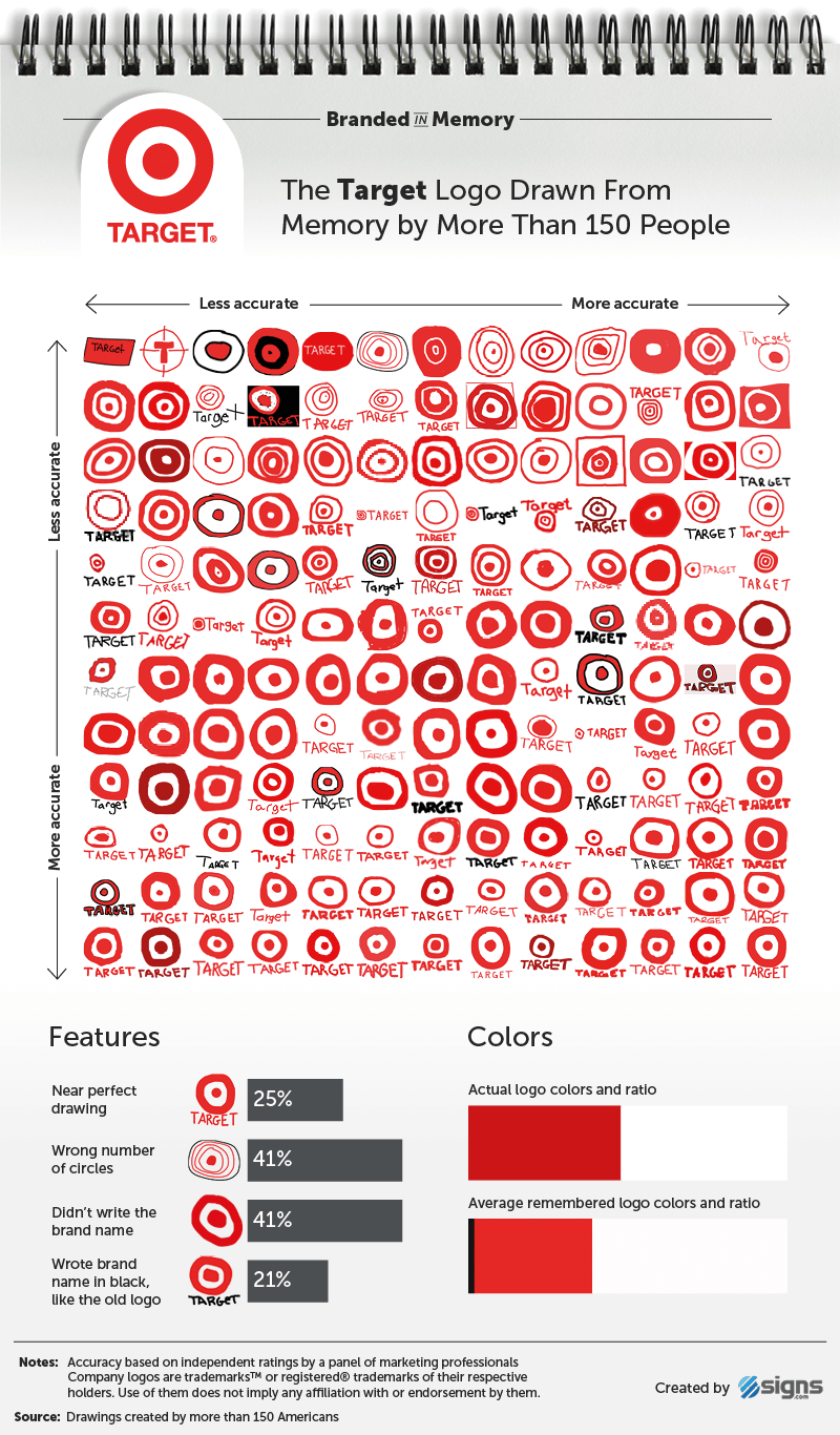
Along with Walmart, Target is the largest retail chain in the United States. Its logo is one of the most recognizable.

A sight or a target, that’s the question
During the experiment, a quarter of people managed to perfectly convey the logo from memory, this put the Target logo in second place among the most memorable of the 10 emblems tested. 52% were able to draw a logo corresponding to the rating “good”, only a few minor mistakes were made.
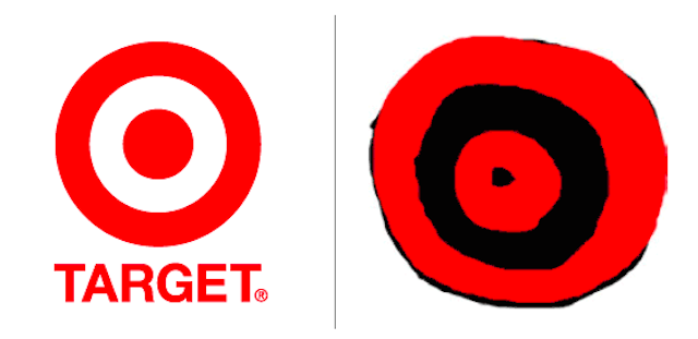
The color of the logo was conveyed correctly (100% of the participants remembered the red color). 59% remembered the circle in the center and one ring around it.

Almost original
Most participants (59%) wrote the word “Target”. Skipping a company name cannot be considered a gross mistake, since Target separated the name from its logo in advertisements and commercials only since 2006, believing that most users are quite familiar with the brand and will be able to associate the image with the company and without letter support.

The logo most accurately drawn from the memory of 156 Americans belongs to the Swedish company IKEA.
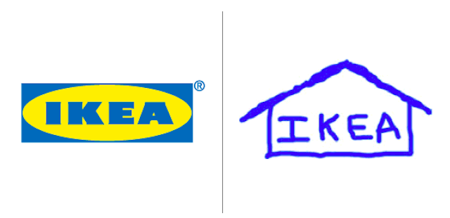
30% of the participants who painted the IKEA logo from memory were able to fully recreate the combination of text, shapes and color, which is a good result compared to 25% Target and 20% Apple.
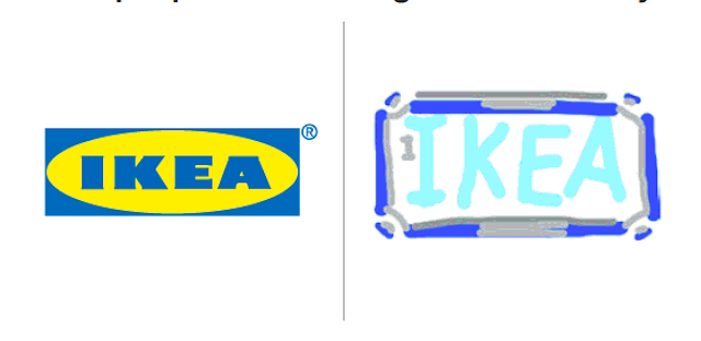
One of the most important elements of the IKEA logo is letters. 88% of participants remembered that they were written in upper case.
The IKEA logo is depicted with or without a yellow oval in blue letters, depending on where it is used: whether it is an IKEA display case or a logo made of printed materials and commercials. 41% of the drawings contained the oval of the brand.
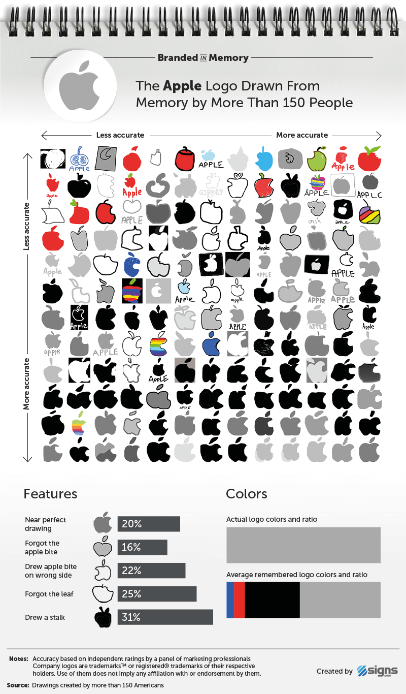
The study, in fact, is not large-scale, but emphasizes one of the main tasks of logo design - to create a sign so that it can be easily remembered, while making it quite distinctive and competitive. The graphic experiment was attended by 156 Americans aged 20 to 70 years, 50% of women, 47% of men, 3% left their belonging to one sex or another secret. Logos were rated by a team of five design and marketing professionals. Each of them evaluated more than 1,500 drawings; the transmission of the main elements, proportions and color palettes was taken into account.
As Sherlock Holmes said, we “see, but do not observe.” Logos of giant corporations are so often found in our eyes that we do not need to photograph them in order to subsequently recognize them. But here we often do not pay attention to details, such a process is called "amnesia due to inattention."
Self-confidence about one's ability to remember logos is astonishingly wrong. Any doubts? Give an answer to a simple question: what color is the second letter in the Google logo?
When writing, we used the translation of Julia Sagar 's article “10 iconic logos hilariously drawn from memory” and “10 iconic logos. 156 Americans. 80 hours of drawing from memory . "
As an advertisement. Stock! Just get it nowup to 4 months of free use of VPS (KVM) with dedicated drives in the Netherlands and the USA (configurations from VPS (KVM) - E5-2650v4 (6 Cores) / 10GB DDR4 / 240GB SSD or 4TB HDD / 1Gbps 10TB - $ 29 / month and above, options are available with RAID1 and RAID10) , a full-fledged analogue of dedicated servers, when ordering for a period of 1-12 months, the terms of the action are here, existing subscribers can get a 2 month bonus!
How to build the infrastructure of the building. class using Dell R730xd E5-2650 v4 servers costing 9,000 euros for a penny?
Well, almost a mermaid.
Being recognizable and memorable - these are important goals when creating a logo. The world's most famous logos from Apple to McDonalds have been carefully designed to be associated with your brand at a glance.
So how deeply rooted are these logos in our minds? To find out, Signs.com asked 156 Americans to draw 10 well-known logos from memory, and it took half an hour to draw.
The results turned out to be funny and funny in some places, there were a lot of variations on the theme, some elements of the logos were distorted, painted in a free version, but there were options close to the originals.
Almost every third participant painted the stem for the Apple logo (and he doesn’t have it), 22% “bit off” a piece of apple on the wrong side; while one out of 10 people used the adidas shamrock, which was born back in 1971 instead of the three bands used since 1997. Almost half of the people surveyed were sure that the Starbucks mermaid does not wear a crown (and she is on it).
So what can we learn from this study? First of all, brand colors are remembered more easily than the form itself - most people can correctly remember a color palette than any other element. The most successful logos use color (and color theory) to differ from competitors.
Color is one of the main components of a brand logo
Karen Haller, a leading specialist in the field of applied psychology of color, emphasizes the importance of the problem of color choice faced by designers in the development of logos.
“Initially, an emotional connection is established with color, then we perceive the form, the entire logo, read the words,” says Haller. “If color evokes a lack of confidence, the logo will not be accepted, despite the beautifully written words.”
Could you draw logos better? First, check out some of the masterpieces drawn by participants in an interesting Signs.com study, confident in their abilities? Take the test yourself, for this you will need a minimum - pencils and a piece of paper.
Apple
In the pocket, on the wrist - wherever you can find Apple devices, about 600 million people around the world use this brand. It would seem that with such a frequent contemplation of the logo, it will be easy to recall its elegantly simple features. In the end (and unlike Starbucks or Foot Locker), the logo design key is in the name itself! In fact, only 20% of the participants were able to perfectly draw the Apple logo.
The most common mistake made by almost one in three is the stem, in fact it is missing from the logo. 15% depicted a leaf, some in the wrong direction, some in the wrong shape.
The Apple logo was developed by Regis McKenna advertising agency in 1977. The task of art director Rob Janov was to create a business-style logo (previously it was Isaac Newton sitting under an apple tree), and, according to Steve Jobs’s request, it was “not nice” to make a logo. The bite - an iconic feature of the logo - was made so that the apple did not look like a cherry. 84% remembered the bite, but 1 out of 5 mistakenly painted it on the left side, and not on the right.
Of the 156 people, 5 participants over the age of 40 (3%) depicted the logo in the form of rainbow stripes, which it was from 1977 to 1998. Perhaps they took from their memory the logo of their youth. 6% of the participants gave the logo red colors (perhaps thinking of a red apple), 72% used black or gray.
Adidas
Adidas is the second-largest sports company in the world; in 1952, the company bought its logo with three stripes from the Karhu Sports shoe brand for two bottles of whiskey in the equivalent of 2 thousand US dollars. 65 years of iconic stripes flaunted on the clothing of hundreds of professional athletes and hundreds of millions of consumers.
Despite its ubiquity, only 12% of the study participants were able to portray the perfect versions of the Adidas logo from memory. Ideally in this case it meant: three bands (not four or more, as 11% of the participants considered), the word “adidas” was written in whole and not in capital letters (21% used the capital A).
About 1 out of 10 people depicted the Adidas trefoil logo. This symbol was used in the beginning of 70 and designated three continents: America, Europe, Africa and Asia. The trefoil logo is still used on some of the company's products (Adidas Originals line).
The Adidas logo is usually black, 8% of participants added blue colors to their drawings. Blue is not the primary color of the logo, although it is widely used on Adidas packaging.
Are you the logo of the new Adinike brand?
Burger king
Unlike the minimalist and monochrome logos of Apple and Adidas, the Burger King is more complex, combines three different components (text, half a roll and a crescent) and three colors (red, yellow and blue).
Perhaps Burger King
18% of the participants could almost ideally depict the Burger King logo from memory, which is already a good indicator compared to 20% Apple and 12% Adidas.
One of the most interesting results of the experiment is that people often mistakenly recall elements taken from brand advertising. 21% of the participants drew the crown, despite the fact that only in the period from 1957 to 1969 the king sitting on the burger was depicted in the Burger King logo.
Participants with an average age of 34 years are unlikely to have painted a 48-year-old non-existent logo in place of the current version. Most likely, they could not completely remember what the logo looks like, so they depicted the crown, relying on the word “king” in the brand name, the king’s character in advertisements and paper crowns that are issued in restaurants.
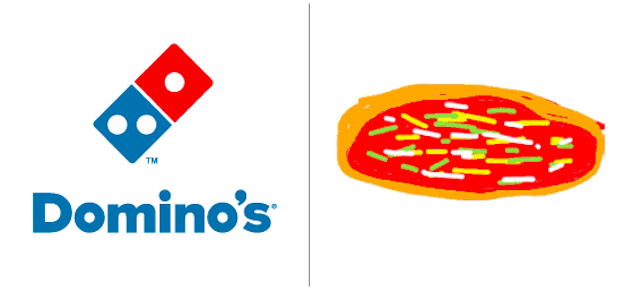
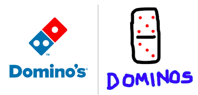
Dominos
The three dots featured on Domino's Pizza's original logo are a symbol of the first three stores owned by their founders Tom and James Monaghan in the 1960s. The plans were to add a point at the opening of another store, but the rapid increase in the number of outlets did not make adjustments to the logo.
28% of the participants remembered that the Dominos logo had three dots and correctly positioned them (two in the lower square, one in the upper part). 37% depicted more than three points, while 14% completely forgot about their presence. 16% approached the ideal features of the Dominos logo, 28% successfully tried to reach the “good” mark.
15% of the participants accurately painted the square with a slope Dominos logo, which was used from 1996 to 2012.
Two-thirds of the participants drew the brand name, although by mistake the hour: 55% forgot about the apostrophe, and 11% added the letter e: Dominoe's.
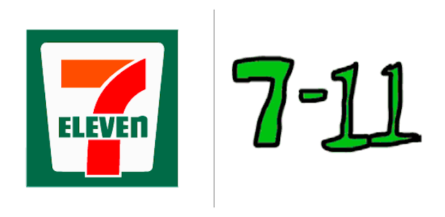
7-eleven
The 7-Eleven logo has not changed much since 1946. It depicts the number 7, which intersects with the word "Eleven", all this is placed in a white trapezoid on a green background. The only significant change was made in 1969: the top of the “7” turned orange, and the bottom remained red.
19% of the participants were able to draw the 7-Eleven logo almost perfectly, and 46% made some minor mistakes. Two of the most common mistakes were to write “Eleven” as a number (31%) and to write the word “Eleven” under “7” (56%).
Feature of the 7-Eleven logo: “Eleven” is written “ELEVEn” - in upper case, except for the letter “n”. Only two of the 156 participants (about 1%) were able to recall this nuance.
Despite the fact that for 50 years the 7-Eleven logo has not changed much, it contains too many elements that can be forgotten or mixed up in people's memory.
Foot locker
Foot Locker and Starbucks are the only brands in this experiment that show people in their logos. The character (referee) was displayed least accurately from memory.
The logo has been used since 1988, but it is not displayed on the windows of every Foot Locker store (it has more than 3,300 worldwide). More often only the brand name is depicted in red, and the judge can be seen on the bags from Foot Locker.
Only 8% of the participants were able to get the almost perfect Foot Locker logo from their memory, making it the second in the list of hard-to-remember logos of the 10 tested. Many drew a hat on the referee (18%), a striped shirt without the referee (9.7%), shoes or foot (14%).
Starbucks
Since its inception (1971), Starbucks has used three logos, each of which depicted a mermaid in a different design (a siren from Greek mythology). In the first version of the logo, the mermaid was top loess, but in 1987 the logo was simplified, the breasts were covered with hair and the main color - brown - was replaced with green.
The current logo (from 2011) with a simplified version of the siren no longer contains the text “Starbucks Coffee”, a pure green color is used. Despite this simplification, only 6% of participants were able to accurately depict the perfect Starbucks logo from memory.
There is no doubt that the Starbucks mermaid is a very memorable element (90% thought of it), but it’s very difficult to convey it in the picture, accurately depicting all the details and shape. 45% forgot that she wears a crown, 16% who draw a crown depicted a star in the center, and 55% lost sight of her forked tails. 31% of participants transferred elements of the old logo, which featured the brand name and the black circle, into the 2011 Starbucks logo.
It turns out that despite the fact that Starbucks daily sells about 18 million cups of coffee, the logo rightfully ranks first in the “least remembered” category of the 10 brands that were taken for research.
Walmart
Walmart is the world's largest company, with 11,500 stores in 28 countries. The first logo (from 1962 to 1964) was basic, consisted of simple inscriptions without serifs and without symbols. The font was later replaced with “Frontier Font”, somewhat reminiscent of the Wild West, but in 1981 the company returned to a simple spelling between “Wal” and “Mart”. One out of ten participants dashed in their images.
In 1992, the star replaced the hyphen (7% of the participants recalled it in their drawings). In 2008, Walmart designed the logo more friendly, removing the hyphen, adding a text name and the symbol "solar charge". 68% of participants remembered the sun.
12% of participants pulled out the nearly perfect Walmart logo. As for color and text, the Walmart logo is very simple. But the symbol of sunlight is something that is hard to remember. Many were confused in the number and location of the rays.
The confusion between the old and the new version of the logo prevented images from becoming close to perfection.
Target
Along with Walmart, Target is the largest retail chain in the United States. Its logo is one of the most recognizable.
A sight or a target, that’s the question
During the experiment, a quarter of people managed to perfectly convey the logo from memory, this put the Target logo in second place among the most memorable of the 10 emblems tested. 52% were able to draw a logo corresponding to the rating “good”, only a few minor mistakes were made.
The color of the logo was conveyed correctly (100% of the participants remembered the red color). 59% remembered the circle in the center and one ring around it.
Almost original
Most participants (59%) wrote the word “Target”. Skipping a company name cannot be considered a gross mistake, since Target separated the name from its logo in advertisements and commercials only since 2006, believing that most users are quite familiar with the brand and will be able to associate the image with the company and without letter support.
IKEA
The logo most accurately drawn from the memory of 156 Americans belongs to the Swedish company IKEA.
30% of the participants who painted the IKEA logo from memory were able to fully recreate the combination of text, shapes and color, which is a good result compared to 25% Target and 20% Apple.
One of the most important elements of the IKEA logo is letters. 88% of participants remembered that they were written in upper case.
The IKEA logo is depicted with or without a yellow oval in blue letters, depending on where it is used: whether it is an IKEA display case or a logo made of printed materials and commercials. 41% of the drawings contained the oval of the brand.
The study, in fact, is not large-scale, but emphasizes one of the main tasks of logo design - to create a sign so that it can be easily remembered, while making it quite distinctive and competitive. The graphic experiment was attended by 156 Americans aged 20 to 70 years, 50% of women, 47% of men, 3% left their belonging to one sex or another secret. Logos were rated by a team of five design and marketing professionals. Each of them evaluated more than 1,500 drawings; the transmission of the main elements, proportions and color palettes was taken into account.
As Sherlock Holmes said, we “see, but do not observe.” Logos of giant corporations are so often found in our eyes that we do not need to photograph them in order to subsequently recognize them. But here we often do not pay attention to details, such a process is called "amnesia due to inattention."
Self-confidence about one's ability to remember logos is astonishingly wrong. Any doubts? Give an answer to a simple question: what color is the second letter in the Google logo?
When writing, we used the translation of Julia Sagar 's article “10 iconic logos hilariously drawn from memory” and “10 iconic logos. 156 Americans. 80 hours of drawing from memory . "
As an advertisement. Stock! Just get it nowup to 4 months of free use of VPS (KVM) with dedicated drives in the Netherlands and the USA (configurations from VPS (KVM) - E5-2650v4 (6 Cores) / 10GB DDR4 / 240GB SSD or 4TB HDD / 1Gbps 10TB - $ 29 / month and above, options are available with RAID1 and RAID10) , a full-fledged analogue of dedicated servers, when ordering for a period of 1-12 months, the terms of the action are here, existing subscribers can get a 2 month bonus!
How to build the infrastructure of the building. class using Dell R730xd E5-2650 v4 servers costing 9,000 euros for a penny?